WHAT’S IN THIS CHAPTER?
WROX.COM CODE DOWNLOADS FOR THIS CHAPTER
Please note that all the code examples in this chapter are available as a part of this chapter’s code download on the book’s website at www.wrox.com on the Download Code tab.
The web applications that you develop generally have more than a single page to them. Usually, you create a number of web pages that are interconnected in some fashion. If you also build the navigation around your collection of pages, you make it easy for the end user to successfully work through your application in a straightforward manner.
Currently, you must choose from a number of ways to expose the paths through your application to the end user. The difficult task of site navigation is compounded when you continue to add pages to the overall application.
The present method for building navigation within web applications is to sprinkle pages with hyperlinks. Hyperlinks are generally added to web pages by using include files or user controls. They can also be directly hard-coded onto a page so that they appear in the header or the sidebar of the page being viewed. The difficulties in working with navigation become worse when you move pages around or change page names. Sometimes, developers are forced to go to every page in the application just to change some aspect of the navigation.
ASP.NET 4.5 tackles this problem by providing a navigation system that makes managing how end users work through the applications you create quite trivial. This capability in ASP.NET is complex; but the great thing is that it can be as simple as you need it to be, or you can actually get in deep and control every aspect of how it works.
The site navigation system includes the capability to define your entire site in an XML file that is called a sitemap. After you define a sitemap, you can work with it programmatically using the SiteMap class. Another aspect of the sitemap capability available in ASP.NET is a data provider that is specifically developed to work with sitemap files and to bind them to a series of navigation-based server controls. This chapter looks at all these components in the ASP.NET 4.5 navigation system. The following section introduces sitemaps.
Although a sitemap is not a required element (as you see later), one of the common first steps you take in working with the ASP.NET 4.5 navigation system is building a sitemap for your application. A sitemap is an XML description of your site’s structure.
You use this sitemap to define the navigational structure of all the pages in your application and how they relate to one another. If you do this according to the ASP.NET sitemap standard, you can then interact with this navigation information using either the SiteMap class or the SiteMapDataSource control. By using the SiteMapDataSource control, you can then bind the information in the sitemap file to a variety of data-binding controls, including the navigation server controls provided by ASP.NET.
To create a sitemap file for your application, add a sitemap or an XML file to your application. When asked, you name the XML file Web.sitemap; this file is already in place if you select the Sitemap option. The file is named Web and has the file extension of .sitemap. Take a look at an example of a .sitemap file, shown here in Listing 17-1 (Web.sitemap in the code download for this chapter).
LISTING 17-1: An example of a Web.sitemap file
<?xml version="1.0" encoding="utf-8" ?>
<siteMap xmlns="http://schemas.microsoft.com/AspNet/SiteMap-File-1.0" >
<siteMapNode title="Home" description="Home Page" url="Default.aspx">
<siteMapNode title="News" description="The Latest News" url="News.aspx">
<siteMapNode title="U.S." description="U.S. News"
url="News.aspx?cat=us" />
<siteMapNode title="World" description="World News"
url="News.aspx?cat=world" />
<siteMapNode title="Technology" description="Technology News"
url="News.aspx?cat=tech" />
<siteMapNode title="Sports" description="Sports News"
url="News.aspx?cat=sport" />
</siteMapNode>
<siteMapNode title="Finance" description="The Latest Financial Information"
url="Finance.aspx">
<siteMapNode title="Quotes" description="Get the Latest Quotes"
url="Quotes.aspx" />
<siteMapNode title="Markets" description="The Latest Market Information"
url="Markets.aspx">
<siteMapNode title="U.S. Market Report"
description="Looking at the U.S. Market" url="MarketsUS.aspx" />
<siteMapNode title="NYSE"
description="The New York Stock Exchange" url="NYSE.aspx" />
</siteMapNode>
<siteMapNode title="Funds" description="Mutual Funds"
url="Funds.aspx" />
</siteMapNode>
<siteMapNode title="Weather" description="The Latest Weather"
url="Weather.aspx" />
</siteMapNode>
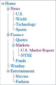
</siteMap>So what does this file give you? Well, it gives you a logical structure that ASP.NET can now use in the rest of the navigation system it provides. Next, this chapter examines how this file is constructed.
The root node of this XML file is a <siteMap> element. Only one <siteMap> element can exist in the file. Within the <siteMap> element is a single root <siteMapNode> element. This is generally the start page of the application. In the case of the file in Listing 17-1, the root <siteMapNode> points to the Default.aspx page, the start page:
<siteMapNode title="Home" description="Home Page" url="Default.aspx">\Table 17-1 describes the most common attributes in the <siteMapNode> element.
| ATTRIBUTE | DESCRIPTION |
| Title | Provides a textual description of the link. The String value used here is the text used for the link. |
| Description | Not only reminds you what the link is for, but also is used for the ToolTip attribute on the link. The ToolTip attribute is the yellow box that shows up next to the link when the end user hovers the cursor over the link for a couple of seconds. |
| url | Describes where the file is located in the solution. If the file is in the root directory, simply use the filename, such as Default.aspx. If the file is located in a subfolder, be sure to include the folders in the String value used in this attribute. For example, MySubFolder/Markets.aspx. |
After you have the first <siteMapNode> in place, you can then nest as many additional <siteMapNode> elements as you need within the root <siteMapNode> element. You can also create additional link-levels by creating child <siteMapNode> elements for any parent <siteMapNode> in the structure.
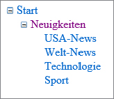
The example in Listing 17-1 gives the application the following navigational structure:
Home
   News
      U.S.
      World
      Technology
      Sports
   Finance
      Quotes
      Markets
         U.S. Market Report
         NYSE
      Funds
   Weather
You can see that this structure goes down three levels in some places. One of the easiest places to use this file is with the SiteMapPath server control that comes with ASP.NET. The SiteMapPath server control in ASP.NET is built to work specifically with the .sitemap files.
Using the .sitemap file you just created with the SiteMapPath server control provided with ASP.NET is quite easy. You can find this control in the Navigation section of the Visual Studio 2012 IDE.
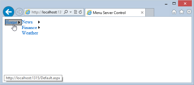
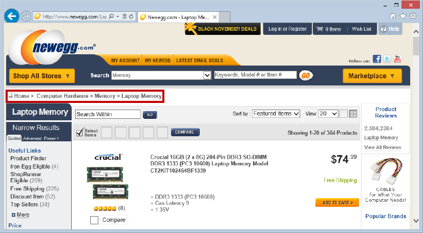
The SiteMapPath control creates navigation functionality that you once might either have created yourself or have seen elsewhere in web pages on the Internet. The SiteMapPath control creates what some refer to as breadcrumb navigation. This linear path defines where the end user is in the navigation structure. The newegg.com website, shown in Figure 17-1, uses the breadcrumb navigation.
The purpose of this type of navigation is to show end users where they are in relation to the rest of the site. Traditionally, coding this kind of navigation has been tricky, to say the least; but with the SiteMapPath server control, you should find coding for this type of navigation a breeze. As an example, you’ll see a site structure for a (fictitious) news website in this chapter.
You should first create an application that has the Web.sitemap file created in Listing 17-1. From there, create a Web Form called MarketsUS.aspx. This file is defined in the Web.sitemap file as being on the lowest tier of files in the application.
The SiteMapPath control is so easy to work with that it doesn’t even require a data source control to hook it up to the Web.sitemap file where it infers all its information. All you do is drag and drop a SiteMapPath control onto your MarketsUS.aspx page. In the end, you should have a page similar to the one shown in Listing 17-2.
LISTING 17-2: Using the Web.sitemap file with a SiteMapPath server control
<%@ Page Language="C#" %>
<html xmlns="http://www.w3.org/1999/xhtml">
<head runat="server">
<title>Using the SiteMapPath Server Control</title>
</head>
<body>
<form id="form1" runat="server">
<asp:SiteMapPath ID="Sitemappath1" runat="server">
</asp:SiteMapPath>
</form>
</body>
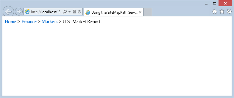
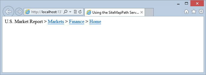
</html>Not much to it, is there? It really is that easy. Run this page and you see the results shown in Figure 17-2.
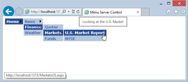
This screenshot shows that you are on the U.S. Market Report page at MarketsUS.aspx. As an end user, you can see that this page is part of the Markets section of the site; Markets, in turn, is part of the Finance section of the site. With breadcrumb navigation, end users who understand the structure of the site and their place in it can quickly select the links to navigate to any location in the site.
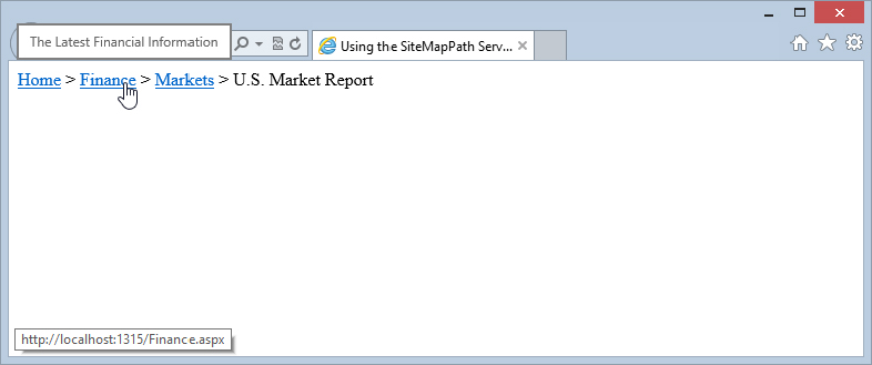
If you hover your mouse over the Finance link, you see a tooltip appear after a couple of seconds, as shown in Figure 17-3.
This tooltip, which reads The Latest Financial Information, comes from the description attribute of the <siteMapNode> element in the Web.sitemap file.
<siteMapNode title="Finance" description="The Latest Financial Information"
 url="Finance.aspx">
The SiteMapPath control works automatically, requiring very little work on your part. You just add the basic control to your page, and the control automatically creates the breadcrumb navigation you have just seen. However, you can use the properties discussed in the following sections to modify the appearance and behavior of the control.
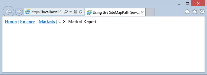
One important style property for the SiteMapPath control is the PathSeparator property. By default, the SiteMapPath control uses a greater-than sign (>) to separate the link elements. You can change it by reassigning a new value to the PathSeparator property. Listing 17-3 illustrates the use of this property.
LISTING 17-3: Changing the PathSeparator value
<asp:SiteMapPath ID="Sitemappath1" runat="server" PathSeparator=" | ">
</asp:SiteMapPath>
or
<asp:SiteMapPath ID="Sitemappath1" runat="server">
   <PathSeparatorTemplate> | </PathSeparatorTemplate>
</asp:SiteMapPath>
The SiteMapPath control in this example uses the pipe character (|), which is found above the Enter key. When it is rendered, you get the results shown in Figure 17-4.
As you can see, you can use either the PathSeparator attribute or the <PathSeparatorTemplate> element within the SiteMapPath control.
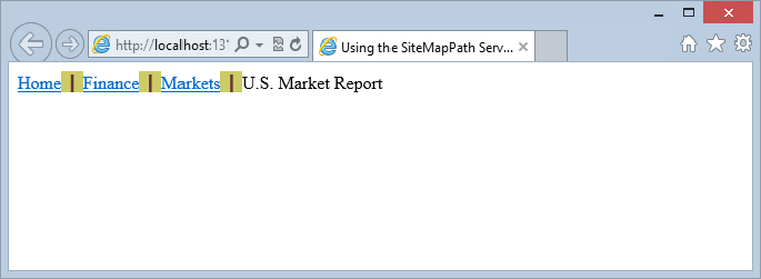
With the use of the PathSeparator attribute or the <PathSeparatorTemplate> element, specifying what you want to use to separate the links in the breadcrumb navigation is quite easy, but you might also want to give this pipe some visual style as well. You can add a <PathSeparatorStyle> node to your SiteMapPath control. Listing 17-4 shows an example of this.
LISTING 17-4: Adding style to the PathSeparator property
<asp:SiteMapPath ID="Sitemappath1" runat="server" PathSeparator=" | ">
   <PathSeparatorStyle Font-Bold="true" Font-Names="Verdana" ForeColor="#663333"
    BackColor="#cccc66"></PathSeparatorStyle>
</asp:SiteMapPath>
Okay, it may not be pretty, but by using the <PathSeparatorStyle> element with the SiteMapPath control, you can change the visual appearance of the separator elements. Figure 17-5 shows the results.
Using these constructs, you can also add an image as the separator, as shown in Listing 17-5.
LISTING 17-5: Using an image as the separator
<%@ Page Language="C#" %>

<html xmlns="http://www.w3.org/1999/xhtml">
<head runat="server">
    <title>Using the SiteMapPath Server Control</title>
</head>
<body>
    <form id="form1" runat="server">
        <asp:SiteMapPath ID="SiteMapPath1" runat="server">
            <PathSeparatorTemplate>
                <asp:Image ID="Image1" runat="server" ImageUrl="divider.gif" />
            </PathSeparatorTemplate>
        </asp:SiteMapPath>
   </form>
</body>
</html>
To utilize an image as the separator between the links, you use the <PathSeparatorTemplate> element and place an Image control within it. In fact, you can place any type of control between the navigation links that the SiteMapPath control produces.
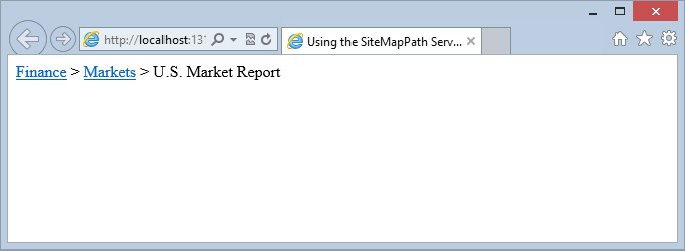
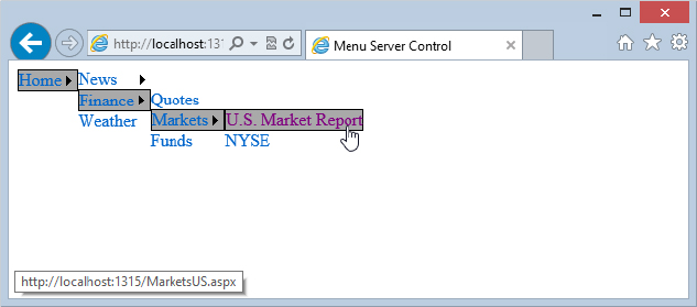
Another interesting property to use with the SiteMapPath control is PathDirection. This property changes the direction of the links generated in the output. Only two settings are possible for this property: RootToCurrent and CurrentToRoot.
The Root link is the first link in the display and is usually the Home page. The Current link is the link for the page currently being displayed. By default, this property is set to RootToCurrent. Changing the example to CurrentToRoot produces the results shown in Figure 17-6.
In some cases, your navigation may go quite deep. You can see on the sitemap shown in Listing 17-1 that you go three pages deep, which isn’t a big deal. Some of you, however, might be dealing with sites that go quite a number of pages deeper. In these cases, using the SiteMapPath control might be a bit silly. Doing so would display a huge list of pages.
In a case like this, you can turn to the ParentLevelsDisplayed property that is part of the SiteMapPath control. When set, this property displays pages only as deep as specified. Therefore, if you are using the SiteMapPath control with the Web.sitemap, as shown in Listing 17-1, and you give the ParentLevelsDisplayed property a value of 3, you don’t notice any change to your page. It already displays the path three pages deep. If you change this value to 2, however, the SiteMapPath control is constructed as follows:
<asp:SiteMapPath ID="Sitemappath1" runat="server" ParentLevelsDisplayed="2">
</asp:SiteMapPath>
Notice the result of this change in Figure 17-7. The SiteMapPath control shows links only two pages deep and doesn’t show the Home page link.
By default, no limit is set on the number of links shown, so the SiteMapPath control just generates the specified number of links based on what is labeled in the sitemap file.
By default, the SiteMapPath control generates tooltips for each link if a description property is used within the Web.sitemap file. Remember, a tooltip is the text that appears onscreen when an end user hovers the mouse over one of the links in the SiteMapPath control. This capability was shown earlier in this chapter.
There may be times when you do not want your SiteMapPath control to show any tooltips for the links that it generates. For these situations, you can actually turn off this capability in a couple of ways. The first way is to omit any description attributes in the .sitemap file. If you remove these attributes from the file, the SiteMapPath has nothing to display for the tooltips on the page.
The other way to turn off the display of tooltips is to set the ShowToolTips property to False, as shown here:
<asp:SiteMapPath ID="Sitemappath1" runat="server" ShowToolTips="false">
</asp:SiteMapPath>
This code turns off the tooltips capability but still enables you to use the description property in the .sitemap file. You may still want to use the description attribute because it allows you to keep track of what the links in your file are used for. This feature is quite advantageous when you are dealing with hundreds or even thousands of links in your application.
You already saw the use of the <PathSeparatorStyle> and the <PathSeparatorTemplate> child elements for the SiteMapPath control, but additional child elements exist. Table 17-2 covers each of the available child elements.
| CHILD ELEMENT | DESCRIPTION |
| CurrentNodeStyle | Applies styles to the link in the SiteMapPath navigation for the currently displayed page. |
| CurrentNodeTemplate | Applies a template construction to the link in the SiteMapPath navigation for the currently displayed page. |
| NodeStyle | Applies styles to all links in the SiteMapPath navigation. The settings applied in the CurrentNodeStyle or RootNodeStyle elements supersede any settings placed here. |
| NodeTemplate | Applies a template construction to all links in the SiteMapPath navigation. The settings applied in the CurrentNodeTemplate or RootNodeTemplate elements supersede any settings placed here. |
| PathSeparatorStyle | Applies styles to the link dividers in the SiteMapPath navigation. |
| PathSeparatorTemplate | Applies a template construction to the link dividers in the SiteMapPath navigation. |
| RootNodeStyle | Applies styles to the first link (the root link) in the SiteMapPath navigation. |
| RootNodeTemplate | Applies a template construction to the first link in the SiteMapPath navigation. |
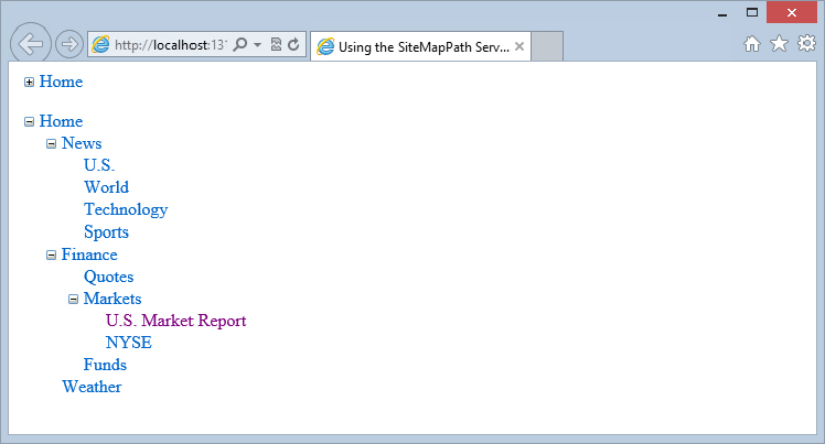
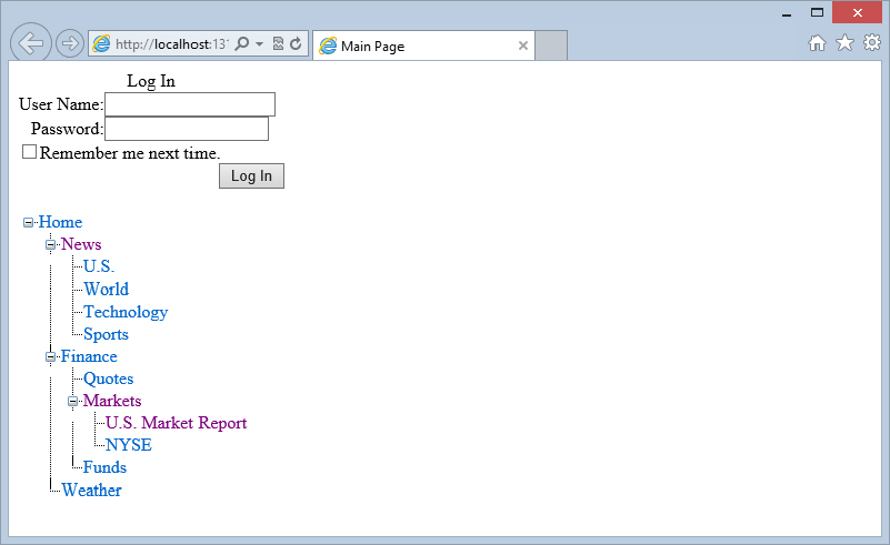
The TreeView server control is a rich server control for rendering a hierarchy of data, so it is quite ideal for displaying what is contained in your .sitemap file. Figure 17-8 shows you how it displays the contents of the sitemap (again from Listing 17-1) that you have been working with thus far in this chapter. This figure first shows a completely collapsed TreeView control at the top of the screen; the second TreeView control has been completely expanded.
This control can dynamically load the nodes to be displayed as they are selected by the expandable and collapsible framework of the control. If the control can render the TreeView output along with some client-side script, the control can make a call back to the server if someone expands one of the nodes in the control to get the subnodes of the selected item. This feature is ideal if your site navigation system is large. In this case, loading nodes of the TreeView control dynamically greatly helps performance. One of the great features of this postback capability is that it is done under the covers and does not require the ASP.NET page to be completely refreshed. Of course, this capability is there only if the browser accepts the client-side code that goes along with the TreeView control. If the browser does not, the control knows this and renders only what is appropriate (pulling all the information that is required of the entire TreeView control). It only performs these JavaScript-based postbacks for those clients who can work with this client-side script.
You can definitely see this scenario in action if you run the TreeView control on a page that is being monitored by an HTTP sniffer of some kind to monitor the traffic moving across the wire.
If your browser allows client-side script and you expand one of the expandable nodes of the TreeView control, your HTTP request will be similar to the following:
POST /Navigation/Default.aspx HTTP/1.1
Accept: */*
Accept-Language: en-us
Referrer: http://localhost:1882/Navigation/Default.aspx
Content-Type: application/x-www-form-urlencoded
Accept-Encoding: gzip, deflate
User-Agent: Mozilla/5.0 (compatible; MSIE 10.0; Windows NT 6.2; WOW64; Trident/6.0)

DNT: 1
Host: localhost:1882
Content-Length: 904
Proxy-Connection: Keep-Alive
Pragma: no-cache

__EVENTTARGET=&__EVENTARGUMENT=&TreeView1_ExpandState=c&TreeView1_SelectedNode=Tree
View1t0&TreeView1_PopulateLog=&__VIEWSTATE=%2FwEPDwUKLTY0ODk0OTE2Mg9kFgICBA9kFgICAw
88KwAJAgAPFggeDU5ldmVyRXhwYW5kZWRkHgtfIURhdGFCb3VuZGceDFNlbGVjdGVkTm9kZQULVHJlZVZpZ
XcxdDAeCUxhc3RJbmRleAIBZAgUKwACBQMwOjAUKwACFhAeBFRleHQFBEhvbWUeBVZhbHVlBQRIb21lHgtO
YXZpZ2F0ZVVybAUYL05hdmlnYXRpb24vRGVmYXVsdC5hc3B4HgdUb29sVGlwBQlIb21lIFBhZ2UeCERhdGF
QYXRoBRgvbmF2aWdhdGlvbi9kZWZhdWx0LmFzcHgeCURhdGFCb3VuZGceCFNlbGVjdGVkZx4QUG9wdWxhdG
VPbkRlbWFuZGdkZBgBBR5fX0NvbnRyb2xzUmVxdWlyZVBvc3RCYWNrS2V5X18WAwURTG9naW4xJFJlbWVtY
mVyTWUFF0xvZ2luMSRMb2dpbkltYWdlQnV0dG9uBQlUcmVlVmlldzFtwszVpUMxFTDtpERnNjgEIkWWbg%3
D%3D&Login1$UserName=&Login1$Password=&__CALLBACKID=TreeView1&__CALLBACKPARAM=0%7C1
%7Ctft%7C4%7CHome24%7C%2Fnavigation%2Fdefault.aspxHome&__EVENTVALIDATION=%2FwEWBgKg
8Yn8DwKUvNa1DwL666vYDAKC0q%2BkBgKnz4ybCAKn5fLxBaSy6WQwPagNZsHisWRoJfuiopOe
The response from your ASP.NET application will not be the entire page that holds the TreeView control, but instead, it is a small portion of HTML that is used by a JavaScript method on the page and is loaded into the TreeView control dynamically. Here is a sample response:
HTTP/1.1 200 OK
Server: Microsoft-IIS/8.0
Date: Sat, 10 Nov 2012 17:55:03 GMT
X-AspNet-Version: 4.0.30319
Cache-Control: private, no-store
Content-Type: text/html; charset=utf-8
Content-Length: 1756
Connection: Close
112|/wEWCgKg8Yn8DwKUvNa1DwL666vYDAKC0q+kBgKnz4ybCAKn5fLxBQKAgtPaBALEmcbhCgK8nZDfCAL
M/ZK8AR/nFcl4nlPgp6HcFlU6YiFBfoNM14|nn|<div id="TreeView1n6Nodes"
style="display:none;">
<table cellpadding="0" cellspacing="0" style="border-width:0;">
<tr>
<td><div style="width:20px;height:1px"></div></td><td><div
style="width:20px;height:1px"><img
src="/Navigation/WebResource.axd?d=GOWKLfnbFU9fYyy
PCMT8DIfngU4PXeMiAHxJNuXB-tU1&t=632662834831594592" alt="" />
</div></td><td><div style="width:20px;height:1px"><img
src="/Navigation/WebResource.axd?d=GOWKLfnbFU9fYyyPCMT8DIfngU
4PXeMiAHxJNuXB-tU1&t=632662834831594592" alt="" />
</div></td><td><img
src="/Navigation/WebResource.axd?d=GOWKLfnbFU9fYyy
PCMT8DCXmyNCWX5x-n_pSXFIW2qE1&t=632662834831594592"
alt="" /></td><td style="white-space:nowrap;">
<a href="/Navigation/MarketsUSasdf.aspx"
title="Looking at the U.S. Market" id="TreeView1t12"
style="text-decoration:none;">U.S. Market Report</a></td>
</tr>
</table><table cellpadding="0" cellspacing="0" style="border-width:0;">
<tr>
<td><div style="width:20px;height:1px"></div></td><td><div
style="width:20px;height:1px"><img
src="/Navigation/WebResource.axd?d=GOWKLfnbFU9fYyyPCMT8DI
fngU4PXeMiAHxJNuXB-tU1&t=632662834831594592" alt="" />
</div></td><td><div style="width:20px;height:1px"><img
src="/Navigation/WebResource.axd?d=GOWKLfnbFU9fYyyPCMT8DI
fngU4PXeMiAHxJNuXB-tU1&t=632662834831594592" alt="" />
</div></td><td><img
src="/Navigation/WebResource.axd?d=GOWKLfnbFU9fY
yyPCMT8DGyYai5iS-79vjeYzdeJoiI1&t=632662834831594592"
alt="" />
</td><td style="white-space:nowrap;">
<a href="/Navigation/NYSE.aspx" title="The New York Stock Exchange"
id="TreeView1t13" style="text-decoration:none;">NYSE</a></td>
</tr>
</table>
</div>This postback capability is rather powerful, but if you want to disable it (even for browsers that can handle it), you just set the PopulateNodesFromClient attribute to False in the TreeView control (the default value is True).
The TreeView control is quite customizable; but first, take a look at how to create a default version of the control using the .sitemap file from Listing 17-1. For this example, continue to use the MarketsUS.aspx page you created earlier.
The first step is to create a SiteMapDataSource control on the page. When working with the TreeView control that displays the contents of your .sitemap file, you must apply one of these data source controls. The TreeView control doesn’t just bind to your sitemap file automatically as the SiteMapPath control does.
After a basic SiteMapDataSource control is in place, position a TreeView control on the page and set the DataSourceId property to SiteMapDataSource1. When you have finished, your code should look like Listing 17-6.
LISTING 17-6: A basic TreeView control
<%@ Page Language="C#" %>
<html xmlns="http://www.w3.org/1999/xhtml">
<head runat="server">
<title>Using the TreeView Server Control</title>
</head>
<body>
<form id="form1" runat="server">
<asp:SiteMapPath ID="SiteMapPath1" runat="server">
</asp:SiteMapPath>
<br /><p>
<asp:TreeView ID="TreeView1" runat="server"
DataSourceID="SiteMapDataSource1">
</asp:TreeView>
<asp:SiteMapDataSource ID="SiteMapDataSource1" runat="server" /></p>
</form>
</body>
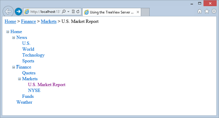
</html>After you run the page and expand the TreeView control, the results appear as shown in Figure 17-9.
This TreeView control is very basic. The great thing about this control is that it allows for a high degree of customization and even gives you the capability to use some predefined styles that come prepackaged with ASP.NET 4.5.
As stated, the TreeView control does come with a number of pre-built styles right out of the box. The best way to utilize these predefined styles is to do so from the Design view of your page. Click on the arrow located in the upper-right section of the server control in the Design view in Visual Studio 2012 to find the Auto Format option. Click this option and a number of styles become available to you. Selecting one of these styles changes the code of your TreeView control to adapt to that chosen style. For example, if you choose MSDN from the list of options, the simple one-line TreeView control you created is converted to what is shown in Listing 17-7.
LISTING 17-7: A TreeView control with the MSDN style applied to it
<asp:TreeView ID="TreeView1" runat="server" DataSourceID="SiteMapDataSource1"
 ImageSet="Msdn" NodeIndent="10">
   <ParentNodeStyle Font-Bold="False" />
   <HoverNodeStyle BackColor="#CCCCCC" BorderColor="#888888" BorderStyle="Solid"
    Font-Underline="True" />
   <SelectedNodeStyle BackColor="White" BorderColor="#888888" BorderStyle="Solid"
    BorderWidth="1px" Font-Underline="False" HorizontalPadding="3px"
    VerticalPadding="1px" />
   <NodeStyle Font-Names="Verdana" Font-Size="8pt" ForeColor="Black"
    HorizontalPadding="5px" NodeSpacing="1px" VerticalPadding="2px" />
</asp:TreeView>
As you can see, if you use these built-in styles, then completely changing the look-and-feel of the TreeView control is not too difficult. When you run this bit of code, you get the results shown in Figure 17-10.
To master working with the TreeView control, you must understand the terminology used for each part of the hierarchical tree that is created by the control.
Every element or entry in the TreeView control is called a node. The uppermost node in the hierarchy of nodes is the root node. A TreeView control can have multiple root nodes. Any node, including the root node, is also considered a parent node if it has any nodes that are directly under it in the hierarchy of nodes. The nodes directly under this parent node are referred to as child nodes. Each parent node can have one or more child nodes. A node that contains no child nodes is called a leaf node.
The following is based on the sitemap shown earlier and details the use of this terminology:
 Home - Root node, parent node
   News - Parent node, child node
      U.S. - Child node, leaf node
      World - Child node, leaf node
      Technology - Child node, leaf node
      Sports - Child node, leaf node
   Finance - Parent node, child node
      Quotes - Child node, leaf node
      Markets - Parent node, child node
         U.S. Market Report - Child node, leaf node
         NYSE - Child node, leaf node
      Funds - Child node, leaf node
   Weather - Child node, leaf node
From this listing, you can see what each node is and how it is referred to in the hierarchy of nodes. For example, the U.S. Market Report node is a leaf node — meaning that it doesn’t have any child nodes associated with it. However, it is also a child node to the Markets node, which is a parent node to the U.S. Market Report node. If you are working with the Markets node directly, it is also a child node to the Finance node, which is its parent node. The main point to take away from all this is that each node in the sitemap hierarchy has a relationship to the other nodes in the hierarchy. You must understand these relationships because you can programmatically work with these nodes (as is demonstrated later in this chapter), and the methods used for working with them include terms such as RootNode, CurrentNode, and ParentNode.
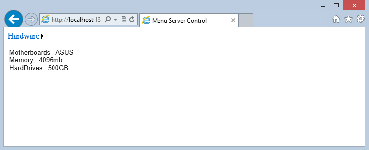
You are not limited to working with just a .sitemap file in order to populate the nodes of your TreeView controls. You have many ways to get this done. One cool way is to use the XmlDataSource control (instead of the SiteMapDataSource control) to populate your TreeView controls from your XML files.
For an example of this, create a hierarchical list of items in an XML file called Hardware.xml. Listing 17-8 shows an example of this file (Hardware.xml in the code download for this chapter).
LISTING 17-8: Hardware.xml
<?xml version="1.0" encoding="utf-8"?>
<Hardware>
    <Item Category="Motherboards">
        <Option Choice="ASUS" />
        <Option Choice="MSI" />
    </Item>
    <Item Category="Memory">
        <Option Choice="2048mb" />
        <Option Choice="4096mb" />
        <Option Choice="8192mb" />
    </Item>
    <Item Category="HardDrives">
        <Option Choice="250GB" />
        <Option Choice="500GB" />
        <Option Choice="750GB" />
    </Item>
    <Item Category="Drives">
        <Option Choice="DVD Burner" />
        <Option Choice="Blu-ray" />
        <Option Choice="Blu-ray Burner" />
    </Item>
</Hardware>
As you can see, this list is not meant to be used for site navigation purposes, but instead for allowing the end user to make a selection from a hierarchical list of options. This XML file is divided into four categories of available options: Motherboards, Memory, HardDrives, and Drives. To bind your TreeView control to this XML file, use an XmlDataSource control that specifies the location of the XML file you are going to use. Then, within the TreeView control itself, use the <asp:TreeNodeBinding> element to specify which elements to bind in the XML file to populate the nodes of the TreeView control, as shown in Listing 17-9.
LISTING 17-9: Binding a TreeView control to the Hardware.xml file
<%@ Page Language="C#" %>

<html xmlns="http://www.w3.org/1999/xhtml">
<head runat="server">
    <title>Latest Hardware</title>
</head>
<body>
    <form id="form1" runat="server">
        <asp:TreeView ID="TreeView1" runat="server" DataSourceID="XmlDataSource1">
            <DataBindings>
                <asp:TreeNodeBinding DataMember="Hardware"
                 Text="Computer Hardware" />
                <asp:TreeNodeBinding DataMember="Item" TextField="Category" />
                <asp:TreeNodeBinding DataMember="Option" TextField="Choice" />
            </DataBindings>
        </asp:TreeView>
        <asp:XmlDataSource ID="XmlDataSource1" runat="server"
         DataFile="Hardware.xml">
        </asp:XmlDataSource>
    </form>
</body>
</html>
The first item to look at is the <asp:XmlDataSource> control. It is just as simple as the previous <asp:SiteMapDataSource> control, but it points at the Hardware.xml file using the DataFile property.
The next step is to create a TreeView control that binds to this particular XML file. You can bind a default TreeView control directly to the XmlDataSource control as follows:
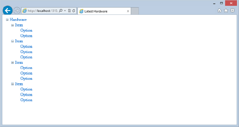
<asp:TreeView ID="TreeView1" runat="server" DataSourceId="XmlDataSource1" />When you do this, you get the incorrect result shown in Figure 17-11.
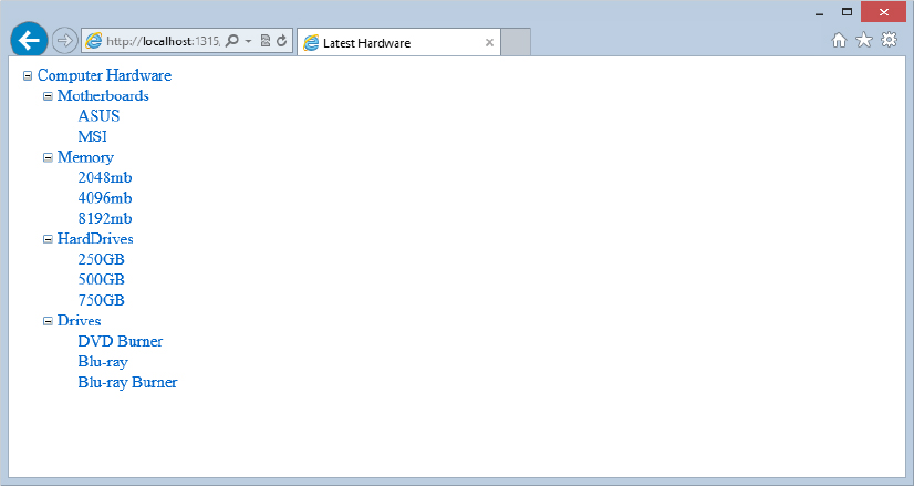
As you can see, the TreeView control binds just fine to the Hardware.xml file, but looking at the nodes within the TreeView control, you can see that it is simply displaying the names of the actual XML elements from the file itself. Because this isn’t what you want, you specify how to bind to the XML file with the use of the <DataBindings> element within the TreeView control.
The <DataBindings> element encapsulates one or more TreeNodeBinding objects. Two of the more important available properties of a TreeNodeBinding object are the DataMember and TextField properties. The DataMember property points to the name of the XML element that the TreeView control should look for. The TextField property specifies the XML attribute that the TreeView should look for in that particular XML element. If you use the <DataBindings> element correctly, using the <DataBindings> construct, you get the result shown in Figure 17-12.
You can also see from Listing 17-9 that you can override the text value of the root node from the XML file, <Hardware>, and have it appear as Computer Hardware in the TreeView control, as follows:
<asp:TreeNodeBinding DataMember="Hardware" Text="Computer Hardware" />As stated earlier, the TreeView control is not meant to be used exclusively for navigation purposes. You can use it for all sorts of things. In many cases, you can present a hierarchical list from which you want the end user to select one or more items.
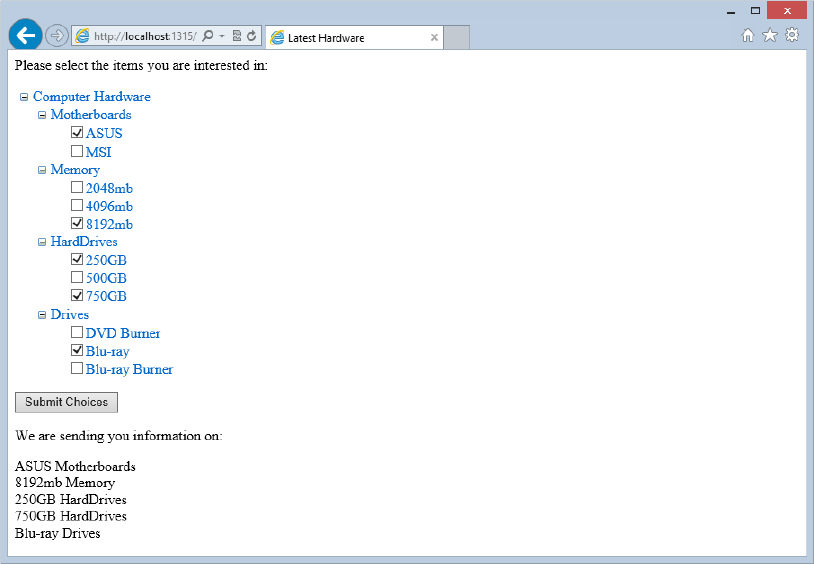
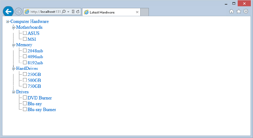
One great built-in feature of the TreeView control is the capability to put check boxes next to nodes within the hierarchical items in the list. These boxes enable end users to make multiple selections. The TreeView control contains a property called ShowCheckBoxes that you can use to create check boxes next to many different types of nodes within a list of items.
Table 17-3 lists the available values for the ShowCheckBoxes property.
| VALUE | DESCRIPTION |
| All | Applies check boxes to every node within the TreeView control. |
| Leaf | Applies check boxes to only the nodes that have no additional child elements. |
| None | Applies no check boxes to any node within the TreeView control. |
| Parent | Applies check boxes to only the nodes considered parent nodes within the TreeView control. A parent node has at least one child node associated with it. |
| Root | Applies a check box to any root node contained within the TreeView control. |
When working with the ShowCheckBoxes property, you can set it declaratively in the control itself, as follows:
<asp:TreeView ID="Treeview1" runat="server" Font-Underline="false"
 DataSourceID="XmlDataSource1" ShowCheckBoxes="Leaf">
   . . .
</asp:TreeViewTreeView>
Or you can set it programmatically by using the following code:
VB
TreeView1.ShowCheckBoxes = TreeNodeTypes.LeafC#
TreeView1.ShowCheckBoxes = TreeNodeTypes.Leaf;For an example of using check boxes with the TreeView control, let’s continue to expand on the computer hardware example from Listing 17-9. Create a hierarchical list that enables people to select multiple items from the list in order to receive additional information about them. Listing 17-10 shows an example of this list.
LISTING 17-10: Applying check boxes next to the leaf nodes within the hierarchical list of nodes
VB
<%@ Page Language="VB" %>
<script runat="server">
   Protected Sub Button1_Click(ByVal sender As Object, ByVal e As System.EventArgs)
        If TreeView1.CheckedNodes.Count > 0 Then
            Label1.Text = "We are sending you information on:<p>"

            For Each node As TreeNode In TreeView1.CheckedNodes
                Label1.Text += node.Text & " " & node.Parent.Text & "<br>"
            Next
        Else
            Label1.Text = "You didn't select anything. Sorry!"
        End If
   End Sub
</script>
<html xmlns="http://www.w3.org/1999/xhtml">
<head runat="server">
    <title>Latest Hardware</title>
</head>
<body>
    <form runat="server">
        Please select the items you are interested in:
        <p>
        <asp:TreeView ID="TreeView1" runat="server" Font-Underline="False"
         DataSourceID="XmlDataSource1" ShowCheckBoxes="Leaf">
            <DataBindings>
                <asp:TreeNodeBinding DataMember="Hardware"
                 Text="Computer Hardware" />
                <asp:TreeNodeBinding DataMember="Item" TextField="Category" />
                <asp:TreeNodeBinding DataMember="Option" TextField="Choice" />
            </DataBindings>
        </asp:TreeView>
        <p>
        <asp:Button ID="Button1" runat="server" Text="Submit Choices"
         OnClick="Button1_Click" />
        </p>
        <asp:XmlDataSource ID="XmlDataSource1" runat="server"
         DataFile="Hardware.xml">
        </asp:XmlDataSource>
        </p>
        <asp:Label ID="Label1" runat="Server" />
    </form>
</body>
</html>
C#
<%@ Page Language="C#" %>
<script runat="server">
    protected void Button1_Click(object sender, System.EventArgs e)
    {
        if (TreeView1.CheckedNodes.Count > 0)
        {
            Label1.Text = "We are sending you information on:<p>";
            foreach (TreeNode node in TreeView1.CheckedNodes)
            {
                Label1.Text += node.Text + " " + node.Parent.Text + "<br>";
            }
        }
        else
        {
            Label1.Text = "You didn't select anything. Sorry!";
        }
    }
</script>
In this example, you first set the ShowTextBoxes property to Leaf, meaning that you are interested in having check boxes appear only next to items in the TreeView control that do not contain any child nodes. The items with check boxes next to them should be the last items that can be expanded in the hierarchical list.
After setting this property, you then work with the items that are selected by the end user in the Button1_Click event. The first thing you should check is whether any selection was made:
if (TreeView1.CheckedNodes.Count > 0) {
   . . .
}
In this case, the number of checked nodes on the postback needs to be greater than zero, meaning that at least one was selected. If so, you can execute the code within the If statement. The If statement then proceeds to populate the Label control that is on the page. To populate the Label control with data from the selected nodes, you use a For Each statement, as shown here:
foreach (TreeNode node in TreeView1.CheckedNodes) {
   . . .
}
This works with an instance of a TreeNode object and checks each TreeNode object within the TreeView1 collection of checked nodes.
For each node that is checked, you grab the node’s Text value and the Text value of this node’s parent node to further populate the Label control, as follows:
Label1.Text += node.Text + " " + node.Parent.Text + "<br>";In the end, you get a page that produces the results shown in Figure 17-13.
The TreeView control allows for a high degree of customization. You saw earlier in the chapter that you can customize the look-and-feel of the TreeView control by specifying one of the built-in styles. Applying one of these styles dramatically changes the appearance of the control. One of the most noticeable changes concerns the icons used for the nodes within the TreeView control. Although it is not as easy as just selecting one of the styles built into the TreeView control, you can apply your own icons to be used for the nodes within the hierarchical list of nodes.
The TreeView control contains the properties discussed in Table 17-4. These properties enable you to specify your own images to use for the nodes of the control.
| PROPERTY | DESCRIPTION |
| CollapseImageUrl | Applies a custom image next to nodes that have been expanded to show any of their child nodes and have the capability of being collapsed. |
| ExpandImageUrl | Applies a custom image next to nodes that have the capability of being expanded to display their child nodes. |
| LeafNodeStyle-ImageUrl | Applies a custom image next to a node that has no child nodes and is last in the hierarchical chain of nodes. |
| NoExpandImageUrl | Applies a custom image to nodes that, for programmatic reasons, cannot be expanded or to nodes that are leaf nodes. This property is primarily used for spacing purposes to align leaf nodes with their parent nodes. |
| ParentNodeStyle-ImageUrl | Applies a custom image only to the parent nodes within the TreeView control. |
| RootNodeStyle-ImageUrl | Applies a custom image next to only the root nodes within the TreeView control. |
Listing 17-11 shows an example of these properties in use.
LISTING 17-11: Applying custom images to the TreeView control
<asp:TreeView ID="TreeView1" runat="server" Font-Underline="False"
 DataSourceId="XmlDataSource1"
 CollapseImageUrl="Images/CollapseImage.png"
 ExpandImageUrl="Images/ExpandImage.png"
 LeafNodeStyle-ImageUrl="Images/LeafImage.png">
   <DataBindings>
      <asp:TreeNodeBinding DataMember="Hardware" Text="Computer Hardware" />
      <asp:TreeNodeBinding DataMember="Item" TextField="Category" />
      <asp:TreeNodeBinding DataMember="Option" TextField="Choice" />
   </DataBindings>
</asp:TreeView>
Specifying these three images to precede the nodes in your control overrides the default values of using a plus (+) sign and a minus (−) sign for the expandable and collapsible nodes. It also overrides simply using an image for any leaf nodes when, by default, nothing is used. Using the code from Listing 17-11, you get something similar to the results illustrated in Figure 17-14 (depending on the images you use, of course).
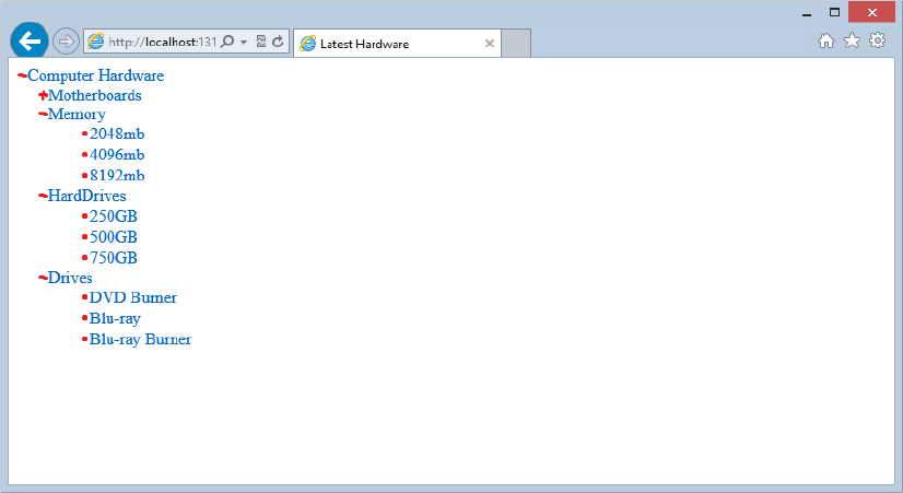
Because the TreeView control shows a hierarchical list of items to the end user, you sometimes want to show the relationship between these hierarchical items more explicitly than is shown by default with the TreeView control. One possibility is to show line connections between parent and child nodes within the display. Simply set the ShowLines property of the TreeView control to True (by default, this property is set to False):
<asp:TreeView ID="TreeView1" runat="server" Font-Underline="False"
 DataSourceId="XmlDataSource1" ShowCheckBoxes="Leaf" ShowLines="True">
   . . .
</asp:TreeViewTreeView>
This code gives the result shown in Figure 17-15.
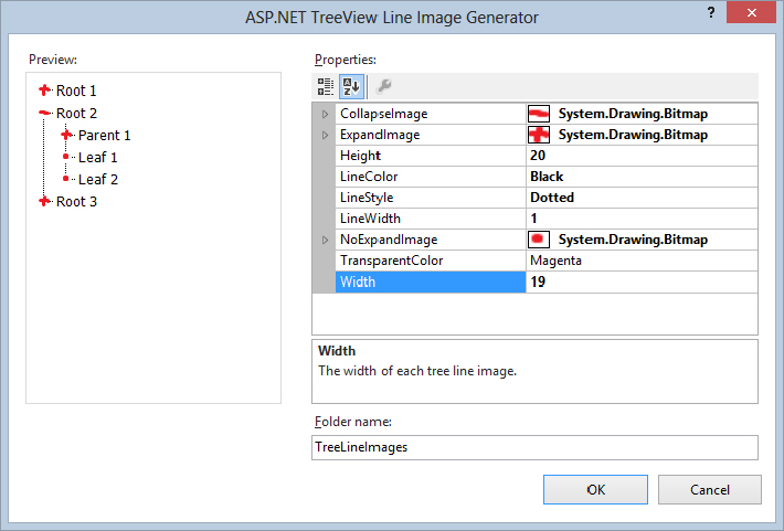
If the ShowLines property is set to True, you can also define your own lines and images within the TreeView control. Doing so is quite easy because Visual Studio 2012 provides you with an ASP.NET TreeView Line Image Generator tool. This tool enables you to visually design how you want the lines and corresponding expanding and collapsing images to appear. After you have it set up as you want, the tool then creates all the necessary files for any of your TreeView controls to use.
To get at the tool, move to the Design view of your file and click the smart tag for the TreeView control that is on your page. Here, you find the option Customize Line Images. You will not see this option unless the Show Lines check box is selected. Click it and the ASP.NET TreeView Line Image Generator dialog box appears (shown in Figure 17-16).
From within this dialog box, you can select the images used for the nodes that require an Expand, Collapse, or NoCollapse icon. You can also specify the color and style of the lines that connect the nodes. As you create your styles, a sample TreeView control output is displayed for you directly in the dialog box based on how your styles are to be applied. The final step is to choose the output of the files that this dialog box will create. When you have completed this step, click OK. This generates a long list of new files to the folder that you specified in the dialog box. By default, the ASP.NET TreeView Line Image Generator wants you to name the output folder TreeLineImages, but feel free to name it as you want. If the folder does not exist in the project, you are prompted to allow Visual Studio to create the folder for you. After this folder is in place, the TreeView control can use your new images and styles if you set the LineImagesFolder property as follows:
<asp:TreeView ID="TreeView1" runat="server" ShowLines="True"
 DataSourceId="SiteMapDataSource1" LineImagesFolder="TreeViewLineImages">
The important properties are shown in bold. You must set the ShowLines property to True. After it is set, the property uses the default settings displayed earlier, unless you have specified a location where it can retrieve custom images and styles using the LineImagesFolder property. As you can see, this simply points to the new folder, TreeViewLineImages, which contains all the new images and styles you created. Look in the folder — seeing what the tool produces is interesting.
So far, with the TreeView control, you have learned how to work with the control declaratively. The great thing about ASP.NET is that you are not simply required to work with its components declaratively, but you can also manipulate these controls programmatically.
The TreeView control has an associated TreeView class that enables you to completely manage the TreeView control and how it functions from within your code. The next section looks at how to use some of the more common ways to control the TreeView programmatically.
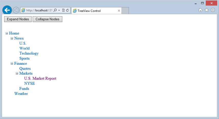
One thing you can do with your TreeView control is to expand or collapse the nodes within the hierarchy programmatically. You can do so by using either the ExpandAll or CollapseAll methods from the TreeView class. Listing 17-12 shows you one of the earlier TreeView controls that you used in Listing 17-6, but with a couple of buttons above it that you can now use to initiate the expanding and collapsing of the nodes.
LISTING 17-12: Expanding and collapsing the nodes of the TreeView control programmatically
VB
<%@ Page Language="VB" %>

<script runat="server">
   Protected Sub Button1_Click(ByVal sender As Object, ByVal e As System.EventArgs)
        TreeView1.ExpandAll()
   End Sub

   Protected Sub Button2_Click(ByVal sender As Object, ByVal e As System.EventArgs)
        TreeView1.CollapseAll()
   End Sub
</script>
<html xmlns="http://www.w3.org/1999/xhtml">
<head runat="server">
    <title>TreeView Control</title>
</head>
<body>
    <form id="Form1" runat="server">
        <p>
            <asp:Button ID="Button1" runat="server" Text="Expand Nodes"
             OnClick="Button1_Click" />
            <asp:Button ID="Button2" runat="server" Text="Collapse Nodes"
             OnClick="Button2_Click" />
            <br />
            <br />
        <asp:TreeView ID="TreeView1" runat="server"
         DataSourceId="SiteMapDataSource1">
        </asp:TreeView>
        <asp:SiteMapDataSource ID="SiteMapDataSource1" runat="server" /></p>
    </form>
</body>
</html>
C#
<%@ Page Language="C#" %>

<script runat="server">
    protected void Button1_Click(object sender, System.EventArgs e)
    {
        TreeView1.ExpandAll();
    }

    protected void Button2_Click(object sender, System.EventArgs e)
    {
        TreeView1.CollapseAll();
    }
</script>
Running this page gives you two buttons above your TreeView control. Clicking the first button invokes the ExpandAll() method and completely expands the entire list of nodes. Clicking the second button invokes the CollapseAll() method and completely collapses the list of nodes (see Figure 17-17).
The example shown in Listing 17-12 is nice, but it expands and collapses the nodes only on end-user actions (when the end user clicks the button). Being able to initiate this action programmatically would be even nicer.
You might want to simply place the TreeView1.CollapseAll() command within the Page_Load event, but if you try this technique, you’ll see that it doesn’t work. Instead, you use the OnDataBound attribute within the TreeView control:
<asp:TreeView ID="TreeView1" runat="server"
 DataSourceId="SiteMapDataSource1" OnDataBound="TreeView1_DataBound">
</asp:TreeView>
The value of this attribute points to a method in your code, as shown here:
VB
Protected Sub TreeView1_DataBound(ByVal sender As Object, _
  ByVal e As System.EventArgs)
   TreeView1.CollapseAll()
End Sub
C#
protected void TreeView1_DataBound(object sender, System.EventArgs e)
{
   TreeView1.CollapseAll();
}
Now when you run the page, notice that the TreeView control is completely collapsed when the page is first loaded in the browser.
You can also expand or collapse specific nodes within the tree instead of just working the entire list. For this example, use the TreeView1_DataBound() method you just created. Using the sitemap from Listing 17-1, change the TreeView1_DataBound() method so that it appears as shown in Listing 17-13.
LISTING 17-13: Expanding specific nodes programmatically
VB
Protected Sub TreeView1_DataBound(ByVal sender As Object, _
  ByVal e As System.EventArgs)
   TreeView1.CollapseAll()
   TreeView1.FindNode("Home").Expand()
   TreeView1.FindNode("Home/Finance").Expand()
   TreeView1.FindNode("Home/Finance/Markets").Expand()
End Sub
C#
protected void TreeView1_DataBound(object sender, System.EventArgs e)
{
   TreeView1.CollapseAll();
   TreeView1.FindNode("Home").Expand();
   TreeView1.FindNode("Home/Finance").Expand();
   TreeView1.FindNode("Home/Finance/Markets").Expand();
}
In this case, you use the FindNode() method and expand the node that is found. The FindNode() method takes a String value, which is the node and the path of the node that you want to reference. For example, TreeView1.FindNode("Home/Finance").Expand() expands the Finance node. To find the node, specifying the entire path from the root node to the node you want to work with (in this case, the Finance node) is important. You separate the nodes within the sitemap path structure with a forward slash between each of the nodes in the sitemap path.
Note that you had to expand each of the nodes individually until you got to the Finance node. If you simply used TreeView1.FindNode("Home/Finance/Markets").Expand() in the TreeView1_DataBound() method, the Markets node would indeed be expanded, but the parent nodes above it (the Finance and Home nodes) would not have been expanded, and you wouldn’t see the expanded Markets node when invoking the page. (Try it; it’s interesting.)
Instead of using the Expand method, you can just as easily set the Expanded property to True, as shown in Listing 17-14.
LISTING 17-14: Expanding nodes programmatically using the Expanded property
VB
Protected Sub TreeView1_DataBound(ByVal sender As Object, _
  ByVal e As System.EventArgs)
   TreeView1.CollapseAll()
   TreeView1.FindNode("Home").Expanded = True
   TreeView1.FindNode("Home/Finance").Expanded = True
   TreeView1.FindNode("Home/Finance/Markets").Expanded = True
End Sub
C#
protected void TreeView1_DataBound(object sender, System.EventArgs e)
{
   TreeView1.CollapseAll();
   TreeView1.FindNode("Home").Expanded = true;
   TreeView1.FindNode("Home/Finance").Expanded = true;
   TreeView1.FindNode("Home/Finance/Markets").Expanded = true;
}
Although you focus on the Expand method and the Expanded property here, you can just as easily programmatically collapse nodes using the Collapse() method. No Collapsed property really exists. Instead, you simply set the Expanded property to False.
Another interesting thing you can do with the TreeView control is to add nodes to the overall hierarchy programmatically. The TreeView control is made up of a collection of TreeNode objects. Therefore, as you see in previous examples, the Finance node is actually a TreeNode object that you can work with programmatically. It includes the capability to add other TreeNode objects.
A TreeNode object typically stores a Text and Value property. The Text property is what is displayed in the TreeView control for the end user. The Value property is an additional data item that you can use to associate with this particular TreeNode object. Another property that you can use (if your TreeView control is a list of navigational links) is the NavigateUrl property. Listing 17-15 demonstrates how to add nodes programmatically to the same sitemap from Listing 17-1 that you have been using.
LISTING 17-15: Adding nodes programmatically to the TreeView control
VB
<%@ Page Language="VB" %>

<script runat="server">
   Protected Sub Button1_Click(ByVal sender As Object, ByVal e As System.EventArgs)
        TreeView1.ExpandAll()
   End Sub
   Protected Sub Button2_Click(ByVal sender As Object, ByVal e As System.EventArgs)
        TreeView1.CollapseAll()
   End Sub
   Protected Sub Button3_Click(ByVal sender As Object, ByVal e As System.EventArgs)
        Dim myNode As New TreeNode
        myNode.Text = TextBox1.Text
        myNode.NavigateUrl = TextBox2.Text
        TreeView1.FindNode("Home/Finance/Markets").ChildNodes.Add(myNode)
   End Sub
</script>

<html xmlns="http://www.w3.org/1999/xhtml">
<head runat="server">
    <title>TreeView Control</title>
</head>
<body>
    <form id="Form1" runat="server">
        <p>
            <asp:Button ID="Button1" runat="server" Text="Expand Nodes"
             OnClick="Button1_Click" />
            <asp:Button ID="Button2" runat="server" Text="Collapse Nodes"
             OnClick="Button2_Click" /></p>
        <p>
            <strong>Text of new node:</strong>
            <asp:TextBox ID="TextBox1" runat="server">
            </asp:TextBox>
        </p>
        <p>
            <strong>Destination URL of new node:</strong>
            <asp:TextBox ID="TextBox2" runat="server">
            </asp:TextBox>
            <br />
            <br />
            <asp:Button ID="Button3" runat="server" Text="Add New Node"
             OnClick="Button3_Click" />
        </p>
        <p>
        <asp:TreeView ID="TreeView1" runat="server"
         DataSourceId="SiteMapDataSource1">
        </asp:TreeView></p>
        <p>
        <asp:SiteMapDataSource ID="SiteMapDataSource1" runat="server" /></p>
    </form>
</body>
</html>
C#
<%@ Page Language="C#" %>

<script runat="server">
protected void Button3_Click(object sender, System.EventArgs e)
{
   TreeNode myNode = new TreeNode();
   myNode.Text = TextBox1.Text;
   myNode.NavigateUrl = TextBox2.Text;
   TreeView1.FindNode("Home/Finance/Markets").ChildNodes.Add(myNode);
}
</script>
This page contains two textboxes and a new Button control. The first textbox is used to populate the Text property of the new node that is created. The second textbox is used to populate the NavigateUrl property of the new node.
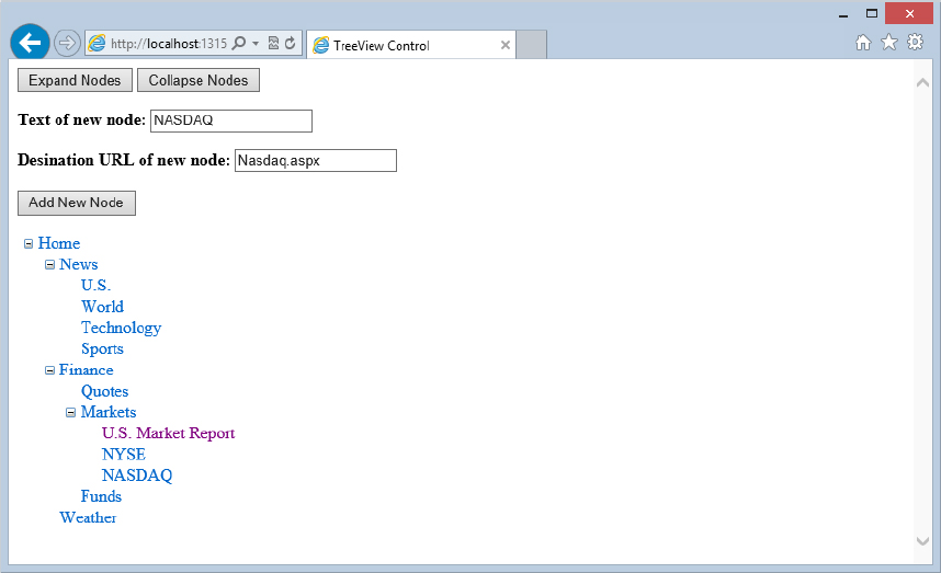
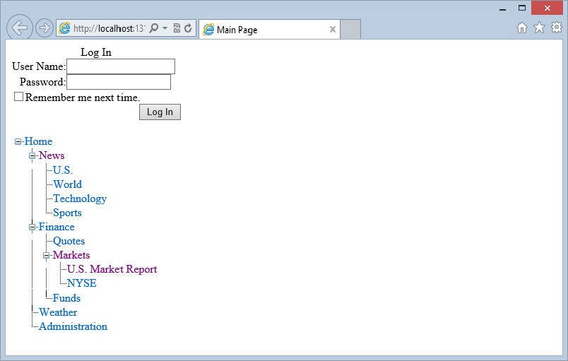
If you run the page, you can expand the entire hierarchy by clicking the Expand Nodes button. Then you can add child nodes to the Markets node. To add a new node programmatically, use the FindNode method as you did before to find the Markets node. When you find it, you can add child nodes by using the ChildNodes.Add() method and pass in a TreeNode object instance. Submitting NASDAQ in the first textbox and Nasdaq.aspx in the second textbox changes your TreeView control, as illustrated in Figure 17-18.
After it is added, the node stays added even after the hierarchy tree is collapsed and reopened. You can also add as many child nodes as you want to the Markets node. Note that, although you are changing nodes programmatically, this in no way alters the contents of the data source (the XML file, or the .sitemap file). These sources remain unchanged throughout the entire process.
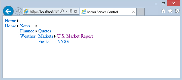
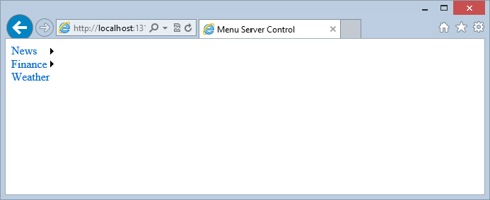
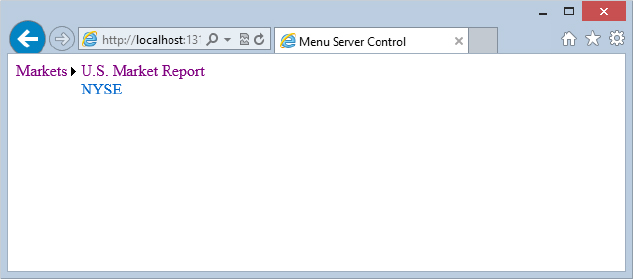
One of the cooler navigation controls found in ASP.NET 4.5 is the Menu server control. This control is ideal for allowing the end user to navigate a larger hierarchy of options while utilizing very little browser real estate in the process. Figure 17-19 shows you what the menu control looks like when it is either completely collapsed or completely extended down one of the branches of the hierarchy.
From here, you can see that the first Menu control displayed simply shows the Home link with a small arrow to the right of the display. The arrow means that more options are available that relate to this upmost link in the hierarchy. The second Menu control displayed shows what the default control looks like when the end user works down one of the branches provided by the sitemap.
The Menu control is an ideal control to use when you have lots of options — whether these options are selections the end user can make or navigation points provided by the application in which they are working. The Menu control can provide a multitude of options and consumes little space in the process.
Using the Menu control in your ASP.NET applications is rather simple. The Menu control works with a SiteMapDataSource control. You can drag and drop the SiteMapDataSource control and the Menu control onto the Visual Studio 2012 design surface and connect the two by using the Menu control’s DataSourceId property. Alternatively, you can create and connect them directly in code. Listing 17-16 shows an example of the Menu control in its simplest form.
LISTING 17-16: A simple use of the Menu control
<%@ Page Language="C#" %>

<html xmlns="http://www.w3.org/1999/xhtml">
<head runat="server">
    <title>Menu Server Control</title>
</head>
<body>
    <form id="form1" runat="server">
        <asp:SiteMapDataSource ID="SiteMapDataSource1" runat="server" />
        <asp:Menu ID="Menu1" runat="server" DataSourceID="SiteMapDataSource1">
        </asp:Menu>
    </form>
</body>
</html>
This example uses a SiteMapDataSource control that automatically works with the application’s Web.sitemap file. The only other item included is the Menu control, which uses the typical ID and runat attributes and the DataSourceID attribute to connect it with what is retrieved from the SiteMapDataSource control.
Although the default Menu control is rather simple, you can highly customize how it looks and works by redefining its properties. The following sections look at some examples of how you can modify the appearance and change the behavior of this control.
By default, the Menu control is rather plain. If you want to maintain this appearance, you can use what is provided or simply change the font sizes and styles to make it fit in with your site. You actually have quite a number of ways in which you can modify this control so that it appears unique and fits in with your site. Either you can customize this control’s appearance yourself, or you can use one of the predefined styles that come with the control.
Visual Studio 2012 includes some predefined styles that you can use with the Menu control to quickly apply a look-and-feel to the displayed menu of items. Some of the provided styles include Classic, Professional, and more. To apply one of these predefined styles, you work with the Menu control from the Design view of your page. Within the Design view, highlight the Menu control and expand the control’s smart tag. From here, you see a list of options for working with this control. To change the look-and-feel of the control, click the Auto Format link and select one of the styles.
Performing this operation changes the code of your control by applying a set of style properties. For example, if you select the Classic option, you get the results shown in Listing 17-17.
LISTING 17-17: Code changes when you apply a style to the Menu control
<asp:Menu ID="Menu1" runat="server" DataSourceID="SiteMapDataSource1"
 BackColor="#B5C7DE" ForeColor="#284E98"
 Font-Names="Verdana" Font-Size="0.8em" StaticSubMenuIndent="10px"
 DynamicHorizontalOffset="2">
   <StaticSelectedStyle BackColor="#507CD1"></StaticSelectedStyle>
   <StaticMenuItemStyle HorizontalPadding="5"
    VerticalPadding="2"></StaticMenuItemStyle>
   <DynamicMenuStyle BackColor="#B5C7DE"></DynamicMenuStyle>
   <DynamicSelectedStyle BackColor="#507CD1"></DynamicSelectedStyle>
   <DynamicMenuItemStyle HorizontalPadding="5"
    VerticalPadding="2"></DynamicMenuItemStyle>
   <DynamicHoverStyle ForeColor="White" Font-Bold="True"
    BackColor="#284E98"></DynamicHoverStyle>
   <StaticHoverStyle ForeColor="White" Font-Bold="True"
    BackColor="#284E98"></StaticHoverStyle>
</asp:Menu>
You can see a lot of added styles that change the menu items that appear in the control. Figure 17-20 shows how this style selection appears in the browser.
The Menu control considers items in the hierarchy to be static or dynamic. The Home link that appears when the page is generated is an example of a static item. Dynamic links are the items that appear dynamically when the user hovers the mouse over the Home link in the menu. Changing the styles for both these types of nodes in the menu is possible.
To apply a specific style to the static links that appear, you must add a static style element to the Menu control. The Menu control includes the following static style elements:
The important options from this list include the <StaticHoverStyle> and the <StaticMenuItemStyle> elements. You use the <StaticHoverStyle> element to define the style of the static item in the menu when the end user hovers the mouse over the option. You use the <StaticMenuItemStyle> element for the style of the static item when the end user is not hovering the mouse over the option.
Listing 17-18 shows how to add a style that is applied when the end user hovers the mouse over static items.
LISTING 17-18: Adding a hover style to static items in the menu control
<asp:Menu ID="Menu1" runat="server" DataSourceID="SiteMapDataSource1">
   <StaticHoverStyle BackColor="DarkGray" BorderColor="Black" BorderStyle="Solid"
    BorderWidth="1"></StaticHoverStyle>
</asp:Menu>
This little example adds a background color and border to the static items in the menu when the end user hovers the mouse over the item. Figure 17-21 shows the result.
Adding styles to the dynamic items of the menu control is just as easy as adding them to static items. The Menu control has a number of elements for modifying the appearance of dynamic items, including the following:
These elements change menu items the same way as the static versions do, but they change only the items that dynamically pop out from the static items. Listing 17-19 shows an example of applying the hover style to dynamic items.
LISTING 17-19: Adding a hover style to dynamic items in the menu control
<asp:Menu ID="Menu1" runat="server" DataSourceID="Sitemapdatasource1">
   <StaticHoverStyle BackColor="DarkGray" BorderColor="Black" BorderStyle="Solid"
    BorderWidth="1"></StaticHoverStyle>
   <DynamicHoverStyle BackColor="DarkGray" BorderColor="Black" BorderStyle="Solid"
    BorderWidth="1"></DynamicHoverStyle>
</asp:Menu>
This code produces the results shown in Figure 17-22.
By default, the dynamic menu items are displayed from left to right. This means that, as the items in the menu expand, they are continually displayed in a vertical fashion. You can actually control this behavior, but another option is available to you.
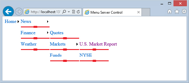
The other option is to have the first level of menu items appear directly below the first static item (horizontally). You change this behavior by using the Orientation attribute of the Menu control, as shown in Listing 17-20.
LISTING 17-20: Forcing the menu items to use a horizontal orientation
 <asp:Menu ID="Menu1" runat="server" DataSourceID="SiteMapDataSource1"
  Orientation="Horizontal">
 </asp:Menu>
This code produces the results shown in Figure 17-23.
The Orientation attribute can take a value of Horizontal or Vertical only. The default value is Vertical.
As the default, an arrow is used as the pop-out symbol for the menu items generated, whether they are static or dynamic, as shown in Figure 17-24.
You are not forced to use this arrow symbol; in fact, you can change it to an image with relatively little work. Listing 17-21 shows how to accomplish this task.
LISTING 17-21: Using custom images
<asp:Menu ID="Menu1" runat="server" DataSourceID="SiteMapDataSource1"
 Orientation="Horizontal" DynamicPopOutImageUrl="Images/myArrow.png"
 StaticPopOutImageUrl="Images/myArrow.png">
</asp:Menu>
To change the pop-out symbol to an image of your choice, you use the DynamicPopOutImageUrl or StaticPopOutImageUrl properties. The String value these attributes take is simply the path of the image you want to use. Depending on the image used, it produces something similar to what you see in Figure 17-25.
Another nice styling option of the Menu control is the capability to add a divider image to the menu items. You use the StaticBottomSeparatorImageUrl, StaticTopSeparatorImageUrl, DynamicBottomSeparatorImageUrl, and DynamicTopSeparatorImageUrl properties, depending on where you want to place the separator image.
For example, if you wanted to place a divider image under only the dynamic menu items, you use the DynamicBottomSeparatorImageUrl property, as shown in Listing 17-22.
LISTING 17-22: Applying divider images to dynamic items
<asp:Menu ID="Menu1" runat="server" DataSourceID="SiteMapDataSource1"
 DynamicBottomSeparatorImageUrl="Images/myDivider.png">
</asp:Menu>
All the properties of the Menu control that define the image to use for the dividers take a String value that points to the location of the image. Figure 17-26 shows the result of Listing 17-22.
The Menu control exposes events such as the following:
One nice event to be aware of is MenuItemClick. This event, shown in Listing 17-23, enables you to take some action when the end user clicks one of the available menu items.
LISTING 17-23: Using the MenuItemClick event
VB
Protected Sub Menu1_MenuItemClick(ByVal sender As Object, _
   ByVal e As System.Web.UI.WebControls.MenuEventArgs)

 ' Code for event here

End Sub
C#
protected void Menu1_MenuItemClick(object sender, MenuEventArgs e)
{

   // Code for event here

}
This delegate uses the MenuEventArgs data class and provides you with access to the text and value of the item selected from the menu.
Just as with the TreeView control, binding the Menu control to items that come from other data source controls provided with ASP.NET 4.5 is possible. Although most developers are likely to use the Menu control to enable end users to navigate to URL destinations, you can also use the Menu control to enable users to make selections.
As an example, take the previous XML file, Hardware.xml, which was used with the TreeView control from Listing 17-8 earlier in the chapter. For this example, the Menu control works with an XmlDataSource control. When the end user makes a selection from the menu, you populate a listbox on the page with the items selected. Listing 17-24 shows the code for this control.
LISTING 17-24: Using the Menu control with an XML file
VB
<%@ Page Language="VB" %>

<script runat="server">
    Protected Sub Menu1_MenuItemClick(ByVal sender As Object, _
       ByVal e As System.Web.UI.WebControls.MenuEventArgs)
        Listbox1.Items.Add(e.Item.Parent.Value & " : " & e.Item.Value)
    End Sub
</script>

<html xmlns="http://www.w3.org/1999/xhtml">
<head runat="server">
    <title>Menu Server Control</title>
</head>
<body>
    <form id="form1" runat="server">
        <asp:Menu ID="Menu1" runat="server" DataSourceID="XmlDataSource1"
         OnMenuItemClick="Menu1_MenuItemClick">
            <DataBindings>
                <asp:MenuItemBinding DataMember="Item"
                 TextField="Category"></asp:MenuItemBinding>
                <asp:MenuItemBinding DataMember="Option"
                 TextField="Choice"></asp:MenuItemBinding>
            </DataBindings>
        </asp:Menu>
        <p>
        <asp:ListBox ID="Listbox1" runat="server">
        </asp:ListBox></p>
        <asp:xmldatasource ID="XmlDataSource1" runat="server"
         datafile="Hardware.xml" />
    </form>
</body>
</html>
C#
<%@ Page Language="C#" %>

<script runat="server">
   protected void Menu1_MenuItemClick(object sender, MenuEventArgs e)
   {
      Listbox1.Items.Add(e.Item.Parent.Value + " : " + e.Item.Value);
   }
</script>
From this example, you can see that instead of using the <asp:TreeNodeBinding> elements, as you did with the TreeView control, the Menu control uses the <asp:MenuItemBinding> elements to make connections to items listed in the XML file, Hardware.xml. In addition, the root element of the Menu control, the <asp:Menu> element, now includes the OnMenuItemClick attribute, which points to the event delegate Menu1_MenuItemClick.
The Menu1_MenuItemClick delegate includes the data class MenuEventArgs, which enables you to get at both the values of the child and parent elements selected. For this example, both are used and then populated into the Listbox control, as illustrated in Figure 17-27.
A series of data providers in the form of DataSource controls is available in ASP.NET 4.5. One of these DataSource controls now at your disposal, which you looked at earlier in the chapter, is the SiteMapDataSource control. This DataSource control was developed to work with sitemaps and the controls that can bind to them.
Some controls do not need a SiteMapDataSource control in order to bind to the application’s sitemap (which is typically stored in the Web.sitemap file). Earlier in the chapter, you saw this in action when using the SiteMapPath control. This control was able to work with the Web.sitemap file directly — without the need for this data provider.
Certain navigation controls, however, such as the TreeView control and the DropDownList control, require an intermediary SiteMapDataSource control to retrieve the site navigation information.
The SiteMapDataSource control is simple to use as demonstrated throughout this chapter. The SiteMapDataSource control in its simplest form is illustrated here:
<asp:SiteMapDataSource ID="SiteMapDataSource1" runat="server" />In this form, the SiteMapDataSource control simply grabs the info as a tree hierarchy (as consistently demonstrated so far). Be aware that a number of properties do change how the data is displayed in any control that binds to the data output.
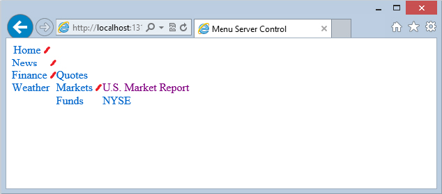
The ShowStartingNode property determines whether the root node of the .sitemap file is retrieved with the retrieved collection of node objects. This property takes a Boolean value and is set to True by default. If you are working with the Web.sitemap file shown in Listing 17-1, you construct your SiteMapDataSource control as shown in Listing 17-25 to remove the root node from the collection.
LISTING 17-25: Removing the root node from the retrieved node collection
<%@ Page Language="C#" %>

<html xmlns="http://www.w3.org/1999/xhtml">
<head runat="server">
    <title>Menu Server Control</title>
</head>
<body>
    <form id="form1" runat="server">
        <asp:SiteMapDataSource ID="SiteMapDataSource1" runat="server"
           ShowStartingNode="False" />
        <asp:Menu ID="Menu1" runat="server" DataSourceID="SiteMapDataSource1">
        </asp:Menu>
    </form>
</body>
</html>
This code produces a menu like the one shown in Figure 17-28.
From this screenshot, you can see that, indeed, the root node has been removed, and the menu shown starts by using all the child nodes of the root node.
The StartFromCurrentNode property causes the SiteMapDataProvider to retrieve only a node collection that starts from the current node of the page being viewed. By default, this property is set to False, meaning that the SiteMapDataProvider always retrieves all the available nodes (from the root node to the current node).
For an example of this property, use the .sitemap file from Listing 17-1 and create a page called Markets.aspx. This page in the hierarchy of the node collection is a child node of the Finance node, as well as having two child nodes itself: U.S. Market Report and NYSE. Listing 17-26 shows an example of setting the StartFromCurrentNode property to True.
LISTING 17-26: The Markets.aspx page using the StartFromCurrentNode property
<%@ Page Language="C#" %>

<html xmlns="http://www.w3.org/1999/xhtml">
<head runat="server">
    <title>Menu Server Control</title>
</head>
<body>
    <form id="form1" runat="server">
        <asp:SiteMapDataSource ID="SiteMapDataSource1" runat="server"
           StartFromCurrentNode="True" />
        <asp:Menu ID="Menu1" runat="server" DataSourceID="SiteMapDataSource1">
        </asp:Menu>
    </form>
</body>
</html>
This simple property addition produces the result shown in Figure 17-29.
The StartingNodeOffset property takes an Integer value that determines the starting point of the hierarchy collection. By default, this property is set to 0, meaning that the node collection retrieved by the SiteMapDataSource control starts at the root node. Any other value provides the offset from the root node and, in turn, makes this the new starting point. From the example provided in Listing 17-1, you know that the collection starts with the Home page found at Default.aspx, a page that you have seen in numerous examples in this chapter.
If you set this property’s value to 1, the starting point of the collection is one space off the default starting point (the Home page starting at Default.aspx). For example, if the page using the SiteMapDataSource control is the MarketsUS.aspx page, the node collection starts with the Finance page (Finance.aspx).
 Home   Offset 0
   News  Offset 1
      U.S.   Offset 2
      World   Offset 2
      Technology   Offset 2
      Sports   Offset 2
   Finance   Offset 1
      Quotes   Offset 2
      Markets   Offset 2
         U.S. Market Report   Offset 3
         NYSE   Offset 3
      Funds   Offset 2
   Weather   Offset 1
From this hierarchy, you can see how much each node is offset from the root node. Therefore, if you set the StartingNodeOffset property to 1 and you are browsing on the U.S. Market Report page, you can see that the node collection starts with the Finance page (Finance.aspx), and the other child nodes of the root node (News and Weather) are not represented in the node collection because the Finance.aspx page is on the direct hierarchical path of the requested page.
The StartingNodeUrl property enables you to specify the page found in the .sitemap file from which the node collection should start. By default, the value of this property is empty; but when set to something such as Finance.aspx, the collection starts with the Finance page as the root node of the node collection. Listing 17-27 shows an example of using the StartingNodeUrl property.
LISTING 17-27: Using the StartingNodeUrl property
<%@ Page Language="C#" %>

<html xmlns="http://www.w3.org/1999/xhtml">
<head runat="server">
    <title>Menu Server Control</title>
</head>
<body>
    <form id="form1" runat="server">
        <asp:SiteMapDataSource ID="SiteMapDataSource1" runat="server"
           StartingNodeUrl="Finance.aspx" />
        <asp:Menu ID="Menu1" runat="server" DataSourceID="SiteMapDataSource1">
        </asp:Menu>
    </form>
</body>
</html>
When the StartingNodeUrl property value is encountered, the value is compared against the url attributes in the Web.sitemap file. When a match is found, the matched page is used as the root node in the node collection retrieved by the SiteMapDataSource control.
The SiteMap class is an in-memory representation of the site’s navigation structure. This class is great for programmatically working around the hierarchical structure of your site. The SiteMap class comes with a couple of objects that make working with the navigation structure easy. Table 17-5 describes these objects (or public properties).
| PROPERTIES | DESCRIPTION |
| CurrentNode | Retrieves a SiteMapNode object for the current page. |
| RootNode | Retrieves a SiteMapNode object that starts from the root node and the rest of the site’s navigation structure. |
| Provider | Retrieves the default SiteMapProvider for the current sitemap. |
| Providers | Retrieves a collection of available, named SiteMapProvider objects. |
Listing 17-28 shows an example of working with some SiteMap objects by demonstrating how to use the CurrentNode object from the Markets.aspx page.
LISTING 17-28: Working with the CurrentNode object
VB
<%@ Page Language="VB" %>

<script runat="server" language="vb">
    Protected Sub Page_Load(ByVal sender As Object, ByVal e As System.EventArgs)
        Label1.Text = SiteMap.CurrentNode.Description & "<br>" & _
            SiteMap.CurrentNode.HasChildNodes & "<br>" & _
            SiteMap.CurrentNode.NextSibling.ToString() & "<br>" & _
            SiteMap.CurrentNode.ParentNode.ToString() & "<br>" & _
            SiteMap.CurrentNode.PreviousSibling.ToString() & "<br>" & _
            SiteMap.CurrentNode.RootNode.ToString() & "<br>" & _
            SiteMap.CurrentNode.Title & "<br>" & _
            SiteMap.CurrentNode.Url
    End Sub
</script>

<html xmlns="http://www.w3.org/1999/xhtml">
<head runat="server">
    <title>SiteMapDataSource</title>
</head>
<body>
    <form id="form1" runat="server">
        <asp:Label ID="Label1" runat="server"></asp:Label>
    </form>
</body>
</html>
C#
<%@ Page Language="C#" %>

<script runat="server">
    protected void Page_Load(object sender, System.EventArgs e)
    {
        Label1.Text = SiteMap.CurrentNode.Description + "<br>" +
            SiteMap.CurrentNode.HasChildNodes + "<br>" +
            SiteMap.CurrentNode.NextSibling.ToString() + "<br>" +
            SiteMap.CurrentNode.ParentNode.ToString() + "<br>" +
            SiteMap.CurrentNode.PreviousSibling.ToString() + "<br>" +
            SiteMap.CurrentNode.RootNode.ToString() + "<br>" +
            SiteMap.CurrentNode.Title + "<br>" +
            SiteMap.CurrentNode.Url;
    }
</script>
As you can see from this little bit of code, by using the SiteMap class and the CurrentNode object, you can work with a plethora of information regarding the current page. Running this page, you get the following results printed to the screen:
The Latest Market Information
True
Funds
Finance
Quotes
Home
Markets
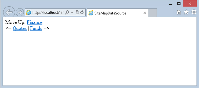
/SiteNavigation/Markets.aspxUsing the CurrentNode property, you can actually create your own style of the SiteMapPath control, as shown in Listing 17-29.
LISTING 17-29: Creating a custom navigation display using the CurrentNode property
VB
<%@ Page Language="VB" %>
<script runat="server">
Protected Sub Page_Load(ByVal sender As Object, ByVal e As System.EventArgs)
Hyperlink1.Text = SiteMap.CurrentNode.ParentNode.ToString()
Hyperlink1.NavigateUrl = SiteMap.CurrentNode.ParentNode.Url
Hyperlink2.Text = SiteMap.CurrentNode.PreviousSibling.ToString()
Hyperlink2.NavigateUrl = SiteMap.CurrentNode.PreviousSibling.Url
Hyperlink3.Text = SiteMap.CurrentNode.NextSibling.ToString()
Hyperlink3.NavigateUrl = SiteMap.CurrentNode.NextSibling.Url
End Sub
</script>
<html xmlns="http://www.w3.org/1999/xhtml" >
<head runat="server">
<title>SiteMapDataSource</title>
</head>
<body>
<form id="form1" runat="server">
Move Up:
<asp:Hyperlink ID="Hyperlink1" runat="server"></asp:Hyperlink><br />
<-- <asp:Hyperlink ID="Hyperlink2" runat="server"></asp:Hyperlink> |
<asp:Hyperlink ID="Hyperlink3" runat="server"></asp:Hyperlink> -->
</form>
</body>
</html>C#
<%@ Page Language="C#" %>

<script runat="server">
    protected void Page_Load(object sender, System.EventArgs e)
    {
        Hyperlink1.Text = SiteMap.CurrentNode.ParentNode.ToString();
        Hyperlink1.NavigateUrl = SiteMap.CurrentNode.ParentNode.Url;

        Hyperlink2.Text = SiteMap.CurrentNode.PreviousSibling.ToString();
        Hyperlink2.NavigateUrl = SiteMap.CurrentNode.PreviousSibling.Url;

        Hyperlink3.Text = SiteMap.CurrentNode.NextSibling.ToString();
        Hyperlink3.NavigateUrl = SiteMap.CurrentNode.NextSibling.Url;
    }
</script>
When run, this page gives you your own custom navigation structure, as shown in Figure 17-30.
The URLs used by web pages can sometimes get rather complex as your application grows and grows. Sometimes, you could be presenting web pages that change their content based on query strings that are provided via the URL, such as:
http://www.asp.net/forums/view.aspx?forumid=12&categoryid=6In other cases, your web page might be so deep within a hierarchy of folders that the URL has become rather cumbersome for an end user to type or remember when they want to pull up the page later in their browser. There are also moments when you want a collection of pages to look like they are the same page or a single destination.
In cases such as these, you can take advantage of an ASP.NET feature called URL mapping. URL mapping enables you to map complex URLs to simpler ones. You accomplish this mapping through settings you apply in the web.config file using the <urlMappings> element (see Listing 17-30).
LISTING 17-30: Mapping URLs using the <urlMappings> element
<configuration>

   <system.web>

      <urlMappings>
         <add url="~/Content.aspx" mappedUrl="~/SystemNews.aspx?categoryid=5" />
      </urlMappings>

   </system.web>

</configuration>
This example uses a fake URL — Content.aspx — that is mapped to a more complicated URL: SystemNews.aspx?categoryid=5. With this construction in place, when the end user types the URL, Content.aspx, the application knows to invoke the more complicated URL SystemNews.aspx?categoryid=5 page. This takes place without the URL even being changed in the browser. Even after the page has completely loaded, the browser will still show the Content.aspx page as the destination — thereby tricking the end user, in a sense.
The improved resource files (.resx) are a great way to localize ASP.NET applications. Chapter 32 covers this localization of web applications using ASP.NET. However, this introduction focused on applying localization features to the pages of your applications, but didn’t demonstrate how to take this localization capability further by applying it to items such as the Web.sitemap file.
Just as applying localization instructions to the pages of your ASP.NET web applications is possible, you can also use the same framework to accomplish your localization tasks in the Web.sitemap file. To show you this technique in action, Listing 17-31 constructs a Web.sitemap file somewhat similar to the one presented in Listing 17-1, but much simpler.
LISTING 17-31: Creating a basic .sitemap file for localization
<?xml version="1.0" encoding="utf-8" ?>

<siteMap xmlns="http://schemas.microsoft.com/AspNet/SiteMap-File-1.0"
 enableLocalization="true">
 <siteMapNode url="Default.aspx" resourceKey="Home">
         <siteMapNode url="News.aspx" resourceKey="News">
                <siteMapNode url="News.aspx?cat=us" resourceKey="NewsUS" />
                <siteMapNode url="News.aspx?cat=world" resourceKey="NewsWorld" />
                <siteMapNode url="News.aspx?cat=tech" resourceKey="NewsTech" />
                <siteMapNode url="News.aspx?cat=sport" resourceKey="NewsSport" />
         </siteMapNode>
 </siteMapNode>
</siteMap>
Listing 17-31 shows a rather simple Web.sitemap file. To enable the localization capability from the Web.sitemap file, you have to turn on this capability by using the enableLocalization attribute in the <siteMap> element and setting it to True. After it is enabled, you can then define each of the navigation nodes as you would normally, using the <siteMapNode> element. In this case, however, because you are going to define the contents of these navigation pieces (most notably, the title and description attributes) in various .resx files, you do not need to repeatedly define these items in this file. That means you need to define only the url attribute for this example. It is important to note, however, that you could also define this attribute through your .resx files, thereby forwarding end users to different pages depending on their defined culture settings.
The next attribute to note is the resourceKey attribute used in the <siteMapNode> elements. This key is used and defined in the various .resx files you will implement. Take the following <siteMapNode> element as an example:
<siteMapNode url="News.aspx" resourceKey="News">
   . . .
</siteMapNode>
In this case, the value of the resourceKey (and the key that will be used in the .resx file) is News. This means that you can define the values of the title and description attributes in the .resx file using the following syntax:
News.Title
News.Description
Now that the Web.sitemap is in place, the next step is to make some minor modifications to the web.config file, as shown next.
Now that the Web.sitemap file is in place and ready, the next step is to provide some minor additions to the web.config file. In order for your web application to make an automatic detection of the culture of the users visiting the various pages you are providing, you must set the Culture and uiCulture settings in the @Page directive, or set these attributes for automatic detection in the <globalization> element of the web.config file.
When you are working with navigation and the Web.sitemap file, as in this example, making this change in the web.config file is actually best so that it automatically takes effect on every page in your application. Adding it to the web.config file makes it much simpler because you won’t have to make these additions yourself to every page.
To make these changes, open your web.config file and add a <globalization> element, as shown in Listing 17-32.
LISTING 17-32: Adding culture detection to the web.config file
<configuration>
   <system.web>

      <globalization culture="auto" uiCulture="auto" />

   </system.web>
</configuration>
For the auto-detection capabilities to occur, you simply set the culture and uiCulture attributes to auto. You also could have defined the values as auto:en-US, which means that the automatic culture detection capabilities should occur, but if the culture defined is not found in the various resource files, then use en-US (American English) as the default culture. However, because you are going to define a default Web.sitemap set of values, there really is no need for you to bring forward this construction.
Next, you create the assembly resource files that define the values used by the Web.sitemap file.
To create a set of assembly resource files that you will use with the Web.sitemap file, create a folder in your project called App_GlobalResources. If you are using Visual Studio 2012 (or Visual Studio Express 2012 for Web), you can add this folder by right-clicking on the project and selecting Add ASP.NET Folder ⇒ App_GlobalResources.
After the folder is in place, add two assembly resource files to this folder. Name the first file Web.sitemap.resx and the second one Web.sitemap.de.resx. Your goal with these two files is to have a default set of values for the Web.sitemap file that will be defined in the Web.sitemap.resx file, and a version of these values that has been translated to the German language and is contained in the Web.sitemap.de.resx file.
The de value used in the name will be the file used by individuals who have their preferred language set to de-DE (or variants such as de-AT or de-CH). Table 17-6 describes other possible variations of these constructions.
| .RESX FILE | CULTURE SERVED |
| Web.sitemap.resx | The default values used when the end user’s culture cannot be identified through another .resx file |
| Web.sitemap.en.resx | The resource file used for all en (English) users |
| Web.sitemap.en-gb.resx | The resource file used for the English speakers of Great Britain |
| Web.sitemap.fr-ca.resx | The resource file used for the French speakers of Canada |
| Web.sitemap.ru.resx | The resource file used for Russian speakers |
Now that the Web.sitemap.resx and Web.sitemap.de.resx files are in place, the next step is to fill these files with values. To accomplish this task, you use the keys defined earlier directly in the Web.sitemap file. Figure 17-31 shows the result of this exercise.
Although the IDE states that these are not valid identifiers, the application still works with this model. After you have the files in place, you can test how this localization endeavor works, as shown in the following section.
Create a page in your application and place a TreeView server control on the page. In addition to the TreeView control, you must also include a SiteMapDataSource control to work with the Web.sitemap file you created. Be sure to tie the two controls together by giving the TreeView control the attribute DataSourceID="SiteMapDataSource1", as demonstrated earlier in this chapter.
If you have your language preference in Microsoft’s Internet Explorer set to en-us (American English), you will see the results shown in Figure 17-32.
When you pull up the page in the browser, the culture of the request is checked. Because the only finely grained preference defined in the example is for users using the culture of de (German), the default Web.sitemap.resx is used instead. Because of this, the Web.sitemap.resx file is used to populate the values of the TreeView control, as shown in Figure 17-32. If the requestor has a culture setting of de, however, she gets an entirely different set of results.
To test this out, change the preferred language used in IE by selecting Tools ⇒ Internet Options in IE. On the first tab (General), click the Languages button at the bottom of the dialog box. The Language Preferences dialog box appears. Add the German language setting to the list of options. The final step is to use the Move Up button to move the German choice to the top of the list. In the end, you should see something similar to what is shown in Figure 17-33. If you are using the Firefox browser, navigate to Tools ⇒ Options ⇒ Content, and click on the Choose button in the Languages section to change the language settings.
With this setting in place, running the page with the TreeView control gives you the result shown in Figure 17-34.
Now, when the page is requested, the culture is set to de and correlates to the Web.sitemap.de.resx file instead of to the default Web.sitemap.resx file.
If you have been following the examples so far in this chapter, you might notice that one of the attributes available to a <siteMapNode> tag hasn’t yet been discussed. The roles attribute is a powerful one that allows you to provide an authorization model to the items contained in the navigation system. This really means that you have the capability to display only the navigational items that a user is entitled to see and nothing more. The term commonly used for this behavior is security trimming. This section looks at how to apply security trimming to the application you are building in ASP.NET 4.5.
This capability is a good example of two ASP.NET 4.5 systems interacting with one another in the site navigation system. Security trimming works only when you have enabled the ASP.NET 4.5 role-management system. Chapter 19 covers this system in more detail. Be sure to check out this chapter because this section does not go into much detail about this system.
As an example of security trimming in your ASP.NET applications, this section shows you how to limit access to the navigation of your application’s administration system to only those users who are contained within a specific application role.
The first step in applying security trimming is to set up your application to handle roles. This process is actually rather simple. One easy way to accomplish this task is to open the ASP.NET Web Site Administration Tool for your application and enable role management directly in this web-based tool. You can get to this administration tool by clicking the ASP.NET Configuration button in the menu of the Solution Explorer in Visual Studio. This button has the logo of a hammer and a globe.
After launching the ASP.NET Web Site Administration Tool, select the Security tab; a new page then appears where you can administer the membership and role-management systems for your application.
First, you enable and build up the role-management system, and then, you also enable the membership system. Chapter 19 covers the membership system in detail. After you turn on the membership system, you build some actual users in your application. You want a user to log in to your application and be assigned a specific role. This role assignment changes the site navigation system display.
Figure 17-35 shows the Security tab in the ASP.NET Web Site Administration Tool.
On this page, you can easily enable the role-management system by selecting the Enable Roles link. After you have done this, you are informed that no roles exist in the system. To create the role that you need for the site navigation system, select the Create or Manage Roles link. A new page then appears where you can create the administrator role. For this example, I named the role Admin.
After adding the Admin role, click the Back button and then select the authentication type that is utilized for the application. You want to make sure that you have selected the From the Internet option. This enables you to create a user in the system. By default, these users are stored in the Microsoft SQL Server Express Edition file that ASP.NET creates in your application, so the database server must be installed. You can also provide a custom connection string in the web.config file to configure ASP.NET to use another database server or type.
After you have selected the authentication type, you can then create the new user and place the user in the Admin role by making sure the role is selected (using a check box) on the screen where you are creating the user.
After you are satisfied that a user has been created and placed in the Admin role, you can check whether the settings are appropriately set in the web.config file, as presented in Listing 17-33.
LISTING 17-33: The role-management system enabled in the web.config file
<configuration>
   <system.web>
      <authentication mode="Forms" />
      <roleManager enabled="true" />
   </system.web>
</configuration>The next step is to set up a page for administrators only. For this example, I named the page AdminOnly.aspx, and it contains only a simple string value welcoming administrators to the page. This page is locked down only for users who are contained in the Admin role. This lockdown is done by making the appropriate settings in the web.config file, as shown in Listing 17-34.
LISTING 17-34: Locking down the AdminOnly.aspx page in the web.config
<configuration>
  <location path="AdminOnly.aspx">
    <system.web>
      <authorization>
        <allow roles="Admin" />
        <deny users="*" />
      </authorization>
    </system.web>
  </location>
</configuration>
Now, because the AdminOnly.aspx page is accessible only to the users who are in the Admin role, the next step is to allow users to log in to the application. The application demo accomplishes this task by creating a Default.aspx page that contains a Login server control as well as a TreeView control bound to a SiteMapDataSource control. Listing 17-35 presents this simple ASP.NET page.
LISTING 17-35: The Default.aspx page
<%@ Page Language="C#" %>

<html xmlns="http://www.w3.org/1999/xhtml">
<head runat="server">
    <title>Main Page</title>
</head>
<body>
    <form id="form1" runat="server">
    <div>
        <asp:Login ID="Login1" runat="server">
        </asp:Login>
        <br />
        <asp:TreeView ID="TreeView1" runat="server"
         DataSourceID="SiteMapDataSource1" ShowLines="True">
        </asp:TreeView>
        <br />
        <asp:SiteMapDataSource ID="SiteMapDataSource1" runat="server" />
    </div>
    </form>
</body>
</html>
With the Default.aspx page in place, you make another change to the Web.sitemap file that was originally presented in Listing 17-1. For this example, you add a <siteMapNode> element that works with the new AdminOnly.aspx page. This node is presented here:
<siteMapNode title="Administration" description="The Administrators page"
 url="AdminOnly.aspx" roles="Admin" />
Since the Login control uses validation, you need to reference jQuery or disable unobtrusive validation (see also Chapter 6); the latter can be done with the following web.config setting:
<appSettings>
  <add key="ValidationSettings:UnobtrusiveValidationMode" value="None" />
</appSettings>
After all items are in place in your application, the next step is to enable security trimming for the site navigation system.
By default, security trimming is disabled. Even if you start applying values to the roles attribute for any <siteMapNode> element in your web.config file, it does not work. To enable security trimming, you must fine-tune the provider declaration for the site navigation system.
To make the necessary changes to the XmlSiteMapProvider, you must make these changes high up in the configuration chain, such as to the machine.config file or the default web.config file; or you can make the change lower down, such as in your application’s web.config file. This example makes the change in the web.config file.
To alter the XmlSiteMapProvider in the web.config file, you first clear out the already declared instance. After it is cleared, you then redeclare a new instance of the XmlSiteMapProvider, but this time, you enable security trimming, as shown in Listing 17-36.
LISTING 17-36: Enabling security trimming in the provider
<configuration>
   <system.web>
      <siteMap>
        <providers>
          <clear />
          <add siteMapFile="web.sitemap" name="AspNetXmlSiteMapProvider"
              type="System.Web.XmlSiteMapProvider, System.Web, Version=4.0.0.0,
                 Culture=neutral, PublicKeyToken=b03f5f7f11d50a3a"
                  securityTrimmingEnabled="true" />
        </providers>
      </siteMap>
   </system.web>
</configuration>
From this example, you can see that a new XmlSiteMapProvider is defined, and the securityTrimmingEnabled attribute is then set to True (shown in bold). With security trimming enabled, the roles attribute in the <siteMapNode> element is utilized in the site navigation system.
To test it out for yourself, run the Default.aspx page. A page appears that does not include the link to the administration portion of the page, as illustrated in Figure 17-36.
From this figure, you can see that the Administration link is not present in the TreeView control. Now, however, log in to the application as a user contained in the Admin role. You then see that, indeed, the site navigation has changed to reflect the role of the user, as presented in Figure 17-37.
Security trimming is an ideal way of automatically altering the site navigation that is presented to users based upon the roles they have in the role-management system.
You are not required to place all your site navigation within a single Web.sitemap file. In fact, you can spread it out into multiple .sitemap files if you want and then bring them all together into a single .sitemap file — also known as nesting .sitemap files.
For example, suppose you are using the sitemap file from Listing 17-1 and you have a rather large amount of site navigation to add under the area of Entertainment. You could put all this new information in the current Web.sitemap file, or you could keep all the Entertainment links in another sitemap file and just reference that in the main sitemap file.
In the simplest case, nesting sitemap files is easily achievable. To see it in action, create a new .sitemap file (called Entertainment.sitemap) and place this file in your application. Listing 17-37 presents an example Entertainment.sitemap file.
LISTING 17-37: The Entertainment.sitemap
<?xml version="1.0" encoding="utf-8" ?>
<siteMap xmlns="http://schemas.microsoft.com/AspNet/SiteMap-File-1.0" >
    <siteMapNode url="Entertainment.aspx" title="Entertainment"
     description="The Entertainment Page">
        <siteMapNode url="Movies.aspx" title="Movies"
         description="The Latest in Movies" />
        <siteMapNode url="Fashion.aspx" title="Fashion"
         description="The Latest in Fashion" />
    </siteMapNode>
</siteMap>
You can place the Entertainment.sitemap in the root directory where you also have the main Web.sitemap file. Now, working from the sitemap file from the earlier Listing 17-1, you make the following addition to the bottom of the list, as presented in Listing 17-38.
LISTING 17-38: Additions to the Web.sitemap file
<siteMapNode siteMapFile="Entertainment.sitemap" />Instead of using the standard url, title, and description attributes, you just point to the other sitemap file to be included in this main sitemap file using the siteMapFile attribute. Running this page gives you results similar to those presented in Figure 17-38.
Another approach to nesting sitemap files is to build a second provider in the sitemap provider model definitions, and then to use the provider attribute within the <siteMapNode> element to reference this declaration. To accomplish this task, you add a new sitemap provider reference in the web.config file, as is illustrated in Listing 17-39.
LISTING 17-39: Using another provider in the same Web.sitemap file
<configuration>
   <system.web>

      <siteMap>
        <providers>
          <add siteMapFile="Entertainment.sitemap" name="AspNetXmlSiteMapProvider2"
              type="System.Web.XmlSiteMapProvider, System.Web, Version=4.0.0.0,
                 Culture=neutral, PublicKeyToken=b03f5f7f11d50a3a" />
        </providers>
      </siteMap>

   </system.web>
</configuration>
From this bit of code, you can see that a second provider is defined. Defining a second sitemap provider does not mean that you have to use the <clear /> element in the <provider> section, but instead, you simply define a new provider that has a new name. In this case, the name of the provider is AspNetXmlSiteMapProvider2. Also, within this provider definition, the siteMapFile attribute is used to point to the name of the sitemap file that should be utilized.
With this in place, you can then reference this declaration by using the provider attribute within the <siteMapNode> element of the Web.sitemap file. To add the Entertainment.sitemap file in this manner, your <siteMapNode> element should take the form presented in Listing 17-40.
LISTING 17-40: Using a second provider in the Web.sitemap file
<siteMapNode provider="AspNetXmlSiteMapProvider2" />This code gives you the same results as those shown in Figure 17-38. Besides providing another way of nesting sitemap files, you gain a lot of power using the provider attribute. If you build a new sitemap provider that pulls sitemap navigation information from another source (rather than from an XML file), you can mix those results in the main Web.sitemap file. The end result could have items that come from two or more completely different data sources.
This chapter introduced the navigation mechanics that ASP.NET 4.5 provides. At the core of the navigation capabilities is the power to detail the navigation structure in an XML file, which various navigation controls — such as the new TreeView and SiteMapPath controls — can then utilize.
The powerful functionality that the navigation capabilities provide saves you a tremendous amount of coding time.
In addition to showing you the core infrastructure for navigation in ASP.NET 4.5, this chapter also described both the TreeView and SiteMapPath controls and how to use them throughout your applications. The great thing about these controls is that, right out of the box, they can richly display your navigation hierarchy and enable the end user to work through the site easily. In addition, these controls are easily changeable so that you can go beyond the standard appearance and functionality that they provide.
Along with the TreeView server control, this chapter also looked at the Menu server control. You will find a lot of similarities between these two controls as they both provide a means to look at hierarchical data.
Finally, this chapter looked at how to achieve URL mapping, as well as how to localize your Web.sitemap files and filter the results of the site navigation contents based upon a user’s role in the role-management system.