

Modeling is a process that highlights the volume of the represented subject matter. Shading creates a gradient of the lights and shadows of the subject matter. Because every manifestation of light affects the representation of volume, aspects of lighting and shading are interconnected and strongly linked. The essential difference between the two lies in the fact that modeling concerns every object individually, whereas shading takes rendering the entire scene into account.

Leonardo da Vinci, Garment Study for a Seated Figure, (1470-1484), The Louvre. The aim of the shading and modeling of objects is to affirm their presence in space and their three-dimensional volume.
Modeling gives objects volume, while shading adds nuances and value to the lights and shadows of the whole scene.

In this drawing, the shading is, in reality, modeling, as the play of lights and shadows remains solely at the level of describing the volumetric shapes of the buildings.
All motifs and scenes can be understood as a particular combination of lights and shadows. Ideally, reproducing a scene’s lights and shadows without paying too much attention to the realistic description of each object is enough to achieve a convincing overall representation. This was the focus of the impressionists, artists for whom the objective and realistic appearance of a subject was of secondary importance to their transformations under various conditions of light.
The objective of all shading is to obtain a three-dimensional effect. Modeling also refers to the descriptive shading of the object’s surfaces, and should create a convincing sense of solid body. This modeling involves directing a single source of light at a surface and darkening the surfaces that are farther away from this light. Be careful to avoid creating a clearly defined frontier between line and shadow.

In this landscape, one can see general shading, which includes objects that have been modeled. The shading renders the representation as an overall unit with no distinction of parts.
T he term, values, refers to the relative degrees or intensities of light and shade. The more shaded a subject is, the greater its range between black and white will be. In theory, values are always single-color. In practice, the effects of sanguine, chalks, crayons, and pastels may also produce values, as they suggest light and shade with lighter or darker tones.
The values of a single color drawing are the variations in intensity of that single color that clarify or darken a single subject. Working with graphite or charcoal, this color will be gray and these variations in intensity will be lighter or darker grays. The two extremes of the possible range of values are the color of the paper and the darkest tone obtainable by the single-color medium.

Drawing with just two values: the white of the paper and the gray of the penciled shadows. The result is schematic and plainly graphic.

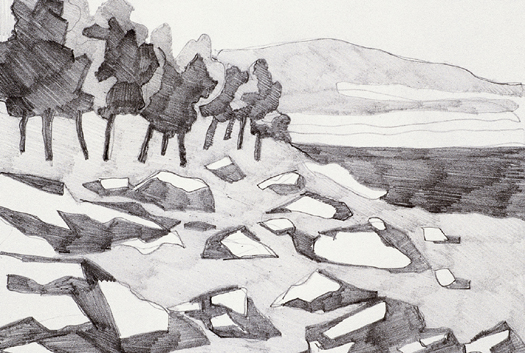
This drawing contains three values: the paper and the two grays of the pencil. Though it is also schematic, the subject seems natural and has complex values.

Shading involves establishing the value of each object (lighter or darker, depending on its actual color), meaning that shadows will appear differently on light objects than on dark objects. In practical terms, this results from creating a general evaluation of the entire subject while ignoring the values of each object. During a second stage, the surfaces are darkened until they achieve the final distribution of tones in the entire drawing.
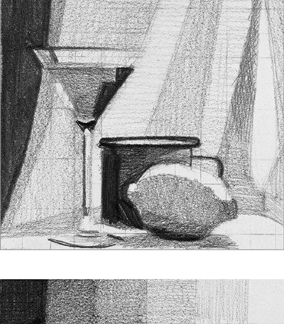
Here, the values of light and shadow have been separated clearly. In addition, the drawing’s scale of evaluation includes all these values.
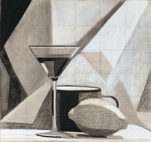
Working on colored paper, white can be included as an auxiliary value. Here, white chalk enriches the scale of values.
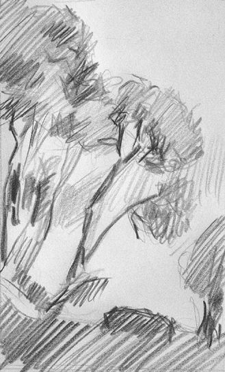
Instead of using all the different values in a drawing equally, artists emphasize some over others in order to create a harmonious play of values.
Beyond shading and evaluation, chiaroscuro is an extraordinary visual effect that bridges drawing and painting. Chiaroscuro is not just a method of representing one or several aspects of the subject, but a genuine creation that involves the entire space in which the subject appears. It concerns atmosphere, light, character, style and a particular way of understanding drawing that distinguishes the artist’s work as a genuine personal creation.

Based on a dramatic counter-position of pure white and saturated black, this work develops chiaroscuro energetically, demonstrating a good balance between values of light and shadow throughout the composition.
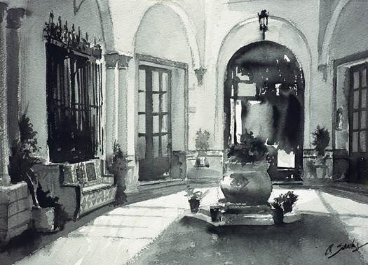
Chiaroscuro achieves the same coherence in a scene by means of a convincing representation of the light. Here, chiaroscuro helps to create a sense of realism. Work by Óscar Sanchís.
Chiaroscuro is a method of shading that creates a balance between the lights and shadows of the work. This harmony requires each element of the drawing to be sufficiently modeled and shaded, as well as a convincing balance of values to be evident. To achieve this, it is necessary to understand the drawing as a complete whole, subject to one single atmosphere of lights and shadows.
Figure drawing is one of the themes that best lends itself to chiaroscuro. All parts of the theme integrate into a single whole (the anatomy of the figure) and the lights and shadows organize around this subject without becoming dissipated by details. Work by Vicenç Ballestar.

In a landscape, chiaroscuro emphasizes the light’s direction. This makes the shadows very dense and they contrast with areas that are filled with light. Work by Gabriel Martín.
Chiaroscuro implies the exclusive use of black and white (the color of the paper and that of the medium employed), but it can also incorporate diverse tones, provided that they relate to the overall tone and do not stand out against it. That is, colors must be shaded towards black or lighten towards white (if white and black are the basic colors), to create a sense of cohesion in the drawing.
V alue and shading techniques depend on the procedure and medium employed to create a composition. The end result will vary depending on the materials the artist uses. Some artists prefer media that produce thin strokes (nib, pencil, etc.), whereas others lean towards more pictorial media that focus on mark-making, for example, with charcoals, sanguine, or pastel.
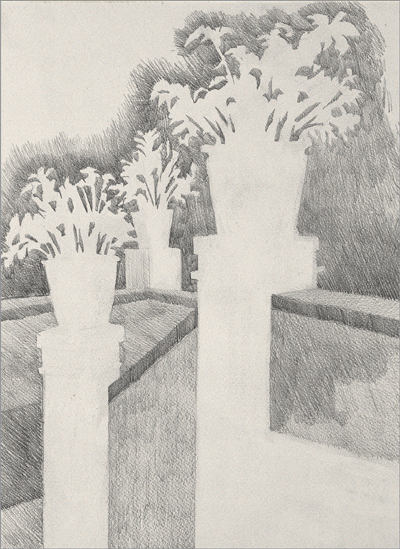
The graphite pencil is a good medium for rendering light, since it is hard to create dark tones with it. It is also ideal for refining values, as it does so with a greater delicacy than other media.

Charcoal is the darkest drawing medium. Its ease and rapidity of use produces the extremes in the range of values that should be established at the start of a drawing. This range extends from the white of the paper to the darkest tone obtainable by the charcoal.
Shading can create a stark or subtle contrast, depending on the procedure chosen. Pencil shading, especially when using hard leads, makes it much easier to move subtly between values, but will never create a drawing with strong contrasts. This calls for charcoal or India ink. Even so, a lighter medium’s great subtlety and delicacy of strokes compensate for its less intense effect.
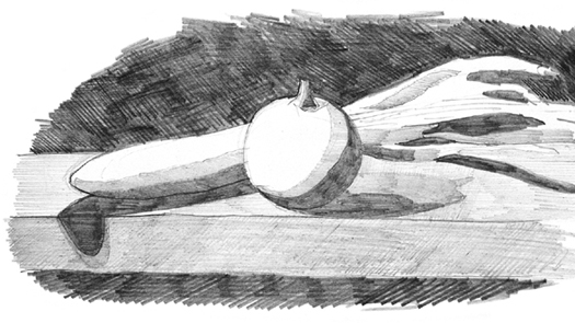
Pencils are a stroke-making medium. Their advantage lies in the fact that the artist can work methodically, adjusting all the values to their exact tone and their precise placement in the drawing.
Types of shading vary considerably, depending on whether an artist favors strokes or mark-making. Appropriate media for making strokes includes pencils, the lithographic pen, the reed pen, and small color sticks (pastel or wax). Mark-making media includes charcoal, pastels, and, in general, thicker sticks. Shading is always more convincing and definite when done with these materials.
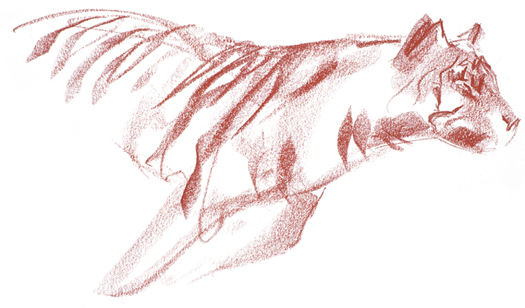
Pastel is a mark-making medium. Rapid and efficacious, pastels are ideal for creating suggestions and simultaneously establishing contour and shadow through broad strokes of the color stick.
Hatching exemplifies drawing techniques that rely on delicacy of stroke. Shading with pen, nib, or pencil necessitates hatching. This is a particular technique that not only represents a value or tone in a composition, but also creates an illusion of texture. The combination of multiple hatchings creates works with very rich tonal value, suggestive of the quality of the surfaces represented.
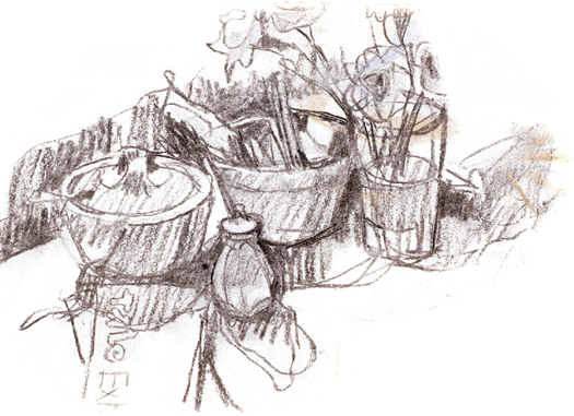
Pencil drawing that exhibits free, uncluttered hatching. This is the artists’ habitual way of working when seeking a temporal, sketched-in effect: the lights and shadows are part of an intertwined mass of hatching that follows no regular layout.

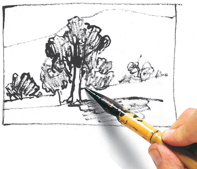
The reed pen is ideal for hatching, but hatching lights and darks does not require a systematic approach and can be developed rapidly and uninterruptedly.
The density of strokes, which depends on the amount of pressure applied to the paper, and their vertical, horizontal, or diagonal direction determines the various intensities of shadow. The range of values can greatly extend if these two factors are combined. In addition, these techniques create a texture that adds a characteristic visual value to the drawing.
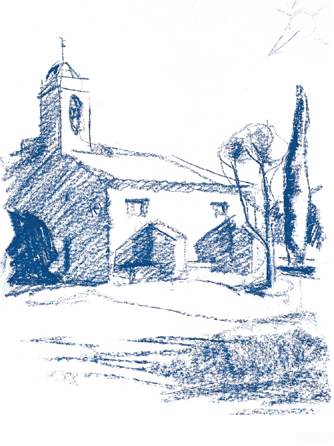
Pastel sticks are a mark-making medium, but they can also achieve light hatching, which, in just a few delicate applications, establishes the general values of the drawing.
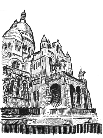
The artist can invent the hatching that they deem appropriate in order to give variety and complexity to a drawing’s shading.

Peculiar cross-hatching with sanguine that suggests more detail in the shadows than they actually contain. This is the virtue of dense cross-hatching, which enriches the graphic texture of the drawing while simultaneously creating tonal value.
A drawing with cross-hatching always exhibits densely textured shadows. This creates the illusion that the drawing contains much more visual information and detail than it actually does. This is one of the great advantages of cross-hatching; by working slowly and patiently, the artist can determine the exact value of each area of light and shadow.
B lending is a habitual resource for obtaining visual unity. Values merge with each other and light and shadow alternate continuously and fluidly. Therefore, it isn’t necessary to define each form; the shapes are not self-containing, rather, one leads to another as if they were all submerged in a single light-filled context. Charcoal, sanguine, or pastel strokes leave particles loose on the paper, which spread and create graded marks on the paper.
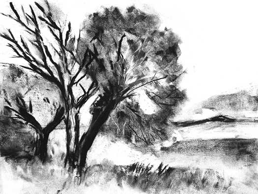
Blending allows strokes and concentrated areas of charcoal to contrast with softened tones. When applied to a landscape drawing, these contrasts create the illusion of an aerial perspective.

Blending with the fingers is the most direct and spontaneous way to adjust values and tone down extreme contrasts. It is ideal for rapidly created drawings.

Here, shading is global and the blending does not seek realism, but rather, a general tonal harmony.
Direct blending arises from the decisive application of strokes with the stick pressed flat against the paper. These marks are blended and the trace left on the paper establishes an initial play of light and shadow. Some added contours that do not define the lines too strongly leave spaces open so that the atmospheric unity of the drawing becomes clear. Continue by applying more marks to blur with the fingers. To finish, use your eraser to locate the most prominent areas of light in the composition.

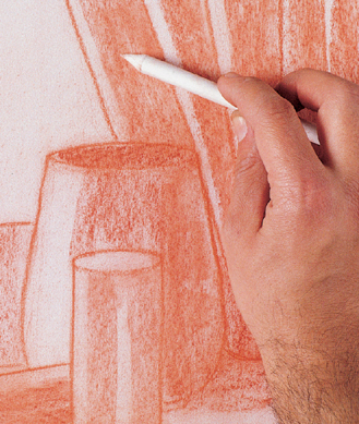
A classic drawing subject is a cloth. The folds create plays of lights and shadows that, properly drawn and evaluated, are the starting point for working with the scumble, should you want an accurate and realistic finish.
In sketches, studies, and small works, using the fingers or edge of the hand can be the most comfortable way to blend. In more elaborate drawings of medium size, the scumble can be advantageous, as it may define details. In big works, a cloth can achieve blending during the drawing’s initial stages before tackling its details.
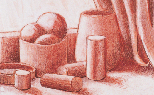
Blending removes the trace of strokes and creates a soft, silky texture, through which light appears, unifying all the areas of light and shadow.
T his method of modeling involves creating a contrast of light on dark to highlight points of relief in the composition, and ensures the unity of the drawing. The lighter or darker value in this pairing should starkly contrast its neighboring value in order to create a distinct border between the two contrasting values. As a result, this border becomes a line in the drawing, the limit of the represented shape.
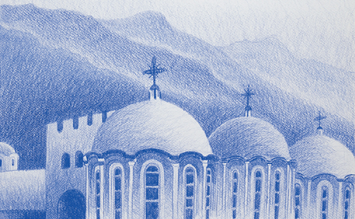
In this drawing by Gabriel Martín, the principle of simultaneous contrast was applied systematically to all the shapes. The lighter tones border the darker ones, defining the contours more clearly than if a mere homogeneous lighting had been used.
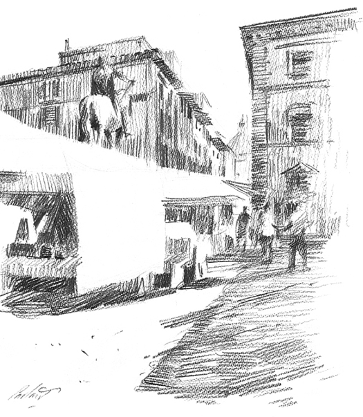
The planes of light and shadow combine so that the simple contrast between darker and lighter planes defines the shape.

The entire highlighted perimeter of the jug strongly contrasts its background, almost creating a polar opposition of black and white.
To highlight the volumes of a drawing, there is no need to darken its shadows. Instead, darken the background on which they appear. Simultaneous contrast involves using both of these methods, so that the forms and the background on which they stand out gain value at the same time. Wherever a shape is lost against the background, darkening the background will re-emphasize its contours. This lightens the weight of the shadows and achieves a harmony of value.

Here, chiaroscuro emphasizes the use of simultaneous contrast, seen in the precise definition of all the contours. The general blurring reinforces the effect of light. Work by Joan Teixidor.

Very light colors nuance the entire cup to give its simple cylindrical volume unity and integrity.
In exercising simultaneous contrast, the artist constructs the subject based on form, size, and distribution of its elements. Lighter hues appear next to shaded forms, and darker forms accompany light-filled areas of these forms. Therefore, the background’s tonalities vary depending on the position of each item.

Simultaneous contrast can be nuanced to create more subtle contrasts, as seen in this work by Mercedes Gaspar. Light and shadow form a very rich fabric of nuances.
S hading by line is the most “pictorial” method of creating color values. This way of working suggests the characteristic qualities of painting, such as brushstrokes, colors, and experimentation with tone. The process, as seen in this exercise by Gabriel Martín, is very rich in varied values and strong graphic lines.
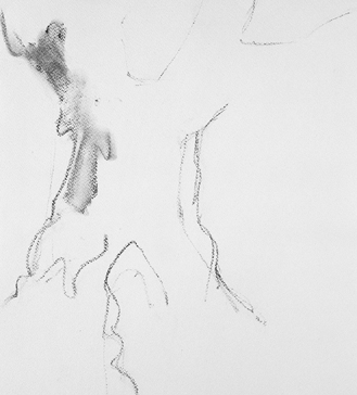
1. The initial lines of the drawing shouldn’t define the shape. Rather, the strokes must leave numerous spaces white to facilitate the following process.
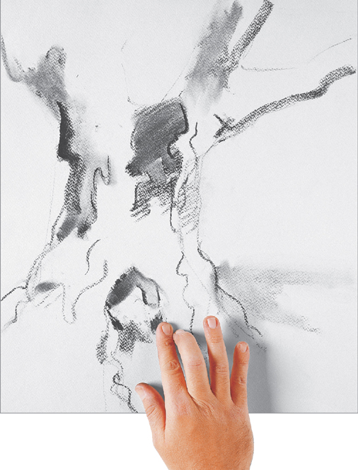
2. First, trace with charcoal and then blur with your fingers. Do not create contours by blurring; contours should be created by shading.
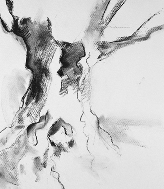
3. The softest spots are achieved by using the fingers. From the start, this gives an abundant range of various values of grays.
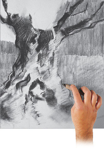
4. Once the drawing has advanced sufficiently and contains various types of strokes, use the scumble to tone down some parts and nuance the areas of the densest texture.

5. The eraser also plays an important role in nuancing the strokes. It can open up white sections so that the paper “breathes” between the hatching and the shadows. This gives the effect of light illuminating the trunk.
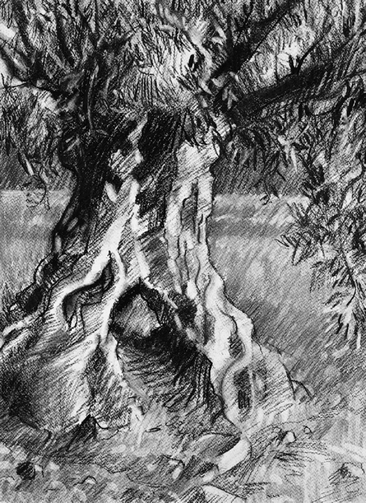
6. The final drawing is comprised of a dense surface covered with bold lines. The graphic wealth and great variety of different values contained in the drawing evoke the roughness and texture of the tree trunk.
Hatching is an appropriate technique when using drawing instruments that create fine or very fine strokes, such as pens, nibs, hard-lead pencils, etc. In exercise, the artist Almudena Carreño employs very sharp HB and 2B graphite pencils to accurately resolve a still life in chiaroscuro. Rulers and setsquares are useful for achieving a result that is as cohesive as possible – and also highly original.
In this exercise, rulers and setsquares help to achieve highly precise and continuous cross-hatching, which occupies the entire surface of the paper.
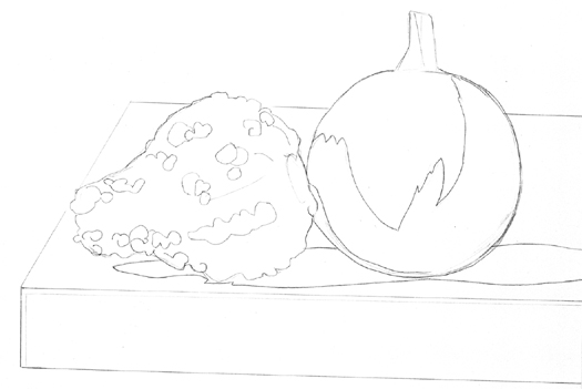
1. The initial drawing should be very precise: if the contours and the areas of different shade are well defined, there will be no doubts regarding where to apply the strokes to establish values and model the shadows.

2. At first, use an HB pencil to create an initial hatching with long parallel, diagonal lines. Keep only the areas of maximum light in white.
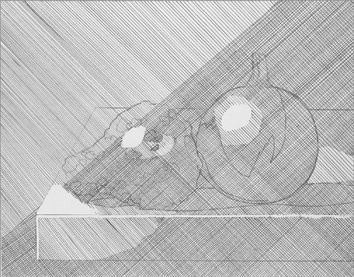
3. The hatching lines should cross each other at right angles to create regular areas of differing value. The strokes will be darker and the hatching will create a darker shadow where the softest pencil has been used.

4. The hatching continues, now vertical and horizontal. Little by little, the shadows darken. The lightest areas are spaces where new hatching has not been added.
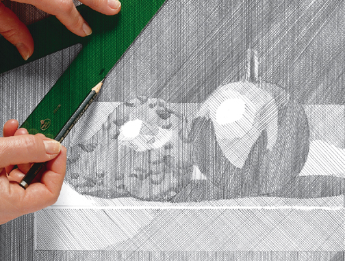
5. In the last stages of hatching, softer lead pencils are steadily used to produce darker and darker intensities of shadow. Very brief strokes in the same direction as the rest of the hatching brings out the rough texture of the gourd.

6. The tonal scale and the gradient of the final drawing are very precise and occupy the entire drawing. Thanks to this very systematic way of working, a complex and developed drawing was achieved.
Backlighting is a light effect not used very often by artists, and rarely used when constructing landscapes. However, when incorporated with the traditional mediums of shading and modeling, it is an interesting experiment, as this exercise designed by Almudena Carreño makes apparent. The powerful focus of light is visible in the composition and dramatically emphasizes the strange and somewhat mysterious effect that this unusual point of view creates.

1. The start of the drawing is conventional: charcoal defines the the basic lines of the composition without developing too much detail, and leaves larger areas of the drawing for elaboration.
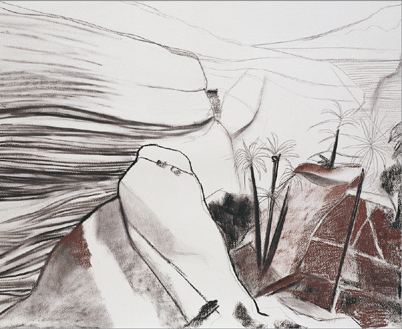
2. The darkest accents of the landscape intensify as if this were a topographical representation, as the stratification of the cliffs becomes clearly illustrated. Working with a sepia chalk stick, define the contours and shade.
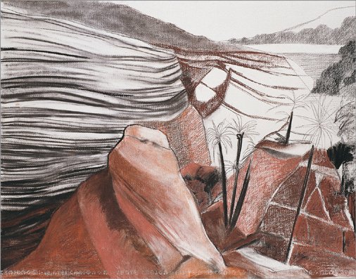
3. Apply sanguine over the sepia chalk. As sanguine is a warmer color, it is much more suitable for dealing with the parts of the composition that are nearest to us.

4. Working with the sanguine stick should be done meticulously, especially in the parts where detail is of primary importance, for example, the center of the composition, where the palm trees appear.
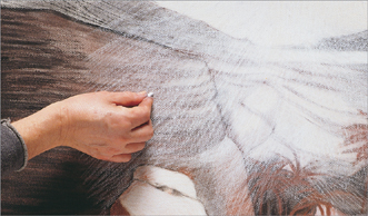
5. Once the shading is completed, hatching with white chalk creates the backlight represented. It is essential that the prior shading remains dark (to contrast with the chalk) and has been blurred well (so that the chalk strokes can easily be added on top).
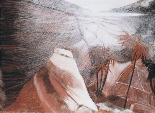
6. The final result is highly original and, at the same time, very faithful to the subject. Successive hatching and strokes soften as the picture recedes from the light source. This is a fine drawing of an effect that is difficult to achieve.