

Landscape drawings express all of nature through its individual parts. The same basic principle of landscape art governs both drawing and painting: recreating a feeling of nature by giving priority to a set of features that the artist believes are significant, or fundamental. This selection of features is the decisive factor and must be based on experience and understanding the means of expression that are characteristic of landscape artists.

Titian (1480-1576), Pastoral scene, (1565). J. Paul Getty Museum. Classic landscape is always a secondary counterpoint to the main subject. In this case, the main subject (apparently mythological) is a vehicle for developing an idealized vision of landscape.
The landscape artist recreates a feeling of nature by emphasizing certain significant features and sidestepping others.
Landscape drawing is based on the choice and combination of significant elements in the motif, changing their form and size according to a concrete principle of composition. In summary, every drawn landscape is a free interpretation of the motif, as every artistic work is. The practice of landscape drawing requires the artist to emphasize certain features, diminishing others, and eliminating some. These features are often concrete visual elements of the panorama. These alterations can be significant, and can allow for a deliberate exercise of autonomous composition based on real observation.
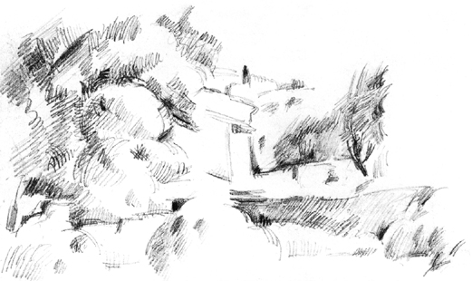
Paul Cézanne, Landscape of Provence, Kunstmuseum. Impressionist landscapes are based on recording apparently unconnected sensations of light and shadow that do not necessarily coincide with the objects in the landscape.
Open-air drawing favors landscapes based on capturing fleeting aspects of the motif chosen. In short, this is a drawing based on the principles of impressionist practice. Composed or constructive landscape style is similar to abstract painting, in which the artist combines memories of landscape with real perceptions, without concerning themselves with creating a realistic description. While a composed landscape does not capture the fleeting and temporal aspects of the motif, it is an accommodating way to work, both for painters who prefer to elaborate their works in the studio with observations from nature, and for artists who begin their picture in front of the motif and finish it in the studio.

Georges Seurat, House beside a river. The Metropolitan Museum of Art. The constructive landscape searches for formal clarity, sacrificing detail and the momentary play of light: bright contrasts and play of well defined lines.

The modern landscape artist can opt for one of the characteristic possibilities of landscape drawing (or a combination of the two) to achieve atmospheric unity, as the landscape reproduced here demonstrates. Work by Mercedes Gaspar.
Landscape is not something that a view can capture, rather, it is a continuous and limitless spectacle. The artist must frame their drawing by selecting features and fragments of the landscape that best fit their intentions and visions for the work. To frame the drawing is to define its limits in accordance with its composition criteria.
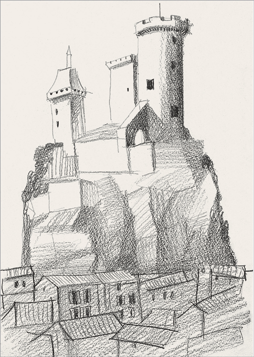
To compose is to select, and to select one element is to discard or eliminate others. When you opt for a particular feature of the landscape, abstracting yourself from the rest, you are engaged in a genuine exercise of framing and composition. Work by David Sanmiguel.
Much of a drawing’s attraction depends on how it is framed. Since every landscape always has its own peculiarities, choose one characteristic that is more interesting and relevant than the others. Depending on the landscape before which the artist stands, these frames can be vertical or horizontal, square or rectangular. The decision depends on the elements you choose to isolate. Vertically oriented subjects (trees, buildings etc.) are usually best resolved by vertical frames, whereas broader frames respond to more extensive and deeper panoramas.

The framing of the landscape does not necessarily have to include outstanding features of the view. Searching for corners hidden in the overall view can yield as interesting results as trying to represent broad panoramas. Work by David Sanmiguel.
The foreground and middle ground depend on the artist’s choice of a frame and their position before their subject. In this drawing, the fragment of boat visible at the left of the frame emphasizes the foreground of the scene.
To choose a good frame, it is essential to distance yourself from the landscape in order to clearly see its various facets. A broad panorama without too many visual obstacles in the way allows the artist to select its most attractive aspect. Normally, this means going up to high positions that let you take in a large amount of space with just one look. Once you have decided on the frame, then you may highlight, exaggerate, reduce, or eliminate any of its parts.
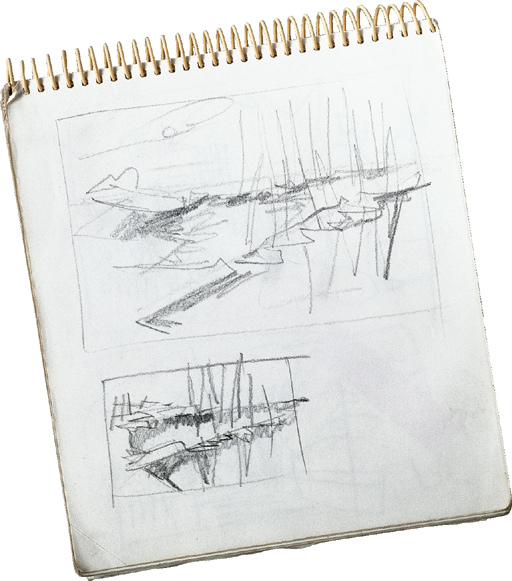
It is difficult to establish the frame of a composition after only one try. Most of the time, successive sketches and multiple studies of the motif resolve the frame.
The presence of the horizon is one of the basic features of a landscape representation. Whereas in other artistic subjects, the horizon is of secondary importance, in landscapes, the horizon is always present and determines the spatial depth of the subject, affecting the entire composition and suggesting what kind of drawing the artist must attempt.

Rembrandt (1606-1669), A Sailing Boat on a Wide Expanse of Water, (1650). J. Paul Getty Museum. Low horizons characterize the classic Dutch landscape. The horizon line takes on absolute importance. In its presence, other items are of secondary importance.
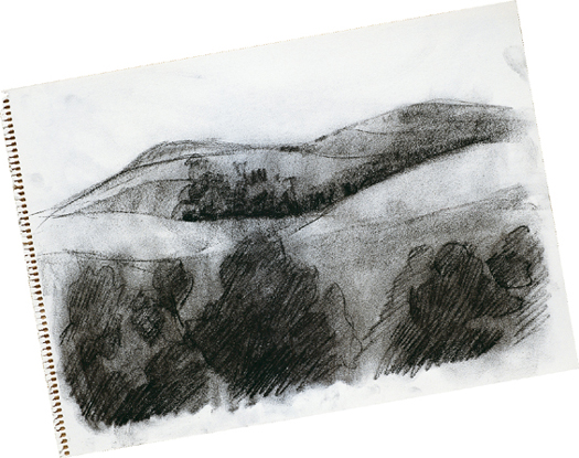
The landscape’s horizon is rarely a straight line. Its undulations repeat in different areas through the progression of the drawing plane. These repetitions are a rhythmic, compositional element.
Space in landscape is organized around the horizon line. A low horizon line does not allow for creating successive planes and layers of landscape; the viewer’s eye goes directly to the sky. A higher horizon line allows different sizes of trees, hills, and buildings to create depth of space. These landscapes suit wider formats best.
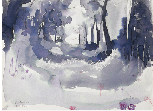
Landscapes with high horizons enable many compositional and spatial features to develop by playing with the abundant areas that can be worked on from the first to the final plane.

The horizon line may disappear due to the atmospheric perspective that obscures the boundary between the horizon and the sky and merges the two elements.
High horizon lines let the artist develop their subject all over the surface of the paper. In general, they suggest a view from a lower vantage point. This entails a stylization of the landscape that highlights all the peculiarities in the ground and expands the view of the landscape. It is possible to raise the horizon to the top of the frame, practically removing the sky.

In some landscapes the horizon lies towards the upper limits of the frame. This is an implicit horizon, which leaves the entire space of the drawing as an area to fill.
E very landscape subject can be reduced to a simple compositional frame that synthesizes the basic features of the motif. It is common to compose the drawing linearly, that is, to distribute the basic lines of the motif on the paper according to the basic compositional principles discussed earlier: avoiding harsh symmetry, adapting the horizon line to the artist’s view, creating balance in the composition, etc.
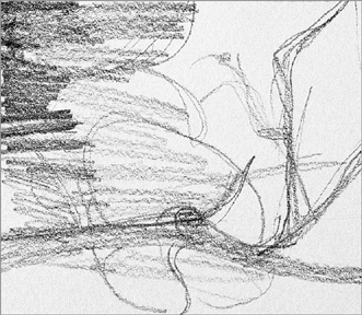
Every landscape contains linear tendencies that organize the composition and serve as linear scaffolding for the synthesis of the whole.
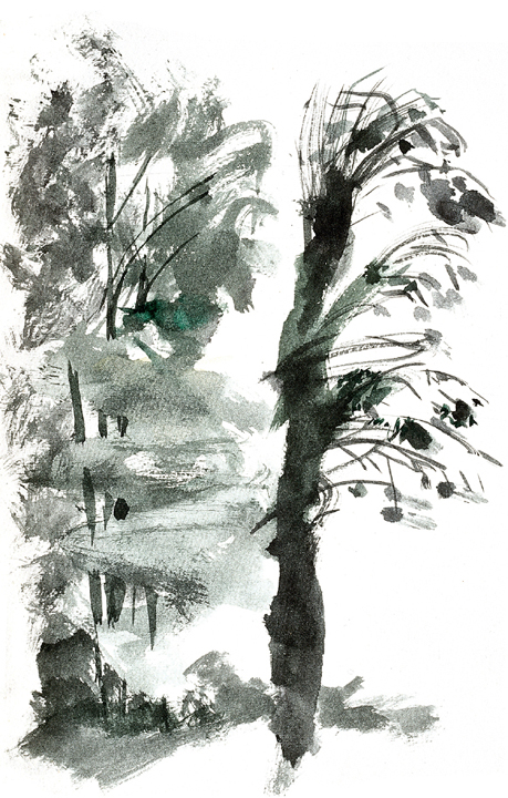
Treetops and plants in general always require synthesis to resolve the problem of representing groups of tiny shapes. In this drawing, David Sanmiguel has used ink marks to resolve this issue.
The shapes of the landscape can be reduced to a grouping of straightforward profiles drawn with simple straight and curved lines. Working up a drawing from the simple to the complex is the correct way to proceed. Before jumping to detail, establish and distribute the outlines and contours of all the objects to be represented. In addition, the profiles of these objects should refer to a central point of interest, such as a tree, cloud, or building. This achieves a hierarchy in the drawing instead of a mere amalgamation of strokes.
The synthesis of a landscape can be a purely graphic representation of its relevant features. In this drawing, Esther Olivé de Puig converts trees into signs and diagrams that make up a kind of drawn writing.
It is not advisable to place the drawing’s center of interest in the middle, because the viewer’s eyes will go there first. By moving the drawing’s focus to one side, you can lead the viewer’s eye throughout the entire drawing. Placing the drawing’s center a bit towards the left of the paper is a common and logical way to resolve this.

A good drawing that synthesizes its contents ultimately facilitates the addition of details and the opportunity for elaboration, since the artist is working with a solid and reliable plan.

Sketches are the best way to figure out how to synthesize the drawing, as they combine all creative tendencies and impulses.
T he space of the sky, if we forget the clouds, is just empty space where it doesn’t seem necessary to represent anything. Rather than making things easier for the landscape artist, this actually complicates the drawing process, as this empty space cannot be modeled like the rest of the landscape. The empty parts of a drawing can be enriched, depending on the artist’s decisions. They can darken or lighten the sky to create contrast, create color gradients, and so on.

The sky’s value must be consistent with the other values that comprise the landscape. Its tone must harmonize with the rest of the picture, regardless of the luminosity and shadings present in the various masses in the view.
The contrast between the strokes and marks in a landscape and the space of the sky can work if the artist is careful to leave underdeveloped spaces on the ground too, which alleviate the heaviness of the darker areas of a landscape. If the land area is very dark, the artist should darken the sky as well, at least very lightly, to create a relationship of tones and general harmony.
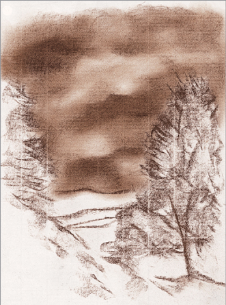
The darkness of the sky, complemented by the shade of the ground, creates a dramatic feeling in the drawing.
When trying to create a drawing that demonstrates a unified balance of tone, making a light gradient in the sky is the most logical way of working. It is important that this gradient is lighter at the bottom, near the horizon, than at the top, since this a landscape appears naturally. Not only does this serve as a guide to create tonal harmony, but will produce realistic lighting effects.
The clouds are independent volumes that must find their shape and form by contrasting the general tone of the sky. Darkening the sky’s tone will highlight a cloud’s whiteness.

This wash confuses the marks of the sky and those of the landscape. The viewer must distinguish them by reconstructing, according to their imagination, the position of each part in the overall whole.
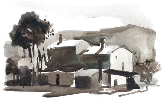
In this wash, the sky was resolved by spreading very soft marks of cold tones that contrast sharply with the darkness of the landscape, creating an effect full of light. Work by Vicenç Ballestar.
The shapes in the surface of water appear in the waves, which distort these shapes and convert them into a mix of lights and shadows. These waves can easily be represented by strokes or marks; the darker a reflection is, the denser the strokes and marks will be. They should also increase in size as they become close to the foreground. This means that the strokes will be smaller the closer they are to the horizon, since they will represent waves that are far away from our point of view. Avoid taking a blind, systematic approach by carefully observing the water’s appearance, which is ever-changing and unique to each drawing.

The representation of water depends entirely on the values found, the right distribution of light and shadow and the rhythmic contrasts between light and dark tones. In this wash by Mercedes Gaspar, these factors are all resolved in masterly fashion.
Arabesques are linear filigree work or strokes curved rhythmically in various directions. Their ultimate purpose is to create a sensation of harmonious movement that both represents and elaborates. In a landscape, water evokes the richest arabesques that give free rein to the artist’s fantasies and whims. In general, arabesques should accompany other mediums that give rigidity and solidarity to the representation of the water.
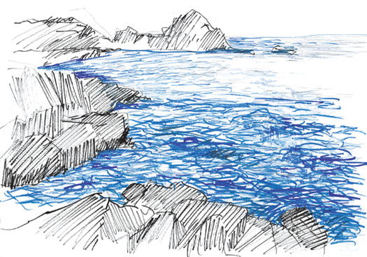
Representing water involves hatching with lines of different density, since there are no concrete profiles or contours in water; shapes are not enclosed in a recognizable, geometric way.
Reflections in the water repeat the shapes of the landscape in a distorted way but their values must be clearly defined and presented in order to be recognizable. Drawing by Óscar Sanchís.
Highlights represent the brightest parts of an object, and can be left blank. These areas must be distributed according to the placement and representation of waves. Highlights should be much broader in the foreground than in the background, seeming to disperse the closer they are to the viewer.

Strong contrasts in tone are the key to representing water surfaces in an attractive way. The appearance of blank paper must not interrupt the sinuous marks. Work by Vicenç Ballestar.
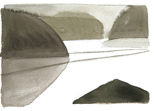
In this study of composition, the strong contrasts between the spots of the wash and the white of the paper describe the water surface.
Abroad panorama almost always implies a high horizon. This is the case in this exercise, which shows a very extensive landscape, taken from a somewhat raised point of view. The picture covers long distances and is marked by a great mountainous undulation. Apart from these composition factors, this charcoal drawing gives you the opportunity to take part in the process of representing the air, known as aerial perspective. The representation of morning mists creates distance and places large expanses of clouds between the planes of the landscape.
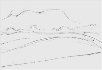
1. The preliminary drawing puts forth the general lines of the motif with marks, above all, the various areas defined by the undulation of the hills.

2. By applying the flat stick to the paper, extend the gray areas. These give soft toning or general value, avoiding sharp contrasts.
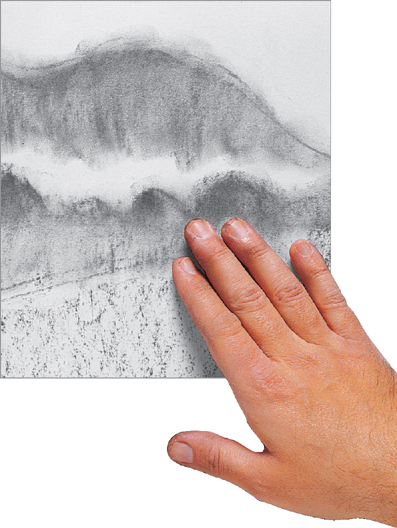
3. Spread and blend the spots with your fingertips. Be careful not to apply too much pressure, as this will create undesired marks on the surface of the paper.
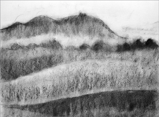
4. This first laying in of tone demonstrates that the closer the plane is to the viewer, the deeper the tones of the drawing will be. This is also a result of the drawing’s initial shading.

5. New applications of charcoal further define the details of the trees that poke out behind the hills. Don’t get lost in detail; these are simple marks whose importance lies in their size, as their dimensions indicate their distance from the viewer.

6. To accentuate the effect of aerial perspective, darken the crest of the mountain that encloses the landscape. This dark tone, dying out slowly towards the bottom, creates the effect of mist and distance.

7. The landscape after the general lay-in is completed. Note the interesting effect of distance that has been created, which will be reinforced by contrasts.
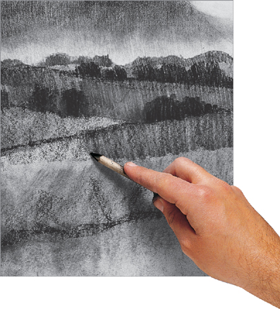
8. Use a scumbling technique to extend the strokes covering the middle plane. This darkens the charcoal considerably by pressing its particles into the paper.

9. Darkening the foreground strengthens the landscape and gives a sensation of depth. In addition, this emphasizes the misty area on the horizon.
10. When the scumble is very dirty with charcoal, its tip can be used to draw the branches of the tree in the foreground. The branches should be very dark lines that stand out against the rest of the scene.

11. The final result is rich in tone, but also light and not heavy-handed. This is the effect that was originally intended: strength in the foreground and mist in the distance— a perfect example of aerial perspective. Work by Gabriel Martín.
This exercise shows the narrow frontier that separates shading with gray tones (drawing in black and white) from shading with color. The colors that are going to be used are, in fact, closer to grays than any other color. The chalk sticks used are green, but very close to neutral tones. The order of work is the same as with charcoal. The difference lies in the translation of color to value.
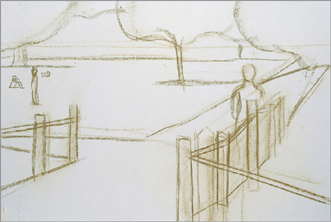
1. For the initial drawing, use a hard pale-green pastel stick. If black were used, the lines would be too visible or would dirty subsequent tones. This green acts as a medium gray.
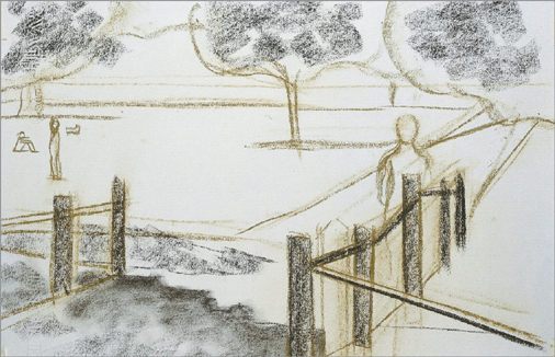
2. Spread some very simple charcoal spots to create initial shading. Given that this first shading must be soft, it is important to rub the charcoal stick on the paper lightly.

3. Spread the spots with a clean cotton cloth. Not only was charcoal used, a sepia chalk stick to achieved warm shading (the gray of charcoal is a cold tone), as well.
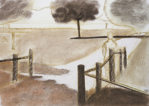
4. The layout for the composition divides the landscape into masses or blocks that are more or less enclosed by lines. Each segment of the drawing has its own, unique value. This drawing employs a small scale of grayish greens. Each tone is blurred after it is applied to the paper.

5. The strong contrast of the foreground in shadow makes the rest of the composition more distant and opens a broad visual space, consistent with the spaciousness of the subject.

6. Draw the figure schematically, without details. Aim to achieve a static silhouette that harmonizes with the peacefulness and the little emphasized relief in all the planes of the landscape.

7. Fill in the entire landscape. Darken the last lines of trees that close the composition’s space in the background to reduce the excess contrast they previously had with the trees in the middle ground.
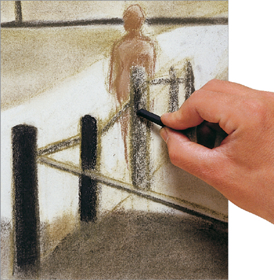
8. Go over the supports of the handrail again with a pressed charcoal stick. The objective is to achieve perfectly black outlines that stand out against the subsequent planes of the landscape.

9. At this stage, make sure to nuance the whites in the composition (sky and path). These areas are too stark and break the general tonality of the picture.
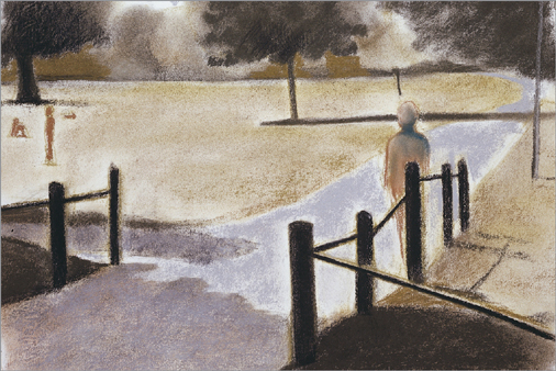
10. Cover the small spaces open to the sky with gray spots which, when compared to the warm greens of the general color scheme, look bluish.

11. Here, the drawing is almost finished. Note the importance of the small figures that appear in the middle ground of the composition; their small size indicates the scale of the distances in the drawing.
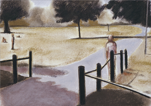
12. After the final blending, the drawing is now finished. The final tones in the shadows of the foreground that were previously too dark for the surrounding tones now fit in harmoniously.