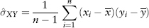
FIGURE 2.1 S&P 500 Index Frequency Distribution
This chapter provides the statistical concepts essential for the understanding of risk management. There are many good textbooks on the topic, see Carol Alexander (2008). Here, we have chosen to adopt a selective approach. Our goal is to provide adequate math background to understand the rest of the book. It is fair to say that if you do not find it here, it is not needed later. As mentioned in the preface, this book tells a story. In fact, the math here is part of the plot. Therefore, we will include philosophy or principles of statistical thinking and other pertinent topics that will contribute to the development of the story. And we will not sidetrack the reader with unneeded theorems and lemmas.
Two schools of thought have emerged from the history of statistics—frequentist and Bayesian schools of thought. Bayesians and frequentists hold very different philosophical views on what defines probability. From a frequentist perspective, probability is objective and can be inferred from the frequency of observation in a large number of trials. All parameters and unknowns that characterize an assumed distribution or regression relationship can be backed out from the sample data. Frequentists will base their interpretations on a limited sample; as we shall see, there is a limit to how much data they can collect without running into other practical difficulties. Frequentists will assume the true value of their estimate lies within the confidence interval that they set (typically at 95%). To qualify their estimate, they will perform hypothesis testing that will (or will not) reject their estimate, in which case they will assume the estimate as false (or true).
Bayesians, on the other hand, interpret the concept of probability as “a measure of a state of knowledge or personal belief” that can be updated on arrival of more information (i.e., incorporates learning). Bayesians embrace the universality of imperfect knowledge. Hence probability is subjective; beliefs and expert judgment are permissible inputs to the model and are also expressed in terms of probability distributions. As mentioned earlier, a frequentist hypothesis (or estimate) is either true or false, but in Bayesian statistics the hypothesis is also assigned a probability.
Value at risk (VaR) falls under the domain of frequentist statistics—inferences are backed out from data alone. The risk manager, by legacy of industry development, is a frequentist.1
A random variable or stochastic variable (often just called variable) is a variable that has an uncertain value in the future. Contrast this to a deterministic variable in physics; for example, the future position of a planet can be determined (calculated) to an exact value using Newton’s laws. But in financial markets, the price of a stock tomorrow is unknown and can only be estimated using statistics.
Let X be a random variable. The observation of X (data point) obtained by the act of sampling is denoted with a lower case letter xi as a convention, where the subscript i = 1,2, . . . , is a running index representing the number of observations. In general, X can be anything—price sequences, returns, heights of a group of people, a sample of dice tosses, income samples of a population, and so on. In finance, variables are usually price (levels) or returns (changes in levels). We shall discuss the various types of returns later and their subtle differences. Unless mentioned otherwise, we shall talk about returns as daily percentage change in prices. In VaR, the data set we will be working with is primarily distributions of sample returns and distributions of profit and loss (PL).
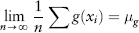
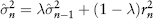
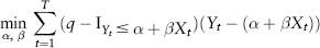
Figure 2.1 is a plot of the frequency distribution (or histogram) of S&P 500 index returns using 500 days data (Jul 2007 to Jun 2009). One can think of this as a probability distribution of events—each day’s return being a single event. So as we obtain more and more data (trials), we get closer to the correct estimate of the “true” distribution.
FIGURE 2.1 S&P 500 Index Frequency Distribution
We posit that this distribution contains all available information about risks of a particular market and we can use this distribution for forecasting. In so doing, we have implicitly assumed that the past is an accurate guide to future risks, at least for the next immediate time step. This is a necessary (though arguable) assumption; otherwise without an intelligent structure, forecasting would be no different from fortune telling.
In risk management, we want to estimate four properties of the return distribution—the so-called first four moments—mean, variance, skewness, and kurtosis. To be sure, higher moments exist mathematically, but they are not intuitive and hence of lesser interest.
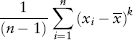
The mean of a random variable X is also called the expectation or expected value, written μ = E(X). The mean or average of a sample x1, . . . , xn is just the sum of all the data divided by the number of observations n. It is denoted by  or
or  .
.
The Excel function is AVERAGE(.). It measures the center location of a sample. A word on statistical notation—generally, when we consider the actual parameter in question μ (a theoretical idea), we want to measure this parameter using an estimator (a formula). The outcome of this measurement is called an estimate, also denoted (a value). Note the use of the ^ symbol henceforth.
The kth moment of a sample x1, . . . , xn is defined and estimated as:
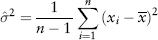
The variance or second moment of a sample is defined as the average of the squared distances to the mean:
The Excel function is VAR(.). It represents the dispersion from the mean. The square-root of variance is called the standard deviation or sigma σ. In risk management, risk is usually defined as uncertainty in returns, and is measured in terms of sigma. The Excel function is STDEV(.).
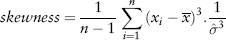
The skewness or third moment (divided by  ) measures the degree of asymmetry about the mean of the sample distribution. A positive (negative) skew means the distribution slants to the right (left). The Excel function is SKEW(.).
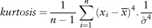
The kurtosis or fourth moment (divided by  ) measures the “peakness” of the sample distribution and is given by:
Since the total area under the probability distribution must sum up to a total probability of 1, a very peakish distribution will naturally have fatter tails. Such a behavior is called leptokurtic. Its Excel function is KURT(.). A normal distribution has a kurtosis of 3. For convenience, Excel shifts the KURT(.) function such that a normal distribution gives an excess kurtosis of 0. We will follow this convention and simply call it kurtosis for brevity.
Back to Figure 2.1, the S&P distribution is overlaid with a normal distribution (of the same variance) for comparison. Notice the sharp central peak above the normal line, and the more frequent than normal observations in the left and right tails. The sample period (Jul 2007 to Jun 2009) corresponds to the credit crisis—as expected the distribution is fat tailed. Interestingly, the distribution is not symmetric—it is positively skewed! (We shall see why in Section 7.1.)
This is a pillar assumption for most statistical modeling. A random sample (y1, . . . , yn) of size n is independent and identically distributed (or i.i.d.) if each observation in the sample belongs to the same probability distribution as all others, and all are mutually independent. Imagine yourself drawing random numbers from a distribution. Identical means each draw must come from the same distribution (it need not even be bell-shaped). Independent means you must not meddle with each draw, like making the next random draw a function of the previous draw. For example, a sample of coin tosses is i.i.d.
A time series is a sequence X1, . . . , Xt of random variables indexed by time. A time series is stationary if the distribution of (X1, . . . , Xt) is identical to that of (X1+k, . . . , Xt+k) for all t and all positive integer k. In other words, the distribution is invariant under time shift k. Since it is difficult to prove empirically that two distributions are identical (in every aspect), in financial modeling, we content ourselves with just showing that the first two moments—mean and variance—are invariant under time shift.2 This condition is called weakly stationary (often just called stationary) and is a common assumption.
A market price series is seldom stationary—trends and periodic components make the time series nonstationary. However, if we take the percentage change or take the first difference, this price change can be shown to be often stationary. This process is called detrending (of differencing) a time series and is a common practice.
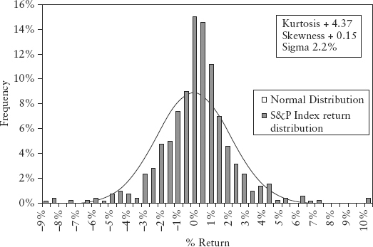
Figure 2.2 illustrates a dummy price series and its corresponding return series. We divide the 200-day period into two 100-day periods, and compute the first two moments. For the price series, the mean moved from 4,693 (first half) to 5,109 (second half). Likewise, the standard deviation changed from 50 to 212. Clearly the price series is nonstationary. The return series, on the other hand, is stationary—its mean and standard deviation remained roughly unchanged at 0% and 0.5% respectively in both periods. Visually a stationary time series always looks like white noise.
FIGURE 2.2 Dummy Price and Return Series
An i.i.d. process will be stationary for finite distributions.3 The benefit of the stationarity assumption is we can then invoke the Law of Large Numbers to estimate properties such as mean and variance in a tractable way.
Expected values can be estimated by sampling. Let X be a random variable and suppose we want to estimate the expected value of some function g(X), where the expected value is μg ≡ E(g(X)). We sample for n observations xi of X where i = 1, . . . , n. The Law of Large Numbers states that if the sample is i.i.d. then:
For example, in equations (2.3) to (2.5) used to estimate the moments, as we take larger and larger samples, precision improves, our estimate converges to the (“true”) expected value. We say our estimate is consistent. On the other hand, if the sample is not i.i.d., one cannot guarantee the estimate will always converge (it may or may not); the forecast is said to be inconsistent. Needless to say, a modeler would strive to derive a consistent theory as this will mean that its conclusion can (like any good scientific result) be reproduced by other investigators.
Let’s look at some examples. We have a coin flip (head +1, tail −1), a return series of a standard normal N(0,1) process and a return series of an autoregressive process called AR(1). The first two are known i.i.d. processes; the AR(1) is not i.i.d. (it depends on the previous random variable) and is generated using:
AR(1) process:
where k0 and k1 are constants and εt, t=1, 2, . . . is a sequence of i.i.d. random variable with zero mean and a finite variance, also known as white noise. Under certain conditions (i.e., |k1| > 1), the AR(1) process becomes nonstationary.
Figure 2.3 illustrates the estimation of the expected value of the three processes using 1,000 simulations. For AR(1), we set k0 = 0, k1 = 0.99. The coin flip and normal process both converge to zero (the expected value) as n increases, but the AR(1) does not. See Spreadsheet 2.1.
FIGURE 2.3 Behavior of Mean Estimates as Number of Trials Increase
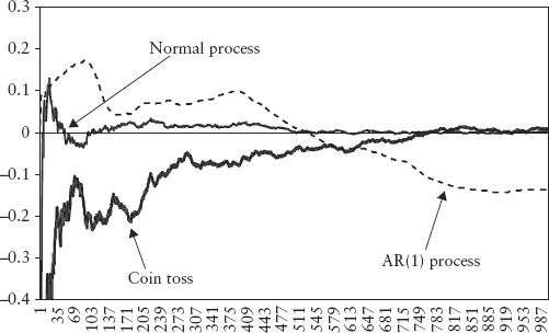
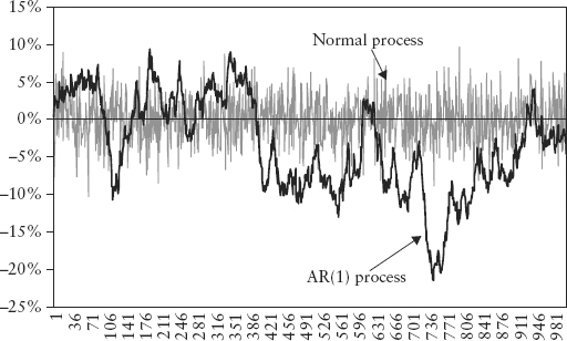
Figure 2.4 plots the return series for both the normal process and the AR(1) process. Notice there is some nonstationary pattern in the AR(1) plot, whereas the normal process shows characteristic white noise.
FIGURE 2.4 Return Time Series for Normal and AR(1) Processes
To ensure stationarity, risk modelers usually detrend the price data and model changes instead. In contrast, technical analysis (TA) has always modeled prices. This is a well-accepted technique for speculative trading since the 1960s after the ticker tape machine became obsolete. Dealing with non-i.i.d. data does not make TA any less effective. It does, however, mean that the method is less consistent in a statistical sense. Thus, TA has always been regarded as unscientific by academia.
In fact, it would seem that the popular and persistent use of TA (such as in program trading) by the global trading community has made its effectiveness self-fulfilling and the market returns more persistent (and less i.i.d.). Market momentum is a known fact. Ignoring it by detrending and assuming returns are i.i.d. does not make risk measurement more scientific. There is no compelling reason why risk management cannot borrow some of the modelling techniques of TA such as that pertaining to momentum and cycles. From an epistemology perspective, such debate can be seen as a tacit choice between intuitive knowledge (heuristics) and mathematical correctness.
From an academic standpoint, the first step in time series modelling is to find a certain aspect of the data set that has a repeatable pattern or is “invariant” across time in an i.i.d. way. This is mathematically necessary because if the variable under study is not repeatable, one cannot really say that a statistical result derived from a past sample is reflective of future occurrences—the notion of forecasting a number at a future horizon breaks down.
A simple graphical way to test for invariance is to plot a variable Xt with itself at a lagged time step (Xt−1). If the variable is i.i.d. this scatter plot will resemble a circular cloud. Figure 2.5 shows the scatter plots for the normal and AR(1) processes seen previously.
FIGURE 2.5 Scatter Plot of Xt versus Xt−1 for a Gaussian Process and an AR(1) Process
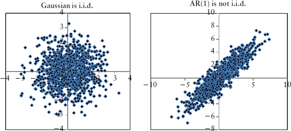
Clearly the AR(1) process is not i.i.d.; its cloud is not circular. For example, if the return of a particular stock, Xt, follows an AR(1) process, it is incorrect to calculate its moments and VaR using Xt. Instead, one should estimate the constant parameters in equation (2.7) from data and back out εt, then compute the moments and VaR from the εt component. The εt is the random (or stochastic) driver of risk and it being i.i.d. allows us to project the randomness to the desired forecast horizon. This is the invariant we are after. The astute reader should refer to Meucci (2011).
Needless to say, a price series is never i.i.d. because of the presence of trends (even if only small ones) in the series, hence, the need to transform the price series into returns.
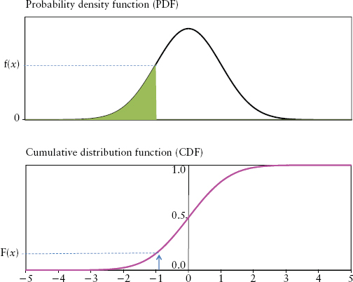
In practice, moments are computed using discrete data from an observed frequency distribution (like the histogram in Figure 2.1). However, it is intuitive and often necessary to think in terms of an abstract continuous distribution. In the continuous world, frequency distribution is replaced by probability density function (PDF). If f(x) is a PDF of a random variable X, then the probability that X is between some numbers a and b is the area under the graph f(x) between a and b. In other words,
where f(.) is understood to be a function of x here. The probability density function f(x) has the following intuitive properties:
The cumulative distribution function (CDF) is defined as:
It is the probability of observing the variable having values at or below x, written F(x) = Pr[X ≤ x]. As shown in Figure 2.6, F(x) is just the area under the graph f(x) at a particular value x.
FIGURE 2.6 Density Function and Distribution Function
The most important continuous distribution is the normal distribution also known as Gaussian distribution. Among many bell-shaped distributions, this famous one describes amazingly well the physical characteristics of natural phenomena such as the biological growth of plants and animals, the so-called Brownian motion of gas, the outcome of casino games, and so on. It seems logical to assume that a distribution that describes science so accurately should also be applicable in the human sphere of trading.
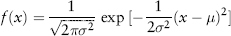
The normal distribution can be described fully by just two parameters—its mean μ and variance σ2. Its PDF is given by:
The normal distribution is written in shorthand as X∼N(μ, σ2). The standard normal, defined as a normal distribution with mean zero and variance 1, is a convenient simplification for modeling purposes. We denote a random variable ε as following a standard normal distribution by ε∼N(0,1).
Figure 2.7 plots the standard normal distribution. Note that it is symmetric about the mean; it has skewness 0 and kurtosis 3 (or 0 excess kurtosis in Excel convention).
FIGURE 2.7 Standard Normal Probability Density Function
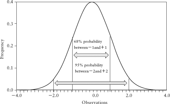
How do we interpret the idea of one standard deviation σ for N (μ, σ2)? It means 68% of its observations (area under f(x)) lies in the interval [−σ, +σ] and 95% of the observations lies within [−2σ, +2σ]. Under normal conditions, a stock’s daily return will fluctuate between −2σ and 2σ roughly 95% of the time, or roughly 237 days out of 250 trading days per year, as a rule of thumb.
The central limit theorem (CLT) is a very fundamental result. It states that the mean of a sample of i.i.d. distributed random variables (regardless of distribution shape) will converge to the normal distribution as the number of samples becomes very large. Hence, the normal distribution is the limiting distribution for the mean. See Spreadsheet 2.2 for an illustration.
The CLT is a very useful result—it means that if you have a very large portfolio of assets, regardless of how each asset’s returns is distributed (some may be fat-tailed, others may be skewed, yet another may be uniform) the average portfolio return behaves like a normal distribution. The only catch is that all the assets must be independent of each other (even though at times they are not).
We summarize the advantages of the normal distribution that make it widely used in financial models:
A quantile is a statistical way to divide ordered data into essentially equal-sized data subsets. For n data points and any q between [0,1], the qth quantile is the number x such that qn of the data points are less than x and (1 − q)n of the data is greater than x. The median is just the special case of a quantile where q = 0.5. Note that the median is not the same as the mean, especially for a skewed distribution.
To obtain the quantile from the CDF (lower panel of Figure 2.6) follow the horizontal line from the vertical axis. When you reach the CDF, the value at the horizontal axis is the quantile. In other words, the quantile is just the inverse function of the CDF, or F−1(x). The Excel function is PERCENTILE({x},q).
VaR is a statistical measure of risk based on loss quantiles. It measures market risk on a total portfolio basis taking into account diversification and leverage. VaR of confidence level c% is defined4 as:
where q = 1 − c is the quantile and X is the return random variable.
There are three possible interpretations of VaR. Consider a 95% VaR of $1 million; it could mean:
Interestingly, all three mean the same thing mathematically but reflect the mental bias we have. See Figure 2.8. In light of the 2008 crisis and the criticism of VaR, it seems the more conservative interpretation (3) is appropriate. Regardless, VaR is certainly not the expected loss.
FIGURE 2.8 Different Interpretations of VaR
Since key decision-makers in banks are often not experts from the risk management department, knowledge gaps may exist. It was argued that the ignorance of what VaR truly represents encouraged a false sense of security that things were under control during the run-up and subsequent crash in the 2008 credit crisis. See Section 13.1.
The target horizon of concern for banks is usually the next one day. That means we need to work with daily returns. Regulators normally stipulate a 10-day horizon for the purpose of capital computation, so the daily VaR is scaled up to 10 days. For limits monitoring and regulatory capital, VaR is often reported in dollar amounts by portfolios. For risk comparison between individual markets, talking in units of sigma (σ) or percentage loss is often more intuitive.
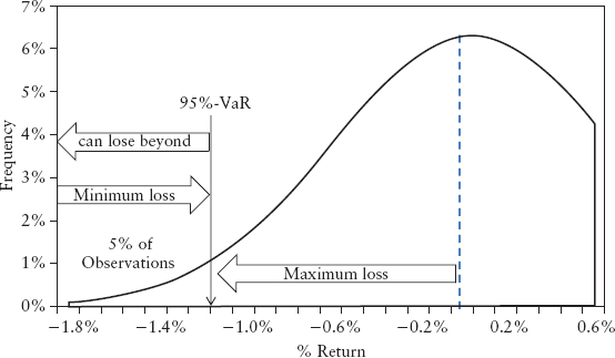
As a convention, the VaR confidence level c is defined on the left tail of the distribution. Hence, 97.5%−VaR or c = 0.975 means the quantile of interest is q = (1 − 0.975) = 0.025.
Banks can choose the observation period (or window length) and confidence level c for their VaR. This is a balancing act. The window must be short enough to make VaR sensitive to market changes, yet long enough to be statistically meaningful. Likewise, if the confidence level is too high, there are too few observations in the left tail to give statistically meaningful inferences.
Figure 2.9 is an example of the return distribution of the S&P 500 taken over a 500-day window (Jan 05 to Dec 06). We overlay with a normal distribution line to show that the stock market behavior was reasonably Gaussian during noncrisis periods. From this data, we can calculate VaR in a few ways using Excel:
FIGURE 2.9 Return Distribution of S&P 500 Index (Jan 05 to Dec 06)
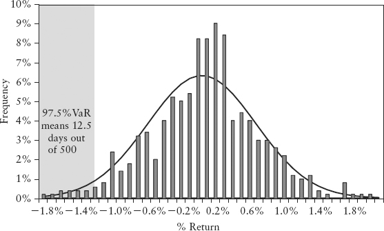
Note the 1.2% loss is the daily VaR. VaR, like volatility, is often quoted in annualized terms. Assuming a normal distribution and 250 business days for a typical trading year, the annual VaR is given by 1.2% * √250 = 19%. (Section 6.4 covers such time scaling.)
From experience, a window length of 250 days and a 97.5% VaR can be a reasonable choice. Unless stated otherwise, we will use this choice throughout this book.
Note that VaR does not really model the behavior of the left tail of the distribution. It is a point estimate, a convenient single-number proxy to represent our knowledge of the probability distribution for the purpose of decision making. Because it is just a quantile cutoff, VaR is oblivious to observations to its left. These exceedences (nq =12 of them in the above example) can be distributed in any number of ways without having an impact on the VaR number. As we shall learn in Chapter 5, there are commendable efforts to model the left tail, but exceedences have so far remained elusive. This is the dangerous domain of extremistan.
Correlation measures the linear dependency between two variables. In financial applications, these are usually asset return time series. Understanding how one asset “co-varies” with another is key to understanding hedging between a pair of assets and risk diversification within a portfolio.
The covariance between two random variables X and Y is defined as:
Given two sets of observed samples {xi} and {yi} where i = 1, . . . , n, we can estimate their covariance using:
where n is the number of observations, and  are the sample means of X and Y respectively. The Excel function is COVAR(.).
Then correlation (sometimes called Pearson’s or linear correlation) is just covariance standardized so that it is unitless and falls in the interval [−1, 1].
A correlation of +1 means two assets move perfectly in tandem, whereas a correlation of −1 means that they move perfectly inversely relative to each other. A correlation of 0 means the two return variables are independent. Correlation in the data (i.e., association) does not imply causation, although causation will imply correlation. Correlation measures the sign (or direction) of asset movements but not the magnitudes. The Excel function is CORREL(.).
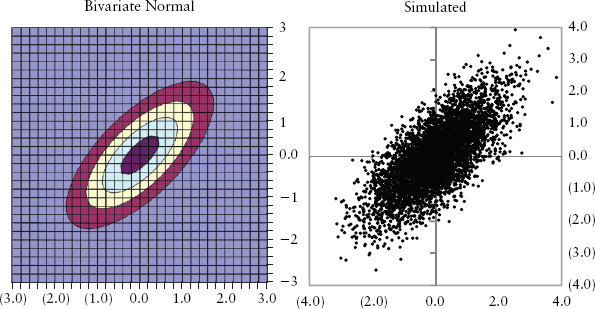
Linear correlation is a fundamental concept in Markowitz portfolio theory (see Section 2.8) and is widely used in portfolio risk management. But correlation is a minefield for the unaware. A very good paper by Embrechts, McNeil, and Straumann (1999) documented the pitfalls of correlation. Here we will go over the main points by looking at the bivariate case; the technical reader is recommended to read that paper.
For correlation to be problem-free, not only must X and Y be normally distributed, their joint distributions must also be normally distributed. More generally, the joint distribution must be an elliptical distribution, of which the multivariate normal is a special case. In our bivariate case, this means the contour line of its 2D plot traces out an ellipse.5 See Figure 2.10. Both diagrams—one actual, one simulated—are generated using N(0,1) with ρ = 0.7.
FIGURE 2.10 An Elliptical Joint Distribution
As long as the joint distribution is not elliptical, linear correlation will be a bad measure of dependency. It helps to remember that correlation only measures clustering around a straight line. Figure 2.11 shows two obviously nonelliptical distributions even though they show the same correlation (ρ = 0.7) as Figure 2.10. Clearly correlation, as a scalar (single number) representation of dependency, tells us very little about the shape (and hence joint risk) of the joint distribution. Correlation is also very sensitive to extreme values or outliers. If we remove the few outliers (bottom right) in the right panel of Figure 2.11, the correlation increases drastically from 0.7 to 0.95. Furthermore, the estimation of correlation will be biased—there is no way to draw a best straight line through Figure 2.11 in an unbiased way (i.e., with points scattered evenly to the left and right of the line).
FIGURE 2.11 Nonelliptical Joint Distributions
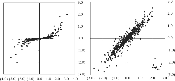
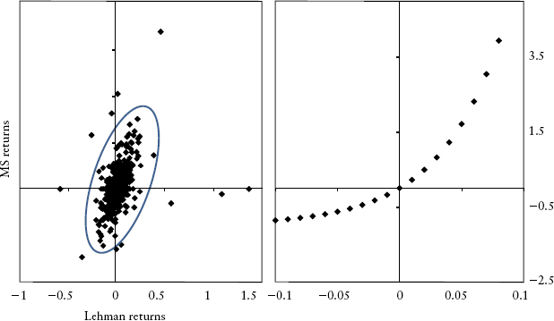
Figure 2.12, left panel shows the actual joint distribution of Lehman 5-year CDS spread and Morgan Stanley 5-year CDS spread. During normal times (the shaded zone) the distribution is reasonably elliptical, but during times of stress the outliers show otherwise.
FIGURE 2.12 (Left panel) Joint Return Distribution of Credit Spreads. (Right panel) Perfect Dependency Shows 1.0 Rank Correlation.
Let’s summarize key weaknesses of linear correlation when used on nonelliptical distributions:
An alternative measure of dependency, rank correlation, can solve problems 2, 4, and 5. Unfortunately, rank correlations cannot be applied to the Markowitz portfolio framework. They are still useful, though, as stand-alone correlation measures.
We introduce two rank correlations: Kendall’s tau and Spearman’s rho. Suppose we have n pairs of observations {x1, y1}, . . . , {xn, yn} of the random variables X and Y. The ith pair and jth pair are said to be concordant if (xi − xj) (yi − yj) > 0, and discordant if (xi − xj) (yi − yj) < 0. The sample estimate of Kendall’s tau is computed by comparing all possible pairs of observations (where i ≠ j), and there are 0.5n(n−1) pairs.
Kendall’s tau:
where c is the number of concordant pairs and d the number of discordant pairs.
The sample estimate of the Spearman’s rho is calculated by applying the Pearson’s (linear) correlation on the ranked paired data:
Spearman’s rho:
where rank(x) is an n-vector containing the ranks6 of {xi} and similarly for rank(y). This can be written in Excel function as: CORREL(RANK(x, x),RANK(y, y)).
Figure 2.12, right panel shows a bivariate distribution that has perfect correlation since all pairs are concordant. Kendall’s tau is 1.0, Spearman’s rho is 1.0, but linear correlation gives 0.9. This illustrates weakness (2). One can easily illustrate weakness (4) as well as shown in Spreadsheet 2.3.
A mathematically perfect but complicated measure of association is by using the copula function (not covered here). A copula is a function that links the marginal distributions (or stand-alone distribution) to form a joint distribution. If we can fully specify the functional form of the N-dimensional joint distribution of N assets in a portfolio, and specify the marginal distributions of each asset, then we can use the copula function to tell us useful information about risk of this system. Clearly, this is an extremely difficult task because in practice there is seldom enough data to specify the distributions precisely, and the copula has to be assumed. Copulas are extensively used in modeling of credit risk and the pricing of tranched credit derivatives such as credit default obligations (CDOs). These models simplify the task of representing the relationships among large numbers of credit risk factors to a handful of latent variables. A copula is then used to link the marginal distributions of the latent variables to the joint distribution. Unfortunately, the choice of the copula function has a significant impact on the final tail risk measurement. This exposes users to considerable model risks as discussed in the article by Frey and colleagues (2001).
In the absence of such perfect knowledge as copulas, a risk manager has to rely on linear and rank correlations. He has to be mindful of the limitations of these imperfect tools.
Autocorrelation is a useful extension of the correlation idea. For a time series variable Yt the autocorrelation of lag k is defined as:
In other words, it is just the correlation of a time series with itself but with a lag of k, hence the synonymous term serial correlation.
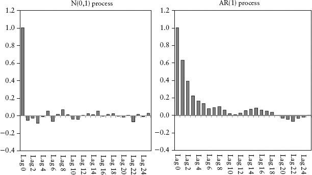
This autocorrelation can be estimated using equation (2.15) but on samples (y1, . . . , yt) and (y1−k, . . . , yt−k) instead. The plot of autocorrelation for various lags is called the autocorrelation function (ACF) or correlogram. Figure 2.13 is an ACF plot of an N(0,1) process and an AR(1) process described by equation (2.7) with k0 = 0, k1 = 0.7. We will discuss AR(p) processes next, but for now notice that the ACF plot shows significant autocorrelation for various k lags, which tapers off as k increases. This compares to the Gaussian process, which has no serial correlation—its ACF fluctuates near zero for all k. The ACF is a practical way to detect serial correlation for a time series. See Spreadsheet 2.4.
FIGURE 2.13 ACF Plot for N(0,1) Process and AR(1) Process, with Up to 25 Lags
The autoregressive model AR(p) for time series variable X is described by:
where p is a positive integer, k’s are constant coefficients and εt is an i.i.d. random sequence. Clearly AR(p) models are non-i.i.d. (they are past dependent).
It is instructive to use the AR(1), equation (2.7), to clarify some important concepts learned previously:
In short, i.i.d., stationarity and serial correlation are related yet distinct ideas. Only under certain conditions, does one lead to another.
Regression is a basic tool in time series modeling to find and to quantify relationships between variables. This has many applications in finance, for example, a trader may form his trading view from the analysis of relationships between stocks and bonds, an economist may need to find relationships between the dollar and various macroeconomic data, an interest rate hedger may need to find relationships between one section of the yield curve against another.
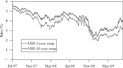
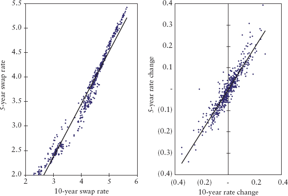
The modeler starts by specifying (guessing) some relationship between the variables based on his knowledge of the markets or by visual study of chart patterns. For example, our interest rate hedger may look at Figure 2.14 and conclude that there is an obvious relationship between the USD 5-year swap rate and 10-year swap rate. A reasonable guess is to assume a linear relationship of the form:
where Yt and Xt are the two random variables representing 5-year and 10-year swap rates respectively. εt is a residual error term that captures all other (unknown) effects not explained by the chosen variables. α and β are constant parameters that need to be estimated from data. The method of estimation is called ordinary least squares (OLS). If εt is a white noise (i.i.d.) series, then the OLS method produces consistent estimates. People often mistakenly model the level price rather than the change in prices. If one models the price, the residual error εt is often found to be serially correlated.7 This means the OLS method will produce inconsistent (biased) estimates. To illustrate, we will do both regressions—one where data samples {yi}, {xi} are levels, the other where they represent changes.
Start by drawing a scatter plot as in Figure 2.15—the more the data concentrate along a straight line, the stronger the regression relationship. Conceptually, OLS works by estimating the parameters α and β that will minimize the residual sum squares (RSS) given by:
FIGURE 2.15 Scatter Plots of Prices and Price Changes
where xi, yi are the ith observation. Intuitively, OLS is a fitting method that draws the best straight line that represents all data points by minimizing the residual distances (squared and summed) between the estimated line  and all the observed points yi. Linear regression can easily be performed by Excel. From the toolbar, select: Tools → Data Analysis → Regression.
The estimated parameters are shown in Table 2.1. The β that represents the slope of the line is close to 1 for both cases. The α is the intercept of the line with the vertical axis. The R-square that ranges from 0 to 1 measures the goodness of fit. R-square of 0.9 means 90% of the variability in Y is explained linearly by X. The Excel functions are SLOPE(.), INTERCEPT(.), and RSQ(.) respectively.
TABLE 2.1 Linear Regression Results
| Using Price | Using Price Change | |
| Beta | 1.079 | 0.987 |
| Alpha | −0.858 | −0.001 |
| R-square | 0.966 | 0.866 |
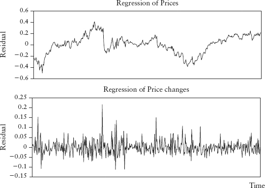
Figure 2.16 shows that if we model using level prices, the residual series does not behave like white noise, unlike the second case where we model using price changes. We can use an ACF plot on the residuals to prove that the first has serial autocorrelation and the second is stationary.
FIGURE 2.16 Residual Time Series Plots
It is worth noting:
We next look at how statisticians measure the precision of their models and express this in the form of statistical significance. So when we say a hypothesis (or whatever we defined to be measured) has a 95% confidence level that means we have chosen an error range around the expected value such that only 5% of observations fall outside this range. Clearly the tighter the range, the higher the precision.
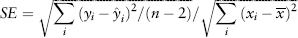
The t-ratio is the basic metric of significance for OLS regression. Consider again equation (2.21)—a simple two variable linear regression. First, we compute the standard error (SE) for the coefficient β defined by:
where  i is the estimate of y at the ith observation and is the sample mean of x. Then the t-ratio is defined by:
This measures how far away the slope is from showing no linear dependence (β = 0) in units of standard error. Clearly, the larger the t-ratio the more significant is the linear relationship. The t-ratios can be calculated by the Excel regression tool.
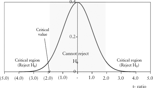
To determine how good the t-ratio is, we need to state the null hypothesis (H0) and an alternative hypothesis (H1).
If the regression relationship is significant, the slope will not equal zero; that is, we hope to reject H0. We assume the t-ratio is distributed like the student-t distribution centered about H0. The student-t is fatter than the normal distribution. But for large samples, the student-t approaches the standard normal N(0,1) distribution, and we assume this case. We need to see if the estimated t-ratio is larger than some critical value (CV) defined on a chosen confidence level p of the distribution. In Excel, the CV is given by NORMSINV(p).
For example, suppose we choose 95% confidence level8 for a two-tail test, then at the left side tail, the CV = NORMSINV(0.025) = −1.96. Suppose the t–ratio of our regression works out to be −7.0, that is, falls in the critical region (see Figure 2.17), then we can reject the null hypothesis H0, and our regression is significant. On the other hand, if the t-ratio is −1.3, then we cannot reject H0, and we have to think of another model.
FIGURE 2.17 Rejecting and Not Rejecting the Null Hypothesis
Note that statisticians will never say accept the null hypothesis. A null hypothesis is never proven by such methods, as the absence of evidence against the null hypothesis does not confirm it. As an example, consider a series of five coin flips. If the outcome turns out to be five heads, an observer will be tempted to form the opinion (the null hypothesis) that the coin is an unfair two-headed coin. Statistically, we can say we cannot reject the null hypothesis. We cannot accept the null hypothesis, since a series of five heads can occur from random chance alone. So likewise if we model financial time series using a chosen fat tail distribution (say the Laplace distribution), we cannot say we accept that distribution as the true distribution, even if the statistical test is highly significant. Perhaps there may be other distributions that fit the data better.
In statistics literature, there are many significance tests of stationarity, also called unit root tests. Here, we will only discuss the augmented Dickey-Fuller test, or ADF(q) test developed by Dickey and Fuller (1981). This test is based on the regression equation:
where ΔX is the first difference of X, q is the number of lags, εt is the residual, and α, β, δs are coefficients. The test statistic is the t-ratio for the coefficient β. The null hypothesis is for β = 0 versus a one-sided alternative hypothesis β < 0. If the null hypothesis is rejected, then X is stationary. The critical values depend on q and are shown in Table 2.2 for a sample size between 500 and 600.
TABLE 2.2 Critical Values of ADF Test
| Number of Lags, q | Significance Level | |
| 1% | 5% | |
| 1 | −3.43 | −2.86 |
| 2 | −3.90 | −3.34 |
| 3 | −4.30 | −3.74 |
| 4 | −4.65 | −4.10 |
Equation (2.25) can easily be implemented in Excel for up to 16 lags if needed. We shall see an example of ADF test in Section 2.10.
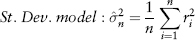
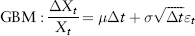
In modern risk management the basic unit of risk is measured as volatility. Risk measures such as notional, sensitivity, and others (see Section 1.1) fall short because they cannot be compared consistently across all products. It is instructive to compare four well-known models of volatility—standard deviation, EWMA, ARCH, and GARCH.
Assuming we have a rolling window of n days with price data p1, . . . , pn, if volatility is constant or varying slowly, we can estimate the nth day volatility by:
where ri is the observed percentage return (pi − pi−1)/pi−1 or log return ln(pi/pi−1). Note that equation (2.26) is just the variance equation (2.3) but with zero mean. Therefore, volatility  (normally written without the subscript n) is simply the standard deviation of returns. In Excel function, is given by STDEV(.).
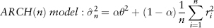
But in financial markets, volatility is known to change with time, often rapidly. The first time-varying model, the Autoregressive Conditional Heteroscedasticity (ARCH) model was pioneered by Engle (1982).
In some sense, equation (2.27) is an extension of equation (2.26) which incorporates mean reversion about a constant long-run volatility θ where α is the weight assigned to this long-run volatility term. Unfortunately, these first two models have an undesirable “plateau” effect as a result of giving equal weights 1/n to each observation. This effect kicks in whenever a large return observation drops off the rolling window as the window moves forward in time, as shown in Figure 2.19.
FIGURE 2.19 Behavior of Four Volatility Models and the Plateau Effect
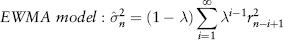
To overcome this problem, different weights should be assigned to each observation; logically, more recent observations (being more representative of the present) should be weighted more. Such models are called conditional variance since volatility is now conditional on information at past times. The time ordering of the returns matters in the calculation. In contrast, for the standard deviation model, the return distribution is assumed to be static. Hence, its variance is constant or unconditional, and equal weights can be used for every observation. A common scheme is the so-called exponentially weighted moving average (EWMA) method promoted by J.P. Morgan’s RiskMetrics (1994).
The decay factor λ (an input parameter) must be larger than 0 and less than 1. Equation (2.28) can be simplified to an iterative formula which can be easily implemented in Excel:
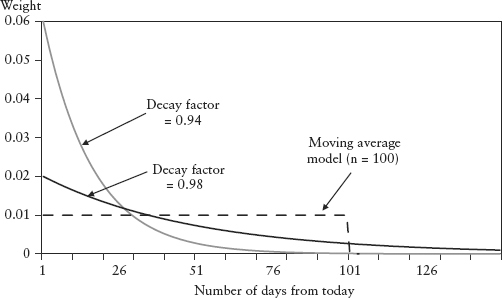
Figure 2.18 shows the EWMA weights for past observations. The larger the λ, the slower the weights decay. Gradually falling weights solve the plateau problem because any (large) return that is exiting the rolling window will have a very tiny weight assigned to it. For a one-day forecast horizon, RiskMetrics proposed a decay factor of 0.94.
FIGURE 2.18 EWMA Weights of Past Observations
Bollerslev (1986) proposed a useful extension of ARCH called Generalized Autoregressive Conditional Heteroscedasticity (GARCH). There is a whole class of models under GARCH, and one simple example of a GARCH model is:
Simple GARCH:
Compared to equation (2.29) it looks like an extension of the EWMA model to include mean reversion about a constant long-term mean volatility θ, which needs to be estimated separately. In fact, the EWMA is the simplest example of a GARCH model with only one parameter. When the weight α = 0, GARCH becomes the EWMA model.
Figure 2.19 graphs all four models for the same simulated time series. We set α = 0.4, λ = 0.99 and θ = 0.02. We simulated a 10% (large) return on a particular day, halfway in the time series. We can see this caused the artificial plateau effect for the standard deviation and ARCH models. There is no plateau effect for the EWMA and GARCH models. This implementation is in Spreadsheet 2.5.
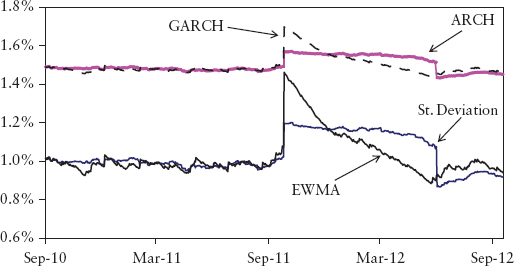
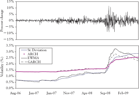
The main advantage of GARCH is it can account for volatility clustering observed in financial markets. This phenomenon refers to the observation, as noted by Mandelbrot (1963), that “large changes tend to be followed by large changes, of either sign, and small changes tend to be followed by small changes.” A quantitative manifestation of this is that absolute returns show a positive and slowly decaying ACF even though returns themselves are not autocorrelated. Figure 2.20 shows volatility clustering observed in the S&P 500 index during the credit crisis. The upper panel shows that the price return bunches together during late 2008. This is captured by GARCH and EWMA, which showed a peak in volatility that tapers off thereafter (lower panel). The standard deviation and ARCH models registered the rise in risk but not the clustering.
FIGURE 2.20 Modeling Volatility Clustering for the S&P 500 Index
Another good feature is that ARCH and GARCH can produce fatter tails than the normal distribution. Unfortunately, they cannot explain the leverage effect (asymmetry) observed in the market, where volatility tends to be higher during a sell-off compared to that during a rally. The exponential GARCH model (EGARCH) by Nelson (1991) allows for this asymmetric effect between positive and negative asset returns.
Note that what we have calculated so far is the volatility for today (the nth day). In risk management, we are actually interested in forecasting the next day’s volatility. It can be shown that for standard deviation and the EWMA model, the expected future variance is the same as today’s. Taking expectations of equation (2.29):

where
This is not strictly true for the ARCH and GARCH models because of the presence of mean-reversion toward the long-term volatility. Depending on whether the current volatility is above or below the long-term volatility, tomorrow’s volatility will fall or rise slightly. However, for a one-day forecast the effect is so tiny that equation (2.31) can still be applied.
The key lesson from this section is that a different choice of method and parameters will produce materially different risk measurements (see Figure 2.19). This is unnerving. What then is the “true” volatility (risk)? Does it really exist? Some believe the implied volatility backed out from option markets can represent real volatility but this runs into its own set of problems. Firstly, not all assets have tradable options, which naturally limit risk management coverage. Secondly, there is the volatility smile where one asset has different volatilities depending on the strike of its options (so which one?). Mathematically, this reflects the fact that asset returns are not normally distributed, which gives rise to the third problem—such implied volatility cannot be used in the Markowitz portfolio framework (explained in the next section).
The current best practice in banks is to use standard deviation or EWMA volatility because of its practical simplicity. These measures are well understood and commonly used in various trades and industries.
Modern portfolio theory was founded by Harry Markowitz (see Markowitz 1952). The Nobel Prize for Economics was eventually awarded in 1990 for this seminal work. The theory served as the foundation for the research and practice of portfolio optimization, diversification, and risk management.
Its basic assumption is that investors are risk-averse (assumption 1)—given two assets, A and B with the same returns, investors will prefer the asset with lower risk. Equally, investors will take on more risk only for higher return. So what is the portfolio composition that will give the best risk-return tradeoff? This is an optimization problem. To answer that question, Markowitz further assumed that investors will only consider the first two moments—mean (expected return) and variance—for their decision making (assumption 2), and the distributions of returns are jointly normal (assumption 3). Investors are indifferent to other characteristics of the distribution such as skew and kurtosis. The Markowitz mean-variance framework makes use of linear correlation to account for dependency, valid for normal distributions.
However, behavioral finance has found evidence that investors are not always rational; that is, not risk-averse. Assumption 2 is challenged by the observation that skew is often priced into the market as evident in the so-called volatility smile of option markets. So investors do consider skewness. There is also empirical evidence that asset prices do not follow the normal distribution during stressful periods. Moreover, distributions are seldom normal for credit markets or when there are options in the portfolio. Despite the weak assumptions, the mean-variance framework is well-accepted because of its practical simplicity.
In the mean-variance framework, the expected return of a portfolio μp is given by the weighted sum of the expected returns of individual assets μi.
where the weights ωi are the asset allocations such that Σωi = 1. The portfolio variance is given by:
where the correlation ρij = 1 when i = j. If there are n assets then i, j = 1, . . . , n.
The incorporation of correlation into equation (2.33) leads to the idea of diversification. An investor can reduce portfolio risk simply by holding combinations of assets that are not perfectly positively correlated, or better, negatively correlated. To see the effects of diversification, consider a portfolio with just two assets a, b. Equation (2.33) then becomes:
As long as the assets are not perfectly correlated (ρab < 1) then:
The risk (volatility) of the portfolio is always less than the sum of the risk of its components. Merging portfolios should not increase risks; conversely splitting portfolios should not decrease risk. This desirable property called subadditivity is generally true for standard deviation regardless of distribution.
For the purpose of mathematical manipulation, it is convenient to write the list of correlation pairs in the form of a matrix, the correlation matrix. Then basic matrix algebra can be applied to solve equations efficiently. Excel has a simple tool that generates the correlation matrix (Tools → Data analysis → Correlation) and some functions to do matrix algebra.
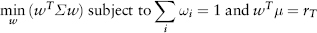
The problem of finding the optimal asset allocation is called the Markowitz problem. The optimization problem can be stated in matrix form:
where w is the column vector of weights ωi, μ is the vector of investor’s expected returns, μi, rT the targeted portfolio return, σ the covariance matrix derived using equation (2.15). We need to find the weights w that minimize the portfolio variance subject to constraints on expected returns and portfolio target return. Spreadsheet 2.6 is an example of portfolio optimization with four assets performed using Excel Solver.
The key weakness of the classical Markowitz problem is that the expected returns and target are all assumed inputs (guesswork)—they are not random variables that are amenable to statistical estimation. The only concrete input is the covariance matrix, which can be statistically estimated from time series. It is found that the optimization result (weights) is unstable and very sensitive to return assumptions. This could lead to slippage losses when the portfolio is rebalanced too frequently. The Markowitz theory has evolved over the years to handle weaknesses in the original version, but that is outside the scope of this book.
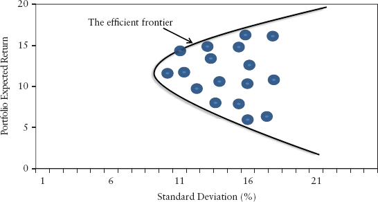
Imagine a universe of stocks available for investment and we have to select a portfolio of stocks by choosing different weights for each stock. Each combination of assets will have its own risk-return characteristics and can be represented as a point in the risk/return space (see Figure 2.21). It can be shown that if we use equation (2.36) to determine our choice of assets, these optimal portfolios will lie on a hyperbola. The upper half of this hyperbola is preferable to the rest of the curve and is called the efficient frontier. Along this frontier, risky portfolios have the lowest risk for a given level of return. The heart of portfolio management is to rebalance the weights dynamically so that a portfolio is always located on the efficient frontier.
FIGURE 2.21 The Efficient Frontier
It is also convenient to express the risk of an individual asset relative to its market benchmark index. This is called the beta approach, commonly used for equities. It is reasonable to assume a linear relationship given by the regression:
where Ri is the return variable for asset i and RM is the return of the market index at time t, αi is a constant drift for asset i. εi(t) is an i.i.d. residual random variable specific to the i th asset; this idiosyncratic risk is assumed to be uncorrelated to the index. The beta βi, also called the hedge ratio, is the sensitivity of the asset to a unit change in the market index. Thus, in the beta model, an asset return is broken down into a systematic component and an idiosyncratic component. The parameters can be estimated using the Excel regression tool.
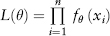
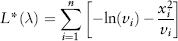
Maximum likelihood estimation (MLE) is a popular statistical method used for fitting a statistical model to data and estimating the model’s parameters. Suppose we have a sample of observations x1, x2, . . . , xn which are assumed to be drawn from a known distribution with PDF given by fθ(x) with parameter θ (where θ can also be a vector). The question is: What is the model parameter θ such that we obtain the maximum likelihood (or probability) of drawing from the distribution, the same sample as the observed sample?
If we assume the draws are all i.i.d. then their probabilities fθ(.) are multiplicative. Thus, we need to find θ that maximizes the likelihood function:
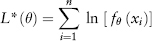
Since the log function is a monotonic function (i.e., perpetually increasing), maximizing L(θ) is equivalent to maximizing ln(L(θ)). In fact, it is easier to maximize the log-likelihood function:
because it is easier to deal with a summation series than a multiplicative series.
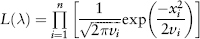
As an example, we will use MLE to estimate the decay factor λ of the EWMA volatility model (see Section 2.7). We assume the PDF fθ(x) is normal as given by equation (2.12). Then, the likelihood function is given by:
where the variance νi = νi(λ) is calculated using the EWMA model. Taking logs, we can simplify to the following log-likelihood function (ignoring the constant term and multiplicative factor):
The conditional variance νi(λ) = σi2 on day i is estimated iteratively using equation (2.29). After that, the objective L*(λ) can be maximized using Excel Solver to solve for parameter λ. Spreadsheet 2.7 illustrates how this can be done for Dow Jones index data. The optimal decay factor works out to be  = 0.94 as was estimated and proposed by RiskMetrics. The weakness of the MLE method is that it assumes the functional form of the PDF is known. This is seldom true in financial markets.
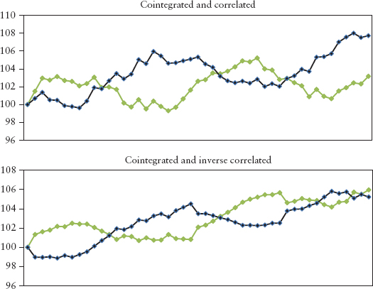
Cointegration analysis tests whether there is a long-run equilibrium relationship between two time series. Hence, if two stocks are cointegrated they have the tendency to gravitate toward a common equilibrium path in the long-run, that is, short-term deviation will be corrected. Hence, cointegration has found popular application in the area of pair trading (statistical arbitrage) where a trader will buy one security and short another security, betting that the securities will mean revert towards each other. This idea is also used by index-tracking funds where a portfolio of stocks is designed to track the performance of a chosen index.
Cointegration and correlation are very different ideas. Correlated stocks rise and fall in synchrony, whereas cointegrated stocks will not wander off from each other for very long without reverting back to some long-term spread. Figure 2.22 shows the difference between the two ideas.
FIGURE 2.22 Cointegration and Correlation
In the 1980s many economists simply used regression on level prices, which ran into the problem of serial correlation of residuals. This means the OLS estimation is not consistent and the correlation relationship may be spurious. Engle and Granger (1987) formalized the cointegration approach and spelled out the necessary conditions for OLS regression to be applied to level prices (nonstationary data).
A time series is said to be integrated of order p written I(p) if we can obtain a stationary series by differencing p times (but no less). Most financial market time series are found to be I(1). A stationary time series is a special case of I(0). Suppose X1, X2, . . . , Xn are integrated prices (or log prices), then these variables are cointegrated if a linear combination of them produces a stationary time series. This can be formalized using the Engle-Granger regression:
The Engle-Granger test is for the residuals ε(t) to be stationary or I(0). If affirmative, then X1, X2, . . . , Xn are said to be cointegrated. Only in this situation, OLS regression can be applied to these random variables.
The coefficients a1, . . . , an can be estimated using the OLS method. The problem with the Engle-Granger regression is that the coefficients obviously depend on which variable you choose as the dependent variable (i.e., as X1). Hence, the estimates are not unique—there can be n−1 sets of coefficients. This is not a problem for n = 2, which is mostly the case for financial applications.
A more advanced cointegration test that does not have such weakness is the Johansen method (1988). Once a cointegration relationship has been established, various models can be used to determine the degree of deviation from equilibrium and the strength of subsequent corrections. For further reading, see Alexander (2008).
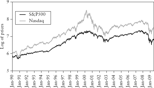
There are many examples of securities in the market that show highly visible correlation when plotted, but no cointegration when tested. Figure 2.23 shows the chart of Dow Jones index vs. Nasdaq index—both I(1) time series. The correlation of their log returns over the period Jan 1990 to Jun 2009 is 0.86. Using the Engle-Granger regression test, we can show that the two indices are not cointegrated. The worked-out example in Spreadsheet 2.8 also shows how the augmented Dickey-Fuller stationarity test can be performed in Excel.
FIGURE 2.23 Dow Jones versus Nasdaq (in log scale)
On the other hand, empirical research has found that different points on the same yield curve are often cointegrated. Pair trading, for example, thrives on searching for cointegrated pairs of stocks, typically from the same industry sector. Cointegrated systems are almost always tied together by common underlying dynamics.
Monte Carlo (MC) simulation is a numerical algorithm that is used extensively in finance for derivatives pricing and VaR calculation. The method involves the generation of large samples of random numbers repeatedly drawn from some known distribution. With the advent of powerful computers this method of brute force became popular because of its intuitive and flexible nature. Furthermore, the simulation method is a useful visualization device for the modeler to gain a deeper understanding of the behavior of the model. In actual implementation, the MC simulation is generally coded in more efficient languages such as C++ and R. But for reasons of pedagogy, examples here will be implemented in Excel.
In simulating a path for a time series Xt where t = 1, . . . , n, a random variable εt needs to be generated by the computer to represent the stochastic change element. This change is then used to evolve the price (or return) Xt to its value Xt+1 in the next time step. This is repeated n times until the whole path is generated. The stochastic element represents the price impact due to the arrival of new information to the market. If the market is efficient, it is reasonable to assume εt is an i.i.d. white noise.
Excel has a random generator RAND() that draws a real number between 0 and 1 with equal probability. This is called the uniform distribution. The i.i.d. random variable is typically modeled using the standard normal N(0, 1) for convenience. We can get this number easily from the following inverse transformation NORMSINV(RAND()). This is the inverse function of the normal CDF. Essentially Excel goes to the CDF (see Figure 2.6), reference the probability as chosen by RAND() on the vertical axis, and finds the corresponding horizontal axis value. Pressing the F9 (calculate) button in Excel will regenerate all the random numbers given by RAND().
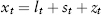
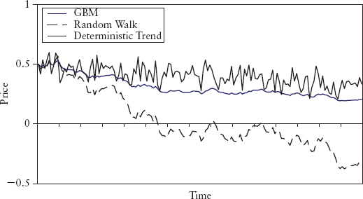
In general, there are two classes of time series processes that are fundamentally different—stochastic trend processes and deterministic trend processes. A stochastic trend process is one where the trend itself is also random. In other words (Xt − Xt−1) shows a stationary randomness. One example is the so-called random walk with drift process given by:
where the constant μ is the drift, εt is i.i.d. Clearly this is an I(1) process as the first difference will produce μ + εt, which is an I(0) stationary process. We call such a process stochastic trend. Another example is the geometric Brownian motion (GBM) process:9
where the constant μ is the annualized drift, σ the annualized volatility, εt ∼ N(0,1) and ΔXt = Xt − Xt−1. The time step is in units of years, so for one day step, Δt = 1/250. Hence, in GBM, we simulate the percentage changes in price; we can then construct the price series itself iteratively.
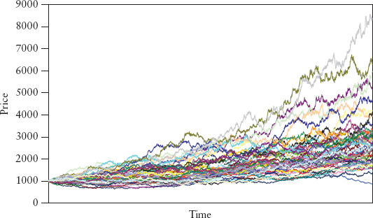
The GBM process is commonly used for derivatives pricing and VaR calculation because it describes the motion of stock prices quite well. In particular, negative prices are not allowed because the resulting prices are lognormally distributed. A random variable Xt is said to follow a lognormal distribution if its log return, ln(Xt/Xt−1) is normally distributed. Figure 2.24 shows simulated GBM paths using σ = 10%, μ = 5%. The larger μ is, the larger the upward drift, the larger σ is, the larger the dispersion of paths.
FIGURE 2.24 Geometric Brownian Motion of 50 Simulated Paths
The other process is the deterministic trend process, where the trend is fixed, only the fluctuations are random. It is an “I(0)+trend” process, and one simple form is:
where α is a constant, μ is the drift, and εt is i.i.d. (α + εt) is I(0) and μt is the trend.
Figure 2.25 shows a comparison of the three processes generated using −30% drift and 50% volatility. Although not obvious from the chart, the I(1) and I(0) + trend processes are fundamentally different, and this will determine the correct method used to detrend them (see next section). It is instructive to experiment with the processes in Excel (see Spreadsheet 2.9).
FIGURE 2.25 Stochastic Trend versus Deterministic Trend Processes
As we shall see in Monte Carlo simulation VaR (Chapter 4), we will need to simulate returns for many assets that are correlated. The dependence structure of the portfolio of assets is contained in the correlation matrix. To generate random numbers that are correlated, the correlation matrix σ needs to be decomposed into the Cholesky matrix L. L is a lower triangular matrix (i.e., entries above the diagonal are all zero) with positive diagonal entries, such that LLT = σ where LT is the transpose of L.
We coded this function as cholesky(.) in Excel, that is, L = cholesky(σ). The code is explained in the reference book by Wilmott (2007).10 Let’s say we have n assets; first, we compute L (n-by-n matrix). Secondly, an n-vector of random numbers {ε1(t), . . . , εn(t)} is sampled from an i.i.d. N(0, 1) distribution. This column vector is denoted ε(t). Finally, the n-column-vector of correlated random numbers r(t) can be computed by simple matrix multiplication: r(t) = Lε(t). For example, to generate n correlated time series of T days, perform the above calculations for t = 1, 2, . . . , T. In Excel function notation, this is written as r = MMULT(L, ε). If the vectors are rows instead, the Excel function is written in a transposed form: r = TRANSPOSE(MMULT(L,TRANSPOSE(ε))). Correlated random numbers are generated in Spreadsheet 2.10.
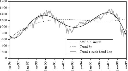
The study of financial market cycles is of paramount importance to policy makers, economists, and the trading community. Clearly being able to forecast where we are in the business cycle can bring great fortunes to a trader or allow the regulator to legislate preemptive policies to cool a bubbling economy. It is the million dollar question. This area of research is far from established as endeavors of such economic impact are, by nature, often elusive.
Actual time series observed in markets are seldom stationary—they exhibit trends and cycles. The problem is that statistical estimation methods are mostly designed to handle stationary data. Hence, in time series analysis, we need to decompose the data so that we obtain something stationary to work with. Figure 2.26 illustrates a stylized time series decomposition. The classical decomposition breaks an observed price series xt (t = 1, 2, . . .) into three additive components:
FIGURE 2.26 Stylized Classical Decomposition
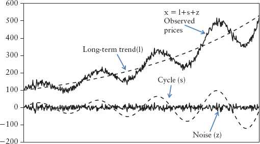
where lt is the long-term trend, st the cycle (or seasonality), and zt the noise (or irregular) component. Of the three components, zt is assumed to be stationary and i.i.d. There is an abundance of research in this area of seasonal decomposition; for a reference book, read Ghysels and Osborn (2001).
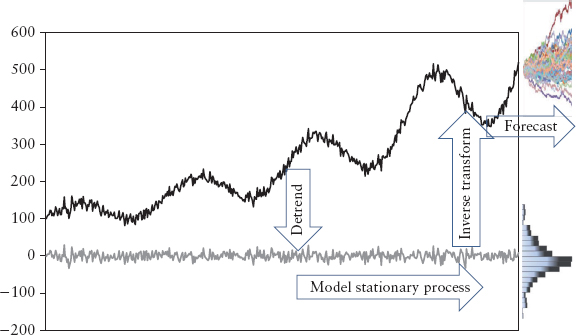
A general approach to time series analysis follows these steps:
This is illustrated in Figure 2.27.
FIGURE 2.27 Time Series Forecast Approach
There are many ways to detrend the data in step 2. If the times series is a stochastic trend process then the correct approach is to take differences. There is considerable evidence that suggests most financial market prices are I(1) stochastic trend processes.
On the other hand, if the data is a deterministic trend—“I(0)+trend” process, then the correct approach is to take the deviation from a fitted trend line (the decomposition approach). Note that if we do this to an I(1) process, the resulting deviation from trend line may not be stationary. Nevertheless, this is a common practice among forecasters, and it remains an open debate. Beveridge and Nelson (1981) found that if the trend is defined as the long-run forecast, then decomposition of an I(1) process can lead to a stationary deviation.
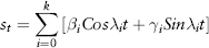
As a typical example, the Berlin procedure, developed by the Federal Statistical Office of Germany, models the long-term trend as a polynomial and the cycle as a Fourier series. It assumes that the stochastic trend follows a highly auto-correlated process such that the realizations will be smooth enough to be approximated using a low-order polynomial (of order p):
The cycle component is assumed to be weakly stationary and changes slowly with time, so that it can be approximated using a finite Fourier series:
We are dealing with 250 daily observations per year, so λ1 = 2π/250 and λi =iλ1 with i = 1, 2, . . . , k are the harmonic waves for λ1. We can use least square minimization11 to estimate the coefficients αi, βi, and γi. Spreadsheet 2.11 shows the decomposition of S&P 500 index daily closing prices using a cubic polynomial (p = 3) and Fourier series (k = 12). The result is shown in Figure 2.28.
FIGURE 2.28 Classical Decomposition of S&P 500 Index
When statisticians speak of forecast, they mean estimating the most statistically likely distribution at a future horizon (typically the next day). While a risk manager will be interested in the four moments of such a distribution and its quantile (the VaR), such forecast of uncertainty (or risk) is of lesser importance to traders who are more concerned about the trend, cycle, and direction of the market. There is a fundamental difference between forecasting distribution and forecasting direction. Statistics is good for distributional forecasts but poor for directional forecasts. The problem is that estimation methods are mostly designed to handle stationary data. During the detrending process, valuable information on trend (or anything other than noise) is lost.
Many analysts and researchers still perform analysis on direction, trends, and cycles using technical analysis and component models, but things become murky once we deal with nonstationary data. We no longer have the law of large numbers on our side, precision is lost, and we can no longer state our results with a high confidence level. Furthermore, the model is not identifiable—for example there are many ways to decompose a time series into its three components.
Table 2.3 compares the two schools of forecasting. In Chapter 13 we will propose a new interpretation of decomposition that will incorporate directional elements into VaR forecasts.
TABLE 2.3 Distributional Forecast versus Directional Forecast
| Type | Distributional Forecast | Directional Forecast |
| Forecast | Distributions, moments, risks, quantiles | Trend, cycles, direction |
| Nature of time series | Stationary | Nonstationary |
| Results | High precision subject to model error | Nonunique solutions |
| Users | Risk managers, statisticians | Traders, economist, analyst, policy makers |
Aside from OLS and MLE methods, another statistical estimation method that is increasingly useful in risk management is the quantile regression model (QRM) introduced by Koenker and Bassett (1978).
The beauty of QRM is that it is model free in the sense that it does not impose any distributional assumptions. The only requirement is i.i.d. In contrast, for OLS estimation, the variables must be jointly normal; otherwise the estimate is biased. Furthermore, OLS only produces an estimate of mean or location of the regression line for the whole sample. It assumes that the regression model being used is appropriate for all data, and thus ignores the possibility of a different degree of skewness and kurtosis at different levels of the independent variable (such as at extreme data points).
But what if there is an internal structure in the population data? For example, the mean salary of the population (as a function of say, age) contains trivial information because there may be some structure in the data that is omitted, such as segmentation into certain salary quantiles based on differences in industry type and income tax bracket. QRM can be used to study these internal structures.
The intuition of QRM is easy to understand if we view quantiles as a solution to an optimization problem. Just as we can define the mean as the solution of the optimization problem of minimizing the sum of residual squares (RSS), the median (or 0.5-quantile) is the solution to minimizing the sum of absolute residuals. Referring to the linear regression equation (2.21), taking its expectation and noting that E(εt) = 0, gives equation (2.49), the conditional mean (i.e., conditional on X):
Conditional mean:
Given a sample, the OLS solution  ,
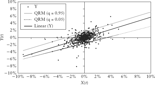
, will provide an estimate Ê (Y|X) shown as the thin (middle) line in Figure 2.29. This best fit line is drawn such that the sum of residual squares above and below the line offset. Likewise, to estimate median, we draw a line such that the sum of absolute residuals above and below the line offset. We can extend this idea to estimate the q-quantile by imposing different weights to the residuals above and below the line. Suppose q = 0.05. We will draw the line such that the 0.05 weighted absolute residuals above the line offset the 0.95 weighted absolute residuals below the line. These are shown in Figure 2.29 for q = 0.05, 0.95.
FIGURE 2.29 Quantile Regression Lines
Mathematically, the quantile regression line (for a chosen q) can be found by minimizing the weighted equation (2.50) and estimating α and β
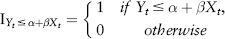
where the indicator function I(.) is given by:
The newly estimated coefficients , depend on the choice of q (a different q leads to a line with a different slope β and intercept α). Note that they are not parameter estimates for the linear regression (2.21) but rather for the (linear) quantile regression model:
Conditional quantile:
where F−1(.) represents the quantile function; recall a quantile is just the inverse CDF (see Section 2.3). So the conditional q-quantile F−1(q|X) is derived by taking the inverse of F(Y|X); that is, you can get equation (2.51) simply by taking the quantile function of equation (2.21). The last term is nonzero because the i.i.d. error εt does not have zero quantile (even though it has zero mean).
Now, since VaR is nothing but the quantile, then (2.51) basically gives the VaR of Y conditional on another variable X, which could be anything such as GDP, market indices, and so on, or even a function of variables. This conditional VaR is a powerful result and will be exploited in Section 5.3 and Section 12.3. However, QRM is not model free in the sense that we still need to assume (2.51) is linear and also specify what X is.
Spreadsheet 2.12 is a worked-out example of QRM estimation using the Excel Solver. Here, we assume Y are returns of a portfolio, X is the change in some risk sentiment index.12 Hence, the estimated  is the c% confidence level VaR conditional on X (where q = 1−c by convention). In other words, we assume there is some relationship between our portfolio’s VaR and variable X (perhaps we have used X as a market timing tool for the portfolio) and would like to study the tail loss behavior. We then use QRM to estimate the quantile loss (or VaR) at different q for different changes in X.
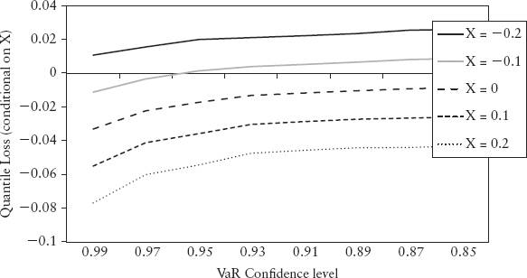
The result is shown in Figure 2.30. Negative return denotes loss. Notice the higher the VaR confidence level, the larger the loss obviously for the same line (i.e., same change in index). But the plot revealed an interesting structure in the tail loss—losses tend to be even higher when the risk sentiment index shows large positive changes (large X). It shows that the index is doing what it is supposed to do—predicting risky sentiment.
FIGURE 2.30 Structure of Quantile Loss Conditional on X
 s and s to calculate the conditional quantile as per equation (2.51) for various X. Plot the results to produce the Figure 2.30.
1. Plight of the Fortune Tellers: Why We Need to Manage Financial Risk Differently by Riccardo Rebonato (2007) challenges the frequentist paradigm and advocates the Bayesian alternative. The book introduces (without using equations) potential use of subjective probability and decision theory in risk management.
2. To be precise, the mean does not depend on t, and the autocovariance COV(Xt, Xt + k) is constant for any time lag k.
3. A finite distribution is one whereby its variance does not go to infinity.
4. Unless mentioned otherwise, in this book we will retain the negative sign for the VaR number to denote loss (or negative P&L), to follow the convention used in most banks.
5. For N-variate joint distribution, imagine an object of N-dimensions that when projected onto any two dimensional plane casts an elliptical shadow.
6. For example, rank (0.5, 0.2, 0.34, −0.23, 0) = (1, 3, 2, 5, 4).
7. Possible exceptions are if the price itself is highly stationary such as the VIX index and implied volatilities observed in option markets.
8. At higher levels, it will be easier to accept the null hypothesis, but there is a risk of accepting a wrong null hypothesis (Type I error). At lower levels, it will be easier to reject the null hypothesis (i.e., our tolerance is more stringent), but there is risk of rejecting a true null hypothesis (Type II error). A 95% confidence level is commonly accepted as a choice that balances the two types of error. Note: Do not confuse this with the VaR’s confidence level, which is just one minus the quantile.
9. The Brownian motion is originally used in physics to describe the random motion of gas particles.
10. The code for Cholesky decomposition is widely available from the Internet and should not distract us from the main discussion here.
11. The actual estimation in the Berlin procedure is more sophisticated than what is described here. For more information, the avid reader can refer to the procedural manual and free application software downloadable from its website www.destatis.de/.
12. Risk sentiment (or risk appetite) indices are created by institutions for market timing (for trading purpose) and are typically made of some average function of VIX, FX option implied volatilities, bond-swap spreads, Treasury yields, and so on. The indicator is supposed to gauge fear or risk perception. Although this has not gone into mainstream risk management, we see it slowly being applied in risks research.