TO START WITH THE OBJECT THAT IS CLOSEST to hand, the laptop with which I wrote these words was bought at an airport branch of Dixons. There is no one or nothing else but me to blame for my choice. Not even what Berger called publicity. Some shops are designed to seduce their customers. Others leave them to make up their own minds.
Dior and Prada hire Pritzker Prize winning architects to build stores on the scale of grand opera to reduce shoppers to an ecstatic consumerist trance. Not Dixons. A generic discount electronics store at Heathrow is no place for the seductions, veiled or unveiled, of the more elaborate forms of retailing. Nor can I ever remember Dixons advertising itself to try to persuade me to enter its doors, even if the companies whose products it sells do. In an airport, there isn’t the space or the time to be charmed or hypnotized, for nuances or irony. Transactions here are of the most brutal kind. There are no window displays. No respectful men in Nehru jackets and electronic ear prosthetics open doors for you. There are no layers of tissue paper wrapping for your purchases, or crisp, unused new banknotes for your change. There is just the inescapable din of a mountain of objects piled high and sold not that cheaply to divert you.
As the waves of economy-class passengers ebb and flow on their way to the 7 a.m. departure for Düsseldorf, a few will browse among the digital cameras and the cellphones, and a few more will pick up a voltage adaptor. Every so often one of them will produce a credit card and buy something, knuckles white as they key in their PIN code for fear they will miss their flight. Consumption here is, on the face of it, the most basic of transactions, shorn of ceremony and elaboration, reduced to its raw essentials. Yet, even in an airport, buying is no simple, rational decision. Like an actor performing without make up, stripped of proscenium arch and footlights, the laptop that eventually persuaded me that I had to have it did it all by itself.
It was a purchase based on a set of seductions and manipulations that was taking place entirely in my head, rather than in physical space. And to understand how the laptop succeeded in making me want it enough to pay to take it away is to understand something about myself, and maybe also a little about the part that design has to play in the modern world. What I certainly did not have uppermost in my mind was that it would be the fifth such machine that I had owned in eight years.
By the time I reached the counter, even if I didn’t know it, I had already consigned my old computer to the electronics street market in Lagos where redundant hard drives go for organ harvesting. Yet my dead laptop was no time expired piece of transistorized, Neolithic technology. In its prime, in the early weeks of 2004, it had presented itself as the most desirable, and most knowing piece of technology that I could ever have wanted. It was a computer that had been reduced to the aesthetic essentials. Just large enough to have a full-size keyboard, it had a distinctive, sparely elegant ratio of width to depth. The shell and the keys were all white. The catch holding down the lid blinked occasionally to show that it guarded a formidable electronic brain even when you weren’t directly engaged with it. Turn the machine over and you could spot lime-green flashes of light tracking across its belly, telling you exactly how much power the lithium battery had left. This was just another decorative flourish with a utilitarian alibi, but it tapped directly into the acquisitiveness vein.
Apple’s designers were quick to understand the need to make starting a computer for the first time as simple as locating the on switch. They have become equally skilled at visual obsolescence.
When I bought my first laptop, in the Apple store in New York in 2003, I really believed that we were going to grow old together. This was going to be an investment in my future, a possession that was so important to me that it would last a lifetime. I knew perfectly well that it was an object manufactured in tens of thousands. Yet somehow it also seemed to be as personal and engaging an acquisition as commissioning a bespoke suit. It turned out to be just one episode in Apple’s transition from scientific equipment to consumer not-very-durables.
Apple takes the view that its route to survival in a world dominated by Bill Gates’s software, and Chinese hardware, is to use design as a lure to turn its products into aspirational alternatives to what its competitors are selling. It expects to sell fewer machines, but it charges more for them. That involves serial seduction. The company has to make most of its customers so hungry for a new product that they will throw away the last one every two years.
The idea that I could so soon be junking something that had so recently seemed to promise so much would once have been inconceivably profligate. But this was exactly the dream of the American marketing pioneers in the 1930s, who had been determined to persuade the world to consume its way out of the Depression. The advertising pioneer Earnest Elmo Calkins coined the term ‘consumer engineering’. He suggested that ‘Goods fall into two classes: those which we use, such as motor cars, and safety razors, and those which we use up, such as toothpaste, or soda biscuits. Consumer engineering must see to it that we use up the kind of goods we now merely use,’ he wrote in Consumer Engineering: A New Technique for Prosperity, published in 1932. Apple has made it happen, just at the moment that the world is beginning to understand that there are limits to its natural resources. It has given the relentless cycle of consumption a fashionable gloss, cynically endorsed by hipsters in black jeans and black T-shirts, rather than corporate suits.
___________
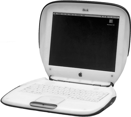
Launched in 1999, Apple’s iBook range came and went in seven years, moving from frivolous citrus fruit to serious-looking black for the MacBook.
The immediate predecessor of the all-white Apple that I used to own was a semi-transparent, citrus-tinted jelly mould that established Jonathan Ive’s name as the Harley Earl of the information age. Earl was the Detroit car designer responsible for elevating tail fins in the 1950s higher and higher every season. He was the creative master of chrome. Ive, the British-born designer who has become as much a part of the Apple identity as Steve Jobs, has done the same with polycarbonate.
My new laptop was an impulse buy, but not that much of one. I knew that I wanted, though I can’t really say needed, a new machine, because the white one, just two years old, had already lost the use of its screen once. Fixing it took an astounding six weeks while Apple sent it to Amsterdam for a new motherboard. If the same thing had happened again it would have cost 60 per cent of the price of buying a new machine, and what came back would have been notably underequipped in comparison with the latest model in the Apple catalogue. I could also still remember that I had been forced to replace two successive keyboards because the letters had rubbed away within weeks, leaving the machine even more minimal than I had bargained for. And so I was in a frame of mind to open my wallet.
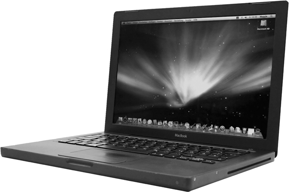
At Heathrow, there were two Apple models to choose from. The first was all white, like my last one. The other was the matt black option. Even though its slightly higher specification made it more expensive, I knew as soon as I saw it that I would end up buying it. The black version looked sleek, technocratic and composed. The purist white one had seemed equally alluring when I bought it, but the black MacBook now seemed so quiet, so dignified and chaste by comparison. The keys are squares with tightly radiused corners, sunk into a tray delicately eroded from the rest of the machine. The effect is of a skilfully carved block of solid, strangely warm, black marble, rather than a lid on top of a box of electronic components.
Black has been used over the years by many other design-conscious manufacturers to suggest seriousness, but it was a new colour for Apple. It is no coincidence that black is the colour of weapons: the embodiment of design shorn of the sell factor. Black is the non-colour, used for scientific instruments that rely on precision rather than fashion to appeal to customers. To have no colour implies that you are doing would-be purchasers the honour of taking them seriously enough not to try fobbing them off with tinsel. Of course this is precisely the most effective kind of seduction. And in the end black too becomes an empty signal, a sign devoid of substance.
No sooner had my new laptop come out of the box than it was clear that, while Apple’s design team, credited on the back of the instruction manual for creating this prodigy, had been clever, they had not been clever enough. They had managed the impressive trick of concealing a preloaded digital camera in the screen. It’s an arrangement that offers the memorable conjuring trick, as you go through the online registration process, of suddenly presenting you with your own image blinking back. But the design team at Cupertino had not addressed the technically less demanding issue of the power cables with the same concentration.
While the machine is black, the cables are white. And so is the transformer, a visually intrusive rectangular box. As is the equally intrusive power plug. There is nothing about this lack of colour coordination that makes the computer work any less fluently, and yet I could feel my sense of disappointment rising as I unwrapped my purchase. How could this portal to the future have such shaky, inconsistent foundations? It felt like discovering Al Gore at the wheel of a Hummer.
What is it about consistency that seems to bestow the authority of logic, rigour and calculation? The origins of the aesthetic vocabulary of the MacBook come at just a few steps removed from the spirit of the Bauhaus that sanctified the geometry of the cube, the sphere and the cone. For the latest generation of its products Apple has borrowed a formal uniform that suggests modernism, integrity and high-minded seriousness (as opposed to the playfulness of all that citrus-fruit-coloured plastic it used to sell). Yet an essential part of that uniform is consistency. Apple couldn’t manage to do something as obvious as match the laptop and the cables, casting doubt on the integrity of the whole conception. A tree has consistency: the outline of its silhouette, the shape of a leaf, the rings on its trunk, the shape of its roots are all formed by the same DNA, and they are all of a piece. And at some level we look for man-made objects to reflect, or mimic, this quality. When they are revealed not to have it, we are disappointed.
Disappointing in a different way is Apple’s introduction of a magnetic latch connecting the machine to its power cable. It certainly stops you from inadvertently bringing the machine crashing to the floor. If you trip over the cable, it comes away with no more than the lightest pressure. But it also means that the power cord and transformer from the previous model, – accessories that had cost a far from negligible £100 as a separately purchased item when I left the first ones behind in a Venetian hotel room – are now utterly redundant.
Even worse, I already knew what the impact of my actually possessing this highly desirable, and desired, object would have on that svelte surface. The very first time it came out of its foamed plastic wrapping, my fingerprints would start to burn indelible marks into its infinitely vulnerable finishes. The trackpad would start to fill up with a film of grease that, as time went on, would take on the quality of a miniature duck pond. Electrostatic build-up would coat the screen with hair and dandruff. The designers, so ingenious and skilful in so many ways, were evidently still unwilling to acknowledge the imperfections of the human body when it comes into contact with the digital world. However, for true believers, there is a way to protect a MacBook. You can buy a film to wrap the machine in a whole body condom to insulate it from all human contact.
Laptops are by no means the only consumer objects to be betrayed by their owners. Simply by using them, we can destroy almost all the things that we persuaded ourselves to love. When it was new, the metal coated plastic body of my mobile phone from Nokia served to suggest that it was the last word in technology. Within a few months, under the constant pressure of my restless fingers, it turned into an unsightly lump of dumb polycarbonate, apparently scarred by the most scabrous of skin diseases as the metallic finish flaked away to reveal grey plastic under the polished surface. And, while its physical shape suggested a genuine attempt to create an object with which you might want to share your waking hours, other aspects of its performance are less engaging. The way that you have to negotiate the sequence of screen based transactions and controls to operate its camera, or reach the Internet, is as awkward as attempting to use its keypad while wearing welder’s gloves.
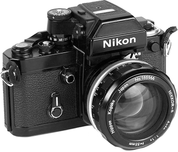
The idea that our possessions reflect the passing of time is hardly a new concept. The traces of life as it is lived once seemed to add authority to an object, like those battered old black Nikons that Vietnam-era war photographers lugged around the killing fields of South East Asia, the shiny logo taped over to avoid the attention of snipers, the heavy brass body showing through the chipped black paint. These were objects to be treated with a certain respect. They were the product of craftsmen, ingenious mechanical contrivances that, at the press of a button, would lift the mirror that allowed you to see through the lens. These were objects with the sheer physical presence to reflect their intelligence and their value. They would last and last, delivering the performance promised by the skill with which opticians had ground their lenses, and the care with which the metallic blades that defined their shutter apertures had been designed. These are not qualities that diminish with the years.
Possessions that stayed with us for decades could be understood as mirroring our own experiences of time passing. Now our relationship with new possessions seems so much emptier. The allure of the product is created and sold on the basis of a look that does not survive physical contact. The bloom of attraction wilts so rapidly that passion is spent almost as soon as the sale is consummated. Desire fades long before an object grows old. Product design has come to resemble a form of plastic surgery, something like a Botox injection to the forehead, suppressing frown lines to create a brief illusion of beauty. It’s only the SIM cards embedded in our phones that have the ability to learn from us, to mark our friendships and our routines through the numbers that we record on them and to make meaningful patterns out of them.
___________
Nikon started making its F series single-lens reflex cameras in 1959. The black body signalled that it was aimed at professionals.
But these, like our Google records, can be the source of well-justified paranoia as much as of comfort.
There is an effective, emotionally manipulative advertising campaign for one particular Swiss watch company whose pitch is that you never actually own one of its products: you just look after it for the next generation. It is an insight into the class-consciousness that is another way to understand the language of objects. Alan Clark’s diaries record an acid description of his fellow Conservative minister Michael Heseltine as looking like the kind of man who had to buy his own furniture. The suggestion was that it was only the vulgar, or the socially unfortunate, who would wish to do anything so crass as to buy a new dining table rather than inherit one. (Curiously, it was Clark’s father, the art historian and former director of the National Gallery Kenneth Clark, who was responsible for Civilisation, the television series and accompanying book that provoked John Berger to riposte with Ways of Seeing.)
While the watch campaign does successfully suggest a certain aura around a product, it does not challenge the essentially fleeting and ever more transient nature of our relationship with our possessions. Until the end of the 1980s, a camera was designed to last a lifetime. A telephone was leased from the government, and built to withstand industrial use. A typewriter was once something that would keep a writer company for an entire career. I still have my father’s portable. Its laminated-cardboard base has come unglued, spilling out from under its black-fabric-covered plywood box. Its keys have rusted together, the bell is stuck, and the tattered ribbon is worn through with multiple imprints from the lower-case e. From a practical point of view it is entirely useless. But I still can’t bear to throw it out, even though I know that someday whoever clears out my own house will face the same dilemma that I did. To discard even a useless object that I don’t look at from one year to the next is somehow to discard part of a life. But to keep it unused is to experience silent reproach every time you open the cupboard door. The same reproach is projected by a wall full of unread books. And once read they ask quietly at first, but then more and more insistently, will we ever read them again?
So many product categories have not just been transformed, they have been entirely eliminated. We have lived through a period that, like the great dinosaur extinctions, has wiped out the beasts that roamed the landscape of the first industrial age. And, in the wake of the extinctions, the evolutionary process has accelerated wildly out of control. Those industrial objects that have survived have a life cycle measured in months, rather than decades. Each new generation is superseded so fast that there is never time to develop a relationship between owner and object.
Just a few of these useless objects re-enter the economic cycle as part of the curious ecology of collecting. But collecting is in itself a very special kind of fetish, perhaps one that is best understood as an attempt to roll back the passing of time. It might also be an attempt to defy the threat of mortality. To collect a sequence of objects is, for a moment at least, to have imposed some sense of order on a universe that doesn’t have any.
Objects are the way in which we measure out the passing of our lives. They are what we use to define ourselves, to signal who we are, and who we are not. Sometimes it is jewellery that takes on this role, at other times it is the furniture that we use in our homes, or the personal possessions that we carry with us, or the clothes that we wear.
And design has become the language with which to shape those objects and to tailor the messages that they carry. The role of the most sophisticated designers today is as much to be storytellers, to make design that speaks in such a way as to convey these messages, as it is to resolve formal and functional problems. They manipulate this language more or less skilfully, or engagingly, to convey the kind of story that my MacBook whispered in my ear at Heathrow.

___________
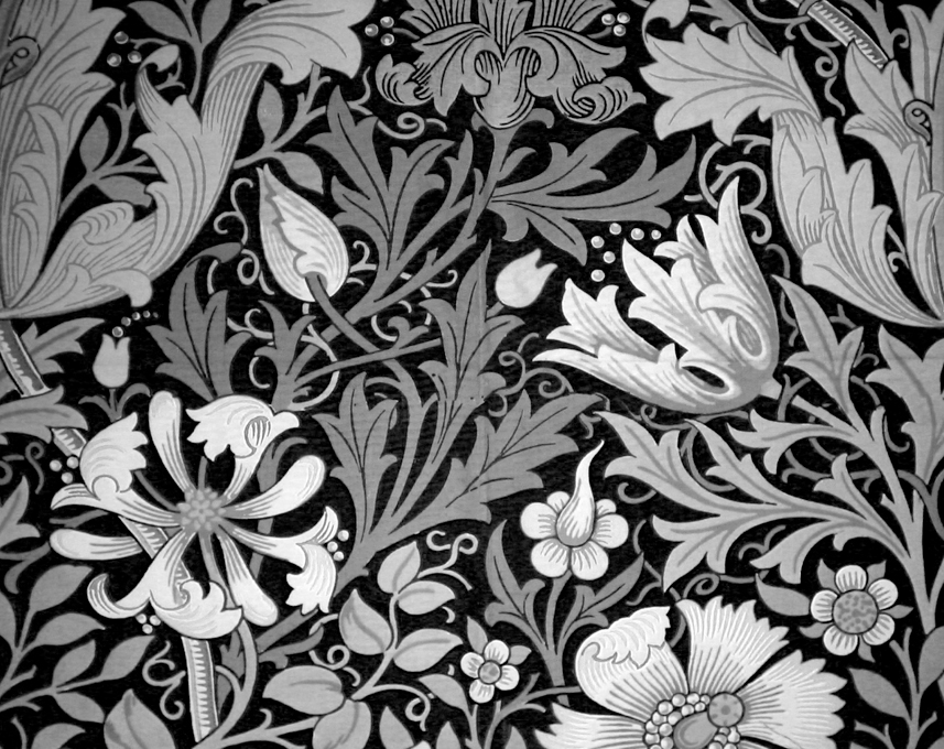
William Morris rejected industrial production and tried to give design a moral dimension by looking back to the Middle Ages for the ornamental patterns derived from nature in his work.
To understand the language of design, we also need to understand how the designer has evolved as a professional. Ever since design emerged as a distinct activity, closely linked to the development of the industrial system towards the end of the eighteenth century, designers have lurched from seeing themselves as social reformers, idealists, profoundly out of sympathy with their times, like William Morris in nineteenth-century England, to become the charismatic snake-oil salesmen led by Raymond Loewy in mid-twentieth-century America. Morris hated the machine age, and tried to find a way to re-create the tradition of the hand crafted object. Loewy once promised to streamline the sales curve.
For Morris, what he saw as the joy of labour was the key to creating meaningful everyday possessions. He wanted to eliminate the ‘lifeless’ mechanically applied decoration of the high Victorians, to replace it with simple, direct forms that both harked back to the Middle Ages and set a marker for the future. As a precocious 17-year-old in 1851, he was taken by his mother to see the Great Exhibition, Prince Albert’s triumphant celebration of the Industrial Revolution. But so stubbornly convinced was Morris that every manifestation of the machine age was not just aesthetically worthless, but an affront to humanity, that he stayed outside. He refused to enter the Crystal Palace, sure that he would find nothing but meretricious rubbish inside. And in a way he was right: Joseph Paxton’s brilliant prefabricated cast-iron and glass structure contained, among many other things, the Venus de Milo carved in butter.
But, despite his progressive social message, Morris later relied on 13-year-old labourers in his carpet factory in Wandsworth. He was not just a revolutionary socialist, he was also a wallpaper designer – a combination that might have been the invention of a satirist. And he found that his decorating business depended on what he himself described as pandering to the swinish luxury of the rich. Morris became a libertarian socialist, a pioneer in the struggle for the emancipation of women and in the movement against colonialism, even as he lived on the income of the mining shares left him by his father.
As an alternative to the view of the world represented by the Crystal Palace, Morris offered a romantic retreat into pre-Raphaelite nostalgia. He loved old buildings, the countryside, Icelandic sagas and traditional ways; he loathed machines, railways, big cities and suburbs. His vision has exercised a powerful influence on the English imagination ever since. Morris’s rural dream has an uncomfortable echo in the tendency of the newly rich to retreat from the city in which they made their money to Wiltshire manor houses, and to react with moral outrage to attempts to build housing estates anywhere near them.
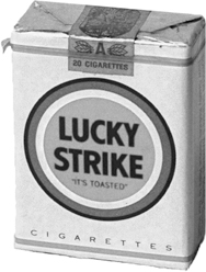
Morris designed beautiful textile and wallpaper patterns that many people still love to use. Raymond Loewy, by contrast, just wanted to help Lucky Strike sell more cigarettes by changing the colour of the packs they came in. Despite his overheated claims to have designed Air Force One for Jack Kennedy, the Coke bottle and NASA’s spacecraft, he started his career in New York after the First World War, a penniless French engineering graduate fresh off the boat, working as a fashion illustrator and window dresser.
Loewy offered a slicker and smoother version of what design could be. He turned cleaners, duplicating machines and pencil sharpeners into glossy fetish objects, used as props to define the modern workplace. He designed some of the most spectacularly beautiful products of his time – in particular his cholesterol-rich streamlined steam locomotives that marked the end of the railway age. But he also constructed an idealized version of his office in the Metropolitan Museum in New York, and hired a publicist to help him get on the cover of the Time magazine. He was a brilliant striker of attitudes for the camera, perched on the footplate of one of ‘his’ locomotives.
___________
Raymond Loewy was perhaps his own greatest creation: the very image of the new breed of designer, in business to streamline the sales curve for anything from locomotives to cigarettes.
Somewhere between these two versions of design is the idea that design is a public service. It’s notable that in Britain one of the first industrial-design practices that emerged in the 1940s called itself the Design Research Unit, a name calculated to suggest that it was a branch of the Welfare State more than any kind of commercial activity, even though it was actually started as the subsidiary of an advertising agency.
Not long before that, wartime Utility furniture ranges designed to government specifications had offered newly married couples and bombed-out families beds and sofas and tables that were a model of rational intelligence. They were also very probably responsible for turning a generation of British consumers against the whole idea of modern design, a phenomenon that had come to be inextricably associated in many peoples’ minds with shortages, deprivation and the condescending imposition of good taste by the privileged elite on their social inferiors.
Following in Loewy’s footsteps today is Philippe Starck. Nobody better encapsulates the contemporary version of the designer as celebrity, capable of transforming anonymous domestic objects with his signature.
For about five minutes in 1984, the most fashionable bar on the most fashionable street in Paris was called the Café Costes. This was in the days when Spandau Ballet were regarded as a serious musical force and turning back the cuffs of your jacket was seen as making a worthwhile fashion statement. It was not the food or the wine list that packed them in at the Café Costes. It was the chance to spend half an hour sitting on a three-legged chair in Starck’s very first interior, waiting for a coffee that never came.
Starck called the look of Café Costes ‘Budapest railway station third-class waiting-room circa 1956’. There was a plunging staircase, a gigantic clock filling most of one wall, and that chair. It had a semi-art-deco, faux mahogany plywood shell, held up on three black steel legs ‘to help the waiters, because it gives them less to trip over’, as Starck put it. Before you could check whether what he said was true, however, Café Costes had faded into an oblivion even sadder than the melancholy of central Europe under Stalin. The fashionable moved on, leaving the chairs to backpackers, and the café soon closed. But it was Café Costes that triggered off the plague of designer kettles, hotels, mineral water, pasta, toothbrushes and all the other useless paraphernalia that now laps around the world, confined for the most part to forgotten drawers and dusty kitchen shelves.
Amazingly, Starck, once the most overexposed designer in the world, who has built a career as much on his own force of personality as on the objects he designs, has not changed. He is still working to the same formula, based on a well-worked decorative palette, surrealistic jumps of scale, cute anthropomorphic styling, and a cloying habit of trying to attach absurdly unpronounceable names to everyday objects. Inviting us to walk into Dixons to ask for a transistor radio named Moa Moa, as he did, is cruelty on a level with Frank Zappa’s when he named his daughter Moon Unit. But, at fifty-something, Starck still has the persona of a small boy, constantly seeking to amuse the grown-ups with his daringly naughty tricks, and still looking over his shoulder for their approval.
And they do approve. The Pompidou Centre, just around the corner from the long-gone Café Costes, staged a Starck retrospective in 2002. The show had all the egotism of mid-period Michael Jackson, when the singer took to floating giant effigies of himself down the major rivers of Europe. Inside a darkened circus tent, Starck positioned a ring of neoclassical laurel-wreathed heads standing on fibreglass plinths 10 feet high, mocked up to look like marble. The heads all had the alarmingly lifelike features of Starck himself, and harangued the darkened room in a simultaneous babble. If that wasn’t incoherent enough, the random sound effects, the snatches of music, and Starck himself bursting into song or dissolving into incoherent yelps as if he were speaking in tongues at a revivalist prayer meeting put the experience beyond the threshold of pain. Groups of spectators pulled up chairs and strained to make sense of the snatches of wisdom from the master’s lips, moving from one graven image to another. It was disturbingly like sitting in on a group-therapy session.
___________
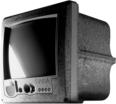
As much a storyteller as anything else, Starck’s way with words got him noticed, along with his enthusiasm for three-legged chairs. His moulded chipboard TV for Thomson brilliantly disrupted the conventional language of consumer electronics.
Starck certainly has a way with words. ‘Ian Schrager asked me to design a $100-a-night hotel room in New York. I was totally into it. For $100 a night in New York, you usually have to sleep with rats.’ And anybody who can design the men’s room in the top-floor restaurant of the Peninsula Hotel in Hong Kong with a glass urinal looking out over the lights of Kowloon is clearly prepared to bite the hand that feeds him enough to be entertaining. You could forgive him his boundless egotism if it wasn’t for the fact that he opened the doors for a generation under the impression that all it takes to be a design genius is an ego and an inability to stop talking. You could even forgive him the cracker-barrel philosophizing if he didn’t still present himself as a breathless iconoclast storming the gates of convention everywhere he goes to liberate us all.
Starck may be under the impression that he is telling us everything about his dreams and our innermost desires in his objects. But he doesn’t tell us that. Try as he might, even his brilliantly conceived retro TV sets, radios and CD players could not improve the fortunes of Thomson, the French state-owned consumer electronics company, which made them. Ultimately Starck has only one trick, and it’s a good one: his childlike view of the world. His motorcycle for Aprilla might have looked cute (in his words, ‘It has the red ears and dripping nose of a real animal’), but it didn’t sell.
The Thomson set that he chose to name Jim Nature showed his real genius in its ability to play with the conventions of product design and the signs that it uses to signal status and price. Instead of encasing the TV in moulded plastic, of more or less sleekness, Starck went back to wood. In the early days of television, the set that occupied the corner of a room, sitting on top of its own stand, perhaps covered with a linen cloth when not in use, would have been finished in a lacquered veneer. Starck used chipboard. It was an extraordinary deconstruction of the language of materials, and the signals of luxury.
There is another view of design, the polar opposite to that represented by Starck. It is the idea that design is concerned with the pursuit of some sort of inner truth and meaning, a view most recently characterized in the person of Dieter Rams. As was William Morris, Rams is driven by a sense of the moral purpose of design, though he does not share Morris’s antipathy towards the machine age.
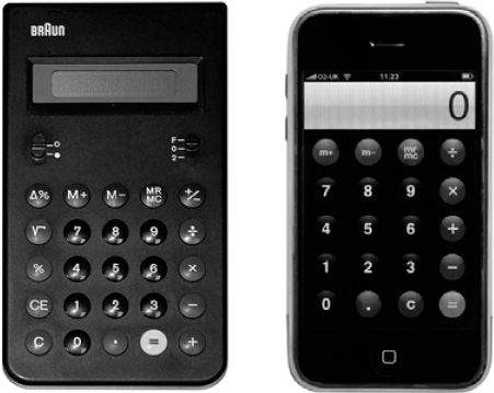
Rams devoted enormous effort and patience to designing perfect objects that could defeat fashion and overcome the passing of time by defying visual redundancy. He dreamed of objects that became timeless by eliminating the superfluous, reflecting intellectual rigour rather than trying too hard to please. Rams made the perfect calculator, with the most carefully considered radiused corners, and the neatest buttons, and the clearest sequence of operating functions. But, with almost unbearable pathos, his most cerebral and high-minded attempt to put design beyond fashion and time ended in the creation of objects with a life expectancy no longer than one of Raymond Loewy’s streamlined steam locomotives. The radio and calculators and record players have each of them been supplanted, not just by newer, younger models, but by entirely new categories of object.
And, in the end, even such an apparently intellectually rigorous designer as Rams is still concerned with what might to an engineer be characterized as superficial styling. Just how innovative is the technology needed to produce an electric shaver after all? Did Rams have a genuine grasp of the developments in recording technology that he housed in Snow White’s coffin, the first Perspex topped domestic record player, which defined the type for two decades? Probably not. But then the physicists and programmers and engineers who between them made the iPod and the MacBook possible for Apple would never have managed to produce a commercially seductive product without Jonathan Ive. And Ive would never have made the MacBook the way it is if Rams had not existed. What Rams did with the Perspex top was to define how audio systems would look right up until the moment when the record was supplanted by the compact disc.
In the end, design cannot be understood by looking only at the world represented by Rams, just as it is not adequately encompassed by the perspective of a Raymond Loewy. Design is about the creation of anonymous mass-produced objects, by people who spend a lot of time worrying about injection moulding, or about the precise degree of curve needed to blunt the sharp edges of a monitor screen. It is also about making objects that feel good to touch and to use.
However, the old definitions of design, and the skills that realizing them demanded, are being marginalized by the rapidly changing nature of objects. The most noticeable change is the way that so many artefacts are converging. There was once a separate category of object known as a telephone, which existed alongside another, entirely separate, category called the camera. And the printer was not the same as the copier or the fax machine. Now a phone and camera, with an MP3 player, a radio and an email communicator, are all subsumed into a single object, as are the printer, the copier and the fax machine.
At the same time, the decline of low-cost manufacturing in the West has transformed the nature of the design process. Ask an industrial designer to ‘design’ a new bike, or a watch, and it will very likely involve a trip to China to select from a hundred different alternatives off the shelf for most of the components, then assembling them in such a way as to give the result a distinct personality. In this context, design is more important than ever, but it is not only about engineering. Or the design of original components.
The argument about the nature of design should not be polarized between style and substance. The surface of things matters, but we also need to be able to understand what lies beneath. Design is no longer based on mechanical models. The typewriter had moving parts that the industrial designer could conceivably impact upon. How many moving parts are there for Jonathan Ive to manipulate? How much is a working knowledge of the laws of thermodynamics going to help in designing a modern consumer electronics product? What the designer is left to deal with is the surface, the appearance, and semantic shades of meaning that allow us to interpret and understand what an object is trying to tell us about itself. These messages range from what an object does, to how much it is worth, to how to switch it on. They are far from trivial issues, but they turn the designer into a storyteller. And, while it is certainly true that design is a language, it is only those who have a convincing story to tell who know how to use that language fluently and effectively.
___________
The restraint of Dieter Rams’s work for Braun was the starting point for the look Jonathan Ive gave Apple products. But while Rams wanted to design objects that would last for ever, the original iPhone was superceded in six months and the calculator interface lost its Braun look.
Contemporary designers in the end must deal with multiple definitions of their purpose. A pair of glasses is both a medical appliance and a fashion accessory. The long associations of spectacles with bookishness are presumably what serve to signify the connotations of maturity that they can confer on their wearers. Glasses are jewellery of a kind: they modify appearance, and so personality. But at the same time we don’t want them to break too easily, or to strain our eyes.
In understanding the language of design, expressed by the shape, colour, texture and imagery of an object, there are constant paradoxes between function and symbolism to be addressed. Certain colours are associated with the male more than the female. Some materials suggest luxury.
The question that is worth asking is, are these actually inherent qualities, or are their meanings acquired through constant repetition, through familiarity and convention, just as road signs still use the pictogram of a steam engine to suggest a level crossing half a century after such machines fell out of common use.
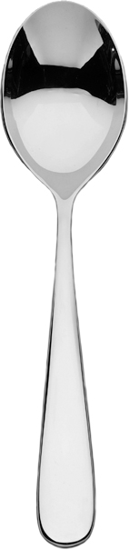
Ernesto Nathan Rogers was an Italian architect, a cousin of Britain’s Richard Rogers, and responsible for Milan’s most distinctive tower of the 1960s, the Torre Velesca. He suggested in an editorial that he wrote for Domus magazine in 1952 that it is possible, from a careful examination of a spoon to understand the kind of city that the society that had produced it would build. Of course he was exaggerating for effect. To judge London on the basis of what you find by shredding the cellophane wrapper on the plastic spoon that comes with the British Airways All Day Deli offering on the flight from Milan to Heathrow would give you a fairly distorted idea about the place. Yet there is still something curiously compelling about his words.
Rogers was talking about the way that Italian architects were able to switch effortlessly from cutlery to skyscrapers without missing a beat. And that is a phenomenon that you see even more of these days, though now it perhaps has more to do with branding – the designer’s signature has come to mean as much as anything more directly useful that they can bring to the project. The extent to which once anonymous, humble but useful designs have been turned into objects that demand to be noticed on the basis of the designer’s signature can be measured by the frequency with which Alessi, or even more strikingly America’s mass-market retailer Target, put postmodern architect Michael Graves’s picture on the box in which his designs are packaged.
Without actually using the word, Rogers was making a powerful argument for the significance of design in the contemporary world. The spoon could be understood as a fragment of genetic code – a code that can grow into any kind of man-made artefact. Traces of the same code can be found in anything that shares the same design roots – a chair, a car, a typeface, even an aircraft, never mind a skyscraper or a city.
The code is partly a reflection of how the object is made, but also of its symbolic meaning.
The issue here is not so much of consistency in the sense of using the same elements, shapes and colours over and over again. What counts is the nature of the thinking, and the methods that are used.
If you question the premise that objects mean anything beyond the utilitarian, just think for a moment about all the emotional content so far beyond legibility that we can read into the minute nuances that shape a typeface and give it a personality. The fact that it’s called a ‘face’ at all is certainly not a coincidence. Type is fully capable of showing the character and personality of the human face.
___________
Examine a spoon carefully and you can understand enough about the society that made it to visualize how they would design a city, claimed Ernesto Rogers.
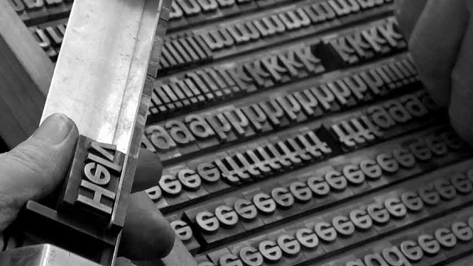
Compare for a moment the message that using Helvetica rather than Gothic for a newspaper headline conveys, and the subtle variations between these two extremes. In the shape and form of a letter we have all the characteristics of an accent. Literally so. I can hear Switzerland when I look at Helvetica. And when the Basque nationalist movement began to establish itself, at the end of the nineteenth century, one of its founders made obsessive transcriptions of the ancient carvings on stones throughout the country to come up with a specifically Basque typography. Partly through association and memory, partly through the emotional triggers and resonances it brings, a typeface expresses an endless range of characteristics, even wider in its scope than handwriting. But, while it takes a graphologist to decode individual signatures, typographic design can communicate on a conscious or unconscious level with everybody, whether aware of the vocabulary of type or not. Send an email in capital letters, and you know that you have raised your voice to a shout. Remember the graphic designer Otl Aicher’s belief that if only Germany had not been so fond of capital letters it would have been less vulnerable to the rise of fascism.
___________
Max Miedinger and Eduard Hoffmann designed Helvetica in 1957 as the personification of Swiss discipline.
Print is self-evidently a means for communicating. Perhaps not quite so self-evidently, the communication is not simply in the formal meanings of the words spelled out by letter forms. How those letters are themselves organized and shaped and designed has come to offer another level of information. The shapes of letters convey levels of meaning that go beyond the literal content of the words themselves. This is sometimes discussed in terms of legibility, as if the only purpose of typography were to make it possible to read a word in any lighting conditions, without any kind of ambiguity. The US highway signage system can be explained in these terms. The upper-and-lower-case rendering of place names in the bold and unambiguous forms of Interstate, as the vernacular signage alphabet in the USA is known, has certain practical tasks to achieve. You need to know in the rain and at 70 miles per hour which turning to take to find your destination. But Interstate is also telling you a whole range of other things. When you see it, you know, without actually needing to read any words, that you are on a freeway. You know that you are in America rather than Britain.
It’s a language that you understand even when it is used for completely different purposes and contexts. A form of Interstate has started to appear in British newspaper headlines, to suggest the dynamic and the contemporary. It’s a graphic device that represents a process comparable with the literary transformation of heroic verse forms to satirical purposes. Or even to the way in which neo-Palladian architects adapted the architectural language of the Veneto to the Anglo-Saxon world, just as Palladio himself had borrowed the forms of ancient Rome. To shrink a font designed for use on signs spanning an eight-lane highway to the size of a tabloid newspaper has the impact of an explosion in a tiny room. Or at least it does the first few times that it is done. After a while the impact wears off. We get used to being dazzled, and our senses recalibrate to adjust to the volume.

___________
Designed to be legible in all weathers and at high speeds on American freeways, Interstate is a typeface that transcends function.
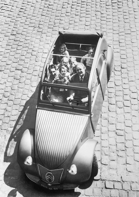
And if graphic design can be a language, then so can other forms of shape making, or form giving. When the great French engineer Pierre Boulanger worked on the Citroën 2CV just before the Second World War, he was not consciously trying to make a car that looked French, though that is what it clearly became – and not just because there were so many 2CVs on the roads of France. The 2CV was designed with the special peculiarities of the French market in mind. It was designed to sell at a price within the reach of French farmers, and built to be robust enough to survive on France’s rural roads in the 1930s. The result was a car whose style reflected those requirements. And it was built with metal forming techniques that reflected the ideas of Jean Prouvé, the quintessentially French engineer architect. Put a 2CV alongside a Volkswagen, designed by Ferdinand Alexander Porsche – with some unwilling help from a Czech engineer, Hans Ledwinka – to show Teutonic industrial prowess in its best light and to populate Hitler’s autobahns, and you knew immediately which was German and which was French.
___________
Pierre Boulanger devised the Citroën 2CV as an affordable workhorse, robust enough for French roads. Early versions came with a single headlamp in the interests of economy.
___________
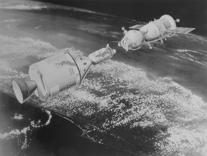
Two objects intended to perform the same tasks, in the same, infinitely challenging conditions, but the Soviet Soyuz and American Apollo space capsules look utterly different, betraying the visual assumptions of their makers.
In the same way you might look at the Soviet and American space capsules that docked in Earth orbit, and which now hang in the Smithsonian Museum in Washington, and see two different national mentalities rendered in physical form. They are two objects designed to do exactly the same thing, in the most extreme of conditions. And yet they look utterly different, and reflect with shattering clarity two utterly different political and economic systems. One looks as sleek as a Harley Earl limousine, the other seems to belong to the world of Jules Verne, of brass portholes and mahogany fittings.
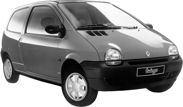
Things have become more self-conscious and knowing since the apparently innocent early days of car design. Patrick LeQuement, working for Renault in the 1980s with a brief to make a car that looked as cute as the family pet, produced the Twingo. He addressed the task by introducing the most obvious of anthropomorphic characteristics: headlamps that look like eyes, and a winning smile for a radiator grille. Indeed, car design in the era of the brand has come closer to a species of selective breeding, like raising sheep and cattle. There was a time when a car designer operated on the basis that nobody had ever designed a car before. Now the designer’s greatest challenge is to ensure that a new Jaguar, or Mini, or Golf, shows all the right family traits, from the wheel arches to the door handles, just as a breeder of pedigree dogs concentrates on giving dachshunds long bodies and short legs.
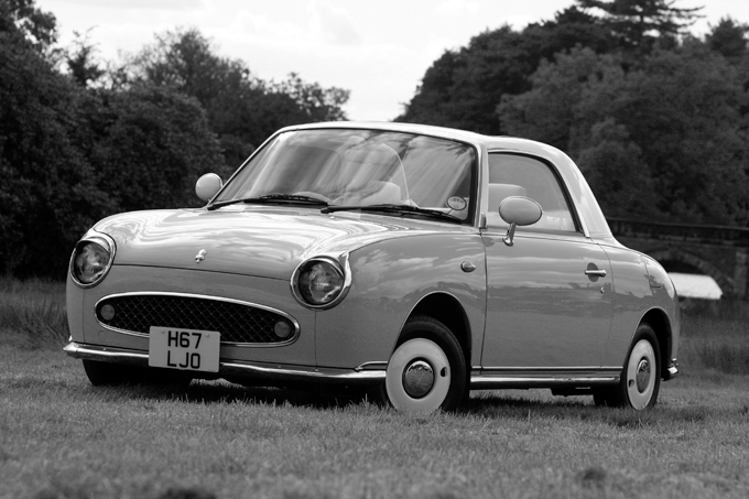
When looking back at the history of the twentieth century, it is hardly controversial to suggest that the most significant piece of car design was the launch, in 1908, of the Model T Ford, which remained in production for the next two decades. But it’s probable that in some ways the Nissan Figaro, first shown at the Tokyo Motor Show in 1989, and of which only 20,000 were ever made, was equally significant – not for mechanical or technical reasons, but because for the first time in the history of automotive design the car was being treated not as a serious piece of technology, but as a toy. And once the genie was out of the bottle it was too late to put it back.
The Figaro made us see cars differently. It was carefully designed to suggest that it belonged to a period sometime between the late 1950s and the early 1960s – its white plastic steering wheel, its dumpy curves, its muddy plastic colours reflected a stitching together of the advertising and cinema images of the period. But the technology under the bodywork was from Nissan’s most modern production lines. This kind of approach reflects the way a fashion collection is put together, starting with a mood board rather than a technical problem. The question becomes how to blend 1940s film noir with punk on a military-style jacket, rather than how to reduce emissions and locate a spare wheel.
___________
The production line for the Model T Ford started up in 1908. The first mass-produced car was certainly an enormously important design. The Nissan Figaro, eighty years later, can be seen as equally significant, even if it was made in tiny numbers (a limited edition of 20,000) and offered nothing technically new. What made the Figaro a landmark was that for the first time a car was self-consciously treated as a toy rather than as a functional object. Renault quickly followed, giving the Twingo its cute, anthropomorphic look.
___________
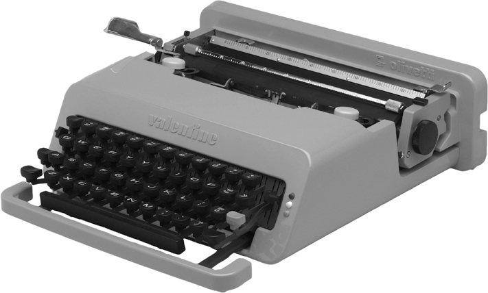
Ettore Sottsass and Perry King transformed the identity of the typewriter from serious, business-like office equipment into a desirable consumer artefact, a trick that Jonathan Ive was to repeat for Apple.
This was not the way that cars had been treated previously. It’s true that Harley Earl had also been playing up the emotional aspects of car design, but in his day the inspirations came from contemporary aircraft, and so appeared to suggest that he was still engaged with the real world, rather than with play. And in the early days cars were much less self-consciously referring to precedent, and much more designed from first principles. The Figaro, on the other hand, was the physical realization of the dream that the advertising image of a car could once have evoked, but never have delivered.
Olivetti made the conceptual leap from manufacturers of business equipment to manufacturer of consumer products when Ettore Sottsass first put a handle on a mainframe computer, making it into an object rather than an accumulation of transistors and valves. In the same way, with design, he transformed the office typewriter for Olivetti by making a red-and-orange lightweight portable, the Valentine. As Sottsass memorably put it, the Valentine was designed to keep lonely poets company on weekends in the country. He had realized that technical equipment could be domesticated. A typewriter did not have to be treated as a piece of anonymous machinery, but could be understood as having a character of its own.
Design in all its manifestations is the DNA of an industrial society – or of a post-industrial society, if that’s what we now have. It’s the code that we need to explore if we are to stand a chance of understanding the nature of the modern world. It’s a reflection of our economic systems. And it shows the imprint of the technology we have to work with. It’s a kind of language, and it’s a reflection of emotional and cultural values.
What makes seeing design in this way really engaging is the sense that there is something to understand about objects beyond the obvious issues of function and purpose. It suggests that there is as much to be gained from exploring what objects mean as from considering what they do and what they look like.
Design is the language that a society uses to create objects that reflect its purposes and its values. It can be used in ways that are manipulative and cynical, or creative and purposeful. Design is the language that helps to define, or perhaps to signal, value. It creates the visual and tactile clues that signal ‘precious’ or ‘cheap’ – even if, given the infinite capacity of the human mind for irony, and the permanent quest for novelty, these signals are regularly subverted. In fashion, once a signal becomes too obvious, its meaning is inevitably inverted. Bad equals good. Sought after becomes inescapably ubiquitous. And the other way around. The naive innocence of East German packaging and product design once signalled the enforced deprivation of a brutal political system. Now it has been defanged and resuscitated by nostalgic interior designers.
It is the language of design that serves to suggest an object’s gender, often through the most unsubtle of means, through colour, shape, size and visual reference. It is design that reflects a sense of authenticity, or its manipulative opposite: cynical salesmanship. And it is design that can serve to signal and reinforce the caste marks of a class system.
Design has become the sometimes cynical process of making what were once serious, unself-conscious products – watches, for example, or cameras, or even cars – into toys for adults, pandering to our fantasies about ourselves, ruthlessly tapping into our willingness to pay to be entertained or flattered by our possessions.
And it is design that can serve as the means for creating a sense of identity – civic, collective or personal. It’s design that creates national insignia, and corporate brands.
These multiple definitions of design make it an endlessly fascinating, critically important, and always revealing subject.
Of course, it’s not only what design means that counts – the ‘why’, as it were. The ‘how’ is an equally powerful way of understanding the physical, material world – not least because technologies and techniques keep evolving and expanding. By combining this technological perspective with an appreciation of the cultural context in which design operates, we have a particularly powerful way of looking at and understanding the world.
Design also has another kind of resonance. Let’s not forget that good design is also a pleasure in itself. The aesthetic, sculptural quality of a glass or a chair, and the intellectual elegance of a typeface are creative expressions that we can appreciate in themselves. So is the elegance with which a software programme interacts with its users.
Design is used to shape perceptions of how objects are to be understood. Sometimes it’s a question of direct communication: to operate a machine, you need to intuitively understand what it is, and how to make it do what you want. The first laptop or single-lens reflex camera or mobile phone required a designer to define what a lap top, camera or phone should be. Everything that followed has been a variation on that theme. Sometimes the communication is of a more emotional kind. Precious materials suggest that the objects that they are used to make are themselves more important than those that are formed from less valuable materials.
This is a language that evolves and changes its meanings as rapidly as any other. It can be manipulated with subtlety and wit, or with heavy handed obviousness. But it is the key to understanding the man-made world.