

Navigational tools help to create habits for the user and assure them they will find what they are looking for in the app.
Providing a smooth, fast and sensible system for users to make their moves in an app is key. We should therefore review some of the most common interface elements used by news apps:
This visually attractive and highly intuitive element is perfect for the user always ready to spin to his next destination. To me, it is the carousel that gives The Daily one of its most attractive, app-centric features.
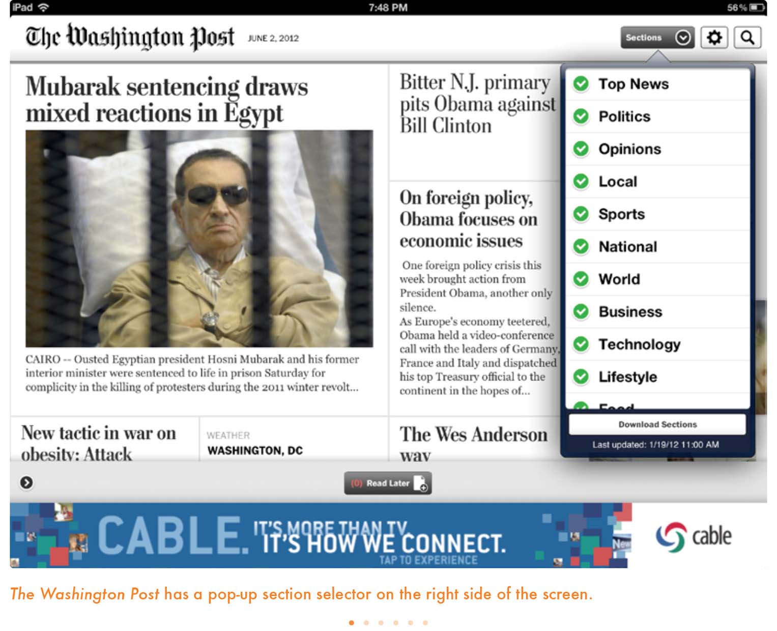
The closest first cousin to the well-known and tested print newspaper index, these lists of contents do the job well, although they are not the most attractive visually. As you would expect, those two classic “gray ladies,” The New York Times and The Washington Post, continue to use the pop-up menu as the engine to content navigation. These menus usually appear when we tap for them, but they can always be visible as well.
Quite visual, this is a more digitally oriented version of how a table of contents could be, as in Wired.
Some apps have a back button, often in the upper-left corner. We should note that this is not universal across tablets. Android, for example, has a dedicated back button, so an Android tablet app should not have an in-app button like this.
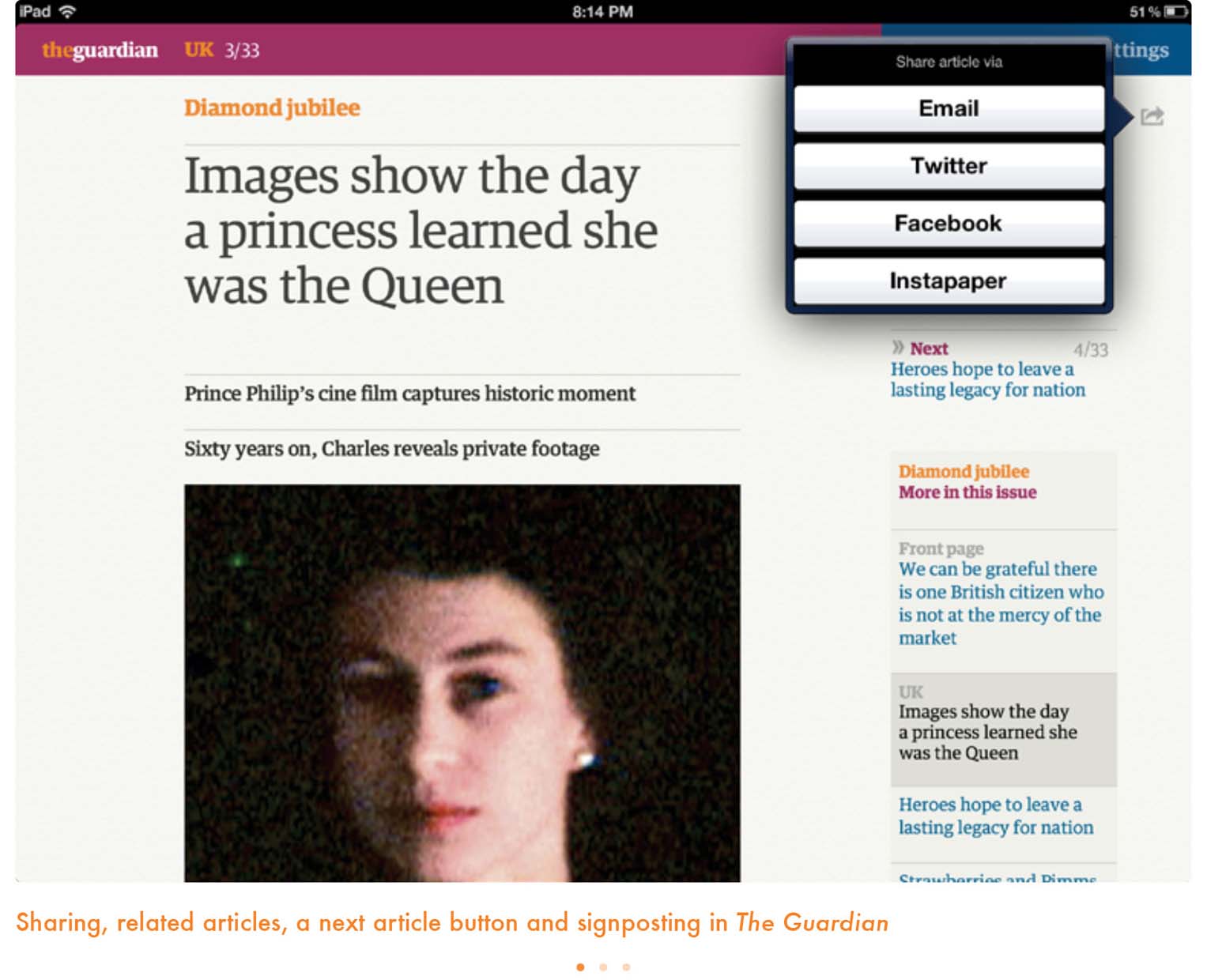
A next or previous article button is an alternative to swiping between articles. Most apps these days allow swiping, though some early ones did not. The Guardian, to allow you to navigate however you like, lets you go to the next article in one of three ways: by swiping, by tapping on the right side of the screen where the arrow is or by tapping the description at the top left labeled “Next.”
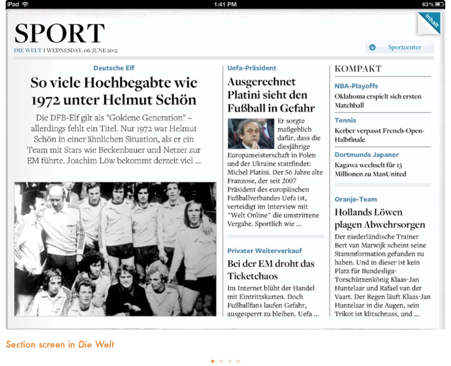
Many apps rely on section fronts to break up their content, much the same as in print and on the web. Section fronts allow the designer to highlight stories that did not make it to the app’s early screens and to target subsets of the general audience. The key is clear hierarchy, with concise headlines and striking imagery. It was the same strategy as on the home screen.
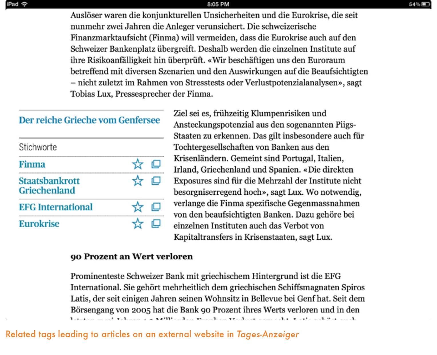
Following a feature on many news websites, some apps list articles related to the one the user is currently reading. The Guardian is one that implements this particularly well, with links not just to other articles in the day’s iPad edition but to articles on its website as well. A variation on this feature is a list of tags relevant to the article. A story about IBM, for example, might carry “technology,” “computers,” and “IBM.” Tapping a tag leads to a screen, either in the app or on a website, collecting all tagged articles for easy browsing. This is a feature that excels on the tablet and allows the reader to gain broader access to a long-term theme than an isolated story might allow.
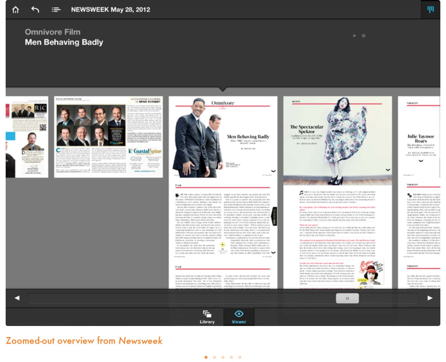
In a nonlinear app, telling the users where they are becomes particularly crucial to avoid confusion. In print, the reader easily creates a mental map of the publication, relying on an estimate of pages flipped, the publication’s thickness, section labels and page numbers. Apps lack these physical attributes of print and must take care to tell readers where they are. The zoomed-out overview feature is one mechanism, but a more prosaic and essential option is the equivalent of putting up signs in a building. The Guardian accomplishes this effectively, highlighting and color-coding the section name, marking what number of article it is out of the total in the section and indicating next and previous articles at the top of the right sidebar. Particularly powerful is the ability to tap many of these indicators to return to the section front or move to another article in the sequence.
These tools are extremely important and functional for users who, in large numbers, love to share content through Facebook, Twitter or simply e-mail. Sometimes these sharing buttons will be more fully featured, allowing the user to share the title, summary or full text of a story. The particular challenge for apps with sharing is how to make a story accessible to readers who have not downloaded or subscribed to the app. Some news organizations feature all their articles on their website and can therefore provide a link. Tablet-only publications may have a limited website exclusively for sharing purposes—The Daily falls into this category—or provide screenshots of the story in the app.


Once users are familiar with a tablet app they visit frequently, their actions become rather automatic.
Then the question is: Should the navigation always be present on the screen, as in Bloomberg Businessweek, or a in pop-up window navigator, as we see in The New York Times? Can we do what The Daily does with its carousel, always ready to appear at the touch of the screen? Is the navigation function less intrusive if it disappears entirely to be revealed with a gesture, as we see with Time magazine or Letter to Jane? I find in my own app creation workshops that designers favor the visual navigation devices, believing that users are less likely to use navigation if they do not see it immediately.
The impatient readers—especially all those digital natives who have become a larger segment of our audience—want to move at the touch of the screen. So touch targets, where the user must tap for an action, must be clear and big. Do not make them smaller than can be easily tapped.
Imagine a reader in the middle of a Culture section’s article, which she has finished or decided to abandon to read top news. She should be able to, without hesitation, tap the right area of the screen to get there. We as designers have an obligation to provide that direction in a visual and tactile manner, effortlessly for the user. Nothing can be more frustrating for an app user that a finger that taps into limbo. Tap, tap and if the third tap yields no results, you have a frustrated user, lost in the midst of your app.
Before designing the Autovisie iPad app, we looked closely at the competition to see how they transformed their print magazines into organized digital playgrounds. (Though the playground part is still very much in development as new gimmicks and cool design features are still being discovered.) How do you create a sense of organization? The Autovisie printed magazine already has its own sections. But the iPad creates a new dimension in terms of navigation, and there are many options to choose from.
So to create a sense of organization and unity with the printed magazine, we began with the cover, help page and table of contents. From this point you can choose to navigate to wherever you want or just flip horizontally through the pages. We have spread out the pages of each article horizontally instead of vertically so the viewer does not get lost and it is easier to get an overview of the magazine. Also, the viewer can at any moment tap at the bottom of the page to access pop-up navigation options, selecting from the table of contents, help page or browsing through a small preview of the pages. Many connecting pages are also horizontal, bounded by the page design.
The iPad has another great feature we wanted to use. Turn the iPad 90 degrees and the format changes. We choose to make two different layouts for all the pages, which requires designing two covers. We are excited about our solution for body text. Turn the iPad in portrait position and it becomes a reader version of the article without any layout except for the top header, which is ideal for reading the text and zooming in on it. In this mode, the reader will not be bothered by distracting design elements that may interfere with readability.