It is through the look and feel of your app that you first extend an invitation to users to walk in and sample it.
You have about ten seconds to seduce a user who opens your app. Of course, I believe those ten seconds are a more urgent matter in the world of print, especially if one arrives at a kiosk, or another point of purchase, to peruse newspaper front pages or magazine covers before deciding which one to buy.
With apps, we may assume that users are already predisposed to look at the current edition, as they have already downloaded the app—much as when one subscribes to a newspaper or magazine. However, as with newspapers and magazines at home or in the office, where the publications must pass the “coffee table test” to make us want to stop what we are doing and take a look, the same applies to apps.
We now have downloaded the app. We tap the icon to open it. This is the moment of truth. We must like what we see. We must feel invited. We must immediately get a sense of direction and know where to go from there.
In the case of news apps, a combination of visuals (a photo or video that piques our curiosity), headlines (the storytelling) and an overall look and feel are the elements that invite us to proceed.
Unless you are creating an app for a nonexistent publication—such as did those who conceived The Daily, the first newspaper created solely for the tablet—you need to make sure that in those first ten seconds you convey the DNA of the publication of which this tablet edition is becoming a part. If, as I suggest, the tablet completes the media quartet of mobile, online, print and tablet, then the brand must come through immediately, and not just in the logo. There must also be a sense of recognition through other factors such as the typography, texture, color palette and an overall sense that this tablet edition complements the rest of what this media house produces.
Recently, I was charged with the task of working on the tablet edition of a major metropolitan European newspaper that is characterized by serving its great storytelling through a rather chaotic and mismatched arrangement of elements on the page. It is a visual puzzle that would be difficult to complete if you are in a hurry.
But the readers of this newspaper understand the chaos, know where to find everything and probably would be totally lost if this newspaper suddenly became minimalist and organized. It is not the job of the designer to impose his views when the publication he is rethinking has a visual legacy so firmly imprinted in the users’ minds.
So what did we do with this chaotically delightful European newspaper and its tablet edition? We studied the chaos in detail. We extracted the elements that are most salient. We tried to incorporate those into the look and feel of the tablet edition, but we also applied a sense of order that the tablet must have. It is a different medium from a printed newspaper. The combination works, a salute to the visual legacy of the publication, its DNA, along with the order and systematization that would make the journey through a tablet easier.
Pick up on the DNA of the publication, translate it to the canvas of the screen and build from there. Create a visual alliance with the look and feel of the print edition, but do not become a slave to it. For more on creating strong visual brands, see the third section of the Storytelling chapter.
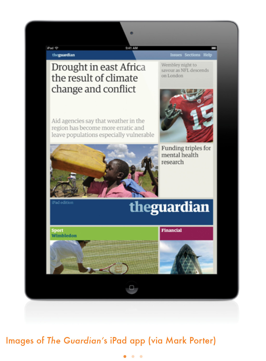
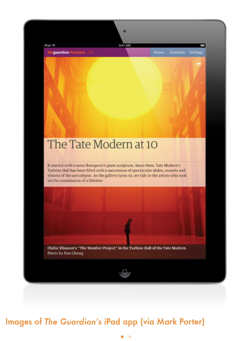
At The Guardian, in the United Kingdom, the designers of their very appealing and functional app paid close attention to what users were told editors they wanted.
This is how Mark Porter, The Guardian’s consulting designer, describes the challenge of translating the print edition to the tablet:
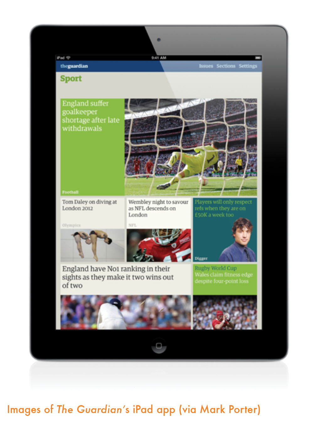
The brief was to deliver the content of the printed paper in a form that felt completely at home on the iPad; simple to say, but quite a challenge to carry through. Editorial websites and apps tend to impose navigation by lists and menus, but something important can get lost—the hierarchy and the editing decisions that create distinctions between stories. What’s more, when you turn the pages of a printed newspaper and skim the headlines, images and layouts, it all combines to build a picture of the whole paper in your head even if you don’t read any of the stories. So I wanted to preserve the editors’ choices and hierarchies, and allow readers to skim the content as a whole before diving into individual stories. The trick was to keep these qualities (which make print lovable and engaging) but to avoid the trap of imposing a print design on a digital device.
In a highly informative slideshow, Andy Brockie of The Guardian’s digital design team explains how the team moved from basic sketches, which they describe as more closely allied with the print design, to more streamlined designs that conveyed the spirit of The Guardian but minimized the number of steps to get users from one place to another.
As Mark Porter reminds us here, many users do want a more print-like look in their news apps, but they also want that tablet experience. Within five years, I believe the look and the experience will be more tablet- than print-oriented all around, a natural evolution for any medium that develops from an existing model. It is worth adding, however, that The Guardian app is quite original to the tablet, taking the type, color and sensibility of print but totally reassembling for the new platform. Porter writes:
The Guardian’s design approach in print has been influenced by the grid-based approach of twentieth century European modernism, so it felt appropriate to carry this through to the digital products. In addition, the iPad itself encourages grid-based design; because of the necessity to view in both horizontal and vertical orientation, it makes sense to divide the screen area into a grid which functions both ways and allows blocks of text, image and color to occupy the same space in different configurations.


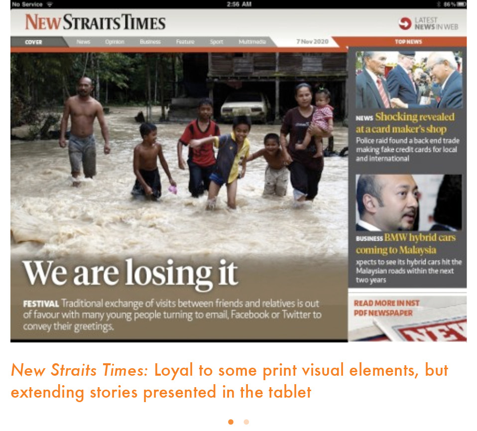
It is also the philosophy we followed when creating a second tablet edition for Malaysia’s New Straits Times, which would be quite loyal to some visual elements of the printed product but unique in minimizing efforts for the user and extending stories presented in the tablet.
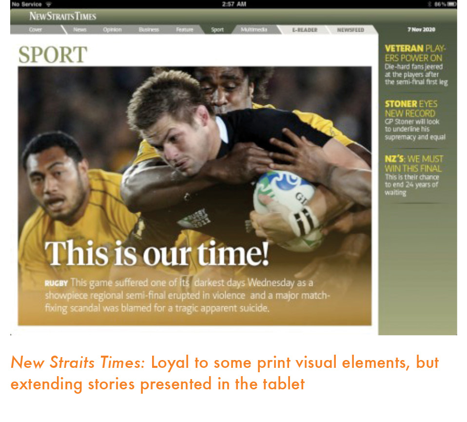
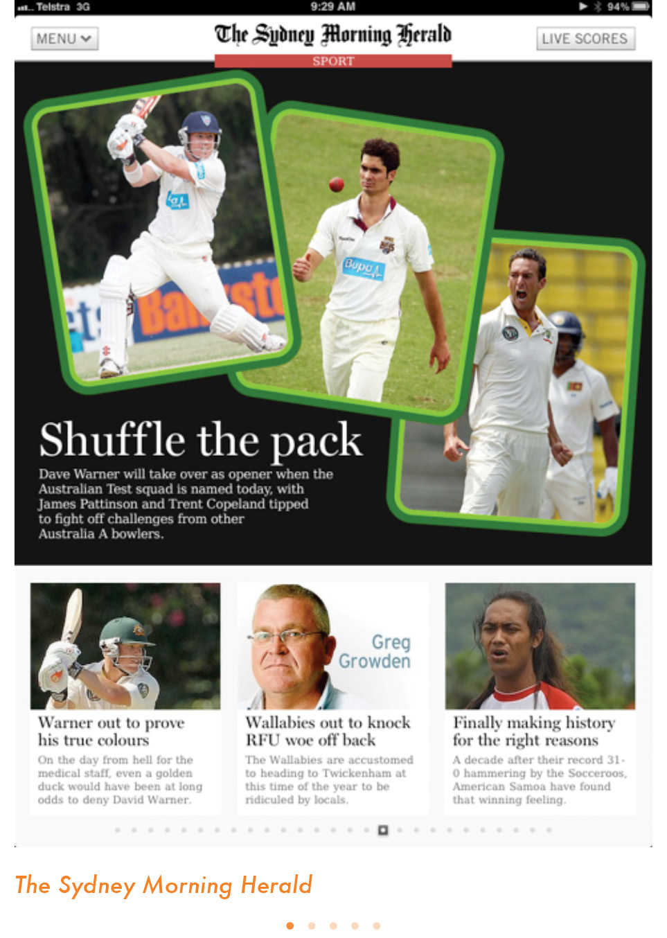
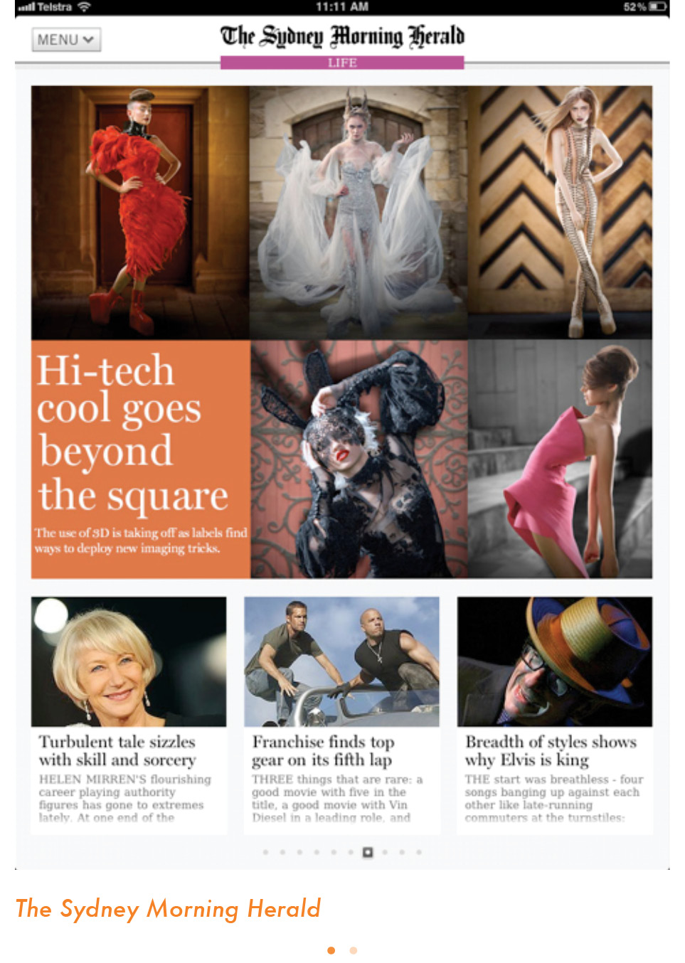
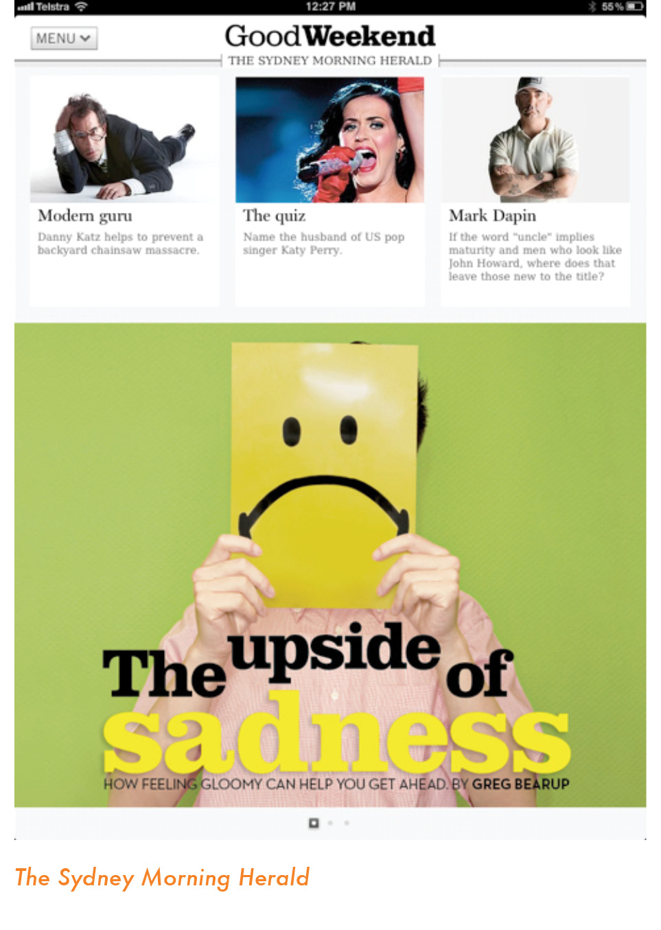
Here is a news app that is easy to use, pleasant to look at and that adapts the look and feel of its print edition, but without being subordinate to it. Let us take a look at how The Sydney Morning Herald app works.
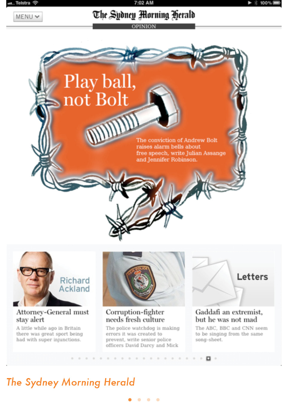
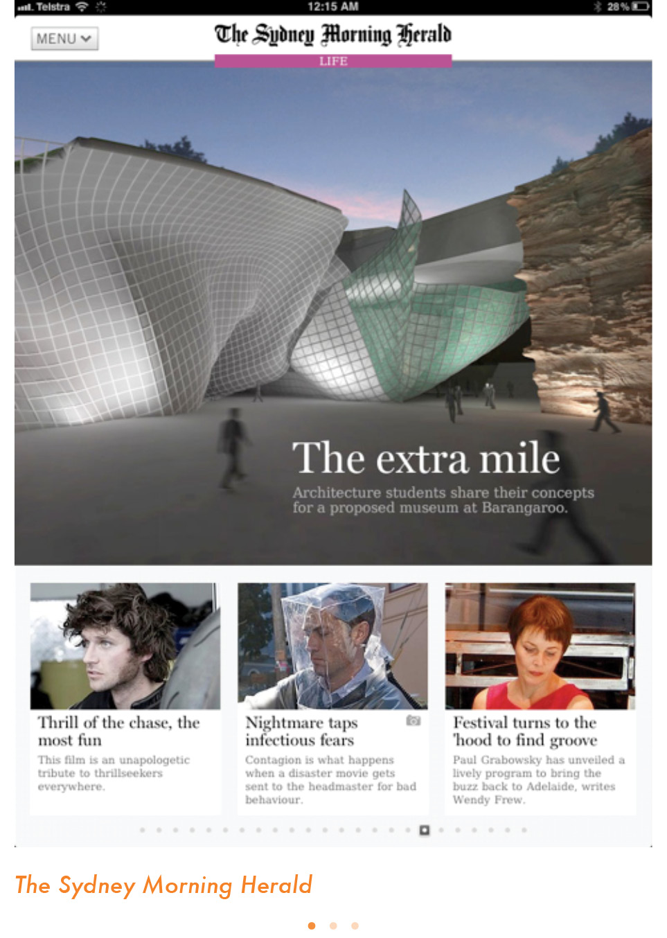
The landing page displays a large image for the lead story, with a one column navigator to the right of it. It is a template that is followed for all section openers, a practice we recommend for continuity. It is interesting to note that the color coding of the sections follows that of the online edition of The Sydney Morning Herald, since the printed edition does not have a color coding. Of course, if the print edition already has established a color coding for sections, it is recommended that the same be followed for the app, for the sake of familiarity and continuity.
Here is how Matt Martel, managing editor for presentation at The Sydney Morning Herald, explains the creation of the SMH app:
The central idea behind the design of the app is that it reflects the design language of the newspaper (rather than our websites). That’s why headlines are in the Miller typeface, for example. It is templated, but we use a lot of video, photo galleries and interactive graphics (our pop-up moments).
We have stats that show readers stay two or three times longer on the pages with graphics, and we put a huge amount of effort into them each and every day. We are really proud of what the editorial art department has achieved, particularly because we are all traditionally print graphic artists and designers, and we have fewer staff than we once did.

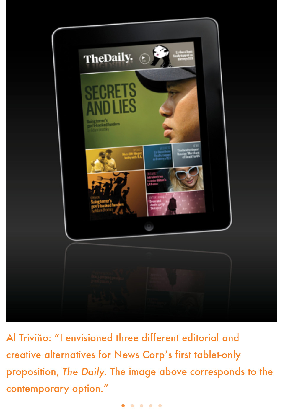
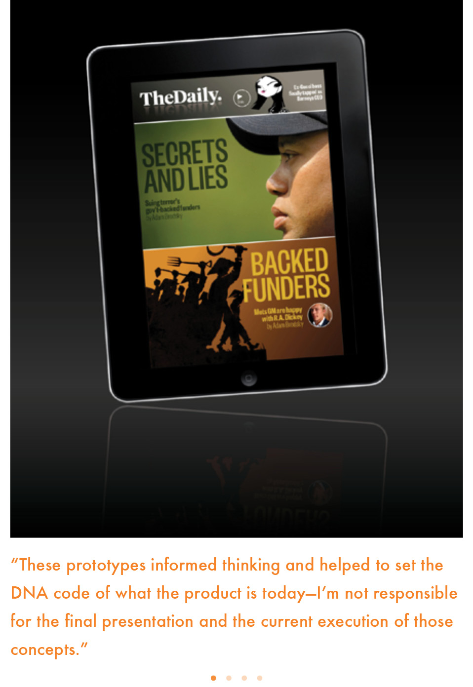
When Alfredo Triviño became a part of the creative team that would develop The Daily, the first tablet-only newspaper, he pushed for a nontraditional model, distinct from the version that was ultimately adopted. Al has since posted the prototype screens on his blog: here and here. I have been impressed with them and their ability to utilize the new platform fully. The legacy of print is hardly detectable in the design. I am not surprised that Al’s design was not fully integrated, however. Perhaps management thought that they would not relate to the print experience that many tablet users at the time The Daily was introduced would expect (not necessarily want).
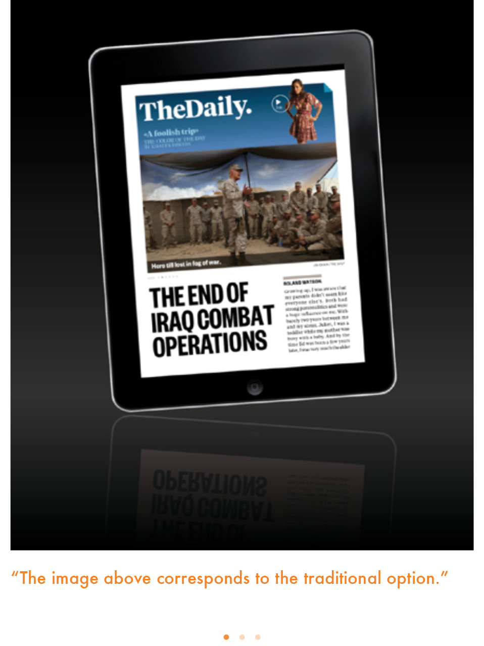
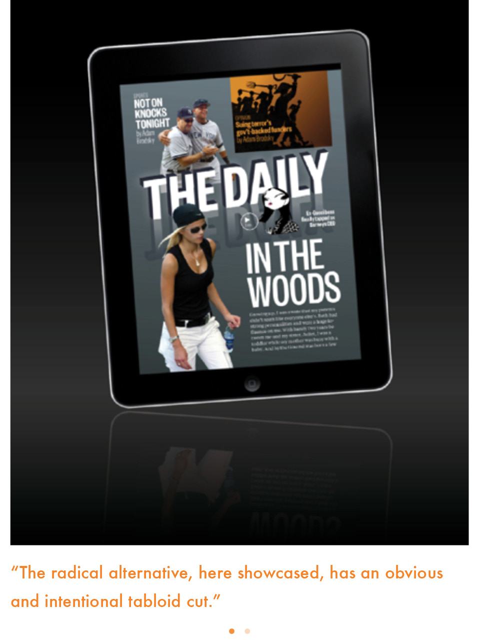
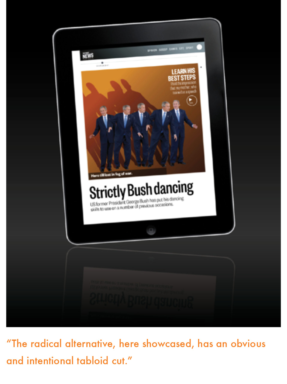
The Daily that appeared was, in my view, a cross between a big-city tabloid newspaper and a newspaper’s online edition. It has evolved to become more tablet-friendly, uses more pop-up moments and keeps the finger entertained.
I have reviewed The Daily several times on my blog as it has evolved. When it first came out, I found the ads, carousel and customization options exciting but was concerned by some inconsistencies in its overall design. When I revisited it seven months later, I found the same inconsistencies but greatly appreciated the increased number of pop-ups. One year after its launch, I wondered why The Daily had not become a daily habit for me. I proposed three ways it could: