
For most users, the most important function of an app is reading articles. Typography is therefore a crucial element of the design.
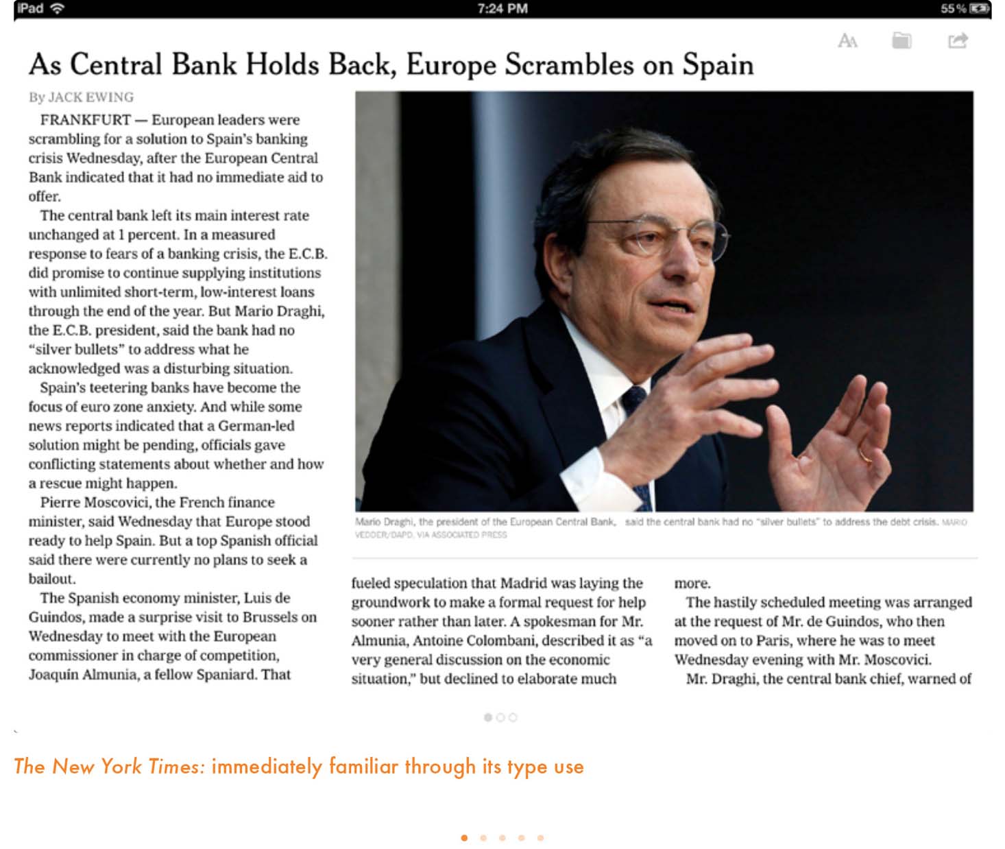
One of the first things that struck me as positive and exciting about news apps is that typography plays an essential role. Even more than in online editions, typography can be a protagonist. It can be an instant visual connection to the DNA of a publication. For example, when you look at the front page of The New York Times and then examine the app, there is an obvious unity in their appearances. The typography carries the tone of the brand even more than the Times’ logo. Those iconic Times fonts—Cheltenham, Franklin Gothic and Imperial—give us an instant sense of recognition in the tablet edition.
In fact, two of the first publications we all experienced on the iPad were, indeed, two icons: The New York Times and Time magazine. In each case, we have long had the typographic DNA of these titles imprinted on our subconscious. How grand it was to find that familiar fonts continued to be used in what was a totally new platform. Time uses its longstanding Franklin Gothic, plus Proforma, a new serif added in its most recent redesigns. This means that designers need to pay special attention to how type is presented on a news app, not just to create associations but also to make the user’s journey through the app more functional and enjoyable. Designers working on the tablet can use type to create contrast and build layers. A sophisticated typographic scheme carries the reader through the text of a story. Exactly as in a well-orchestrated symphony, nicely executed typography provides a balance of bold, medium and light tones.
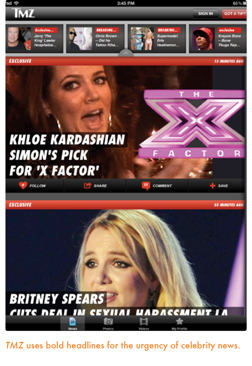
Such tabloid-style publications as Bild have capitalized on the volume and style of their typography to connect users of their apps with their well-known, existing printed products. Notice that not only are the identical fonts used, but we also see that the styles are preserved as well: the size of the headlines, the use of all capital letters and how type moves on the screen. In addition, we see more color used for type in these titles.
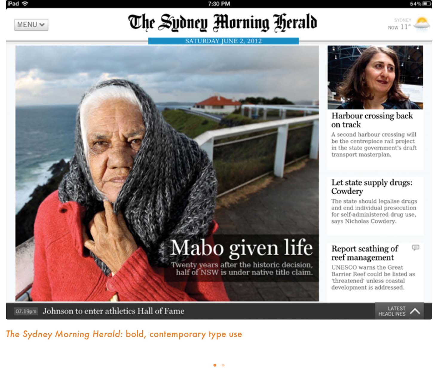
The classics do the same, as we see with El País, The Sydney Morning Herald and Frankfurter Rundschau. The more subdued, elegant style of what I refer to as the classic newspapers also translates well to the tablet as we see in these examples.


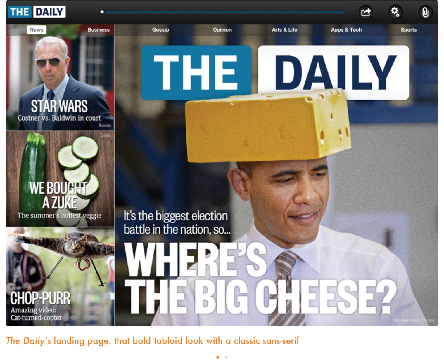
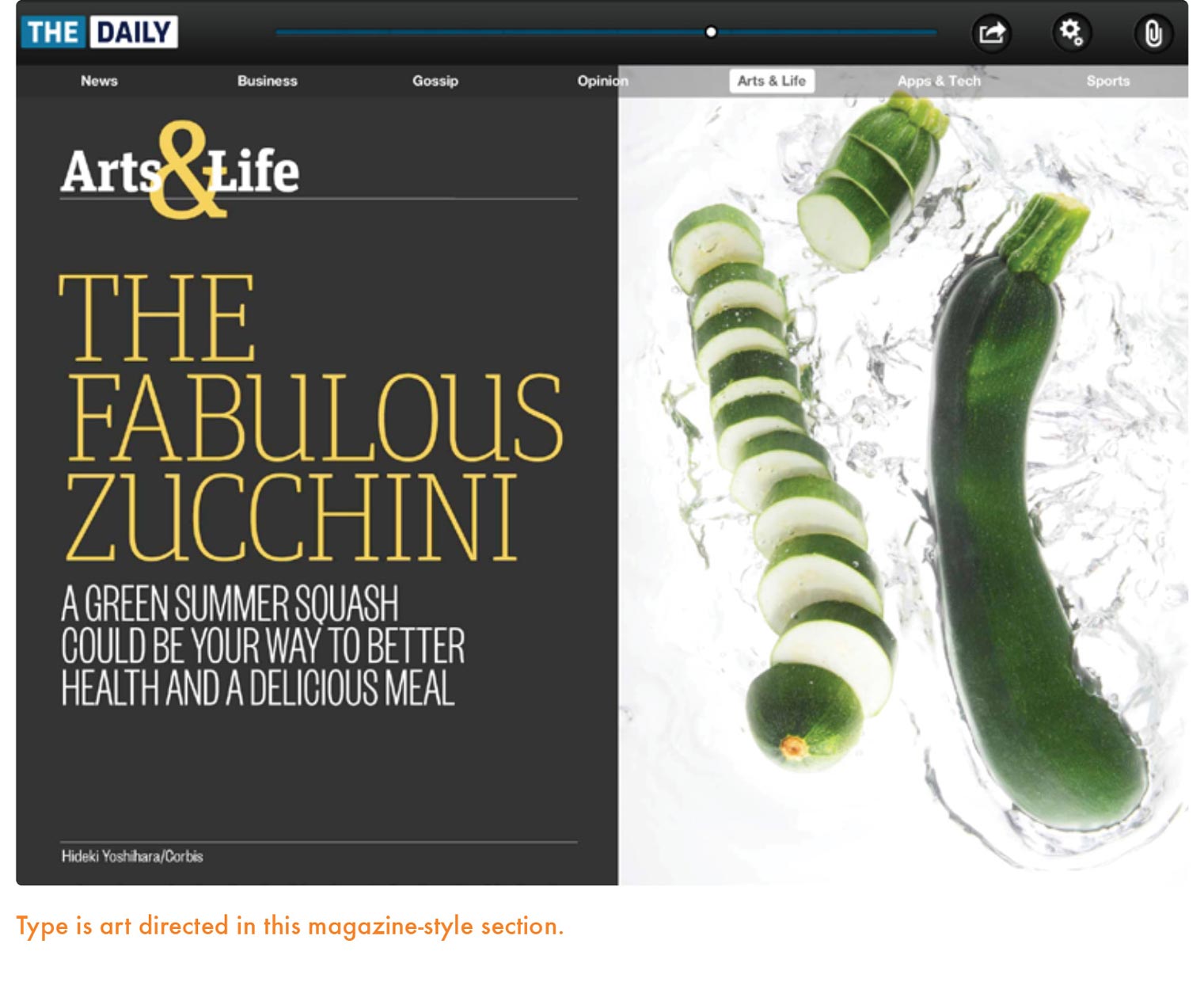
And how about creating a typographic image for a newspaper, such as The Daily, which never existed in print? This is an opportunity for the designers to select fonts that would be easy to read, while providing us with a blueprint for how type could work best in the new tablet platform. The Daily primarily uses Founders Grotesk, a sans-serif font in various weights and widths throughout the entire app. However, the slab-serif FF Unit Slab is used as the main font for sections such as Arts & Life, Apps & Tech and Opinion. This is a good element of typographic contrast that allows each section of The Daily to have its own personality. Founders Grotesk, in line with the classic newspaper grotesque sans-serifs, plays well against the warmer, more magazine-oriented FF Unit Slab.
Ironically, while The Daily did not have to provide us with the familiar to reconnect us to a print edition of the title, it did use type as one would have in a printed tabloid newspaper.
See Stephen Coles’ review on the blog Fonts in Use, “The Daily: Design trumps content in launch of first major tablet newspaper.”
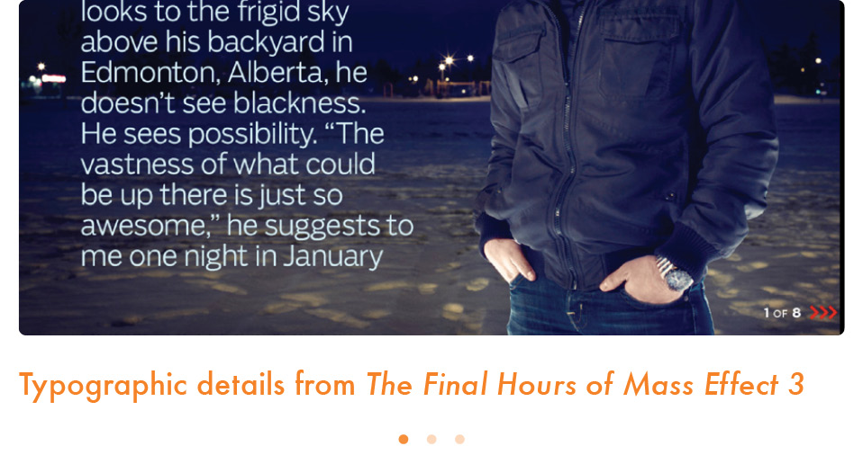
This leads us to a discussion of how type can best be used in a news tablet app, regardless of whether the type echoes what is used in other platforms of the same title. For that, we turn to apps that are less directly related to the news cycle, such as The Final Hours of Mass Effect 3, created by the team at Joe Zeff Design. Generous spacing between lines of text, excellent use of white space, and a solid grid make this app an example worth investigating.


Generally, the rules for selecting fonts for print are equally applicable to the tablet. For both print and tablet, it is all about appealing to the eye and the brain. Make it easy to read, allow for contrast of weight and sizes and emphasize layering. Text is a particular challenge in both cases. It must be large enough to be easily readable by both the young and the old, while economical enough to fit a large number of letters on each page or screen. Line length must also be reasonable: too short and a reader’s eyes move distractingly back and forth; too long and a reader must work to find the next line of text. If designers set body text in columns, as is often the case, they must pay careful attention to having proper hyphenation when text is justified. The tablet features a tighter canvas than print, making these elements more crucial than ever. If text is not set well, the reader is less likely to come back to read another story.
The choice of a text typeface is as essential as defining how it will be set. While Apple’s newer iPads feature a “retina” resolution that matches that of a well-printed page, most tablets do not. Therefore, the smart designer will select a typeface that can stand up to the harsher conditions of a low-resolution screen. Pay close attention to the increasing number of typefaces designed for text on the web, from such foundries as Font Bureau, Hoefler & Frere-Jones, Typotheque, Type Together and Process Type Foundry. You may wish to contact a foundry to ensure that you have selected the correct version and licensing scheme for use in an app.
Cyrus Highsmith has given us such elegant fonts as Prensa and Relay. The Font Bureau type designer reminds us of such terms as craftsman, draftsman and original.

MARIO: As one of the foremost contemporary type creators, how do you see the use of typography in news apps?
CYRUS HIGHSMITH: We are still working in a very crude medium. There isn’t the kind of control and resolution you need for really good typography yet. However, it’s getting better fast. Publications like The Boston Globe are leading the way. Their digital versions adapt themselves well to devices’ different-sized screens while maintaining the overall visual and typographic personality of the print edition. This kind of continuity is important.
What are some recommendations you would make to designers creating a tablet edition of their newspapers and/or magazines?
As a story moves from a printed page to tablet screen to web browser, the story’s typography needs a way to move with it. When the size changes and columns expand or contract, when resolution goes up or down, the spaces within a paragraph, the typography, needs to be carefully adjusted to suit each context.
Why is this important? Because typography is part of the story. It is one of the details that helps present the story to the reader. Our struggle as designers and typographers in the near future will be to remind developers, publishers and readers of this.
Are there some fonts that lend themselves better to the specific use of the tablet, where we design not just for the eye and the brain but also for the finger?
I will confess that I have never considered the reader’s finger as part of my design process. In terms of the eye, a good screen text face (for a tablet, smartphone or computer) should have a high x-height, open apertures and clear counter forms. Our RE (Reading Edge) designs for the screen demonstrate this. It is similar to drawing a text face for print designed to be set at small sizes.