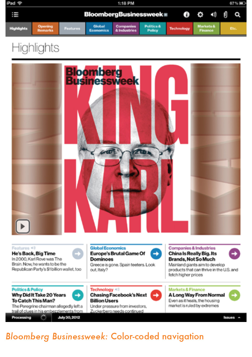
Color is one of the most important design tools. It can create an immediate visual and emotional link between app and user.
The first thing that strikes a traditional designer about designing for the tablet is that one does not have to worry about the surprises that bad printing can produce. Indeed, how many times has a designer worked on creating a special hue only to see it turn into a darker shade of whatever when it appears in print?
Those worries aside, we can turn our attention to color as an important design tool. The rules of color use for the tablet are the same as for print in terms of aesthetics. But there is one interesting difference: White plays a major role, especially for backgrounds. One can use color “wallpaper” effects, and many news apps do. In my opinion, however, nothing is as effective as white as a background on which to hang the other color elements. Some apps, like The Daily, often return to that most revered of tabloid editors’ choices, white on black. If you opt not to use white, gray is a formidable choice to present some color texture without making it too obvious.
It is important to remember the symbolic value of color in terms of different cultures. I always take a good look around me when I arrive in a city where we will develop a new product. For example, what color are the curtains that we see hanging on most windows? Or I would visit the local art gallery to investigate how artists paint in this part of the world. What color palettes do they use? Keep cultural color touchstones in mind when creating the color palette for your app.
Recently, though, during a news app design workshop, one of the participants reminded us that, unlike a printed newspaper that circulates in a specific geographic area, news apps can be accessed from any corner of the world, and, thus, the cultural component may not be so important. While this is true, I still believe that the news app itself must reflect its point of origin. I may be in Florida accessing a Brazilian news app, but I want that app to transport me to Brazil—not just with the content but also visually. Color is, without a doubt, one major element that can help achieve this sense of identification with a specific locale.

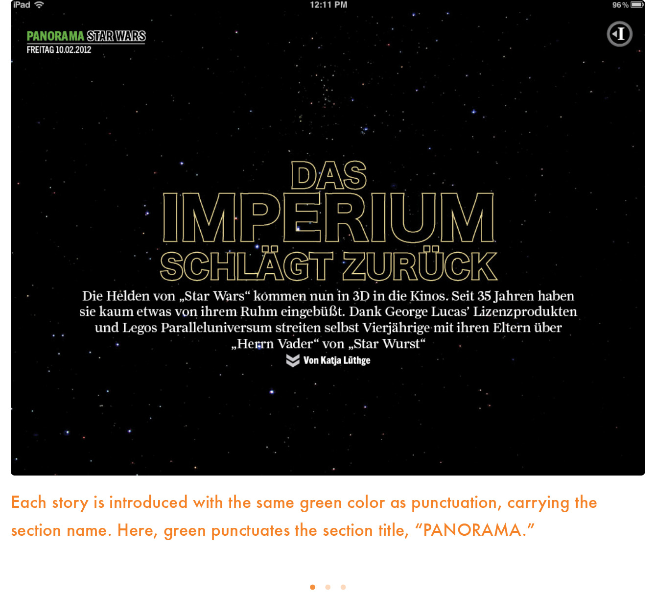
Dr. Pegie Stark Adam, a recognized expert on color in publication design, has contributed the following section on the concept of “color as punctuation.”

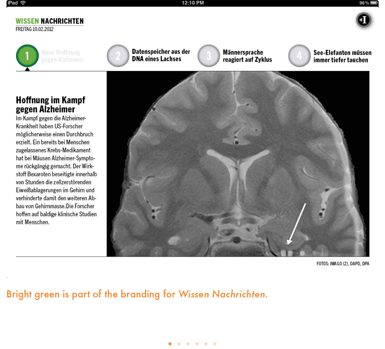
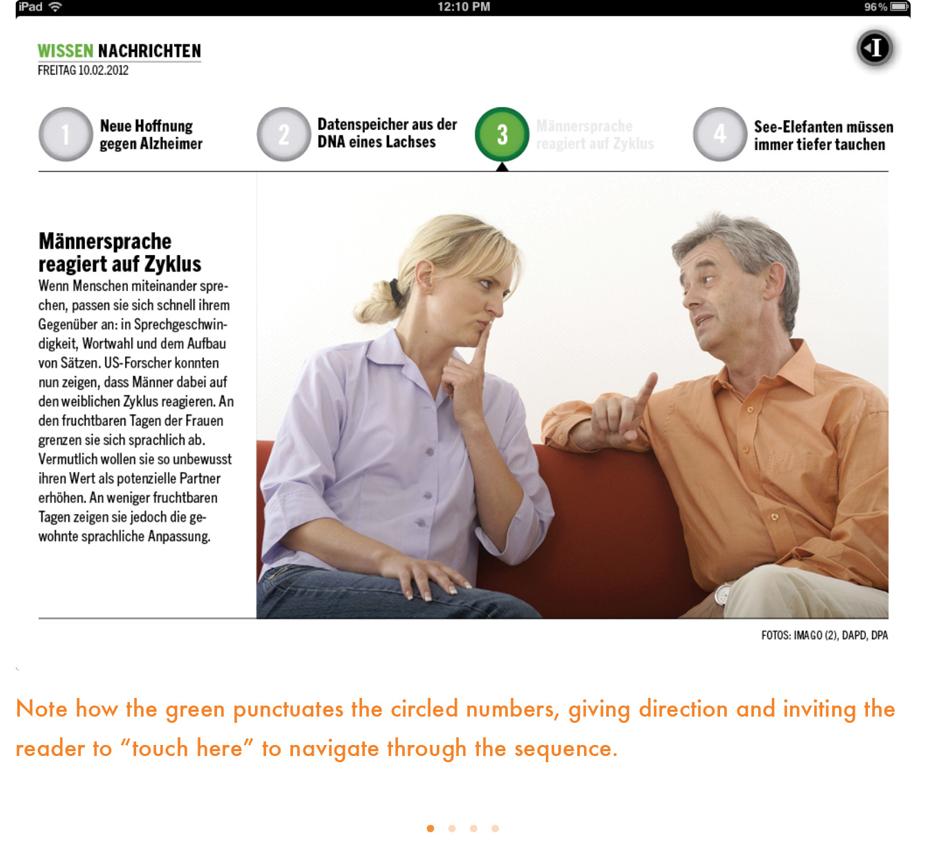
Color is one of your most powerful design tools, no matter what the format. Think of color as a living thing with energy, light, length and dimension. Color can grab the eye and pull it from one element to the other. It can help stop the eye on an important element or phrase. It can be the transitional clue that indicates a new thought or idea. It can link a number of different elements. And it can drive the reader to act—giving subliminal direction to touch, to open, to swipe, to enlarge or to make something move and become interactive.
In other words, color can punctuate and become the navigation tool on the page.
Think of “punctuation” literally—as you would in writing. Punctuation is a signaling device giving direction to readers to get them moving into and around the content. Capital letters tell the reader where to start; commas say “pause”; semicolons indicate the end of one thought and the start of a related thought; and a period says “stop.” Color can do the same if thought of as punctuation.
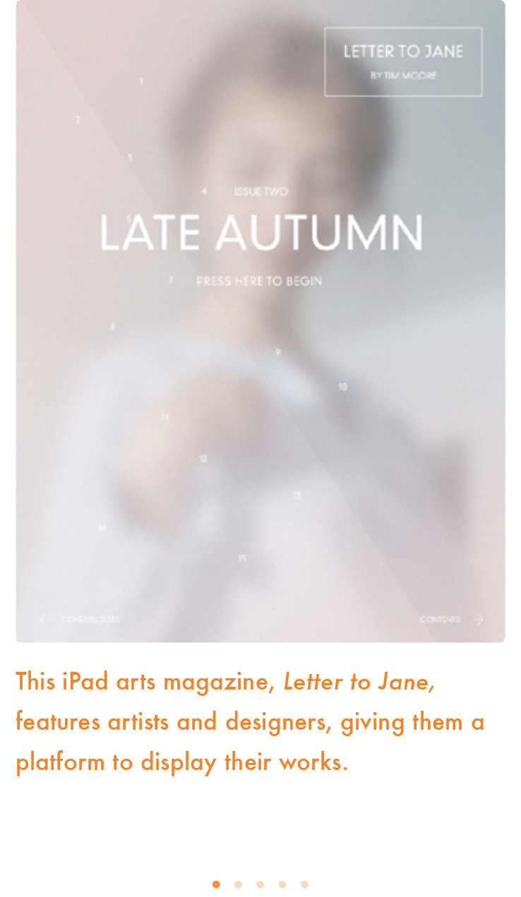
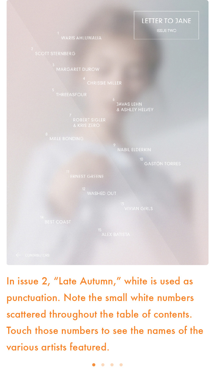
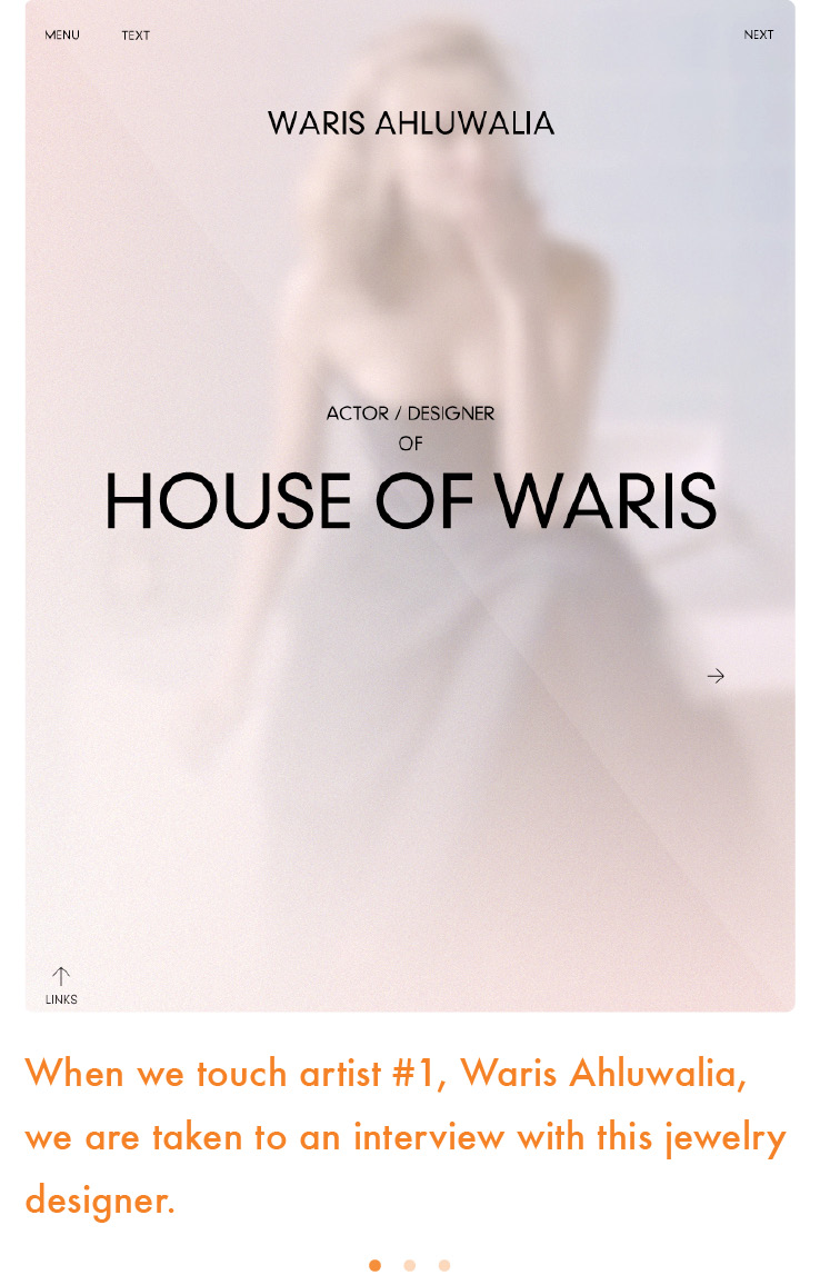
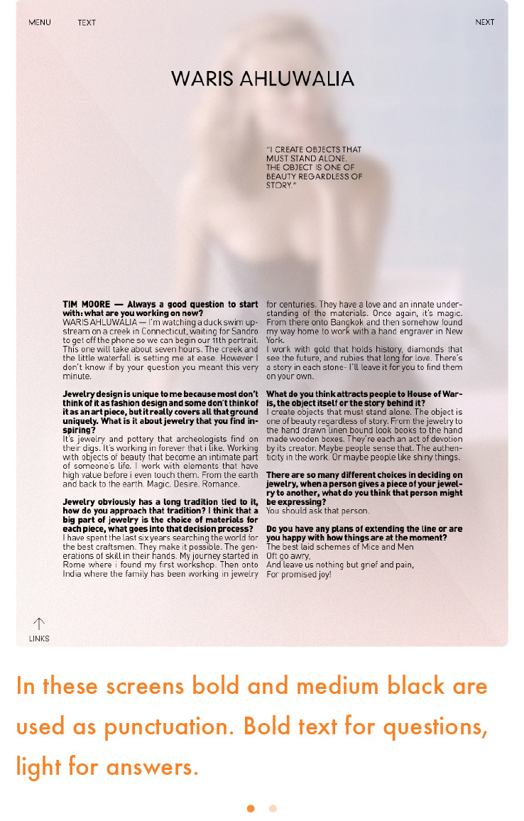
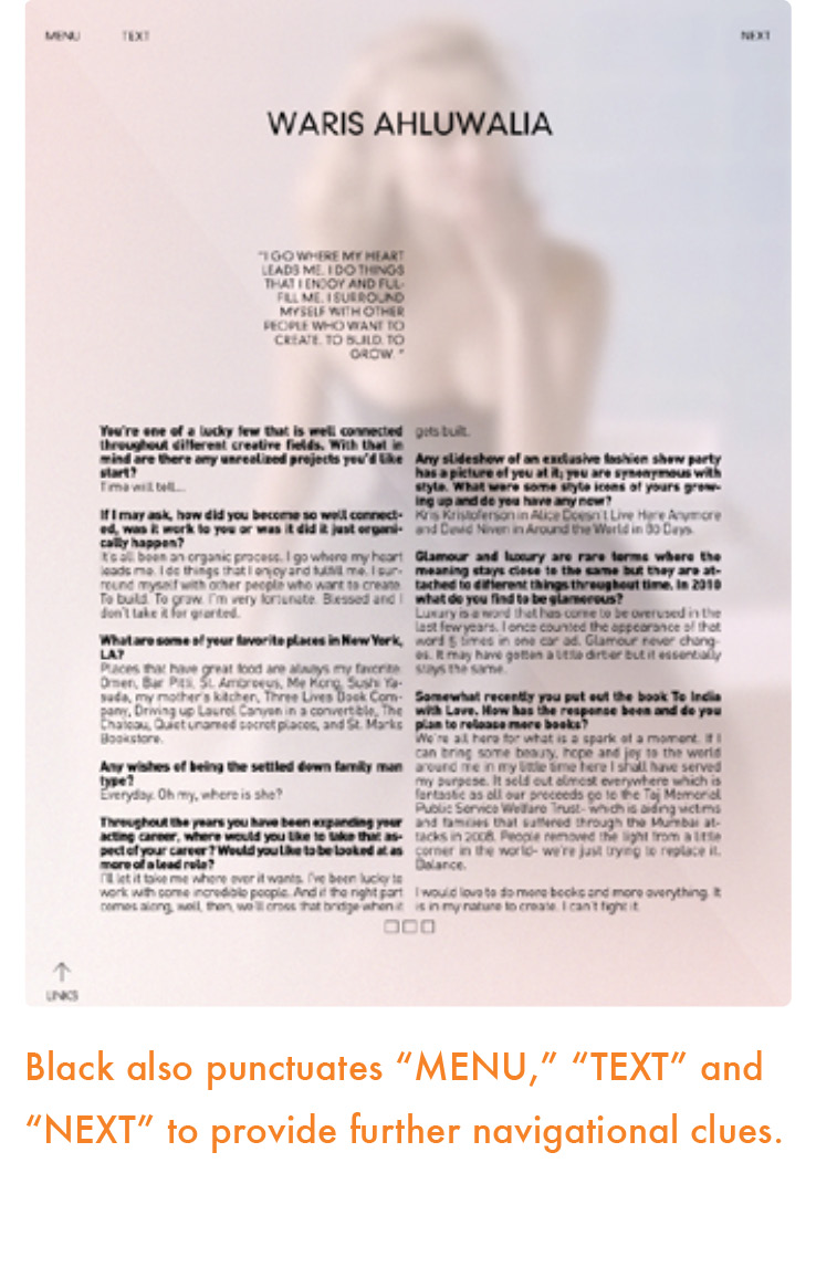
Color on a label, headline or initial cap says “start here.” From there color can highlight or punctuate key words, phrases, quotes or images throughout the screen, uniting all of the elements and giving the reader direction—pause here, go there, touch here, swipe. It can be a symbol that ends the experience with a dot of color at the end.
When applying color as punctuation, start by selecting one color as your directional or navigation device. Remember the power of that color to unite the entire design, driving the reader to travel from one element to the next in a logical pattern, making the experience meaningful and easy at the same time. Make sure that each color works in harmony with the other colors in your design.
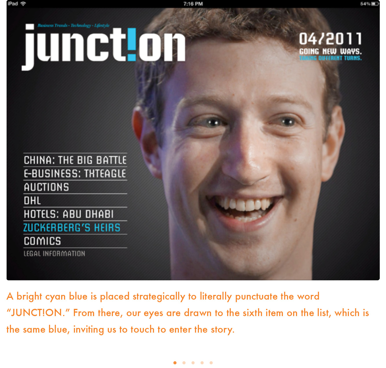
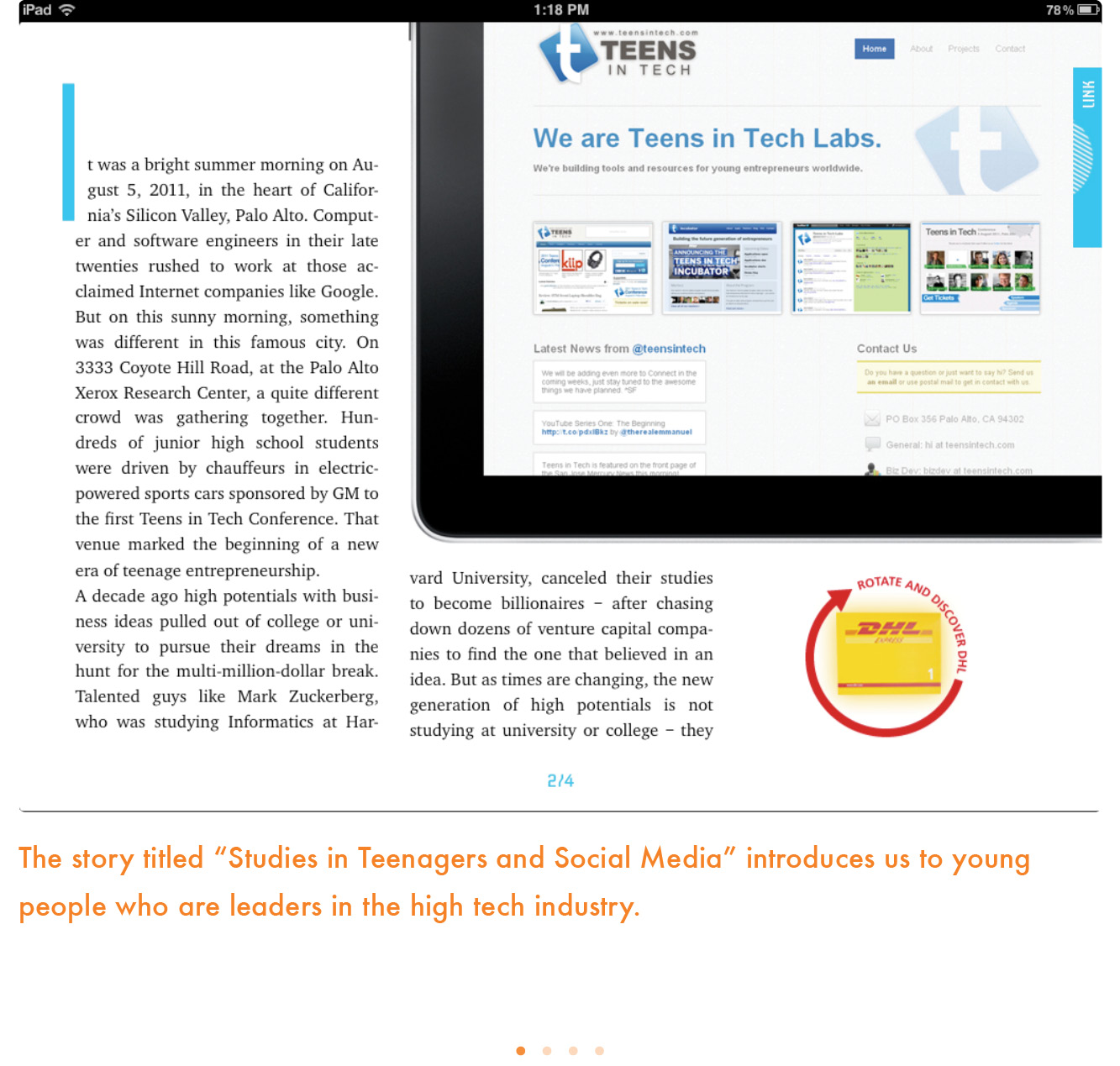
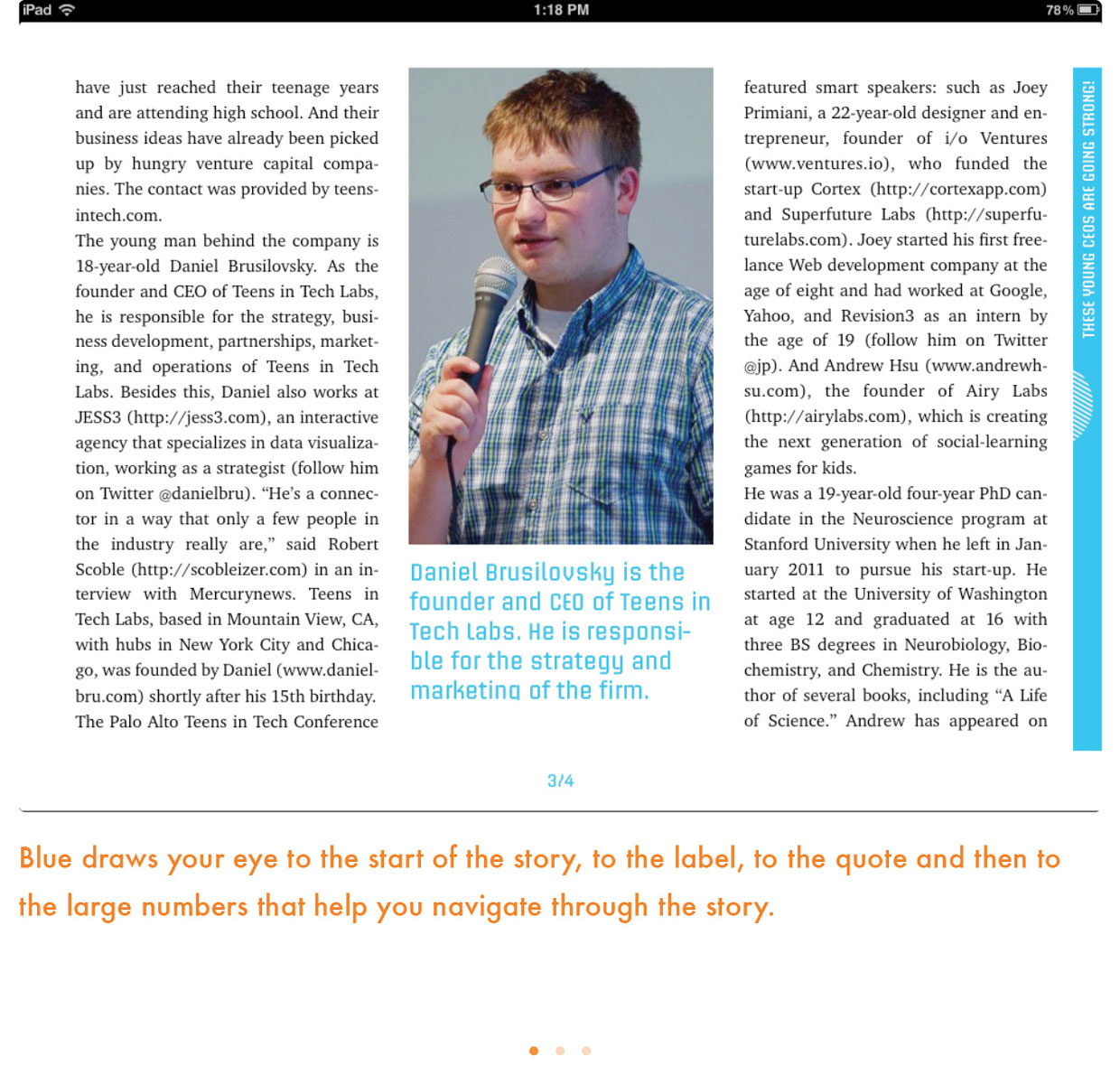
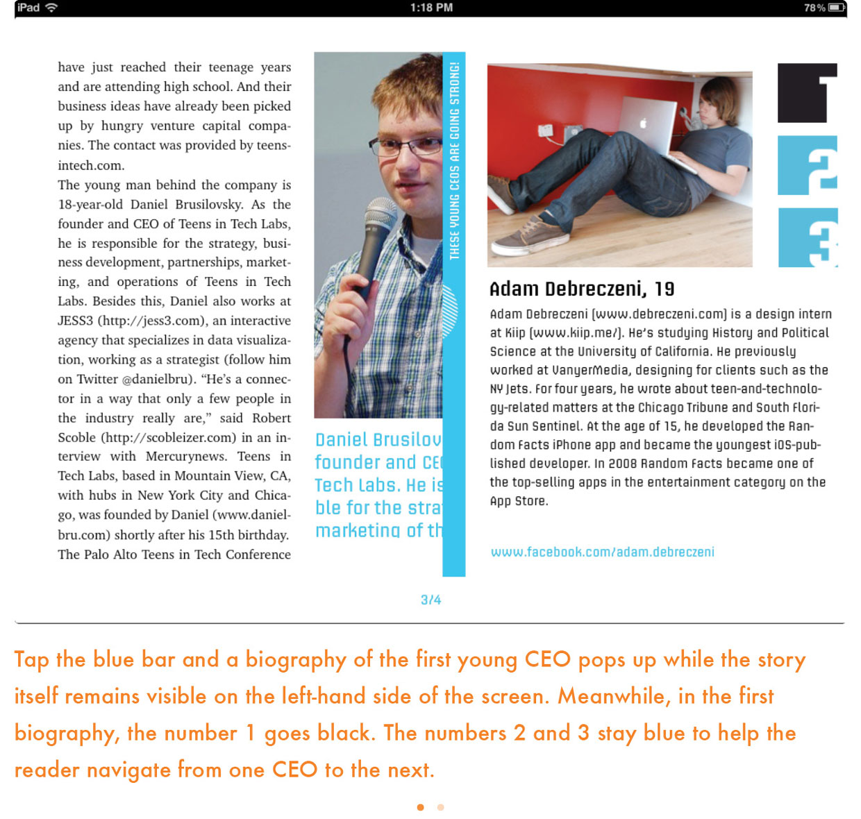

Which colors are best for navigation? Red is often used as punctuation because it is a “hot” color that stands out amid everything else. If you think of your design as a three-dimensional plane, red sits on top, acting as the perfect traveling tool.
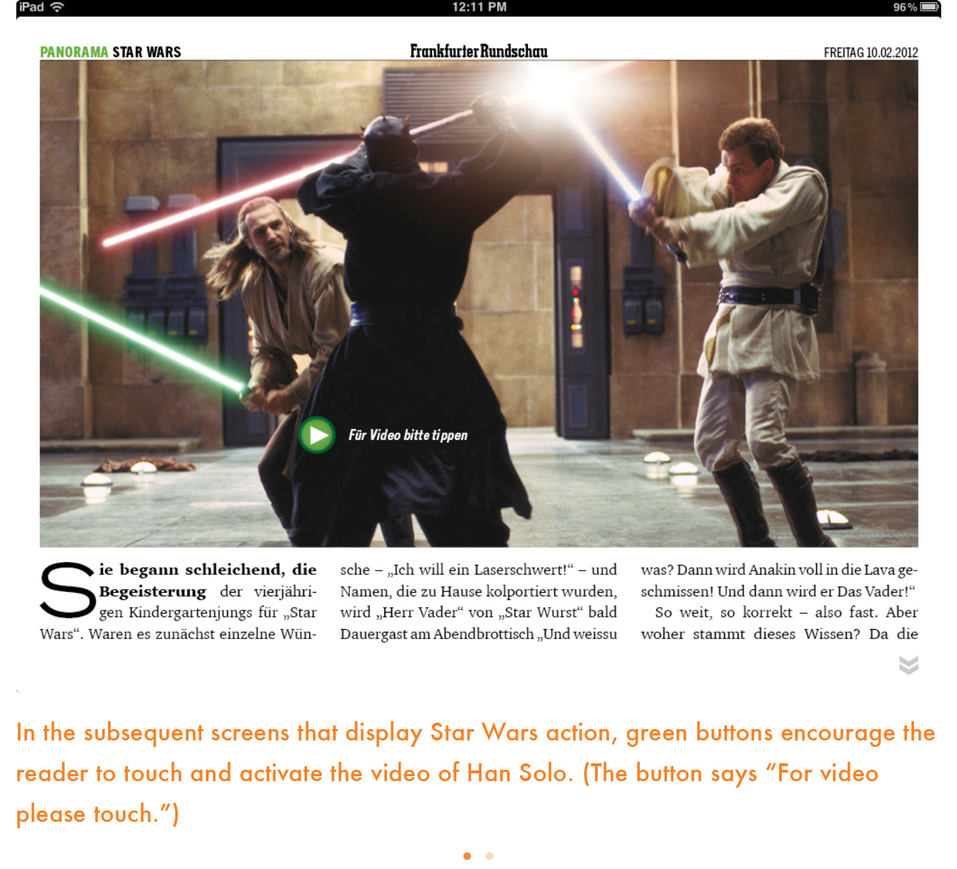
Punctuation color can also be the complementary color to a dominant color in your photos. For example, orange can be the punctuation color if the dominant color in your photos or other design elements is blue. What is different about color as punctuation in print and color as punctuation in tablets is that color “ends” the experience in print. Color at the bottom of a page can be the period that proclaims that the experience is over. On the tablet, color can be the directional device that allows the experience to continue by indicating the reader should “touch or swipe here,” thus extending the experience with video, audio and interactivity. In other words, color as punctuation on the tablet seems endless.


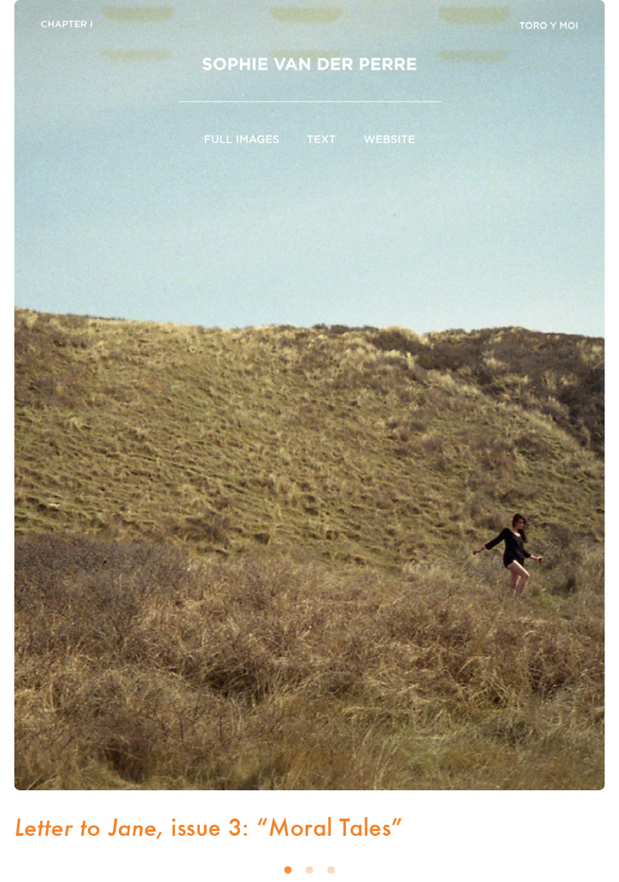
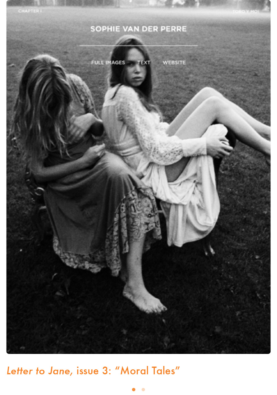
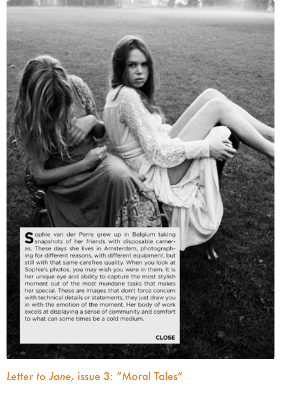
I am a fan of the Letter to Jane app, particularly for its elegant, classic and almost minimalist design and the grid composition. With it I feel as if the tablet coffee table mag has arrived. I asked its creator, compiler and designer, Tim Moore, for some more information on its genesis and striking visual appearance.
I’m a 27-year-old designer from Portland, Ore. I graduated college in 2008 and started a blog I called “Letter to Jane” as a way to share my photography. “Letter to Jane” comes from a very small movie made by Jean-Luc Godard and Jean-Pierre Gorin also called Letter to Jane. It’s a 45-minute film in which the two men just talk about the “Hanoi Jane” photo of Jane Fonda. I didn’t use the name as a direct tribute, but it was definitely an inspiration. The film’s simple minimal construction and its concept that a photograph can be a conversation in it’s own right was very appealing to me.
I soon started expanding the site and interviewing bands, fashion designers, and other artists that I really admired. I was a young art kid who couldn’t find work and had no clue how to get started in the creative community. So I used these interviews and “Letter to Jane” as an opportunity to ask around and get advice from other professionals. I made the first issue of Letter to Jane as a pdf and released online. I then tried print with the MagCloud online service for the first and second issue. When the iPad came out I got one the first week and instantly fell in love with it. I never had any desire or knowledge to code my own app, but as soon as I played with an iPad I knew I wanted to have Letter to Jane on there. So I downloaded Xcode, found tutorials on how to make simple apps and converted the first issue into an iPad app. The app was released on the iPad five weeks after the device was released, making it one of the first—if not the first—independent zines for the iPad.
I never liked designing for print or the web that much, but I fell in love with designing for the iPad. I kept on learning how to code and decided to make Letter to Jane iOS only. I released the next issue with a new design called “Late Autumn.” The next issue, “Moral Tales,” is the latest at the moment and is available for iPad and iPhone. Over the summer I started collaborating with Jeremy Leslie on Port magazine and have made two apps for them. I learned a great deal from that experience, and I am currently working on the next issue. I make Letter to Jane by myself. I do the photography, video, design, interviews and coding.
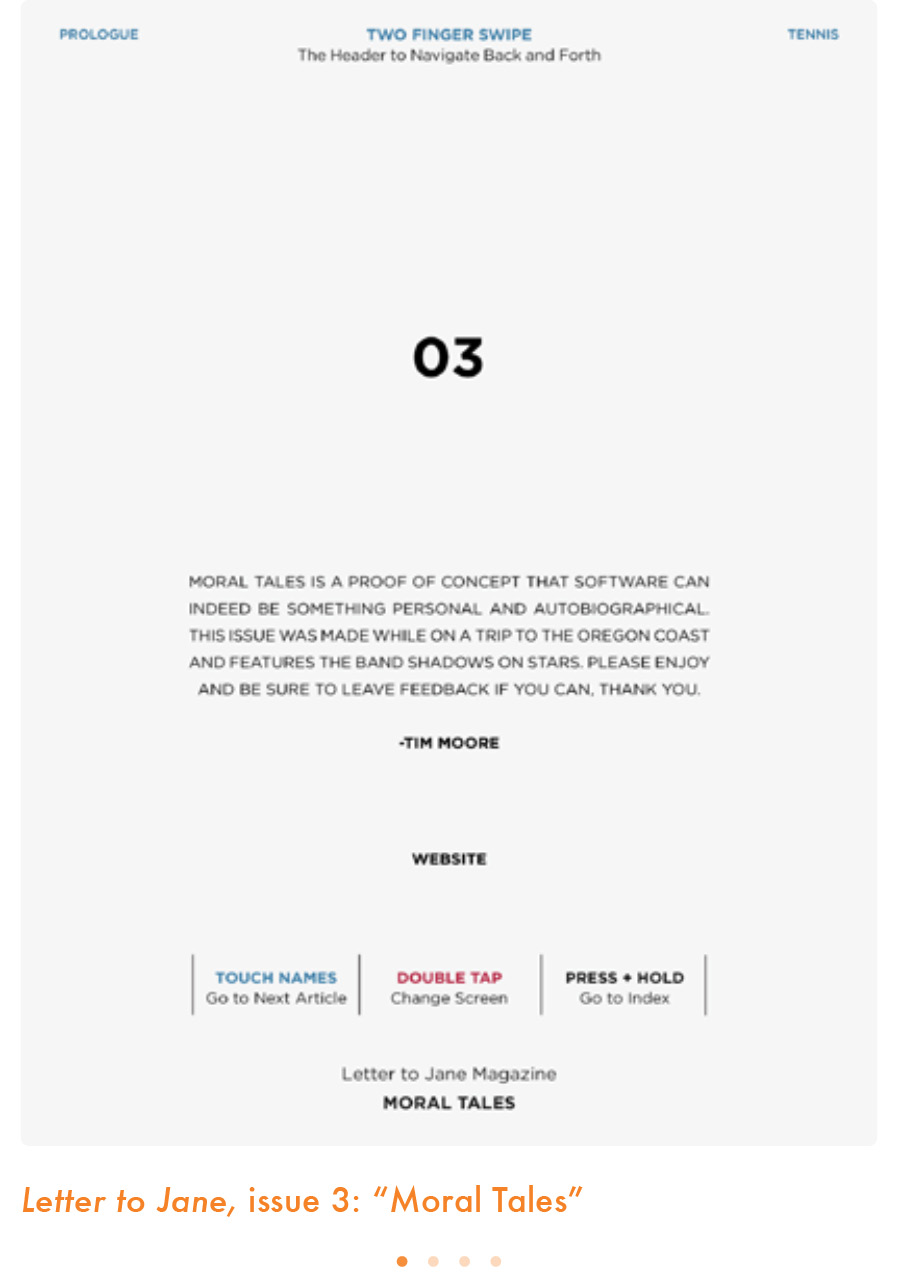
Letter to Jane is an arts/culture zine focusing on interviews and photography. Each issue has its own theme and is inspired by the work of a certain film director. The last issue, “Moral Tales,” was named after the work of Eric Rohmer. I tried to bring the same kind of simple and minimal style and feeling that is found in his films. As I said earlier, the interviews were based around me asking my favorite artists how they made it and a part of that principle is still the same. I try to keep Letter to Jane feeling as personal as possible. I try to find the right artists and talk about their careers and their views on the industry, not just the latest project they’re plugging. This magazine is my day job and because of that I live in poverty. Readers know that this is a project of love. Up until recently I had been making all the apps on my 6-year-old MacBook and an iPad 1.
The audience for Letter to Jane is a bit split these days. People who like Letter to Jane for the content and style are usually young creative professionals, 18–24. Because it’s an iPad magazine, I have a lot of fans in the publishing and technology industries who like Letter to Jane more for the technical aspects. They’re usually 30–50.
As you learned in this chapter, once the content of the app is defined, design takes over. An app’s look and feel determines how it will be perceived in those crucial first ten seconds, how order will be created on each screen, the impact of colors and, most importantly, the legibility and tone of type. Using what you have learned: