Chapter 1
Inevitable solar: the experience curve
No talk about energy is complete without the speaker noting that the sun gives us enough power in less than an hour to provide the total energy needs of the world for a year. This is not quite right. It actually takes about ninety minutes for enough solar energy to reach the surface of the earth. A small fraction of this energy is in the form of ultraviolet light (the sort that burns you when you are outside for too long) but most comes as infrared radiation (the kind that warms you when you stand in the sun) and visible light.
The numbers are simple. Across the whole year, an average of about 90,000 terawatts of solar energy is getting through the atmosphere and hitting the planet’s surface. (The earth’s annual orbit isn’t precisely circular and slightly less energy arrives when our planet is a little further away from the sun in January. To compensate, July gets more sunlight.)
How does this 90,000 terawatts of solar energy compare to our needs for power? The world today is using an average of 15–17 terawatts at any one time. Just to be clear, that is the total running energy demand, not the amount consumed in any particular period. Divided over the human population of around 7.4 billion, this represents just over 2 kilowatts per person of continuous energy consumption, about the same as an electric kettle working all the time for each of us on the planet. Most of this power is generated by the burning of fossil fuels around the globe.
The world’s current need for 15–17 terawatts is about one six thousandth of the energy that reaches us from the sun. 1/6000 of a year is about an hour and a half.
So, in the broadest terms, the earth’s surface will always receive enough useful light and infrared energy every hour of the day to give everybody all the power that they could conceivably need. We just need to capture it cheaply and get it to everybody who needs it.
The plateauing of energy demand
Of course, the figure of 15–17 terawatts is not fixed. Global populations are set to rise and, currently, some 18 per cent (or 1.3 billion) of people are without any form of electricity. At some stage the world’s poor must get access to power, and many others will buy cars for the first time and install energy-guzzling air conditioning. 2050’s energy needs may be a multiple of what we use now. Can we still be confident that solar energy can give us enough power then?
The first point to note is that energy needs are now almost flat in the world’s richest nations. In fact, total energy demand has been flat in the richer countries for over a decade. This surprises most people but, essentially, the wealthier nations have got as much power as they will ever need. Even if the industrial economies double or quadruple in size, energy use will probably not rise.
This seems counter-intuitive. The rise of the modern economy, whether in Europe, North America or Asia, was strongly linked to huge increases in fossil fuel consumption. Until quite recently, Chinese energy demand was growing as fast, or faster, than its annual economic output. There was a time not long ago when the country was said to be building two coal-fired power stations a week.
That era has passed for industrial countries, including China; our future growth will come not from using millions of tonnes of energy-intensive steel but from making smaller and smaller semiconductors. In the developed world we have largely got the stock of metals and concrete that we need and our energy demands are getting more modest, particularly as we get better at recycling everything.
In Britain, for example, the total amount of energy used peaked in the years just after 2001, has fallen by an average of 2 per cent a year since, and is now lower than it was in 1970. At the peak, the average person was responsible for about 5 kilowatts of running energy use (two kettles boiling away all the time, twenty-four hours a day). This number might seem absurdly high but when we are driving a car, for example, we might be using 40 kilowatts of power. and, even if we only drive it for an hour a day, that adds about 1.6 kilowatts to your average 24 hours running energy use. Today, the per person figure is about 4 kilowatts and falling fairly consistently at a rate of several per cent a year. Some of this energy is consumed in the home, about 30 per cent in the form of motor and aviation fuels, and some by private and public institutions providing goods and services to us.
Is the fall in British energy consumption from 5 to 4 kilowatts over the past decade or so typical of other richer countries around the world? The UK’s rate of decline is faster than in most places, but the EU as a whole managed a reduction of 8 per cent between 2005 and 2013. In the US, demand fell by about 6 per cent in the eight years to 2012. The energy use of the advanced economies appears to have peaked.
I’m going to guess that by 2035 the UK will need no more than 3 kilowatts per person. That’s a decline of around 25 per cent on today’s levels, requiring a reduction of just over 1 per cent a year, a far lower rate than the reduction seen in the last decade. Switching the population to electric cars and buses will provide a substantial fraction of this. Instead of using internal combustion engines, which are about 25 per cent efficient at turning energy into motion, we’ll be using electric motors with efficiencies of up to 90 per cent. Similarly, many of us will be using electric heat pumps to heat our (newly well-insulated) houses and using far less energy than the gas boilers of today. All our lighting will be provided by highly efficient LED bulbs.
It seems a reasonable hypothesis that 3 kilowatts per person can provide a decent standard of living, wherever you are in the world. So I am going to assume that figure is roughly what the 9–10 billion people on the planet in 2035 will need to ensure access to light, heat, electricity and transport, and for businesses and government to supply goods and services.
Interestingly, BP agrees with this central idea that energy demand is close to a peak in rich countries. Its annual forecast for 2015 suggested a rise of a third in global energy demand by 2035 – but all from outside the US and EU. It predicts that power needs in today’s rich OECD countries will barely change: China’s energy growth will have slowed, and demand from the rest of the world will also be flattening. Overall global energy demand in 2035 will be rising about 1 per cent a year, less than half the current yearly increase.
The chart below makes this transition clear. By 2035, BP says, the world will be using energy at a rate of about 23 terawatts, up from about 15–17 terawatts today. With a world population of 9 billion, that would give the average person around 2.5 kilowatts – almost as much as I think is needed.
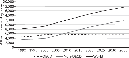
Energy demand in the rich OECD countries is flat and all future increases will come exclusively from other parts of the world.
BP’s runing energy figure of 23 terawatts seems a reasonable estimate. But I’m going to be much more conservative and assume the planet actually needs 30 terawatts – almost twice today’s level. I do this partly because I want to show that the switch to solar doesn’t require us to stint on our use of power; a solar-based world will be a world of cheap and abundant energy. If we want to move globally to a low carbon energy system, without fossil fuels, then the big question is this: can solar PV, storage and other renewable technologies provide 30 terawatts constantly, twenty-four hours a day?
The availability of renewable energy
The solar resource available to us is enormous and is thus the obvious provider of our power. Whereas there’s 90,000 terawatts of solar energy to use, the total amount of power in the wind is less than one per cent of this (around 870 terawatts). The next most important potential source is biomass – plants and trees – at around a thousandth of the amount of solar energy. And the potential for hydro-electric power or energy from waves across the world is another order of magnitude less.
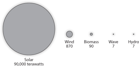
A clear winner: annual global energy capacity for solar (90,000 TW), wind (870 TW), biomass (90 TW), wave (7 TW) and hydro (7 TW).
The direct power of the sun is almost a hundred times as important as all other renewable sources put together. And indeed, all these other potential sources of renewable energy are indirect products of the sun’s rays. Wind’s chief function is to carry heated air from the hot tropics to cooler higher latitudes. Plant and tree biomass is produced as a result of photosynthesis that has used the sun’s energy to create complex carbohydrates with a high energy content. Waves are the product of offshore winds. Hydro-electric power arises from the condensation of water into clouds which then rain on to high ground.
The other sources will, however, play important roles. Wind turbines will be really helpful in meeting the world’s 30 terawatt need, although we cannot realistically expect to capture more than a small fraction of the 870 terawatts available. Wind blows over oceans, remote deserts and inaccessible mountains. Harvesting more than a few terawatts of power is going to be almost impossibly difficult.
Wind’s role will nevertheless be a vital complement to solar in many locations, such as for the UK, in offshore locations around the edges of the North Sea, where the winds blow at greater speed and reliability than anybody realised even a few years ago. Biomass will be similarly useful to meet demand when the sun isn’t shining, though we have deal first with the conflict with food growing (Chapter 4 looks at how this might happen). Hydro-electric can play a smallish part, too.
Nuclear power might help the move away from carbon fuels. However, problems of cost and construction difficulties are holding back the next generation of power plants. A year ago I heard a distinguished nuclear engineer describe the EPR, the new nuclear design planned for Hinkley Point in Somerset and other places in the UK, as ‘unconstructable’. And while the world has substantial reserves of uranium, it would very rapidly use them up if it ramped up nuclear without very substantial investment in fuel recycling (something that has so far failed to happen anywhere in the world).
If the world is going to move away from fossil energy, and decides not to use nuclear power, solar is going to have to perform the critical role. Everything else can only really fill niches, not form the mainstay of world energy supply.
Does the world have enough space for solar?
We can look at this question in a variety of different ways. The first is this. The world is receiving 90,000 terawatts of energy and will need to use as much as 30 terawatts for generation in 2050. In a reasonably sunny country, a solar panel generates about 20 per cent of its theoretical maximum. (This low figure is mainly because it is dark twelve hours a day.) So let’s say we need 150 terawatts of solar generating capacity for our 30 terawatts of continuous power requirements.
A tightly packed solar farm occupies about two hectares (five acres) of space to generate one megawatt. There are a million megawatts in a terawatt, so we will need 2 million hectares for each terawatt of peak power. 150 terawatts of generation therefore requires 300 million hectares.
Is this a lot? Very approximately, it’s 1 per cent of the world’s land area: far from negligible but not impossibly large. It is also a figure that doesn’t take account of the 50 to 100 per cent improvements that we can reasonably expect between now and 2050 in the efficiency of solar panels. Nor the harvesting of solar energy falling on the walls and roofs of buildings. Together, these factors should cut the area of open space needed to well below half a per cent of the world’s land area. We might be able to manage with about a quarter of one per cent of the planet’s land surface.
When energy geeks are talking about this point to general audiences, they often show a world map with smallish dots, representing the area needed to provide the world’s energy. They put some squares in the middle of the Sahara or the Arizona desert or on remote parts of Asia. Actually, this is a cheat. We won’t place our solar farms in regions like this. Most photovoltaic installations will need to be close to centres of population and large scale electricity transmission lines. Generally solar will need to be placed in crowded parts of the globe and we shouldn’t try to deny this.
For a country with a high population density – like the UK or Bangladesh – a much larger fraction of total space will be needed than the 1 per cent suggested above. By 2050, Bangladesh, the world’s most densely populated large country, might have 200 million people, or about 2 per cent of the world’s total. To give all these people 3 kilowatts of running energy will require about 6 million hectares, or 40 per cent of the country (before the efficiency improvements or the use of the roofs and walls). This is clearly a problematic number. Even though Bangladesh will probably put panels on every single building, on floats in rivers and lakes and even above some crops, it will still struggle to meet all its energy requirements from solar electricity. It will need to import power from India and other countries and may have to hold its energy requirements below the 3 kilowatts per head level.
In the UK, the position is somewhat different. We will need energy for at least 70 million people on a land area of 24 million hectares. At current solar panel productivity in this cloudy country – with the amount of sunshine running at less than half the world average – perhaps 16 per cent of the land area would need to be occupied by solar to provide all the energy the country will consume. Large amounts of PV-collecting capacity will need to be mounted on roofs and south-facing façades, which will work relatively well because the sun is generally quite low in the British sky. And solar will need to be supplemented by the country’s unusually large wind resource, particularly in winter. It will be a challenge.
These are the most difficult countries. Dense populations and, in the UK’s case, poor insolation, make the solar switch harder than the average. Look at the US, however, and the position is very different. Here, even at today’s efficiency levels, the total space needed for panels would only be about 3 per cent of the land area, even if no contribution at all came from wind power. The southwest US has some of the best sunshine in the world – and large parts have good wind as well – so the space requirements will be even smaller.
If the US can push its needs for electricity and other energy sources down to 3 kilowatts a person – a very much lower figure than current requirements – and we experience the expected improvements in the ability of panels to turn sunlight into power, then probably about 1 per cent of the US land area will have to be used for PV or other solar technologies. A large fraction will be on land of negligible agricultural value, although some will inevitably have high levels of unusual biodiversity or other important environmental features.
But can we rely on solar getting cheaper?
In the late 1960s the Boston Consulting Group (BCG) investigated the cost of producing semiconductors for one of its clients. The consultants found that every time the aggregate number of electronic devices that had ever been made doubled, the cost of each individual item fell by about 25 per cent. If, for example, producers made a total of 1,000 units and the cost was $10 each, then by the time a total of 2,000 had been made the cost would be $7.50 per unit.
Bruce Henderson, the founder of BCG, called this the ‘experience curve’ and his company later showed that the cost declines arising from this effect were pervasive across different industries, countries and time. Although the rate of cost reductions tends to be fastest in products that are manufactured using automated processes in large factories, the experience curve phenomenon can also be seen in office-based or even agricultural activities. The speed of the decline varies from fractions of one per cent for each doubling of total production to levels even greater than that observed in semiconductors. A recent note from BCG reported that: ‘Hard-disk drives showed a cost decline of about 50 per cent for each doubling of accumulated production from 1980 through 2002, bringing the average cost per gigabyte from $80,000 in 1984 to $6 in 2001.’
The most astonishing decline has probably been observed in the cost of gene sequencing. The full cost of extracting the genetic instructions from the human sequence fell from about $100 million in 2001 to around $2,000 in 2015. That is roughly equivalent to a 60 per cent slope on the experience curve.
We’d be wrong to imagine that BCG consultants were the first people to notice the impact of the accumulated number of units produced on the cost of production. That honour probably goes to T. P. Wright, an otherwise little known aircraft engineer who produced an academic paper in 1936 called ‘Factors affecting the cost of airplanes’. This paper gave his observations, based on real factory-floor experience in the US, of how the costs of making a particular aircraft fell as the total number of planes produced rose.
He called this phenomenon ‘the learning curve’ and even today his term is more widely used than BCG’s equivalent expression. He found that the rate of improvement was approximately 15 per cent for every doubling of accumulated production, a number not too dissimilar to the 20 per cent declines typically seen in solar panel manufacturing over the last sixty years.
Nobody doubts that learning effects exist. They are too universal not to be real. Take yourself as an example and that item of flat-pack furniture you recently purchased from IKEA. It probably took you several hours to assemble and, if you are like me, you made several mistakes in the process. But if you bought a second piece of the same piece of furniture, you’d probably see a major reduction in the time taken (and an enhancement in the quality of the finished item). That progress would continue over further units, although the improvements would tend to get smaller. That’s an ‘experience curve’ in BCG’s language.
In the Introduction, I mentioned Peter Eisenberger, the man who led Exxon’s investigation in the 1980s into the prospects for solar energy. He agrees about the underlying predictability of solar development and the role of ‘learning by doing’. In an interview with Bloomberg News published in November 2015 and headlined ‘Exxon predicted today’s cheap solar boom back in the 1980s’ Eisenberger reflected that with enough data on how investment and effort lead to progress, ‘you can use it pretty accurately to forecast what might happen in the future’. Eisenberger was saying that today’s costs of solar technologies could be forecast with reasonable precision using assumptions about how fast costs improve with manufacturing experience.
Explanations of why the declines occur so consistently are varied. Some suggesr that the dominant causes are the larger factories and bigger companies (so-called ‘economies of scale’) that occur as industry grows. Others point to the effect of many small and minor improvements in manufacturing processes, technological advances or the fact that humans are good at getting rid of irksome inefficiencies.
Bruce Henderson of BCG taught us that cost declines across different industries were remarkably closely tied to the total volume of a particular product that had ever been made. In apparent contrast, Moore’s Law, a maxim invented by Gordon Moore, one of the founders of chip-maker Intel, postulated in a 1965 paper that the maximum number of transistors on an integrated circuit would double every two years, while the cost of the chip would stay the same. Such an improvement would mean an approximately 41 per cent rate of reduction, year after year, in the cost of making transistors. In the way it is framed, Moore’s Law appears to suggest that the passage of time drives the improvements. But the cost reductions that we have seen could equally be explained by a steep experience curve and the very rapid expansion in the numbers of transistors manufactured.
For the last half century commentators have questioned whether manufacturing cost improvements can continue for electronic components. So far, they have been wrong time after time. Looking out to 2020, experts now suggest binding physical limits to the number of transistors on a chip. At that point Moore’s Law will cease to work.
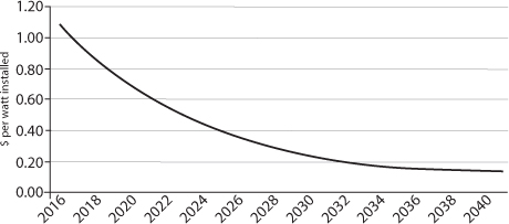
But nobody yet sees comparable boundaries to the fall in the cost of collecting solar energy. Analysts attempting to calculate the percentage fall in cost from each doubling in accumulated global output of solar panels have almost all arrived at a figure of 20 per cent and the PV industry named this frequently observed, apparently highly predictable cost decline ‘Swanson’s Law’, after the CEO of a solar PV company. The chart below shows the average cost of a watt of solar PV generating capacity on the left hand scale. The bottom axis is a measure of the total volume of PV panels produced, expressed in megawatts of peak output (MWp). Each point on the line in the chart measures the position at the end of each year since 1976. Although the speed of fall varies from period to period, the slope matches a 20 per cent experience curve over the course of the last forty years.
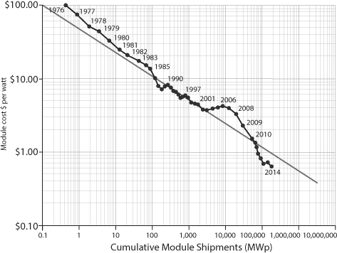
Source: Creative Commons
Swanson’s Law tracks the cost of solar PV modules. The cost of solar has fallen predictably and consistently from 1976 to today.
Twenty per cent is a slightly slower rate of decrease than BCG calculated for the early semiconductors half a century ago but still a strikingly fast rate of decline – and the figure has been standard wisdom for some time. Back in 2004, a group of Dutch and German researchers exhaustively discussed the evidence for the experience curve for photovoltaics. Their conclusion was clear-cut. The solar experience curve existed and the rate was somewhere between 20–23 per cent. If anything, they concluded, it was increasing over time. A couple of years later Travis Bradford, an American fund manager, calculated the decline at around 18 per cent for each doubling in the period 1980–2003. (Bradford’s work is the earliest I have seen that asserts unequivocally that the resilience of this figure over more than three decades makes the eventual dominance of solar power a near-inevitability).
Other studies have compared the PV experience curve to the declines seen in the cost of onshore wind power. Here, the degree of cost reduction appears to run at about 8 per cent for each doubling of installed capacity. This means that although turbines in the windiest onshore locations offer electricity more cheaply than solar today, this will change. In the longer term solar seems certain to be less costly.
Other sources of power, such as nuclear, appear to have very slow declines in the expense of construction, at least in the last couple of decades. In fact, almost every study shows that the recent costs of nuclear power stations have increased sharply. This is probably because each new generation of power station is more complex and difficult to construct than the last. More money is spent on safety. Tony Roulstone, a nuclear engineer from Cambridge University, says that the learning curve for nuclear doesn’t have a downward slope also because each construction site uses different workforces and construction engineers who don’t learn from each other’s experiences. There is very little learning by doing.
If the world is going to use nuclear power instead of solar, it will have to find a way of getting plant construction on to a similar experience curve to solar. Since the first civilian nuclear power station in the world was built in Lancashire in the mid-1950s, this has never happened. Even France, which put in place the most sustained programme of nuclear power construction ever seen, saw sharp increases in costs over the two decades of construction. Prices approximately tripled over the period for each unit of electricity generation capacity.
Returning to solar, what does Swanson’s Law mean for the future? As of late 2015 the world has manufactured something over one billion individual PV panels. Were the sun were shining on all of them at the same time, they would be continuously producing about 240 gigawatts of electricity, almost ten times the UK’s requirement in the middle of a summer day. By the time the planet has two billion panels, the cost will be 80 per cent of today’s level – if the learning curve forecast is correct. The initial price of the PV system is by far the most important determinant of the cost of the electricity it will produce. If a 10-kilowatt installation on a school roof costs £10,000 today, but £8,000 in two years’ time, and nothing else changes, then the implicit cost of its electricity will also have fallen 20 per cent. The learning curve in manufacturing PV kit drives down the price of solar electricity.
The Swanson figure of 20 per cent reductions for every doubling of accumulated production of solar panels is a vital number. But it is only part of the equation. The other crucial element is the rate of expansion of manufacturing volumes. During 2015, the world manufactured enough panels to produce about 55 gigawatts of peak power, adding to the 175–185 gigawatts already installed. (Almost all the panels ever made are still generating electricity.) So in 2015 the world’s total accumulated PV production rose by slightly more than 30 per cent. Swanson’s law predicts that this reduced the cost of PV by about 8 per cent. (The maths here isn’t entirely simple because each bit of extra accumulated production reduces the cost of PV by a gradually smaller amount.)
The rate of future fall in costs depends on the combination of Swanson’s Law and on the speed of expansion of PV manufacturing. More precisely, cost reductions will depend on what percentage the new capacity adds to the total accumulated production each year. Currently, expectations are for installations of at least another 65–70 gigawatts globally in 2016, adding another 25 per cent to cumulative production, and reducing costs by a further 6 per cent or so.
This may well be far too conservative; installations of PV have grown on average by a fairly consistent 40 per cent a year for the last few decades and US, Chinese and Indian installations were sharply accelerating as we entered 2016. One recent prediction from industry analysts suggests the US alone will put 16 gigawatts on the ground and on roofs during 2016. And in the UK, where on the first weekend of April 2016 power from solar exceeded that from coal, it is amazing to note that 99 per cent of that PV capacity had been deployed since May 2010.
What do cost declines mean for PV?
Photovoltaics currently supply less than 2 per cent of the world’s electricity but such is the awesome power of compound growth that a straightforward continuation of the average 40 per cent rate of growth over the last half century would see about 150 terawatts of solar PV installations by about 2035. That would provide enough for all the world’s energy needs – not just electricity.
But this is not the likely shape of the upward curve. More probable is that growth shades off slowly as PV grows. Most products and services that eventually become universal (such as access to the internet in developed countries or mobile phone ownership in the newer economies) follow a pattern often described as the ‘S curve’. With the help of Professor Nick Jelley of Oxford University, I developed some arithmetic that allows us to model how PV might actually follow an S curve between now and about 2040. One possible pattern is shown below.
This is a description of what might happen and is certainly not a prediction. Nevertheless, I think it illustrates some important hypotheses. In this model, a 40 per cent growth rate continues for a few years and then begins to fall gradually, and later with increasing speed. By the late 2030s – as almost all energy needs are fulfilled by PV – the amount of new capacity installed each year falls to almost zero. Slower growth rates in later years would mean, of course, that it will take longer to move to near complete reliance on solar energy. Nevertheless, the complete transition still occurs by 2041.
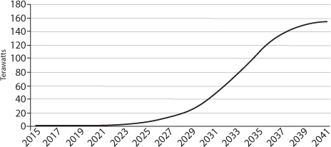
The S-curve. Forty per cent annual growth, slowing as saturation arrives, gives the world an energy system entirely based on solar within twenty-five years.
If, instead of 40 per cent growth, we see 30 per cent increases each year then it takes until mid-century to get to complete reliance on solar. An even lower rate of twenty per cent would mean it will be at least fifty years before that target is reached. Importantly, that 20 per cent growth rate would mean that the world would lose any hope of achieving a target of less than two degrees of global warming. But a continuation of 40 per cent growth may enable us to achieve close to zero emissions sufficiently soon to avoid the worst impact of climate change.
If we assume that an experience curve of 20 per cent slope continues to apply – and I can see reason why not – then the cost of PV in a world of 40 per cent yearly growth falls from about $1.20 a fully installed watt in late 2015 to as low as 15 US cents in 2041. (The faster the growth, the quicker the cost of solar declines, if the experience curve continues.) The crucial impact of this is that the implicit cost of electricity produced by solar PV in 2015, assuming an interest rate of 6 per cent and average amounts of solar radiation, is about 7.5 cents per kilowatt hour and will be little more than 1.5 cents by 2041. No other technology is likely to come remotely close to achieving this level. To labour the point, if PV is competitive now in the sunnier places around the world and falls to about one fifth of today’s cost in 2041, it would be strange if it did not take over the world energy system.
Whether these individual numbers are accurate forecasts or not is not particularly important. The crucial thing is that a continuation of the trends of the last decades (40 per cent annual growth and a 20 per cent slope on the experience curve) can get the world free of fossil fuels within about thirty years. If world energy demand doesn’t rise as fast as I have assumed then the process of complete decarbonisation would be even quicker.
If current trends continue, the price of installing solar PV will fall to less than a sixth of current levels by 2041.
The even more surprising conclusion is that the net cost of this to the global economy may be less than zero. As solar increases, the amount of money that the world needs to spend on fossil fuels falls. There is simply less need for coal, oil and gas as PV replaces them as the source of energy. I compared the total cost of adding enough solar power to completely replace fossil fuels over the next few decades with an alternative scenario that sees all renewables growth stopping tomorrow and the world needing more and more fossil fuels to meet its needs. If PV increases sufficiently rapidly, the world actually saves money by 2041. The creation of an entirely fossil-free global society is costless over a twenty-five year period.
At today’s depressed prices, the world spends about $2.2 trillion on fossil fuels every year. If total energy demand rises from around 15–17 terawatts to about twice this level, then the total expenditure on fossil fuels between now and 2041 will be just over $81 trillion (which is about the total size of annual world GDP today). The total cost of installing enough PV by 2041 to meet the entire energy needs of the world will be slightly less.
It may even be better than this. In my calculations, I assumed that fossil fuel costs stayed at the very low levels of early 2016, with oil at about $32 a barrel and coal and gas also very cheap. At higher levels of fossil fuel prices, the benefits of switching to PV as fast as possible would be greater.
The graph below shows how expenditures might evolve year by year. The thick line estimates the total cost of installing PV and buying sufficient fossil fuels to meet the energy demand unfilled by solar energy. The dotted line shows how total fossil fuel costs would rise if there were no PV growth at all as the total global need for energy increases.
The PV line rises to a peak of around $5 trillion about 2032. It then represents a combination of around $3 trillion of solar PV installation costs and $2 trillion of remaining fossil fuel expenditures. This compares with about $3.3 trillion of carbon fuel costs if PV installations stopped completely tomorrow. So in 2032 THE SWITCH to PV is costing the world about $1.7 trillion more than a fossil fuel future. This is the worst year. By 2036, the aggregate of new PV costs and the remaining carbon fuel expenditure is less than the cost of a no-PV world for the first time. By 2041, the fossil fuel dominated scenario costs $4 trillion a year compared to almost nothing for a PV-based economy.
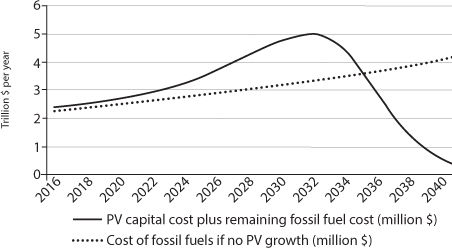
Moving to an energy system based on PV costs more over the next few years but then saves huge sums each year.
It’s worth pointing out that if fossil fuel prices return to their levels of 2013 then even the worst year of 2032 would see a lower cash bill from the switch to PV than from unrestrained growth in conventional fuels. In a world of higher oil prices than today, there might not be a single year in which the transition had a net financial cost.
I think the conclusion is clear. The world will benefit in cash terms, without even considering climate or air pollution benefits, from the move to renewable energy. It takes until 2041 to drive fossil fuel costs to zero but by that date the world has, over the full twenty-five-year period, actually saved money even at the low oil prices of $32 a barrel used in these calculations. By contrast, if PV grew more slowly than 40 per cent a year, not only would the world both have magnified its problems of climate change and air quality, but it would also not have saved money. For example, a growth rate of 30 per cent a year would result in the world being almost $4 trillion less well off than if PV continued on a 40 per cent growth curve. In short, the world’s financial interests lie in pushing PV growth hard so that it continues to grow at its historic rates. Even if you believe climate change is an invention of the world’s scientists and that air pollution doesn’t result in premature deaths, PV makes straightforward and hard-headed financial sense.
It may be obvious but the key reason for all this is the experience curve. The more rapid the growth of output of an industry, whether it be semiconductors, mobile phones, LED lights or solar panels, the faster the rate of cost improvement. As a result, I suggest that if the world had to have just a single energy policy priority, the rational thing would be to back the continued rapid growth of PV panel production and installation to get the benefits of the experience curve as quickly as we can. (Later on in the book, I’ll argue for a focus on further research into the improved conversion of solar light into liquid fuels as a second priority.)
Perhaps, like me, you find the extraordinary impact of fast growth combined with a steep experience curve difficult to comprehend. How can it be possible to get from 1 per cent of all energy requirements to close to 100 per cent in twenty-five years? Human psychology is very bad at understanding the long-term effects of a consistent percentage increase. This is perhaps best illustrated by the old story of an Indian king who offered his servant a prize for inventing the game of chess. The servant’s claim was modest. He wanted some rice. All that he required was one grain on the first square of a chessboard, two on the second, four on the third, and so on. The king agreed, thinking the servant was a fool for asking for so little. His views started to change as the doubling from one square to the next started to require large quantities of grain. The king never reached the 64th and final square because by that time the amount of rice would have exceeded total world production by a factor of 1,000. Like most humans, he’d been unable to foresee the impact of continuous compound growth.
Some futurists note the importance of this deficiency in our psychology. They refer to it as the ‘second half of the chessboard’ problem. While we can envisage the impact of the doublings on the first few squares from a very small beginning, we do not have the ability to comprehend what will inevitably happen as the exponential growth continues. Solar power is still in the first few squares of the chessboard and none of us can yet see that continued rapid growth will eventually completely change the shape of the world energy system.
And we don’t only have a blind spot about compound growth. Another weakness is that we cannot comprehend the impacts of two forces acting at once and strongly reinforcing each other. What has happened in solar PV over the last half century is that increases in accumulated production have caused major declines in the cost of manufacturing. These cost reductions have then resulted in lower prices and, inevitably, higher volumes of orders – ‘a virtuous circle’ as economists like to call it.
Even experts have problems with forecasting the speed of cost decline. In the 2004 Dutch/German study I mentioned on p. 22, the researchers told their readers that the experience curve was real and would probably persist in cutting PV prices indefinitely. But they went on to reduce expected industry growth rates to only 15–20 per cent rather than the 40 per cent annual rates experienced up to that point. As a result, they said that ‘reaching break-even for the wholesale electricity market will most probably not happen before 2030’. For sunnier countries, that assertion is already incorrect.
It was the same for transistors, the building blocks of the electronic circuitry that now dominates our lives; lower prices meant that the range of financially viable applications increased year after year. Now we are actively talking about incorporating integrated circuits into almost everything that is manufactured because they are so cheap.
The volume of transistors that are shipped each year continues to rise, further driving experience curve benefits and cutting costs yet more. One analyst recently estimated that the number made is rising by about 65 per cent a year, meaning that over the next eighteen months more will be made than have been made in their history. The cost has gone down more than a thousand billion times since 1955, largely due to this expansion.
Dan Hutcheson, the head of industry research firm VLSI Research, made a comment about the growth of transistors that is relevant to PV:
This steady, predictable decline in prices was a self-reinforcing gift. Because electronics manufacturers could depend on Moore’s Law, they could plan further ahead and invest more in the development of new and better-performing products. In ways profound and surprising, this situation promoted economic growth. It has been the ever-rising tide that has not only lifted all boats but also enabled us to make fantastic and entirely new kinds of boats.
To compare the likely progress of PV over the next few years with transistors is not fanciful. Solar panels use some of the same principles of physics as transistors and improvements in manufacturing costs will come through similar processes of miniaturisation. The major solar PV manufacturers are all aware of the need to invest in performance improvement, knowing that if they do not spend they will be left behind by the cost improvements captured by their competitors.
I cannot see any reason why the experience curve in solar PV will stop. The world will use lighter and cheaper materials for the panels – in fact they probably won’t be panels in twenty years but rather sheets – and the electronics to connect to the electricity grid (using huge numbers of ever cheaper integrated circuits, of course) will be getting smaller and more efficient. Chapter 3 has more details of how the technology of solar photovoltaics will improve.
Doyne Farmer, a mathematics professor at Oxford University, has made a study of the reliability of experience curve trends. If we know a particular technology has fallen in cost by 20 per cent for every doubling of accumulated production, how certain can we be that the trend will continue? Doyne and his colleague François Lafond did their work based on dozens of experience curves for different products and showed the underlying reliability of the continued decline in cost. If a product is on an experience curve of a particular rate, it tends to stay at that percentage. They showed, based on statistical analysis of the history of other commodities, that there is a small percentage chance that the PV cost decline will be halted or interrupted but that the odds are very low. Much more likely is that the decline in costs will continue at the same historic rate. They suggest that the most likely module cost in 2030 will be about 13 US cents per peak watt, about one sixth of the cost in 2013.
Not just falling costs for solar; the price of alternatives is tending to rise
Writers should probably avoid the phrase ‘tipping point’, when referring to a sudden speeding up of the transition between one state of affairs and another. The expression usually hides a lack of clarity about what is really going on. However, it is exactly what seems to be happening with solar power. Having struggled for decades, with support from eccentrics and specialist users, solar has now become the obvious, almost unthinking, choice for those adding new power capacity in many parts of the world. In some of the months of 2015, solar and wind together provided almost 100 per cent of the additions to the US grid, for example.
When another solar farm is added to the grid, or a few new panels put on someone’s domestic roof, electricity utilities know one thing with absolute clarity. In almost all circumstances every single kilowatt hour of power produced by the new PV system will be used. Electricity from PV is free to produce and so even if the market price of power falls close to zero, solar power will still be shipped out into the grid. Once installed, PV (and wind-generated) electricity will always be able to undercut all other sources of power.
However low the price of gas falls, it will never be cheaper to fire up a gas-fired power station than to take electricity from a solar farm. As solar penetration rises, operators of fossil fuel plants are therefore only too aware that the total amount of electricity they will be called on to supply will be smaller and smaller each year as solar grows.
Put yourself in the position of an electricity utility trying to decide whether or not to spend upwards of a billion pounds to build a new Combined Cycle Gas Turbine (CCGT) plant. It varies a bit around the world but generally power stations compete in a market. Buyers of electric power – usually companies that then sell electricity to homes and businesses – will purchase power from whatever source offers the lowest price for the next hour. If solar or wind are producing enough electricity, coal and gas power stations will be idle, not even earning the money needed to pay staff or maintenance costs, let alone the interest on the money borrowed to construct the plant. So the company facing the decision about whether to build the new CCGT plant needs to forecast whether it will earn enough to cover its costs and make a profit.
In front of the investment decision-takers will be a report containing the two key numbers: a projection of the number of hours a year the power station will work over the twenty-five or thirty years of the plant’s life and an estimate of the price it will get for the electricity it generates when it is working. The first of these numbers might be 2,000 hours, or it might be 6,000, out of the nearly 9,000 hours in a year. A large number will mean that the plant is a valuable addition to the portfolio of generators providing electricity. It will be working most of the time. A limited number of hours will suggest that the power station will be used only when other sources of power are not quite providing enough.
On the same page will be an estimate of the price it will obtain for electricity during the hours it is working. The people round the table will start to look worried. If solar electricity is getting cheaper and cheaper – perhaps dropping in price by 8 or 10 per cent per year – and continuing to grow rapidly, then as time goes on both the number of hours that the CCGT will work, and the price it is able to obtain, will tend to fall. No one knows quite how rapidly the change will occur, but occur it will.
We can see the problem facing these decision-takers. The success of their gamble investing a large amount of their shareholders’ money for the next twenty-five years or more will depend on whether the plant is going to be reliably used for profitable generation most of the hours in a year. They don’t want their billion pound plant lying idle, losing cash. They cannot predict how fast solar will grow but they will have noted that even the CEOs of fossil fuel companies are beginning to say PV will eventually dominate. Trend-setters like California are already mandating 50 per cent renewables by 2030, leaving little space for gas or coal-fired power. A report from Bloomberg in October 2015 noted that the average utilisation of gas-fired power stations in the US had fallen from 70 per cent of the available hours in the year before to 62 per cent in 2015. Coal-fired power stations in China were used 51 per cent of the time in 2015, down from 56 per cent the year before. And this is only the start of the trend.
If these people sitting around a boardroom table were in the UK, they’d probably have access to the chart below, and it doesn’t make enjoyable study. For a few brief months in late 2014 and early 2015 the UK was one of the world leaders in installing photovoltaics. Between summer 2014 and summer 2015, the amount of solar power almost doubled from about 4.4 to about 8.3 gigawatts (the numbers are vague because the UK government doesn’t keep proper statistics).
The chart below shows the impact of this sharp growth on the need for power from gas and coal power stations at 1pm in the March–July period of 2014 and 2015. (I’ve used 1pm on British Summer Time because this is usually the time of peak solar PV output.) The UK had a total of about 44 gigawatts of coal and gas-fired power stations. In 2014, over half of this capacity was typically producing power at 1pm in summer. This average fell by 3.5 gigawatts in one year, reducing the utilisation of available capacity from 51 per cent down to 43 per cent. As solar goes up, the amount of electricity needed from fossil fuel producers inevitably falls. If you own gas power stations with hundreds of people on the staff, this really hurts.
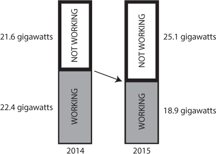
Patterns of working for fossil fuel power stations in the UK, summer 2014 and 2015
Over the summer of 2015, the 1pm need for fossil fuel generation fluctuated from below 10 gigawatts to a maximum of around 28 gigawatts. Lunchtime in the summer has quite a high daily power demand compared to the early and late parts of the working day but large numbers of gas and coal-fired plants never worked during the midday hours. There was a regular siesta for tens of fossil fuel stations across Britain. On one day in early June – an unusually sunny and windy Saturday – the need for coal and gas plants fell to just 9 gigawatts, implying that only one fifth of these units were working. It wasn’t until the early evening that this figure rose to more than 10 gigawatts. This was just one day, of course, and the wind doesn’t often blow strongly in June, but it shows what the future will be like for fossil fuel generating plants.
Bankers and investors note events like this and they are getting increasingly twitchy about putting their money behind new fossil fuel power stations. Their concerns are exacerbated by the long-term trend of declining electricity use, unrelated to the growth of PV. Even with these adverse background circumstances, however, sometimes a utility will commit to a new CCGT plant. Its reasoning will be that when renewables are unavailable at night or in periods of unproductive weather, the market price will shoot up. So although the proposed power station will not work many hours each year, it will make more money when it does. Spikes in the electricity price can be short but sometimes reach astonishing heights. On one day in November 2015, the UK’s National Grid was forced to pay a small number of generators about £2,500 per megawatt hour of electricity – over fifty times the going rate – because of an unexpected shortage of electricity. (This deficit actually arose because several fossil fuel plants all failed at the same time.)
However, someone in the room when the decision is made whether to built a new gas-fired power station will probably point out that these spikes may become less frequent in the future. ‘In ten years’ time,’ the finance person may say, ‘many businesses and households will be linked to a system that automatically reduces their electricity draw when the cost rises. This will tend to dampen the sharp upward moves. We cannot rely on high prices, even when solar (or wind) isn’t working.’
He or she may get outvoted, but their concerns are reasonable. Today’s variations in price are in part a function of the historic inflexibility of electricity demand. Most users, including homes and many small businesses, don’t pay any more even when their utility has had to pay thousands of pounds for a megawatt hour during periods of electricity shortage. So there’s little or no incentive on them to ratchet down their use. In the face of sharp increases in the wholesale price, utilities face inflexible demand. This will change dramatically over the next few years as companies like REstore (see p. 149) put sensors and algorithms in place that reduce electricity use in factories and warehouses when supply is tight.
When I spoke to REstore entrepreneur Pieter-Jan Mermans, he told me that before he set the business up he’d gone to visit a competitor that had been around for some years. That company’s business, like his, revolved around cutting the electricity demand of major users at periods of grid stress in return for payments from the operator of the grid. They did this work using old-fashioned fax machines and telephone calls. And they could never be completely sure that the electricity use at their customers had in fact been cut below what it would have been because they didn’t have sensors or intelligent meters at the factories. That’s less than ten years ago.
Now REstore has completely automated ‘demand response’ and hundreds of sensors at its customers measure the need for electricity every second. Demand can be throttled back quickly and easily. As a consequence the electricity industry is rapidly becoming like any other market in which tight supply causes buyers to back away, perhaps delaying their purchases or perhaps avoiding the need to buy altogether. The idea that electricity demand is inflexible and unchangeable is wrong, and electricity producers can no longer rely on being able to sell electricity into sharp price spikes at busy times.
As solar grows, along with wind and the other technologies discussed in this book, it will become more and more difficult to justify investing in fossil fuel power stations. Investors will get increasingly wary of backing new projects using gas or coal. Their insecurity will manifest itself in demands for higher financial returns, delivered quickly and before the solar revolution completely consumes the energy market. Those requirements will be harder and harder to fulfil. Solar will become cheaper – not without the hiccups of temporary price rises but generally much cheaper year on year – and the relative attractiveness of gas and coal will fall further.
Activist movements in universities and throughout social media will encourage the trend towards renewables and eventually it may become impossible anywhere in the world to build a gas-fired power station, let alone coal, in the face of public disapproval. In what may be a symbolic moment in early October 2015, a British developer admitted it could not find the finance for a long-planned CCGT plant in Manchester. Similar cancellations have been seen across the world, partly as a result of the rise of solar and other renewables and partly as a result of the worldwide flattening of electricity demand. Even in the US, the home of cheap natural gas as a result of the fracking boom, the installation of new CCGT plants is running at a fraction of the level of recent years. Coal is already in deep crisis with a string of bankruptcies in 2015–16, among them Peabody Energy, the world’s largest coal company.
It may be too soon to say this, but the developed world may be close to collectively concluding that new coal and gas is financially unjustifiable in the face of lowered need for electricity and better availability and cost from solar PV. As PV grows, the financial rewards from investing in fossil fuel power generation continuously weaken. As that happens, the ‘tipping point’ will be a reality.
Governments have been slow to recognise this, not least because it produces some very uncomfortable conclusions about their capacity to determine the shape of the future electricity industry. In the UK, for example, the government minister in charge of energy policy, Amber Rudd, said in late 2015 that the national interest is ‘best served by open competitive markets’. But no market can work effectively when a new entrant – in this case solar PV – can offer extra electricity at zero cost. If building new gas-fired power stations is necessary to provide a last resort source of electricity when other resources are unavailable, then they will have to be financed, or guaranteed, by governments. Or, as I suggest in the last chapter of this book, we’ll need to develop sources such as renewable methane as the fuel for the gas-fired power stations some countries will continue to need when the sun isn’t shining and the wind not blowing.