Chapter 14. Table Layout in CSS
You may have glanced at that title and wondered, “Table layout? Isn’t that exactly what we’re trying to avoid doing?” Indeed so, but this chapter is not about using tables for layout. Instead, it’s about the ways that tables themselves are laid out by CSS, which is a far more complicated affair than it might first appear.
Tables are unusual, compared to the rest of document layout. Until flexbox and grid came along, tables alone possessed the unique ability to associate element sizes with other elements—for example, all the cells in a row have the same height, no matter how much or how little content each individual cell might contain. The same is true for the widths of cells that share a column. Cells that adjoin can share a border, even if the two cells have very different border styles. As we’ll see, these abilities are purchased at the expense of a great many behaviors and rules—many of them rooted deep in the past—that apply to tables, and only tables.
Table Formatting
Before we can start to worry about how cell borders are drawn and tables sized, we need to delve into the fundamental ways in which tables are assembled, and the ways that elements within a table are related. This is referred to as table formatting, and it is quite distinct from table layout: the layout is possible only after the formatting has been completed.
Visually Arranging a Table
The first thing to understand is how CSS defines the arrangement of tables. While this knowledge may seem a bit basic, it’s key to understanding how best to style tables.
CSS draws a distinction between table elements and internal table elements. In CSS, internal table elements generate rectangular boxes that have content, padding, and borders, but not margins. Therefore, it is not possible to define the separation between table cells by giving them margins. A CSS-conformant browser will ignore any attempts to apply margins to cells, rows, or any other internal table element (with the exception of captions, which are discussed in the “Captions”).
There are six basic rules for arranging tables. The basis of these rules is a grid cell, which is one area between the grid lines on which a table is drawn. Consider Figure 14-1, in which two tables are shown: their grid cells are indicated by the dashed lines drawn over the tables.

Figure 14-1. Grid cells form the basis of table layout
In a simple 2 × 2 table, such as the lefthand table shown in Figure 14-1, the grid cells correspond to the actual table cells. In a more complicated table, like the righthand table in Figure 14-1, some table cells will span multiple grid cells—but note that every table cell’s edges are placed along a grid-cell edge.
These grid cells are largely theoretical constructs, and they cannot be styled or even accessed through the Document Object Model (DOM). They just serve as a way to describe how tables are assembled for styling.
Table arrangement rules
-
Each row box encompasses a single row of grid cells. All the row boxes in a table fill the table from top to bottom in the order they occur in the source document (with the exception of any table-header or table-footer row boxes, which come at the beginning and end of the table, respectively). Thus, a table contains as many grid rows as there are row elements (e.g.,
trelements). -
A row group’s box encompasses the same grid cells as the row boxes it contains.
-
A column box encompasses one or more columns of grid cells. All the column boxes are placed next to one another in the order they occur. The first column box is on the left for left-to-right languages, and on the right for right-to-left languages.
-
A column group’s box encompasses the same grid cells as the column boxes it contains.
-
Although cells may span several rows or columns, CSS does not define how this happens. It is instead left to the document language to define spanning. Each spanned cell is a rectangular box one or more grid cells wide and high. The top row of this spanning rectangle is in the row that is parent to the spanned grid cell. The cell’s rectangle must be as far to the left as possible in left-to-right languages, but it may not overlap any other cell box. It must also be to the right of all cells in the same row that are earlier in the source document (in a left-to-right language). In right-to-left languages, a spanned cell must be as far to the right as possible without overlapping other cells, and must be to the left of all cells in the same row that follow it in the document source.
-
A cell’s box cannot extend beyond the last row box of a table or row group. If the table structure would cause this condition, the cell must be shortened until it fits within the table or row group that encloses it.
Note
The CSS specification discourages, but does not prohibit, the positioning of table cells and other internal table elements. Positioning a row that contains row-spanning cells, for example, could dramatically alter the layout of the table by removing the row from the table entirely, thus removing the spanned cells from consideration in the layout of other rows. Nevertheless, it is quite possible to apply positioning to table elements in current browsers.
By definition, grid cells are rectangular, but they do not all have to be the same size. All the grid cells in a given grid column will be the same width, and all the grid cells in a grid row will be the same height, but the height of one grid row may be different than that of another grid row. Similarly, grid columns may be of different widths.
With those basic rules in mind, a question may arise: how, exactly, do you know which elements are cells and which are not?
Table Display Values
In HTML, it’s easy to know which elements are parts of tables because
the handling of elements like tr and td is built into browsers. In
XML, on the other hand, there is no way to intrinsically know which
elements might be part of a table. This is where a whole collection of
values for display come into play.
In this chapter, we’ll stick to the table-related values, as the others are all beyond the scope of tables. The table-related values can be summarized as follows:
table-
This value specifies that an element defines a block-level table. Thus, it defines a rectangular block that generates a block box. The corresponding HTML element is, not surprisingly,
table. inline-table-
This value specifies that an element defines an inline-level table. This means the element defines a rectangular block that generates an inline box. The closest non-table analogue is the value
inline-block. The closest HTML element istable, although, by default, HTML tables are not inline. table-row-
This value specifies that an element is a row of table cells. The corresponding HTML element is the
trelement. table-row-group-
This value specifies that an element groups one or more table rows. The corresponding HTML value is
tbody. table-header-group-
This value is very much like
table-row-group, except that for visual formatting, the header row group is always displayed before all other rows and row groups, and after any top captions. In print, if a table requires multiple pages to print, a user agent may repeat header rows at the top of each page (Firefox does this, for example). The specification does not define what happens if you assigntable-header-groupto multiple elements. A header group can contain multiple rows. The HTML equivalent isthead. table-footer-group-
This value is very much like
table-header-group, except that the footer row group is always displayed after all other rows and row groups, and before any bottom captions. In print, if a table requires multiple pages to print, a user agent may repeat footer rows at the bottom of each page. The specification does not define what happens if you assigntable-footer-groupto multiple elements. This is equivalent to the HTML elementtfoot. table-column-
This value declares that an element describes a column of table cells. In CSS terms, elements with this
displayvalue are not visually rendered, as if they had the valuenone. Their existence is largely for the purposes of helping to define the presentation of cells within the column. The HTML equivalent is thecolelement. table-column-group-
This value declares that an element groups one or more columns. Like
table-columnelements,table-column-groupelements are not rendered, but the value is useful for defining presentation for elements within the column group. The HTML equivalent is thecolgroupelement. table-cell-
This value specifies that an element represents a single cell in a table. The HTML elements
thandtdare both examples oftable-cellelements. table-caption-
This value defines a table’s caption. CSS does not define what should happen if multiple elements have the value
caption, but it does explicitly warn, “authors should not put more than one element withdisplay: captioninside a table or inline-table element.”
You can get a quick summary of the general effects of these values by taking an excerpt from the example HTML 4.0 stylesheet given in Appendix D of the CSS 2.1 specification:
table{display:table;}tr{display:table-row;}thead{display:table-header-group;}tbody{display:table-row-group;}tfoot{display:table-footer-group;}col{display:table-column;}colgroup{display:table-column-group;}td,th{display:table-cell;}caption{display:table-caption;}
In XML, where elements will not have display semantics by default, these values become quite useful. Consider the following markup:
<scores><headers><label>Team</label><label>Score</label></headers><gamesport="MLB"league="NL"><team><name>Reds</name><score>8</score></team><team><name>Cubs</name><score>5</score></team></game></scores>
This could be formatted in a tabular fashion using the following styles:
scores{display:table;}headers{display:table-header-group;}game{display:table-row-group;}team{display:table-row;}label,name,score{display:table-cell;}
The various cells could then be styled as necessary—for example, boldfacing the
label elements and right-aligning the scores.
Row primacy
CSS defines its table model as “row primacy.” In other words, the model assumes that authors will create markup languages where rows are explicitly declared. Columns, on the other hand, are derived from the layout of the rows of cells. Thus, the first column is made up of the first cells in each row; the second column is made up of the second cells, and so forth.
Row primacy is not a major issue in HTML, where the markup language is already row-oriented. In XML, it has more of an impact because it constrains the way in which authors can define table markup. Because of the row-oriented nature of the CSS table model, a markup language in which columns are the basis of table layout is not really possible (assuming that the intent is to use CSS to present such documents).
Columns
Although the CSS table model is row-oriented, columns do still play a
part in layout. A cell can belong to both contexts (row and column),
even though it is descended from row elements in the document source.
In CSS, however, columns and column groups can accept only four
nontable properties: border, background, width, and visibility.
In addition, each of these four properties has special rules that apply only in the columnar context:
border-
Borders can be set for columns and column groups only if the property
border-collapsehas the valuecollapse. In such circumstances, column and column-group borders participate in the collapsing algorithm that sets the border styles at each cell edge. (See “Collapsing Cell Borders”.) background-
The background of a column or column group will be visible only in cells where both the cell and its row have transparent backgrounds. (See “Table Layers”.)
width-
The
widthproperty defines the minimum width of the column or column group. The content of cells within the column (or group) may force the column to become wider. visibility-
If the value of
visibilityfor a column or column group iscollapse, then none of the cells in the column (or group) are rendered. Cells that span from the collapsed column into other columns are clipped, as are cells that span from other columns into the hidden column. Furthermore, the overall width of the table is reduced by the width the column would have taken up. A declaration of anyvisibilityvalue other thanhiddenis ignored for a column or column group.
Anonymous Table Objects
There is the possibility that a markup language might not contain enough elements to fully represent tables as they are defined in CSS, or that an author will forget to include all the necessary elements. For example, consider this HTML:
<table><td>Name:</td><td><inputtype="text"></td></table>
You might glance at this markup and assume that it defines a two-cell
table of a single row, but structurally, there is no element defining a
row (because the tr is missing).
To cover such possibilities, CSS defines a mechanism for inserting
“missing” table components as anonymous objects. For a basic example of
how this works, let’s revisit our missing-row HTML example. In CSS
terms, what effectively happens is that an anonymous table-row object is
inserted between the table element and its descendant table cells:
<table><!--anonymous table-row object begins--><td>Name:</td><td><inputtype="text"></td><!--anonymous table-row object ends--></table>
A visual representation of this process is given in Figure 14-2, where the dotted line represents the inserted anonymous table row.

Figure 14-2. Anonymous-object generation in table formatting
Seven different kinds of anonymous-object insertions can occur in the CSS table model. These seven rules are, like inheritance and specificity, an example of a mechanism that attempts to impose intuitive sense on the way CSS behaves.
Object insertion rules
-
If a
table-cellelement’s parent is not atable-rowelement, then an anonymoustable-rowobject is inserted between thetable-cellelement and its parent. The inserted object will include all consecutive siblings of thetable-cellelement. Consider the following styles and markup:system{display:table;}name,moons{display:table-cell;}<system><name>Mercury</name><moons>0</moons></system>The anonymous
table-rowobject is inserted between the cell elements and thesystemelement, and it encloses both thenameandmoonselements.The same holds true even if the parent element is a
table-row-group. To extend the example, assume that the following applies:system{display:table;}planet{display:table-row-group;}name,moons{display:table-cell;}<system><planet><name>Mercury</name><moons>0</moons></planet><planet><name>Venus</name><moons>0</moons></planet></system>In this example, both sets of cells will be enclosed in an anonymous
table-rowobject that is inserted between them and theplanetelements.
-
If a
table-rowelement’s parent is not atable,inline-table, ortable-row-groupelement, then an anonymoustableelement is inserted between thetable-rowelement and its parent. The inserted object will include all consecutive siblings of thetable-rowelement. Consider the following styles and markup:docbody{display:block;}planet{display:table-row;}<docbody><planet><name>Mercury</name><moons>0</moons></planet><planet><name>Venus</name><moons>0</moons></planet></docbody>Because the
displayvalue of theplanetelements’ parent isblock, the anonymoustableobject is inserted between theplanetelements and thedocbodyelement. This anonymoustableobject will enclose bothplanetelements, since they are consecutive siblings. -
If a
table-columnelement’s parent is not atable,inline-table, ortable-column-groupelement, then an anonymoustableelement is inserted between thetable-columnelement and its parent. This is much the same as thetable-rowrule just discussed, except for its column-oriented nature. -
If the parent element of a
table-row-group,table-header-group,table-footer-group,table-column-group, ortable-captionelement is not atableelement, then an anonymoustableobject is inserted between the element and its parent. -
If a child element of a
tableorinline-tableelement is not atable-row-group,table-header-group,table-footer-group,table-row, ortable-captionelement, then an anonymoustable-rowobject is inserted between thetableelement and its child element. This anonymous object spans all of the consecutive siblings of the child element that are nottable-row-group,table-header-group,table-footer-group,table-row, ortable-captionelements. Consider the following markup and styles:system{display:table;}planet{display:table-row;}name,moons{display:table-cell;}<system><planet><name>Mercury</name><moons>0</moons></planet><name>Venus</name><moons>0</moons></system>Here, a single anonymous
table-rowobject will be inserted between thesystemelement and the second set ofnameandmoonselements. Theplanetelement is not enclosed by the anonymous object because itsdisplayistable-row. -
If a child element of a
table-row-group,table-header-group, ortable-footer-groupelement is not atable-rowelement, then an anonymoustable-rowobject is inserted between the element and its child element. This anonymous object spans all of the consecutive siblings of the child element that are nottable-rowobjects themselves. Consider the following markup and styles:system{display:table;}planet{display:table-row-group;}name,moons{display:table-cell;}<system><planet><name>Mercury</name><moons>0</moons></planet><name>Venus</name><moons>0</moons></system>In this case, each set of
nameandmoonselements will be enclosed in an anonymoustable-rowelement. For the second set, the insertion happens in accord with rule 5. For the first set, the anonymous object is inserted between theplanetelement and its children because theplanetelement is atable-row-groupelement. -
If a child element of a
table-rowelement is not atable-cellelement, then an anonymoustable-cellobject is inserted between the element and its child element. This anonymous object encloses all consecutive siblings of the child element that are nottable-cellelements themselves. Consider the following markup and styles:system{display:table;}planet{display:table-row;}name,moons{display:table-cell;}<system><planet><name>Mercury</name><num>0</num></planet></system>Because the element
numdoes not have a table-relateddisplayvalue, an anonymoustable-cellobject is inserted between theplanetelement and thenumelement.This behavior also extends to the encapsulation of anonymous inline boxes. Suppose that the
numelement was not included:<system><planet><name>Mercury</name>0</planet></system>The
0would still be enclosed in an anonymoustable-cellobject. To further illustrate this point, here is an example adapted from the CSS specification:example{display:table-cell;}row{display:table-row;}hey{font-weight:900;}<example><row>This is the<hey>top</hey>row.</row><row>This is the<hey>bottom</hey>row.</row></example>Within each
rowelement, the text fragments andheyelement are enclosed in anonymoustable-cellobjects.
Table Layers
For the assembly of a table’s presentation, CSS defines six individual “layers” on which the various aspects of a table are placed. Figure 14-3 shows these layers.

Figure 14-3. The formatting layers used in table presentation
Basically, the styles for each aspect of the table are drawn on their
individual layers. Thus, if the table element has a green background
and a one-pixel black border, then those styles are drawn on the lowest
layer. Any styles for the column groups are drawn on the next layer up,
the columns themselves on the layer above that, and so on. The top
layer, which corresponds to the table cells, is drawn last.
For the most part, this is a logical process; after all, if you declare a background color for table cells, you would want that drawn over the background for the table element. The most important point revealed by Figure 14-3 is that column styles come below row styles, so a row’s background will overwrite a column’s background.
It is important to remember that by default, all elements have transparent backgrounds. Thus, in the following markup, the table element’s background will be visible “through” cells, rows, columns, and so forth that do not have a background of their own, as illustrated in Figure 14-4:
<tablestyle="background: #B84;"><tr><td>hey</td><tdstyle="background: #ABC;">there</td></tr><tr><td>what’s</td><td>up?</td></tr><trstyle="background: #CBA;"><td>not</td><tdstyle="background: #ECC;">much</td></tr></table>
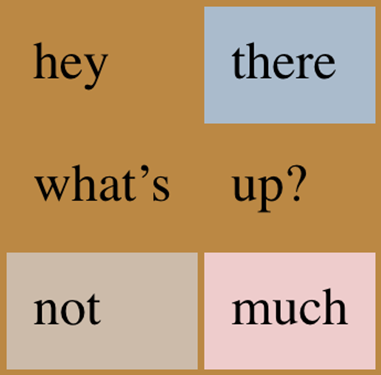
Figure 14-4. Seeing the background of table-formatting layers through other layers
Captions
A table caption is about what you’d expect: a short bit of text that
describes the nature of the table’s contents. A chart of stock quotes
for the fourth quarter of 2016, therefore, might have a caption element
whose contents read “Q4 2016 Stock Performance.” With the property
caption-side, you can place this element either above or below the
table, regardless of where the caption appears in the table’s structure.
(In HTML5, the caption element can appear only as the first child of a
table element, but other languages may have different rules.)
Captions are a bit odd, at least in visual terms. The CSS specification states that a caption is formatted as if it were a block box placed immediately before (or after) the table’s box, with one exception: the caption can still inherit values from the table.
A simple example should suffice to illustrate most of the important aspects of caption presentation. Consider the following, illustrated in Figure 14-5:
caption{background:#B84;margin:1em0;caption-side:top;}table{color:white;background:#840;margin:0.5em0;}
The text in the caption element inherits the color value white
from the table, while the caption gets its own background. The
separation between the table’s outer border edge and the caption’s outer
margin edge is 1 em, as the top margin of the table and bottom margin
of the caption have collapsed. Finally, the width of the caption is
based on the content width of the table element, which is considered
to be the containing block of the caption.
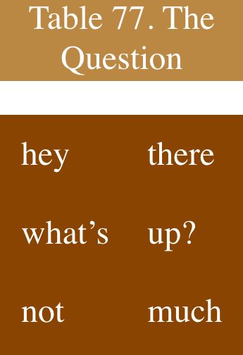
Figure 14-5. Styling captions and tables
These same results would occur if we change the value of caption-side
to bottom, except that the caption would be placed after the table’s
box, and collapsing would occur between the top margin of the caption
and the bottom margin of the table.
For the most part, captions are styled just like any block-level
element: they can be padded, have borders, be given backgrounds, and so
on. For example, if we need to change the horizontal alignment of text
within the caption, we use the property text-align. Thus, to
right-align the caption in the previous example, we would write:
caption{background:gray;margin:1em0;caption-side:top;text-align:right;}
Table Cell Borders
There are two quite distinct border models in CSS. The separated border model takes effect when cells are separated from each other in layout terms. The other option is the collapsed border model, in which there is no visual separation between cells, and cell borders merge, or collapse into one another. The former is the default model, although in an earlier version of CSS the latter was the default.
An author can choose between the two models with the property
border-collapse.
The whole point of this property is to offer a way to
determine which border model the user agent will employ. If the value
collapse is in effect, then the collapsing borders model is used. If
the value is separate, then the separated borders model is used. We’ll
look at the former model first, since it’s much easier to
describe, and it’s the default value.
Separated Cell Borders
In this model, every cell in the table is separated from the other cells by some distance, and the borders of cells do not collapse into one another. Thus, given the following styles and markup, you would see the result shown in Figure 14-6:
table{border-collapse:separate;}td{border:3pxdoubleblack;padding:3px;}tr:nth-child(2)td:nth-child(2){border-color:gray;}
<tablecellspacing="0"><tr><td>cell one</td><td>cell two</td></tr><tr><td>cell three</td><td>cell four</td></tr></table>
Note that the cell borders touch but remain distinct from one another. The three lines between cells are actually the two double borders sitting right next to each other; the gray border around the fourth cell helps make this more clear.
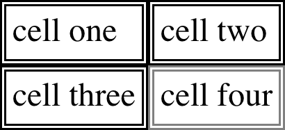
Figure 14-6. Separated (and thus separate) cell borders
The HTML attribute cellspacing was included in the preceding example to make sure the cells had no separation between them, but its
presence is likely a bit troubling. After all, if you can define that
borders be separate, then there ought to be a way to use CSS to alter
the spacing between cells. Fortunately, there is.
Border spacing
Once you’ve separated the table cell borders, there may be situations
where you want those borders to be separated by some distance. This can
be easily accomplished with the property border-spacing, which
provides a more powerful replacement for the HTML attribute
cellspacing.
Either one or two lengths can be given for the value of this property.
If you want all your cells separated by a single pixel, then
border-spacing: 1px; will suffice. If, on the other hand, you want
cells to be separated by one pixel horizontally and five pixels
vertically, write border-spacing: 1px 5px;. If two lengths are
supplied, the first is always the horizontal separation, and the second
is always the vertical.
The spacing values are also applied between the borders of cells along
the outside of a table and the padding on the table element itself.
Given the following styles, you would get the result shown in Figure 14-7:
table{border-collapse:separate;border-spacing:5px8px;padding:12px;border:2pxsolidblack;}td{border:1pxsolidgray;}td#squeeze{border-width:5px;}
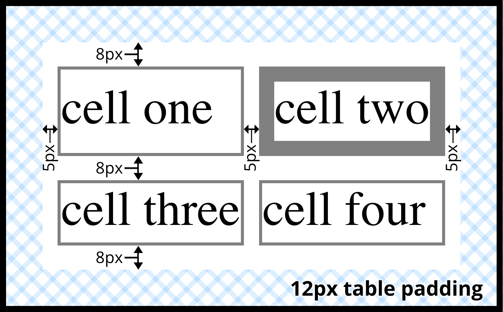
Figure 14-7. Border spacing effects between cells and their enclosing table
In Figure 14-7, there is a space 5 pixels wide between the borders of any
two horizontally adjacent cells, and there are 17 pixels of space
between the borders of the right- and left-most cells and the right and
left borders of the table element. Similarly, the borders of
vertically adjacent cells are 8 pixels apart, and the borders of the
cells in the top and bottom rows are 20 pixels from the top and bottom
borders of the table, respectively. The separation between cell borders
is constant throughout the table, regardless of the border widths of the
cells themselves.
Note also that if you’re going to declare a border-spacing value, it’s
done on the table itself, not on the individual cells. If
border-spacing had been declared for the td elements in the previous
example, it would have been ignored.
In the separated-border model, borders cannot be set for rows, row groups, columns, and column groups. Any border properties declared for such elements must be ignored by a CSS-conformant user agent.
Handling empty cells
Because every cell is, in a visual sense, distinct from all the other
cells in the table, what do you do with cells that are empty (i.e., have
no content)? You have two choices, which are reflected in the values of
the empty-cells property.
If empty-cells is set to show, then the borders and background of an
empty cell will be drawn, just as with table cells that have content. If
the value is hide, then no part of the cell is drawn, just as if the
cell were set to visibility: hidden.
If a cell contains any content, it cannot be considered empty.
“Content,” in this case, includes not only text, images, form elements,
and so on, but also the nonbreaking space entity ( ) and any
other whitespace except the CR (carriage return), LF (line feed), tab,
and space characters. If all the cells in a row are empty, and all have
an empty-cells value of hide, then the entire row is treated as if
the row element were set to display: none.
Collapsing Cell Borders
While the collapsing cell model largely describes how HTML tables have always been laid out when they don’t have any cell spacing, it is quite a bit more complicated than the separated borders model. There are also some rules that set collapsing cell borders apart from the separated borders model:
-
Elements with a
displayoftableorinline-tablecannot have any padding whenborder-collapseiscollapse, although they can have margins. Thus, there is never separation between the border around the outside of the table and the edges of its outermost cells in the collapsed borders model. -
Borders can be applied to cells, rows, row groups, columns, and column groups. A table itself can, as always, have a border.
-
There is never any separation between cell borders in the collapsed borders model. In fact, borders collapse into each other where they adjoin, so that only one of the collapsing borders is actually drawn. This is somewhat akin to margin collapsing, where the largest margin wins. When cell borders collapse, the “most interesting” border wins.
-
Once they are collapsed, the borders between cells are centered on the hypothetical grid lines between the cells.
We’ll explore the last two points in more detail in the next two sections.
Collapsing border layout
In order to better understand how the collapsing borders model works, let’s look at the layout of a single table row, as shown in Figure 14-8.

Figure 14-8. The layout of a table row using the collapsing borders model
For each cell, the padding and content width of the cell is inside the borders, as expected. For the borders between cells, half of the border is to one side of the grid line between two cells, and the other half is to the other side. In each case, only a single border is drawn along each cell edge. You might think that half of each cell’s border is drawn to each side of the grid line, but that’s not what happens.
For example, assume that the solid borders on the middle cell are green and the solid borders on the outer two cells are red. The borders on the right and left sides of the middle cell (which collapse with the adjacent borders of the outer cells) will be all green, or all red, depending on which border wins out. We’ll discuss how to tell which one wins in the next section.
You may have noticed that the outer borders protrude past the table’s width. This is because in this model, half the table’s borders are included in the width. The other half sticks out beyond that distance, sitting in the margin itself. This might seem a bit weird, but that’s how the model is defined to work.
The specification includes a layout formula that I’ll reproduce here for the benefit of those who enjoy such things:
row width = (0.5 * border-width-0) + padding-left-1 + width-1 + padding-right-1 + border-width-1 + padding-left-2 +...+ padding-right-n + (0.5 * border-width-n)
Each border-width-n refers to the border between cell n and the next
cell; thus, border-width-3 refers to the border between the third and
fourth cells. The value n stands for the total number of cells in the
row.
There is a slight exception to this mechanism. When beginning the layout of a collapsed-border table, the user agent computes an initial left and right border for the table itself. It does this by examining the left border of the first cell in the first row of the table and by taking half of that border’s width as the table’s initial left border width. The user agent then examines the right border of the last cell in the first row and uses half that width to set the table’s initial right-border width. For any row after the first, if the left or right border is wider than the initial border widths, it sticks out into the margin area of the table.
In cases where a border is an odd number of display elements (pixels, printer dots, etc.) wide, the user agent is left to decide what to do about centering the border on the grid line. It might shift the border so that it is slightly off-center, round up or down to an even number of display elements, use anti-aliasing, or adjust anything else that seems reasonable.
Border collapsing
When two or more borders are adjacent, they collapse into each other. In fact, they don’t collapse so much as fight it out to see which of them will gain supremacy over the others. There are some strict rules governing which borders will win and which will not:
-
If one of the collapsing borders has a
border-styleofhidden, it takes precedence over all other collapsing borders. All borders at this location are hidden. -
If all the borders are visible, then wider borders take precedence over narrower ones. Thus, if a two-pixel dotted border and a five-pixel double border collapse, the border at that location will be a five-pixel double border.
-
If all collapsing borders have the same width but different border styles, then the border style is taken in the following order, from most to least preferred:
double,solid,dashed,dotted,ridge,outset,groove,inset,none. Thus, if two borders with the same width are collapsing, and one isdashedwhile the other isoutset, the border at that location will be dashed. -
If collapsing borders have the same style and width, but differ in color, then the color used is taken from an element in the following list, from most preferred to least: cell, row, row group, column, column group, table. Thus, if the borders of a cell and a column (identical in every way except color) collapse, then the cell’s border color (and style and width) will be used. If the collapsing borders come from the same type of element, such as two row borders with the same style and width but different colors, then the color is taken from borders that are further to the top and left (in left-to-right languages; otherwise, further to the top and right).
The following styles and markup, presented in Figure 14-9, help illustrate each of the four rules:
table{border-collapse:collapse;border:3pxoutsetgray;}td{border:1pxsolidgray;padding:0.5em;}#r2c1,#r2c2{border-style:hidden;}#r1c1,#r1c4{border-width:5px;}#r2c4{border-style:double;border-width:3px;}#r3c4{border-style:dotted;border-width:2px;}#r4c1{border-bottom-style:hidden;}#r4c3{border-top:13pxsolidsilver;}
<table><tr><tdid="r1c1">1-1</td><tdid="r1c2">1-2</td><tdid="r1c3">1-3</td><tdid="r1c4">1-4</td></tr><tr><tdid="r2c1">2-1</td><tdid="r2c2">2-2</td><tdid="r2c3">2-3</td><tdid="r2c4">2-4</td></tr><tr><tdid="r3c1">3-1</td><tdid="r3c2">3-2</td><tdid="r3c3">3-3</td><tdid="r3c4">3-4</td></tr><tr><tdid="r4c1">4-1</td><tdid="r4c2">4-2</td><tdid="r4c3">4-3</td><tdid="r4c4">4-4</td></tr></table>
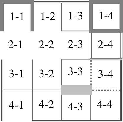
Figure 14-9. Manipulating border widths, styles, and colors leads to some unusual results
Let’s consider what happened for each of the cells, in turn:
-
For cells 1-1 and 1-4, the five-pixel borders were wider than any of their adjacent borders, so they won out not only over adjoining cell borders, but over the border of the table itself. The only exception is the bottom of cell 1-1, which was suppressed.
-
The bottom border on cell 1-1 was suppressed because cells 2-1 and 2-2, with their explicitly hidden borders, completely remove any borders from the edge of the cells. Again, the table’s border lost out (on the left edge of cell 2-1) to a cell’s border. The bottom border of cell 4-1 was also hidden, and so it prevented any border from appearing below the cell.
-
The three-pixel double border of cell 2-4 was overridden on top by the five-pixel solid border of cell 1-4. Cell 2-4’s border, in turn, overrode the border between itself and cell 2-3 because it was both wider and “more interesting.” Cell 2-4 also overrode the border between itself and cell 3-4, even though both are the same width, because 2-4’s double style is defined to be “more interesting” than 3-4’s dotted border.
-
The 13-pixel bottom silver border of cell 3-3 not only overrode the top border of cell 4-3, but it also affected the layout of content within both cells and the rows that contain both cells.
-
For cells along the outer edge of the table that aren’t specially styled, their one-pixel solid borders are overridden by the three-pixel outset border on the table element itself.
This is, in fact, about as complicated as it sounds, although the behaviors are largely intuitive and make a little more sense with practice. It’s worth noting, though, that the basic Netscape 1.1-era table presentation can be captured with a fairly simple set of rules, described here and illustrated by Figure 14-10:
table{border-collapse:collapse;border:2pxoutsetgray;}td{border:1pxinsetgray;}
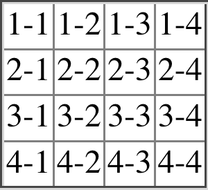
Figure 14-10. Reproducing old-school table presentation
Table Sizing
Now that we’ve dug into the guts of table formatting and cell border appearance, we have the pieces we need to understand the sizing of tables and their internal elements. When it comes to determining table width, there are two different approaches: fixed-width layout and automatic-width layout. Heights are calculated automatically, no matter what width algorithms are used.
Width
Since there are two different ways to figure out the width of a table,
it’s only logical that there be a way to declare which should be used
for a given table. Authors can use the property table-layout to select
between the two kinds of table width calculation.
While the two models can have different results in laying out a given table, the fundamental difference between the two is that of speed. With a fixed-width table layout, the user agent can calculate the layout of the table more quickly than is possible in the automatic-width model.
Fixed layout
The main reason the fixed-layout model is so fast is that its layout does not depend on the contents of table cells. Instead, it’s driven by the width values of the table, columns, and cells within that table.
The fixed-layout model works in the following steps:
-
Any column element whose
widthproperty has a value other thanautosets the width for that entire column.-
If a column has an
autowidth, but the cell in the first row of the table within that column has awidthother thanauto, then the cell sets the width for that entire column. If the cell spans multiple columns, then the width is divided between the columns. -
Any columns that are still auto-sized are sized so that their widths are as equal as possible.
-
At that point, the width of the table is set to be either the value of
width for the table or the sum of the column widths, whichever is
greater. If the table turns out to be wider than its columns, then the
difference is divided by the number of columns and the result is added to each of
them.
This approach is fast because all of the column widths are defined by
the first row of the table. The cells in any rows that come after the
first are sized according to the column widths that were defined by the
first row. The cells in those following rows do not—indeed,
cannot—change column widths, which means that any width value assigned
to those cells will be ignored. In cases where a cell’s content does not
fit into its cell, the overflow value for the cell determines whether
the cell contents are clipped, visible, or generate a scrollbar.
Let’s consider the following styles and markup, which are illustrated in Figure 14-11:
table{table-layout:fixed;width:400px;border-collapse:collapse;}td{border:1pxsolid;}col#c1{width:200px;}#r1c2{width:75px;}#r2c3{width:500px;}
<table><colgroup><colid="c1"><colid="c2"><colid="c3"><colid="c4"></colgroup><tr><tdid="r1c1">1-1</td><tdid="r1c2">1-2</td><tdid="r1c3">1-3</td><tdid="r1c4">1-4</td></tr><tr><tdid="r2c1">2-1</td><tdid="r2c2">2-2</td><tdid="r2c3">2-3</td><tdid="r2c4">2-4</td></tr><tr><tdid="r3c1">3-1</td><tdid="r3c2">3-2</td><tdid="r3c3">3-3</td><tdid="r3c4">3-4</td></tr><tr><tdid="r4c1">4-1</td><tdid="r4c2">4-2</td><tdid="r4c3">4-3</td><tdid="r4c4">4-4</td></tr></table>
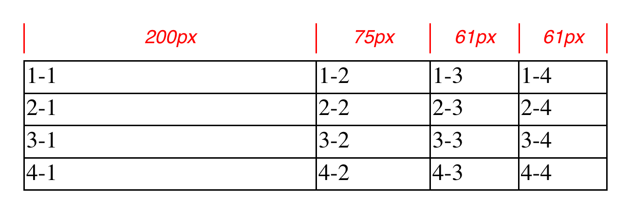
Figure 14-11. Fixed-width table layout
As you can see in Figure 14-11, the first column is 200 pixels wide, which
happens to be half the 400-pixel width of the table. The second column
is 75 pixels wide, because the first-row cell within that column has been
assigned an explicit width. The third and fourth columns are each 61
pixels wide. Why? Because the sum of the column widths for the first and
second columns (275 pixels), plus the various borders between columns (3 pixels),
equals 278 pixels. 400 minus 278 is 122, and that divided in half is 61,
so that’s how many pixels wide the third and fourth columns will be.
What about the 500-pixel width for #r2c3? It’s ignored because that
cell isn’t in the first row of the table.
Note that it is not absolutely necessary that the table have an explicit
width value to make use of the fixed-width layout model, although it
definitely helps. For example, given the following, a user agent could
calculate a width for the table that is 50 pixels narrower than the
parent element’s width. It would then use that calculated width in the
fixed-layout algorithm:
table{table-layout:fixed;margin:025px;width:auto;}
This is not required, however. User agents are also permitted to lay out
any table with an auto value for width using the automatic-width
layout model.
Automatic layout
The automatic-width layout model, while not as fast as fixed layout, is
probably much more familiar to you because it’s substantially the same
model that HTML tables have used for years. In most current user agents,
use of this model will be triggered by a table having a width of
auto, regardless of the value of table-layout, although this is not
assured.
The reason automatic layout is slower is that the table cannot be laid out until the user agent has looked at all of the content in the table. That is, it requires that the user agent lay out the entire table in a fashion that takes the contents and styles of every cell into account. This generally requires the user agent to perform some calculations and then go back through the table to perform a second set of calculations.
The content has to be fully examined because, as with HTML tables, the table’s layout is dependent on the content in all the cells. If there is a 400-pixel-wide image in a cell in the last row, then it will force all of the cells above it (those in the same column) to be at least 400 pixels wide. Thus, the width of every cell has to be calculated, and adjustments must be made (possibly triggering another round of content-width calculations) before the table can be laid out.
The details of the model can be expressed in the following steps:
-
For each cell in a column, calculate both the minimum and maximum cell width.
-
Determine the minimum width required to display the content. In determining this minimum content width, the content can flow to any number of lines, but it may not stick out of the cell’s box. If the cell has a
widthvalue that is larger than the minimum possible width, then the minimum cell width is set to the value ofwidth. If the cell’swidthvalue isauto, then the minimum cell width is set to the minimum content width. -
For the maximum width, determine the width required to display the content without any line breaking other than that forced by explicit line breaking (e.g., the
<br>element). That value is the maximum cell width.
-
-
For each column, calculate both the minimum and maximum column width.
-
The column’s minimum width is determined by the largest minimum cell width of the cells within the column. If the column has been given an explicit
widthvalue that is larger than any of the minimum cell widths within the column, then the minimum column width is set to the value ofwidth. -
For the maximum width, take the largest maximum cell width of the cells within the column. If the column has been given an explicit
widthvalue that is larger than any of the maximum cell widths within the column, then the maximum column width is set to the value ofwidth. These two behaviors recreate the traditional HTML table behavior of forcibly expanding any column to be as wide as its widest cell.
-
-
In cases where a cell spans more than one column, then the sum of the minimum column widths must be equal to the minimum cell width for the spanning cell. Similarly, the sum of the maximum column widths has to equal the spanning cell’s maximum width. User agents should divide any changes in column widths equally among the spanned columns.
In addition, the user agent must take into account that when a column width has a percentage value for its width, the percentage is calculated in relation to the width of the table—even though it doesn’t yet know what that will be! It instead has to hang on to the percentage value and use it in the next part of the algorithm.
At this point, the user agent will have figured how wide or narrow each column can be. With that information in hand, it can then proceed to actually figuring out the width of the table. This happens as follows:
-
If the computed width of the table is not
auto, then the computed table width is compared to the sum of all the column widths plus any borders and cell spacing. (Columns with percentage widths are likely calculated at this time.) The larger of the two is the final width of the table. If the table’s computed width is larger than the sum of the column widths, borders, and cell spacing, then the difference is divided by the number of columns and the result is added to each of them. -
If the computed width of the table is
auto, then the final width of the table is determined by adding up the column widths, borders, and cell spacing. This means that the table will be only as wide as needed to display its content, just as with traditional HTML tables. Any columns with percentage widths use that percentage as a constraint—but one that a user agent does not have to satisfy.
Once the last step is completed, then—and only then—can the user agent actually lay out the table.
The following styles and markup, presented in Figure 14-12, help illustrate how this process works:
table{table-layout:auto;width:auto;border-collapse:collapse;}td{border:1pxsolid;padding:0;}col#c3{width:25%;}#r1c2{width:40%;}#r2c2{width:50px;}#r2c3{width:35px;}#r4c1{width:100px;}#r4c4{width:1px;}
<table><colgroup><colid="c1"><colid="c2"><colid="c3"><colid="c4"></colgroup><tr><tdid="r1c1">1-1</td><tdid="r1c2">1-2</td><tdid="r1c3">1-3</td><tdid="r1c4">1-4</td></tr><tr><tdid="r2c1">2-1</td><tdid="r2c2">2-2</td><tdid="r2c3">2-3</td><tdid="r2c4">2-4</td></tr><tr><tdid="r3c1">3-1</td><tdid="r3c2">3-2</td><tdid="r3c3">3-3</td><tdid="r3c4">3-4</td></tr><tr><tdid="r4c1">4-1</td><tdid="r4c2">4-2</td><tdid="r4c3">4-3</td><tdid="r4c4">4-4</td></tr></table>
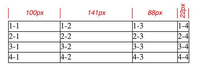
Figure 14-12. Automatic table layout
Let’s consider what happened for each of the columns, in turn:
-
For the first column, the only explicit cell or column width is that of cell 4-1, which was given a width of
100px. Because the content is so short, both the minimum and maximum column widths are set to100px. (If there were a cell in the column with several sentences of text, it would have increased the maximum column width to whatever width necessary to display all of the text without line breaking.) -
For the second column, two
widths were declared: cell 1-2 was given a width of40%, and cell 2-2 was given a width of50px. The minimum width of this column is50px, and the maximum width is40%of the final table width. -
For the third column, only cell 3-3 had an explicit width (
35px), but the column itself was given awidthof25%. Therefore, the minimum column width is 35 pixels, and the maximum width is 25% of the final table width. -
For the fourth column, only cell 4-4 was given an explicit width (
1px). This is smaller than the minimum content width, so both the minimum and maximum column widths are equal to the minimum content width of the cells. This turns out to be a computed 22 pixels, so the minimum and maximum widths are both 22 pixels.
The user agent now knows that the four columns have minimum and maximum widths as follows:
-
Minimum 100 px, maximum 100 px
-
Minimum 50 px, maximum 40%
-
Minimum 35 px, maximum 25%
-
Minimum 25 px, maximum 22 px
-
Thus, the table’s minimum width is the sum of all the column minimums,
plus the borders collapsed between the columns, which totals 215 pixels.
The table’s maximum width is 123px + 65%, where the 123px comes from the
first and last columns and their shares of the collapsed borders.
This maximum works out to be 351.42857142857143 pixels (given that
123px represents 35% of the overall table width). With this number in hand,
the second column will be 140.5 pixels wide, and the third column will be
87.8 pixels wide. These may be rounded by the user agent to whole numbers
such as 141px and 88px, or not, depending on the exact rendering method
used. (These are the numbers used in Figure 14-12.)
Note that it is not required that user agents actually use the maximum value; they may choose another course of action.
This was (although it may not seem like it) a comparatively simple and straightforward example: all of the content was basically the same width, and most of the declared widths were pixel lengths. In a situation where a table contains images, paragraphs of text, form elements, and so forth, the process of figuring out the table’s layout is likely to be a great deal more complicated.
Height
After all of the effort that was expended in figuring out the width of the table, you might well wonder how much more complicated height calculation will be. Actually, in CSS terms, it’s pretty simple, although browser developers probably don’t think so.
The easiest situation to describe is one in which the table height is
explicitly set via the height property. In such cases, the height of
the table is defined by the value of height. This means that a table
may be taller or shorter than the sum of its row heights. Note that
height is treated much more like min-height for tables, so if you
define a height value that’s smaller than the sum total of the row
heights, it may appear to be ignored.
By contrast, if the height value of a table is greater than the total
of its row heights, the specification explicitly refuses to define what
should happen, instead noting that the issue may be resolved in future
versions of CSS. A user agent could expand the table’s rows to fill out
its height, or leave blank space inside the table’s box, or something
completely different. It’s up to each user agent to decide.
Note
As of late 2017, the most common behavior of user agents was to increase the heights of the rows in a table to fill out its overall height. This was accomplished by taking the difference between the table height and the sum of the row heights, dividing it by the number of rows, and applying the resulting amount to each row.
If the height of the table is auto, then its height is the sum of
the heights of all the rows within the table, plus any borders and cell
spacing. To determine the height of each row, the user agent goes
through a process similar to that used to find the widths of columns. It
calculates a minimum and maximum height for the contents of each cell
and then uses these to derive a minimum and maximum height for the row.
After having done this for all the rows, the user agent figures out what
each row’s height should be, stacks them all on top of one another, and
uses the total to determine the table’s height. It’s a lot like inline
layout, only with less certainty in how things should be done.
In addition to what to do about tables with explicit heights and how to treat row heights within them, you can add the following to the list of things CSS does not define:
-
The effect of a percentage height for table cells.
-
The effect of a percentage height for table rows and row groups.
-
How a row-spanning cell affects the heights of the rows that are spanned, except that the rows have to contain the spanning cell.
As you can see, height calculations in tables are largely left up to user agents to figure out. Historical evidence would suggest that this will lead to each user agent doing something different, so you should probably avoid setting table heights as much as possible.
Alignment
In a rather interesting turn of events, alignment of content within cells is a lot better defined than cell and row heights. This is true even for vertical alignment, which can quite easily affect the height of a row.
Horizontal alignment is the simplest. To align content within a cell,
you use the text-align property. In effect, the cell is treated as a
block-level box, and all of the content within it is aligned as per the
text-align value.
To vertically align content in a table cell, vertical-align is the
relevant property. It uses many of the same values that are used for
vertically aligning inline content, but the meanings of those values
change when applied to a table cell. To summarize the three simplest
cases:
top-
The top of the cell’s content is aligned with the top of its row; in the case of row-spanning cells, the top of the cell’s content is aligned with the top of the first row it spans.
bottom-
The bottom of the cell’s content is aligned with the bottom of its row; in the case of row-spanning cells, the bottom of the cell’s content is aligned with the bottom of the last row it spans.
middle-
The middle of the cell’s content is aligned with the middle of its row; in the case of row-spanning cells, the middle of the cell’s content is aligned with the middle of all the rows it spans.
These are illustrated in Figure 14-13, which uses the following styles and markup:
table{table-layout:auto;width:20em;border-collapse:separate;border-spacing:3px;}td{border:1pxsolid;background:silver;padding:0;}div{border:1pxdashedgray;background:white;}#r1c1{vertical-align:top;height:10em;}#r1c2{vertical-align:middle;}#r1c3{vertical-align:bottom;}
<table><tr><tdid="r1c1"><div>The contents of this cell are top-aligned.</div></td><tdid="r1c2"><div>The contents of this cell are middle-aligned.</div></td><tdid="r1c3"><div>The contents of this cell are bottom-aligned.</div></td></tr></table>
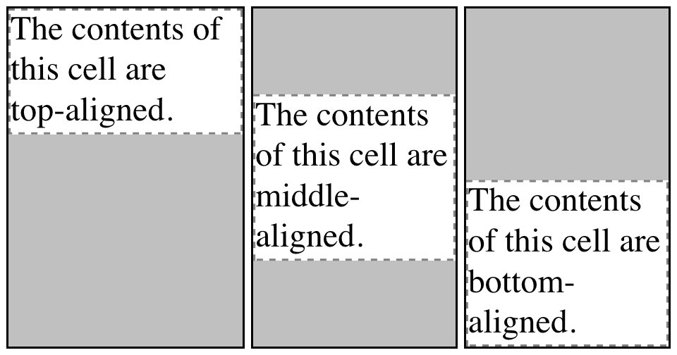
Figure 14-13. Vertical alignment of cell contents
In each case, the alignment is carried out by automatically increasing the padding of the cell itself to achieve the desired effect. In the first cell in Figure 14-13, the bottom padding of the cell has been changed to equal the difference between the height of the cell’s box and the height of the content within the cell. For the second cell, the top and bottom padding of the cell have been reset to be equal, thus vertically centering the content of the cell. In the last cell, the cell’s top padding has been altered.
The fourth possible value alignment is baseline, and it’s a little more
complicated that the first three:
baseline-
The baseline of the cell is aligned with the baseline of its row; in the case of row-spanning cells, the baseline of the cell is aligned with the baseline of the first row it spans.
It’s easiest to provide an illustration (Figure 14-14) and then discuss what’s happening.
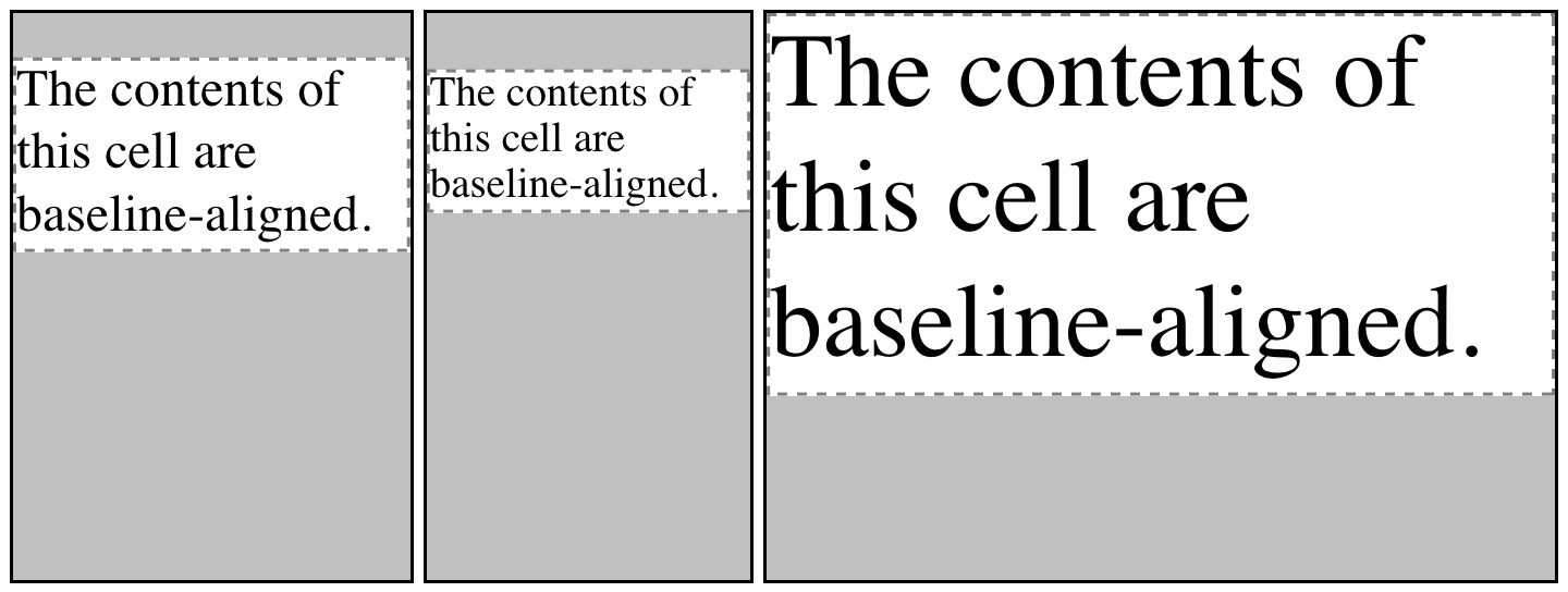
Figure 14-14. Baseline alignment of cell contents
A row’s baseline is defined by the lowest initial cell baseline (that is, the baseline of the first line of text) out of all its cells. Thus, in Figure 14-14, the row’s baseline was defined by the third cell, which has the lowest initial baseline. The first two cells then have the baseline of their first line of text aligned with the row’s baseline.
As with top, middle, and bottom alignment, the placement of baseline-aligned cell content is accomplished by altering the top and bottom padding of the cells. In cases where none of the cells in a row are baseline-aligned, the row does not even have a baseline—it doesn’t really need one.
The detailed process for aligning cell contents within a row is as follows:
-
If any of the cells are baseline-aligned, then the row’s baseline is determined and the content of the baseline-aligned cells is placed.
-
Any top-aligned cell has its content placed. The row now has a provisional height, which is defined by the lowest cell bottom of the cells that have already had their content placed.
-
If any remaining cells are middle- or bottom-aligned, and the content height is taller than the provisional row height, the height of the row is increased to enclose the tallest of those cells.
-
All remaining cells have their content placed. In any cell whose contents are shorter than the row height, the cell’s padding is increased in order to match the height of the row.
-
The vertical-align values sub, super, text-top, and
text-bottom are supposed to be ignored when applied to table cells.
Instead, they seem to all treated as if they are baseline, or possibly
top.
Summary
Even if you’re quite familiar with table layout from years of table-and-spacer design, it turns out that the mechanisms driving such layout are rather complicated. Thanks to the legacy of HTML table construction, the CSS table model is row-centric, but it does, thankfully, accommodate columns and limited column styling. Thanks to new abilities to affect cell alignment and table width, you now have even more tools for presenting tables in a pleasing way.
The ability to apply table-related display values to arbitrary elements
opens the door to creating table-like layouts using HTML elements such
as div and section, or in XML languages where any element could be
used to describe table components.