For those who are longtime watercolorists, this chapter can act as a review, a warm-up. For those newer to the medium—or to making art at all—here are some of the basic techniques you’ll want to know before starting an actual painting.
Once you know the basics, you’ll be able to do anything—with practice. Some artists do have a natural aptitude, of course, but we all need to hone our skills. Besides, learning new techniques and tricks is great fun—almost like magic. So, whether you’re an old hand or brand new to the medium, try these concepts on for size.
Color is a key to success. Think about it—we respond to some paintings instantaneously on a purely emotional level. Subject matter aside, most likely it’s color that elicits that response. At a recent show I judged, one painting just made me stop and catch my breath. When I analyzed my reaction, I realized it was the artist’s masterful use of color that stopped me in my tracks.
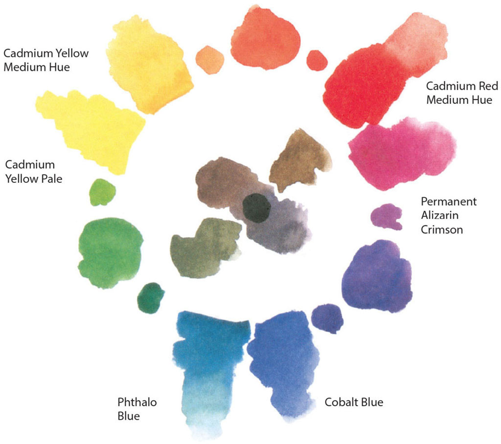
To make mixing clean, fresh secondary colors easier, you may want a warm and a cool of each primary—for example:
To start out, try choosing one or two of each primary color in tube form. These can be squeezed out onto your palette, allowed to dry for portability then rehydrated when you’re ready to paint, at home or in the field.
Using a warm and a cool of each primary color will allow you to mix clean purples, hot oranges and spring-like greens, or you will be able to choose a more subtle mixture, if you like. Mixing opposites on the color wheel (complements) will give you a range of warm and cool neutrals, depending on how you balance your mixture. Mixing all your colors produces a near-black. It’s very versatile!
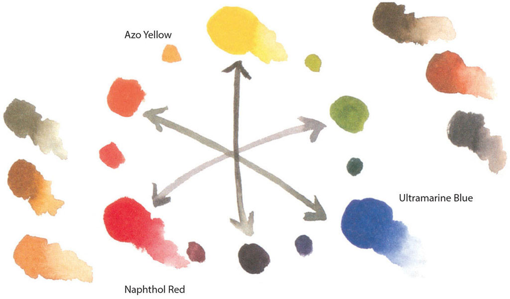
A simpler color wheel can use very pure primary colors, like Ultramarine Blue, Azo Yellow and Naphthol Red. These three colors alone will produce a wide range of colors. It’s a wonderful discipline to start out like this instead of investing in a full array of pigments.
The three spots of color between adjoining primaries are varied mixtures of those primaries. The arrows connect complements (yellow and purple, orange and blue, green and red). Mixing all three primaries—or mixing the complements, which is really the same thing—produces neutrals. The six outer colors are mixtures of the three primaries, in a variety of strengths.

It’s good exercise to try a limited palette painting, that is, choosing only one to three colors for your painting. This little sketch of the Nevada desert was done on Cartiere Magnani’s 4 1⁄2" × 9" (11cm × 23cm) cold-pressed watercolor pad, using only Azo Yellow, Naphthol Red and Ultramarine Blue. I painted swatches of the various mixtures I used.

The early Velázquez palette (named for the Spanish artist who used it so frequently) let Burnt Umber act as the red, Yellow Ochre as the yellow and black as the blue in this low-key color wheel. You may want to try the more bluish Payne’s Gray as your blue.

WINTER LANDSCAPE
Watercolor on Strathmore cold-pressed watercolor paper 5" × 7" (13cm × 18cm)
Here I used a variation of the Velázquez palette: Payne’s Gray, Burnt Sienna and Yellow Ochre. I let backruns suggest the trees and scratched the limbs into the damp wash. I lifted the clouds with a paper towel while the sky was still wet.