Sometimes a painting seems to need some preplanning and “what-ifs” before you can decide how you want to proceed with the finished work, especially if you are working after the fact rather than on the spot.
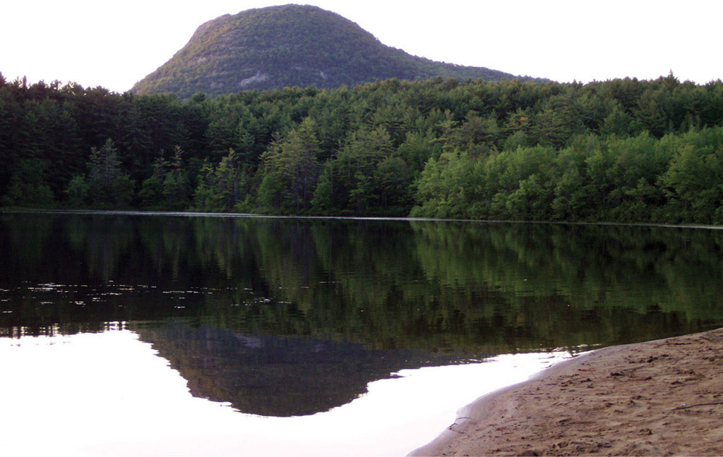
It was evening on Fourth Lake in New York, and Potash Mountain caught the last warm rays of the sun at the summer solstice. My love cast his line into the lake nearby. I hurried to catch the image in my journal. Since we didn’t have the luxury of another sunset in that location, I shot a quick resource photo as well. The sketch is in a vertical format, the photo is a horizontal one. Which to choose, and what colors? I did some preliminary sketches to help me decide.
Strathmore cold-pressed watercolor paper
Burnt Sienna, Cadmium Red Medium, Cobalt Blue, Dragon’s Blood, Phthalo Blue, Quinacridone Burnt Scarlet, Transparent Yellow, Ultramarine Blue
nos. 5 and 8 rounds
1⁄2-inch (13mm) and 3⁄4-inch (19mm) flats
small, inexpensive brush for masking fluid
indigo colored pencil, craft knife, palette knife, masking fluid, Sunset watercolor pencil
Joseph had already left to go start the fire for dinner, but I stayed a bit, enjoying the peace and shooting resource photos.

This is the initial, hurried sketch—the light was fading rapidly!

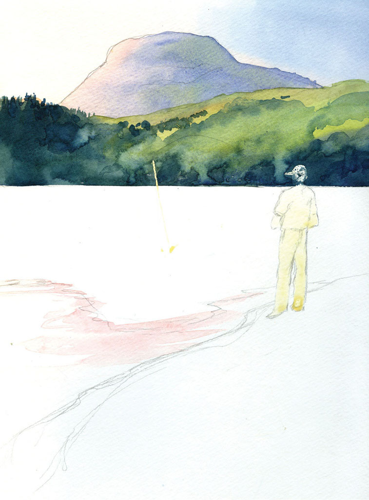
I used indigo colored pencil to explore portrait and landscape formats. Both would work well.
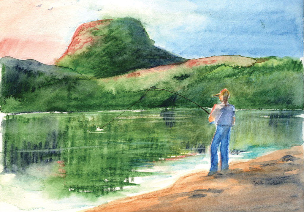
In this quick watercolor pencil sketch, I explored the horizontal format as well as a more colorful possibility, pushing what I saw just a bit toward an earlier time of day. Though the format has possibilities, I decided the vertical is more exciting, focusing the attention on that odd mountain in the background.
For the sky, I used a graded wash from a warm sunset hue made up of Cadmium Red Medium Hue and Transparent Yellow, to a cooler blue mixed with Cobalt Blue and Phthalo Blue. I applied these colors with a 3⁄4-inch (19mm) flat.
I protected the figure of the fisherman with masking fluid, applied with a small, inexpensive brush. The masking fluid on the fishing line was laid in with the edge of a palette knife. I used a no. 8 round to paint in the mountain, using the same colors as the sky, with the addition of a bit of green, letting the lower edge of the mountain fade into the trees in the middle distance. Then I repeated some of the warm color in the foreground water.
When that was completely dry, I was ready to paint the middle ground. Strong, variegated washes of Phthalo Blue, Ultramarine Blue, Burnt Sienna and Transparent Yellow suggest the distant shoreline. I paid close attention to the location of the shadows and the lightstruck areas. The 1⁄2-inch (13mm) flat worked well for most of these additions.
Notice the clean horizontal where the far shore meets the water. A distant lake shore will almost always look straight and flat.

Using mostly a strong Phthalo Blue, Ultramarine Blue and Burnt Sienna mixture, I painted in the water, leaving a bright sparkle of white at the distant shore and trying for broken ripples in the mountain’s reflection. A bit of lighter green introduced while that bold wash was still wet suggested the reflections of the lightstruck trees. The 1⁄2-inch (13mm) flat gave me the most control for these details.
I was nervous about how protected the figure actually was. Notice how dark the blue looks over his face—I wasn’t sure I’d put the masking fluid on thick enough.

The foreground beach was very fine sand. I painted it with a 3⁄4-inch (19mm) flat and a varied mixture of Cobalt Blue, Ultramarine Blue and Dragon’s Blood, which is a very warm Burnt Sienna-like color. Quinacridone Burnt Scarlet will work as well.
I added clear water spatter as well as spatter in stronger mixtures used for the sand itself. The mountain and tree-lined shore got some detail now, too.
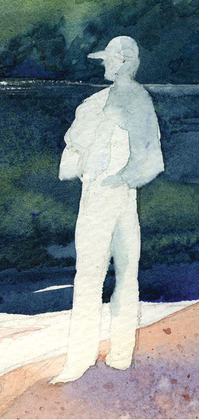
I was relieved to find that the masking fluid over the figure had leaked only a little, and it lifted and blended into shadow areas with a brush and clear water.
The fishing rod was carefully cut from the top layer of paper with the tip of a very sharp craft knife. I cut two lines, closer together at the tip and widening slightly closer to the figure, then peeled away the thin layer of paper to expose the white underneath. With a bit of color added, the rod looks fairly natural against the dark hillside.
Hurray for computers and photo-editing software! I wasn’t quite happy with the value of the beach, the mountain or the figure (they were a bit too pale and delicate), so I pulled the image into a photo-editing program and did a little preliminary tweaking with the burn tool, just to see how it would look if the beach and figure were darker, as well as the shadowed side of the mountain. I liked it, so I went ahead and altered the painting’s values as well.

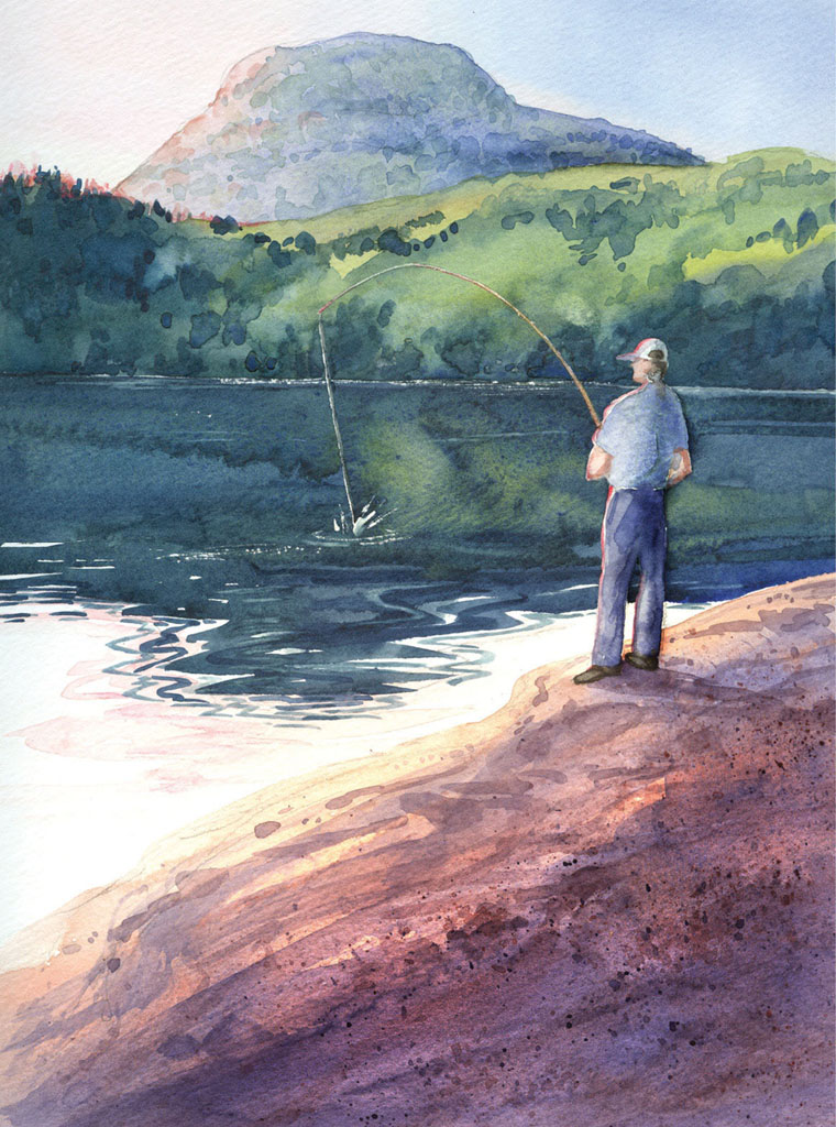
JOSEPH AT SUNSET
Watercolor on Strathmore cold-pressed watercolor paper
12" × 9" (30cm × 23cm)
This is the finished painting—a bit more work on the closer edge of the water and some sparkles scratched out with a sharp knife suggest light on water.
I’m still thinking of cropping the foreground a bit, even though there’s a good flow through the painting. As you can see, the eye travels from lower left to right, up the figure and along the rod, then up to the shadowed side of the mountain and back down the V of shadow on the far shore to the man himself.

Lost and found edges soften the figure and keep it from looking pasted on. As usual, I let the colors run into one another to keep this from being too harsh or cartoonish. A bit of sunset-colored watercolor pencil makes him look lightstruck as well.