Chapter 10
Reporting Your Findings
In this chapter, we assume you have just completed an analysis of your own or someone else’s research and now wish to issue a report on the overall findings. You’ll learn what to report and how to go about reporting it with particular emphasis on the statistical aspects of data collection and analysis.
One of the most common misrepresentations in scientific work is the scientific paper itself. It presents a mythical reconstruction of what actually happened. All mistaken ideas, false starts, badly designed experiments, and incorrect calculations are omitted. The paper presents the research as if it had been carefully thought out, planned, and executed according to a neat, rigorous process, for example, one involving testing of a hypothesis. The misrepresentation of the scientific paper is the most formal aspect of the misrepresentation of science as an orderly process based on a clearly defined method.
Brian Martin
Reportable elements include all of the following:
If you are contributing to the design or analysis of someone else’s research efforts, a restatement of the objectives is an essential first step. This ensures that you and the principal investigator are on the same page. This may be necessary in order to formulate quantifiable, testable hypotheses.
Objectives may have shifted or been expanded upon. Often such changes are not documented. You cannot choose or justify the choice of statistical procedures without a thorough understanding of study objectives.
To summarize what was stated in Chapter 5, both your primary and alternate hypotheses must be put in quantified testable form. Your primary hypothesis is used to establish the significance level and your alternative hypothesis to calculate the power of your tests.
Your objective may be to determine whether adding a certain feature to a product would increase sales. (Quick. Will this alternative hypothesis lead to a one-sided or a two-sided test?) Yet, for reasons that have to do solely with the limitations of statistical procedures, your primary hypothesis will normally be a null hypothesis of no effect.
Not incidentally, as we saw in Chapter 8, the optimal statistical test for an ordered response is quite different from the statistic one uses for detecting an arbitrary difference among approaches. All the more reason why we need to state our alternative hypotheses explicitly.
Your readers will want to know the details of your power and sample size calculations early on. If you don’t let them know, they may assume the worst, for example, that your sample size is too small and your survey is not capable of detecting significant effects. State the alternative hypotheses that your study is intended to detect. Reference your methodology and/or the software you employed in making your power calculations. State the source(s) you relied on for your initial estimates of incidence and variability.
Here is one example. “Over a 10-year period in the Himalayas, Dempsy and Peters (1995) observed an incidence of five infected individuals per 100 persons per year. To ensure a probability of at least 90% of detecting a reduction in disease incidence from five persons to one person per 100 persons per year using a one-sided Fisher’s exact test at the 2.5% significance level, 400 individuals were assigned to each experimental procedure group. This sample size was determined using the StatXact-5 power calculations for comparing two binomials.”
Although others may have established the methods of data collection, a comprehensive knowledge of these methods is essential to your choice of statistical procedures and should be made apparent in report preparation. Consider that 90% of all errors occur during data collection, as observations are erroneously recorded (garbage in, garbage out, GIGO), guessed at, or even faked. Seemingly innocuous workarounds may have jeopardized the integrity of the study. You need to know and report on exactly how the data were collected, not on how they were supposed to have been collected.
You need to record how study subjects were selected, what was done to them (if appropriate), and when and how this was done. Details of recruitment or selection are essential if you are to convince readers that your work is applicable to a specific population. If incentives were used (phone cards, t-shirts, cash), their use should be noted.
Readers will want to know the nature and extent of any blinding (and of the problems you may have had to overcome to achieve it). They will want to know how each subject was selected—random, stratified, or cluster sampling? They will want to know the nature of the controls (and the reasoning underlying your choice of a passive or active control procedure) and of the experimental design. Did each subject act as his own control as in a crossover design? Were case controls employed? If they were matched, how were they matched?
You will need the answers to all of the following questions and should incorporate each of the answers in your report:
Surveys often take advantage of the cost savings that result from naturally occurring groups, such as work sites, schools, clinics, neighborhoods, even entire towns or states. Not surprisingly, the observations within such a group are correlated. For example, individuals in the same community or work group often have shared views. Married couples, the ones whose marriages last, tend to have shared values. The effect of such correlation must be accounted for by the use of the appropriate statistical procedures. Thus, the nature and extent of such cluster sampling must be spelled out in detail in your reports.
Exercise 10.1: Examine three recent reports in your field of study or in any field that interests you. (Examine three of your own reports if you have them.) Answer the following in each instance:
If the answers to these questions were not present in the reports you reviewed, what was the reason? Had their authors something to hide?
A survey will be compromised if any of the following is true:
Your report should detail the preventive measures employed by the investigator and the degree to which they were successful.
You should describe the population(s) of interest in detail—providing demographic information where available, and similarly characterize the samples of participants to see whether they are indeed representative. (Graphs are essential here.)
You should describe the measures taken to ensure responses were independent including how participants were selected and where and how the survey took place.
A sample of nonrespondents should be contacted and evaluated. The demographics of the nonrespondents and their responses should be compared with those of the original sample.
How do you know respondents told the truth? You should report the results of any cross checks, such as redundant questions. And you should report the frequency of response omissions on a question-by-question basis.
Whatever is the use of a book without pictures?
Alice in Alice in Wonderland
A series of major decisions need to be made as to how you will report your results—text, table, or graph? Whatever Alice’s views on the subject, a graph may or may not be more efficient at communicating numeric information than the equivalent prose. This efficiency is in terms of the amount of information successfully communicated and not necessarily any space savings. Resist the temptation to enhance your prose with pictures.
And don’t fail to provide a comprehensive caption for each figure. As Good and Hardin note in their Wiley text, Common Errors in Statistics, if the graphic is a summary of numeric information, then the graph caption is a summary of the graphic. The text should be considered part of the graphic design and should be carefully constructed rather than placed as an afterthought. Readers, for their own use, often copy graphics and tables that appear in articles and reports. A failure on your part to completely document the graphic in the caption can result in gross misrepresentation in these cases.
A sentence should be used for displaying two to five numbers, as in “The blood type of the population of the United States is approximately 45% O, 40% A, 11% B, and 4% AB.” Note that the blood types are ordered by frequency.
Tables with appropriate marginal means are often the best method of presenting results. Consider adding a row (or column, or both) of contrasts; for example, if the table has only two rows, we could add a row of differences, row 1 minus row 2.
Tables dealing with two-factor arrays are straightforward, provided confidence limits are clearly associated with the correct set of figures. Tables involving three or more factors simultaneously are not always clear to the reader and are best avoided.
Make sure the results are expressed in appropriate units. For example, parts per thousand may be more natural than percentages in certain cases.
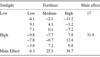
A table of deviations from row and column means as shown in Table 10.1 (or tables, if there are several strata) can alert us to the presence of outliers and may also reveal patterns in the data that were not yet considered.
Table 10.1 Residuals after Eliminating Main Effects
Exercise 10.2: To report each of the following, should you use text, a table, or a graph? If a graphic, then what kind?
Your objective in summarizing your results should be to communicate some idea of all of the following:
Proceed in three steps:
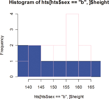
First, characterize the populations and subpopulations from which your observations are drawn. Of course, this is the main goal in studies of market segmentation. A histogram or scatterplot can help communicate the existence of such subpopulations to our readers. Few real-life distributions resemble the bell-shaped normal curve depicted in Figure 4.3. Most are bi- or even trimodal with each mode or peak corresponding to a distinct subpopulation. We can let the histogram speak for itself, but a better idea, particularly if you already suspect that the basis for market segments is the value of a second variable (such as home ownership, or level of education), is to add an additional dimension by dividing each of the histogram’s bars into differently shaded segments whose size corresponds to the relative numbers in each subpopulation. Our R program to construct two overlaid histograms makes use of data frames, selection by variable value [hts$sex==“b”,], and the options of the hist() function. Figure 10.1 is the result.
 height = c(141, 156.5, 162, 159, 157, 143.5, 154, 158, 140, 142, 150, 148.5, 138.5, 161, 153, 145, 147, 158.5, 160.5, 167.5, 155, 137)
 sex = c("b",rep("g",7),"b",rep("g",6),rep("b",7))
 hts = data.frame(sex,height)
 hist(hts[hts$sex == "b",]$height,
  + xlim = c(min(height), max(height)), ylim = c(0,4),
  + col = "blue")
 hist(hts[hts$sex == "g",]$height,
  + xlim = c(min(height), max(height)), ylim = c(0,4),
  +add = T, border = "pink")
Figure 10.1 Histograms of class data by sex.
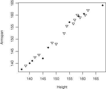
Similarly, we can provide for different subpopulations on a two-dimensional scatterplot by using different colors or shapes for the points.
 armspan = c(141, 156.5, 162, 159, 158, 143.5, 155.5, 160, 140, 142.5, 148, 148.5, 139, 160, 152.5, 142, 146.5, 159.5, 160.5, 164, 157, 137.5)
 psex = c(18,rep(25,7),18,rep(25,6),rep(18,7))
 plot(height,armspan, pch = psex)
yields Figure 10.2, while
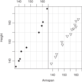
 coplot(height∼armspan|sexf)
 plot(sexf,height)
Figure 10.2 Overlying scatterplots of class data by sex.
produces Figure 10.3.
Figure 10.3 Side-by-side scatterplots of class data by sex.
Exercise 10.3: Redo Figure 10.2 and Figure 10.3 so as to provide legends and labels that will make it clear which set of data corresponds to each sex. Hint: Use R’s legend() function.
For small samples of three to five observations, summary statistics are virtually meaningless. Reproduce the actual observations; this is easier to do and more informative.
Though the arithmetic mean or average is in common use, it can be very misleading. For example, the mean income in most countries is far in excess of the median income or 50th percentile to which most of us can relate. When the arithmetic mean is meaningful, it is usually equal to or close to the median. Consider reporting the median in the first place.
The geometric mean is more appropriate than the arithmetic in three sets of circumstances:
Because bacterial populations can double in number in only a few hours, many government health regulations utilize the geometric rather than the arithmetic mean. A number of other government regulations also use it, though the sample median would be far more appropriate (and understandable). In any event, since your average reader may be unfamiliar with the geometric mean, be sure to comment in its use and on your reasons for adopting it.
The purpose of your inquiry must be kept in mind. Orders (in $) from a machinery plant ranked by size may be quite skewed with a few large orders. The median order size might be of interest in describing sales; the mean order size would be of interest in estimating revenues and profits.
Are the results expressed in appropriate units? For example, are parts per thousand more natural in a specific case than percentages? Have we rounded off to the correct degree of precision, taking account of what we know about the variability of the results, and considering whether the reader will use them, perhaps by multiplying by a constant factor, or another variable?
Whether you report a mean or a median, be sure to report only a sensible number of decimal places. Most statistical packages including R can give you nine or 10. Don’t use them. If your observations were to the nearest integer, your report on the mean should include only a single decimal place. Limit tabulated values to no more than two effective (changing) digits. Readers can distinguish 354,691 and 354,634 at a glance but will be confused by 354,691 and 357,634.
The standard error of a summary is a useful measure of uncertainty if the observations come from a normal or Gaussian distribution (see Figure 4.3). Then, in 95% of the samples, we would expect the sample mean to lie within two standard errors of the population mean.
But if the observations come from any of the following:
we cannot draw any such inference. For such a distribution, the probability that a future observation would lie between plus and minus one standard error of the mean might be anywhere from 40 to 100%.
Recall that the standard error of the mean equals the standard deviation of a single observation divided by the square root of the sample size. As the standard error depends on the squares of individual observations, it is particularly sensitive to outliers. A few excessively large observations, even a simple typographical error might have a dramatic impact on its value.
If you can’t be sure your observations come from a normal distribution, then for samples from nonsymmetric distributions of size 6 or less, tabulate the minimum, the median, and the maximum. For samples of size 7 and up, consider using a box and whiskers plot. For samples of size 30 and up, the bootstrap may provide the answer you need.
Always report actual numbers, not percentages. The differences shown in Table 10.2b are statistically significant; the differences shown in Table 10.2a are not; yet the relative frequencies are the same in both tables.
Table 10.2a Effect of Treatment on Survival (Sample Size = 10, 10)
| Treat A | Treat B | |
| Survived | 5 | 9 |
| Died | 5 | 1 |
Table 10.2b Effect of Treatment on Survival (Sample Size = 20, 20)
| Treat A | Treat B | |
| Survived | 10 | 18 |
| Died | 10 | 2 |
Exercise 10.4: Verify the correctness of the previous statement.
How you conduct and report your analysis will depend upon whether or not
Thus, your report will have to include
Further explanations and stratifications will be necessary if the rates of any of the above protocol deviations differ among the groups assigned to the various experimental procedures. For example, if there are differences in the baseline demographics, then subsequent results will need to be stratified accordingly. Moreover, some plausible explanation for the differences must be advanced.
Here is an example: Suppose the vast majority of women in the study were in the control group. To avoid drawing false conclusions about the men, the results for men and women must be presented separately, unless one first can demonstrate that the experimental procedures have similar effects on men and women.
Report the results for each primary endpoint separately. For each endpoint:
If there are multiple endpoints, you have the option of providing a further multivariate comparison of the experimental procedures.
Last, but by no means least, you must report the number of tests performed. When we perform multiple tests in a study, there may not be room (nor interest) to report all the results, but we do need to report the total number of statistical tests performed so that readers can draw their own conclusions as to the significance of the results that are reported. To repeat a finding of previous chapters, when we make 20 tests at the 1 in 20 or 5% significance level, we expect to find at least one or perhaps two results that are “statistically significant” by chance alone.
As you read the literature of your chosen field, you will soon discover that p-values are more likely to be reported than confidence intervals. We don’t agree with this practice, and here is why.
Before we perform a statistical test, we are concerned with its significance level, that is, the probability that we will mistakenly reject our hypothesis when it is actually true. In contrast to the significance level, the p-value is a random variable that varies from sample to sample. There may be highly significant differences between two populations and yet the samples taken from those populations and the resulting p-value may not reveal that difference. Consequently, it is not appropriate for us to compare the p-values from two distinct experiments, or from tests on two variables measured in the same experiment, and declare that one is more significant than the other.
If we agree in advance of examining the data that we will reject the hypothesis if the p-value is less than 5%, then our significance level is 5%. Whether our p-value proves to be 4.9 or 1 or 0.001%, we will come to the same conclusion. One set of results is not more significant than another; it is only that the difference we uncovered was measurably more extreme in one set of samples than in another.
We are less likely to mislead and more likely to communicate all the essential information if we provide confidence intervals about the estimated values. A confidence interval provides us with an estimate of the size of an effect as well as telling us whether an effect is significantly different from zero.
Confidence intervals, you will recall from Chapter 4, can be derived from the rejection regions of our hypothesis tests. Confidence intervals include all values of a parameter for which we would accept the hypothesis that the parameter takes that value.
Warning: A common error is to misinterpret the confidence interval as a statement about the unknown parameter. It is not true that the probability that a parameter is included in a 95% confidence interval is 95%. Nor is it at all reasonable to assume that the unknown parameter lies in the middle of the interval rather than toward one of the ends. What is true is that if we derive a large number of 95% confidence intervals, we can expect the true value of the parameter to be included in the computed intervals 95% of the time. Like the p-value, the upper and lower confidence limits of a particular confidence interval are random variables, for they depend upon the sample that is drawn.
The probability the confidence interval covers the true value of the parameter of interest and the method used to derive the interval must both be reported.
Exercise 10.5: Give at least two examples to illustrate why p-values are not applicable to hypotheses and subgroups that are conceived after the data are examined.
Before you draw conclusions, be sure you have accounted for all missing data, interviewed nonresponders, and determined whether the data were missing at random or were specific to one or more subgroups.
Let’s look at two examples, the first involving nonresponders, the second airplanes.
A major source of frustration for researchers is when the variances of the various samples are unequal. Alarm bells sound. t-Tests and the analysis of variance are no longer applicable; we run to the advanced textbooks in search of some variance-leveling transformation. And completely ignore the phenomena we’ve just uncovered.
If individuals have been assigned at random to the various study groups, the existence of a significant difference in any parameter suggests that there is a difference in the groups. Our primary concern should be to understand why the variances are so different, and what the implications are for the subjects of the study. It may well be the case that a new experimental procedure is not appropriate because of higher variance, even if the difference in means is favorable. This issue is important whether or not the difference was anticipated.
In many clinical measurements, there are minimum and maximum values that are possible. If one of the experimental procedures is very effective, it will tend to push patient values into one of the extremes. This will produce a change in distribution from a relatively symmetric one to a skewed one, with a corresponding change in variance.
The distribution may not have a single mode but represents a mixture. A large variance may occur because an experimental procedure is effective for only a subset of the patients. When you compare mixtures of responders and nonresponders, specialized statistical techniques may be required.
During the Second World War, a group was studying planes returning from bombing Germany. They drew a rough diagram showing where the bullet holes were and recommended those areas be reinforced. Abraham Wald, a statistician, pointed out that essential data were missing. What about the planes that didn’t return?
When we think along these lines, we see that the areas of the returning planes that had almost no apparent bullet holes have their own story to tell. Bullet holes in a plane are likely to be at random, occurring over the entire plane. The planes that did not return were those that were hit in the areas where the returning planes had no holes. Do the data missing from your own experiments and surveys also have a story to tell?
As noted in an earlier section of this chapter, you need to report the number and source of all missing data. But especially important is to summarize and describe all those instances in which the incidence of missing data varied among the various treatment and procedure groups.
The following are two examples where the missing data was the real finding of the research effort.
To increase participation, respondents to a recent survey were offered a choice of completing a printed form or responding online. An unexpected finding was that the proportion of missing answers from the online survey was half that from the printed forms.
A minor drop in cholesterol levels was recorded among the small fraction of participants who completed a recent trial of a cholesterol-lowering drug. As it turned out, almost all those who completed the trial were in the control group. The numerous dropouts from the treatment group had only unkind words for the test product’s foul taste and undrinkable consistency.
Very few studies can avoid bias at some point in sample selection, study conduct, and results interpretation. We focus on the wrong endpoints; participants and coinvestigators see through our blinding schemes; the effects of neglected and unobserved confounding factors overwhelm and outweigh the effects of our variables of interest. With careful and prolonged planning, we may reduce or eliminate many potential sources of bias, but seldom will we be able to eliminate all of them. Accept bias as inevitable and then endeavor to recognize and report all that do slip through the cracks.
Most biases occur during data collection, often as a result of taking observations from an unrepresentative subset of the population rather than from the population as a whole. An excellent example is the study that failed to include planes that did not return from combat.
When analyzing extended seismological and neurological data, investigators typically select specific cuts (a set of consecutive observations in time) for detailed analysis, rather than trying to examine all the data (a near impossibility). Not surprisingly, such “cuts” usually possess one or more intriguing features not to be found in run-of-the-mill samples. Too often theories evolve from these very biased selections.
The same is true of meteorological, geological, astronomical, and epidemiological studies, where with a large amount of available data, investigators naturally focus on the “interesting” patterns.
Limitations in the measuring instrument, such as censoring at either end of the scale, can result in biased estimates. Current methods of estimating cloud optical depth from satellite measurements produce biased results that depend strongly on satellite viewing geometry. Similar problems arise in high temperature and high-pressure physics and in radio-immune assay. In psychological and sociological studies, too often we measure that which is convenient to measure rather than that which is truly relevant.
Close collaboration between the statistician and the domain expert is essential if all sources of bias are to be detected, and, if not corrected, accounted for and reported. We read a report recently by economist Otmar Issing in which it was stated that the three principal sources of bias in the measurement of price indices are substitution bias, quality change bias, and new product bias. We’ve no idea what he was talking about, but we do know that we would never attempt an analysis of pricing data without first consulting an economist.
In this chapter, we discussed the necessary contents of your reports whether on your own work or that of others. We reviewed what to report, the best form in which to report it, and the appropriate statistics to use in summarizing your data and your analysis. We also discussed the need to report sources of missing data and potential biases. We provided some useful R functions for graphing data derived from several strata.