PART 2
Dry Helpers
There are a number of nonliquid aids that can help add life, color, texture and an individual stamp to your work. Experimenting to find the ones that work best for you can be a creative adventure!
Dry helpers include the watercolor paper or surface itself, as well as drafting and masking tape, tissues and paper towels, aluminum foil, wax paper, plastic wrap, salt and more. Your imagination is the limit.
These aids, happily, are usually less tricky to use than some of the liquids. You won’t have to worry about permanence, spillage or liquids getting away from you, at least not as much as with the wet helpers in Part 1.
These tools and materials are for the most part readily available. Your own kitchen may supply you with some of them, and a trip to the grocery, the hardware store or the pharmacist will round out your collection of dry helpers.
PAINT
Dry Pigment
Several companies make dry pigments these days. You can mix your own watercolors using pigment, gum arabic, glycerin and water. Handmade paints may be more intense, saturated and granular than you are used to, especially if you don’t grind the pigments long enough (an hour is considered the minimum). And different pigments will require different percentages of this or that ingredient added to make the paint work—no wonder premixed paints cost what they do!
You can also use dry pigment sprinkled as is into a wet painting for a more experimental approach. Go outdoors and tap your paper from the backside when dry, to remove the excess.
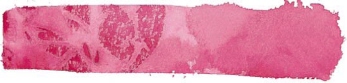
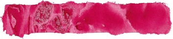
Intense Handmade Paints
I made my own paints here. At the top, you can see the colors are opaque—look almost like tempera paints—but you can thin them with water to achieve whatever strength or transparency you wish.
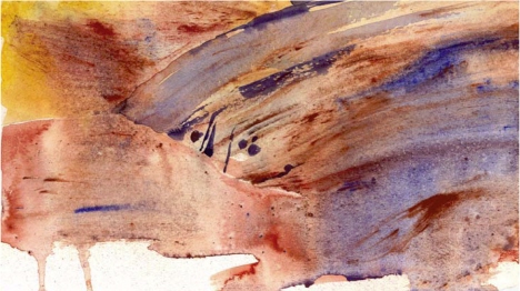
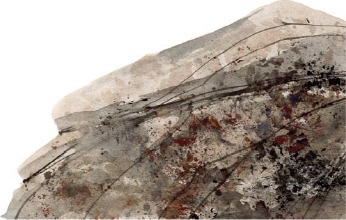
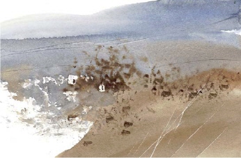
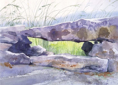
Painting With Dry Pigment
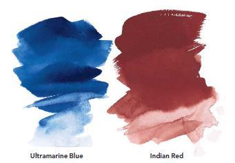
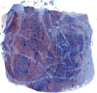
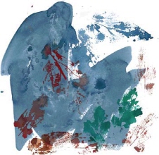
The sky here is an intense, pure, handmade Ultramarine Blue. For the rocks, I used traditionally mixed colors, then dropped in dry powdered blue and earth pigments and dragged them through the wash to create fine linear effects.
The earth colors and Ultramarine Blue are among the safest pigments, so I enjoy playing with them using only the basic precautions.
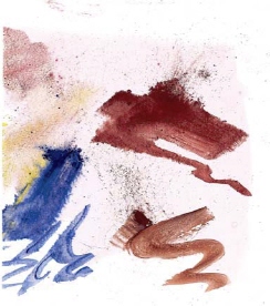
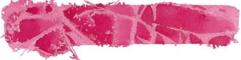
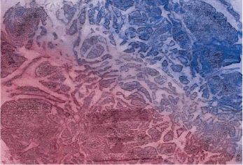
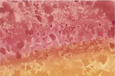
Sprinkle on Pigment
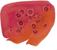
Here I applied a thin coat of gum arabic to the paper to make sure the powdered pigments stayed put. Then I sprinkled on Burnt Sienna, Indian Red, Ultramarine Blue and Cadmium Yellow and dragged the pigments around with a damp brush for some interesting granular effects.
Use With Caution
Pay attention to the manufacturer’s warnings about dry pigment use, and take proper precautions. Wear thin rubber gloves and always use a respirator or dust mask for maximum safety. Don’t eat, drink or smoke while mixing dry pigments, and be sure to wash your hands thoroughly afterward.
You may want to choose only nontoxic pigments. And keep in mind that the metal-containing pigments require special care—in addition to the cadmiums, that would be chromium, cobalt, manganese, nickel or zinc.
For complete instructions for making your own paint, see www.handprint.com or www.paintmaking.com.
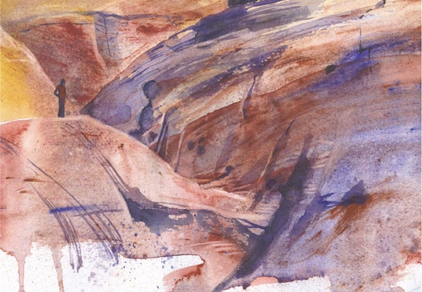
Dry Pigment in Action
DEMONSTRATION
Dry pigments allow us to work in ways very similar to our forebears, when the artist, apprentice or a “color man” mixed the paint fresh each time. Used dry, powdered pigments offer subtle, delicate effects.
MATERIALS LIST
Pigments
Powdered Pigment: Burnt
Sienna, Indian Red, Ultramarine
Blue
Brushes
½-inch (12mm) and 1-inch
(25mm) flats
Surface
140-lb. (300gsm) cold-pressed watercolor paper
Other
Gum arabic
Spray bottle

1 Lay in Base Color
Apply an initial layer of well-thinned Indian Red with a 1-inch (25mm) flat, mixing the pigment with gum arabic and water. While still wet, sprinkle in a very small amount of Ultramarine Blue and Indian Red dry pigments.
2 Paint With Dry Pigment
When the washes lose their shine, pull the pigment particles into linear shapes with a clean, damp ½-inch (12mm) flat to create rocky formations, spraying here and there with clear water while still damp to make a sandy texture. Let dry.
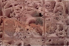
Creating Texture With Powered Pigment
You can get some surprisingly delicate effects by pulling powder with a brush through a damp area—the lines follow the direction of your strokes.
3 Build Form and Texture
Strengthen areas you wish with Ultramarine Blue, grayed a bit with Burnt Sienna. You can pre-mix these with water and gum arabic in a small container
Spatter a strong mix of these same colors to add texture.
When dry, lift here and there with clean water on your ½-inch (12mm) flat, blotting away the excess pigment. This technique really captures the desert sandstone look!
SURFACES
Watercolor Paper
The granddaddy of all dry helpers for the watercolorist is the very ground you work on: your paper. Getting to know your chosen surface (or surfaces!) will set you free to choose effects and techniques never before imagined.
There’s no one right paper or surface, just keep trying till you find the ones you like! Many companies offer samplers to allow you to explore. Just don’t cheat yourself by trying to use cheap, lightweight paper, as it will only lead to frustration!
Good watercolor paper is alive; it’s beautiful and varied and sometimes as unpredictable as the medium itself. Consider and try out all the possibilities: surface texture (rough, cold press, hot press), handmade or mouldmade, heavily or lightly sized, color (pure white or creamy traditional) and weight (300-lb. [640gsm], 140-lb. [300gsm], 90-lb. [190gsm]).
Stretching Lightweight Watercolor Paper
Paper that is 90-lb. or lighter will buckle if used larger than 5" x 7" (13cm x 18cm) if you don’t stretch it. There are commercial paper stretchers on the market; if you choose one of these, follow the directions. To stretch it on your own, follow these steps:
1. Soak paper thoroughly with a hose or by putting it in a tub or sink of water.
2. Remove it from the water and lay it flat on a piece of plywood, non-marine Masonite (the marine type is oily, which you want to avoid) or Plexiglas, and sponge excess water off the surface.
3. Use a gummed paper tape (the kind you wet), and tape the paper onto the surface on all four sides. Overlap the paper’s edge by at least ¾" (19mm) on a large sheet or ½" (13mm) on 9" x 12" (23cm x 30cm) or smaller. (If you use plywood, staple the edges closely all around, then cover the staples with gummed tape.)
4. Keep the surface flat and allow your stretched paper to dry thoroughly.
5. Finish your painting completely before cutting it loose from the stretcher.
The Weight of Watercolor Paper
• 300-lb. (640gsm) or heavier papers allow you to paint very wet. They’re more expensive, but they don’t buckle under juicy washes.
• 140-lb. (300gsm) paper works well for most applications. Especially if you tape it down until your painting is dry, it usually requires no stretching. (This is my most common choice.)
• 90-lb. (190gsm) paper can also be used if you stretch it before working, or if you use it in smaller works with dryer washes of paint.
SURFACES
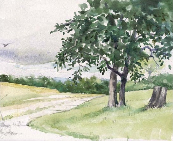
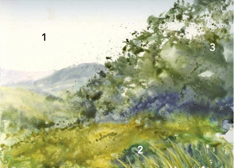
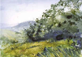
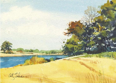
Rough Watercolor Paper
Rough watercolor paper has noticeable “peaks” and “valleys,” allowing the texture of the paper to become an integral element of the painting. You can take advantage of that texture to make sparkling, broken effects with drybrushing, or allow sedimenting pigments to settle in the valleys by using a juicy wash.

Practice Direct Painting on a Rough Surface
In this sample, the top swatch of color shows the effect of holding a flat brush at a right angle to the paper’s surface. This wash of color is smooth as the paint settles into all the little valleys in the paper.
The bottom shows what happens when the brush is held nearly flat to the paper and a rapid dry-brush stroke is made with the body of the brush. It is very open and sparkling. On rough paper, drybrushing allows paint to hit the peaks of the paper without going down into the valleys.
Painting on Rough Paper
I utilized the texture of the paper to suggest the lacy foliage on the old cedar trees and on the vignetted foreground, skimming the high points of the paper with my brush.
Play With Mixing Color Directly on the Paper’s Surface
As the colors mix, they settle into the valleys of the paper and blend in interesting ways.
SURFACES
Cold-Pressed Watercolor Paper
Cold-pressed watercolor paper is one of the most popular choices among watercolorists. It has just enough surface texture to create interesting effects, yet is smooth enough to not intrude or distract from the painting.
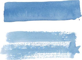
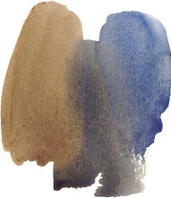
Practice Direct Painting on a Cold-Pressed Surface
Here I’ve made two straight strokes. I made the top stroke with the tip of a flat brush, which drives paint into the texture of the paper for a smoother wash.
I did a dry-brush stroke on the bottom. On cold-pressed paper, the “peaks” and “valleys” aren’t as pronounced as on rough paper, so the paint goes on smoother when you drybrush, with fewer jumps and gaps in color.
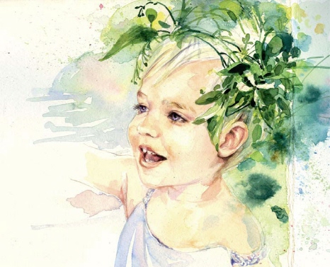
Painting on Cold-Pressed Paper
The soft blending of colors on this toddler’s skin creates a silken texture. Painting the background with muted wet-into-wet washes keeps it from competing with the subject. I let the shadow washes on her neck and shoulder puddle a little to keep them fresh.
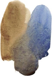
Play With Mixing Color Directly on a Cold-Pressed Surface
Watch as your paints blend together on the paper’s surface. Be aware that backruns and “flowers” are more frequent on this paper than on rough paper.
SURFACES
Hot-Pressed Watercolor Paper
This paper is made by literally pressing the paper with a hot, smooth iron plate—hence the name. Painting on hot-pressed paper is just plain fun! The surface is so smooth that the paint flows on unpredictably and can produce flowers, backruns or hard-edged puddles.

Practice Direct Painting on a Hot-Pressed Surface
Here I’ve made two straight strokes. I made the top one with the tip of a flat brush.
I made the bottom one with a drybrush technique. On hot-pressed paper, the strokes are nearly alike, because there are no “peaks” and “valleys” to affect the openness of the stroke. In order to get any dry-brush effect at all, it is necessary to literally dry your brush on a piece of tissue before making a stroke.
Painting on Hot-Pressed Paper
On hot-pressed paper, paint tends to puddle and enhance small, crisp washes. This can create a very nice, fresh effect that works well with subjects such as florals.
Play With Mixing Color Directly on a Hot-Pressed Surface
The paper is so smooth that when you mix colors on the surface of hot-pressed paper, they flow with a mind of their own and may not mix entirely or may even repel and backrun into each other. The graininess you see here is the sedimenting colors themselves.
SURFACES
Oriental Paper
The beautiful Oriental papers are as varied as you can imagine, depending on their basic ingredients as well as any sizing or additives. You may prefer rice paper for its absorbent whiteness, but do try others. Some kinds are nearly as thick and stiff as regular watercolor paper; others are thin and delicate and come in long scrolls, allowing you to cut whatever size you need. Some interesting papers have bits of dead leaves, petals or threads as a texturing additive in the body of the paper. Work with this texture or work around it for unusual effects.
Goyu Paper
This paper has much more sizing than you might expect; it behaved more like Western watercolor paper than the absorbent sumi-e papers I was used to. Experiment on a small corner first, so you know what to expect.
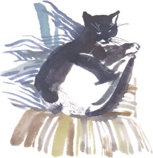
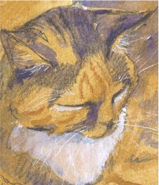
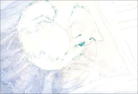
Mulberry Paper
Absorbent mulberry paper encourages a traditional technique. I painted this cat very quickly, with no previous sketching. I like the way the strokes overlap in the striped pillow behind Miss Lara.
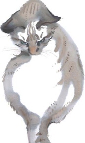
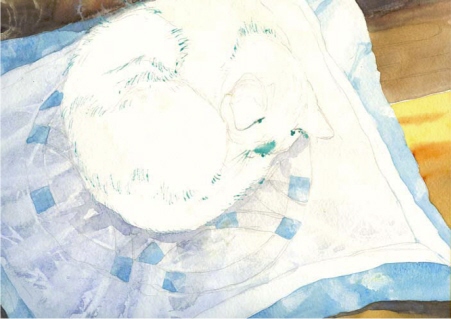
Rice Paper
Available at virtually any art supply store and by mail from any of the larger art suppliers, this paper is extremely absorbent; each stroke sinks right in (there’s no lifting on rice paper!). You can get nice soft effects with this paper that are unobtainable any other way.
I took my time with this sample, and used multiple layers of strokes. Thicker, dryer paint tends to stay put. I added the fine details of fur, eyes and whiskers last.
Experiment With Paint Strength
Since some of these papers are so absorbent, your strokes will look darker as you lay them down. As the paper dries, however, they may lighten significantly. Learn to compensate for this by being bolder and darker in the strength of your washes, and adding small, crisp accents with a drier brush.
SURFACES
Toned Paper
Colored or toned papers give a whole new dimension to watercolor.
The color you choose to work on can add a halftone or midground aspect to your work. You may also use the color of your paper to affect the overall mood of the piece or to express time of day, weather, ambience, temperature or any number of other factors.
Consider papers intended for use with pastels or printing; just be sure they have a neutral pH if you plan to use them for a lasting work.
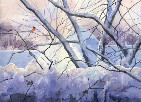
Painting on Amber Colored Paper
I captured this wintry twilight scene with watercolor and watercolor pencil on amber drawing paper. If you keep your brush on the dry side, this lightweight paper will accept light watercolor washes.

Painting on Green Colored Paper
I used transparent watercolor mixed with a bit of opaque white gouache throughout the whole painting to give me a wider value range, and to make the flowers really come forward on this medium green paper.
Understand the Value of Your Paper
Working on nonwhite paper can change the values of your work, and unless you employ opaque pigments, your lightest value will be the paper itself.
For that reason, I usually add a bit of gouache to my watercolors when working on a colored ground, to make my subject pop.
SURFACES
Toned Paper continued
You can tint your own paper, too, with watercolor or thinned acrylics.
Paper Toned With Acrylic
I prepared several pages in my journal ahead of time, tinting them with acrylics thinned to watercolor consistency. The Raw Sienna paper tone worked beautifully to complement the tortoiseshell coat of my old cat, Moggy. Burnt Sienna, Ultramarine Blue and a touch of opaque white captured her tricolor look.
Paper Toned With Watercolor
I made a generous puddle of well-thinned Phthalo Blue and washed it over the entire paper surface, laying in the soft, lavender clouds while it was still wet so I would have soft-edged clouds. I added the distant hills with a strong mix of Phthalo Blue and Cobalt Blue, adding a little Burnt Sienna to the mix closer to the winter wood. When that was dry I glazed on Yellow Ochre and Raw Sienna to suggest the grassy foreground.
SURFACES
Watercolor Canvas
Watercolor canvas is a true canvas, specially treated with an archival finish that will allow you to paint on it with watercolors. It is tough; it won’t tear or buckle like paper can, so you can lift, scrape, scratch or use other aggressive techniques with less fear of damaging your painting surface.
You can use watercolor canvas direct from the pad or tape or staple it to a rigid surface. You can also buy watercolor canvas in rolls and cut it to size or stretch it. It also comes in board form, prebacked with a rigid surface!
Painting on Watercolor Canvas
In this painting on watercolor canvas, you can see the individual brushstrokes, puddling and some lifting, especially on the tree trunk. If you look closely, you can also see the texture of the canvas.
Lifting on Watercolor Canvas
When you paint directly on watercolor canvas without wiping or pre-wetting, your paint will lift very easily. Even the staining Phthalo Blue I used here with the green came up without a problem. To lift, just use a damp brush, blotting away the loosened pigment with a clean tissue. You can even sponge off your whole painting and start over!
Pre-Wetting Your Canvas
You may wish to wipe the canvas with a damp cloth before painting to remove any grease, dust or oil which might repel your washes; some people use rubbing alcohol for this step. When you do this, you don’t get the resist-like effects, and lifting isn’t quite so easy anymore.
Sculpting With Paint
The easy lifting quality of watercolor canvas makes it fun to push and pull your values. Here I made a blob of color in a middle value and allowed it to dry, then lifted with a small bristle brush and clean water, blotting away the loosened pigment. I added darker values here and there and lifted a bit more. It was almost like sculpting!
SURFACES
Canvas Paper
This coated, textured paper looks much like canvas. It was originally meant for oils or acrylics, but it works nicely with watercolor, too. It’s very similar to working on watercolor canvas, but the surface is not quite as tough!

Lifting on Canvas Paper
Like watercolor canvas, you can lift easily on canvas paper, even with staining colors. The paint resists settling down into the surface and can create a highly sparkled effect, especially if there is any dust, dirt or oil from your hands on the paper.
Pre-Wetting Your Canvas
Here you can see how much better the paint took when the surface was cleaned first. And you can still lift color quite easily.
Tips for Painting on Coated Surfaces
Be aware that many of the newer nonpaper surfaces are also nonabsorbent. The paint may sit on top, which can make lifting a breeze, but it also means the paint can take longer to dry.
• If you use a hair dryer to speed drying, be sure to keep it moving on low speed at least 12 inches (30cm) away from your painting surface.
• The painted surface of canvas paper will be more delicate than traditional papers, since the paint doesn’t soak into the surface but sits on top. You’ll want to use a quick, light, sure touch when adding additional layers of color, or subsequent washes may lift, muddy or disturb the earlier washes. Some artists use their watercolors as thick as oils or acrylics when painting on this surface to avoid that!
• Try not to let a drop of water fall where you don’t want it, or it will leave a mark. Of course, that’s one of the best texturing tools, too: a spritz of water on a dry or nearly dry wash, quickly blotted, will give you wonderful surface illusions.
SURFACES
Yupo Paper
This surface is not really paper at all; it’s actually 100% polypropylene and comes in a variety of thicknesses, translucences and surfaces. For watercolor work, you may be happiest with the 74-lb. (157gsm) surface available as single sheets or pads. None of the Yupo surfaces will buckle under washes since they don’t absorb moisture (remember, they’re not really paper), but the thicker surface just feels nicer to work with. The surface color is a whiter white that will allow you to judge your values more accurately.
Painting on Yupo is much more like painting on a very hot-pressed or ultra-smooth watercolor paper; be prepared for puddling and lifting. It will be difficult, if not impossible, to get a smooth wash, but that’s not why you choose this surface. The puddles and textures are exciting and fresh, and the free-fall effect can be exhilarating!
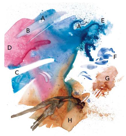
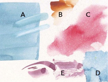
Playing With Yupo
Playing with Yupo is really the best way to learn how to use it!
A You can lift some color without wiping away the loosened pigment for a neat effect.
B Smear the color as you lift.
C Lift back to the clean, white surface.
D Spatter clean water into a wash when it is almost dry.
E Spray clear water into a very wet wash to make a lacy edge.
F Dab on puddly brushstrokes.
G Paint on color roughly, then lift a bit.
H Spatter and layer colors, allowing previous layers to dry first. When you do this, work quickly and lightly to avoid lifting.
Yupo Tips
• Wipe the surface with a cotton ball soaked in rubbing alcohol before beginning. This will remove any dirt or oils that would act as a resist as you paint.
• You can use a hair dryer to speed drying, but keep the temperature on medium and keep the dryer 12 to 18 inches (30cm to 46cm) away from your painting until you see the puddles have lost their shine—that means they are mostly dry.
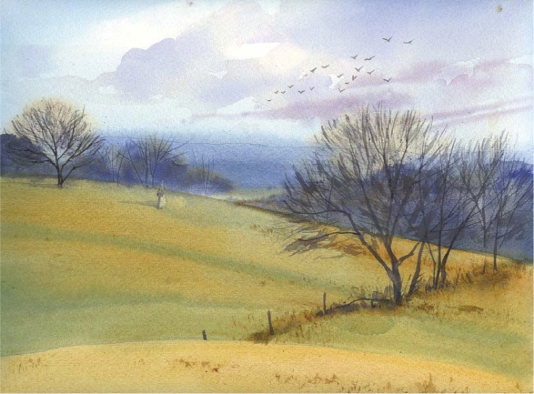
Paint a Landscape on Yupo Paper
DEMONSTRATION
You’ll need to work fast with Yupo. Since the paint sits on the top of the surface and is easily lifted, muddied or damaged, most artists try to get as much done in one go as possible. Then let it dry, and come back in with quick, light washes or other effects to complete the painting. It’s a good, creative experience to see what these first, sometimes wild, effects suggest to you, and go from there.
1 Lay in Background
Wipe the surface with rubbing alcohol to remove dirt and oils, and let that dry. Then wet the surface and use your ¾-inch (19mm) flat to flood in the light, hazy sky with a pale, delicate wash of Phthalo Blue. The distant hills here are varied mixtures of Raw Sienna and Phthalo Blue, painted in very quickly with a light touch.
2 Paint the Foreground Grasses
Use a ¾-inch (19mm) flat to paint in the rich, darker washes of Raw Sienna and Phthalo Blue as beautiful olive greens in the foreground. While still wet, stroke in some foreground grasses with a strong mixture of Yellow Ochre. This will lift and displace some color, while laying down the heavier opaque ochre. You can also use your fingernail or the end of your brush to scrape some more light grasses out of the damp paint.
3 Develop the Trees and Foliage
A no. 10 round with a mix of Phthalo Blue and Burnt Sienna works well for the trees; add a touch of Indigo for the cool shadow areas underneath.
A natural sponge dipped in the Phthalo Blue/Burnt Sienna mix and applied with a pouncing motion suggests the lacy leaves at the edges of the foliage mass. A light spray of clear water will further break up the foliage area and make the trees sparkle.
MATERIALS LIST
Pigments
Burnt Sienna
Indigo
Phthalo Blue
Raw Sienna
Ultramarine Blue
Yellow Ochre
Brushes
¾-inch (19mm) flat
nos. 6 and 10 rounds
Bristle or stencil brush
Surface
74-lb. (157gsm) Yupo paper
Other
Black watercolor pencil
Natural sponge
Rubbing alcohol
Spray bottle
4 Add Darker Values
Let everything dry thoroughly, then darken the shadow areas if you like with a bit more Indigo. A bit of spatter with a bristle or stencil brush in varied colors gives texture to the foreground.
5 Add Final Details
Lift the shapes of the bare, weathered trees almost back to the white surface using a no. 6 round dampened with clear water, blotting up the extra pigment. Then flood in a bit of warm brown to keep them from being too stark. Scratch in some sharp lines for tree branches. A no. 10 round and a dark mixture of Ultramarine Blue and Burnt Sienna works for the details in the trunks and small shadows. A black watercolor pencil suggests the smallest, darkest branches—no need to wet it. Add final details like birds and tree trunks with the no. 6 round.
SURFACES
Aquabord
Aquabord is an archival, clay-coated board that is absorbent (it used to be called Claybord Textured). It feels very much like fine watercolor paper, but like Yupo and watercolor canvas, you can often lift back to white or wash off the entire board if you want. And colors can be quite vibrant on this surface.
You can also still buy Claybord Smooth, which is much like working on a very hot-pressed surface. This surface will produce a variety of effects, from lovely, loose puddles to fine, sharp detail, depending on how you work.
Practice Painting on Aquabord
Because of its absorbency, you may find it difficult to get a smooth wash on Aquabord unless you wet it down first.
A Paint on color with a ¾-inch (19mm) flat brush, and you can see where the strokes overlap and make backruns. Try lifting with a damp brush and clear water, blotting to remove loosened pigment.
B Add strong color and soften immediately with a brush and clear water.
C Wet the surface with clear water, then lay in a wash of color. While it is still damp, spray it lightly with clear water to give it texture.
D Paint on color then spray it with clear water while it is still quite wet to make lacy edges.
E Practice strokes with a round brush. Try dragging it over the surface for a dry-brush effect.
Painting on Aquabord
In this rich, little landscape, I made good use of scratching techniques to create texture in the water and grasses. Lifting worked well in the sky area for the clouds, and I used a sharp watercolor pencil for the small twigs on the trees.
Frame Without Glass
If you spray your completed work on Aquabord with finishing spray, you can then frame without glass.
SURFACES
Scratchboard
Scratchboard is a clay-coated paper used mostly by illustrators to produce sharp black and white drawings. Since it is very slick, washes cannot be painted on smoothly. It’s a bit like using hot-pressed paper, only more so, since the clay coating is also somewhat absorbent. Still, you can get interesting results if you experiment.
India ink is commonly used to paint or draw a design on scratchboard. After it is thoroughly dried, you scratch through the ink’s surface to the white below to add details or texture. (You can buy pre-inked board that comes completely covered with ink if you plan on only a little white line work that you’ll tint with watercolor later.)
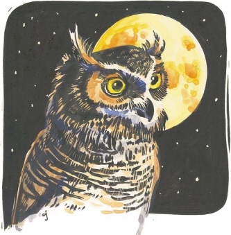
Tint Your Scratchboard Drawing With Watercolor
Here I painted the owl with India ink and allowed it to dry. I then scratched in the details and added watercolor washes.
If you use the heavier earth pigments or the cadmiums, some of your color will remain on top of the ink and affect its value and purity. If you use staining colors instead, the ink will stay pure black and the color will seem to have been applied only to the white areas.
Some artists use an airbrush loaded with transparent watercolor to get a smoother effect when tinting these drawings, but I prefer the looser, washier effects of paint applied with a brush.
Paint With Watercolor on Un-Inked Scratchboard
Experiment with watercolor pigments alone on an uninked scratchboard surface.
You’ll get the best results with this technique if you stick to nonstaining pigments, as the staining colors sink into the clay coating and discolor it far below the surface, causing you to lose the effect of the scraped white lines.
TEXTURE TOOLS
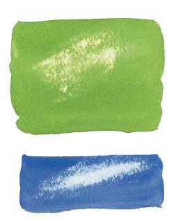
Salt
Salt has become quite ubiquitous in the watercolorist’s toolbox. It works in watercolor because it repels pigment. While attracting moisture, it pushes the color away from itself, creating lighter spots in your wash. Be careful; it’s in danger of being overused by its very usefulness in creating texture. Try it sparingly and only where it counts.

The Effects of Salt
Salt has more or less effect, depending on the type of pigment you choose. Here I placed salt into Ultramarine Blue of two varying strengths. With the heavier, sedimenting pigment, the effect of salt is not so great.
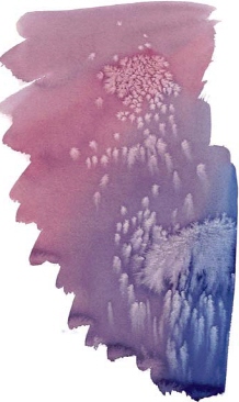
Make Salt Flow
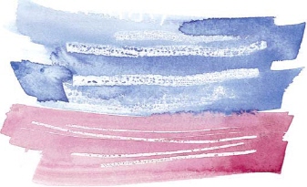
Tilt your paper to make the salt flow with gravity. This sample shows a mixture of Permanent Alizarin Crimson and Phthalo Blue. I tipped the board at an acute angle, making the bluer area stay wet longer. Notice how the salt traveled in this area. I’d use these frosty effects on an icy puddle, a winter window pane or a snowbank.
Sea Salt
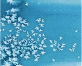
Table Salt
Try a Variety of Types of Salt
The wetness of the wash and the type of pigment seem to control the size of the salt’s effect more than the type of salt, though. I have the best luck with plain old table salt or sea salt.
Handy Salt Tips
• Use it sparingly.
• Don’t clump it in one spot.
• Don’t space it out too much or too evenly.
• Apply it when you see your wash has begun to lose its shine. If your wash is too wet or too dry, you’ll lose the effect of the salt.
• Try a variety of different kinds of salt, both fine grain and coarse.
• Experiment with salt on different surfaces.
• Using salt can affect drying time due to its attraction of moisture, so make sure to brush it all off once the painting is thoroughly dry.
• You can also use sand in the same way as salt, with slightly darker results.
TEXTURE TOOLS
Salt continued
Salt can suggest starry skies, flowers in a field, sandy ground or simply an interesting texture. Like many tricks, if it is too obvious, it becomes jarring, so do use it carefully and don’t become dependent on it for texture. Some artists are concerned about long-term damage to the paper; if that bothers you, skip salt and use another texturing agent, like clear water.
Try Using Salt as a Background Texture
Salt can add a subtle texture to your background, especially if you keep the color subdued as I did in this floral sketch.
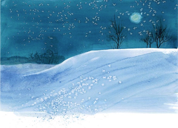
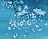
Salt Can Suggest Stars and Snow
The sky in this night scene is a mixture of Phthalo Blue and Indigo. I waited for the wash to begin to lose its shine, then used salt to suggest stars. I painted the foreground snow with Cobalt Blue, and added the salt while the paint still had a shine, to give it a bit of icy sparkle.
TEXTURE TOOLS
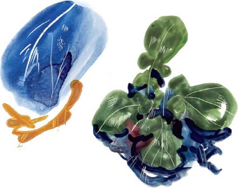
Plastic Wrap
Plastic wrap as a texture tool can be great, or it can be too obvious, obtrusive and overused, so try to use it judiciously and in a way that makes sense to your subject. Combine it with other techniques in a nonrepresentational way, if you like. (I use it in less abstract ways, since that is how I have evolved as a painter.) To make the best use of this enticing tool, lay the plastic into bold, wet washes of color.
Layering With Plastic Wrap
For a neat, layered effect, puddle Permanent Alizarin Crimson on your surface and texture it with the wrap. When that dries, lightly float on a second wash of Cobalt Blue over the first, making sure not to lift too much of the initial crinkled wash. Apply plastic wrap to this new wash and allow it to dry. This effect is transparent and has a kind of depth that could be useful.
Rough Press
Cold Press
Soft Press
Hot Press
Experiment With Different Surfaces and Lengths of Time
The paper surface you use can give you different effects with plastic wrap. See the results yourself by adding a wash of color onto various strips of watercolor paper.
On the right of each sample here, I added plastic wrap into a wet wash and kept it there for mere seconds, then pulled it away, leaving soft-edged marks on the paper.
On the left of each strip, I placed the plastic wrap onto the wet wash and allowed the paint to set up for several minutes, but not long enough to dry. You get much more emphatic marks this way.
TEXTURE TOOLS
Plastic Wrap continued
Plastic wrap also works well as an actual painting tool rather than something affecting the pigment after it is applied.
Painting With Plastic Wrap
After painting a rock shape, I crumpled a piece of plastic wrap dipped in warm and cool darks and stamped it here and there. I was pleased enough with the results to add cracks and shadows. You can see that this would be useful to paint rough earth, a sandy shoreline, short grasses or any number of textures.

Using Plastic Wrap in a Painting
To add texture to these castle walls, I laid plastic wrap into the shadow areas and let it rest until the paint began to set up a bit. I removed the plastic, then used a wad of the same plastic to stamp with, dipping it into the paint on my palette.
TEXTURE TOOLS
Wax Paper
Wax paper is very similar in use to plastic wrap, but with somewhat softer and more subtle results, as well as a few tricks unique to the paper. I like it even better than plastic wrap.
Accentuate the Texture of Your Surface With Smooth Wax Paper
Lay down a wash of color, then apply a flat, smooth piece of wax paper on top and allow it to dry in place. The paper may wrinkle just a bit as it dries, making subtle, hazy effects. This technique might make a nice sky effect or a soft fabric. The cloth-like effect of this paper is played up where the wax paper was pressed tightly against it.
Achieve Soft Textures With Wax Paper
Lay crumpled wax paper in a wet wash and pull it off after a few minutes. The texture is soft and hazy. It reminds me of wet sand by the beach.
Add a Lot of Texture With Crumbled Wax Paper
Crumple a sheet of wax paper and apply it to a wet wash of color. Place a weight on the paper to maintain contact. Lift the paper after 24 hours. Notice in this sample how the blue pigment puddled somewhat along the edges of the wrinkles. And, some of the wax stuck in the red areas of the wash. I polished these areas with a soft cloth to smooth the surface.
TEXTURE TOOLS
Wax Paper continued
Wax paper also works well as a resist in addition to being a handy texture tool.
Stamping and Burnishing With Wax Paper
I made the lines in the lower right by laying wax paper over my untouched watercolor paper and drawing through the overlay with a pencil point. It laid down a fine line of wax, which then resisted the subsequent wash.
In the center, I’ve stamped my crumpled wax paper into the colors still on my palette and briskly dabbed them onto my paper into wet and dry areas.
Using Wax Paper as a Resist
To get wide areas of resist, you can burnish over wax paper with a dull butter knife, a burnishing tool or the back of a spoon before you paint. Remember, you will not be able to make pigments stick to burnished areas, so be sure you want them to remain white.
Using Wax Paper Resist in a Painting
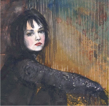
Here I drew lines through a sheet of wax paper to deposit a thin wax resist, to suggest the vertical blinds behind the beautiful Rachel. I also masked out her face so I could paint the background freely. The wax paper gave just the right amount of structure to the rich background, and added interest and texture.
Paint a Textured Wall With Wax Paper
DEMONSTRATION
I loved this old mission (now a museum and historic site) and could have stayed there for days, painting. This is the entrance to one of the rooms that opens onto a courtyard beyond, with a few people lingering in the dark room. I knew the old adobe walls would be a perfect subject for the soft textural effects achievable with wax paper.
MATERIALS LIST
Pigments
Burnt Sienna
Burnt Umber
Indanthrene Blue
Indigo
Quinacridone Burnt Scarlet
Ultramarine Blue
Brushes
1-inch (25mm) flat
no. 6 round
Stencil brush
Surface
140-lb. (300gsm) paper
Other
Mechanical pencil or stylus
Wax paper
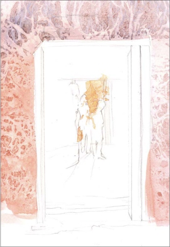
1 Establish the Texture
Once you’ve drawn in the subject, mix a varied wash of Quinacridone Burnt Scarlet and Ultramarine Blue with just a touch of Burnt Sienna, and splash it on the wall area with a 1-inch (25mm) flat, around the opening and on the back wall beyond the next room. Keep the color warmer on the back wall, where the sunlit courtyard lights the wall.
While the paint is still quite wet, lay crumpled wax paper down on the wash and weigh it down. Lift it up after 15 minutes or so.
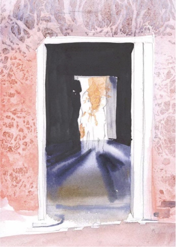
2 Develop Depth
Once the wall wash dries, use your no. 6 round to add a strong wash of Indanthrene Blue, mixed with Burnt Sienna and a touch of Indigo to the rich shadow area inside the building.
Apply a graded wash of these colors on the floor, using more Burnt Sienna in the foreground to bring it forward. While that is still damp, add in soft-edged shadows on the floor, keeping them darker closest to their objects.
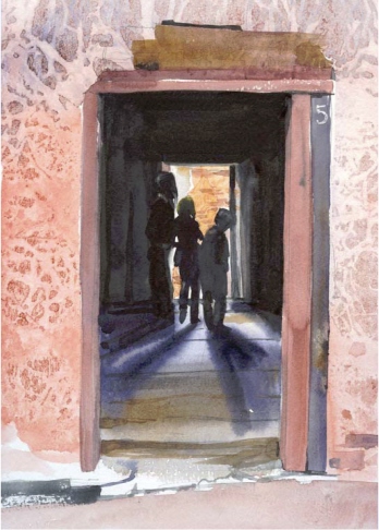
3 Add Figures and Add Detail to the Doorway
In keeping with this realistic portrayal, draw the building number (5) on the doorjamb area to the right of the entrance by burnishing through wax paper with a pencil. Paint over this doorjamb area using the no. 6 round with Quinacridone Burnt Scarlet mixed with a bit of Ultramarine Blue to gray it. When it dries, suggest the exposed beam above the door with Burnt Umber.
Carefully paint the silhouettes of the people with more of the rich, dark wash used for the shadows in step 2.
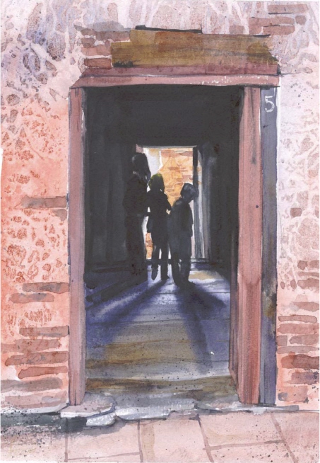
4 Add Final Details
The exposed adobe bricks, tiled floor and other details can be painted with a no. 6 round, varying the color for interest. Almost pure Burnt Sienna works well on the bricks, and you’ll find that a mixture of Ultramarine Blue and Burnt Sienna makes a thunderous dark for additional shadow areas. Finish it all up with a little spatter here and there, using a small round stencil brush to flick paint onto the paper.
TEXTURE TOOLS
Aluminum Foil
Aluminum foil can be pressed into a damp wash to texturize it, similar to wax paper and plastic wrap. Depending on whether you lift it quickly or leave it in place until the paint is set, you can get softer or sharper, more fractured effects.
If you are branching out into acrylics as a water-based medium, you can even collage foil onto your paper and paint over it for a metallic shimmer.
Using Aluminum Foil in a Painting
These huge granite rocks juxtaposed against the soft, delicate spring grasses fascinated me. I used aluminum foil to create the mottled texture in the rocks, crumpling it and pressing it into the damp wash, then allowing it to set a bit. Once the initial textured shapes were dry, I added in the painting’s details and spattered color for added texture.
Accentuate the Texture of Your Surface With Smooth Aluminum Foil
Place smooth foil in a wet wash, and scratch in a few lines here and there through the foil with a blunt knife. Let it dry in place.
Create a Rough Texture With Crumpled Aluminum Foil
Lay crumpled foil in a wet wash and lift after a few minutes.
Fold the Foil for Added Interest
For a grid or line effect, you can fold the foil before you lay it in your wash. Since foil holds its shape, you can somewhat control the textures or lines that you create.
TEXTURE TOOLS
Found Objects
Look around your studio and home to see what might be on hand. Perhaps you received a package with plastic bubble wrap...that and the corrugated cardboard itself are terrific texturing tools. If you have old rags in your paint box, do something with them besides wiping your brushes—use them as texture tools. Natural objects work great, too!
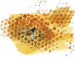
Small Bubble Wrap
The small bubbles of some bubble wrap remind me of a bee’s honeycomb. Paint a double wash of Quinacridone Gold. Then paint a darker color directly onto the bubble wrap and press it to the paper for texture. (I couldn’t resist adding the bee!)
If you leave the bubble wrap in place, weigh it down and allow it to dry, you’ll also capture the texture of the wrinkles in the plastic (see top right of painting).
Large Bubble Wrap
A single large bubble cut from a piece of bubble wrap can be used to print with. Dip it into paint and press it firmly to the paper. It reminded me of stylized lacy trees, so I added fine trunks and branches. There are dozens of other applications for bubble wrap—an aerial view of an orchard, clouds.
Cardboard
Strip the smooth face from a cardboard carton and stamp the corrugations into a wet wash, then allow it to sit with a weight on it for about 10 minutes.
The darker, narrower diagonal lines at the lower left of this sample were made by painting directly onto the corrugated cardboard before pressing it to the paper.
Kitchen Cloth
On the left I stamped and blotted on a wet wash with a kitchen cloth. The gray pattern in the center is the mark made by laying a piece of the cloth flat on my palette, then applying it to the paper. On the right I stamped on color with a wadded piece of cloth.
TEXTURE TOOLS
Found Objects continued
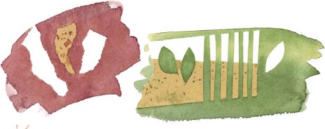
Leaves
You can stamp or press leaves into a wet wash, or paint the leaf first, then stamp it on top of a dry wash for another layer. Use the leaves as a mask or stencil by painting around their shape.
Beads
Lay small or large beads in a wet wash. Dot them with pigment after you drop them into the wash. This will build up a small dam of color around each one, so that it dries with a sharp demarcation line.
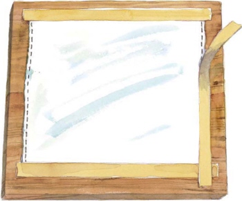
Tape
Masking, painter’s or drafting tape are all great masking tools. You can use tape to mask large areas, or cut and tear shapes to mask smaller details.
Here I’ve left some of the masking tape pieces in place, so you can see how well they work to mask whites out of a watercolor wash. Tear or cut pieces, and paint directly over the tape. Let your wash dry and peel the tape off carefully, leaving a sharp, white edge. This technique is great for fence posts, windows or even a sailboat’s hull.
String
Dip yarn and string into concentrated mixtures of paint, lay them on your paper, and press them into place with another sheet of paper just like you used to do in school. You may find you need to paint directly onto the string to get a strong-enough effect—it’s messy, but it works! (You can also try this technique with rubber bands.)
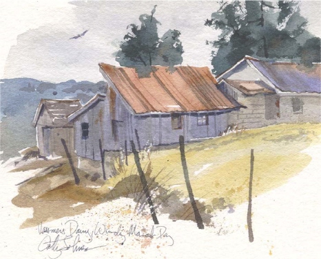
Paint a Building With Painter’s Tape
DEMONSTRATION
Masking tape has been around for decades as an artist’s tool, as well as a house-painter’s old standby. In this case, I found painter’s tape a bit gentler than masking tape on my paper—not as likely to tear or damage the surface when removed. In this demo, you’ll use painter’s tape to mask off large areas with good, sharp corners and crisp lines, so that when your washes are dry and the tape removed, you are left with pure white paper.
MATERIALS LIST
Pigments
Burnt Sienna
Burnt Umber
Phthalo Blue
Quinacridone Burnt Scarlet
Quinacridone Gold
Ultramarine Blue
Brushes
½-inch (12mm) and 1-inch (25mm) flats
nos. 5, 6 and 8 rounds
Small, stiff brush
Surface
140-lb. (300gsm) cold-pressed watercolor paper
Other
Craft knife
Facial tissue
HB pencil
Liquid mask
Yellow painter’s tape
1 Draw and Mask Your Subject
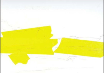
Draw your scene with an HB pencil and apply a general mask to the buildings with yellow painter’s tape. This type of tape is thin enough and light enough in color to let your guidelines show right through it.
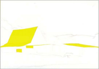
2 Refine the Mask
Cut carefully, using a very sharp craft knife with a new blade, pressing just hard enough to go through the tape, not all the way through the paper (it’s ok if you cut the top surface, but do not cut through the paper). When you pull away the excess tape, you have nice sharp-edged protected areas. Burnish over the tape with your thumbnail to assure a good seal. Protect the sunlit back of the horse in this scene with liquid mask applied with a no. 5 round, and let it dry.

3 Paint Initial Washes on Sky
Apply Phthalo Blue to the sky, adding a thin, wet mixture of Ultramarine Blue and Burnt Sienna to suggest clouds—a 1-inch (25mm) flat works well to give you a broad, soft, sky effect.
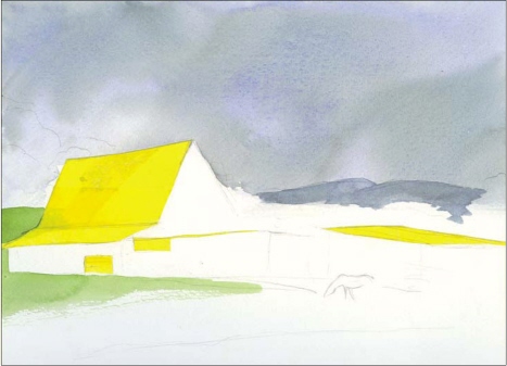
4 Paint Initial Washes on Hills and Grasses
Wash the distant hills with a darker value mix of Ultramarine Blue and Burnt Sienna, using your no. 6 round.
Start on the grassy area with a ½-inch (12mm) flat and a mixture of Phthalo Blue and Quinacridone Gold. With the tape in place, you can splash your paint in freely and paint right over the edge of the tape.
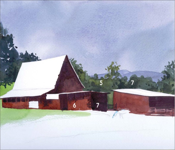
5 Paint Initial Washes on the Midground
Add the midground trees behind the barns with rich mixtures of Quinacridone Gold, Burnt Sienna and Phthalo Blue using your no. 8 round and a dancing, irregular stroke that suggests foliage.
6 Paint the Buildings
Lay in the shapes of the buildings with a ½-inch (12mm) flat and a mixture of Quinacridone Burnt Scarlet and Ultramarine Blue. Let this dry, then remove the tape from the barn roofs.
7 Develop the Shadows
Add shadows to the buildings with a mix of Ultramarine Blue and Burnt Sienna using your no. 5 round.
Use a mix of Ultramarine Blue, Phthalo Blue and Quinacridone Gold to create deeper shadows in the tree area to give it depth.
8 Add Final Details
Wash in the rest of the foreground grasses with the same colors from step 3 and your ½-inch (12mm) flat.
Use your no. 6 round and varied mixtures of Ultramarine Blue and Burnt Sienna to add details to the barns—rust on the roof, vertical boards, windows and gates.
Add the stone fence using your no. 5 round to apply Burnt Sienna and Ultramarine Blue in a rough, dancing fashion, blotting here and there to suggest individual stones. Then spatter on additional texture with the same colors, and add a few smaller, sharp details using a richer mix of these same colors for unity.
Paint the grazing horse with a no. 6 round using Burnt Sienna darkened in the shadow areas with Burnt Umber. Paint it directly, then blot the upper edge with a tissue to give form and volume to the horse.
As a final touch, use a small stiff brush and clear water to lift some of the pigment around the edge of the flat roof in the center of the scene and the fence on the right; this will result in a soft highlight not achievable with masking or scraping.
TEXTURE TOOLS
Paper Towel and Tissue
Disposable and always clean, paper towels and tissue make great paint rags and lifters. Try holding a tissue or paper towel in one hand and a brush in the other. That way you can instantly adjust a wash, soften an edge, blot up a spill, lift excess moisture from the bead of a wash or from your brush, or even lift out or add texture.
Lifting and Stamping With a Damp Paper Towel
I did the same thing here with a paper towel as with the tissue. As you can see, paper towels can give you a different effect. At the bottom, I rubbed the paint off to resemble cirrus clouds without the paper towel falling apart on me. I also dipped the wad of towel into wet paint and printed with it at lower right.
Lifting and Stamping With a Damp Tissue
Here I laid a graded wash of Phthalo Blue and used a damp tissue to lift cloud shapes. Notice the soft edges on this sample. Stamping with the paint on the damp tissue creates a soft, crinkled effect.
Lifting and Stamping With a Dry Paper Towel
Using a dry paper towel to lift and stamp creates much harder edged shapes.
Lifting and Stamping With a Dry Tissue
I laid another graded wash of Phthalo Blue here and this time used a dry tissue to blot this wet wash in the shape of a cloud. The edges of the cloud forms are hard because a dry tissue is less absorbent than a damp one. Stamping with the paint on the dry tissue creates a hard, crinkled effect.
TEXTURE TOOLS
Cotton Balls
Cotton balls can be used in ways similar to towels and tissues, but surprisingly, are not as absorbent. They are strong and sturdy, though, so you can get a lot of use out of a single cotton ball before you have to throw it away. Be careful about dipping cotton balls into the moist paints on your palette—they leave more fibers than a shedding cat!

Practice Lifting and Stamping With Cotton Balls
I tried lifting color away from a still-damp Quinacridone Burnt Orange wash with a cotton ball and clean water at upper right. I then allowed the flat wash to dry completely and wiped it with a cotton ball and clear water at left. That lifted fairly efficiently, too, but not as cleanly as when the wash was still damp. I also stamped on color with a cotton ball.
I switched to Phthalo Blue to make the tree at lower right, dipping into the paint and pressing the cotton ball onto the paper with varying pressure.
Wet vs. Dry Cotton Balls
A wet cotton ball holds a lot of water, even if you think you’ve wrung it out well. The large amorphous shape at left is the result of blotting quickly with such a dampened ball. Next to it, you can see what I mean by lack of absorbency—a dry cotton ball hardly lifted a thing. They are fun for stamping with, though, as you can see at lower right.
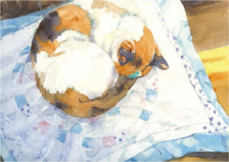
Paint a Cat With Lifting and Stamping
DEMONSTRATION
I combined a number of the techniques and materials from this chapter to make this portrait of my cat, Scout. She looked so sweet, curled up asleep on the Double Wedding Ring quilted pillow almost as if she knew she mirrored the ring. The calico cat and the calico patchwork just seemed to fit as well...I knew I’d have to paint this!
For this demonstration, choice of paper is key—start with a sheet of strong, durable 140-lb. (300gsm) cold-pressed watercolor paper for texture and durability (you’ll be doing some lifting and scraping, so this strong surface will serve your needs well).
MATERIALS LIST
Pigments
Burnt Sienna
Burnt Umber
Cobalt Blue
Manganese Blue Hue
Quinacridone Red
Raw Sienna
Ultramarine Blue
Yellow Ochre
Brushes
½-inch (12mm) and ¾-inch (19mm) flats
nos. 4 and 6 rounds
Surface
140-lb. (300gsm) cold-pressed watercolor paper
Other
Facial tissue
HB pencil
Liquid mask
Paper towels
Plastic grocery bag
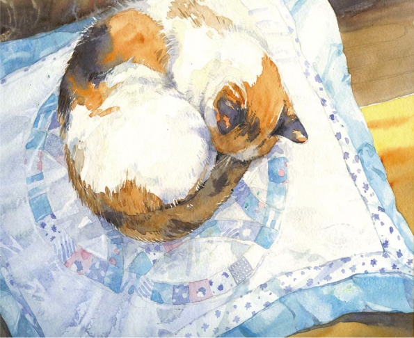
1 Draw Your Subject and Apply a Base Wash
Plan your composition and draw in the shapes with an HB pencil, adjusting the shape of the patchwork in the quilted pillow to suggest perspective. Apply liquid mask where the lightstruck hairs of the cat will be silhouetted against a darker background, or where white and darker hairs meet in her fur.
Mix Cobalt Blue, Ultramarine Blue and a touch of Burnt Sienna for a subtle, moody first wash on the pillow, applying it with your ½-inch (12mm) flat, gradating darker on the left, away from the light source.
While the wash is still wet, lay a plastic grocery bag into it to suggest the texture of quilting and folds. Keep it in place for a few minutes to get soft, expressive “wrinkles,” then remove it. The granulating blues look perfect with just this subtle bit of texture.
2 Establish the Background and the Quilt
Lay in strong washes of Burnt Umber, Burnt Sienna and Yellow Ochre for the wooden desktop with a ¾-inch (19mm) flat, adding a bit of Ultramarine Blue to your colors in the shadow areas surrounding the quilt. You can stamp with the edge of a rolled up paper towel in the upper left wooden area to suggest the spiral shape for a motif that repeats in the quilt.
Paint the border of the quilt using a ½-inch (12mm) flat with a mix of Cobalt Blue and Manganese Blue Hue, blotting here and there with a tissue to give it dimension.
Add matching blues to the wedding ring pattern, blotting with a tissue while damp to lift lighter lines that suggest quilting.
3 Develop the Cat and the Quilt
Use a no. 6 round to add the calico on the cat with a strong mixture of Ultramarine Blue and Burnt Sienna for the darkest areas, and Burnt and Raw Sienna in the brown patches. Overlap the shapes where the hairs are protected with mask, working wet-into-wet for soft blending in the shadows, and to give form and volume.
Develop the quilt with a variety of pinks, blues and mauves in the patchwork pattern—use Cobalt Blue and Ultramarine Blue for the blues, Ultramarine Blue mixed with Quinacridone Red for the soft mauves, and straight Quinacridone Red thinned with water for beautiful clear pinks. Blot here and there to suggest the tiny folds in the fabric.
Allow the cat and the quilt to dry.
4 Refine the Cat and the Quilt
When everything is dry, you can remove the mask and continue to develop the pattern in both the cat and the pillow with the same mixes you used in step 3, paying attention to the myriad small prints, and developing and strengthening the patterns of fur. Use your no. 4 round for added control when painting the tiny calico prints.
Add in lighter values of Cobalt Blue and Burnt Sienna for the shadows in the body of the cat itself.
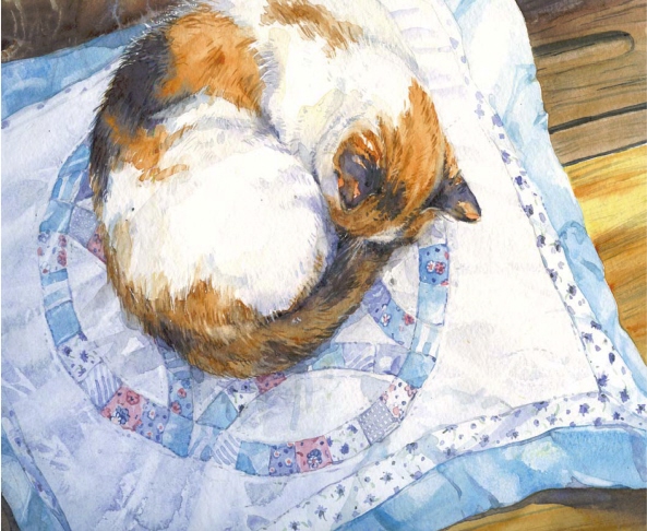
5 Add Final Details
Continue to develop the fur on the cat, softening here and there with a damp brush. Lift and restate darker areas on her fur where necessary to refine her form and shape.
Suggest shadows where the cat’s body presses into the quilt, using a strong mix of Ultramarine Blue and Burnt Sienna.
Add a few tiny stitches to the pillow here and there with the same mix of Ultramarine Blue and Burnt Sienna and your no. 4 round.
Then work on finishing the desktop by adding the grain with mostly Burnt Umber and Burnt Sienna, applying it with a no. 6 round with the hairs spread apart for a drybrush effect. The same colors also work well for the cracks and shadows on the desk.
Scratch a few fine white lines in for stray hairs and whiskers, and voila, you’re done!
TEXTURE TOOLS
Sandpaper
Sandpaper can provide a dark, roughened area or a bold texture. You can even take your paper back down to clean white with help from sandpaper. Try a variety of sandpaper grades for different effects.
Use Sandpaper Before You Lay Down Color for a Dark Effect
Sand your paper before you paint, then lay on color to make dark textured areas.
Use Sandpaper on a Dry Wash to Lift and Remove Color
Paint on a wash of color and let it dry, then lift or lighten with sandpaper.
Using Sandpaper in a Painting
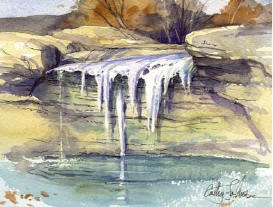
I used a rather coarse wet/dry sandpaper to regain the white paper in the midground here, to suggest steam rising on an icy morning. The slightly granular effect at the edges of the sanded area made me think of ice crystals in the air. (See Paint a Snow Scene With a Variety of Indispensable Tools for complete instructions on how to paint this scene.)
TEXTURE TOOLS
Collage
Using the techniques of collage and watercolor together magnifies the possibilities of texture in many exciting ways. By building a surface with your watercolor and added objects, you can create many layered and textural effects.
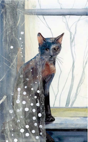
Collaging With Rice Paper on Your Watercolor Painting
This little painting combines straight watercolor technique with a bit of collage for spice. I painted the cat and windowsill with watercolor on heavy watercolor board (a heavier, thicker support works best with collage). When it was dry, I moistened a piece of textured rice paper with polymer medium and placed it on the painting, partly veiling the cat. I worked out bubbles on the paper by brushing more medium over the top. I added a few more layers of rice paper to suggest folds in the sheer curtain. As a finishing touch, I added a few white dots and lines directly over the dried rice paper for a sort of a textured-fabric effect.
Collaging With Rice Paper and Foil on Acrylic
In this example, I applied a wash of acrylic on heavy watercolor board. I textured this watery wash with folded aluminum foil and let it dry. Since it is acrylic, you don’t have to worry about this nice texture lifting as you work. I painted rice paper and foil squares with polymer medium and placed them in the painting, brushing over and beyond the squares with more polymer medium to get out bubbles.
Try Collaging These Objects Into Your Next Watercolor Painting
The only limit to what you collage is your imagination and the permanence of the materials used.
Mediums
Use polymer medium (gloss or matt) or gel medium to attach your collaged objects. The gel medium works better on heavier objects.
Paper-Thin Objects
Rice paper, stenciled letters, light-weight wood, metal pieces, thread or yarn, ribbon or lace, foils
3-D Objects
Nails or washers, feathers, straw, sticks or stones