The most widely used Python package for graphs and images is called matplotlib. The following program can be viewed as the simplest Python program to generate a graph since it has just three lines:
import matplotlib.pyplot as plt
plt.plot([2,3,8,12])
plt.show()
The first command line would upload a Python package called matplotlib.pyplot and rename it to plt.
Note that we could even use other short names, but it is conventional to use plt for the matplotlib package. The second line plots four points, while the last one concludes the whole process. The completed graph is shown here:
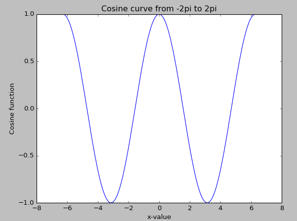
For the next example, we add labels for both x and y, and a title. The function is the cosine function with an input value varying from -2π to 2π:
import scipy as sp
import matplotlib.pyplot as plt
x=sp.linspace(-2*sp.pi,2*sp.pi,200,endpoint=True)
y=sp.cos(x)
plt.plot(x,y)
plt.xlabel("x-value")
plt.ylabel("Cosine function")
plt.title("Cosine curve from -2pi to 2pi")
plt.show()
The nice-looking cosine graph is shown here:
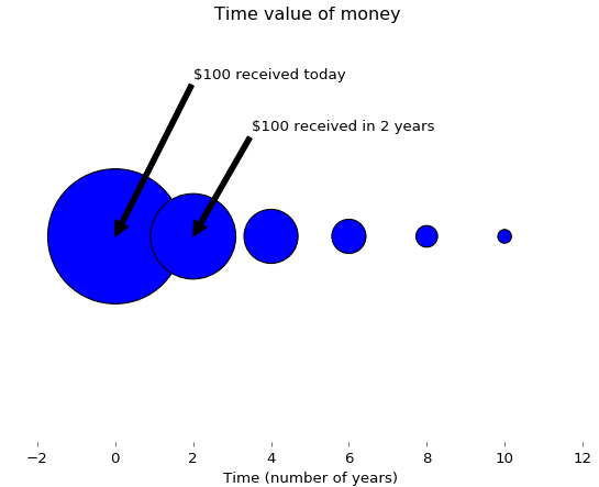
If we received $100 today, it would be more valuable than what would be received in two years. This concept is called the time value of money, since we could deposit $100 today in a bank to earn interest. The following Python program uses size to illustrate this concept:
import matplotlib.pyplot as plt
fig = plt.figure(facecolor='white')
dd = plt.axes(frameon=False)
dd.set_frame_on(False)
dd.get_xaxis().tick_bottom()
dd.axes.get_yaxis().set_visible(False)
x=range(0,11,2)
x1=range(len(x),0,-1)
y = [0]*len(x);
plt.annotate("$100 received today",xy=(0,0),xytext=(2,0.15),arrowprops=dict(facecolor='black',shrink=2))
plt.annotate("$100 received in 2 years",xy=(2,0),xytext=(3.5,0.10),arrowprops=dict(facecolor='black',shrink=2))
s = [50*2.5**n for n in x1];
plt.title("Time value of money ")
plt.xlabel("Time (number of years)")
plt.scatter(x,y,s=s);
plt.show()
The associated graph is shown here. Again, the different sizes show their present values in relative terms: