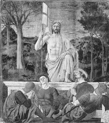
Piero della Francesca, Resurrection of Christ, 1463–65, fresco, 225 × 200 cm (photo credit 6.1)
Piero della Francesca seems to have been opposed to the manifestation of feeling, and ready to go to any length to avoid it.… In the Borgo San Sepolcro fresco the Resurrected Christ, a sturdy stevedore.… looks straight ahead of him, dazed and as if waking from a refreshing sleep.… One is almost compelled to conclude that Piero was not interested in human beings as living animals, sentient and acting. For him they were existence in three dimensions whom perchance he would gladly have exchanged for pillars and arches, capitals, entablatures and facets of walls.
Indeed, it is in his architecture that Piero betrays something like lyrical feeling. He paints what he cannot hope to realize, his dream of surroundings worthy of his mind and heart, where his soul would feel at home.…
One may venture to ask whether it is not precisely Piero’s ineloquence, his unemotional, unfeeling figures, behaving as if nothing could touch them, in short his avoidance of inflation, which, in a moment of exasperated passions like our [sic] today, rests and calms and soothes the spectator and compels gratitude and worship.
—BERNARD BERENSON1
FOR FIVE YEARS, Balthus had been haunted by the urge to make a journey to Italy. He wrote to friends that just hearing “Arezzo” would make him shudder; he equated its effect with that of the sound of the name of an inamorata. He approached the trip with fear; it might let him down. But rather than disappoint him, the weeks that followed provided lessons that would guide and compel him for the rest of his life.
Piero della Francesca’s name had been in the air in the Klossowski household ever since Balthus had begun to look at art. The early Renaissance Italian had long been a favorite of Erich Klossowski’s. In 1920 one of Erich’s friends—Hans Graber, a professor in Basel—wrote a pioneering book on Piero which he sent a couple of years later to Balthus in Beatenberg. Baladine responded so strongly to Piero’s imagery that she wrote to Rilke—in one of her letters in which she alternated between French and German in her fervor to find the words that could best evoke the intensity of her emotion—
The day before yesterday I saw a reproduction of Piero della Francesca’s Noli me tangere. That head of the Magdalen, almost grimacing with grief, with terror as she falls to her knees, slipping over the flowers of that garden, suffering and fainting. And he, the Christ, with an arrogant, unpitying gesture, as if he scarcely recognized her—I was terrified, a sort of dread clutched my heart.2
So this was the grip a painting might have!
Balthus, meanwhile, prized Graber’s book. When he was sixteen, he lent it to Rilke—who soon wrote that he was savoring it. Now the young painter needed to know the originals. When a friend invited him to Florence for the summer of 1926, he was desperate to go. The trip would take him to the work of Masaccio, Fra Angelico, and, above all, to Piero.
IN SPITE OF THE ESTEEM in which the Klossowskis and Rilke held Piero della Francesca, for the eighteen-year-old Balthus to make a pilgrimage to his work in 1926 was a brave and independent move. Piero was not the taste of the day. In his thirty-nine volumes on Italian art, John Ruskin—in Balthus’s youth still the reigning authority on Italian art—had given the fifteenth-century painter only a parenthetical reference. Ruskin and his followers found Piero’s work antithetical to their taste. Their preference was for the decorative flourishes and overt sentimentality they found in Botticelli.
Rather than address Piero’s painting, Ruskin had mentioned Piero only in connection with the issue of students taking their masters’ names. Piero was different for having used his mother’s; as Vasari had been the first to report, he had done so because it was his mother, Francesca, who had trained him as a painter. Even if Balthus enjoyed and, perhaps, to some degree identified with this detail Ruskin had latched on to—while Erich was also a painter, Baladine was the parent with whom he spent more time—it had little to do with the primary draw of Piero.
Piero’s work has no lack of emotional depth, but achieves its force with the utmost reserve. It also emphasizes modeling more than line, and keeps details at a minimum. Like the art Balthus would come to admire by more recent practitioners—especially Courbet and Seurat—it extols balance and solidity. There is a strong sense of stasis and order; figures and objects are anchored and stable. The precise pictorial architecture creates a distinct impression of depth. Conscious geometry underlies both the overall composition and the individual figures. The paintings—and in this respect they are like Poussin’s—give to visual experience a sublime classical order that deliberately counterbalances the vagaries of the human psyche.
No wonder Balthus, when talking to me about Piero at age eighty-two, was visibly still in the thrall he felt at eighteen. To embrace the haze of life, one must first establish an atmosphere of plausibility. Ambiguity is its most telling when cloaked in harmony.
For a young artist to obsess over Piero in 1926 was counter to the prevailing trends not only because Piero was then among the old masters out of favor. At that moment in the history of art, the tendency was to avoid the past altogether. Painters and sculptors of various schools above all sought newness and novelty. They wished to shatter boundaries, not learn from what others had already achieved. Some were taking the Cubists’ dissolution of form or the Fauves’ unabashed emotionalism to new extremes. The Dadaists closed the book on history. The general emphasis was on art that gave voice to the inner self, and that broke new ground.
Heading to Florence and Arezzo, Balthus was turning in an opposite direction. The idea of intentionally exposing his own personality held no appeal for him. Tastefulness was central. Piero offered deliberation and structure. In the havoc of the 1920s, to seek out the art of Piero della Francesca was to gravitate toward order and discipline: the route of steely control.
Its cultivation of human experience and high degree of visual refinement made Piero’s art the ideal. Its organization and miraculous appearance had a magnetic attraction on Balthus. And it provided a disguise.
IN JULY 1926 BALTHUS BEGAN his pilgrimage toward the originals of those Piero frescoes he had savored in reproduction. En route from Paris to Florence, he stopped at Muzot for an overnight stay with Rilke for what would be, as he perhaps realized, their last meeting. The occasion was profoundly significant for both of them. On July 8, 1926, Rilke sent a telegram to Merline, who was in Paris: “Happy to have Baltusz here and with him a little of you & the Rue Malebranche. He leaves tomorrow morning.—René.”3 In 1898 Rilke had briefly lived in Florence, and he must have been delighted to think of his protégé on his way there.
From Florence a few days later, Balthus described this visit to his mother: “I spent some delicious hours with René, what a springboard to jump into Italy from!”4 Baladine liked these words so much that she quoted them when she wrote Rilke on July 14 to describe this “charming letter from Florence” from her “charming boy.”5
“What a springboard to jump into Italy from!”6 The unbridled enthusiasm evokes Balthus’s persona more than any of his bigotry or pseudoaristocratic nonsense. If he deplores or scoffs at all he deems second-rate, he does so in part because he has long been so genuinely euphoric, and reverential, when the object of his feelings is brilliant and beautiful.
In the power of the art of Arezzo—and in the charms of the hill town itself and the surrounding countryside with its cypresses and vineyards and olive groves—the journey exceeded Balthus’s wildest imagining.
BALTHUS SPENT THREE WEEKS in Arezzo, from which he made outings to Sansepolcro, and then returned to Florence, where he stayed for a month with American friends he had met in Paris and who lived on the Piazza Santa Croce. These were young painters he knew through Stanley William Hayter, the painter and printmaker. Hayter was “like an older brother for me … a marvelous man,” Balthus told me: words far more affectionate than any I ever heard him utter about his actual brother.
The trip to Italy was financed by Jean Strohl. Strohl, a professor of zoology who lived in Zurich, was a friend of Erich Klossowski’s, of Gide’s, and of Rilke’s patrons the Reinharts. The Strohl and Reinhart families knew lots of artists, Bonnard and Xavier Roussel among them; Jean Strohl was happy to support the journey of such a promising young painter.
Balthus told me that Professor Strohl was a wonderful man “who knew everybody.” When he was eighteen, he wrote Strohl and his wife frequently from both Arezzo and Florence; these letters reveal a tremendous rapport between the young artist and his patrons. Balthus was rapturous, and extremely articulate. He described his thrill over Piero’s frescoes and his love affair with Italy in general. He told his patrons that, having been haunted by the desire to make this journey, he had considered it dangerous to anticipate it, putting himself at risk of disappointment. Now his ecstasy was almost beyond measure—at seeing the cypress trees that were like toys, at the balance and precision and unprecedented harmony of Piero’s frescoes in Arezzo, at the divine mystery of this art. He wrote that the Arezzo frescoes conjured thoughts of Valéry and of “The Lady and the Unicorn”—but that no adjective was sufficient to describe them.
Balthus also recounted to the Strohls how he would—as discreetly as possible—observe schoolgirls playing on the Piazza Santa Croce. He would sketch these girls at night. But in spite of his effort not to attract their notice, the youngsters would often surround him. Writing about this, the eighteen-year-old artist repeatedly used the word that, in my days with him, was always the ultimate accolade for any person or any experience: “amusing.” Watching the children play on the piazza was amusing. And he would amuse himself “enormously” by making little girls jump over a rope and studying the acrobatic pirouettes they would perform in the process.
Sabine Rewald quoted a few of these letters in a doctoral thesis she wrote for New York University on Balthus. But, alas, none of these fragments can appear within this text, because of Balthus’s prohibition against such usage.
It is, however, a blessing that at least the excerpts remain on microfilm (the only form in which Mrs. Rewald’s thesis can be read, according to its author’s stipulations), for a strange fate has now befallen those letters.
These letters to Professor and Mrs. Strohl that so tellingly document Balthus’s pivotal first journey to Italy belonged to the Geneva-based art dealer Jan Krugier, whose adoptive mother was the niece of Jean Strohl’s wife. An outgoing and highly insightful individual, Jan Krugier is a gallery owner of rare taste and seriousness whose exhibitions and connoisseurship I have long admired. Krugier, who has known Balthus for practically his entire life, discussed these letters and other matters with me at the New York branch of his gallery. It was he who, in the early 1980s, let Sabine Rewald read them. Subsequently, as requested, he sent the same material to Jean Leymarie.
Leymarie was, at the time, the director of the Villa Medici. It was perfectly natural for him—Balthus’s heir in that directorship, and a substantial authority on the artist—to see the correspondence.
Several months later, however, Krugier asked for the return of his collection of letters. Leymarie was terribly upset. He explained that Balthus had recently visited Rome. Leymarie had shown the painter the stack of letters and left him in a room to read them. Now they had disappeared. The archive has not resurfaced since.
FORTUNATELY, HOWEVER, Jan Krugier still has several Balthus copies of Piero’s frescoes which the young artist sent to Jean Strohl in appreciation for having financed the journey, and that subsequently were passed on to the gallerist. These small canvases may have nothing to say about the pirouetting schoolgirls, but they are immensely informative about the exchange between the early Renaissance master and the eighteen-year-old prodigy.
Balthus told me that he considers the process of making copies a complete necessity for a young painter. He pointed out that for many centuries this was a tradition in Chinese as well as Western art; that Piero probably copied Masaccio, and that Michelangelo certainly did. Copying is one of the greatest learning tools open to the artist.
Yet Balthus did not “copy” Piero della Francesca’s compositions in the manner of academically trained art students attempting precise facsimiles. Rather, he created his own versions of Piero’s scenes. Both in Arezzo, where Piero’s Legend of the True Cross fresco cycle is, and in Sansepolcro, where the Resurrection is, Balthus made small, sketchy oils that are like lively conversations between two painters five centuries apart. Balthus’s studies reveal both the education that Piero’s art gave its young admirer and the remarkable freedom and license he took with his beloved model.
Humbled as Balthus was by the sublime force of those frescoes, he nevertheless transformed Piero with independence and savoir faire. The young artist fastened on the nuances of Piero’s organization and control of form but took them his own way. Balthus forsook most of the details and iconography. He dwelled, rather, on the action, the quality of rhythm, the positioning of Piero’s broad planes. His renditions of Piero’s highly finished, entirely resolved scenes are fresh and breezy sketches. Concentrating where he chose and avoiding a multitude of elements either because he could not master them or because he did not care about them, Balthus left most of the faces featureless and relied on posture to evoke the drama of the scenes.
The eighteen-year-old’s version of the Sansepolcro Resurrection testifies to this combination of respectfulness and self-confidence with which he responded to his artistic hero. In love with the past, the young artist made his own, highly personal selection of its offerings. He was devoted—but not enslaved.
What he gleaned from Piero was not a specific period style but, rather, the qualities that ally Piero with Poussin, or, for that matter, with Chardin and Cézanne. The fresco at Sansepolcro offered Balthus a strong vertical against a strong horizontal, a colorful panoply of curves played out against that grid, a profound mix of passion and control.
BALTHUS’S SUBSEQUENT ART—whether it shows little girls’ underpants or a cat grinning demonically—is consistent with this copy he made in a small rural pinacoteca. Whatever the psychological factors, Balthus has been brazen yet refined, bold and delicate at the same time. Marveling at the riches before his eyes, he has not hesitated to use his imagination in his handling of them.
As he looked at Piero’s Resurrection, Balthus’s first instinct was to block out the forms. He focused on the major issues of the composition and stayed away from questions of surface. He maintained the strong frontal design and the solidity of forms. He also kept the two vanishing points, suggesting two different origins of vision, so that we see the sleeping soldiers’ heads from below but are at eye level with Christ’s. Regarding Christ, we feel as if we are in the apse of a church. With the Piero as with the subsequent themes of his own invention, Balthus concentrated on the figures and objects, giving them a larger-than-life presence. Generalizing Christ’s facial features by practically eliminating them, he used gesture to make Christ triumphant. And he kept his palette minimal: displaying an austerity, a taste for limitations of means and materials, to which he would adhere forever after.
That self-imposed limitation of his color range is one of the few aspects of his painting method which Balthus was willing to acknowledge in our conversations. In general, he would not talk about how he paints; nor, he told me, does he discuss this with anyone else. But his preference for a deliberately small color vocabulary is something he pointed out. It is apparent as far back in his work as in this version of Piero’s Resurrection. The nuances Balthus could extract from a few hues are evident in this panel he made at age eighteen. Simply but cogently, he worked the darks against the lights. In interpreting Piero, Balthus balanced limited colors just as he orchestrated a few bold forms. The pale rosedust wash of Jesus’ robe, in contrast to the guards’ darker tones, makes Jesus truly ethereal; that same hue, translucent in Jesus’ flesh, effectively establishes its bearer’s otherworldliness. Similarly, Balthus played the light emerald of the hats against the darker green of the robe.
He also created a range of reds by having the light hit the red shoulder strap of the guard in the right foreground so that it becomes a needed crimson accent. The sharp dashes of red on the flag and on Jesus’ wound add to the potent rhythm of the painting and make the reality of the scene jump out at us. Balthus would incorporate the same sort of rich and telling tonality in his later work. While never abandoning his overview, he would treat the act of painting as a series of small imperatives—and continue to reap the benefits of the lessons learned within the thick plaster walls of Sansepolcro.
ONE OF THE HALLMARKS of most of Balthus’s major pictures is their sharp division into two major areas of light and dark. What Piero implied in this regard, Balthus took further. In Balthus’s small panel, the tomb and everything in front of it are dark, as if in earthly shadow; Jesus and the background landscape are more luminous, bathed in light physically and spiritually.
The paradisiacal trees on the right, fresh and brushy, are much like the trees that would appear in Balthus’s later scenes of Paris—in the parks where young children play with hoops—and in stage sets he would design in the 1950s for performances of Mozart. Balthus doesn’t just paint nature; he paints its powers of liberation, the release it affords the human soul. While true to Piero’s prototypes, his trees have an added springiness; what was statuesque is now dancing.
Piero della Francesca, Resurrection of Christ, 1463–65, fresco, 225 × 200 cm (photo credit 6.1)
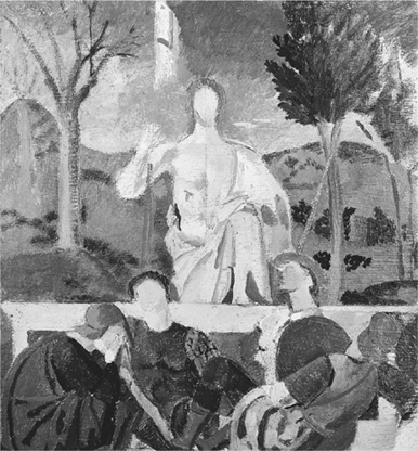
Copy after Piero della Francesca’s “Resurrection,” 1926, oil on wood, 29 × 31 cm
On the other hand, Balthus has taken Piero’s less leafy trees on the left and denuded them. Perhaps it was only a formal decision, but it is as if he was driven toward the theme of death. Instinctively, he has disarmed us by adding an element that is quirky and unexpected—and morbid.
While Piero’s Jesus has taut skin that we can practically touch, Balthus’s is more frankly painterly; the fifteenth-century version seems a reproduction of life itself, whereas in its twentieth-century interpretation the breastbone is suggested in what is clearly a single stroke of pigment. The arm is patently a sketch, a candid assertion of painting, not a simulation of living reality. The flag is just a splash of white in the sky, fading into the blue. But hasty as its formation appears to be, it is, with its red cross, a strong optical anchor.
Informal though the brushwork may seem, the scene is cogently evoked. Balthus gives the mountains their sweep. He achieves the mass and solidity of the tomb. It is palpably man-made and inescapable, which is essential for the tale. Balthus has made postures as telling as possible. So Jesus is nobly erect; he emerges strong and confident, with that undeniable presence that the walking figures of Balthus’s friend Giacometti would ultimately possess. The guards, on the other hand, are supine to the degree of complete lassitude. This ability to conjure the way in which people carry themselves—or sprawl or laze—and to make it establish personality and attitude, would prevail in Balthus’s future work.
In spite of Balthus’s deceptive informality, Piero’s well-defined structure prevails. The speedy brushstrokes honor the grid. Lively and fluid as Balthus’s rendition appears, it is also rigid and hieratic. The forms line up within a horizontal/vertical/diagonal system. That obeisance to ancient guidelines suited Balthus’s temperament, as it always would. So did the deliberate sense of measure. When, within a decade, his subject matter would turn from traditional biblical imagery to scenes full of sex in which many of the characters either attack or recoil, he would continue to give priority to form. Balthus needed all the rules and structure possible to counteract both his emotional intensity and the sheer abandon of his subjects.
IN MOST OF THE MAJOR ARTISTIC and psychological developments of the twentieth century, spontaneity and freedom have supplanted the premeditation and training that were previously deemed essential. For Balthus, on the other hand, compositional structure and a highly developed code of behavior—both associated with earlier times—have always been paramount. Every line of his canvases relates to the underlying pencil grid that precedes the paint; his way of life adheres to ancient guidelines for conduct. Piero helped provide the model.
Another aspect of Balthus’s traditionalism, reinforced by his Piero pilgrimage and at such a remove from many concurrent artistic movements, is the dominance of highly legible human figures throughout his art. People and their actions and emotions—more than abstract or theoretical issues—are at its center. Balthus told me emphatically—however laconic his manner, however seemingly untroubled his attitude, a look of gravity was there—that his work “always stems from nature.” More than nature itself, human experience is his starting point. His landscapes are not the mountains and valleys alone so much as the earth observed, or cultivated, by people. To view his work is to have a spiritual and physical confrontation with the human drama; it is like watching living theater.
Yet even though Balthus made the setting in his Resurrection secondary to the human events, the natural environment rings true. The clouds are nothing more than three dashes of paint, but they are real clouds. Such clarity would always be his goal. The soldier’s staff catching the light adds plausibility to the scene; as such, it is like the baguette carried by the solitary man in The Passage du Commerce Saint-André. Part of the central lesson Balthus learned from Piero, and would return to time and again, was that a dash of light caressing a straight object could provide both allure and a vital resemblance to reality.
AS HE COPIED PIERO’S FRESCOES, Balthus evidently came to recognize the merits of premeditation in creating art. Careful planning was essential to the balance and the underlying mathematical precision that give the frescoes their pure, timeless beauty. It was this divine, abstract grace that inspired him to the lofty comparisons to Valéry and a string of superlatives when he wrote to the Strohls declaring that, for all his enthusiasm, his attempts to verbalize his response to this art would never be adequate. His only recourse was to paint them.
And so he made those sketches evoking Piero’s rich order, capturing the Italian’s series of echoes, striving for his eloquence. Totally engaged, Balthus embraced the tasks of painting as Piero presented them. Copying the Resurrection, when he re-created the relationship between the guard on the left, wrapped in a circle, and the one on the right, swinging around, Balthus absorbed rhythms and balances he would never forget. The young artist continued the lesson he had begun with Poussin about how to get the folds of drapery to fall correctly; that early learning would be recalled throughout his subsequent art in the many towels draped over chairs, and in sheets hanging off beds. This is the possibility of art: a painter can take human life and its props and transform the juxtapositions into magic.
IN 1989, AND AGAIN IN 1992, Balthus and Setsuko went to London for the openings of gallery exhibitions of her work. Setsuko—who, like her husband, uses her single name professionally—is a competent figurative painter whose charming, somewhat lightweight work has a distinctly Japanese cast. Her still lifes, vases of flowers, interiors, and paintings of cats almost all have a predominantly golden yellow palette. Their subject matter reflects the rural elegance and worldly style in which the couple lives: Queen Anne chairs, Persian rugs, backgammon boards, Japanese black-iron teapots, baskets full of fruit, and vases of flowers from the gardens at Le Grand Chalet.
This work has been bought by Balthus and Setsuko’s fellow elegant habitués of the Swiss Alps like Audrey Hepburn and the Prince and Princess Aga Khan. Setsuko’s paintings are pleasing and very well executed, if some-what stultified, and it is no surprise that her shows sell out quickly, with the prices ranging from about $15,000 to $25,000 per work. In a way, her canvases are like tame, affordable, trouble-free Balthuses: perfect for gracing well-appointed interiors.
Balthus told me that he considers his wife to have enormous natural gifts: an instinct for composition as well as an inherent gracefulness. The artist said he turns to her “for her feeling for composition and her way of applying colors.” That gallant, supportive approach is, on the one hand, easy to understand because Setsuko is such a marvelous aide-de-camp to her husband. She is also enviably confident of her own artistic skills, and although her talents are limited, her sense of her own worth combines with a certain ability to make the paintings attractive. Yet it also seems extraordinary that the former soul mate of Antonin Artaud and Giacometti, those ceaseless explorers of the raw underpinnings of human existence, might now content himself with the essentially thin, and completely self-satisfied, art of pussycats and objets d’art bathed in their artificially golden light. There is little question that the polite Palm Beach veneer of his wife’s art, and the emotional veil that overshadows it, would have horrified Balthus’s friends from the old days.
Balthus adores his highly intelligent and cultivated wife, and has become extremely helpful to Setsuko and her career. When I asked why he had agreed to have their houses (not only Le Grand Chalet but also their castle in Italy and the rooms Balthus restored at the Villa Medici) published in House & Garden, the French Vogue, and so on, Balthus told me he consented to this only for Setsuko’s sake. Thus he was willing to overcome his distaste for publicity—his evident devotion betraying just a hint of condescension that she should need such aid.
Having failed to make the journey for his own, larger exhibition at the Tate when he was considerably younger and more fit to travel, the attentive husband attended both of Setsuko’s London vernissages. Balthus told me he was delighted to find that London was still the way it has always been—civilized and on a human scale, unlike Paris, which he considered nearly destroyed. Besides, he and Setsuko had a lot of friends there; Balthus mentioned especially Lucien Freud, whom he said he had “taken care of” years earlier in Paris. On the 1989 visit, Balthus sat for a portrait by Freud—who, I believe, was the first person to draw him since Baladine.
But the greatest pleasure of all in London for Balthus and Setsuko was, they said, their visit to the National Gallery in Trafalgar Square to see Piero’s Nativity and Baptism of St. John. For Balthus’s passion for the artist who overwhelmed him in Arezzo has been lifelong. The Piero pilgrimages are a framing element of his artistic life—at age eighteen after the glorious stay with Rilke, at age eighty-four with his stunning young Japanese wife at his side.
BALTHUS CLEARLY could have written a catalogue raisonné of Piero from memory. He was pleased that, because I came from America, I could bring him firsthand reports on the Pieros at the Frick in New York, the Gardner in Boston, and the Clark in Williamstown. He knew them well in reproduction, but lamented not having seen the originals. Balthus told me he felt a certain “malaise” about the one at the Clark; the composition and the folds seemed wrong. Here he sounded suspicious of American culture in general—as if in a place called Massachusetts they would not recognize a true Piero della Francesca anyway.
When Balthus spoke about recent restoration work on Piero’s frescoes, his brow furrowed. Since he rarely betrayed emotion—and never raised his voice or altered the evenly metered gait of his speaking—those wrinkles suggested a high level of feeling. He did not approve “at all” of the way the Arezzo paintings had been cleaned, he said. Yet this was not because he was uniformly opposed to conservation work. He liked the restoration of the Masaccios and Masolinos in the Brancacci Chapel. Balthus told me that these, too, were among his favorite paintings in the world. He had copied several of these in 1926 when he returned to Florence after Arezzo; a few years later, he gave one of his Masaccios to André Derain, who cherished it.
Setsuko, Summer Afternoon, 1990, gouache, 100 × 70 cm (photo credit 6.3)
What came Balthus’s way from the contemporary scene, he treated more as evidence of human folly. He and Setsuko sometimes opened their morning post in front of me. Looking at the announcements they receive from the Centre Pompidou and other showplaces of modernism, they acted as if it were all one big joke. Why deliberately create such ugliness? asked the count and countess. They named Andy Warhol, John Chamberlain, and Duane Hanson as particularly beyond their comprehension. The only art worthy of a journey must be of a caliber and excellence of another order.
WHAT THRILLS US when we are eighteen sometimes retains its hold. Young females like those schoolgirls jumping rope on the Piazza Santa Croce have never lost their sway on Balthus. Nor has the nature of art as it presented itself to him in the work of Piero della Francesca.
Ever since those summer weeks in Italy, Balthus’s art has resembled Piero’s in the precision of its arrangement and in its stately tempo. In The Street (1933) and The Passage du Commerce Saint-André (1952–54), in the various versions of The Three Sisters (the 1950s and 1960s) and the canvases of girls looking out windows or staring into mirrors (including the most recent one, completed in 1993), time is frozen—as if in the “Crac” identified by Rilke. The world—in all its storm and pageantry—has been immobilized much as it was at Arezzo. Sights both wondrous and unsettling have been taking place for quite a while and should continue uninterrupted into the future. Just as Balthus conducts his daily ritual in the tranquillity afforded by rural isolation, life is a careful progression: the speed is andante at most.
Having been hurled about by the miserable circumstances that had forced him and his mother and brother repeatedly back to Berlin, Balthus found relief and security in Piero’s careful, metered unfurling of events. Even when World War II was destroying civilizations, he painted scenes of utter peacefulness in which everyone seemed to have all the time in the world just to watch the grass grow and listen to the sound of waterfalls. He would never want to move faster.
PROCESSIONAL GRACE CAN, of course, be a marvelous cloak for fury. It tempers innuendo and violence—while not completely denying or concealing them. This, too, was a lesson Balthus learned from Piero della Francesca.
Consider what unfolds to the slow march rhythm of the Legend of the True Cross, from which Balthus copied many passages in Arezzo. Adam announces his own impending death, with the melancholy Eve behind him. Then he appears as a rigid corpse, his family torn asunder by grief. Beleaguered men carry the beam of sacred wood to bury it, while failing to see the mouth of hell yawning at their feet. Horsemen who clash ferociously look as if they are under a spell.
Judas, threatened with starvation until he reveals the whereabouts of the cross, seems dazed as he is lowered into a dry well. He has the same glazed look worn by the people in Balthus’s paintings; nothing in his face will betray either his sins or his fears. Even as Judas’s hair is pulled, he remains expressionless, as if resigned to his conduct and his pain. Similarly, his torturer’s emotions are indecipherable. The events are extreme, but the participants engage in them enigmatically, with emotional distance. It was an example from which Balthus learned some lifelong messages: about how to paint his subjects, and how to behave in public.
Decorum and restraint prevail in the midst of high drama. And violence is expressed through gesture and pose rather than by any hint that the people involved know the state they are in. This is the approach Balthus would apply with consummate skill. Even more than Piero, he would control tumult with artifice. He would, meticulously, ration what observers might glean beneath the surface—first luring them into what is patently a highly charged scenario and then throwing a gauzy screen over all the excitement.
Balthus’s card-playing boys, adolescent girls, and city dwellers are the direct descendants of Piero’s workmen and Judas. So is the artist himself, with his sterling facade. The rest of us cannot penetrate the emotions or get beyond the masks. The apparent isolation in which Balthus has deliberately encased himself and his subjects enhances their strength. The people with whom Piero populated his chapel at Arezzo, the characters in Balthus’s paintings, and Balthus himself all gain—through their detachment—tremendous power. At the same time, their distance and separateness diminish us, their viewers.
EVER SINCE THE END OF World War II, when he first began to acquire interesting ancestry, Balthus has tried to make himself into the people he envied as a youth: titled, non-Jewish, of particularly distinguished lineage—sometimes Byronic, sometimes czarist. Having chosen his heritage and convinced himself that it is his own, he has, like the most studious of actors, performed the privileged part impeccably—right down to the requisite soupçon of simplicity. He has imitated everything he has wanted to be, and done his utmost to become the objects of his admiration. The same can be said for his artistic technique. He has had more than one role model, but the mentor he has followed the most assiduously has remained Piero della Francesca.
Not that Balthus would have us see him this way. Talking with me, he denied the notion of direct influence with a flick of the wrist—as if of course we were in agreement that this was the piddle of art history. I had asked him what he thought of John Russell’s statement in his Tate catalog that the man carrying wood in The Street (color plate 4) derived from Piero’s man shouldering the cross at Arezzo, and Russell’s illustration of the fresco detail to support his argument. Balthus belittled the point with a quizzical laugh. Then, bearing his patient professor’s look, he remarked to me that people carry wood, that there is a natural way of placing a board on your shoulder, and that he intended no specific reference to his beloved Piero.
But the visual evidence is all on Russell’s side. Examine the work, put it together with what you know of Balthus’s personality, and it is clear that Rilke’s protégé took his unabashed admiration for his fifteenth-century hero to the degree of trying to be, in certain ways, Piero’s modern reincarnation. The Italian painter was not the only person Balthus would imitate to the point of becoming him—we will see some other, wilder models he would latch on to for briefer periods—but with regard to how he paints, Piero was and is the most lasting of his chosen selves.
Perhaps he was in the same sort of unconscious trance in which he shows his subjects, but Balthus has paraphrased Piero throughout his art. The boy on the left in The Street (1933) has an uncanny resemblance to the figure of Eve in Adam Announcing His Death at Arezzo. They have the identical eyebrows, full lips, flattened nose, wide cheeks, and strong indentations under their mouths. In addition to being practically the same person thanks to their features, they have in common that they both look as if they harbor a secret. They hold some knowledge unavailable to the rest of us. And the other boy in The Street, the one walking toward us with his hand across his chest, is, equally, Piero’s version of one of Adam’s sons, only now in modern Parisian dress.
THE PROFILED HEAD OF THE GIRL in Balthus’s Nude in Front of a Mantel (1955) has features virtually identical to those of one of the members of the Queen of Sheba’s retinue. The same delicate chin tucks into the girl’s neck. Balthus’s subject, like Piero’s, gazes ahead transfixed. And these women painted five centuries apart have been revealed in much the same way. A soft light falls on their cheeks and caresses their curves, giving them the sheen of porcelain. Balthus’s girl—in relief just as Piero’s women are—has the same milky flesh and smooth perfection of her ancestor from Arezzo. She, too, emerges detached and beautiful.
ALAS, THIS 1955 Nude in Front of a Mantel is one of the most difficult of all of Balthus’s paintings to see, although it is now almost always on view in a major public museum. The large canvas hangs in the Robert Lehman Collection at the Metropolitan Museum of Art in New York. Not only is it illuminated entirely by artificial light, in direct violation of the artist’s wishes for the viewing of his work, but—worst of all—it is under glass. When it went to the 1980 Balthus show at the Venice Biennale, where it appeared on the catalog cover, witnesses saw the artist himself reduced to despair at the moment it arrived for installation. Balthus stormed around, shaking his cane in rage; here was one of his treasures imprisoned behind glass that deprived it of all its nuance and subtlety.
The 1955 painting, to begin with, has a distance about it; compared with the brazen adolescent girls of Balthus’s prewar years, this girl with her hands in her hair is more of a stylized relief figure, her profile muted, her surroundings a stage set more than a room. But behind the shimmering glass that disturbs and deadens the treasure it traps, there is some fine painting. The girl stands with true weight and equipoise, her feet authentically planted. The light and shadows on her lovely flesh and within the fireplace are completely real and, at the same time, soothing.
Balthus first fell in love with this deliberate artificiality under the vaults of the apse at Arezzo. He learned how to formulate that cool and distant beauty, and how to conceal emotion—both his own and his subject’s—when he was eighteen years old.
ONE OF THE REASONS BALTHUS doesn’t want us looking at his origins and sources may well be that they offer too many clues to much that he would rather keep shadowed in mystery. Piero’s prototypes help unravel the enigma of some of Balthus’s most puzzling paintings.
In this regard, I have a theory that I did not dare bring up with the painter himself. It is that Balthus’s extremely discomfiting 1952–54 Room derives directly from Piero della Francesca’s equally baffling Madonna del parto.
The face of the woman in The Room is practically identical to that of Piero’s Virgin. Her private domain is similarly revealed by a smaller creature holding back the drapery. But in Balthus’s transformation, the woman who was in an elegant dress in the Renaissance has been stripped bare. Piero had her standing regally; Balthus has vanquished her. Now the former Holy Mother lies stunned. Her limp right arm suggests she is a victim, although the splay of her left leg reveals her to be available for sex. Piero’s magisterial setting has become an ordinary room.
Yet for all that has changed, the Madonna del parto and The Room have similar effects. We are swayed and moved by their remarkable painterly beauty; at the same time, we struggle with a feeling of being left in the dark. The enigma is deliberate. In the Piero, why is her hand on her belly? In the Balthus, what has happened to her? Like cats, the facts are provocative yet out of reach.
One possibility that scholars have raised about Piero’s offbeat fresco, located in Monterchi, is that the Madonna is pregnant. Such an image is practically unique in Italian art, and no one can be certain that Piero intended it, but it has been surmised that Mary points to her womb in what might be the sixth month. One of the reasons I think Balthus had the Madonna del parto in mind is that the woman in The Room—naked except for her shoes and socks—also looks pregnant. The shape of her bare abdomen, like this facial resemblance, makes Balthus’s girl an updated, overtly sexualized version of that fifteenth-century Madonna.
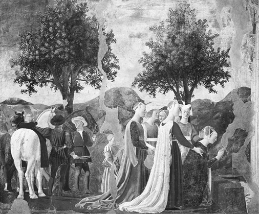
Piero della Francesca, The Queen of Sheba, Kneeling with Her Retinue, detail from The Queen of Sheba’s Visit to Solomon, 1452, fresco, overall size: 336 × 747 cm (photo credit 6.4)
Kenneth Clark has pointed out that this, of all of Piero’s paintings, “reminds us of the finest Buddhist sculpture in its calm detachment, and is even more oriental in its outlines.”7 We know these to have been Balthus’s ideals as well. His dramatically exhausted figure in The Room shares that distance—and Easternness. Much as she is the image of spent passion, she is also like a statue. And the artwork that contains her is a fine and stirring object.
The Madonna del parto is considered a memorial to Piero’s mother, who was born and married in Monterchi. The Room might easily be read as Balthus’s portrait of his mother—one of many. This is the Baladine Klossowska we know from her letters to Rilke—consumed by her own passions and longings.
Piero’s Madonnas are some of the strongest females ever painted. They are not the tender earth mothers of many Renaissance Madonnas but creatures of steely strength, composure, and fortitude. Balthus’s women, however young and unformed some of them may be, have similar power. While Balthus and Piero were both artistically reserved, they gave their women an unreserved forcefulness.
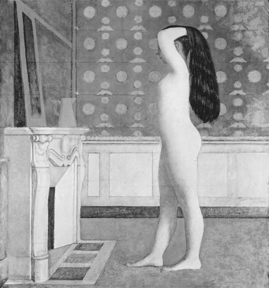
Nude in Front of Mantel, 1956, oil on canvas, 190 × 164 cm (photo credit 6.5)
As for the character in The Room who resembles a terrifying dwarf—the little girl with the aged face and the miniaturized build of a middle-aged man; the character of whom Balthus told me, with his most taciturn look and a declaration that the point was beyond debate, that she was just a girl, and that if people called her a dwarf, or said there was anything odd about her, that it reflected their own hang-ups, but had no bearing at all either on him or on the actual painting—it seems to me that this is his own transformation of the angels in the Madonna del parto. Like those angels, Balthus’s golem in 1950s schoolgirls’ clothing stands firmly anchored with its legs wide apart—in a position that we now associate with classical ballet. It wears slippers almost identical to those on Piero’s angels. The light from the window behind creates a glow like a cap over the poor character’s bangs that can be read as a grotesque parody of the angels’ halos. Balthus’s weird invention appears to be his own, highly personal version of those biblical supporting actors. In Renaissance art, they almost always look female, although they were, historically, male; Balthus has taken the angel type one step further and turned it into an impersonator.
In the Madonna del parto, the angels, holding open drapery so that we may see the scene better, serve as revealers. Pulling back curtains, throwing light on a subject, they have the same function as the artist. The angels’ heir, the weird creature in The Room, is a stand-in for Balthus himself. An amalgam of middle-aged man and young girl, the different ages and opposite sexes converging in one puzzling being, this representative of the artist is both revealer of an enigma and creator of an even greater one. Unique, unfamiliar, and unforgettable, the anomaly is meant to keep us guessing.
The androgynous gnome is a mix of youth and old age, childishness and wisdom. The nude on the divan also combines birth and death. Life is starting up inside her, yet she appears halfway out of the world, as if in a coma or at the edge of death. The stages of existence are as simultaneously evident in Balthus’s art as in the man himself.
BALTHUS TOLD ME, OF COURSE, that The Room is simply a painting of a nude in a room with a girl at the window. People hold back curtains. They naturally situate their feet firmly—which is why the “child” stands as it does. This is life—not artistic quotation or poetic analogue. He painted what moved him, without knowing why. What concerned him were the problems of texture and color and light and form—not symbolism or meaning. Yet he did allow that the pulled-back curtains of The Room are an invitation to seeing, a form of opening. For Balthus perpetually beckons and excites us—even as he refutes our conclusions.
PIERO’S CLEAR PERSPECTIVE, spatial geometry, and delicate balance of convex and concave that were the eighteen-year-old Balthus’s ambrosia moved him to develop standards and techniques that have guided him ever since.
Piero della Francesca, Madonna del parto, c. 1460, fresco, 260 × 203 cm (photo credit 6.6)
In those few weeks in Arezzo and Sansepolcro, he discovered how he would paint. He learned how to model figures delicately in relief. Like Piero, he would populate his paintings with fully frontal faces, on heads that were relatively large proportionate to the rest of the body. Compelled by the look of assurance behind Piero’s work, he made its arrangements his own. Piero’s design precision and controlled observation became his models. Balthus emulated Piero’s motionless gravity and his delicacy, as well as his mix of opulence and austerity. He has worked to achieve the Italian’s clear delineation of sunshine, and his use of light to envelop forms. He has strived for Piero’s impeccable judgment in the subtle tones of his carefully related, pale, cool colors. Balthus learned that such a palette creates a quiet, detached majesty; it helps provide the elegance, and the air of remoteness, vital to figures absorbed in their own worlds.
So Balthus would give the colors of The Street a softness—the muted, dignified tonality—much like the cast of The Victory of Heracles at Arezzo. These earthy, yellow-tinged hues provide the action of The Street with a look of extreme significance—as if these happenings have been going on for quite some time and now are fixed forever. The Street shows everyday occurrences, but the people in it have noble stature, like biblical characters. So do the hikers in The Mountain, and most of Balthus’s adolescents. The well-controlled, subtle, atmospheric palette that he learned from Piero is a primary source of that momentousness.
From Piero, Balthus developed a color sensibility that lends both reality and unreality. The palette that makes the personalities in Piero’s frescoes simultaneously genuine and fictitious provides Balthus’s people and scenes with their dreamlike aura. The muted, powdery fresco colors help create Balthus’s unusual combination of palpable presence and elusiveness.
Whatever his subject—children languishing in dark interiors, the splashily tiled Turkish Room of the Villa Medici in Rome, mountain landscapes, naked bathers stepping out of the tub—Balthus has always put his colors in quiet discourse with one another. They resonate subtly under the pervading calm cast by muted sunlight. The system of responses—a splash of yellow-green in the foreground echoing the identical tint in the distant hills, the orange of a flower the same as that in a nearby tapestry pattern—works like the balancing of forms. Blacks, ochers, and russets correspond just as arcs, spheres, and cylinders do. These were among Piero’s most potent lessons.
In Balthus’s art as in Piero’s, the restrained colors and precise geometry classicize the experience. Balthus’s imagery—even though he denies this—is often sexually violent, yet he handles the subject matter as if it were a formal occasion to which one should have received an engraved invitation protected by a tiny square of tissue paper. The underlying systematization asks us not to recoil. A breast hangs out, a lance pierces, a child flashes her inner thigh, but the tone in which the story is told suggests that the teller is unfazed and we should be, too. Following his Italian sojourn, Balthus would depict lust and brutality, yet he would veil it—and, perhaps, disguise it from himself—by making it look staged. If it is theater, then we don’t have to take it as real. The techniques whereby he achieved that glorious artifice were at his beck and call in Piero’s marvelous frescoes.
Balthus became as careful in his placement of colors and forms throughout his paintings as he would eventually become in his application of the rules and schemata with which he controlled his personal image. He gave to The Street a careful orchestration of cylindrical, columnar shapes much like that of Piero’s rendering of the Queen of Sheba’s visit. He could depict the most provocative, unsettling subject matter—as in the 1937 White Skirt, in which his sitter, looking as if she has been hit over the head, collapses in an armchair with her blouse open, her breasts so tight in her bra that she seems in bondage—while precisely halving the composition horizontally just as Piero did in his ineffably tranquil London Baptism and in so many of the Arezzo frescoes.
Balthus’s approach is the exact opposite of that of realist photography or Expressionistic painting. With those styles, horrors are conveyed in a cry of anguish. The voice unsettles us as much as the subject does. When Balthus and Setsuko speak of the current art scene, they deplore art in which the shock is explicit. Bluntness is out of the question, deliberate unattractiveness inexcusable. To hear the Count and Countess de Rola speak, you would not think that Balthus’s own work had ever made anyone uncomfortable. You would assume his paintings were as tame, and harmlessly decorative, as hers are. Art should have nothing to do with hardship, except for the struggles implicit in the act of painting. Formality and propriety are the ultimate virtues. This is what Edmund Burke called “the decent drapery of life”—of which, for Balthus, his mentor Piero della Francesca was early on, and remains, the greatest exemplar.
IN De Prospettiva Pingendí, Piero della Francesca wrote:
Painting contains within itself three principal parts, drawing, composition, and coloring. By drawing we mean the profiles and contours within which they are contained. By composition we mean how these profiles and contours may be situated proportionately in their proper places. By coloring we mean how to give things their colors as they appear, light or dark, according as the light varies them.8
Piero’s word for “composition” is commensuratio, whereas Alberti’s, in Della pittura, was composizione. This distinction is key to why Balthus fastened on Piero with such zeal, and to what he has been emulating for more than seventy years. Balthus has, unflaggingly, sought measure and proportion—the qualities it took to commensurate for other, less ruly forces—in both his art and his self. What he has suppressed is another matter.
