

CHAPTER 1
The Casting Call: Discovering the Personality of Gems
We all know the type. Gorgeous, glamorous, glorious. They light up a room and sparkle in the spotlight. They love the red carpet and snag all the awards.
You might think I’m talking about last year’s Academy Awards winners, but I’m not. I’m talking about the quilts that give you whiplash when you spot them in your peripheral vision, the quilts that demand your attention from across the room. I’m talking about the quilts you dream of making!
While your inspiration may be landscapes, portraits, still life, or abstract images, my inspiration for the past twenty years has been gemstones. I’ve spent hours looking for images of dazzling stones to use in my work.
Whether they’re making a statement with a bold splash of color, flirting with a flash of brilliant light, or sporting an amazing cut, these lovely gems have taught me much about creating work that delights. My hope is to inspire you to look at your subject matter in new ways and, using freezer-paper piecing techniques, bring out the bling in your own compositions.

Bicolored tourmaline
Photo by Geoffrey Watt (Mayer & Watt)

Blue-green tourmaline
Photo by Geoffrey Watt (Mayer & Watt)

Bicolored watermelon tourmaline
Photo by Geoffrey Watt (Mayer & Watt)

Aquamarines
Photo by Geoffrey Watt (Mayer & Watt)
Three of the Four C’s: Cut, Color, and Clarity
Experts in the gem industry commonly describe a gemstone using the Four C’s: cut, color, clarity, and carat. Understanding the first three—cut, color, and clarity—is key to creating a quilt that sparkles like the gem that inspired it.

Lavender zoisite
Photo by Geoffrey Watt (Mayer & Watt)
Organized Chaos: The Cut of a Gem
When people first see my gem quilts, they typically ask one of two questions: “How long did it take you to make this quilt?” or “How in the world do you piece these things?” The second is a much easier question to answer.
My gem quilts are built block by block. In that regard, they have a lot in common with traditional quilts. The only difference between my quilts and a typical traditional quilt is that my blocks are wonky shapes. It’s all based on the gem’s cut, its faceting pattern. Once you spot the underlying structure of a gem, you can piece it using freezer paper.
Facets: Windows into the Heart of a Gem
Facets are the flat, polished surfaces of a gem. Gem cutters are the magicians who meticulously slice off portions of a gemstone to unlock its brilliance, color, and luster. More than any other factor, the precise positioning of these facets determines the beauty of the stone.
Think of facets as windows and mirrors. The facets on top of a gem function as windows, welcoming light into the heart of the gem. The facets on the bottom function as mirrors, bouncing light around the interior of the gem until it bursts back out through the top in a blaze of light.

Samples of faceting patterns used today
Illustrations based on images by Gemological Institute of America (GIA)

Round brilliant-cut diamond
Photo by Gemological Institute of America (GIA)
There are literally thousands of faceting patterns in use today. Some are highly branded, while others remain unnamed. In order to introduce you to the basic anatomy of a faceted gem, however, I’d like to introduce you to the most common and probably the most beloved faceting pattern in the gem world: the round brilliant cut.
Crown The crown is the up-facing portion of the gemstone. It consists of the table facet, the kite (or bezel) facets, star facets, and upper girdle facets. These are the windows into the heart of the gem.
Girdle The girdle is the thin band that separates the upper (crown) facets and the lower (pavilion) facets.
Pavilion The pavilion is the lower portion of the gemstone. It consists of the lower girdle facets, the main pavilion facets, and a culet (the tip of the stone). The pavilion acts like a hall of mirrors, scattering light around the interior until it angles back up through the crown to dazzle your eye.


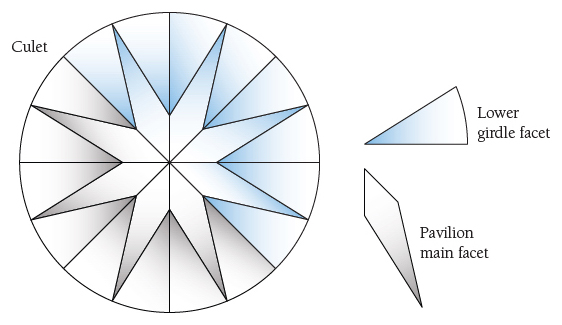
Diagram of round brilliant-cut facets
Illustrations based on images by Gemological Institute of America (GIA)
Translating Cut into Design
In the introduction, I told my story of becoming obsessed several years ago with an image of a gemstone and how I wanted to transform it into a quilt. I remember staring at that image for hours. I had no knowledge of the gem anatomy I just described. However, as my eyes scanned the light and color that tumbled across the image, I began to detect order within the chaos. Repeating shapes began to emerge.
First to emerge were the pie-shaped wedges radiating from the center. Once I recognized these wedges, I was able to pick out the kite shape that formed the narrow part of each pie-shaped wedge. Then I noticed that a quadrilateral balanced en point atop the kite. I really got excited when I realized that the side points of each quadrilateral met up with the side points of the adjacent quadrilateral—as if they were all holding hands and dancing around the edge of the gemstone.
I had just identified the crown facets of a round brilliant-cut diamond—the table, kite, star, and upper girdle facets. This was the key to the puzzle! I would piece the diamond using each facet as a separate “block” in my pattern.
If you apply this idea to an image of an up-facing brilliant-cut round gemstone, you can divide the design into 48 distinct sections. Each of the 8 pie-shaped wedges includes 6 subsections: the kite wedge of the table facet, 2 halves of the star facets touching the kite facet, the kite facet, and 2 halves of the upper girdle facets.
Once the major facets have been identified, you can then begin to further divide them into the shards of light that dance around the inside of the gem. Depending on the complexity of the quilt you want to create, you could divide a facet into multiple subsections to reflect lots of sparkle or you could simply keep the facet as one piece. The facet lines and the lines delineating the shards of color and light in these gems are going to be your seamlines. Always ask this question: How would I piece this back together?
When I’m searching for gems to use as inspiration, I evaluate each candidate by asking the following questions:
1. How can I separate the gem into sections or “blocks”? I search for the major “through lines” that divide the stone into discernible sections. For example, round brilliant cuts can be easily divided into half, then quartered, then further segmented into eighths. Here is another example.
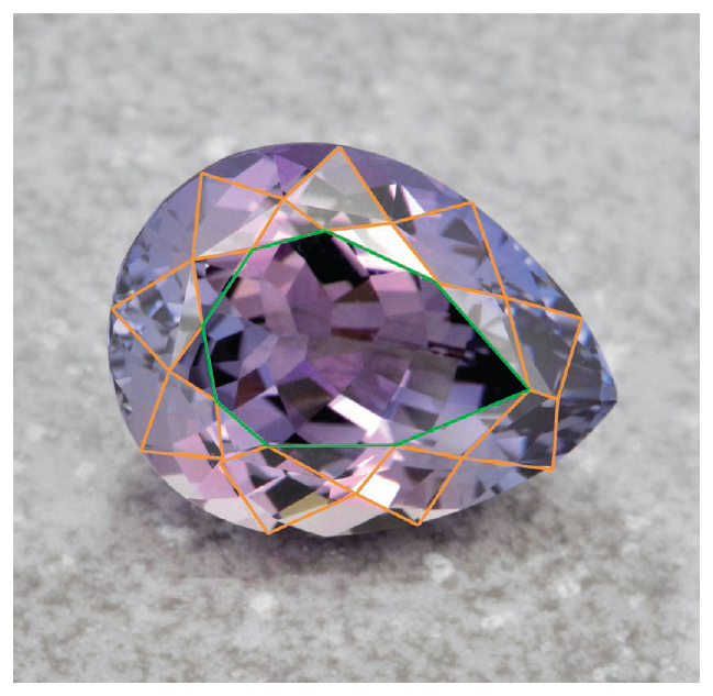
Finding facets and shards of light within
Photo by Geoffrey Watt (Mayer & Watt)
2. How can I reduce the number of Y-seams needed to piece this back together? Y-seams are created when 3 pieces of fabric come together, causing 3 different seams to converge at 1 point. Most gems will require some Y-seam piecing. For example, an emerald cut has 2 major Y-seams in the center of it.
If you don’t want to tackle Y-seams, you can straighten the facet line and create a y-seam instead. By a y-seam, I am referring to seams where 3 pieces of fabric come together, but only 2 seams converge.

Y-seams in emerald-cut gem
3. If there are multiple lines of the facets and shards of light converging in 1 place, can I offset them and still keep the integrity of the design? In most cases the answer is yes! In fact, I purposely offset seams in my gems for this very reason. And when you look at gems, you’ll see light bouncing every which way; it’s not lining up perfectly at the points. Light does not conform to quilters’ rules!
The next challenges centered around construction. For example, how would I keep track of all the little templates once they were cut apart? Each piece would require its own unique identifier to indicate where it belonged within the gem.
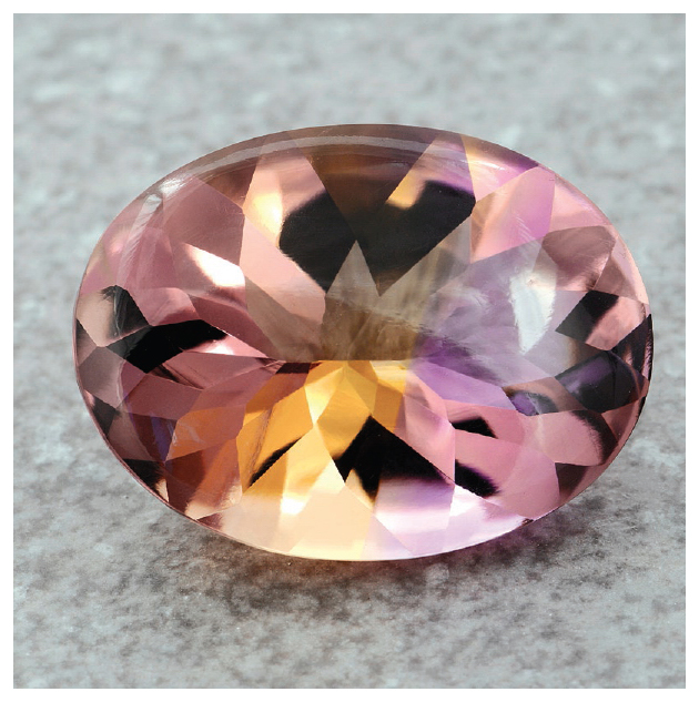
Ametrine
Photo by Geoffrey Watt (Mayer & Watt)
Since I try to capture as much of the sparkle of a gem as I can in my quilts, I like to subdivide each facet into lots of little pieces. Some of my larger quilts have over 1,000 separate pieces, each with its own template.
I decided to code my early gems with a single unique number: 1, 2, 3 … 345, 346, 347, and so on. Then I learned the hard way that my mind tends to wander at about piece 300. I start skipping numbers.
That reminds me of the story about the high school seniors who released three little pigs into the school on Senior Prank Day. But before they did, they attached numbers to their collars: 1, 2, and 4. After retrieving sweet little Pig #1, Pig #2, and Pig #4, the staff spent the rest of the day searching for nonexistent Pig #3.
When I realized I was spending far too much time searching for “Pig #3” pieces—pieces that never existed in the first place—I decided to use a code comprised of two digits separated by a hyphen. The first digit represents the section number, while the second digit represents the unique piece within the section. For example, a piece coded “3-5” would be the fifth piece in Section 3. This reduced the potential for mistakes. We’ll talk in more detail about planning your unique identifier codes in Chapter 3 (see Unique Identifier Codes).
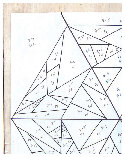
Unique hyphenated identifier codes
Catching the Light: Fire and Brilliance in Gems
I’m a nut for color. While actual images of gemstones are the inspiration for my art quilts, I take great liberties when translating a gem’s original color into my design. For example, I might take an image of a pale, yellow citrine and boost the color to a fiery red-orange, and then sprinkle complementary hues of purple and blue around the design as I did with Devil’s Due.
When I work with students to create their own gem designs, the topic of color produces the most anxiety. With an entire rainbow of colors available to them, many students freeze at the prospect of picking five or six colors. While this book is not intended to be a treatise on color, here are a few tips that I hope will help restore the fun to selecting color for your gem.

Banded orange sapphire
Photo by Geoffrey Watt (Mayer & Watt)
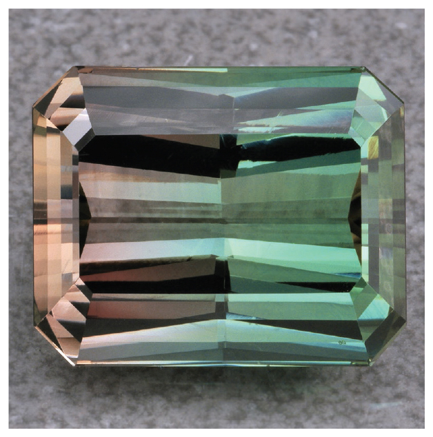
Himalaya mine bicolored tourmaline
Photo by Geoffrey Watt (Mayer & Watt)
Let’s start this discussion by defining a few terms that will help clarify some of the concepts. I’m going to use the words color and hue interchangeably. In color theory, a hue is a pure pigment—without any shade or tint (added black or white pigment, respectively). Hues are the pure colors that surround the edge of a color wheel and can be defined as red, orange, yellow, green, blue, purple, or a combination thereof.
Value, on the other hand, refers to a hue’s lightness or darkness. You probably created a value chart in a middle school art class by adding different amounts of white paint to produce a progression of tints (lighter values of a hue), and conversely greater amounts of black paint to produce a progression of shades (darker values of a hue).
Fire in Ice: Capturing Color (Hue)
There is no “perfect” color choice for a gem. Rubies, sapphires, emeralds, citrines, aquamarines, peridots, garnets, and all other lovely gemstones can be found in a wide variety of hues and shades. For example, all sapphires aren’t blue. Some are pink, yellow, green, or even orange! Rubies can come in deep purple, bright red, or a soft pink. Emeralds range from dark green to a light celery color.
Beyond the inherent color of a gemstone, ambient light and environment can also impact the color you see. Alexandrites are famous for their “personality” change depending on the light in which they are viewed. In natural light, alexandrites may appear blue-green; in artificial light, they appear reddish-purple. Gem aficionados sometimes refer to alexandrites as “emerald by day, ruby by night.”

Mixed fancy sapphires
Photo by Geoffrey Watt (Mayer & Watt)

Spinels of various hues
Photo by Geoffrey Watt (Mayer & Watt)
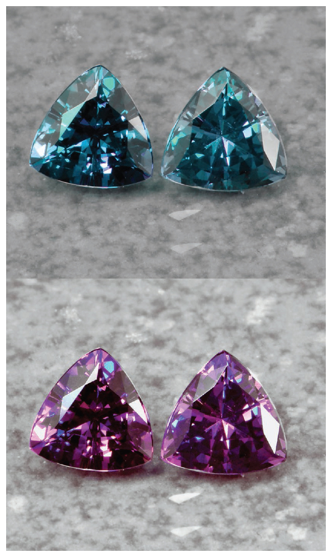
Alexandrites in different lighting
Photo by Geoffrey Watt (Mayer & Watt)

GIA D-Z color examples of the diamond grading scale
Photo by Gemological Institute of America (GIA)
White diamonds are prized for their lack of color. The most highly valued diamonds reflect pure white light without any tint at all. Those that show a faint yellow or gray tint are deemed lower in value—until the yellow crosses a threshold and becomes a rich hue, at which point it is classified as a colored diamond. More on colored diamonds to follow.
The flashes of color—blue, yellow, red, green, purple—you see in a spectacular white diamond are its fire. Fire is the result of light splitting into different color wavelengths before bursting out through the crown. (This is different from brilliance, which I’ll discuss a bit later in this chapter.)
Let me throw one more curve at you. Heavenly objects known as colored diamonds exist. The gemological name for a colored diamond is a fancy diamond. Fancy diamonds are caused by an anomaly in their molecular structure.
For example, blue diamonds (such as the famous Hope Diamond) contain boron particles within their crystal structure. Green diamonds have had a few molecules knocked loose as a result of sitting too near an irradiated rock. Deep rich yellow and orange diamonds include nitrogen molecules that absorb blue light, causing them to throw off a yellow color.
Fancy diamonds are categorized by the intensity of their hue. Gemologists use terms like “faint,” “very light,” “fancy light,” “fancy intense,” “fancy vivid,” and “fancy deep” to describe diamonds of deepening hues.
Given that there is no “perfect” color for any gem, you can relax and let the fear go. This is your gemstone. Make it any color you want!

Hope Diamond
Photo by Chip Clark, courtesy of the Smithsonian Institution
Brilliance: The Role of Value Contrast
The interplay between different tints (lighter values of a hue) and shades (darker values of a hue) can bring drama to your work by creating stark delineations of form and spatial illusions.
The interplay between light and dark is of profound importance in the gem world. In the diamond industry, brilliance refers to the pure white light that is reflected back to your eyes through the crown of a diamond. It’s the pop of light that captures our attention.
For a diamond to be at its most brilliant, though, it needs more than just brightness. It needs contrast. It needs the dark bits.
Imagine a blank sheet of white paper and a chessboard of alternating white and black squares. The sheet of paper returns twice the amount of light to our eye than the chessboard, but the chessboard appears brighter than the blank sheet. Why? The contrast between the black and the white further define and delineate their stark values.
You can use the idea of brilliance to make your work sparkle, no matter what type of quilts you make. If you want to bring out the bling in your work, put the lightest lights and the darkest darks next to one another and watch what happens.

Lavender zoisite
Photo by Geoffrey Watt (Mayer & Watt)
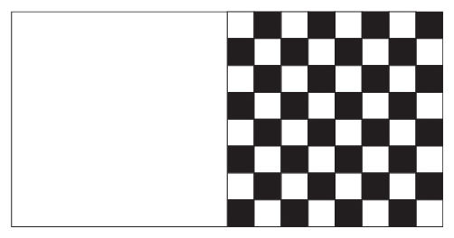
Demonstration of value contrast
Translating Color and Value Contrast into Design
I generally allow the image of a gem to guide my initial color choices. For example, Between River & Sky was inspired by a lovely aquamarine and citrine cut by German gem cutters Wild & Petsch. I studied the image and identified a few basic hues within each.
Within the aquamarine, my eye primarily saw aqua (greenish blue), clear blue, and slate (grayish blue). While the hues of the citrine were in the yellow and yellow-orange range, I wanted a deeper, richer color palette for that stone in my quilt. As a result, I selected hues in the gold, orange, and red-orange family for the citrine.
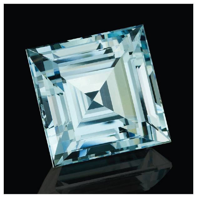
Aquamarine
Photo by Wild & Petsch
Why did I place the aquamarine and citrine gems together? They have hues that are opposite one another on the color chart—complementary colors. Colors that sit opposite one another on the color wheel make each other pop and create lots of drama. Drama was what I was going for.
Because I like to add drama to my “diamond divas and drama queens,” I often play with complementary colors. Earlier in this section I mentioned Devil’s Due, in which I paired yellowish orange fabrics with purplish blue fabrics, perfect complementary colors.
I played up the color in a similar way with Angel’s Share, creating the heart-shaped diamond in a variety of warm hues (yellow, gold, orange, and red-orange). Then I added a background of painted electric blue fabric. The result? A composition with lots of “zorch!” (You won’t find that term in any dictionary: It was coined by a friend to describe the jolt you get when you see knockout color combinations.)
Fire & Ice and Old-Fashioned New are both built on the interplay of colors opposite (or close to opposite) on the color wheel. Blush is built on a complementary palette of blue-greens and red-oranges.

Citrine
Photo by Wild & Petsch
Investing a few dollars in a good color wheel or color chart will go a long way to building your color confidence. You can find them in any art supply store. Some quilt shops carry them, too, so be sure to ask. C&T Publishing offers several quality color tools.
Do you know what Georgia O’Keefe is attributed to have said about complementary colors? Colors adjacent to one another on the color wheel are friends, while colors opposite one another are lovers. That’s so Georgia!
You can use value contrast with dramatic results, too. For example, if you want to simulate the gradual deepening (or lightening) of a particular hue within a section, you can arrange a progression of values next to one another, creating a gradient effect or color wash. If, on the other hand, you want to highlight the sharp edge of a facet, place two fabrics of starkly different values next to one another.
An effective way to determine the color values of the fabrics you’ve selected is to use the grayscale filter on your phone. This is a helpful technique, especially when you’re attempting to determine the value of two different hues.
Arrange your fabric from lightest to darkest as best you can. If you have an iPhone, you can look at the image through your phone application using a grayscale filter before you snap the picture. If you’re using an Android phone, you must snap the picture first and then open it in your gallery application to apply the grayscale filter.
Look carefully at the grayscale image and ask yourself a few questions:
1. Are there one or more fabrics that are out of place in the progression of value? If so, move the out-of-place fabrics to their more suitable locations within the progression.
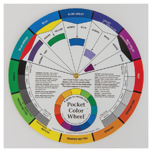
Color wheels are good investments.
2. Are there two or more fabrics that have about the same value? If so, consider removing one of them to simplify your choices.
3. Is there a stark difference in value between two fabrics that you’ve placed next to each other? If so, consider adding one or more fabrics of values that bridge the gap between the two.
Once you’ve adjusted the order, added fabrics, or subtracted fabrics, take another look through your grayscale filter and reassess. Do the fabrics flow evenly in value from one to the next? Are more adjustments needed?
Artist Josef Albers noted that very few people are able to distinguish value similarities between different hues. A bright pink fabric and a brilliant blue fabric appear to be of vastly different values. But when you evaluate them through a grayscale filter, they are virtually indistinguishable. If you’re using two or more hues and you’re struggling to combine them all into one value progression, try this technique. Separate the fabrics into piles by their common hue (that is, reds together, blues together, and so on). If you have two piles, arrange the fabrics in each pile in a value progression next to one another. Snap an image and compare them using the grayscale filter.
Using the same three questions, adjust each column of fabric so that the values flow evenly across the fabrics.
Now you can begin to merge the two columns into one. Lay like values next to one another. Even though they are different hues, they have the same value. You already know which ones are similar in value, so at this point you can start auditioning your fabric by removing fabric swatches, evaluating your reaction to the new combination.
Repeat with various fabric swatches, eliminating those that don’t appeal to you, until you winnow the selection to a manageable number. Of course, the definition of manageable is up to you. Remember: I suggest using no more than one or two basic hues and only a few corresponding shades and tints of each.
You can also use any one of the gorgeous commercial gradation fabrics available in the marketplace to create a gradual flow of color across the surface of a facet.
Here are a few ways I like to use value contrast, particularly the concept of brilliance, in my work.
Effect 1: Shimmer
Imagine you’re gazing out across a lake while the sun hovers over the horizon in front of you. See the millions of tiny sparkles shimmering on the water? The combination of the brilliant light and the deep shadows creates a mesmerizing effect.
By combining light and dark pieces in a symmetrical fashion through the surface of your quilt, you can add the same kind of shimmering brilliance to your work. This is a powerful effect that you can use in quilts that aren’t intended to have a defined focal point. Many traditional block quilts fit this category.
While I usually spend time in my studio on my gem designs, I sometimes get the chance to put together an occasional traditional quilt. A few years ago, I made the pinwheel quilt shown here for a friend using clothing that belonged to her late father. I intentionally placed light and dark fabrics next to one another to create maximum sparkle across the top.

This pinwheel quilt uses value contrast to create a shimmering effect.
Photo by MJ Kinman
Effect 2: Traffic Lights
You can also use the placement of light and dark fabric to direct your viewer’s eye across the quilt. These areas of light and dark act like traffic lights, helping your viewers visually navigate through your composition.
Pathways of lighter-colored areas invite your viewer’s eye to move across them, while deep pools of darkness slow down your viewers’ treks across the composition, giving them a chance to rest and rejuvenate. As a result, your quilt comes alive with movement.
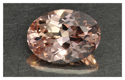
Peach zoisite
Photo by Geoffrey Watt (Mayer & Watt)
As an example, I fell in love with the peach zoisite that inspired Char #4 precisely because of the river of light that flowed through its center. I wanted to be sure to capture that stream of light in my final design.
To replicate the river of light across the gem, I deliberately positioned areas of white and lighter-colored fabric across the central portion of the quilt. Then I surrounded them with areas of black and deep brown tones. As a result, your eye moves easily across the central part of the design.
A second example is Devil’s Due. When I first pieced this quilt, I was not satisfied with the result. It looked flat and lifeless. Not only was it missing the brilliance I wanted to capture but it was also missing the focal point—the tip at the bottom edge of the quilt. It didn’t have the punch I wanted.
Once I replaced a few of the long facets in the lower left part of the diamond with pure white fabric, it all came together. The splash of white added more sparkle, and the pathway of light moved the viewer’s eye more effectively to the focal point. Her inner diva came through!
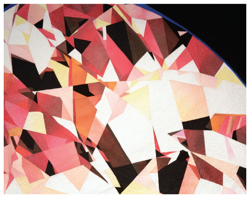
Detail of Char #4
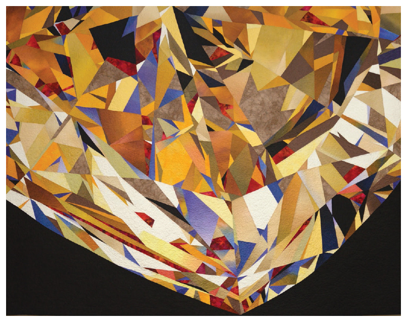
Detail of Devil’s Due
Photo by Cliff Patrie
Effect 3: Spotlight
A third way to use the idea of brilliance in your designs is to highlight one or more specific places on your quilt by packing them with the lightest lights and darkest darks. Areas of great contrast draw the eye to them and can create loads of drama in your work.
Lila is inspired by the very first crystal that caught my attention. I loved the way the light dove into the top left of the solitaire and exploded out the bottom right facets. In my design, I created areas of pure white and light fabric to highlight those focal points and, to boost the brilliance, I placed fabric of darker values around them.

Lila
Luminous Wonders: The Clarity of a Gem
While clarity is a concept typically associated with diamonds, clarity is a quality factor in all gemstones. Clarity describes the unique “birthmark” of a gem, either internal (called inclusions) or external (called blemishes).
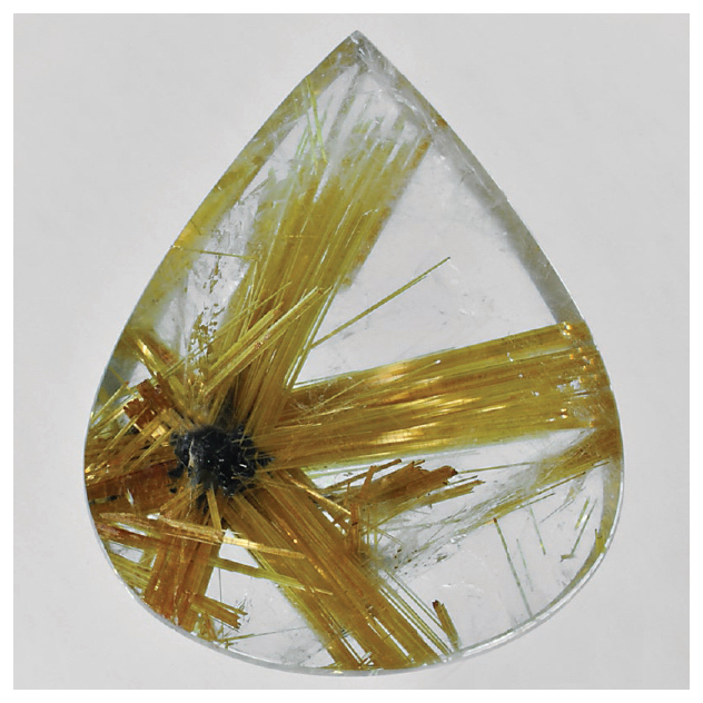
Rutilated quartz
Photo by Geoffrey Watt (Mayer & Watt)
Inclusions and Blemishes
Diamonds are formed deep within the earth under extreme heat and pressure, and they explode to the surface through volcanic action. It’s no surprise that most diamonds bear some type of inclusion as a result of their dramatic creation stories.
Colored gemstones, too, are evaluated for their clarity. For example, sapphires and rubies often contain long, thin inclusions called needles. Emeralds typically contain inclusions that can be seen without a microscope. Emerald inclusions are often described as mossy or garden-like. In fact, sometimes they are referred to as jardin, French for “garden.”
Blemishes are the external chips, nicks, or scratches that have resulted after the formation of the gemstone. These normally occur during the cutting, mounting, or wearing of the gem.
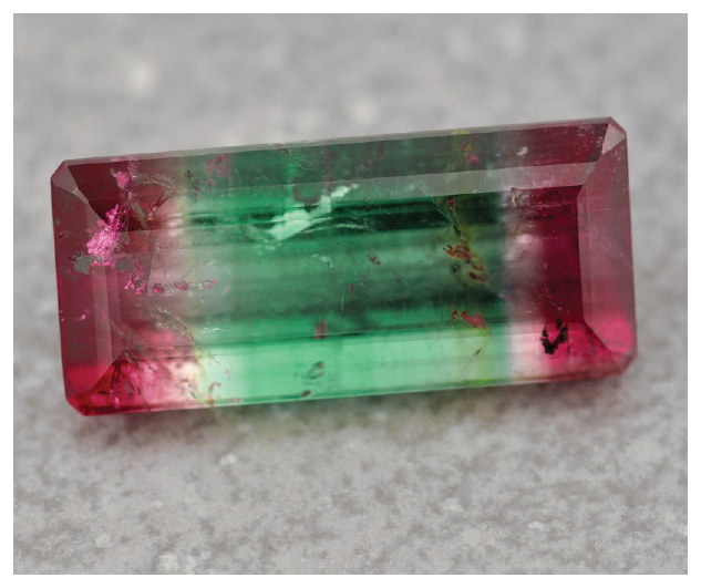
Inclusions within a tricolored tourmaline
Photo by Geoffrey Watt (Mayer & Watt)
Translating Clarity into Design
The illusion of clarity in your gem quilt depends on your choices in surface design, which of course means the fabric you select. I’ve used solids, prints, batiks, hand-dyed fabric, and hand-painted fabric to create my gemstones.
SOLIDS
I made my first gem quilt with solid fabrics. You can’t go wrong with the consistent, rich color that fabric companies are producing today. The downside of using solid fabrics is that you can’t create the illusion of light floating up through the crystal (its translucence) like you can with gradient, hand-dyed, or hand-painted fabric. To create the impression of a gradual value change, you must piece several fabrics of similar value color together to achieve the gradation.
PRINTS
I experimented early on with prints and decided they were not my top choice for the visual impact I wanted to make. Prints are created to call attention to themselves. Since I want viewers of my quilts to look at the whole quilt, not the individual parts, I shy away from dramatic prints.
In addition, if you put different prints together, you can end up with a confusing mishmash of styles. This could distract from the coherent whole that you’re striving for. If you mix stripes and florals and textured prints, it’s like listening to a classical symphony, country music, and zydeco on the same station. All those different genres, which are great all by themselves, are a little off-putting when played one right after the other.
You can minimize the impact of singling out individual pieces of the gem by using the same type of print for all the facets. This provides a consistent look across the design. However, it can be difficult to find the different colors of a single print to achieve the look you are going for.
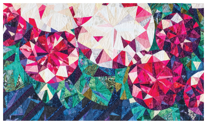
Prints in Roses for Sister Eilerman
GRADATIONS
Fabric companies have been creating gorgeous gradations for years. These work well in gem quilts when you’re searching for fabric to provide a progression of lights to dark in one fabric swatch. Many gradations also display changes across the color spectrum, providing even more interesting opportunities.
However, you are limited to the prescribed length and span of the gradient. If your gem requires a long, subtle change from one value to the next, you’ll have to piece it with solids rather than use a tight gradient.
BALI HAND-DYES
I can’t tell you how much I love Bali hand-dyed fabrics. These were my go-to fabrics for many of my early quilts. The color values rippling across the surface resemble the cloudy interior of a gemstone. But they can be limiting when you’re aiming for the appearance of a long, subtle wash of color or a perfectly clear pool of color.
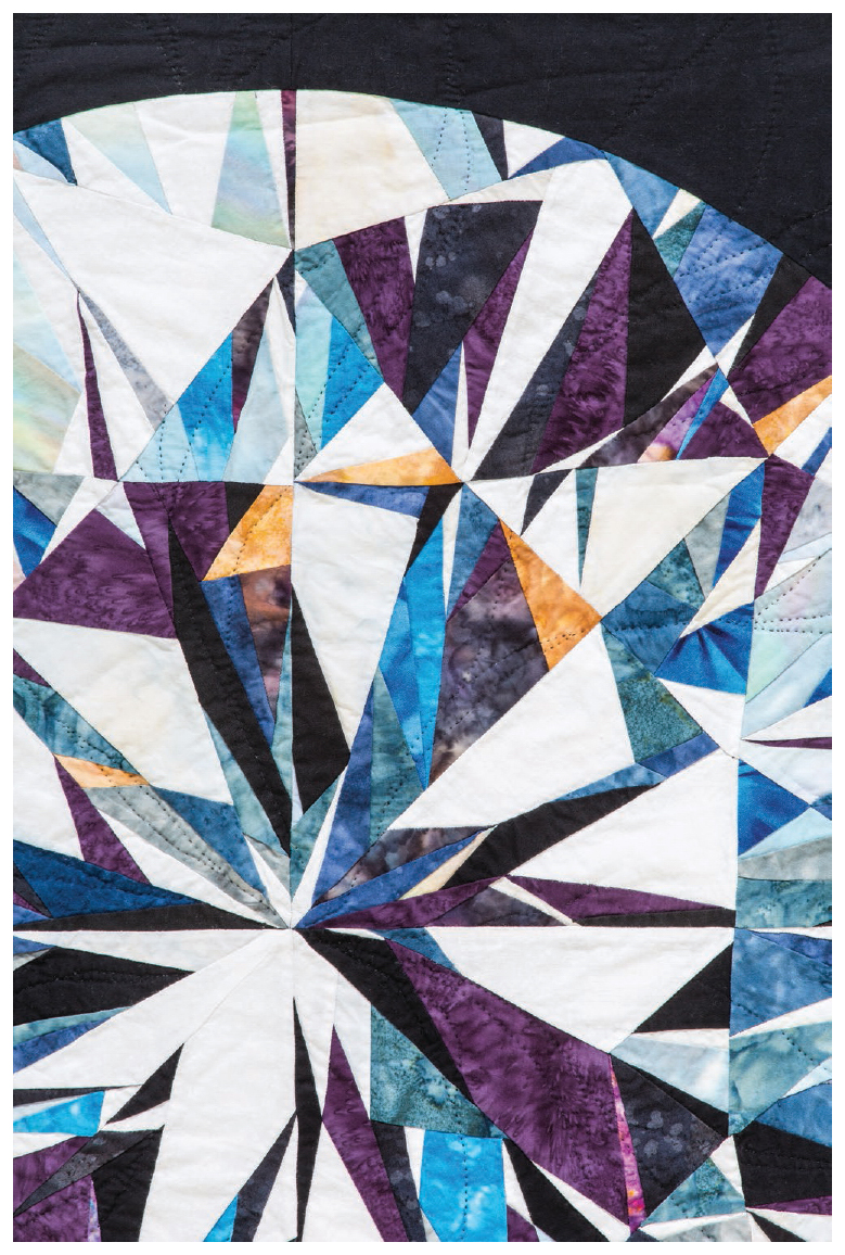
Bali hand-dyes in Nikki’s Wedding Quilt
HAND-DYED FABRIC
Hand-dyed fabrics are delicious to find and fun to buy. If you decide to dye your own fabric, you’ll need to make space in your studio to manage the chemical process. My home studio doesn’t have the facilities to handle all the chemicals, rinsing, and drying needed to dye fabric, so I’ve stayed away from this option.
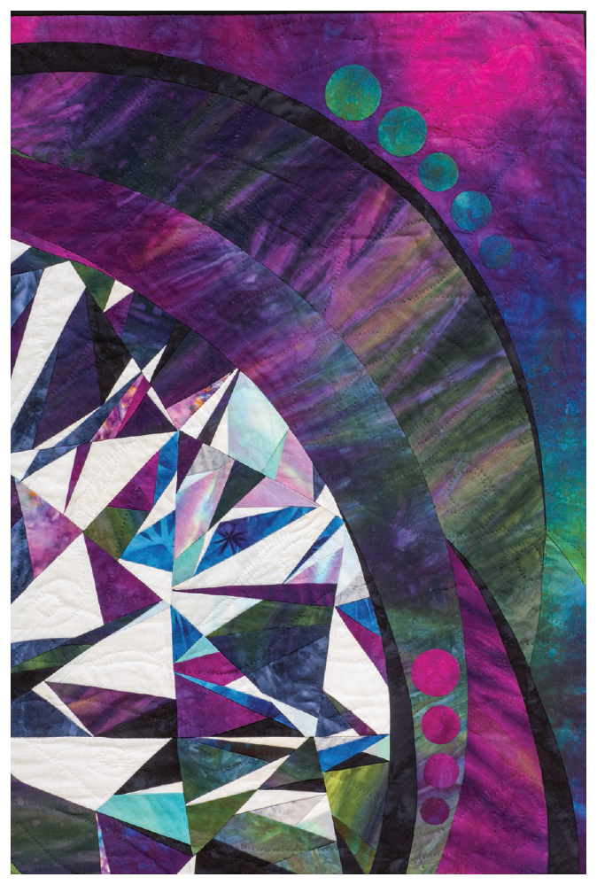
Hand-dyed fabric in Penumbra
HAND-PAINTED FABRIC
My preferred method of creating the illusion of clarity in my quilts is to paint my own fabric. I use Jacquard Products’ Dye-Na-Flow fabric paint. I love painting fabric, because in a process that is highly premeditated and precise, painting is wild, gestural, and spontaneous.
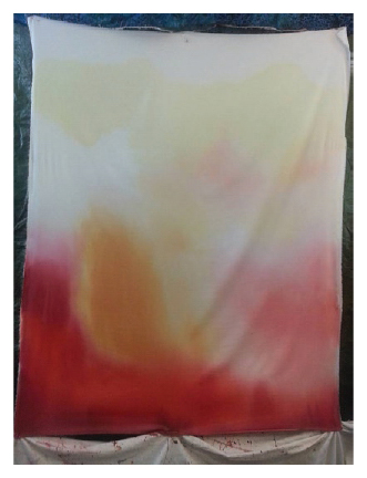
Sample of MJ’s hand-painted fabric
Creating Light: Painting Fabric
I used solid fabrics for many years to create my gem quilts. I also experimented with prints, but I wasn’t satisfied with the way they distracted from the overall design. Then I turned to batiks, hand-dyed fabrics, and gradations, but all had their limitations.
I reluctantly realized that I was going to have to paint my own fabric to get the effects I envisioned. Despite my hesitation, I bought supplies, dove in … and loved it! In stark contrast to the precise and premeditated process I use to design and code my quilts, painting fabric is wild, gestural, and provides immediate satisfaction. It results in some pretty amazing fabric, too.
Here are my suggestions if you’d like to experiment with fabric painting.

Photo by MJ Kinman
TOOLS AND MATERIALS
100% cotton sateen or prepared-for-dying (PFD) fabric, at least 44˝ wide and pressed to remove major creases and wrinkles
42˝ canvas stretcher bars: Set of 4 (available at art supply stores)
Staple gun and staples
Dye-Na-Flow fabric paints (by Jacquard Products)
2˝- to 3˝-wide paintbrushes: 2 or 3
Plastic bowls
Paper towels
Large tarp
Drop cloth
Plastic tablecloth or small tarp
Spray bottle filled with water
Vinyl gloves or other protective covering for your hands
Hairdryer
Steps to Create Hand-Painted Fabric
1. Assemble the stretcher bars by joining the ends at right angles. Place 2 staples spanning the mitered joints on both the front and back of the frame.
2. Place the frame on a table with the flat side of the stretcher bars facing up. Drape the pressed fabric loosely over the edges, making sure the shiny side of the sateen faces up.
3. On one side of the frame, staple the fabric onto the edge in 4 or 5 places.
4. Move to the opposite side of the frame, pull the fabric taut, and staple the fabric again in 4 or 5 places.
5. Repeat on the remaining sides. Finish up by stapling the corners.
6. Secure a large tarp against a wall so the top edge is at least a foot above the top edge of the frame. The tarp should drape down the wall and pool on the floor. The tarp will protect the walls and floor from splatters.

TIP
Curtain Rods Make Great Tarp Hangers
I installed curtain rods over my design wall and threaded clips onto them to hold the top edge of the tarp.
7. Place a drop cloth over the tarp that extends across the floor. This provides extra protection for the floor and prevents the frame from sliding.
8. Lean the frame against the wall with the tarp and on top of the drop cloth. The tarp on the back wall should not touch the back of the cotton sateen.
9. Cover the worktable where you’ll stage your paints, bowls, and paintbrushes with the plastic tablecloth to protect from spills.
10. Fill plastic bowls with water for rinsing paintbrushes. Set several layers of paper towels nearby for drying paintbrushes.
11. Arrange paints on your worktable in the order in which you’ll use them. I typically apply the lightest color first.
12. Wearing protective gloves, pour the first color of paint into an empty plastic bowl. A little paint goes a long way, so start with 5–6 teaspoons of paint in the bottom of the bowl. Recap the bottle to prevent spills.
13. Dip a paintbrush in the paint and, with the spray bottle in one hand and a brush in the other, apply the paint gently to the fabric in a broad sweep.

TIP
Avoiding Drips and Drops
Loading up the brush with lots of paint can result in unwanted drips. Instead, add small amounts of paint to the fabric in rapid succession. You should not slap the paint onto the surface. This may result in small drops of paint bouncing onto areas of unpainted fabric. If you do get drips, however, no need to fret. Blend these little inclusions into the overall design.
14. To achieve a gradual wash of color from medium to near white (resulting in a gradual brightening value study), feather the color across the fabric in short, overlapping vertical and horizontal strokes. As the color lightens, dip the brush into clean water to remove excess pigment and dab it onto the paper towel to remove the water. Use the spray bottle to mist as needed to push the color around the fabric and to facilitate blending. If drops of water create little areas devoid of color, continue to feather them out with the brush.
15. To achieve a gradual flow of one color to a different color, pour the first color into the bowl and apply it to the fabric. Replenish the original color in the bowl and add a tiny drop of the second color you want to achieve and mix. Apply the second color next to the original one and, using short horizontal and vertical strokes, blend the 2 together. Remove excess paint that the brush has picked up during this action before continuing to work on the wash. Continue to add more of the second color to the paint bowl, applying next to the worked fabric, feathering and blending as needed. To end with the second color, use it in full strength and blend.

TIP
Saturation
It is difficult to achieve a deep black with this spray method because water dilutes all pigments. The best you can achieve is a dark gray. To achieve a pure black, apply the paint directly onto dry fabric or use a commercially available solid.

TIP
Channeling Helen Frankenthaler
I prefer to stand while painting fabric because it gives me more control over the placement of the paint. (And it makes me feel a bit like Helen Frankenthaler, the amazing twentieth-century abstract painter.) If you prefer to paint the fabric while it is lying flat, raise the frame several inches above the work surface with blocks. If the frame is not raised high enough, the wet fabric will sag and touch the surface below. This will hamper the flow of paint across the surface and result in uneven paint application, striping, or dense spots of color.
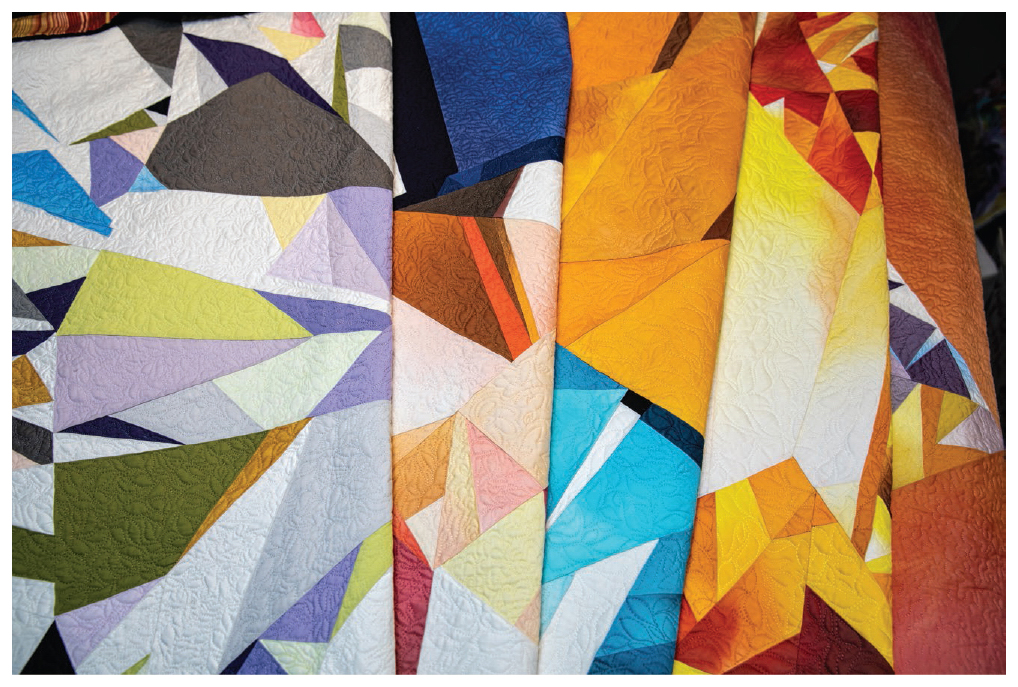
Photo by MJ Kinman