Chapter 5. Navigation and Wayfinding

Websites are all alike, in some ways. The internet’s been around long enough now that—whatever carousels and tables and JavaScript frameworks come and go—we’ve developed certain expectations about how websites function.
We have, collectively, a mental map for website organization. We expect navigation somewhere near the top of the page. We expect some kind of footer. We generally look for subnavigation in dropdowns or to the sides.
Building off those shared expectations supports information access. When we encounter systems that buck convention (oooh, how disruptive and edgy), we often can’t use the information as effectively or efficiently as we can in a system that matches our mental model.
That’s not meant to squash our creativity or condemn us to sites made out of ticky-tacky. It just means we need to be respectful of how far we can push that particular Overton window. It’s a point of admiration, too: look at how quickly, in the oh-so-short history of the web, we’ve been able to establish effective affordances!
A large part of organizing information online is organizing for findability and access. Cutting-edge categorization and slick sitemaps don’t mean much if the content can’t be found and used—which is why tools and tricks that promise to deliver the precisely right content to the precisely right eyeballs at the precisely right times are so seductive. But before you start reaching for magic wands, remember that findability and access start here: with clear, well-structured content arranged in clear, well-structured ways.
Now that we’ve determined the best arrangement of pages, we have to dig into how our users move through them. What paths can they take? How do they keep track of where they are? How do they know where to go next? How can we ensure that they arrive at their intended destinations, safe and sound?
Plotting the Course
When we make a sitemap, we’re documenting the skeleton of the site: how the pages are put together, how the content is categorized, and how we expect our users to weave their way through it.
Of course, we know our users will take whatever paths they please, which may or may not dovetail with our expectations. But the navigation structures of a website are a starting point: they offer at last one potential path in to the content.
If navigation were simply a table of contents, we would, quite reasonably, design it that way. But navigation is much more than an index of topics—it creates meaning. How much the navigation reveals, what it chooses to prioritize, and how the paths are labeled can tell users everything about the content (and the people behind it).
This is why we must be just as deliberate with our navigation structures as we are about any other aspect of the design. We must ensure that we’re providing our users with clear, accessible, established pathways into the content.
Navigation structures
I identify navigation structures as any conceptually unique interface that provides access to deeper content. The structures I generally work with include:
- Main navigation. Sometimes called primary or global navigation, this is exactly what it sounds like: the key navigation structure that accesses your most important content. When you’re categorizing and labeling content, you’re usually doing so with this “main menu” in mind.
- Secondary navigation. Again, exactly what it sounds like—navigation to content that’s considered secondary to the core content. In many of the sites I work on, secondary navigations tend to hold institutional or operational content that plays a supporting role in the site’s purpose, like About Us or News pages.
- Utility navigation. This often contains functionality like portals, logins, account access, shopping carts, directories, and sometimes the search bar and social navigation. Not every site needs it; in many sites, the secondary and utility navigation are the same.
- Search. While the search bar is sometimes considered part of other navigation structures, it can be useful to call attention to it separately in documentation. It’s a critical element, yet so fundamental that it can get overlooked as a structural component. (You remembered to include it—and the results page—in your sitemap, right?)
- Social navigation. While a series of social icons isn’t, strictly speaking, “navigation” (picky, picky!), it’s important to be aware of major links that will direct visitors away from the domain. Social accounts, blogs, partner sites, and any other requisite links to a company’s digital ecosystem need to be documented somewhere—and you might as well do it in the navigation.
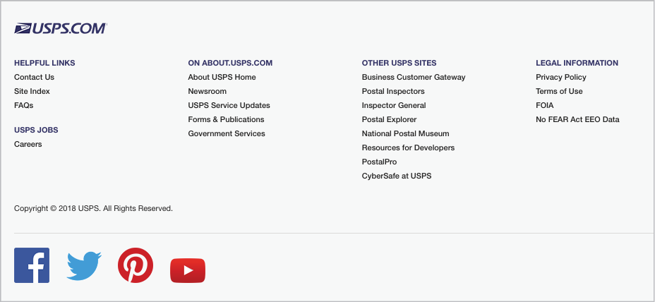
- Header or footer navigation. Headers and footers usually refer to the areas at the top and bottom of a page (assuming there is a bottom! Endless scrolling doesn’t offer the most structured experience). Header areas usually hold the secondary or utility navigation, but they sometimes have their own unique navigation structures. Footers tend to either repeat the main navigation along with the first level of child pages, or display a curated list of interior pages (often chosen to satisfy stakeholder requests for more prominence). In either case, footers can be a way of exposing more content without distracting from the page layout or more central pathways (Fig 5.1).
As you can see, these definitions are subjective, and I’m blurring the lines between the structural and visual aspects of navigation. But ultimately, it doesn’t matter if you think of the search bar as part of the header navigation, or if you place the social links in a unique interface. What matters is that you document your navigation structures—and start to consider all the other paths users might take to find content.
Too much, too soon
Several years ago, I worked with Seven Heads Design to redesign the website for Seton Hill University. We knew (from our user and stakeholder interviews) that the job of the website—like many in higher education—was to attract prospective students.
The homepage at that time offered several different ways to access deeper content (Fig 5.2): an eight-item main navigation, a seven-item secondary navigation, a three-item carousel, a dropdown audience selector, a dual-focus search bar, four tabs for events, and four tabs for campus news.

There were so many paths to content, in fact, that most users didn’t know which to take. Prospective students felt particularly lost, since the most prominent content and links were for things like campus events, donation requests, and system logins—content intended for current students and alumni.
By surfacing as much content as possible to as many audiences as possible, the navigation structures were backfiring. The target audience was giving up.
One of our first goals was to redesign the paths to content. We narrowed down the main navigation to just a few menu items: Academics, Campus Life, and Admissions (Fig 5.3). These three labels suggested a chronological journey for prospective students to get to know Seton Hill: first, they could learn about educational opportunities; then about the social and extracurricular experiences; and, finally—when they were confident that Seton Hill was a good fit for them—they could investigate the application process.

The rest of the design followed suit with a before-and-after concept that spoke directly to the educational and professional journeys of would-be students. The new look, combined with significantly fewer paths in to the content (counterintuitive as that could seem!), resulted in a much more effective, tailored site.
A few months after the new design launched, we checked the analytics: sessions on the Undergraduate Admissions landing page had more than doubled, and the number of new users was up 185%. Those changes weren’t solely the result of our simplified navigation, but certainly more prospective students found their way in.
Balanced pathways
One lesson to take from the Seton Hill redesign is that less is more—as long as it’s not too much less. For every website flooded with menus, there’s a website withholding its content. For every rule about web work, we will stumble across an exception. (Even my permaban on FAQs gets lifted in very special circumstances.) (Not yours.)
When we think about paths in to deeper content, there is—as in so many elements of our work—a careful balance to be struck:
- Too many paths will create indecision...Choice paralysis is hardly the desired reaction. Trying to put every single possibility in front of every single user every single time is a recipe for disaster. Fewer paths mean quicker decision-making.
- …and too few paths will create dead ends. The pendulum can also swing too far in the other direction: if we don’t offer enough choices, users have nowhere to go. Missing calls to action, poor content visibility, menus that don’t connect—all of these end with the user closing the tab or hitting the back button.
- Establish firm paths...As we’ve just seen with Seton Hill, we have to make tough decisions about who and what to prioritize—otherwise, our paths become muddled. The more confident you are about creating clear entry points into the content, the more confident users will be about following them.
- …but be prepared for users to carve their own. We know users rarely follow our carefully planned navigation. But when they stray from our journey maps, that shouldn’t mean they’re lost forever—our information structures should empower them to explore.
And the final reminder: not all roads start from the homepage. Our industry has been saying “every page is the homepage” for a while now, and most teams have internalized the importance of brand representation on deeper pages. But have we internalized the need for clear wayfinding at every level? When users skip the homepage, or pop into our deepest pages straight from search—perhaps with little to no context for the site they’ve just landed on—we have to be ready to direct them.
Wayfinding Signals
In any large or unfamiliar physical space, we have ways of orienting ourselves. We look for entrances and exits. We look for labels on doors, illuminated exit signs, friendly faces. Spaces that care about helping us find our way around will hang maps and arrows and explanatory signage. (Spaces that don’t are the Newark airport.)
Online, we can’t navigate by the Terminal C Dunkin’ Donuts—but we are still looking for signposts to help us along. We might call this information scent—a sense of how close we are to the information we seek.
To track information scent online, we look for signals in all sorts of places:
- Navigation structures
- Page titles and headings
- Breadcrumbs
- URLs and other elements in the browser chrome
- Pagination and frames
- Buttons and calls to actions
- Search results
- Imagery and captions
- Text links
Most of us probably don’t look for these signals consciously. As our eyes scan a page, trying to spot our sought-after information, we’re taking in all these peripheral bits of data (or not!) to build a composite sense of place. Where are we? Where have we come from? Where are we going?
Not that this is existential—we just want what we want from the web. (Hedgehog videos.) And, often, the deeper we get into a site, the harder it becomes to tether ourselves. This is especially tricky if we arrived to a page through search (rather than navigation from the homepage), or if poor site maintenance has left pages with outdated information and broken links.
As stewards of these sites, it’s on us to create signals that will helps users understand the space, orient themselves within it, and get where they’re going. Three of the most visible wayfinding signals we can employ are breadcrumbs, URLs, and calls to action.
Breadcrumbs
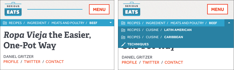
Breadcrumbs are one of the most immediate ways to help users orient themselves within a site. They’re textual, but also visual. Done well, they’re prominent enough to be spotted by users, but subtle enough not to distract from the page design. They spell out an established path—not necessarily the one the user took, but one that can provide context for where they are (Fig 5.4).
Some designers may think breadcrumbs are a waste—that the design should be able to orient users without such on-the-nose details. But even the most intuitive design can benefit from explicit placemaking. Identifying a page’s location in the larger system doesn’t have anything to do with the strength of the design.
Remember that users are—I mean this in the kindest way—distracted. They skip over information, they forget clues, they misread links (especially in stress cases). Given humans’ propensity to miss even obvious signals, why skimp on them?
And if you need even more evidence of their value, SEO-style: yes, Google likes breadcrumbs (http://bkaprt.com/eia/05-01/).
URL structures
URLs are more than an address—like breadcrumbs, they also offer helpfully repetitive signals for understanding a page’s relationship to the system.
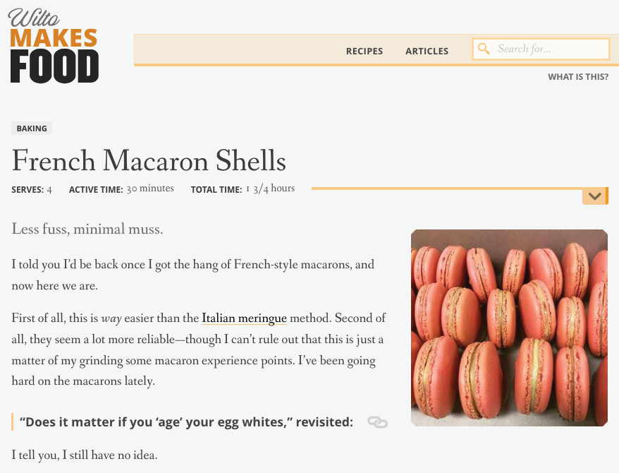
For example, what can we learn from a URL like wiltomakesfood.com/recipes/french-macarons/?
- The page is probably titled French Macarons (Fig 5.5).
- It is probably organized under a top-level page called Recipes, which would show all recipes on the site.
Most content management systems manage URLs for us, though we can often override them or establish our own strategies. Where we get into trouble is when some of our URLs follow consistent folder paths, and some don’t. When there is no stated plan for URL structures—naming schemas, subdomain strategies, shortening guidelines—the patterns become patchy and misleading.
URL structures don’t just tell people where they are in the site; they also communicate security, reliability, and trustworthiness (http://bkaprt.com/eia/05-02/). This signaling is particularly important in the post-factual era. Many, many, many words have been written about the scourge of fake news, but in a New Yorker article in early 2017, Emily Nussbaum pointed to URLs, specifically as displayed in Facebook posts, as a key signal:
[Facebook] design made all news-like items feel fungible. On both the left and the right, the advertising imperative was stronger than the ethical one: you had to check the URL for an added “.co” to see if a story was real, and how many people bothered? If some readers thought your story was a joke and others thought it was outrageous, well, all the better. Satire was what got traffic on Saturday night. (http://bkaprt.com/eia/05-03/)
Masked or misleading URLs might be good for bots and white supremacists, but for those of us interested in righting the ship, we need to treat URLs as the sources of information that they are. They may not be noticed by every user, but they are seen, and they should send the right messages.
Calls to action
Every page should have a next step—a way to continue the journey, an action for the user to take. That action might be submitting a form, making a phone call, reading another article, adding a product to a cart, or sharing a link. It might occur on the page, on a different site, or offline entirely.
The action needs to be clear: users need to know what to do, how to do it, and why to do it. Many pages have multiple calls to action—options for the user, different paths away from the page—but there should always be one primary purpose for a page, and one primary action tied to it.
For example, a product page has the primary purpose of selling me something (Fig 5.6). The page might have secondary goals as well—to convince me to trust the brand, to help me understand fit, to let me compare colors—but they are all in support of the one true purpose: convincing me to click that Add to Bag button.
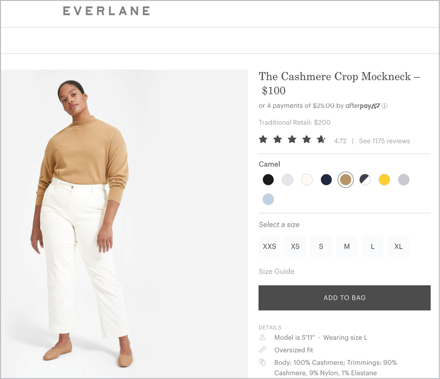
Fig 5.6: This page exists to sell a product, so that particular call to action is the most prominent. Plenty of smaller actions can be taken elsewhere on the page.
Actions are a kind of navigation, furthering journeys and fulfilling the page’s purpose. Pages without actions—without clear purpose—are just dead ends (Fig 5.7). They don’t offer a direction, provide a next step, clarify information, or assist with wayfinding. Dead ends just…end.
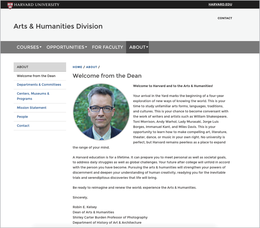
Fig 5.7: “Message from the dean” pages are notoriously common to higher-ed websites, and just as notoriously offer users almost no calls to action.
The quick and the dead
Speaking of dead ends: please do not ever create “quick links” (Fig 5.8). They go by many different names, but they’re the same usability trap if they are:
- a collection of links, with little to no context, description, or explanation,
- arranged as a list in a module or sidebar, particularly on the homepage or landing pages, and
- politically expedient, which is to say, there by stakeholder insistence.
Quick links and their ilk are a perfect storm of unclear categorical criteria, vague labels, and stakeholder arguments—and it all leads to user confusion. As Gerry McGovern wrote on his blog,
If you call something Quick Links, then that surely implies that the other links are Slow Links, doesn’t it? I mean, why would anyone choose a slow link when they have the option of choosing a quick link? (http://bkaprt.com/eia/05-04/)
Quick links are the result of poor organization; when content is hard to find, a tidy list of links to expose that content is mighty appealing. They’re often championed by stakeholders who feel like their content is being hidden or losing prominence—motivated by fear, not by providing the best user experience.
And while quick links may allay some of that fear, they won’t resolve the underlying usability problem. Hidden content can only be surfaced through better structure—clear paths, clear labels, clear wayfinding.
If stakeholders ask for quick links, push back:
- What does quick mean? What criteria is being used to choose which links are “quick”?
- Quick for whom? Which audiences are prioritized by elevating certain links (and which audiences are ignored)?
- Why can’t the content be found through more traditional routes?
- How might a link list derail or distract from other links?
- How might additional context and more specific labels help users to understand the links?
I’m not suggesting that you can’t ever list links. Lists have a place in this world! Just make sure you’re creating clear, specific, contextual links because they’re the right way to meet a user need—not because there are unsolved findability issues.
Wild Goose Chases
I don’t mean to be rude to Harney & Sons, a purveyor of fine teas based out of New England, but I am about to be rude to Harney & Sons, a purveyor of fine teas based out of New England. (It’s only because they provide such an excellent lesson on navigation and findability. It’s out of love, I swear!)
Now, I like tea. I like it a lot, particularly the caffeinated teas that fuel my workday. I’ve got an electric kettle and a cast iron pot and a powerful thirst for liquids named for the people and pastorals of the British Isles.
But I don’t know tea. I am not a connoisseur. When I shop for tea, I know that I want black tea, not green or herbal—but that’s the extent of my taxonomic tea knowledge (Fig 5.9).
Unfortunately, after selecting Black Tea on the Harney & Sons website, I’m forced to select from a bevy of unfamiliar and inconsistent subcategories of tea (Fig 5.10). Even though the subcategories are lightly contextualized with some definitional copy, I still find myself out of my depth, with more tea questions than I started with. What’s a “flavored” black tea? Don’t all teas have flavors? Is a “blend” a kind of flavor? Why don’t the regional teas count as blends or flavors? Maybe I should stick with coffee.
For a seasoned tea drinker, I am sure these are stupid questions. But here I am, already using words like “stupid” to describe myself at step two in my attempt to buy tea. None of us, including Harney & Sons, want our users to feel stupid.

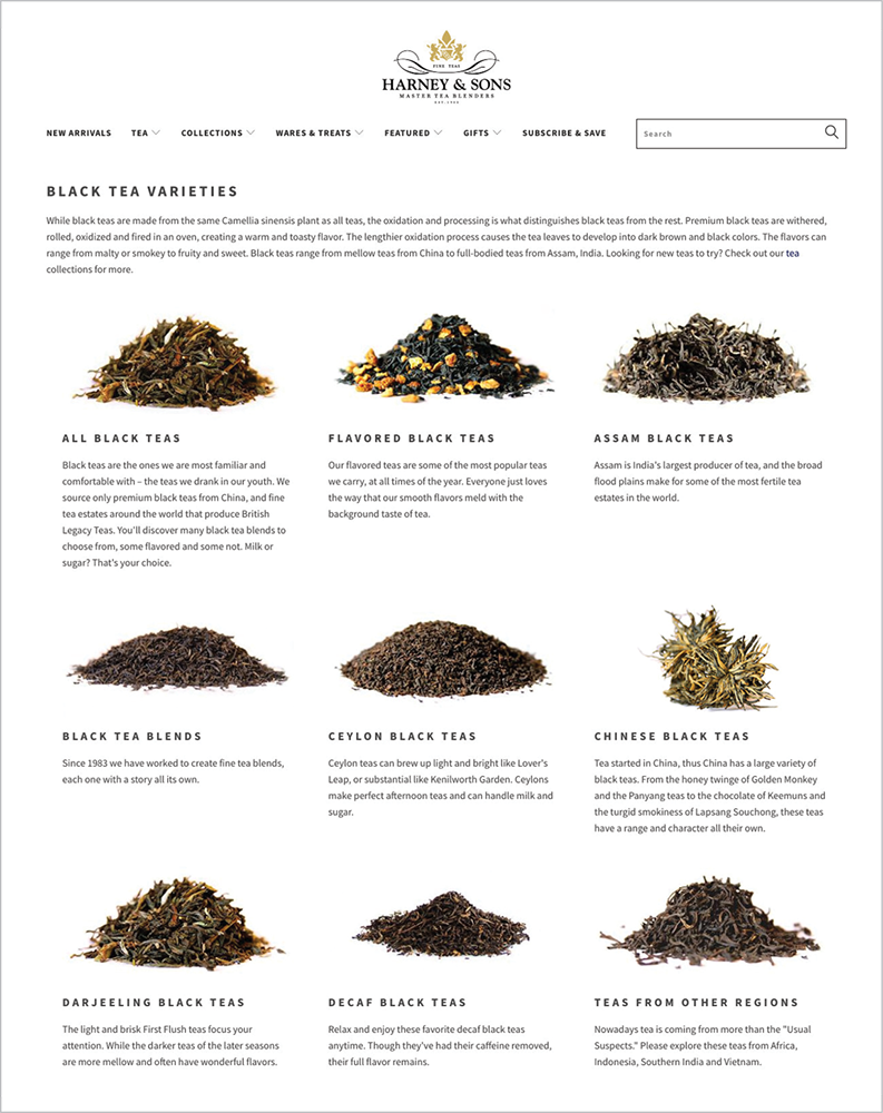
Fig 5.10: Selecting Black Tea from the Tea menu presents a second level of categorization and a deep sense of existential anxiety.
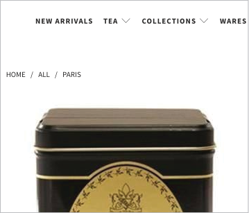
The only reason I’m in this situation—feeling silly, staring at dried leaves, complaining about the internet—is because I fell in love with Paris. It’s a Harney & Sons tea, and after a friend served me a cup, I swore I’d never drink anything else. But, at first, I couldn’t find it on the site, because I didn’t know how to categorize it. A flavor? A blend? A “tea from other regions”?
They’re missing an opportunity to turn me from a casual tea drinker to a knowledgeable brand devotee. This organizational structure cannot help me understand tea, discover new flavors I might like, or feel confident in buying anything other than the one type I happened upon by chance.
The Harney & Sons navigation expects that visitors to the site will already be in possession of two key facts: what tea they want to buy, and how that tea is classified. The site requires specialized knowledge (a.k.a. jargon) to navigate—and structural elements like breadcrumbs provide little clarity (Fig 5.11).
This is not a system that supports browsing. This system only supports known-item seeking.
Information-seeking behaviors
The solution to this is not to build chatbots and questionnaires. Not to be curmudgeonly, but I don’t need my tea-buying experience to be interrupted, personalized, or gamified. I just need the information to be organized for browsing.
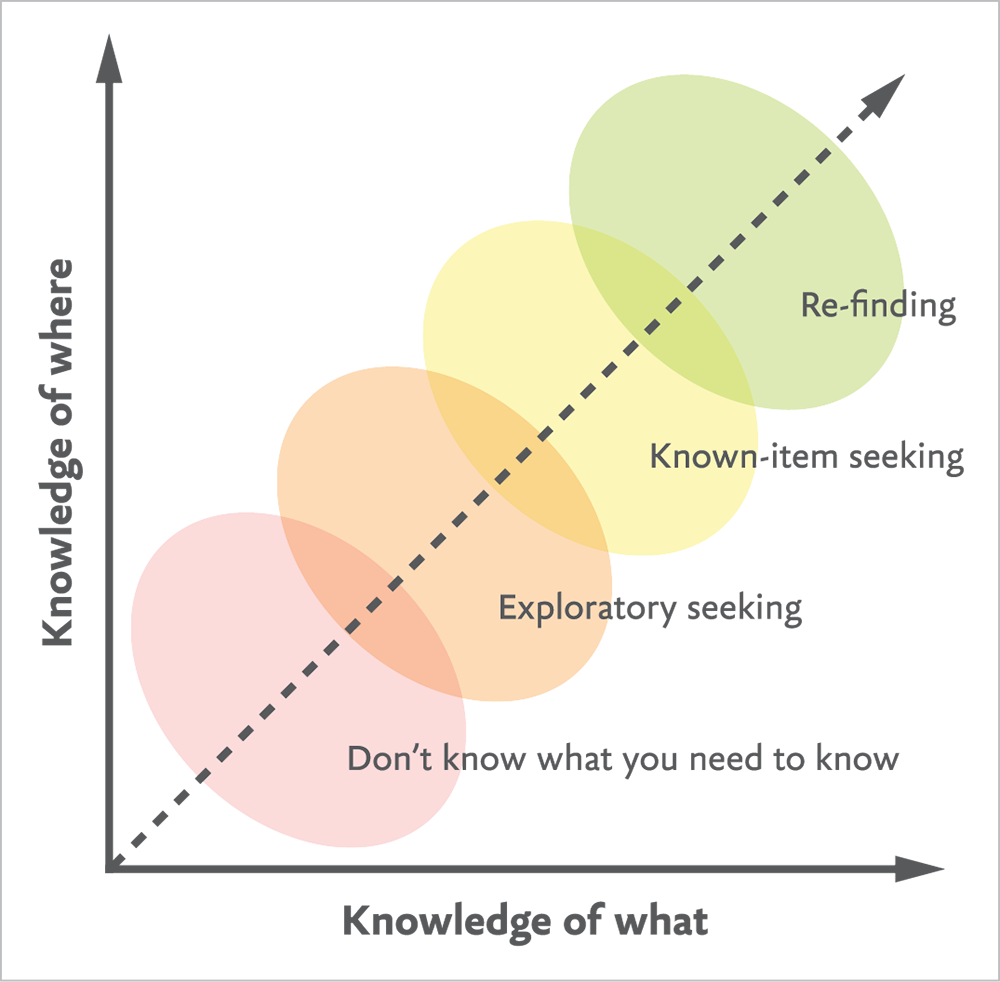
To truly understand that, we have to understand how people look for information—that is, how do we search? To borrow from information architect Donna Spencer, there are only a few different modes humans have when they are trying to find something (http://bkaprt.com/eia/05-05/):
- Known-item seeking. This is how we search for information when we know what we’re trying to find—we just don’t know where to find it. Googling an answer to a question, looking up a word in a dictionary, searching Netflix for Star Trek: Enterprise, typing “Paris” into the Harney & Sons search box—those are all searches with a specific intent behind them.
- Exploratory seeking: On the flip side, there are searches we undertake when we don’t have a specific intent: looking for a new show to watch, seeing what restaurants are nearby, browsing articles, conducting research. There might be an intention to the search process itself, but not an expected result.
Spencer defines two other search modes, which I classify as more contextualized versions of the first two modes:
- Re-finding: When we look for a specific piece of information we have previously found, we are conducting known-item seeking, but with a stronger sense of the destination than before.
- “Don’t know what you need to know”: An exploratory search with even less information to start with—not only do we not know what we’re looking for, we don’t even know what question to ask.
The way people search for information depends on their confidence in what to look for and where they think they’ll find the answer (Fig 5.12). As web workers, the question we need to keep top of mind is: What must our users already know in order to find what they’re looking for?
The challenge with Harney & Sons’ navigation is that it assumes the user has the exact same information about tea that the content owners do: it’s been designed with the full knowledge of tea on offer as the starting point, rather than the endpoint.
Our organizational choices—through categories, wayfinding signals, navigation structures, and more—are not there to passively move users through a site. They should give users the tools to move themselves.
Findability and SEO
Talking about search behaviors is sure to bring up questions around search engine optimization (SEO). Beyond our structural decisions, how do we know if our content is actually findable? How can we make it more findable? Whose souls do we need to sell to get to the top of the search rankings?
I hate talking about SEO because, frankly, it was all quite spoiled by a few bad apples back when Google was a system to game. When some marketers thought the key to findability was to sardine-pack a page with keywords, writers and designers had to expend a lot of energy just trying to make the content readable by people. Chris Corak, partner at Onward, an SEO and content design consultancy, acknowledged that this history often makes designers wary of SEO:
Sometimes people are scared because they’ve had an experience of SEO that was just keyword stuffing. But that’s not how it’s done now. Content should have common terminology, but it doesn’t need to be a million times on the page or said in a way that sounds horrible…Often, what the search engine wants is what people want to see, too. Search engines are trying to emulate what they think people like.
While search is becoming more human-centered, shady practices—clickbait, hashtag abuse, all sorts of weird keyword messes—seem impossible to eradicate. Amazon, I’m talking to you (Fig 5.13).
Keyword clutter is annoying. But when that gambit for garnering views shows up in other areas—like, say, the news—it becomes insensitive, corrupt, and dangerous. Take this series of Newsweek headlines that appeared after Anthony Bourdain’s death in June 2018 (http://bkaprt.com/eia/05-06/):
Who is Anthony Bourdain’s daughter, Ariane? Celebrity chef found dead at 61
Who is Anthony Bourdain’s girlfriend, Asia Argento? Chef found dead at 61
Who is Anthony Bourdain’s ex-wife, Ottavia Busia? Chef dead at 61
In an article for the Verge, Bijan Stephen compiled even more examples of Newsweek’s insensitive, manipulative headlines, demonstrating that this was not simply an isolated incident, but a purposeful, entrenched strategy at Newsweek Media Group. This could be dismissed as a purely editorial issue—but publishing strategies involve design and development, too, or this dilemma wouldn’t be so frustratingly familiar to many web workers:
Every publication has to make this choice: reach for traffic at the expense of editorial morality or give up that potential revenue in service of professional ethics. Newsweek has chosen to take the traffic. (http://bkaprt.com/eia/05-07/)
I don’t know how to fix the publishing industry, but I do know that this binary—be ethical and lose, or cheat and win—isn’t real. Clickbait and dark patterns don’t guarantee traffic. Chasing short-term wins at the expense of basic human decency—please, stop. You’re making it worse.
Depending on your role, you may not have the power to change headlines—but you do have power in crafting the system, structuring the content, and improving findability. Rebekah Baggs, partner at Onward, suggested focusing on the relationship between the content’s meaning and its presentation:
When you’re designing a content module, think about how your design decisions impact the content, as well as how that might impact search. What is this container, and how does it interact with the actual information that will live in it? How are H1s and H2s nested, and how do they appear on the page? If heading tags are treated as aesthetic labels, they won’t map to the informational weight that they carry.
Labels and markup have a huge impact on findability—they speak to search robots and they assist with human understanding. The goal is for content and design to be in alignment, as content strategist Rick Allen explained:
Ultimately, visual hierarchy has to support information hierarchy. But they are two different things, so if you’re not designing with that in mind, there will be a disconnect. Hierarchy and prioritization is what makes information cohesive.
Bottom line: skip the keyword repetition, and focus on the interplay of content and design to help users find what they need.
The End of the Rainbow
A colleague of mine once worked on a government website where the primary stakeholder insisted that no navigation was necessary on their site—users “only use the search box.”
You know, part of me wishes that were true. What a utopia that would be: a place where the only search behavior is known-item seeking, and search systems always parse intent flawlessly, and Nazis have finally been kicked off Twitter. (As long as I’m dreaming.)
Unfortunately, that’s not the world we live in. We can’t know how our users will navigate our websites any more than we can know what device they’ll use to do it. We can only provide signposts to help them on their way.
Still, those signposts count for quite a lot. Navigation structures, wayfinding signals, the content’s meaning and design—all of it works together to help users find what they need.
The operative word here is together. It isn’t just the labels, or just the SEO, or just the calls to action—it’s thinking critically, and responsibly, about all the signals we send users about the information space. Including the taxonomy.