When the design process for new technology begins, it often starts brilliantly.
“What’s good about that?” an elderly senior citizen is asked about her daily foot rub.
This path is fantastic.
“Hmph,” a painter watching his paint dry is looked at with genuine curiosity, his techniques and typical processes well-noted.
It’s journalistic. Qualitative. Without fail, enlightening.
It’s a practice that can unmask new opportunities, uncover unknown yet common problems, illuminate regular routines, and find those things that are actually important to the end customer. And just a few weeks of these open-minded observations and conversations with customers is a marvelous first step that many smart people in technology use today to create something useful.
But it’s certainly not the only smart first step taken in tech today.
Some start with history. Go beyond an Internet image search and—yikes—dust off old books for classic, beautiful examples where others have solved similar problems you’re trying to tackle today. Like Jony Ive did with Dieter Rams’s ideas of simplicity to inspire the forms for things like, oh, the iMac, iPhone, iPad, Apple Watch, and later versions of iOS.
Quantitative insights can be fantastic as well.
A smart analytics team can reveal patterns about customer behavior that may have been overlooked by everyone else in the organization. There’s a good reason why McKinsey found that “companies championing the use of customer analytics are 6.5 times more likely to retain customers, 7.4 times more likely to outperform their competitors on making sales to existing customers, and nearly 19 times more likely to achieve above-average profitability.”1 Uh, because it’s a great idea.
The lessons of analytics are often aggregated by wonderful means, as well.
Walls are covered in imagery. Mood boards are created around the emotional qualities of aspirational outcomes. User stories, personas, scenarios, and other means of aggregation provide an enormously useful guide into what must be accomplished to make something great for the customers.
But then, the creativity stops.
The amazing stack of unique problems is forgotten. The rich pile of specific insights disappears. Instead, from the unique opportunities emerges the expected. Organic insights are morphed into mechanical results. Oneof-a-kind is turned into a square peg for a square hole. Because screens come before problems.
We do this:
And we do it again. And again. And again. No matter the client, the industry, or the problem we’re trying to solve, the creative process for developing technological solutions repeats the lazy act of drawing a screen.
Where does the logo go? How big is it?
And in particularly polluted organizations, the more screens, the better the designer seems to be doing.
 I pumped out a 32-screen flow today!
What!? You’re the man!
No, he’s not. As designers, as makers of technology, we’re here to solve problems in the most elegant ways possible. Our research allows us to identify new and unique problems to solve. Our creative drive to discover what motivates our customers is a fantastic way to start. But then, so often, we commit the common, terrible mistake:
Insight
+ insight
+ insight
+ insight
= screen.
Repeat.
We learn fascinating things, then we draw a lazy rectangle. We start asking what generic pattern libraries we should use, and toss in a parallax scroll . . . or whatever is trendy at the moment. Like the hamburger icon:

I’m the sexy rounded rectangle hamburger man with all the things you really need buried inside!
We end up asking questions like, “How can we help this 82-year-old diabetes patient using this form field?”
Ugh.
Unique problems don’t have generic answers. Yes, in some cases a graphical user interface is a decent solution. But so often we throw away our best stuff, our opportunity to do something new and different, the very moment that marker hits whiteboard. Before we can even solve a problem meaningfully, we throw away the opportunity to do something better.
Digital products can do so much more than have a fancy front end.
Even if your company’s core product is an interface, not everything that comes after has to be an interface. If things were that rigid, Apple Computer, the personal computer company, would have never become Apple Inc., the world’s largest consumer electronics company. If companies didn’t go after opportunities beyond what they do today, Netflix would still be mailing DVDs in red envelopes.
Great thinkers adapt. Great companies offer their customers the best possible solutions, whether they have a graphical user interface or not.
Alan Cooper—who brought user research to the software world back in 1992—once wrote to technologists, “Our most effective tool is profoundly simple: Develop a precise description of our user and what he wishes to accomplish.”2
What he wishes to accomplish is rarely to use a menu, a drop-down, or other outcomes of lazy rectangles.

In 1967, a group of pocket radio and TV manufacturers got together for the first annual Consumer Electronics Show (CES). It was a chance to show off the tech of the future—things like “$8 radios the size of a pack of cigarettes.”3
By 1984, the annual event started gathering over 100,000 attendees. The growing audience at the technology trade show made it a destination at which to announce new products and services. In 1985, Nintendo revealed its first gaming console at CES. In 1992, Apple showed off its PDA, the Newton.4
At the show in January 2010, a car security company had a booth at CES to announce their new smartphone app. They said it “has many other capabilities beyond remote start,” including helping people “pop the trunk.” At CES that year, which had attracted companies from around the world, their app stood out to the event’s judges. It was awarded the “Best of Innovations Honors.”5
From a wireframe perspective, it actually wasn’t that bad.
On the home screen, five actions were clearly visible. The icons in the final design were even paired with text to help customers avoid any ambiguity. Those large five actions—lock, unlock, trunk, and panic—all seem like common, appropriate actions for an app that controls your car. It wasn’t a beautiful interface, but the wireframe was coherent. Maybe the judges at CES were on point.
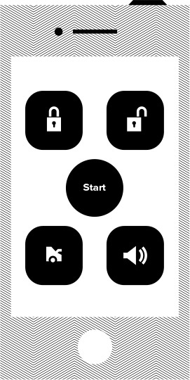
A simple wireframe of the app
Well, hold on to that thought for a moment.
Consider that we think this is decent because we’re used to seeing things made with wireframes. Consider that we think this is good because we’re used to screen-based thinking. And then consider an alternative path.
Let’s actually look at the experience of using one of the functions from the app. Say, opening the trunk.
We already know one great way to start: Observation—watching people do the thing you’re interested in improving in the environment in which they typically do that thing. It’s almost too obvious.
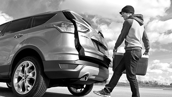
If you watch an older man carry something to the trunk of his car, it’s clear to see that his arms are full. His feet are free. He’s carrying something heavy. He doesn’t want to put down the heavy object, pull out his smartphone, tap and swipe, put away his phone, and then potentially throw out his back trying to pick up the heavy object again. Not too good news for our app makers.
I didn’t make the observation. The Ford Escape design team did. In the “crossover SUV market awash with new models,” Ford was hoping to create something that would distinguish its SUV from the others.6
Did they make an app with bigger buttons? Add voice commands so that their customers can stand in a parking lot shouting random commands at their trunk?
Nope.
They put a set of sensors under the bumper that can read a foot kick—a simple and easy action that works within the typical process of carrying something heavy to the trunk.
When the trunk opens from a foot kick, it feels like magic. No buttons to press. No interfaces to learn. Some 47 percent of Escape owners purchased this optional feature that attempted to work within the constraints of real life instead of pixel dimensions. As Forbes said, “That’s a pretty robust rate for an option that hasn’t appeared anywhere else before.”7
Good design solves problems. Good experience design isn’t about good screens, it’s about good experiences.
There is so much screen-based thinking for cars. It’s a screen-obsessed industry in which some companies pride themselves on awful touch screen center consoles. Where the most innovative companies say things like, “We started with a blank slate—17" of glass—which is the centerpiece of the interior.”8 Tesla, you have a fantastic company vision and beautiful cars, but a blank slate is not a 17-inch touch screen. It’s dangerous to take a driver’s eyes off the road. Let’s solve real problems that embrace typical processes, not screens.
When a foot kick breaks the electrical field via the two motion sensors at the back of trunk, the system knows to open the trunk. And if you’re reading this caption to understand mechanical engineering, read another book. (Just kidding. I’m glad you’re here.)
Even when a car isn’t on the road, there are still legitimate problems to solve. Like having a boiling hot interior after your car’s been sitting in a cement parking lot, baking from the sun. It can get so hot that according to NBC News, “more than 36 children die in overheated cars every year in the United States.” Dogs left in cars are also fatal victims of the heat. The National Highway Traffic Safety Administration (NHTSA) found that “cars parked in direct sunlight can reach internal temperatures up to 131°F to 172°F (55°C to 78°C).”9
When in Australia recently, I ran across an ad for the Nissan Leaf. It took over an entire wall of the Sydney Airport. It read:
I’m not making that up. It was part of a global ad campaign. You download Nissan’s app from an app store, toss it into your sea of icons, and manually launch it when ready. Here’s a screenshot of the app being advertised:
How does it work? Here’s Nissan’s explanation:
Here’s the scenario: It’s a sweltering August day and you know you’ll be getting in the car in 15 minutes. Use your smartphone or computer to remotely turn on the air conditioning and voila, you’ll be entering a nice cool car.10
Another great car misdirected by trying to solve problems with screens? The result of a lazy rectangle? Well, let’s consider their scenario through open-minded observations. We know how.
It’s a sweltering day, and your car is heating up in a parking lot. Wherever you are at the moment, you probably aren’t thinking about how to babysit your car in the distant parking lot.
Say you’re at the movies. After all, when things heat up in the summer, movie ticket sales do, too.11 Pulling out a bright screen in a dark theater is probably not going to make the people around you very happy. Even CNN says looking at your phone during a movie is one of the “most annoying smartphone habits.”12
Dude, turn off your phone!
Even if people around you were OK with it, 15 minutes before the end of a decent movie, you probably aren’t thinking about how your car interior is cooking.

Where you might be on a hot day (Source: NASA Goddard Space Flight Center / CC BY 2.0)
Can we again reduce the number of steps in a way that embraces a typical process? Here’s a simplified view:
1. Leave car in hot parking lot and go inside movie theater. — Me
2. Decide to return to my car.
3. 15 minutes before I return to my car, remember that my car could be warm.
4. Pull out my smartphone.
5. Wake up my phone.
6. Press my thumb to login.
7. Exit my last-opened app.
8. Exit my last-opened group.
9. Swipe through a sea of icons, searching for the app.
10. Tap the app icon.
11. Wait for the app to load and try to find the cooling action
12. Make a guess with the menu and tap “Climate.”
13. Tap “Turn Climate Control On.”
14. Wait 15 minutes.
15. Return to cool car. _____________________________ My Goal
Hmm.
To find someone coming up with an original solution unpolluted by lazy rectangles, we’d have to go so far back, we’d end up at a time when even the Internet wasn’t regularly used. Back to 1991, when the online tech scene was so young there were fewer than 1 million websites worldwide. (For some context, there were 100 million13 websites by 2007, and nearly a billion14 by 2014).
That year, Mazda Motor Corporation released a new model of their luxury sedan called the 929. Being the fourth-largest Japanese automaker in the United States at the time,15 they packed the 929 model with forward-thinking features in hopes of attracting new customers. The New York Times called the car “a snazzy new model.”16
In this time before websites, before apps, before our lives were inundated by smartphones and -watches, before screens seemed like the solution to every problem, Mazda offered an optional feature in their 929 that attempted to tackle overwhelming interior car temperatures without any graphical user interface at all.
Clark Vitulli, then senior vice president and chief operating officer of Mazda Motor of America Inc., told the Chicago Tribune, “our goal is to become a world-class, premium motor car company, and you don’t do that by being the cheapest or the most expensive, but by being distinctive and personal so that there’s nothing else out there like your cars.”17
Clark sounds like someone who cares about creating great experiences.
How did Mazda do it? They solved the problem elegantly by embracing the actual situation instead of what works best on a screen.
It goes without saying: Your car heats to unbearable temperatures when it’s hot outside. So, Mazda installed one of the oldest and most common devices to check when it’s hot: a thermometer. When the temperature crosses a certain threshold, a sensor acts like a trigger, letting the system know your car is heating up.
When that trigger is activated, small fans started to cool off the car. And since the sensor knew it was hot outside, it could be assumed that the sun was beating down on your car, so Mazda installed solar panels on top of the car to power the entire automatic ventilation feature. When you return to your 929, the system has automatically cooled down your car without using any gas, and perhaps just as importantly, no interface. By understanding the context, the 929 used the cause of the problem—the sun—as a solution to the problem.
Smart.
And when the temperature sensor detected that it wasn’t hot outside, the 929’s solar panels charged the battery.
Smarter.
But maybe not good enough.
In their tests, Mazda found that on a hot day (say, a sunny day with no shade in the Arizona desert), interior car temperatures could reach up to a ludicrous 167 degrees (75°C). Their system could make the interior temperature significantly cooler, but it tended to only reduce the temperature to a still scorching 140 degrees (60°C).17
The 929 did save gas because less air conditioning was needed to bring the car down to comfortable levels. And the system did so automatically, without a cumbersome experience for the driver. But the interior temperatures were still far from ideal. You would never want to leave anything sensitive to temperature—dog, child, goldfish, or gallon of milk—inside the car.
Eighteen years later, in 2009, Toyota took another shot at the same problem by leveraging the lessons of the 929.
An optional moonroof on their 2009 Prius slightly opened when it was hotter than 86 degrees outside.18 Small fans then drew warm air out of the moonroof, and the whole system was powered by a solar panel on the roof of the car. Unlike the 929, the solar panel didn’t power the battery on cold days, but Toyota did report better cooling results.
With a system based on modern components, Toyota claimed that indoor temperatures reached “near ambient” temperatures, which meant that if it was 90 degrees outside, the car wasn’t too much hotter. (But not cool enough to keep your children in the car. Please don’t keep your children in the car. Or an ice cream cake.) For the Prius, the feature was so popular that sales numbers for the optional feature exceeded even company estimates.19
The system—still available—isn’t yet good enough to prevent heat-related accidents, but it’s a fascinating feature and in high demand for good reason. Instead of asking us to learn a new interface, it works within our normal, everyday habits.
You’re smart. You know how to look at a problem and understand the unique problems. You see the opportunities for improvement.
But if you’re working on software, don’t throw up a lazy rectangle as a solution. We so often miss the magic when we draw a screen and wonder how to fill it with generic elements, or cool new tricks, such as parallax scrolling or the hamburger button.
Instead, by understanding the context, by embracing typical processes, we can create more elegant solutions. Things that feel like magic.
Automatically opening trunks and cooling cars are just an early start. We can and should use machines to do things much greater.
Let’s embrace typical processes, not screens. Let’s aim for elegant solutions, not lazy rectangles.