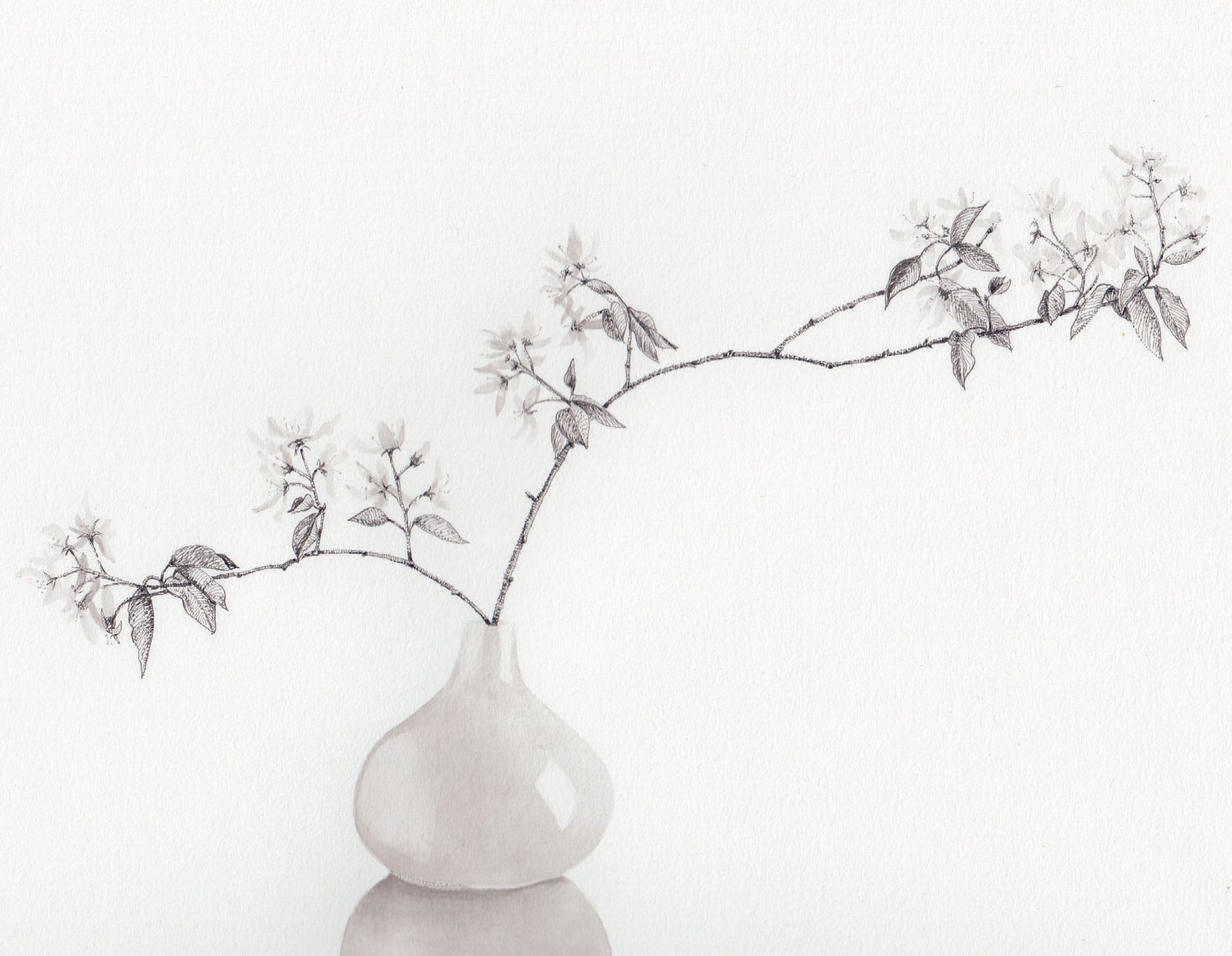
A FINAL PROJECT—STILL LIFE IN BOTH GRAPHITE AND INK
We’ve learned a lot about honing our ability to see subjects along with the techniques to help us document what we see with many mediums: graphite, charcoal, ink, and watercolor. One question that I’m often asked is “How do you decide which medium to use when creating realistic drawings?” For me, this has to do with my emotional response to the subject I wish to portray, but also with the unique characteristics of the subject. Is my subject full of linear surfaces, such as the pine needles on a bough? Then, the fine lines I can achieve with pen and ink would be a great fit. Does my subject exude a soft sense of roundness, subtle coloring, and fine textural detail? Then, graphite would be an excellent choice, such as with the pear. Do I want to suggest dramatic lighting on a very simple subject? Nothing can achieve dramatic lights and darks with subtle shading like a reductive charcoal drawing, such as in the Charcoal Project: Turnips. And then there is watercolor, which can bring brilliant color to drawings either as a dreamy background as in the Graphite and Watercolor Project: Beech Leaves and Nuts or as a way to achieve fine detail and life-like color, as in the Graphite and Watercolor Project: Chickadee on a Branch. So many choices, but in the end the choice is yours.
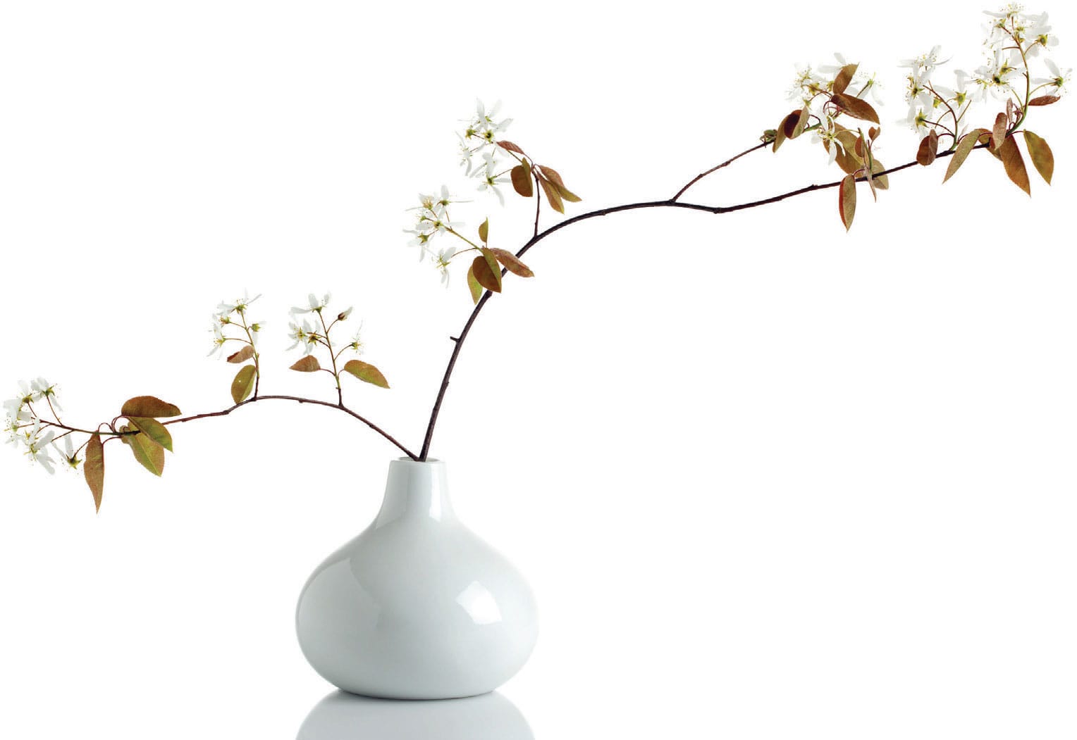
Our final project is actually two projects created from the same reference image. First, we’ll make a realistic drawing in graphite, then another in pen and ink with wash. I chose a simple still life that includes a man-made object. The way I depict man-made objects in my drawings is to use less focus on them, making the natural subjects the focal point. This is my own personal aesthetic, but I find it effective. In the reference image, we have a simple white vase that has a real sense of roundness, but no texture or other detail. This lends itself to subtle transitions with graphite or dreamy washes with ink. No other detail will be necessary. However, the branches of leaves and flowers can be depicted with fine details, making nature the focal point.
Note: Please read through all instructions before beginning each project and refer back to the Graphite chapter if needed.
Still Life in Graphite
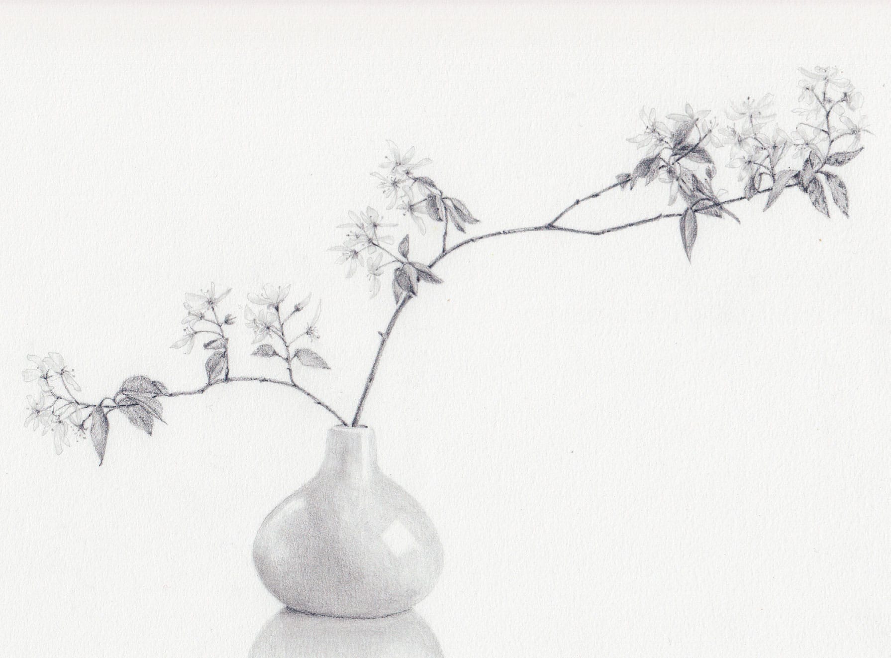
Let’s use some of the skills and techniques we’ve practiced to create a very refined still life of a flowering branch in a white glass vase. I chose this image for its wide variety of textures, from the shiny and reflective glass to the velvety white petals to the textured foliage and branch. This is a perfect subject to bring many techniques to one project and requires a refined and delicate touch.
TOOLS AND MATERIALS
• Well-sharpened graphite pencils in 5B, 2B, HB, and 4H
• Pencil sharpener
• Kneaded eraser and sharpened stick eraser
• Feather or brush to dust off paper as needed
• Vellum-finish drawing paper in size 9 × 12 inch (23 × 30 cm), such as Stonehenge White
STEP ONE: THE BIG PICTURE BLOCK-IN AND LINE DRAWING
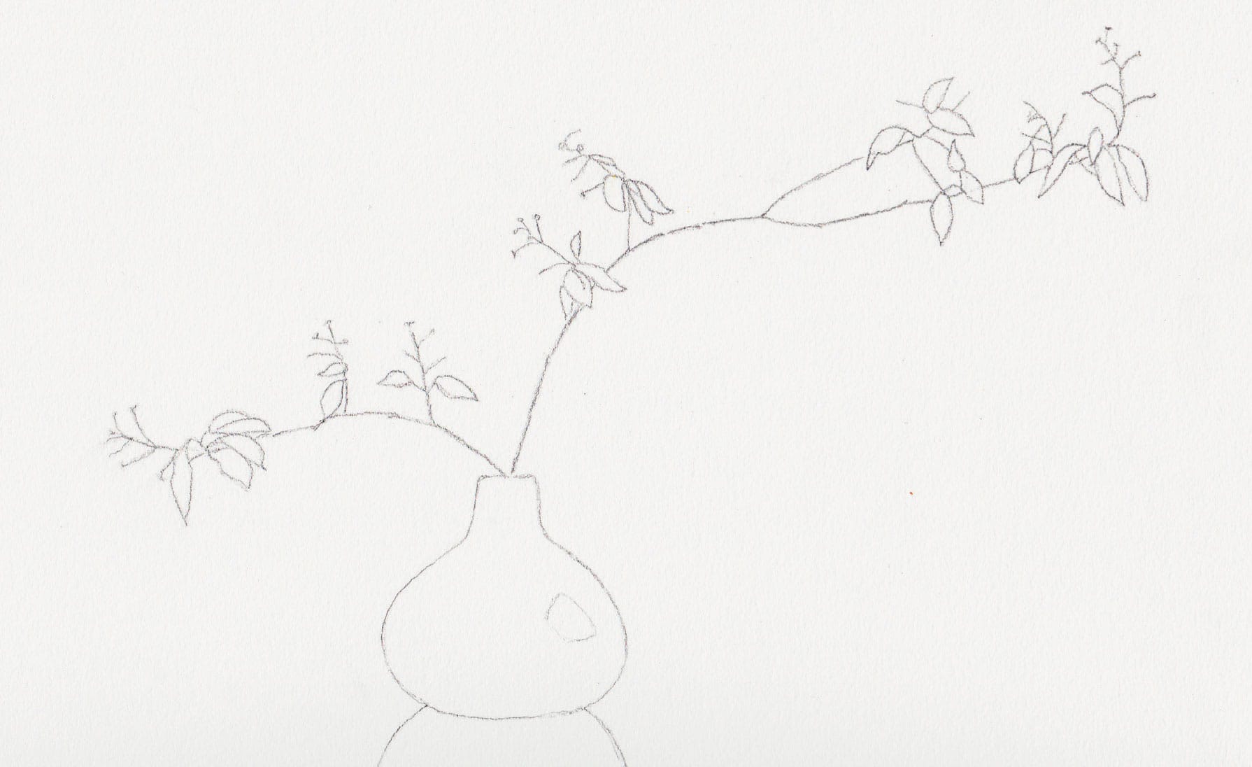
As with all drawing projects, begin on a piece of sketchbook paper by creating a big picture block-in. Notice the shapes you see in the vase, an oval for the base with a small square for the neck. Pay attention to the proportions of each and how they relate to one another and to the composition as a whole. Also, notice the area of highlight on the vase and make a suggestion of it in your line drawing.
For the branches, use fluid lines, in segments, as they extend from the base to the tip. You don’t need to be exact, but create likenesses of each segment of the two main branches and the places where smaller twigs branch out and support the leaves and flowers. Notice in the sample drawing how the flowers are not drawn, but the leaves are. This allows us to draw the flowers very lightly where they fit in, as the final step, even using a blending stick for a very soft suggestion of line without committing to a hard mark that would need to be erased.
This exercise will test your ability to create small, fine shapes and detail. We tend to think that bigger subjects are more difficult, but often, it is the smallest subjects that test our skills the most. It’s important to keep your pencils at their sharpest when drawing small objects. It will make your job much easier.
Study both the reference and the sample drawing for an idea of how much detail to add to the line drawing. Adjust your marks as necessary and once finished, use your transfer method of choice to transfer the line drawing to a clean sheet of drawing paper. Save the sketchbook drawing for use in the next lesson as well.
STEP TWO: LOSING THE OUTLINES BY CREATING A MID-TONE VALUE LAYER
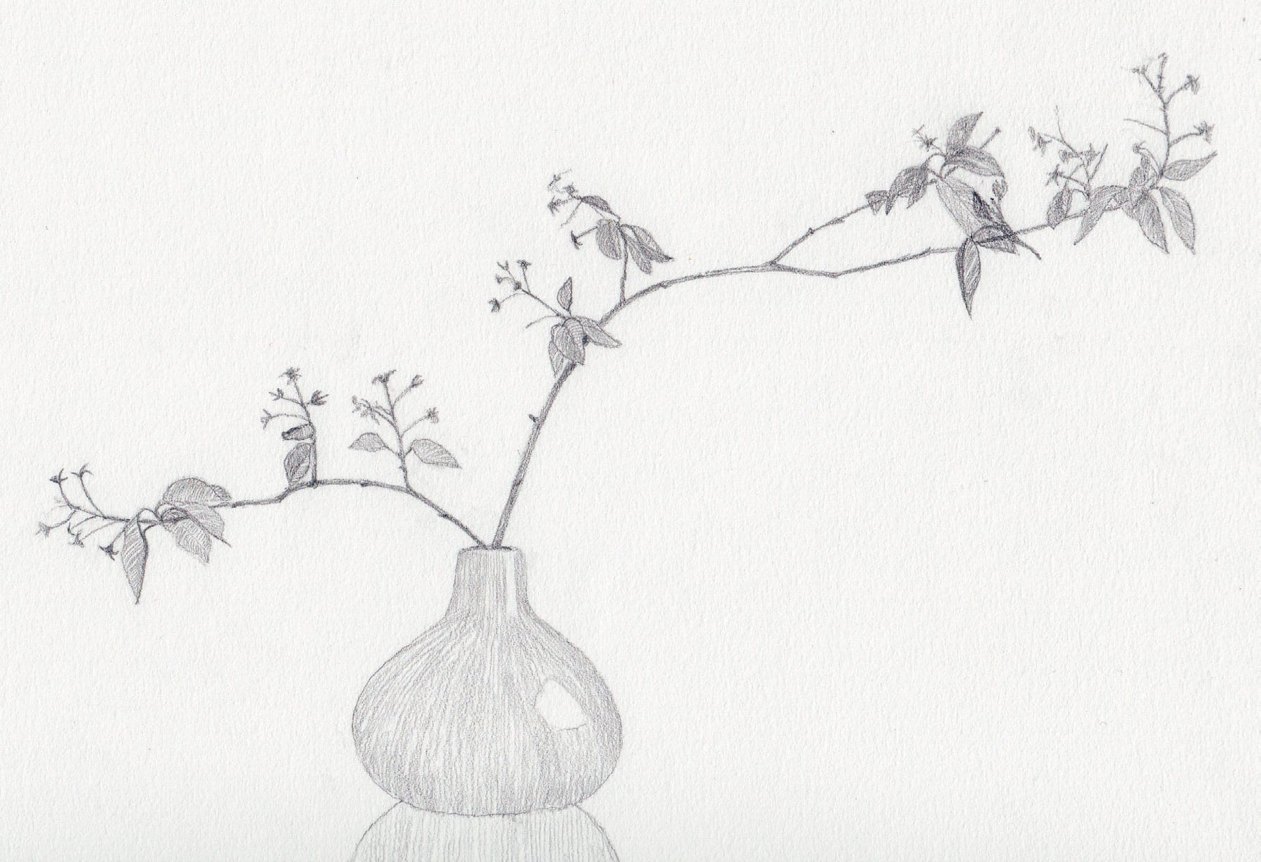
In this step, use a well-sharpened HB pencil to create a mid-tone value layer of graphite in the direction of form. If there are any areas of white highlight, leave the paper white. Also, do not fill in the white flowers yet, but do make marks to suggest the sepals where you see them and also fill in the form of the branches. Study the example to see how I’ve used direction of form and to notice where I’ve left the paper white, in comparison to the reference image. Also make note of where I used creative license to simplify the composition of leaves where necessary.
STEP THREE: BLENDING TO CREATE AN EVEN TEXTURE
This step addresses the man-made object in our reference image, the white vase. To create the illusion of its smooth and reflective surface, we’ll use a tortillon or blending stick with the lightest pressure possible. Pay close attention to the reference image and follow the direction of form. Start at the top of the vase and gently smooth the graphite with the tip of the tortillon in the direction of form until you have an even texture all over. Do not press firmly or embed the graphite into the texture of the paper. Think of your blending tool as a feather grazing over the surface. Take a look at the example to see how this should appear when complete. Remember to keep the white areas, as seen in the reference image, free of any graphite.
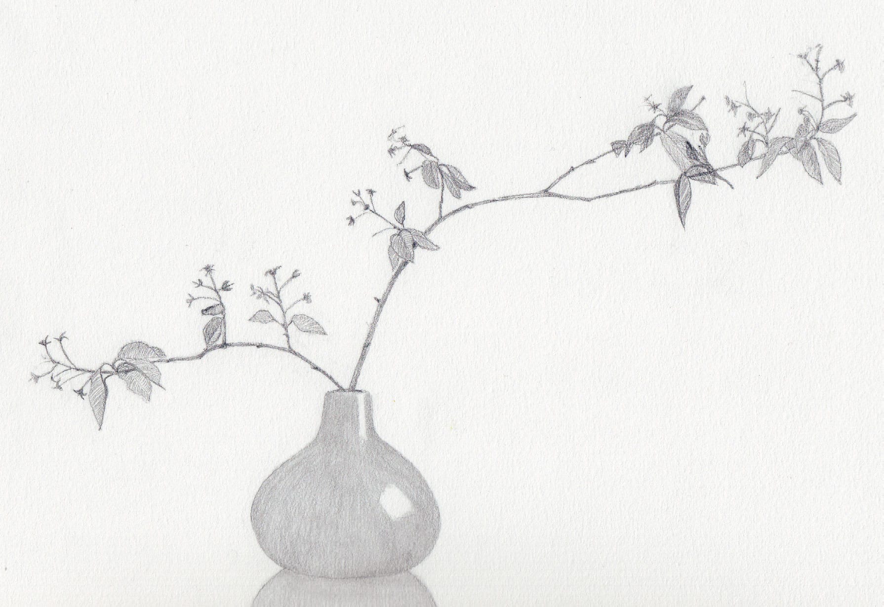
STEP FOUR: REVEALING THE HIGHLIGHTS
Now, it’s time to reveal the light. You will need your kneaded eraser as well as a stick eraser with a sharp point. For the Tombow stick erasers, cut the end into a chisel-tip with an X-Acto knife. For pencil-style stick erasers, use a pencil sharpener. This is very helpful for tiny highlights on smaller subjects such as the leaves, if necessary, and for subtle lifting on larger areas. Use the kneaded eraser to delicately press and lift the graphite on the vase where you notice highlights on the reference image. The stick eraser is used for small areas of light everywhere else, including the top edge of the vase, and to blend between areas of dark and light. Experiment with them both to see how they best work for you, always using the lightest touch. Study the example to see how your drawing should look after this step, paying special attention the different values of light in the vase, the shapes formed by the highlights, and the lighter areas of the cast shadow.

STEP FIVE: ADDING THE DARKS
Here, we begin to add the contrast to the leaves, branches, and the space where the vase meets the cast shadow. Again, this is delicate work, as our subject is so small. Using a very sharp HB pencil, begin to comb over the entire spectrum of leaves and branches, leaving the space for the flowers blank. Notice where the leaves are darkest and use the very tip of the pencil to mark in what you see, always following the direction of form. The branches need to be darkened over all, but pay attention to where they are darkest, especially at the areas where leaves create shadows on the branch and on the places where the branches join. This is slow and fine work, and I cannot stress enough how important it is to really see your reference and mimic what your eyes see with your pencil marks.
Once the leaves and branches are complete, create a darker area where the vase meets the cast shadow. Be soft but specific here. We will blend all together in the next step.
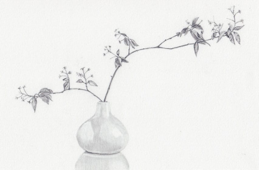
STEP SIX: THE DANCE BETWEEN DARK AND LIGHT
Once we have our lightest areas and darker areas in place, it’s time to soften the transitions between the two. With your 4H pencil and very delicate pressure, blend these areas together on the leaves. It doesn’t take much, but it’s a very important step. Always think in terms of directional form and the balance between dark and light as you see it in the reference image. Study the example before you begin.
Once the leaves and branches have been blended, continue to use the 4H pencil to lightly blend the areas where dark and light meet on the vase. Use fluid and light pencil strokes, varying between light hatching, cross-hatching, stippling, circular motions, and intuitive marks. Imagine your pencil is a fine cloth and you are polishing the smooth white porcelain of the vase, always taking care to leave the brightest white highlights as the pure white of the paper and to subtlety darken areas where there is shadow. Take your time here and closely observe the reference image throughout.
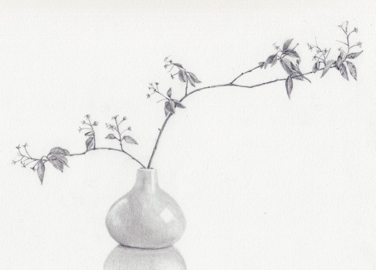
STEP SEVEN: THE WHITE FLOWERS
Before the final step of adding in the darkest details, we need to add the illusion of the white flowers. Illusion means that we don’t need to be exact. Use creative license to add the petals where they fit into your drawing, but be true to the forms of the petals and how they are situated on each stem. You don’t need to make a photographic copy, and it’s fine to leave off petals if the area feels congested. It’s never a bad idea to simplify the composition of the elements to make them better suited to a drawing.
White is rarely white, but when you’re working in a monochromatic medium such as graphite you need to be particularly careful to not go too dark. For this step, use your 4H pencil and a clean tortillon. The idea is to lightly create the outline of the flowers using broken lines and stippling with the graphite. Then, use the tortillon to blend it into form. Where the edges are lightest, use stippling, and where they are completely white, use a broken line. First, use the 4H to draw the outline of every flower and then go back and gently blend to mimic the forms and values that you see in each flower petal. This is also slow work, but meditative. Take your time as you work your way across every flower. You might also need to use an eraser to lift areas of branch or leaf where a white petal needs to be. Study the example to see how the flowers might look when finished. We each see things in our own unique way, and your flowers will be your own.
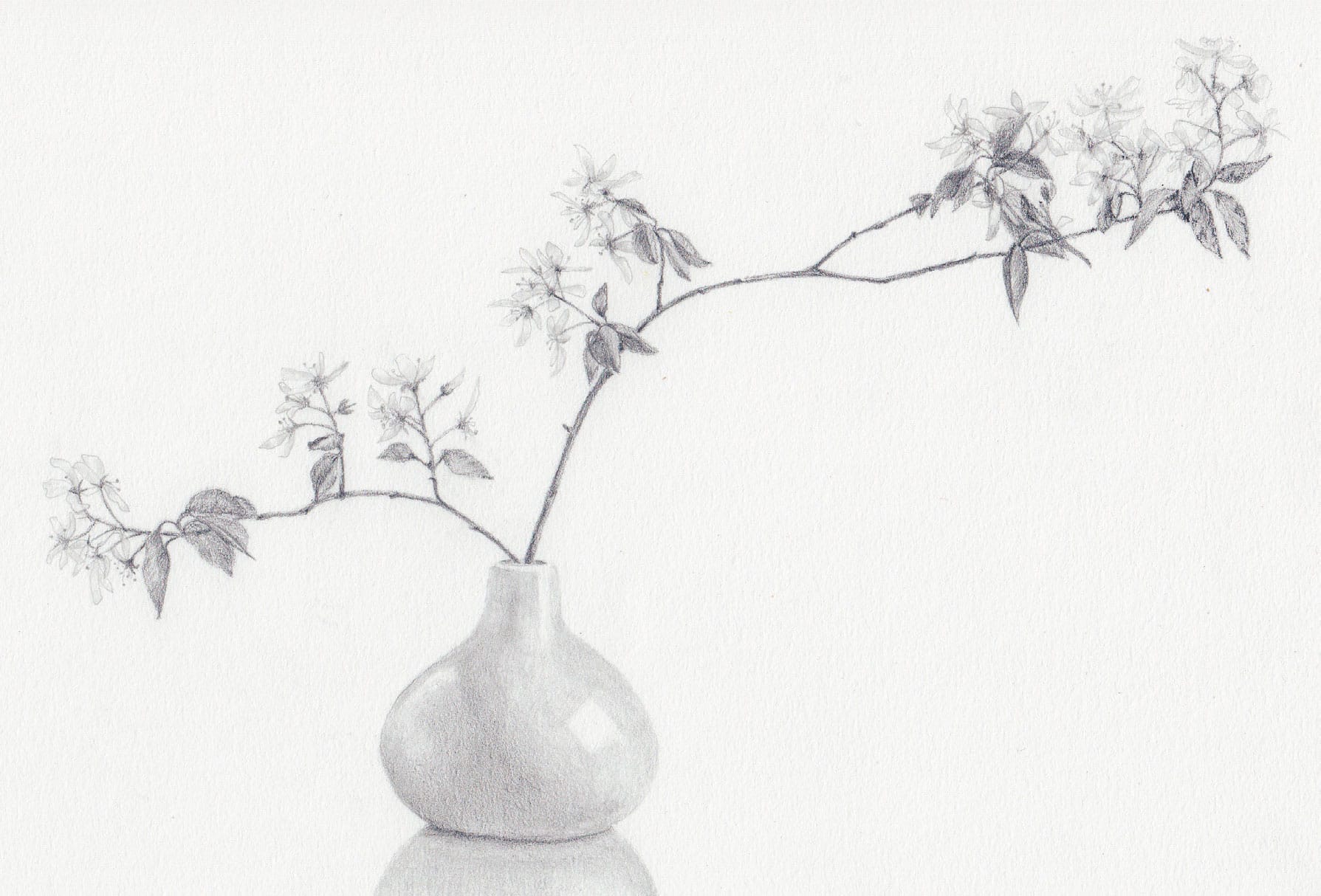
STEP EIGHT: THE FINAL DETAILS
The last step is about creating the areas of greatest contrast and making them really pop by using a very sharp 6B pencil and adding the tiny marks of darkest gray where we notice them on our reference image. These small, subtle marks will bring dimension to your drawing and truly bring it life. Squint your eyes when studying the reference image and notice where the darkest areas are. This is where we want to add small and intuitive markings, making sure to comb over the entire composition. Take a look at the finished drawing to see where I’ve made these marks.
THE FINISHED DRAWING
The more we draw, the better we see; and the better we see, the more honest, realistic, and poetic our drawings become. This drawing of the flowering branches is a testament to that. When we can accurately create the illusion of such tiny subjects, we’re truly using our eyes and hands together. Next, we’ll use the same reference image to see how to create a different kind of portrait of nature by using pen and ink and wash.
Still Life in Pen and Ink and Wash
For the final project, we’ll use a different approach to the same subject of a vase with flowering branches. By using pen and ink, we can create the finely detailed leaves and branches. By using ink wash, we can portray the vase as rounded, smooth, and a bit expressionistic. I love the juxtaposition of richly detailed renderings with the dreamier, loose washes of ink. Again, we’re working with fine detail on a very small subject, which challenges our rendering skills and delicate touch.
TOOLS AND MATERIALS
• HB drawing pencil for the initial line drawing
• Kneaded eraser
• Metal drawing nib and nib holder: I used a Manga G nib.
• Pointed round watercolor brushes, size 8 and size 2: If you have a size 0, it might be helpful.
• Chinese carbon-based drawing ink or other water-soluble ink: You can choose black or sepia, depending on your preference. I’ll use black Chinese ink.
• Shot glasses or jars or other type of glass wells for ink
• Two glasses of clean water
• Paper toweling
• 100% cotton, sized drawing paper such as Stonehenge White in 9 × 12 inch (23 × 30 cm) or sized, hot pressed watercolor paper, preferably 100% cotton, in 9 × 12 inch (23 × 30 cm): You can either tape it to a drawing board or work from a block. I used Stonehenge Aqua Hot Press in 140 lb (255 gsm).
STEP ONE: TRANSFERRING THE OUTLINE DRAWING
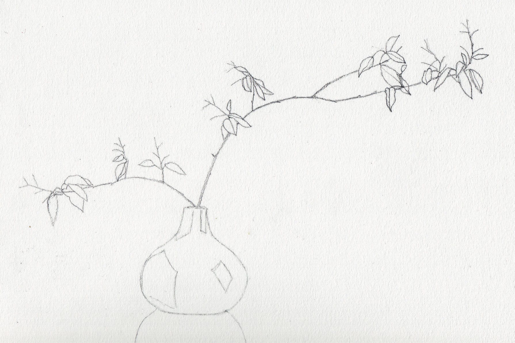
Because you’ve already done the work of creating the outline drawing for the previous project, simply use that original drawing to create a transfer to the hot-press watercolor paper or sized drawing paper. Notice in the sample drawing how the highlights on the vase are included this time. You can simply add these with light pencil markings to your finished transfer.
STEP TWO: THE VASE
Normally, I propose going over the entire subject step by step, but with this project, I suggest completing the vase in its entirety before moving on. The reason is that the vase is the trickiest part, and if we need to begin again, all is not lost. If I know that a certain component of a composition is going to be more difficult than others, I will often complete that area first so that I do not lose hours of work if I need to start over. We learn by our mistakes.
We’ll use a heavily diluted ink and the fine point of a watercolor brush for the vase. A number 8 pointed round brush that comes to a fine point is perfect. Make sure you clean your brush very well after using it for ink washes. To begin, make three dilutions of ink to water in small shot gasses or a small palette dish with individual wells: 1:8 parts ink to water (very, very pale!); 1:6 parts ink to water; and 1:4 parts ink to water. The ink washes for the vase are very pale, and yet the ink version will turn out a bit darker than the graphite version. Still, we’ll have the same illusion of a smooth, shiny ceramic surface. All brands of ink have different levels of darkness. If your dilution seems too dark, add more water.
Step A: With the pointed round brush and the 1:8 dilution of ink to water, carefully lay a light wash over the entire vase, avoiding all of the highlighted areas that are defined in the pencil drawing. See the example for how this should look when complete. Allow this layer to dry completely and then use a clean kneaded eraser to gently erase all the pencil lines except for the lines defining the cast shadow.
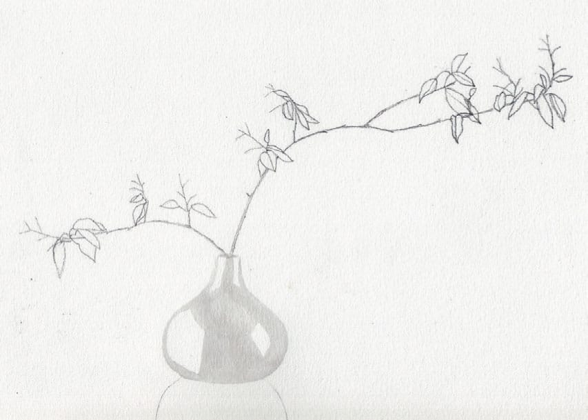
Step B: Next, we’ll add another wash over the entire vase, using the same 1:8 dilution, but this time avoiding only the two brightest highlights shown on the right side of the vase. Study the example to see how this should look. When the wash is complete, dip the tip of the brush into the 1:6 dilution and carefully drop just a touch of the diluted ink into the areas where you see shadow on the vase on the left side. Again, study the example to see where the 1:6 dilution was added. We’re slowly creating the illusion of roundness.
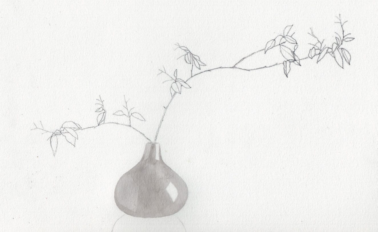
Step C: This is the final wash for the vase. We’ll also create the cast shadow underneath it. Begin with a glaze of clean water over the entire vase, excluding the brightest two highlights on the right. We’ll leave these as the white of the paper for maximum effect of shine, but will soften the edges at the very end of the project.
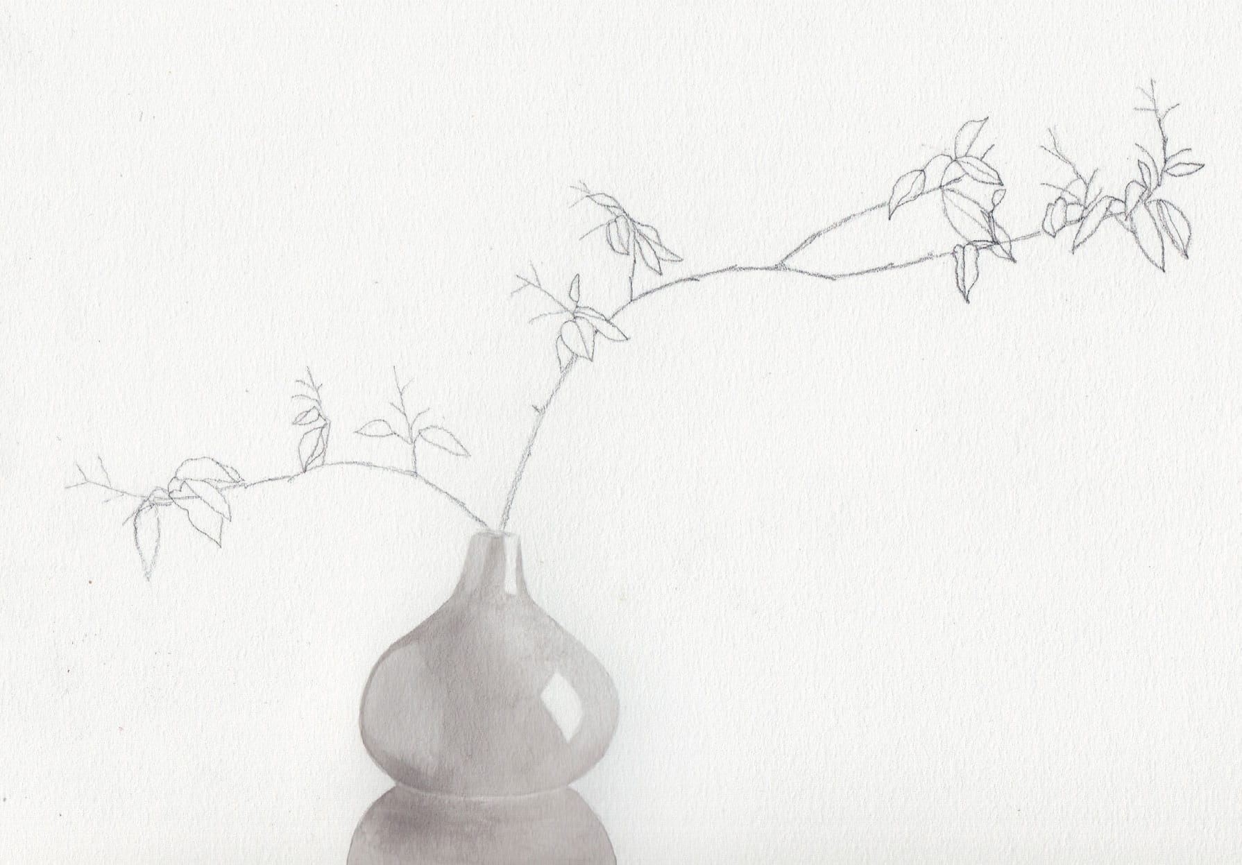
After the water glaze is in place, slightly tilt the paper so the ink works its way downward. Dip the brush into the 1:6 dilution and drop in very small amounts where you see the darkest areas of shadow. Let the ink pool at the bottom edge and then dry your brush and use it to wick up any extra wetness.
Next, dip the brush into the 1:4 dilution and draw a line along the bottom edge of the vase, being careful not to go over into the wet edge. Begin to pull the wash down and across the area of the cast shadow, allowing it to lightly fade as you move the wash away from the vase. Wick up any extra ink at the bottom with a damp brush and then lay the paper flat on the table again. Notice the area between the vase and the cast shadow in the reference. It’s a bit wider and darker toward the left side. Drop in a bit more of the 1:4 dilution to create this additional darkness. Then, clean and dry your brush and lightly run the tip along the area where the vase meets the cast shadow. This will soften the two areas together and create a thread of light where the two areas meet. Allow the ink to dry completely before moving on.
STEP THREE: THE FIRST LAYER OF INK AND BROKEN LINES
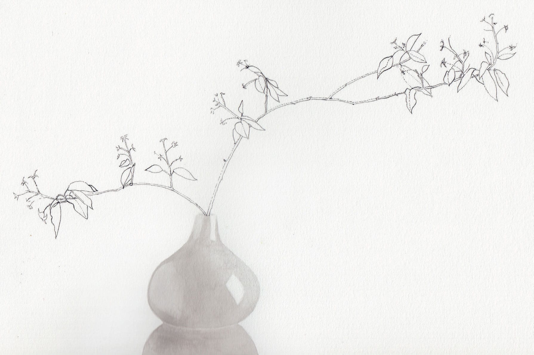
Once again, our goal is to have a layer, light in value, over the entire image. We are basically creating the same outline drawing, but in a light value of ink. Once this is complete and is totally dry, we’ll erase the pencil lines of the transfer drawing.
Use the extra light 1:8 ink dilution for the first layer. Keep in mind that different brands and types of ink have different strengths. Refer back to Creating Values in Pen and Ink. If your ink still seems quite dark at a 1:8 dilution, add more water until you achieve the correct value.
In making realistic drawings in pen and ink, be mindful not to create a hard or dark outline, especially when there are areas of the drawing with lost, or very light, edges. Do this by using the lighter value of ink and by using a very fine line, as well as broken lines and stippling. Refer back to the Pen and Ink chapter if necessary.
Look at the reference image and notice where the leaves and branches have lighter edges. When we draw these during the first layer, we’ll create this “light” by using broken lines, or even stippling, to avoid a strong outline. Look closely at the example shown to see how this might look. Make note of the thickness of the branches and stems. Use a more solid line on the darker edges and a broken line of stipples where lighter. We won’t be adding the white flowers until the very end, but do work in intuitive marks, lightly, where you see the darker sepals of the flowers.
Begin to ink the transfer drawing by starting on the left side of the image if you are right-handed or the right side if you are left-handed. This will help prevent accidental smudges while the ink is still wet. Pay close attention to your reference image or subject while inking over the pencil lines, using broken lines and stippling whenever you come to a place that requires it. When finished, allow the drawing to dry for at least an hour before using a clean kneaded eraser to gently remove all traces of the graphite transfer drawing.
STEP FOUR: FILLING IN THE FORMS
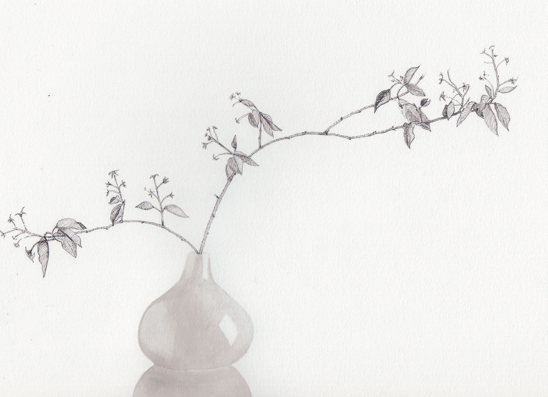
It’s time to fill in the forms using directional hatching and stippling to convert the contour of each shape. Our goal is to lay down these directional hatch marks, first in a light layer and then to cross-hatch with a darker value of ink. These steps will leave us with a drawing that shows the beginning of the illusion of roundness—always the goal when creating realistic drawings, no matter what medium we are working in.
For this step, create a 1:6 ink dilution in a shot glass or small jar and have another glass of clean water sitting next to it. You can also use the dipping method as discussed in Creating Values in Pen and Ink. You will also want some clean paper toweling to dab your nib on to remove excess ink. Paying close attention to the reference image, begin to fill in hatch marks in the direction of form with a 1:6 dilution of ink. One reason that I prefer the dipping method is because it gives me more random variations in value, which I find pleasing, and I can easily take the ink to a lighter value if necessary. If you prefer a more uniform value, use a pre-made dilution of 1:6.
We are working only on the leaves and branches. Pay special attention to the areas where the sample drawing has the darker cross-hatching. Don’t add in the darkest darks or fine details; simply fill in the contour of the outlined subject. The subject is delicate and small, so use a fine, delicate touch and work slowly across each leaf and section of branch, always remembering the direction of form. When these steps are complete, allow your drawing to dry completely before moving on.
STEP FIVE: ADDING DETAIL AND REFINING CONTRAST
Now begins the dance between dark and light and the fine application of textural marks. As with the graphite version of this subject, our subject is quite delicate and small; our marks will be, also. This can seem insignificant, but it’s what truly defines a realistic drawing with a sense of presence over a simple drawing made with hatching and basic contrast. We want to use our eyes to really see our subject and then to use our drawing tool as an extension of our eyes to intuitively make marks that create the illusion of what we see. This is nuanced work that gets better with every drawing you complete. The effort is worth it; you will learn to create drawings that are realistic, but also poetic.
For this step, have two dilutions prepared or use the dipping method: 1:6 dilution and 1:4 dilution. Carefully, study your reference image for areas that need more contrast or that require a bit of texture, still avoiding the white flowers and the vase. Use the 1:6 dilution for lighter areas that need texture or details and use the 1:4 dilution for areas of darkest contrast. As always, with such a small subject, use your most delicate touch with the pen and nib. See the example for an idea of how your drawing might look when this step is complete. Really get those darkest areas in place. This can be on the leaves or also on certain areas of the branches. Use stippling or other intuitive marks to create what your own eyes see. It’s all about the dark and the light.
STEP SIX: THE WHITE FLOWERS AND FINISHING THE VASE
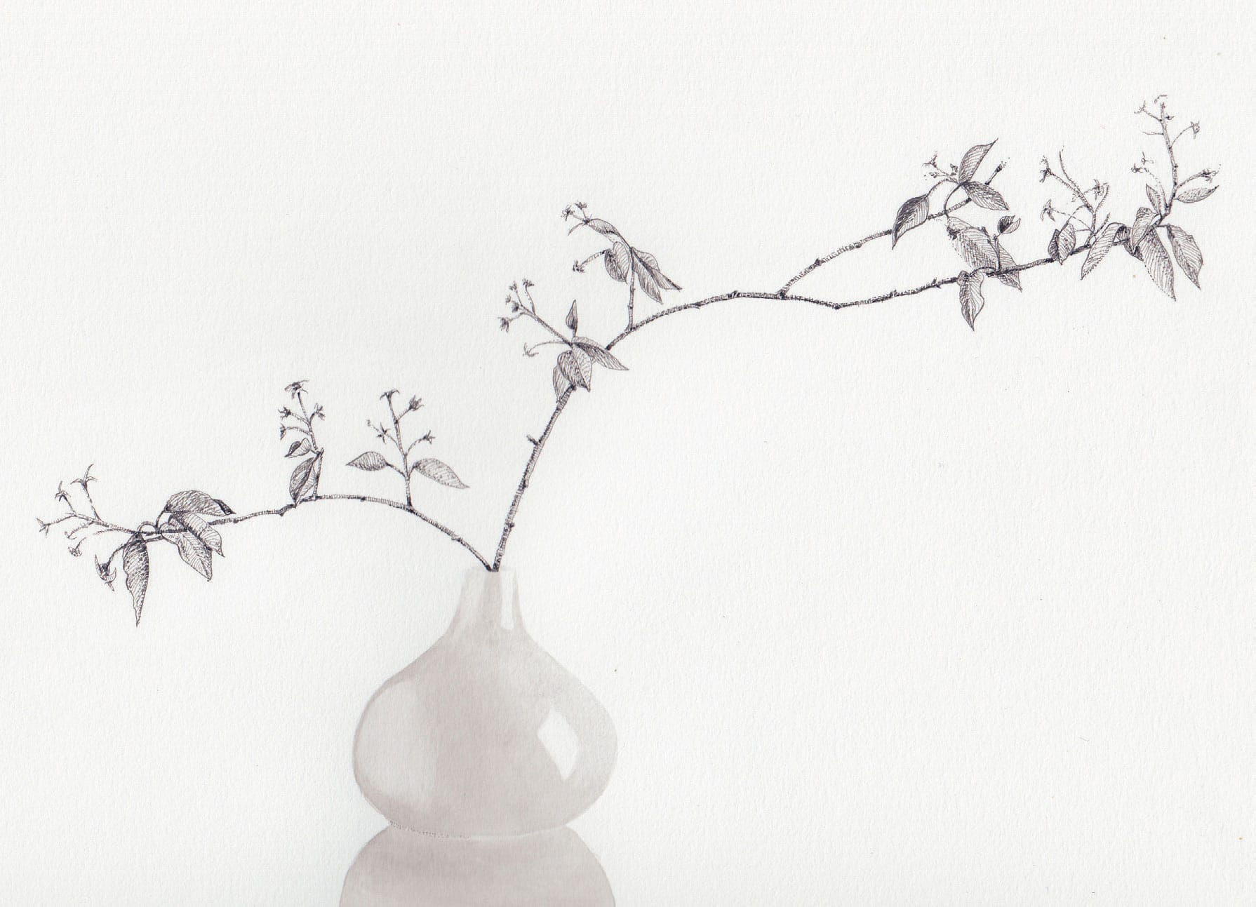
The final step for this project is adding the illusion of white flowers and adding contrast to the vase. For this, we will once again use a brush and a very diluted ink wash. The most important thing to remember is that you will be creating clusters of white flowers as seen in the reference, but that you will use your own artistic license about their placement. The main thing to notice is the shape of each petal and where it is dark and light. This step is done one petal at a time.
Make a 1:9 ink-to-water dilution and have a glass of clean water nearby. With the very pointed tip of a number 2 pointed round brush, create a water glaze in the shape of each petal, not too wet, just a smooth glaze of clear water in the shape of the petal as you see it. Good lighting really helps here. Once the glaze is down, dry your brush on a paper towel, dip the tip of it into your ink dilution, and then blot on the paper towel. Use the very tip of the brush to drop the ink into the petal where it’s darkest. If it is too dark once applied, wipe your brush clean and then blot up some of the ink to make it paler. Use your reference as a guide, but do not be afraid to improvise. If two petals touch one another, move to another area and paint that petal. You can go back to paint the petals that are touching when the first one is completely dry. Move around the entire drawing until all white flowers are complete. Then, use the pen and the diluted ink to add some details in the white flowers with tiny dots and lines, where you see the pistils and anthers. Study the sample drawing to see how this might look when finished.
For the vase, use the number 6 or 8 pointed round brush and the 1:6 ink-to-water dilution. Apply a light water glaze with clean water to the entire vase area. Dip the end of the brush into the ink dilution and then add a fine line of ink where you see the darkest area, where the vase meets the cast shadow. Right away, clean your brush and lightly dry it off and then soften the edges of the ink wash to let it blend into the cast shadow. Study the finished drawing to see how this should look.

THE FINISHED DRAWING
It’s truly beneficial to experience the difference of creating drawings of the same subject with two vastly different mediums. It encourages us to see our subjects in terms of texture and contrast and form and to learn how to make decisions about how different subjects can be portrayed simply by our choice of tools and materials. I hope you will try this exercise with several different subjects and with all four mediums we’ve used in our lessons together. It will reinforce what your eyes see, instead of what your brain knows, and give you experience with your entire tool box. This is key to creating realistic drawings that are personal, unique to you, and filled with presence.
