

The Bond Stock Earnings Yield Differential Model
In the Short View section of the Financial Times page 30 on Wednesday July 28, 2010, guest columnist Spenser Jakab casts doubt on the so called FED model saying that ‘its use and abuse have endured in spite of an utter lack of theoretical or empirical evidence.‘ Here is a response to this misconception.

I was a visiting professor at Tsukuba University and consultant to the Yamaichi Research Institute in 1988-89. In a study group at YRI, I discovered the BSEYD model, namely the 30-year T-bond yield minus the stock yield (which is the reciprocal of the trailing price earnings ratio). By April 1987, BESY=9.56-6.17=3.39 for the US S&P500 which enters the 'danger zone', then with a value above 3.0. By September 1987, BSEYD=9.66- 5.52=4.14. After the October 1987 crash, the measure was below 2.0 and the market rallied back. The danger zones and reentry points are computed from confidence limits on the distribution of the BSEYD.Our study of the Nikkei stock average from 1948-88 showed a gain of 221 times in yen and 550 times in US dollars. But, during this 40-year period, there were 20 declines or crashes of 10% or more. Twelve times, the BSEYD was in the danger zone and ALL twelve had these declines. The other eight declines were caused by other reasons than interest rates being too high relative to earnings, see Ziemba and Schwartz (1991). So not all crashes come from interest rate problems. Reinhart and Rogoff (2010) discuss other causes for economic crisis periods that sometimes include stock market crashes. Also see Evanoff, Kaufman and Malliaris (2012).
The BSEYD model in the difference form I use and the Fed model ratio version proposed later in 1996 are basically equivalent. The BSEYD did call the 2007–2009 subprime, credit confidence crash which occurred with low interest rates but was signaled at high interest rates relative to earnings on June 14, 2007. It also called the 2008 declines in China and Iceland which again were high interest rate relative to earnings declines. Despite the theory having a nominal quantity (the long bond rate) relative to a real quantity (the earnings to price ratio) theoretical flaw, the model does seem to predict crashes quite well when it applies. It predicted the 2000-2001 and 2002 crashes. By April 1999, the measure was 3.03 and in the danger zone with a 1335.18 S&P500 which later fell to 885.76 on October 31, 2002. There were actually two BSEYD crashes in this period with the second calling the –22% S&P500 fall in 2002. For details, see Chapter 21 which summarizes results from Ziemba (2003), Koivu, Pennanen and Ziemba (2005) and Lleo and Ziemba (2012).
The best use of the model is to call crashes. Ask George Soros whose high PE models like those of Bob Shiller, suggested shorts of the Japanese market in the fall of 1988. But only in January 1990 when the BSEYD was in the danger zone did it actually crash, and then it fell –56%! In a typical situation, the market goes into the danger zone but continues rallying and then crashes 10%+ from the initial danger signal. But is provides some help on recoveries and for buy and hold strategies. The decision rule: stay in the S&P500 unless the model enters the danger zone and be in cash yields double final wealth with lower standard deviation risk during 1975–2005 for the US, Japan, Germany, Canada and the UK, details are below bases on Berge, Consigli and Ziemba (2008).
Going to the present Bill Miller, the manager of the famed Value Trust Legg Mason Mutual Fund, may be right that the current US stock market is undervalued and indeed the BSEYD model is in the bullish mode but it has been there since 2006, well before, during and after the 2007–2009 crash. So I would tread carefully here as we are in a different economic environment. Miller got fame by beating the S&P500 for 15 straight years but got totally blasted in 2008 with more than 50% losses. Later, he was removed from this fund. Maybe later the BSEYD model will suggest future crashes. Mohammed El Erian of PIMCO had the good sense to leave the Harvard endowment before the poor 2008 returns came in — much from ill-advised swap trades put on by Larry Summers, the president of Harvard at the time. El Erian has championed the view that there is a new normal now with much lower returns to be expected compared to historical data. A lot of this historical data on asset classes is in the retirement and pensions book of Bertocchi, Schwartz and Ziemba (2010). I agree with the PIMCO view for most investors. The great ones will still be able to rack up high returns through clever strategies.
Regarding the new normal, Bill Gross, the head of PIMCO and the manager of their $248 billion total return fund, feels that the departure of fund managers such as Stanley Druckmiller of Duquesne Capital Markets, ran this fund since 1980, marks the end of the old normal; see McCormick (2010). In the new normal, instead of leverage and deregulation, the world is moving away from these approaches. Other hedge funds are closing shop or reducing fees. In the latter case is the $11.1 billion Citadel fund Kensington and Wellington which are which are considering cutting fees.
PIMCO has shifted focus from the authority on bonds to the your global investment authority in their advertising. They are now a $1.1 trillion subsidiary of the $1.7 trillion Munich Insurer Allianz SE. They have dropped their percent of government debt from 54% in July to 36% in August. Gross has said he feels that the 15 plus year bull market in bonds is over.
A sad note for non-believers of such models: After we completed the crash study group in the fall of 1989, I sent up to the YRI management, who had supported my research, one of my Japanese colleagues to indicate extreme danger in the Japanese market. Indeed, the BSEYD measure was the furthest into the danger zone since 1948. Too bad they would not listen, for five years later, Yamaichi Securities, then the sixth biggest brokerage firm in the world, went bankrupt. They lost a lot more than Soros, who shorted in the fall of 1988, nearly a full year before the BSEYD measure suggested that the market was in the danger zone and lost about $1 billion!. He takes many short term losses but wins more often as do most aggressive Kelly bettors such as Buffett and Keynes. They win long term, see MacLean, Thorp and Ziemba (2010).
Predictive Ability of the Bond-Stock Earnings Yield Difference Model
I end this chapter discussing the study of Berge, Consigli and Ziemba (2008) and Berge and Ziemba (2006) which show how the BSEYD model is useful for determining being in or out of markets. This is done using rules to be in or out of stocks and in cash for five countries: the US, UK, Japan, Germany and Canada for the period 1975–2005 and 1980–2005. The model recommends that the investor be in cash about 15-20% of the time and the result is that final wealth in 2005 is about double that of a buy and hold strategy with a higher Sharpe ratio and lower risk.
I begin with the idea that suggested the BSEYD model and that is in Table 2.1. The data is the Morgan Stanley Capital International Indices (MSCI) while Chapter 21 uses the S&P500. This reinforces the result that with different data or different time periods, the BSEYD model more of less has the same conclusions. In this table, we see that the BSEYD=10 year T bond yield - earnings/price ratio.
The danger zone was entered in May 1987 and the correction occurred in October, four months later. During June, July and August investors kept rebalancing their portfolios from the bond to the equity market (MSCI TRI + 13.87% over the quarter) then the equity market fell -31.80% in the following quarter (September to November 1987) with the main decline in October. In order to validate the approach, Berge and Ziemba (2006) used eight different strategies to test the predictive ability of the BSEYD or, equivalently, the BSYR, see Table 2.2. The strategies are defined over either 5 or 10 year time past data intervals, under normal or historical return distributions and different fractile levels for exiting and entering the equity market.
Table 2.1:Behavior of the BSEYD in the US around the Stock Market Correction in October 1987. Source Berge and Ziemba (2006)
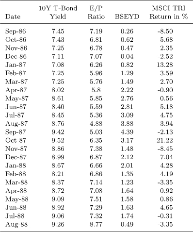
All data except for stock market return data are as of the end of the given months. The BSEYD is the difference between the 10-year bond yield and the E/P ratio.
Table 2.2:Strategies Used to Evaluate the Robustness (Predictive Ability) of (the) BSEYD-based strategies. Source Berge and Ziemba (2006)
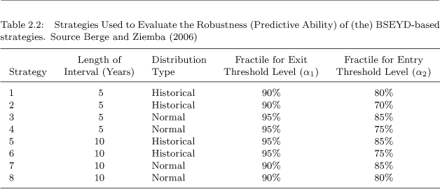
These 60 or 120 observations, respectively, including the value of the current month define the threshold levels for the end of that month. As time evolves, the most recent monthly value is added and the oldest monthly value is omitted. Moving intervals diminish the impact of changes in the regulatory framework of the economy on E/P ratios over time, since high past values of the BSEYD are eventually excluded. For the historical values of the BSEYD two different distributional concepts are used to define the predetermined exit and entry threshold levels, normality and historical. Assuming normality, the mean and standard deviation of the historical range of BSEYDs are

respectively, where d is the length of the interval considered. The exit threshold levels is

and the entry threshold level is

where zα1, and zα2 are the α1 and α2 fractiles of the standard normal probability distribution, respectively. The second concept calculates the α1 and a2 fractiles of the historical distribution. The α fractile of d observations is

where k = d · α and x(k) is the k-smallest value of the d observations starting at the end of month (t – d +1) and ending at the end of month t.
The strategies were evaluated during the 1979–2005 period in five equity markets: the US, Germany, Canada, UK and Japan. The total return indices were calculated with gross dividends (before taxes) reinvested to estimate the total return on the market that would be achieved by reinvesting one twelfth of the annual dividend reported at every month end. P/E ratios provided by MSCI refer to the companies in the respective MSCI TRI. They are the sum of the weighted latest share prices in local currency divided by the sum of the weighted most recent trailing twelve month earnings (losses) per share. Actual earnings are entered in the database as soon as they are reported at an adequately detailed level. The advantage of the MSCI indices over other indices is that even when the overall market experiences losses, P/E ratios, in this case negative, can be calculated. For cash equivalents the yield on 3 month T Bills is used. Data for 3 month T Bills are from Global Financial Data (GFD) and Thomson Financial Datastream.
Data on 10 year government bond yields come from various sources. The US, data were from the Fed. Yields are of constant maturity interpolated from the daily yield curves. Data for Germany were supplied by the Deutsche Börse AG and were calculated in a similar way as for US data. Data for the United Kingdom and Japan come from GFD. These yields refer to government bonds with a maturity closest to ten years. Data for Japan are available beginning in May 1980. Japanese T Bills data were not updated monthly until December 1981. Canadian government bond yields were obtained from the Bank of Canada.
For the first strategy, five years of monthly observations are used prior to 1979 to estimate the historical (or frequency) distribution of the 90% and 80% fractiles. Every month the data includes the realized monthly return and discards the oldest observation to keep the five year window constant. Every strategy has well defined equity market entry and exit values : once in, the strategy suggests 100% in equities, once out 0%, i.e., a 0-1 stock-bond strategy. Results for the five markets for the 35-period, 1970–2005. Every fractiles pair defines the market danger zone, which are used in the definition of the optimal investment strategies and portfolio rebalancing.
Tables 2.3 to 2.12 show for the five countries, the stock market corrections (declines of 10% plus) and their durations and the results of the strategies in terms of percent of time in the stock market, mean log return, standard deviation, Sharpe ratio, mean excess return and terminal value all the comparison with the actual stock markets total returns in 1975-2005 for strategies 1–4 and 1980–2005 for strategies 5–8.
The US had nine corrections and the terminal values, and Sharpe ratios show that the strategies added value. The main test is: are you better off or not being out of the stock market when the BSEYD measure suggest you should be? For example, $100 grew to $4650 in the stock market and from $8480 to $10,635 with strategies 1–4 for the period 1975-2005. In addition, the portfolio variance was less because about 15–20% of the time one is out of the stock market. The period 1980–2005 had similar positive results for the various strategies.
Japan had seven corrections including the 31-month 56.2% decline starting in January 1990. The results for Japan are good for the measure: 100 yen grows to 213.88 yen with the market index from 1985–2005 but to 455.72 yen to 498.62 yen with strategies 1–4. Strategies 5-8 also had good prediction results for 1990–2005.
The results for the other three countries were not as good in terms of final wealth levels from 1975–2005. However, all the strategies were superior to buy and hold in terms of the Sharpe ratios and in the final wealth levels during 1980–2005. For the UK, most of the strategies outperformed the buy and hold stock market returns but there were some underperforming strategies and the outperformance of the winning strategies was minimal.
The UK had 15 corrections mostly of short duration but the 17.9% decline of September 2000 lasted 13 months and the April 2002 decline of 31.6% lasted 10 months.
Canada had similar results to the US with five of its 12 corrections having declines of over 20% including a 41.2% decline in September 2000 over 13 months. Germany also had similar results with 13 corrections with the March 2000 decline being –44% over 19 months and April 2002 –53.9% over 12 months.
The basic conclusion is that the bond-stock model has had positive predictive ability worked in these five countries especially in the 1980–2 005 period with the results in the US and Japan the best: portfolio strategies based on the bond-stock relative valuation measure have produced superior returns relative to a buy and hold strategy.
Table 2.3: Although the duration of the correction starting in January 1977 is longer than one year, it is considered a correction since the stock market dropped 11% within ten months between January and October 1977. The same is true for the correction starting in April 2000 - the stock market dropped 23.9% within the following twelve months.
Table 2.3: Stock Market Corrections (10% plus) in the US, 1975–2005
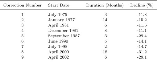
Table 2.4: The mean excess return is the average monthly excess return of the strategy over the stock market. Terminal values refer to the gross performance of $100 invested using the strategy signals.
Table 2.5: Although the duration of the correction starting in October 1978 is longer than one year, it is considered a correction since the stock market dropped 12.5% within nine months between October 1978 and June 1979. The same is true for the correction starting in March 2000 - the stock market dropped 20.7% within the following twelve months.
Table 2.6: The mean excess return is the average monthly excess return of the strategy over the stock market. Terminal values refer to the gross performance of 100 invested using the strategy signals.
Table 2.4:Evaluation of the Performance of the Strategies for the US

Table 2.5:Stock Market Corrections (10% plus) in Germany, 1975–2005
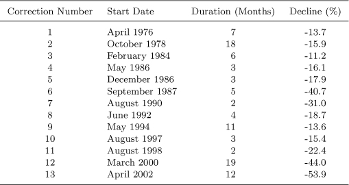
Table 2.6:Evaluation of the Overall Performance of the Strategies for Germany

Table 2.7: Although the duration of the correction starting in September 2000 is longer than one year, it is considered a correction since the stock market dropped 36.4% within twelve months between September 2000 and August 2001.
Table 2.7: Stock Market Corrections (10% plus) in Canada, 1975-2005

Table 2.8: Evaluation of the Overall Performance of the Strategies for Canada

Table 2.8: The mean excess return is the average monthly excess return of the strategy over the stock market. Terminal values refer to the gross performance of C$ 100 invested using the strategy signals.
Table 2.9: Although the duration of the correction starting in September 2000 is longer than one year, it is considered a correction since the stock market dropped 14.7% within twelve months between September 2000 and August 2001.
Table 2.10: The mean excess return is the average monthly excess return of the strategy over the stock market. Terminal values refer to the gross performance of £100 invested using the strategy signals.
Table 2.9:Stock Market Corrections (10% plus) in the UK, 1975–2005
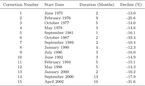
Table 2.10:Evaluation of the Overall Performance of the Strategies for the UK

Table 2.11:Stock Market Corrections (10% plus) in Japan, May 1985 to December 2005

Table 2.11: Although the duration of the correction starting in January 1990 is longer than one year, it is considered a correction since the stock market dropped 40% within twelve months between January and December 1990. The same is true for Corrections 4 (23.5% decline between June 1994 and May 1995), 6 (15.3% decline between August 1997 and July 1998) and 7 (20.1% decline between April 2000 and March 2001).
Table 2.12:Evaluation of the Overall Performance of the Strategies for Japan
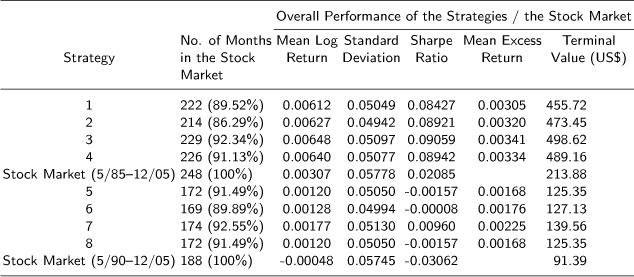
Table 2.12: The mean excess return is the average monthly excess return of the strategy over the stock market. Terminal values refer to the gross performance of ¥100 invested using the strategy signals.