One of BigQuery’s advantages is its ability to query into external datasets. We’ve mostly used this capability for federated queries to your data hosted in other Google Cloud Platform services or as a stepping stone to loading that data into your own warehouse. Google hosts several hundred public datasets through its Google BigQuery Public Datasets program.1 Google’s available data crosses a wide variety of disciplines and includes datasets like the National Oceanic and Atmospheric Administration’s daily weather records with some data going back as early as 1763. Other datasets cover cryptocurrency, politics, geology, and healthcare.
I’d also like to introduce Kaggle. Kaggle is a community of more than a million data science and machine learning practitioners, affectionately self-styled “Kagglers.” It got its start as a competition-based data science platform. Competitions are hosted on the Kaggle platform for prize money, in exchange for a license to use the model. Afterward, Kaggle frequently interviews the winning team for a deep dive into the technical workings of the model. Typical competitions are fierce, drawing thousands of entrants and producing high-quality results, sometimes from groups new to the space. Visiting Kaggle at kaggle.com and browsing around is a good way to get a flavor for this area. It can be a very different world from that of SQL-based business intelligence.
Google purchased Kaggle in 2017, and in June of 2019, the two organizations jointly announced a direct connection between the Kaggle platform and Google BigQuery. The two services have integrated for some time, but the latest version allows you to access BigQuery data directly using Kaggle Kernels.
Kaggle’s datasets range to the considerably more eclectic. A surprising number of datasets are dedicated to Pokemon. It’s possible that Pokemon have relevance to your field of study and that you might want to perform some exploratory data analysis on them. (I was able to determine with about three minutes of effort that things called “Mega Mewtwo X” and “Mega Heracross” have the highest attack stat. But I have no idea if this is good or bad nor what to do with the information. Score one point for the observation that you need to understand your data domain to analyze it in any useful way.2)
This chapter is about exploring the emergent possibilities of combining publicly available datasets together. The data in your data warehouse is a microcosm of behavior in the world at large, so the possibility of gaining insight from connecting to these other sources is both practical and alluring. I also believe it will be a skill expected for all data practitioners in the relatively near future.
The Edge of the Abyss
In the previous chapter and this one, we’re coming right up to the edge of our discipline in business intelligence. On the other side is bleeding-edge research into machine learning. If you find these topics interesting and want to learn more, there are other Apress books that cover these subjects in great detail. By all means, get a running start and leap over.
As we’ve seen, BigQuery ML provides a stepping stone of accessibility for you to take advantage of some of this power inside your own data warehouse. It hasn’t yet caught up to the latest state of the research.
The research to practice gap is a feedback loop too. New innovations are produced in raw form, requiring a lot of effort to understand and implement. After a time, companies figure out how to commoditize this research as a product and slap a marketing label on it. Then they collect learnings from the market at scale, which feeds back into the research process. By then, the research is months or years ahead again, and the cycle restarts. This feedback loop has been tightening—witness BQML—but it’s not instantaneous.
From here on out, you get to decide how far upstream you want to push. If your organization is solving problems that would benefit massively from these capabilities, look to graft an R&D arm onto your data program. (That could represent a commitment as small as you reading about these topics after work.) Having a state-of-the-art warehouse that can turn massive datasets into real-time insight already puts you miles ahead of most of your competitors. If you’ve solved that problem, what’s next?
Jupyter Notebooks
Jupyter Notebooks are a template for essentially a self-contained coding environment running in the cloud. There are several great implementations of them available in cloud platforms. Google supports them through its AI Platform and Google Colaboratory. You can also run them on Amazon Web Services SageMaker, Microsoft Azure Notebooks, and many others. I’m going to be using Kaggle Kernels for these examples, but you can use any notebook environment you prefer. Like its relatives, Kaggle Kernels are run inside isolated Docker containers that come pre-instrumented with a helpful suite of data analytics libraries preinstalled. Due to Kaggle’s direct integration with BigQuery, it’s low hassle to send data back and forth. It’s also free, so at hobby scale it’s a great choice.
The container for the default Kaggle Python kernel is open source, and you can download it and run it on your own machine if you like. The advantage of kernels, especially when you are getting started with data analysis in Python, is that you don’t have to do any work to get under way.
The downside is that kernels operate with resource limitations in order to remain free for your use. Kernels have limited CPU, RAM, and disk space, as well as a time limit. The defaults are generous enough for you to do any exploratory or low-scale work. At this time, kernels support Python and R; we’ll use Python because I promised we would.
Kaggle also provides some helpful syntax suggestions as you work. These can be helpful if your background is not in software engineering. It will remind you of differences between the deprecated Python 2.7 and the notebook’s Python 3 or if you accidentally write R code in your Python notebook or vice versa. Of course, you get the full stack trace too.
Aside from accessing your own data on BigQuery, Kaggle grants you a free rolling quota of 5 terabytes per 30 days to use on BigQuery public datasets. 5 TB sounds like a lot, but many of these datasets are multi-terabyte. A single SELECT * FROM could blow most of your allowance for the month. Even though you’re querying it from Kaggle, this is still the BigQuery you know and love—which means you already know better than to SELECT * FROM anything.
Setting Up Your Notebook
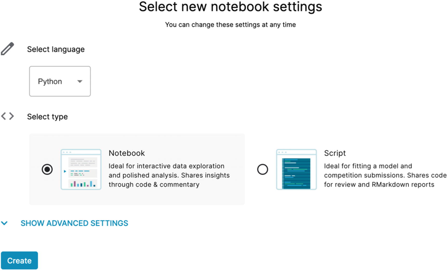
The Kaggle notebook setup screen
Open the advanced settings and select “Enable Google Cloud Services” to see the popup to integrate with BigQuery. This will allow you to sign in to your GCP account and link them. The window will also generate a code snippet—copy that out so you can paste it into the notebook.
You can integrate with BigQuery, Cloud Storage, and AutoML. We’re familiar with the first two, but AutoML is new to us. AutoML is Google’s offering to provide an even higher-level abstraction for machine learning models. The newest method of AutoML interaction is called AutoML Tables, which integrates natively with—you guessed it—BigQuery.
The Notebook Interface
When you get to the kernel window, you’ll see a console for entering code and Markdown. On the surface, it doesn’t look all that different from the BigQuery console. However, it has a lot of concepts designed for ease of use and quick integration. To be honest, SQL consoles could borrow some concepts from Jupyter notebooks and improve life for all of us. Once you start using notebooks, you may never go back to the BigQuery console for interactive sessions again. (No, you will, because SQL syntax highlighting.)
Cells
Cells are both a logical and execution unit for your notebooks. You can divide your notebooks into individual cells, each performing one logical step of your task. There are a few things that make them extra powerful and uniquely suited for this kind of work.
A cell can be code (Python/R) or Markdown. This allows you to freely intermix your analysis code with a formatted explanation of each step and the results. You can show your results quantitatively and then use Markdown to display them qualitatively. If you’re unfamiliar with Markdown, then you’re in for two treats today. It’s a simple formatting language and has become pretty widely used. The GitHub tutorial3 is pretty succinct. Additionally, Jupyter Markdown supports LaTeX equations so you can get your math formulas in there.
Furthermore, you can place the cells around in any order and run them independently or together. They all run inside the same container context, so you can perform individual analysis steps without having to rerun the whole notebook. This is also useful for BigQuery, where you may be running time- and data-intensive queries that you don’t want to pay to repeat.
You can hide and show cells as well, so if you want to focus on a particular step, you can hide your boilerplate code and dependency declarations so they aren’t distracting.
Cells also have a rudimentary source control. Each time you save the notebook, it creates a checkpoint of the current state that you can refer back to if you accidentally break your notebook. You can compare your code across versions, including by execution duration. It’s pretty easy to pinpoint where you tanked the performance of your notebook so you can recover it.
Keyboard Shortcuts
You can find the common keyboard shortcuts for Jupyter Notebooks, so I won’t list them out here, but you can use them to navigate between cells, run individual cells, and shuffle cells around. The keyboard shortcut “P” opens a modal with all of the commands and their shortcuts, so you can always look at that to figure things out.
Community
Kaggle allows you to share your notebook with other users on the platform. If you’re just getting started, you won’t have anything to share yet, but you can browse other Kagglers’ notebooks and read comments people have left on them.
Dark Mode
Look. I’m just going to put it out there. Android and iOS support dark mode system-wide; most of the daily productivity apps we use have rolled out dark mode in the last few years. Why not Google Cloud Platform? Google Colab and Google AI Platform also support dark mode, so maybe this is the business intelligence holy war we’ve all been waiting for. (Much lower stakes than SQL vs. NoSQL.)
Sharing
The most important way to present business intelligence and predictions to your organization is through easy, accessible sharing. Using a traditional method like Microsoft PowerPoint means more synthesis of data, copying, pasting, and generating graphs. The notebook concept makes it easier to publish results quickly without sacrificing clarity.
Most of my colleagues have many stories about a time when they found a huge risk or a major opportunity for the business, but they couldn’t communicate it effectively in a way to get anyone’s attention. Eventually they found the right mode—reporting, dashboards, or an in-person meeting—to convey the importance of what they’d found.
Data Analysis in Python
When your kernel starts, you will see a prebuilt script with some instructions. It also has a couple libraries referenced by default. If you’re not familiar with these libraries, a quick introduction.
numpy
NumPy, or Numerical Python, is a venerable library written for Python in the mid-2000s. It grants powerful array and matrix manipulation to Python, as well as linear algebra functions, random number generation, and numerical functions like Fourier transforms. Python does not natively have numerical computing capability, so NumPy had a role to play in making Python a first-class language for data scientists.
pandas
Pandas is a data analysis and manipulation library and is also a fundamental inclusion for any work in this field using Python. (It’s also built on NumPy, so they work well together.) Its primary data structure is known as a DataFrame, which is a tabular format. This makes it ideal for working with data from systems like BigQuery. In fact, the BigQuery SDK for Python has a function to load query results directly into a pandas DataFrame, as we’ll see shortly. Pandas also works natively with other formats we’ve seen before, like CSV, JSON, and Parquet.
Also useful is that pandas has support for many kinds of plots and graphs directly from dataframes. There are other libraries to do this, most notably Seaborn, which integrates quite well with pandas and NumPy. For the scope of this survey, we won’t be doing any advanced statistical plotting, so we’ll try to keep it simple.
Pandas has other concepts to support the management of multiple DataFrame objects. The concept of “merging” closely resembles that of the SQL INNER JOIN, and GroupBy, which has concepts from both SQL GROUP BY and the analytic PARTITION BY.
TensorFlow
TensorFlow is a mathematical library created by the Google Brain team4 to assist in deep learning problems. Over the last several years, it has grown to become the most well-known library for machine learning. As we discussed in the previous chapter, BigQuery also supports a TensorFlow reader so it’s available to you in BQML.
Keras
Keras is a Python library for neural network development. It is designed to offer higher-level abstractions for deep learning models and can use several other systems as back ends, including TensorFlow.
I won’t use TensorFlow or Keras in our sample data analysis, but I did want to call them out as the upstream versions of what is making its way into BigQuery ML. There are many, many other Python libraries of note in this area as well.
Other Libraries
Since the dependency wouldn’t be installed by default on the kernel, you’ll have to run this as a first step each time you’re using a new instance.
Setting Up BigQuery
As soon as you open the interface, you can click “Run All” immediately. Nothing will happen, but you can get a sense for a full run, and it will load your dependencies into the kernel so you don’t have to do it again later. When you’re inside a cell, you can click the blue play button to execute only the code in that cell.
Adding Data to the Kernel
Side note: We’re going to pull a dataset down from BigQuery, but you can also add data directly to your notebook for analysis. Clicking “Add Data” in the upper-right corner allows you to pull in Kaggle datasets just by clicking “Add” next to one. You can also drag and drop your own files into Kaggle. Like a regular data IDE, you can preview some types of data files, like CSVs, in the bottom pane.
Loading Data from BigQuery
When you set up your notebook, you connected it to your BigQuery project. All of the authentication and connection stuff will be handled automatically, so we can get right down to pulling some data. You can pull your own data from the warehouse just as easily, but for the purposes of this chapter, we’ll use a public dataset. This way the examples will work without any special preparation on your part. We’ll use one of my favorite sample datasets, the Iowa Liquor Retail Sales dataset. This dataset gives us every wholesale purchase of liquor in Iowa since January 1, 2012. It’s currently about 5 GB in size, so we’ll run an aggregate query to cut it down to remain inside the free limits for both Kaggle and BigQuery.
(This dataset is available directly from the state of Iowa’s government website, as well as on Kaggle, so you can obtain it in a variety of ways.)
Then in the third cell, let’s define and load the SQL query directly into a pandas dataframe. The query we’ll run here will tell us, by month, every liquor store in Iowa’s total sales in dollars and liters by item. This query uses about 2 GB, so remove some columns if you want to cut that down. Because of the aggregation, it also takes about 35 seconds to execute the query.
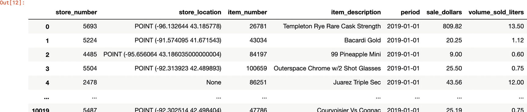
Sample results
You can also apply a narrower date range if you are only interested in the data in certain time periods. Again, this doesn’t lower the amount of data scanned, but it does lower the size of the dataset being loaded into the kernel. With the default parameters for the free Kaggle Kernel, this could be material. (You may also opt to spin up a kernel elsewhere now with more power.)
One issue I have with using the BigQuery SDK to load a dataframe is that there’s no progress bar. The pandas-gbq library, which also uses the SDK internally, gives you a running count of how quickly it’s processing rows and about how long it expects to take. In my testing, the 2018 data took approximately 2–3 minutes to load.

pandas-gbq download status
With the data in a dataframe, we can start doing some exploration. We’re not after anything in particular here, and as a well-known dataset, it has already been fairly well picked over for insight. In the real world, you might be answering a question from your sales or marketing department like “Why did sales for X fall off?” You’ll be looking to see if you can fit the data to clues in the dataset or by looking at other related datasets. Your dataset might benefit from analysis in a Jupyter Notebook environment because you could start to answer questions predictively, forecasting sales and applying machine learning models to understand the fluctuations of supply and demand.
Exploring a DataFrame
As I mentioned, it’s tempting to want to SELECT * or look at every row. Going back to the beginning, BigQuery is a columnar store—using LIMIT doesn’t help if you’re pulling in all the columns.
We’ve done fairly advanced analysis using SQL directly, and a lot of the fundamentals are the same between pandas and SQL, only differing in syntax and terminology. Try rewriting the SQL query to filter, but also try rewriting the pandas code to do the equivalent. You may have a preference after learning to work with both.
While we’re connected through BigQuery, if you want to go deeper, add this data from Kaggle to your notebook and use it there, or work on a local machine. The connectivity is to show how you can connect to your own data, not a fundamental part of the data exploration.
The docs for pandas are really good. Even better, they thought of us and provide some helpful translations from SQL into pandas.5
Finding Bearings
Some things you can do with a dataset you’re seeing for the first time are to plot some of the data and sample random rows to get a sense of its shape.
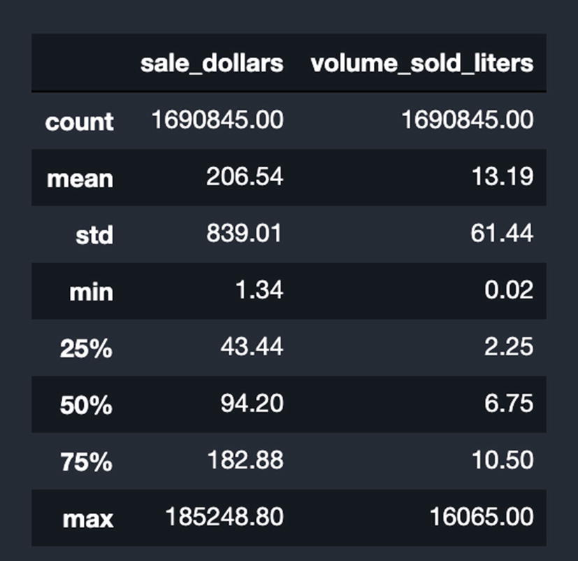
Results of using “describe” on the dataset
Now we can get a sense of the magnitude. The average wholesale order in 2019 was about 13 liters and cost about 207 USD.
Exploring Individual Values
This is equivalent to GROUP BY item description and returning the 15 largest rows in terms of liters sold. Number one on the list is a product called “Black Velvet,” also a Canadian whisky. Well, we’ve learned that Iowans like Canadian whisky and vodka. Data has become information.
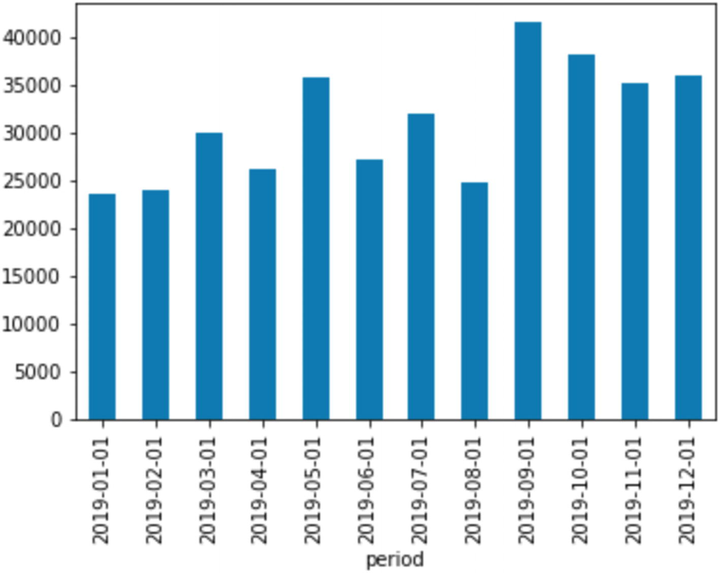
Crown Royal sales by month
That’s interesting. Sales spike once in May and again in September, remaining higher for the rest of the year. Note: These are sales to the retail stores, so it’s hard to see individual purchase patterns from here. Additionally, we quantized the data to the month level, so we can’t see if there are interesting spikes inside each month.
This might be a clue that we want to look at the daily trend for these products to see if we can learn anything at a higher level of granularity. Meanwhile, with this dataset, let’s include graphs of other item_descriptions to see if other popular items have the same trend.
Exploring Multiple Values
Resetting the index is an easy way to pop a groupby that was done over multiple index columns back into a non-nested tabular view. (You might have noticed that when you visualized the results of the groupby, it showed the values as nested inside each item.) This is pretty similar to structs and UNNEST in BigQuery. It was one of the distinguishing factors of this sort of analysis before BigQuery came along.
This statement says to check if item_description is in the nlargest array we just made. If so, group by the description and period and sum the rows for each.
Pivoting is incredibly common in data analysis, but not something that BigQuery can do natively. In order to get pivoting in SQL, you end up using a lot of analytic aggregates to flip the table axes. Here, it’s very simple to plot the results. We pivot the table so that instead of the item_description being the index, the period becomes the index.
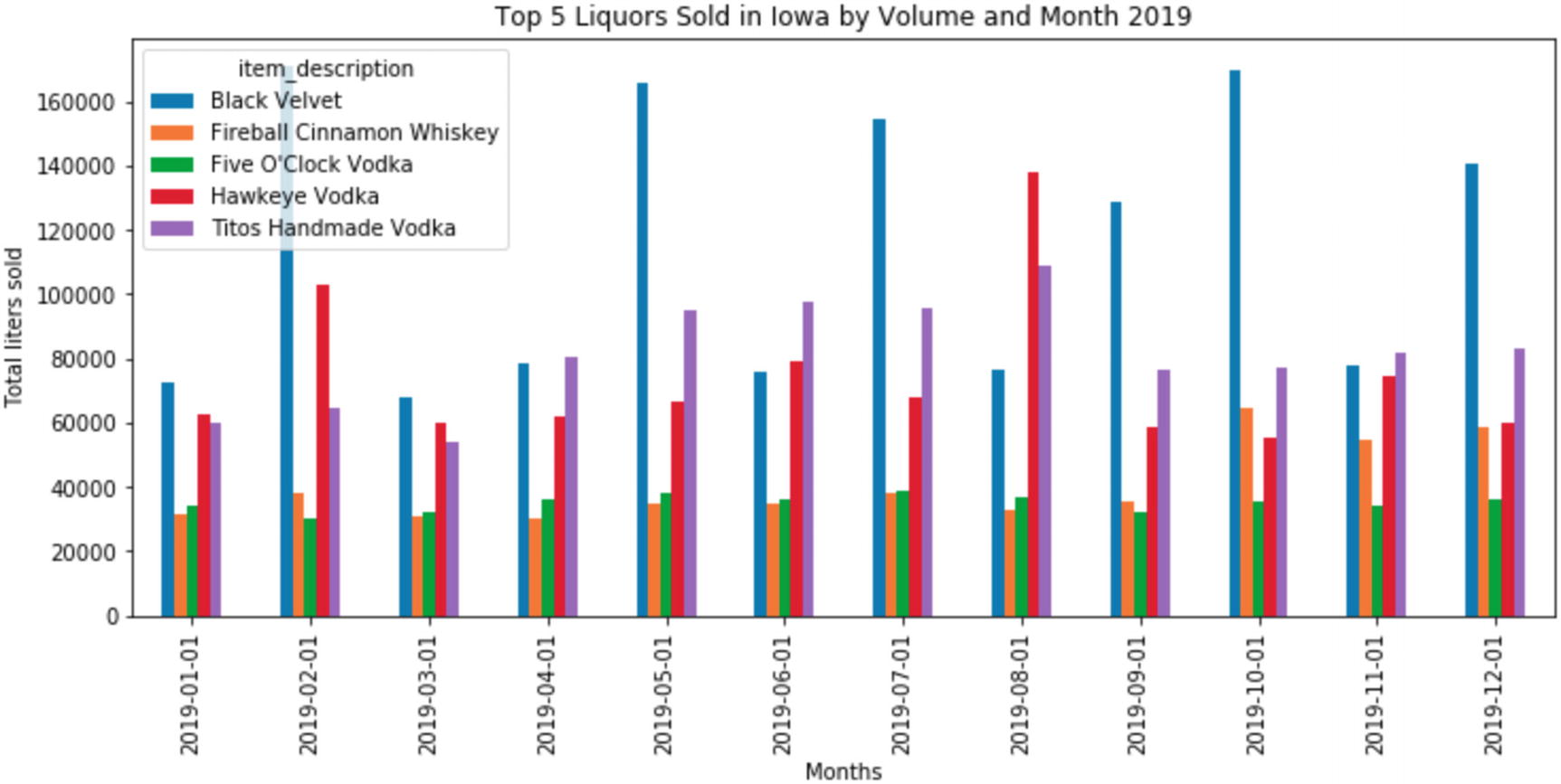
Top five by plot and liters sold
Next Steps
Find a dataset containing Iowa population data. (Hint: data.census.gov has downloadable data from the 2010 census.)
Learn about Zip Code Tabulation Areas, or ZCTAs, which represent geographical data for the census by zip code rollup. (Zip codes actually have no geographic boundaries, so in order to use them effectively, you have to do some data manipulation.)
Add the dataset you need to your kernel.
Create a DataFrame mapping ZCTAs to unique store_ids across all liquor stores.
Group the data by ZCTA and perform the same visualization.
In order to encourage you to use Kaggle a bit more, I uploaded this population dataset publicly to Kaggle.6 You can add it to your project and start playing around. In the following AutoML example, we’ll start to look at the county level too.
Using the styling features of pandas, which uses matplotlib, you can easily get images like these. Other libraries will take dataframes and produce publication-quality images. Since you’ve created this plot programmatically, you can easily change it until it looks like what you want. You can change the number of items you want to see, create new filters, or exclude certain items or format the strings. You could even replace the title string with a variable that automatically updates to your parameters, for example, (“Top 20 Liquors Sold in Iowa by Volume and Day, 2017–2018”). You could programmatically produce every static chart you wanted for whatever purpose you needed. If you ever wonder how the New York Times is able to produce such interactive and detailed data visualizations so quickly after the news breaks, here it is.
Now consider that you can share this with your stakeholders, including descriptive Markdown to annotate each step. This notebook is a living document that you can continue to use for ongoing analysis without losing your place, from anywhere in the world. Try doing that with BigQuery alone.
And because this data is coming straight from your live BigQuery instance, you can create things like monthly analyses that use your streaming business data as soon as it arrives. You can use Dataflows combining every source in your organization and beyond.
Jupyter Magics
This will automatically write the code to load the SQL query into a string, execute it, and load it into a DataFrame object named df, thereby saving you several cells.
Magics are a feature inherited from IPython, the wrapper around the Python interpreter that allows it to accept interactive statements. You can read about built-in magics at the IPython documentation site.7 Most of the libraries you’d use within Jupyter environments have their own magics.
AutoML Tables
AutoML Tables, currently in beta, is a Google product from the AutoML Platform. The AutoML Platform aims to make machine learning accessible to non-experts in a variety of areas. Its current areas include ML-aided vision and video processing, natural language, and Tables. The Tables product is designed to operate on structured data from files or BigQuery. Many of the things we discussed in the previous chapter such as feature engineering, data cleanup, and interpretability are handled directly for you by AutoML Tables. If you are finding that BQML doesn’t meet your needs or is taking a lot of your effort to extract and train your models, you might try the same exercise using AutoML Tables and see if it gets you closer to your goal with less effort.
A disclaimer before we begin: AutoML is expensive. This sort of computational work pushes machines to the limit. AutoML Tables training, at this writing, costs $19.32 per hour, using 92 n1-standard-4 machines in parallel. Batch prediction on AutoML Tables is $1.16 per hour, using 5.5 machines of equivalent class.8
AutoML Tables currently offers a free trial of 6 node hours each for training and batch prediction. Those hours expire after a year. The basic example here is probably not worth the activation of your trial unless you have no other plans to use AutoML Tables.
AutoML Tables, similarly to BQML, supports two basic kinds of models: regression and classification. Regression models attempt to use existing data to predict the value of a data point based on its other variables. We’ll be using that model in the example.
The other type, classification, takes input and attempts to sort it into buckets based on what type it probably is. This is the type of model that automatic object classification uses. Given an image, a classification model would attempt to classify it according to the types you’ve provided, for example, things that are hot dogs and things that are not hot dogs.
Importing a Dataset
The first thing you have to do is have AutoML Tables import your dataset, after which you can specify the parameters and begin training. Just for fun, we’ll use the notebook to facilitate the connection between BigQuery and AutoML Tables. There’s no special reason we need the notebook here; you can do this entirely from the AutoML Tables console. However, if you are experimenting and want to test various ML methodologies against each other, for example, BQML, AutoML Tables, and TensorFlow, you could do them all from within the same notebook, sourced initially from the same BigQuery dataset.
Before you start, make sure you go to the AutoML Tables console9 and enable the API, or the notebook script will tell you that the project doesn’t exist. After you execute the script, you will see Auto ML Tables loading in your dataset. The data import process can take up to an hour. When I uploaded the full 5 GB Iowa dataset, it took about ten minutes.
The last command initiates the transfer. Since you’re transferring directly from BigQuery to AutoML, the data doesn’t need to come down into your notebook—you just coordinated the transfer from one part of Google Cloud Platform to another.
Configuring the Training
For a prediction to be useful, we have to know what we’re trying to get out of it. For the regression modeling we’ll be using, we will use some fields in the table to predict the value of a target column.
Let’s try to predict the total volume in liters sold by county in 2019. We already have the answer to this, but the model won’t. The easiest way to test a model like this is in three parts—training, testing, and unseen data. AutoML Tables splits the data you give it into training and testing. While training the model, the process will hide the testing data and then use it to see how well training is going.
Once the model has assessed itself, you can try to predict data it has never seen before, but which you know the answer to. If that does well too, then the quality of the prediction model is good.
We’ll give it all the data from the beginning of the dataset up to the end of 2018. Knowing what we want to target, let’s write another query to clean things up. Date aggregation is good, but let’s go down to the week level. We’ll obviously need the county number too. We won’t need any of the store-level data, though, since we’ll aggregate across the county.
You can run this query from the kernel or from BigQuery itself. It generates about 1.2 million rows and takes roughly 8 seconds.
If you want to test with this more focused query, you can go back up to the previous code sample and replace the public dataset URI with your own.
Make sure you set the training budget! The property for this is train_budget_milli_node_hours, which specifies the number of millihours10/node you want training to last. For an example run, I wouldn’t exceed 2000 millihours/node (2 hours) even if it degrades the model results. Your total free trial, measured in millihours/node, is 6000 (6 hours). Note that if AutoML finds the best solution before time runs out, it will stop and you won’t be charged for the remainder.
In addition to the actual training time, AutoML has to build out the infrastructure cluster before it can begin training. This takes some time on its own, so the actual time before your model is complete will be more than the budget you specified.
This code sample will actually start the model. At this point, since you’ve seen it running entirely from the notebook, you can also go to the AutoML Tables console and configure it interactively. The UI offers a lot of helpful hints, and you can look at options we haven’t configured here. The console also offers some interesting dataset statistics.
Training the Model
Regardless of whether you ran the notebook or clicked “Start Training” in the UI, AutoML will now go and build out your 92 compute nodes and initiate training. This process will take several hours, based primarily on what you specified in your training budget. Once the training has finished, an email will arrive to let you know.
After the training finishes, we’re going to jump into the AutoML Tables console to look at the results. If you like, you can spin down any Jupyter kernels you created now; we’re done with them for this last part. You could also continue writing cells to pull the analysis back into a DataFrame.
Evaluating the Model
The model is scored on a number of factors to indicate the relative quality of the model. This should give you some idea of the quality of the model’s predictions. It’s also good to look at this in the console because it has helpful tooltips telling you what each of the scores means.
This is also where you get a sense of how well you prepared the dataset. If the model is not very accurate, you can often improve it by tweaking the granularity, outliers, or columns you provided. When working on your own data, you can use your knowledge of your business domain to help target the right information.
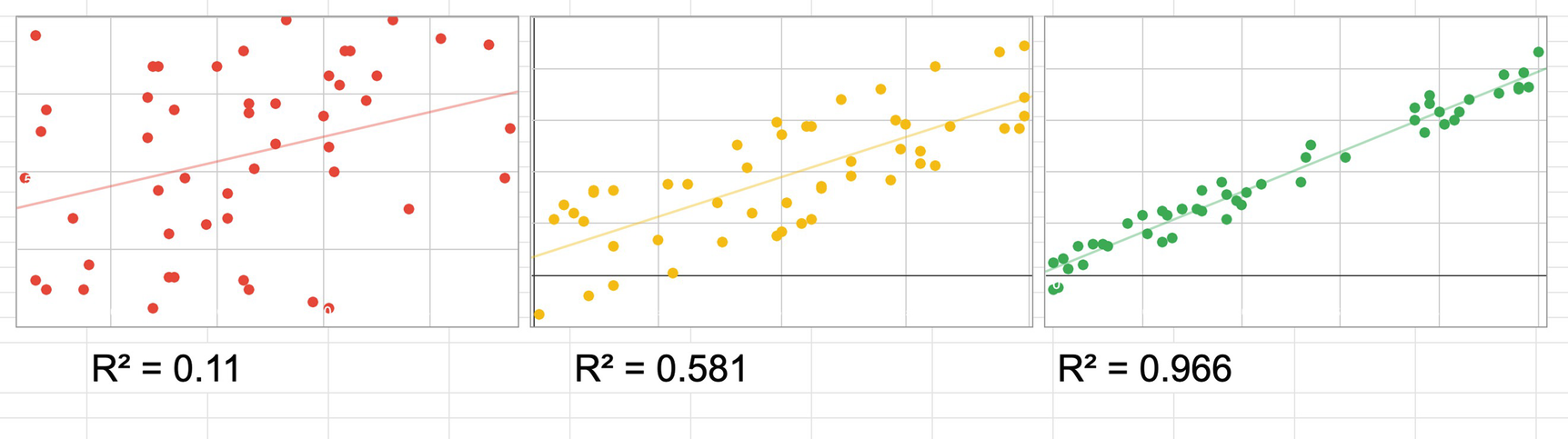
Plots of low R^2 vs. high R^2
This is a gross oversimplification, and there are reasons why you might expect a lower score and situations where a high score means a false signal. No data analyst would let me get away without repeating the fundamental axiom: correlation is not causation. Even if you forgot your linear algebra, you probably remember that. A well-known collector of useless correlations is Tyler Vigen,11 who among other things notes that the per-capita consumption of cheese in the United States correlates nearly directly with the total revenue generated by golf courses, year over year. Eating cheese does not increase revenue for golf courses. However, you could make a reasonable guess that both of these factors are driven by the size of the US economy, and thus all economic measures are likely to follow a similar pattern.
All of that disclaimer to say that our training model generated an R^2 of 0.954. This looks pretty good, but think about why that might be. The model knows the total sales in dollars—it’s a pretty good bet that the ratio of money to volume is going to stay pretty stable over time. It’s possible that the only signal we picked up here is that inflation remained in the same range in 2019 as it had in the previous years. This would be known as “target leakage”—the data includes features that the training data couldn’t have known about at the time, but which were applied later.
For example, if we had included the volume sold in gallons in our test data, the model would have learned that it can predict the volume sold in liters, because it is always about 0.264 times the gallons column. That doesn’t tell us anything except the conversion factor between gallons and liters, which we already knew. On real data, we’re not going to know the volume in gallons. If we did, we wouldn’t need a machine learning model—only a calculator. So if the model performs perfectly, something is probably wrong.
Even if that’s the case, it doesn’t mean our model is useless. We now have lots of hypotheses to test around the relationship between the economy and liquor consumption in Iowa. This also means we can look for examples that are not well predicted by this and use them to zero in on a better model that could help us forecast anomalies. As we add other likely variables to the model, we might learn that one of them has a significant effect on the model.
Making Predictions
In order to actually use a model you’ve created, you must first deploy it. AutoML Tables provides 6 free trial hours of batch prediction. The predictions described here run in a few minutes each.
The last panel on the AutoML Tables console sets up the batch prediction. Using batch prediction on the model, we can feed in a BigQuery table with all of the other variables, and it will generate its results. Since we have the 2019 data, we can do a direct comparison between the predicted and actual values.
The query to generate the input batch table is the same as the preceding one, with two changes. First, don’t use the target column. Second, change the date range to be between DATE(2019, 1, 1) and DATE(2019, 12, 31).
Select Data from BigQuery for the input dataset and give it your 2019 table. Then set the result to your BigQuery project and project ID, and click “Send Batch Prediction.” Within a few minutes, you’ll have a results directory, which will be a BigQuery dataset with two tables in it.
If all went well, most of the rows will be in the predictions table, and few will be in the errors row. If you did something wrong, the rows in the errors row will tell you what the problems were. When I got the input dataset form correct, my errors table was empty, so all of the rows should process.
Now, you can go to the dataset and compare the actual 2019 values against the prediction values. You can use all of the other things we did in this chapter to analyze the quality of the model and look for variances. You can plot this data by county or across other variables, or you can rejoin the original dataset to get the metadata like the names of the counties or more granular data about top sellers. Basically I am saying you could get lost in this data for a very long time.
Bonus Analysis
It can be pretty difficult to get out of the rabbit hole. I started to wonder which rows had predicted the results exactly, or at least down to a margin of about 2 teaspoons. This is called “data fishing” and it is a bad practice in statistics. XKCD,12 a well-known web comic, illustrated the practice and its implications for bad science. Nonetheless, I was curious what factors might lead to a successful prediction, and as you might have noticed, this is far from a rigorous scientific analysis. I didn’t find anything obvious.
I found 236 rows (out of nearly 200,000, mind you) where the model had predicted the volume within 0.01 liters of accuracy. They crossed date ranges, counties, and categories, which means this is likely complete noise; even a broken clock is right twice a day.
I then checked, based on popularity of category and thus likely amount of training data, how accurate the model had been across categories. There was no substantial correlation between popularity of category and accuracy of prediction, in either direction. While the model didn’t bias to popularity, it does mean that some popular categories were way off, and some niche categories did fairly well.
I ended my fishing expedition by looking at the best category/period prediction, for which one county’s Tennessee whiskey sales appeared to have been predicted accurately across all of 2019. The reason? The county is tiny and the categorization had changed. There was only one sale in the category that year. Noise!
We could spend days or weeks refining the data inputs, retraining models, and seeking better predictions. And on the surface, this is a public dataset of limited interest to most people. What are you thinking about doing with your own data?
The Data ➤ Insight Funnel

A funnel shape showing how raw data, information, and insight interact
The term “data mining” really earns the analogy here. Tons of raw ore must be mined to find veins from which a tiny amount of precious metal can be extracted. So it is with data. You now have tools which can take you all the way from one end to the other.
Summary
Jupyter Notebooks are an open source application for doing data analysis, statistics, and machine learning. There are many implementations available in various clouds. Through one of these offerings, you can access a Jupyter notebook environment from which you can access BigQuery. Using Python, you can access all of the latest numerical computing, statistical modeling, and machine learning and apply them to your datasets in BigQuery. By doing this, you can go the final distance in your journey to extract valuable insight from your organization’s data. Taking actions on high-quality insight can transform your data program, your organization, and the world around you.