
PORTLAND TIMBERS
THE LUMBERJACKS FROM OREGON
Portland Timbers knows the value of a brand with a local connection: during its more than 40-year history, the franchise has never tried to disguise its origins. And why should it? The timber industry was a massive force in the town’s economy during the 19th century, and continued as such well into the last decades of the 20th century.
This was, of course, a symbol which the original club exploited when it was founded in 1975. The name of the club was chosen on 8 March the same year, from more than 3,000 suggestions sent in by the public, and with this choice the club’s identity was determined. Portland’s proud lumberjacks would now represent the town even on the football pitch, and initially this worked out well. The fight for the title that same year, in front of 20,000 wildly cheering home fans, gave rise to the town’s nickname, Soccer City USA – a name and an identity that have followed the club through various franchises, fresh starts and divisions since then. Today, the club’s most visible inheritance is the mascot, Timber Joey (known as Timber Jim up to 2008).
Every time Portland score a goal, Timber Joey saws through a tree trunk with his chainsaw. This has become an internet phenomenon in football circles and, of course, references Portland’s origins and identity.
CLUB: Portland Timbers
NICKNAME: The Timbers
FOUNDED: 2009
STADIUM: Providence Park, Portland (21,144 capacity)
HISTORIC PLAYERS: Clive Charles, John Bain, Jimmy Conway, Mikael Silvestre, Mick Hoban, Darlington Nagbe and Jack Jewsbury
1975–1982. During the years in the North American Soccer League (NASL), various different club crests were used, all with the same basic message. The circle symbolises togetherness and the search for perfection; the diagonals represent the trees in and around Portland; and the axe, the emblem’s main element, references the timber business that was invaluable for the town’s development.

2001–2004 and 2005–2010. When the Timbers figured in the American second division in the early 2000s, an updated crest was unveiled with a new shape and different colours. The three-pointed crest was neither popular nor long-lasting. The later crest, which reverted to the club’s origins, was welcomed by the fans. Both marked a fresh start in Oregon’s football heartland.

2011–2014. Before Portland Timbers’ first season in Major League Soccer (MLS) in 2011, a new, modernised version of the earlier emblem was introduced. The updates irritated a great number of Timbers fans. Superficially there are no great differences, but the axe, indeed the whole emblem has a more comic-book-style look than before. In addition ‘Portland’ has become much larger than ‘Timbers’, a change that again irked supporters, although this was a common device by clubs to show their attachment to their region. The fact that the axe extends beyond the borders of the circle suggests the club’s strength, precision and attention to detail.
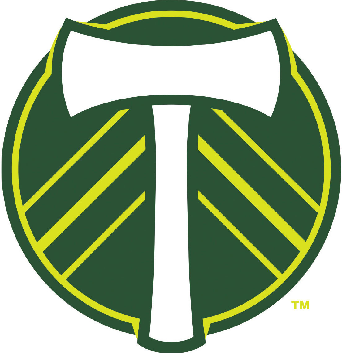
2015–present. In the same year that the club won the MLS Cup, the emblem was changed. After representations from the fans, the time had come for an update. With this, the name disappeared. The design of the axe had already been somewhat toned down, and the fact that the axe is shaped like a T is, of course, no coincidence. The three lines on either side still represent the trees of the area, but also refer to the club’s three epochs: NASL (‘where we have our roots’), USL (the United Soccer League, ‘where we started to flourish’) and MLS. The club’s colours – moss green and ponderosa pine – represent Oregon’s forests.