LEEDS UNITED
RICH TRADITIONS – EVOLVING CREST
In 1919, Leeds United were formed from the ashes of the disbanded club Leeds City. They enjoyed their most successful period in the early 1970s, when they became one of the strongest clubs in England. Under Don Revie they were promoted back to the First Division in 1964 and within the next 10 years had won two league titles, an FA Cup and two Fairs Cups (predecessor of the UEFA cup and the current Europa League). Revie was also responsible for changing the team’s colours from blue and yellow to all white (à la Real Madrid) and introducing a new crest.
Over the years, the team sheet has been graced by such iconic names as Billy Bremner, Jack Charlton and Eric Cantona and as late as 2001 the club played in a Champions League semi-final. In 1992, the year before the advent of the Premier League, they added a third League title with Howard Wilkinson in charge. He remains the last English manager to win the top division in England. Today, the reality is rather different. The Yorkshire club has been leading a life of footballing anonymity in the second tier of English football, and as recently as 2010 found themselves in the lowly League One.
There are several reasons for this calamitous decline, but the man who is probably the most culpable is Peter Ridsdale. As chairman, he left the club with debts in excess of £100 million. Ridsdale is as unpopular as Massimo Cellino, who became the target of the fans’ anger during his tempestuous spell in charge. The turbulence that has marked Leeds’ recent history has been reflected in the story of the club emblem, which has undergone a number of radical changes. In early 2018, the club’s propensity to shoot themselves in the foot was perfectly illustrated by the unveiling of a new badge, which lasted less than a week; the club was swamped by protests.
CLUB: Leeds United FC
NICKNAMES: The Whites, United and The Peacocks
FOUNDED: 1919
STADIUM: Elland Road, Leeds (37,890 capacity)
HISTORIC PLAYERS: Jack Charlton, Billy Bremner, Peter Lorimer, Lee Chapman, David Batty, Eric Cantona, Tony Yeboah and Harry Kewell
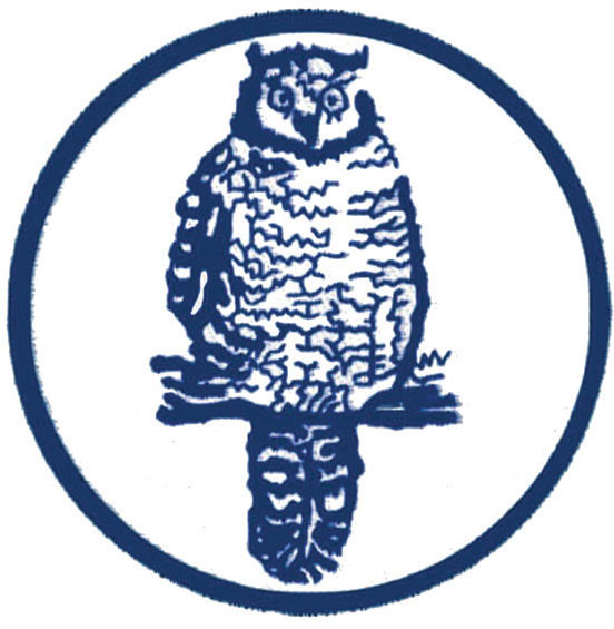
1965–1972. An owl in blue and white looks more like something that should be worn by Sheffield Wednesday (the Owls), but this is, in fact, the first emblem to adorn Leeds’ match shirts after decades when the town crest had served as the club symbol. The city crest features three owls, hence the club logo. Manager Don Revie believed that birds mean bad luck, so in 1972 the design of the emblem was changed to display only the club’s initials.
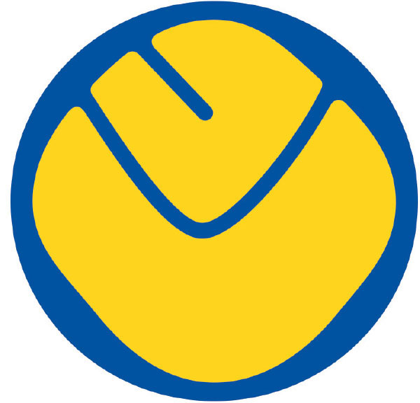
1973–1981. This image, generally referred to as ‘smiley’, became widely popular, not least because it coincided with the club’s golden age. After three years, the colours were inverted and then, at the end of the 1970s, it was expanded with the addition of a ring around ‘smiley’. This logo is a strong seller to this day as one of the club’s retro products.

1981–1984. When Umbro took over as kit supplier in 1981, the emblem was changed. The inspiration for the central motif here is the club nickname the Peacocks, which itself derives from the original name of Elland Road: the Old Peacock Ground.

1984–1998. This fusion of the white rose of York and a football was popular with fans. This was partly because of the symbolic regional association of the rose, which stood for the House of York during the Wars of the Roses in the 15th century, and partly because Leeds won its last league title wearing this emblem.
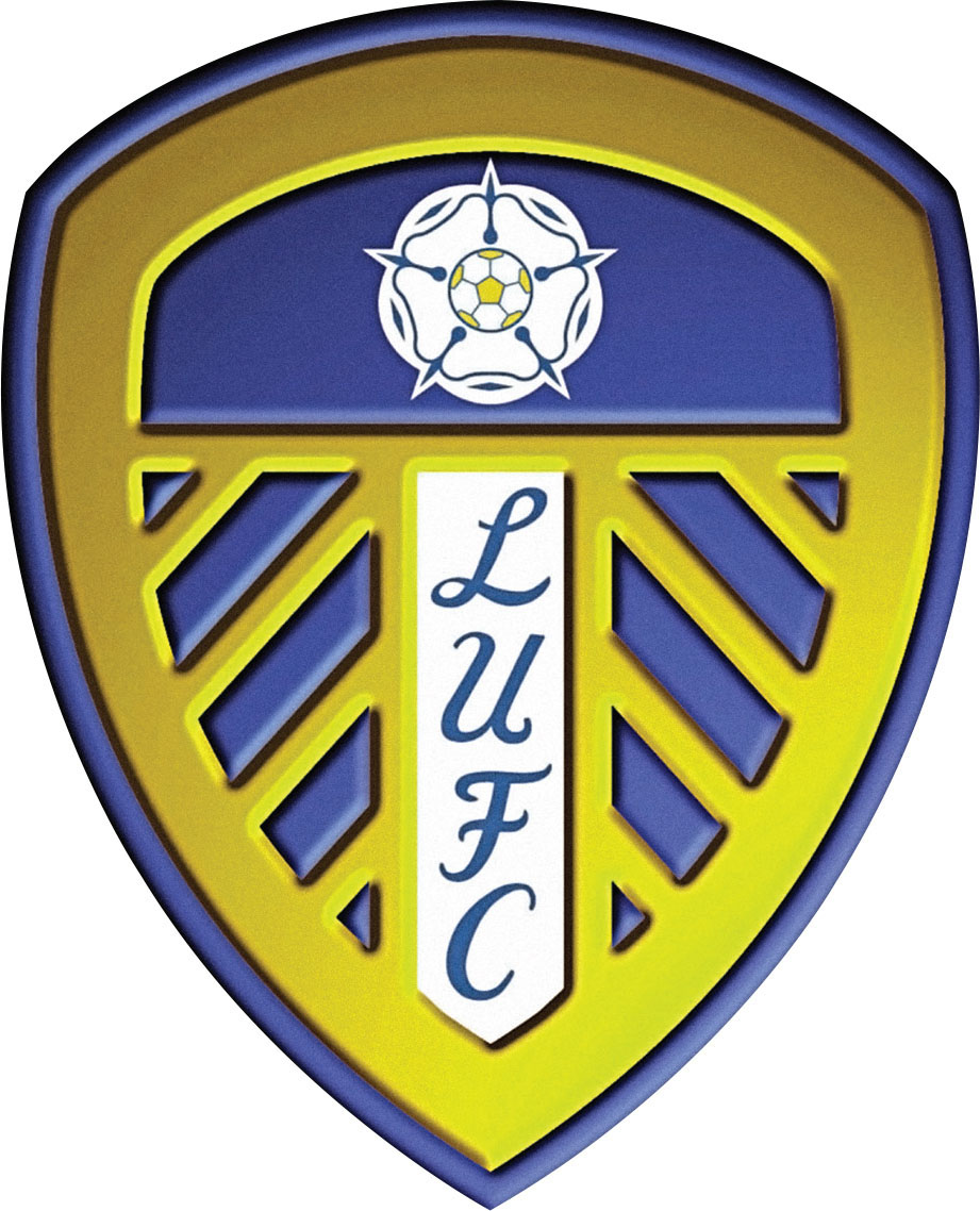
1998–present. At the end of the 1990s, Leeds produced a new, more modern emblem. It was, however, criticised, and was seen by the fans as lacking in any sense of history. The next year, in order to win over the angry fans, the club made space for the earlier emblem in the top centre. The club’s initials are written in the same style used for the emblem that adorned the shirts in the 1972/73 season.

Leeds United ‘90s striker Tony Yeboah models a simplified 1960s/’70s-inspired shirt crest, with the club initials running at a diagonal.