CHAPTER 9
Spatial analysis
LEARNING GOALS
- Use buffers for proximity analysis.
- Use multiple-ring buffers to estimate a gravity model of demand versus distance from nearest facility.
- Estimate service areas of facilities using ArcGIS® Network Analyst.
- Optimally locate facilities using Network Analyst.
- Carry out cluster analysis to explore multidimensional data.
Introduction
Maps sometimes require more than a visualization of spatial data for users to answer questions and solve problems. The right data might be on the map, but analytical methods offer the best answers or solutions to a problem. This chapter covers four spatial analytical methods: buffers, service areas, facility location models, and clustering. The application areas include identifying illegal drug dealing within drug-free zones around schools, estimating a so-called “gravity model” for the fraction of youths intending to use public swimming pools as a function of the distance to the nearest pool from their residences, determining which public swimming pools to keep open during a budget crisis, and determining spatial patterns of arrested person attributes for serious violent crimes.
This chapter introduces a new spatial data type, the network dataset, which is used for estimating travel distance or time on a street network. ArcGIS Online provides accurate network analysis with network datasets for much of the world. Because these services require purchase, ensure that you check with your instructor to see if you have credits. For instructional purposes, this chapter uses approximate network datasets built from TIGER street centerlines that are free to use.
Tutorial 9-1: Buffers for proximity analysis
A buffer is a polygon surrounding map features of a feature class. As the analyst, you will specify a buffer’s radius, and then the Buffer tool will sweep the radius around each feature, remaining perpendicular to features, to create buffers. For points, buffers are circles; for lines, they’re rectangles with rounded end points; and for polygons, they’re enlarged polygons with rounded vertices.

Generally, you use buffers to find what’s near (proximate to) the features being buffered. For schools symbolized as points, 1,000-foot school buffers define drug-free zones. Any person convicted of dealing illicit drugs within such zones will receive a mandatory increase in jail sentence, which is intended to serve as a deterrent to selling drugs to children. You’ll analyze drug-free zones in this tutorial.
Another example of spatial analysis with buffers is “food deserts,” which are often defined as areas that are more than a mile from the nearest grocery store in a city. Often, the persons living in food deserts are poor and from minority populations, and it’s straightforward to analyze affected populations using selection by location. You will select the populations within buffers, and then analyze selected features—for example, using ArcGIS Pro’s ability to summarize data. Additionally, from the book resource web page, you will have the opportunity to explore this topic further. Assignment 9-2 addresses the analogous problem to food deserts of “urgent health care deserts” in Pittsburgh—areas more than a mile from the nearest urgent health care facilities. Assignment 9-4 is a response to food deserts, finding the best locations for additional farmers’ markets in Washington, DC.
Sometimes, buffers are exactly the right tool. One such example are the drug-free zones for which federal and state laws prescribe a buffer radius, generally 1,000 feet, of school properties. Other times, buffers are less accurate but provide a quick estimate. One such case is geographic access by youths to public swimming pools in Pittsburgh, because users of the pools travel the street network to get to the pools. Pittsburgh has an irregular street network because of its rivers and hilly terrain, so even though some youths appear to be close to a pool on a map, they may have no direct route to the pool. In this case, you’ll need a network model that uses travel distance on a street network dataset. Buffers estimated with street networks are called service areas, and you’ll work with them in tutorial 9-3 to analyze public swimming pools in Pittsburgh.
Open the Tutorial 9-1 project
In this tutorial, you’ll buffer Pittsburgh schools to find illicit drug dealing arrests within drug-free school zones—1,000-foot buffers of schools. Drug arrests often occur at the scene of drug dealing, so arrest locations, which are the same as illegal drug sales violations, are relevant for the analysis of this exercise.
- 1.Open Tutorial9-1.aprx from Chapter9\Tutorials, and save it as Tutorial9-1YourName.aprx.
- 2.Use the Northside bookmark. Pittsburgh (and any city) has so many schools that it seems most drug arrests, as seen here in the Northside of Pittsburgh, would likely fall into drug-free zones. For this tutorial, persons’ names in the Drug Violations feature class are from a random-name generator and are not the actual names of arrested persons. Also, dates, exact addresses, and other data have been changed to protect privacy.

Run the Buffer tool
- 1.On the Analysis tab, click Tools, and search for and open the Buffer (Analysis tools) tool.
- 2.Type or make the selections as shown. The No Dissolve option creates a separate buffer for each point feature. The opposite, Dissolve, dissolves interior lines of overlapping buffers, merging them into a single buffer. A dissolved buffer gives you distance to the nearest facility (school, in this case).
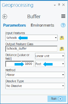
- 3.Run the Buffer tool, and close it after it finishes.
- 4.Take the color fill out of the buffers, move Drug Violations above Schools in the Contents pane, and turn off the school labels. Looking at the map alone, you cannot readily determine whether drug-free zones deter drug dealing near schools in Pittsburgh. So you’ll analyze this issue in the next Your Turn assignment. Note the overlapping buffers in the next figure. If the buffers were made instead with the dissolve option, each set of overlapping buffers would be replaced with a single buffer consisting of the outline of each set.
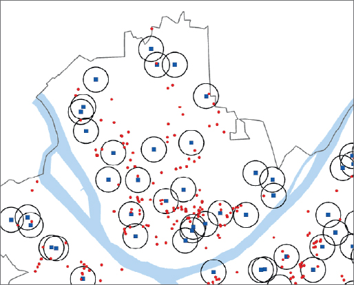
Select drug violations within drug-free zones
- 1.On the Map tab in the Selection group layer, click Select By Location.
- 2.For Input Feature Layer, select Drug Violations, and for Selecting Features, select Schools_Buffer.
- 3.Run the tool, and close it when it finishes.
- 4.Open the Drug Violations table, and see how many violations are selected. Across the city, 222 of 651 drug violations are selected within drug-free zones, 33.8 percent of all drug violations.
- 5.Close the table, and clear the selection.
YOUR TURN
If drug violations occurred randomly in Pittsburgh, then for any given area within Pittsburgh, you’d expect the fraction of such crimes to be the same as that area’s fraction of Pittsburgh’s area. Run the buffer tool again with Schools as input, Schools_Buffer_Dissolved as output, 1,000-foot radius, and this time with the option, “Dissolve all output features into a single feature.” Then divide the area of the resulting buffer by the area of Pittsburgh. Both areas are in square feet and so are large numbers. You can copy and paste them into Microsoft Excel from Shape_Area attributes of the two feature classes to do the division. You should get 398,645,239/1,627,099,663 = 0.245, or 24.5 percent, but earlier you found that a substantially higher fraction, 33.8 percent, of drug violations occurred in drug-free zones. Although not a definitive result, you should be suspicious that drug-free zones are not working in Pittsburgh. A better estimate, however, than the one you just did uses Pittsburgh’s area with human activity instead of all of Pittsburgh for the divisor. You’d have to subtract the area of rivers, cemeteries, steep hillsides, and so on, which for Pittsburgh is about 50 percent of its area. Then you’d expect 49 percent of drug arrests to be in the drug-free zone buffers, which is considerably larger than the 33.8 percent found. So perhaps the law reduces drug dealing near schools. Save your project.
Spatially join school buffers to drug violations
You can get a list of all drug violations within school buffers with the names of the schools included. If a drug violation is in more than one school buffer, you can get the names of all the schools. You’ll use a spatial join of school buffers to drug violations to get this information, which could be passed along to police and the courts.
- 1.Open the Spatial Join tool.
- 2.Type or make the selections as shown, using your original Schools_Buffer.
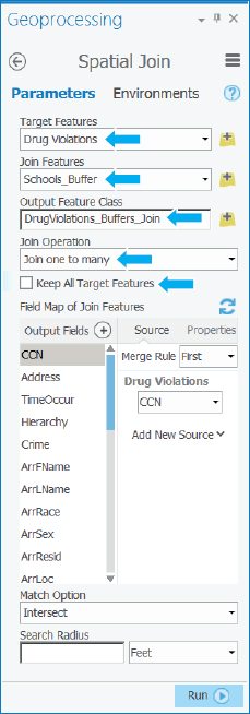
- 3.Run the Spatial Join tool, and close it when it finishes.
- 4.Open the attribute table of the resulting spatial join.
- 5.Sort the table by CCN (the crime ID) ascending. Notice that the first three records are all for the same CCN number, 2015016991, so the corresponding drug offense is in three school buffers (see the Name attribute for the names of the three schools). This output is the result of the “Join one to many” option from the tool: one drug violation possibly in many buffers.
- 6.Save your project.
Tutorial 9-2: Multiple-ring buffers
A multiple-ring buffer for a point looks like a bull’s-eye target, with a center circle and rings extending out. You can configure the center circle and each ring to be separate polygons, thereby allowing you to select other features within given distance ranges from the buffered feature.
During a budget crisis, Pittsburgh officials permanently closed 16 of 32 public swimming pools. You’ll estimate the number of youths, ages 5 to 17, living at different distances from the nearest swimming pool for all 32 pools versus the 16 that were kept open. Youths living within a half mile of the nearest open pool are considered to have good access to pools, while youths living from a half to one mile from the nearest pool are considered to have fair access. Youths living farther than one mile from the nearest pool are considered to have poor access (borrowing from the definition of food deserts). In tutorial 9-4, you’ll make more precise access estimates based on travel time across the street network of Pittsburgh from youth residences to the nearest pool.
Open the Tutorial 9-2 project
- 1.Open Tutorial9-2.aprx, and save it as Tutorial9-2YourName.aprx.
- 2.Use the Pittsburgh bookmark. The map has all 32 public pools (open and closed) and block centroids symbolized with youth population, ages 5 to 17. First, you’ll get the number of youths that had good access when all 32 pools were open.
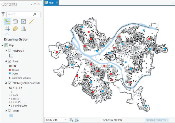
Create buffers
- 1.Open the Multiple Ring Buffer tool, and type or make the selections as shown.
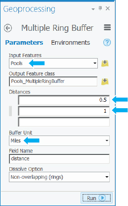
- 2.Run the tool, and close it when it finishes.
- 3.Symbolize the buffers to have no color fill with a size 2 dark-green outline. Many Pittsburgh youths appear to have had fair-to-good pool access before the pool closings. Next, you’ll get the corresponding statistics.

Use spatial overlay to get statistics by buffer area
- 1.Open the Spatial Join tool, and type or make the selections as shown.

- 2.Run the tool, and close it when finished.
- 3.Open the resulting map layer’s attribute table to see in the Age_5_17 attribute that 21,833 youths had good access, and 20,725 had fair access. If you ran the Summarize tool to sum the Age_5_17 field of PittsburghBlockCentroids, you’d get 48,903 youths who live in the city. Then you can calculate that 44.6 percent had good access and 42.4 percent had fair access, for a total of 87.0 percent who had good or fair access. Those results seem to be good.
YOUR TURN
Next, find good or fair youth access for pools that remained open. Select open pools using Select by Attributes with the criterion Open is Equal to 1. Create the same multiple-ring buffers for open pools. Perform a spatial join of the block centroids to the new buffers, and get the new totals for good and fair access. You’ll find that 10,726 youths have good access and 20,450 have fair access, compared with 21,833 who had good access and 20,725 who had fair access when all pools were open. Why do you suppose that fair access remained so high? Maybe it’s the conversion of good access to fair access, or maybe it’s because with all pools open, there tended to be access to more than one pool for a given residence, whereas with pools closed, there’s still fair access but to only one pool. In any event, now only 63.7 percent of the youths have good or fair access compared with 87 percent with all pools open. Save your project.
Tutorial 9-3: Multiple-ring service areas for calibrating a gravity model
Service areas are similar to buffers but are based on travel over a network, usually a street network dataset. If a point, say for a retail store, has a five-minute service area constructed using ArcGIS Pro’s Network Analysis tools, then anyone residing in the service area has, at most, a five-minute trip to the store. If you have permission from your instructor to use an ArcGIS Online service that consumes credits or otherwise have access to your own ArcGIS Online credits, you could use an ArcGIS Online network service, which would be much more accurate than the free, TIGER-based network datasets that you’ll use in this chapter. Nevertheless, you will use the PittsburghStreets_ND network dataset provided in Tutorial9-4.aprx so that your results match the tutorial results.
In this tutorial, you’ll use service areas to estimate a so-called “gravity model” of geography (also known as the “spatial interaction model”), which assumes that the farther apart two features are, the less attraction between them. The falloff in attraction with distance is often nonlinear and rapid, as in Newton’s gravity model for physical objects where the denominator of attraction is distance squared. The application of this tutorial is a continuation of the pool case study, based on a random sample of youths owning pool tags (which allow admission to any Pittsburgh public pool). To scale the random sample up to the full population of youths with pool tags, you will need to multiply estimates by 11.3. With service areas, you could use distance or travel time to estimate a gravity model. Here, you’ll use time (minutes).
This tutorial uses this multiple-step workflow:
- 1.Select open pools from the feature layer of all pools (so that the service area of the next step is applied to only open pools).
- 2.Create service areas for a given set of travel times (1, 2, 3, 5, and 7 minutes) to produce nonoverlapping service area rings. The result is the center area and four rings (0 to 1 minute, 1 to 2 minutes, and so on). These times were determined by trial and error to get good sample sizes in each ring and cover the catchment areas of pools.
- 3.Count the number of pool tags in each service area. The count is accomplished using a spatial join of the service areas and pool tag points. When scaled up by multiplying by 11.3, the result is an estimate of the number of youths owning pool tags who will use pools in each service area ring.
- 4.Sum up the population of youths ages 5–17 in each service area, using a spatial join of the service areas and block centroids. The result is the target total population for pool use of all youths in each service ring.
- 5.Calculate the average use rate for each service area as a percentage using Use Rate = 100 × 11.3 × [number of youths with pool tags in sample] / [total population of youths].
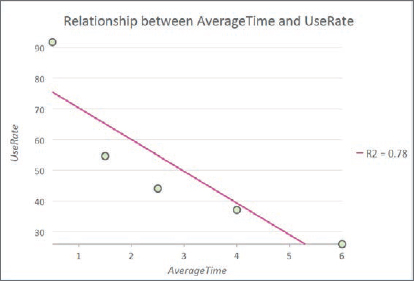
- 6.Plot the estimated use rate of each service area versus the average travel time in each service area in minutes from the nearest pool (0.5, 1.5, 2.5, 4.0, 6.0). Use rate is expected to decline rapidly with travel time.
Note for the technically advanced student: You can make more accurate estimates of the average travel times for each service area ring of step 6 using an origin destination (OD) cost matrix calculated using a Network Analyst tool (search for “OD cost matrix analysis” in ArcGIS Pro help). You can configure this matrix to record the shortest-path distance or time between each demand point (origin) and supply point (destination). In the current problem, block centroids are origins and pools are destinations. Manipulations of the OD matrix, say in Microsoft® Excel, can yield exact averages (or medians) of travel times for rings instead of assuming that the midpoints of service area rings are average travel times.
Open the Tutorial 9-3 project
- 1.Open Tutorial9-3.aprx from Chapter3\Tutorials, and save it as Tutorial9-3YourName.aprx.
- 2.Use the Pittsburgh bookmark. The map has all 32 public pools (both open and closed) and block centroids symbolized with youth population, ages 5 to 17, and pool tags. The map also has a network dataset for Pittsburgh, PittsburghStreets_ND, built from TIGER street centerlines. The network dataset is calibrated for drive time in a vehicle.

- 3.Turn off Pooltags and PittsburghBlockCentroids.
- 4.Click Select By Attributes, and complete its geoprocessing form as shown, click Run, and close the Geoprocessing pane. Later, when you add facilities (pools) to the network analysis, only open pools will be added.

Create multiple-ring service area polygons
- 1.On the Analysis tab in the Tools group, click the Network Analysis button
 > Service Area. If you don’t see the Network Analysis button, make your ArcGIS Pro window wider. Because the Contents pane has a network dataset, PittsburghStreets_ND, the items on the Network Analysis list are enabled. ArcGIS Pro builds the Service Area group layer in the Contents pane and adds the Network Analyst service area context menu to the ribbon.
 - 2.On the Network Analyst contextual tab in the Input Data group, click Import Facilities, make your selections as shown, then run the tool, and close it after it runs. All open pools become facilities because of their selection.
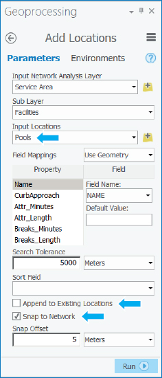
- 3.In the Travel Settings group, change Direction to Towards Facilities. Next, you’ll change cutoffs for the service areas. ArcGIS Pro has detected that the street network, PittsburghStreets_ND, is set up for travel time in minutes and suggests 5, 10, and 15 minutes. You’ll change these times next.
- 4.For Cutoffs, type 1, 2, 3, 5, 7.
- 5.In the Output Geometry group, select Dissolve instead of Overlap, leaving Standard Precision and Rings selected. By selecting Dissolve, your service areas will provide travel time to the nearest pool.
- 6.On the Network Analyst contextual tab in the Analysis group, click Run.
- 7.Symbolize the output Polygons so that 1 is blue, 2 is bluish green, 3 is green, 5 is yellow, and 7 is orange. Also, turn on labeling for Pools, and move that layer above Service Area. Suppose that a travel time of 1 minute or less is excellent, 1 to 2 minutes is very good, 2 to 3 minutes is good, 3 to 5 minutes is fair, and 5 minutes and higher is poor. Then according to estimated street travel time in a car, areas that are considered fair or poor are clearly visible in yellow and orange with two interesting results. First, the service areas are much different from circular pool buffers because Pittsburgh’s streets have irregular patterns caused by its many hills and valleys. Jack Stack and Highland pools are good examples. Zoom into their areas to see their streets. Second, you will see open pools close together, such as Cowley and Sue Murray where perhaps one could be closed. Also, closed pools, such as Fowler, perhaps could be opened to provide better access. The analysis that you just performed was not available at the time of initial pool closings so these results would have been informative; however, city officials used criteria in addition to geographic access when closing pools, such as the condition of pools and historic attendance patterns. After the first year of closings, with location analysis and other information in hand, some closed pools were opened and others closed to improve overall pool access.

Next are steps 3 and 4 of the workflow—counting youths with pool tags and summing up youth population, all by service area polygons.
Spatially join service areas and pool tag owners
- 1.Turn Pooltags on.
- 2.In the Contents pane, right-click Polygons in the Service Area group layer, and click Joins and Relates > Spatial Join, type or make the selections as shown, run the tool, and close it when it finishes. The Count Merge Rule counts pool tag records, and because there’s only one youth per pool tag, counting records is needed.

- 3.Open the resulting Join_Pooltags table, and examine the Join_Count and Name fields to see 377 sampled pool tag holders in the travel time range of 0 to 1 minutes from all pools, 512 tag holders in the range of 1 to 2 minutes, and so on. Leave the table open. Next, you must change the name of Join_Count field so that the spatial join you run next on Join_Pooltags does not overwrite the current Join_Count values.
- 4.In the attribute table, click the Option button > Fields View, change the Field Name and Alias of Join_Count to Join_Count_Pooltags, save the changes, and close all tables.
- 5.In the Contents pane, right-click the Join_Pooltags layer, click Joins and Relates > Spatial Join, type or make the selections as shown, run the tool, and close it when it finishes. Note that you can specify the Merge rule for each field in the Output Fields panel as shown in the figure.

Spatially join service areas and youths
Next are the final steps, 5 and 6, of the workflow—calculating and plotting use rate.
- 1.Open the attribute table of Join_Pooltags_Blocks.
- 2.Open Fields View of Join_Pooltags_Blocks, and create two new fields: AverageTime and UseRate, both with Float data type.
- 3.Save the results, and close the Fields View table. AverageTime will store the midpoint of each service area disk—for example, 0.5 for the 0–1 disk.
- 4.Move the Name column to just before the AverageTime field.
- 5.Type these values for AverageTime, referring to Name to correspond to travel time ranges: 6, 4, 2.5, 1.5, and 0.5. The final task is to compute estimated use rates for each service area disk = 100 × 11.3 × !Join_Count_Pooltags!/!Age_5_17!, where 100 makes the result a percentage, 11.3 is the scale-up factor from the random sample to the population, Join_Count_Pooltags is the sample number of youth pool tag holders in each service area ring, and Age_5_17 has the total (sum) of youths in each ring.
- 6.Right-click UseRate, click Calculate Field, and type or make the selections as shown.
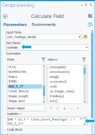
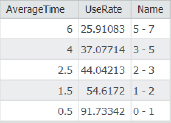
- 7.Run the tool, and close it when it finishes. As expected, use rate declines quickly with average time from the nearest pool: 91.7 percent of youths within a mile of the nearest pool have pool tags, but the rate drops to 54.6 percent in the 1–2 minute ring, and all the way down to 25.9 percent in the 5–7 minute ring.
Make a scatterplot
It’s easy in ArcGIS Pro to make a scatterplot of Use Rate versus Average Time to visualize the estimated gravity model data points.
- 1.In the Contents pane, select Join_Pooltags_Blocks.
- 2.On the Feature Layer contextual tab on the Data tab, click Create chart > Scatter Plot. If you don’t see the Create Chart button, make your ArcGIS Pro window wider.
- 3.In the Chart pane, for X-Axis Number, select AverageTime; for Y-Axis Number, select UseRate, and close the Chart pane. You will see that the gravity model curve falls rapidly in a nonlinear way as expected. Note that you can change the title and axis labels of the chart by using the General tab of the Chart pane. Automatically included in the chart is a straight-line regression model, which is not an appropriate form for the evidently nonlinear relationship.
- 4.Save your project.
Tutorial 9-4: Facility location
Suppose that you are an analyst for an organization that owns several facilities in a city, and you are asked to find the best locations for new facilities. The classic problem of this kind is to locate facilities for a chain of retail stores in an urban area, but other examples are federally qualified health centers (FQHCs) as studied in chapter 1 and the public swimming pools earlier in this chapter. In the most general case, your organization has existing facilities that will remain open, a set of competitor facilities, and a set of potential new locations from which you want to determine a best subset of a specified size. Another case is where a subset of existing facilities must be closed, as with the Pittsburgh swimming pools, for which you want to determine the appropriate 16 of 32 facilities to close. Yet another case is where there are no existing facilities, and you want to locate one new facility.
ArcGIS Pro’s Location-Allocation model in the Network Analysis collection of models handles these sorts of facility location problems. Inputs are a network dataset, locations of facility types (existing, competitors, and new potential sites), demand points, and a gravity model. Demand is represented by polygon centroids—blocks, block groups, tracts, ZIP Codes, and so on—for which you have data on the target population, generally from the US Census Bureau, such as youth population. Resistance to flow in the network, called impedance, is represented by a gravity model and can be distance- or time-traveled along shortest paths to facilities. Several optimization models are available within the Location-Allocation model. You’ll use the Maximize Attendance model, which includes a gravity model (for which you supply parameter values) and a network optimization model that selects a specified number of new facility locations that maximize attendance.
In this tutorial, you’ll run a model to choose the best 16 out of 32 swimming pools to keep open using geographic access (distance from the nearest pool) as the criterion.
Open the Tutorial 9-4 project
- 1.Open Tutorial9-4.aprx from Chapter9\Tutorials, and save it as Tutorial9-4YourName.aprx.
- 2.Use the Pittsburgh bookmark. This map has the 32 pools, block centroids with youth population, and PittsburghStreets_ND network dataset. Also included is the PittsburghStreets street centerline layer symbolized using a tan color for visualization. Note that the PittsburghBlockCentroids table has an attribute, Cutoff_Minutes, which has value 10, meaning that any block centroid farther than 10 minutes travel time to the nearest pool under consideration will not be served and therefore has none of its youth going to a pool.

Calibrate the Location-Allocation model
The Location-Allocation model is straightforward to use, but first you must fit a gravity model to the five points of the scatterplot at the end of tutorial 9-3. In other words, tutorial 9-3 produced data points, but the Location-Allocation model needs a gravity-model function fitted to those points as input. Available in the Location-Allocation model are three functional forms for a gravity model: linear, exponential, and power. The power form does not work well for cases with short travel times, such as for the swimming pools (a few minutes), so it’s not discussed further here. The linear form is easy to understand and use and is based on an impedance cutoff (10 minutes for the swimming pools). It estimates that 100 percent of the target population that lives at a pool uses it (of course no one lives at a pool, but some are nearby, and nearly 100 percent of the population uses the pool), 75 percent uses the pool at a quarter of the cutoff (2.5 minutes), 50 percent at half the cutoff time (5 minutes), 25 percent uses it at three quarters of the cutoff (7.5 minutes), and 0 percent at the cutoff or beyond—(10 minutes or higher). If C = cutoff in minutes and T = impedance in minutes, then as a percentage, Use Rate = 100 × (1 – T/C) for T ranges between 0 and C, and is 0 otherwise.
Exponential is the most applicable gravity model for the swimming pool case, because it declines rapidly as travel time increases, and it generalizes to other cases very well. The Microsoft Excel worksheet, Exponential.xlsx, available in Chapter9\Data, provides a method of fitting the exponential model to the results of tutorial 9-3.
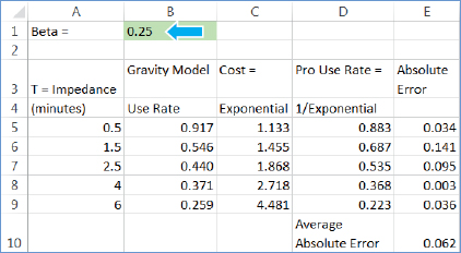
- 1.Open Exponential.xlsx from Chapter9\Data. Beta, which currently has the value 0.25, is the one parameter that you must choose (optimize) in the worksheet and provide in the Location-Allocation model. Impedances are average travel times in minutes. The Gravity Model Use Rate column has the estimates 9–3 for its multiring service areas, expressed here as fractions instead of percentages. Cost is an exponential function, eβT, used in the network optimization model to represent system impedance, and the model uses Pro Use Rate, e-βT, as the gravity model. Your task is to vary beta until you get a good fit of the Pro Use Rate to the Gravity Model Use Rate. Average Absolute Error is a guide for choosing beta; you must minimize it by trial and error.
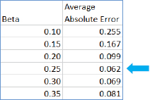
- 2.Enter the beta values, one at a time, into the worksheet: 0.10, 0.15, 0.20, 0.25, 0.30, and 0.35, and note resulting average absolute error values. Next are the results, which are also saved in the worksheet in rows 13 through 19. Beta = 0.25 is the best fit out of the values tried. Note that if you are comfortable with Microsoft Excel, you can easily modify this worksheet for other case studies or projects by adding (copying) rows and changing impedances.
- 3.Save and close the worksheet.
Configure and run the Location-Allocation model
- 1.On the Analysis tab in the Tools group, click Network analysis > Location-Allocation. ArcGIS Pro creates the Location-Allocation group layer in the Contents pane.
- 2.Click the Network-Analyst contextual tab. The horizontal toolbar for this model opens. If this toolbar ever closes and you want to reopen it, click the Location-Allocation group layer in the Contents pane.
- 3.In the Import Data group, click Import Facilities, and make the selections as shown, and then run the tool and close it when it finishes. This tool can be run more than once to load different kinds of facilities. Notice that the default FacilityType under Field Mapping Property is Candidate, which is correct for this model run. Other values are Required, Competitor, and Chosen.

- 4.Click Import Demand Points, and make the selections as shown. Under Field Mappings Property, for Weight, select Age_5_17 (this is the target population), and for the Cutoff_Minutes property, select the Cutoff_Minutes field.

It takes a minute or so for ArcGIS Pro to load the 7,493 demand points.
- 5.In the Travel settings group, select Towards Facilities, and type 16 for Facilities.
- 6.In the Problem Type group, click Type > Maximize Attendance.
- 7.In the Problem Type group, select Exponential for f(cost, β), type 0.25 for β, and press Tab.
- 8.Run the model.
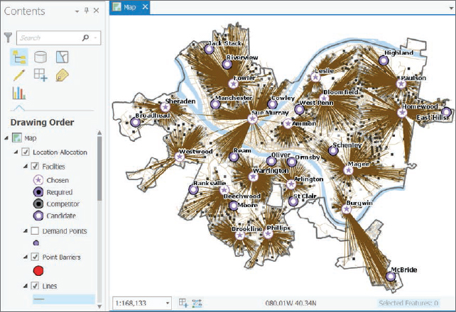
- 9.In the Contents pane and its Location-Allocation group layer, clear Demand Points, and resymbolize Lines to have a 0.5 line width and color of your choice. The lines connecting pools and served demand points constitute a “spider map.” This sort of map is used for visualization; however, the actual lines connecting pools and block centroids follow the shortest paths along the street network.
Analyze the optimal solution
Officials had closed half (eight) of the optimal pools. Remember, however, that officials had criteria in addition to geographic access for selecting pools to close or keep open, and didn’t have GIS-based location analysis.
- 1.Open and sort the Facilities attribute table as descending using the DemandWeight column. DemandWeight has the number of youths allocated by the Location-Allocation model to each pool. However, only about 50 percent of Pittsburgh’s youths had pool tags in the study year, so a better estimate of the number of users for each pool is to divide the DemandWeight values by 2. Then, for example, you’d expect 3,317/2 = 1,658 users of the Homewood pool.
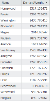
- 2.Open the Pools attribute table. MaxLoad is the capacity of a pool. The Homewood pool has a capacity of 455, while the model estimate is 3,306/2 = 1,653—more than 3.5 times its capacity. Of course, not every potential user of the pool will show up at once. Some days, youths would have to wait or be turned away from the pool, but it seems that attendance would be good.
- 3.Close the Pools table.
- 4.In the Facilities attribute table, use the Summarize tool to sum DemandWeight. The total is 27,607 estimated pool users. Dividing by 2, the estimate is that 13,804 youths would use the 16 optimal pools.
- 5.Close the Facilities table.
- 6.In the Contents pane, clear PittsburghStreets and PittsburghStreets_ND, zoom into the southeast corner of Pittsburgh that has the long lines from the Burgwin pool to demand points near the McBride pool, and click the longest line you can find. In the resulting pop-up window, Total_Minutes, 7.239, has the estimated travel time from Burgwin to the farthest point on the map, within the 10-minute cutoff.
- 7.Save your project.
YOUR TURN
Remove the Location-Allocation group layer from the Contents pane, and set up a new Location-Allocation model to estimate pool use from pools that officials left open. First, select open pools with the clause Open Is Equal to 1. Then start a new Location-Allocation model, and import Pools as facilities with FacilityType (under Property) being Required. Then import Demand Points just as you did in the previous steps (Weight = Age_5_17, and Cutoff_Minutes = Cutoff_Minutes). Select Towards Facilities, and type 16 facilities. Set the problem type to Maximize Attendance and the function to exponential with 0.25 for beta. Run the model. Sum DemandWeight for Facilities to find 25,044 youths estimated to use the open pools. Dividing by 2, you get the number 12,522 as the best estimate of pool users, compared with 13,804 from the optimal solution, only 1,282 fewer (9.3 percent). Ultimately, although officials chose a much different set of pools to keep open compared with the model-based optimum, not much was given up in terms of potential users. That’s good news for youths living in Pittsburgh from a policy point of view.
If you have time, make one more model run, this time using all 32 pools. You’ll find that the model estimates 30,218 users compared with 27,607 for the optimal solution and 25,044 for the remaining 16 pools. Why do 32 pools only produce such a small gain over 16 pools? The answer is probably because there were too many pools competing for users when there were 32 pools. So it appears that officials did not make a bad decision, if the network dataset is accurate enough and travel to pools is primarily driving on the road network.

Tutorial 9-5: Data clustering
The goal of data mining is exploration, to find hidden structure in large and complex datasets that has some interest or value. Data clustering, a branch of data mining, finds clusters of data points that are close to each other but distant from points of other clusters. If your data points were 2D and graphed as a scatterplot, it would be easy to draw boundaries around points and call them clusters. You’d perform as well as any clustering method. The problem is when the points lie in more than 3D space because you can’t see them anymore, and that’s where cluster methods are valuable. In this tutorial, you’ll cluster crimes using four attributes/dimensions, including severity of the crime, plus the race, age, and gender of the arrested persons. A better attribute than race would be to use the poverty status of arrested persons, which is an underlying cause of criminal behavior, but that data is not collected by police.
A limitation of clustering, however done, is that there is no way of knowing “true” clusters in real data to compare against what a method determines are clusters. You take what clustering methods provide, and if you get information or ideas from cluster patterns in your data, you can confirm them or determine their predictability using additional models or other methods. Clustering is purely an exploratory method. There are no right or wrong clusters, only more or less informative ones.
This tutorial uses a simple method called k-means clustering, which partitions a dataset with n observations and p variables into k clusters. You’ll use a dataset with n = 303 observations, p = 4 variables for clustering, and k = 5 clusters desired. K-means is a heuristic algorithm, as are all clustering methods: it’s a set of repeated steps that produces good if not optimal results. For this tutorial’s data, the algorithm starts with a procedure that selects five, four-dimensional (4D) observations called seeds as initial centroids. Then each observation is assigned to its nearest centroid, on the basis of Euclidean (straight line) distance in the 4D cluster variable space. Next, a new centroid is calculated for each cluster, and then all observations are reassigned to the nearest centroid. These steps are repeated until the cluster centroids do not move appreciably. So k-means clustering is a common-sense, mechanistic method.
K-means assumes that all attributes are equally important for clustering because of its use of distance between numerical points as its basis. To meet this assumption, all input attributes must be scaled to a similar magnitude and range. Generally, you can use standardized variables (for each variable, subtract its mean and divide by its standard deviation) to accomplish scale parity, but other ways of rescaling are acceptable, too. It is the range, or relative distances between observations, that’s important in k-means clustering. The data used in this tutorial includes numerical (interval or ratio), ordinal, and nominal class data for classification. K-means clustering is intended for numerical data only because of its use of distance in cluster variable space. Nevertheless, with rescaling, it’s possible to get informative clusters when including nonnumerical data. Next, the discussion turns to the specific case at hand and how to rescale attributes.
The data used in this tutorial is serious violent crimes from a summer in Pittsburgh, with the data mapped as points. The crimes are ranked by severity using FBI hierarchy numbers (1 = murder, 2 = rape, 3 = robbery, and 4 = aggravated assault), with of course murder being the most serious. Clearly, the nature of crimes should be important for their clustering. So the first assumption you must make is that the distance between crime types, such as the number 3 between 1 for murder and 4 for aggravated assault (attempted or actual serious bodily harm to another person), is meaningful for clustering purposes. The criminal justice system agrees on the order, and for clustering, we can accept the “distances” or change them using our judgment. For this tutorial, you’ll leave them as listed here.
Next, consider the single numerical attribute that is available, the age of an arrested person. Crime is generally committed by young adults, tapering off with older ages. For the serious violent crimes studied here, age varies between 13 and 65 (range of 42) with a mean of 29.7. Together with crime severity, age would dominate clustering because of its greater range. The remedy is to standardize age, which then varies between −2.3 to 2.7 with a range of 5, whereas crime severity has a range of 3. So then both attributes are fairly equal in determining clusters.
Finally, there are two nominal attributes: race (black or white) and gender (male or female). These can be encoded as binary attributes: race (0 = white, 1 = black) and gender (0 = male, 1 = female). As a binary indicator variable, race has a mean, which is the fraction of arrestees who are black, and similarly gender has a mean, which is the fraction of arrestees who are female. These variables as encoded here would have perhaps lesser roles than the previous two, but not by that much. If you wanted to increase the importance of the binary variables for clustering, you could encode them as (0, 2) or (0, 4) indicators. You’ll leave them as (0, 1) variables, which makes interpretation of clustering results easier.
One last point is that you must choose the number of clusters instead of having k-means clustering find an optimal number for you. That’s the case for most clustering methods. For the crime data, experimentation with three through six clusters resulted in five clusters being the most informative, so you’ll run with five clusters.
In summary, each observation is a 4D vector (crime, standardized age, gender, race)—for example, (1, –0.364, 0, 0) is a murder with an arrested 25-year-old (standardized age 25 is –0.364) male who is white. The clusters found by k-means exist in the 4D space in which the observations lie. Each cluster is characterized by its centroid with corresponding means and standard deviations of each cluster variable.
Open the Tutorial 9-5 project
- 1.Open Tutorial9-5.aprx from Chapter9\Tutorials, and save it as Tutorial9-5YourName.aprx.
- 2.Use the Pittsburgh bookmark. The map shows the spatial distribution of serious violent crimes by crime type within police zones. Each zone has a commander, station, officers, and staff. Also shown are the poverty areas from chapter 1. Generally, there is a positive correlation between poverty and crime.

- 3.Open the attribute table for Serious Violent Crimes, scroll to the last column, Seed, and sort it descending. These are the five records used as initial cluster centroids as found by k-means clustering for a given run. Each time you run k-means, the procedure has a chance of choosing different initial cluster centroids, so you’ll use these initial cluster centroids to get results consistent with the steps that follow. Hierarchy is the FBI code for crime types and one of the four cluster attributes. ArrAge is the actual age of the arrested person, and ArrAgeStnd, the second cluster attribute, is the standardized arrest age. Notice that there is a good deal of variation in the cluster variables of the seed records, although the clusters that k-means ultimately finds are much different from these starting cluster centroids, as you will see. The remaining two 0/1 attributes, ArrGender and ArrRace, are the remaining cluster variables.

- 4.Close the table.
Run the clustering algorithm
The k-means algorithm is in a geoprocessing tool called Grouping Analysis, which you’ll run next.
- 1.Open the Grouping Analysis tool.
- 2.Carefully fill out the tool form as shown, including typing the extension .pdf, for the output report file. Use the Tab key to move to a new field, and ensure that you do not use the Enter key, because doing so may run the tool prematurely. The selection for Spatial Constraints—No spatial constraint—triggers the use of k-means clustering. In this case, the objective is to cluster crime type and arrested person attributes, and then observe and interpret the spatial distribution of clusters. For instance, the cluster analysis finds that older criminals commit crimes in the city’s central business district, which is interesting. If a spatial constraint is used (for example, that observations must close in geographical space), a different clustering method is used. Also note that if you are running this tool for your own data or in an assignment, for Initialization Method you’d use the Find seed location option instead of Get seeds from field.

- 3.Double-check the form, and then run the tool. The tool takes a minute or two to complete its extensive calculations and write its PDF report. When finished, it adds the Clusters layer, which has the five identified clusters, to the Contents pane. The warning message says that the tool was not able to read 38 of the 303 crime records, but those are only records that did not geocode successfully in a data preparation step. Those 38 records are in the attribute table but not on the map, and they are not a problem in terms of successfully computing clusters for 265 geocoded records.
- 4.Close the Geoprocessing pane.
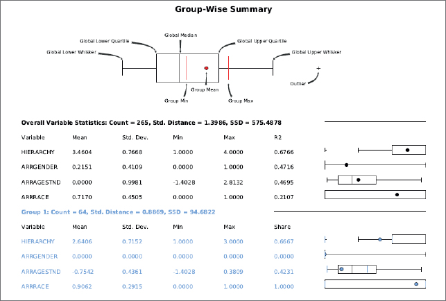
- 5.Use Windows or File Explorer to browse to and open ClusterReport.pdf. To interpret the clusters, you must study ClusterReport.pdf, which is in your Tutorials folder. The first page of the report is shown.
Interpret the cluster report
Each group (or cluster) has its font color matching mapped points for SS_GROUP. Note that your groups may have different numbers and colors than those reported here, but the statistics and everything else will be the same. One issue is that the standardized age needs to be unstandardized. The mean of age is 30.3, and its standard deviation is 12.3. So for the Group 1 (blue) standardized value, which is −0.7242, to get the unstandardized corresponding age, calculate age = 30.3 + (−0.7542) x 12.3 = 20. Each group’s mean values are summarized as shown. It’s difficult to find terms to describe the mean crime hierarchy numbers, so the range from least serious to most serious used in the table are in the context of reporting results in regard to harm done.

These results have moderately interesting patterns and one anomalous group—Group 2. With a group size of only three crimes for Group 2, you can’t rely on that small result. Group 1 represents young black males committing a range of serious violent crimes. Group 3 is middle-aged persons of either race committing a range of crimes. Group 4 represents middle-aged persons of either race committing aggravated assaults (FBI hierarchy 4). Finally, group 5, the largest in size, is composed mainly of young blacks, mostly committing aggravated assaults.
Next, you can see if there are any spatial patterns for these groups.
- 1.Turn off Serious Violent Crimes in Contents, and make sure that Clusters is on.
- 2.Open Symbology for Clusters, and relabel the groups as follows:
- 1 becomes Young black males moderate.
- 2 becomes Middle-aged black females highest.
- 3 becomes Middle-aged either race males moderate.
- 4 becomes Middle-aged either race males lowest.
- 5 becomes Young blacks either gender lowest.
- 3.Keep the same colors, but change the point symbols for the two young groups to Square 1, Size 5. The cluster results that were judged moderately interesting earlier get more interesting when mapped. The youth groups clearly are spatially clustered in the poverty areas, while the middle-aged groups are scattered. Also, various locations on the map show spatial clusters, with a few indicated by arrows. The central business district’s serious violent crimes (arrow in the middle of the map) are predominantly by older criminals, as are those at the second arrow in an outlying area. These results make sense. Youths generally commit crimes near to where they live, whereas older criminals, who have more ability to travel, travel to the central business district to commit crimes. Certain outlying areas may have high concentrations of older persons.

- 4.Save your project.
Assignments
This chapter has five assignments to complete that you can download from this book’s resource web page, esri.com/gist1arcgispro:
- Assignment 9-1: Study California cities affected by earthquakes.
- Assignment 9-2: Analyze geographic access to federally qualified health centers.
- Assignment 9-3: Analyze visits to the Phillips public pool in Pittsburgh.
- Assignment 9-4: Locate new farmers’ markets in Washington, DC.
- Assignment 9-5: Carry out a cluster analysis of tornadoes.