 Georges Seurat (1859–91)
The Seine at the Grande Jatte, 1888, Oil on canvas, 25 9/16 × 32 5/16 in (65 × 82 cm)
ELEMENTS WORKING TOGETHER FOR THE GOOD OF THE WHOLE
Harmony is achieved in a work of art when all its parts are integrated into a whole in which the relationships between the elements are mutually beneficial and aesthetically pleasing. In music, harmony is a result of certain mathematical relationships between notes. Mathematical relationships can also play a role in visual harmony where variations in shapes, areas, and angles have some sort of mathematical consistency. Similarly, colors that stand in an orderly relationship to each other within a color solid will tend to feel more harmonious than those in a disorderly relationship. However, perception of color can be influenced by a great many factors, including context, personal association, minute variations in color purity, saturation, and hue, all of which make a scientific recipe for harmony all but impossible. In the last resort, harmony is an aesthetic response, a judgment of feeling as much as an objective measure.
The obverse of harmony is discordancy, which results when relationships are disordered, chaotic, or stridently opposed. Discordancy is sometimes exploited by visual artists for effect. Henri Matisse (1869–1954) deployed discordant color in many of his paintings during the Fauvist era.
• Shapes
Groupings of shapes that have similar characteristics will tend to form harmonious compositions.
• Proportions
Elements that differ in scale by ratios that are consistent will tend to confer harmony. Similarly, intervals within a composition that stand in simple and consistent proportions to each other will also confer a sense of clarity and harmony.
• Color
There are many theories of harmonious color, most of which involve the application of simple geometries to a color wheel or color solid. The most simple of these is the use of complementary colors, which will give a dynamic balance to a composition. A slightly less active harmony is achieved with a so-called “split complementary” where, say, a red is replaced by a red-violet and a red-orange and placed within a composition opposed to a green. Applying other geometric shapes to a color wheel, such as rectangles or triangles, also yield simple harmonies. For a quieter effect, artists can choose analogous harmonies, arrangements of colors that are very close together on the color wheel.
• Association
Harmony by association is most often achieved with color where a palette that is associated with, say, autumn conveys a sense of order because the viewer makes the same association and accepts the combination as natural.
 Georges Seurat (1859–91)
The Seine at the Grande Jatte, 1888, Oil on canvas, 25 9/16 × 32 5/16 in (65 × 82 cm)
An example of triadic harmony where greens are balanced by blues and a beige (yellow-orange). The sense of harmony is enhanced by the inclusion of warm and cool versions of each hue.
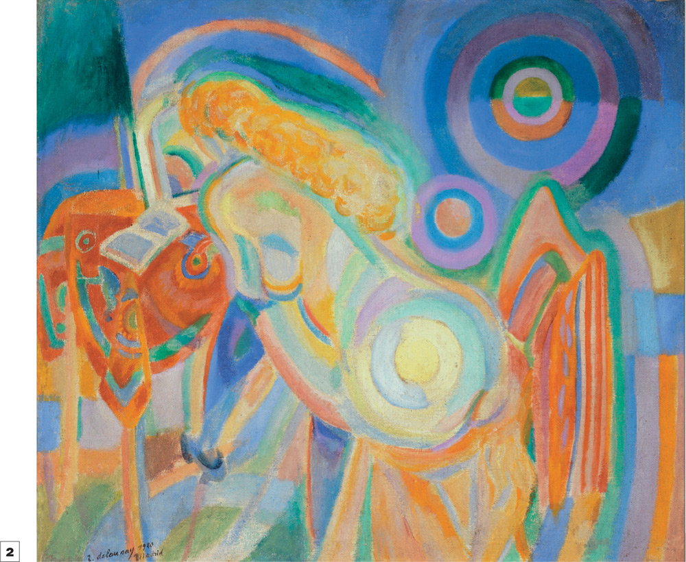
 Robert Delaunay (1885–1941)
Nude Woman Reading, 1920, Oil on canvas, 36 13/16 × 32 3/16 in (93.5 × 81.7 cm)
Soft interlocking shapes form a harmonious grouping. The color forms a simple harmony in which the major pairs of complimentaries—blue/orange, yellow/violet, and red/green—are balanced.
