WHEN EDITING PHOTOS, THERE IS A CONFUSING ARRAY OF APPS OUT THERE. THIS CHAPTER COVERS THE ESSENTIAL TOOLS NEEDED TO CORRECT COMMON ISSUES, FROM WONKY BUILDINGS TO FLAT, LIFELESS IMAGES. CASE STUDIES AND STEP-BY-STEP GUIDES WILL EXPLAIN HOW TO MAKE YOUR PHOTOS GREAT USING APPS AND A TESTED METHOD TO EDIT AND PRINT.
CHAPTER 1 LESSON 1
A FEW THOUGHTS ON EDITING WISELY
WHEN I LEARNED TO TAKE PHOTOS AT COLLEGE, I ALSO LEARNT HOW TO PROCESS AND PRINT THEM IN A DARKROOM. IN THIS SETTING I LEARNED ALL ABOUT MASTER PHOTOGRAPHERS AND PRINTERS LIKE ANSEL ADAMS. WHAT I TOOK MOST FROM STUDYING THE MASTERS WAS THAT TAKING THE PHOTO WAS ONLY THE FIRST STAGE OF THE PROCESS.
Once in the darkroom, the photo would be perfected to heighten the sense of the extraordinary that the photographer wanted to share with their audience. There you might “dodge and burn” your photos, darkening or lightening them to enhance areas and help balance out the tonal range overall. This is considered a normal part of the art of making photographs; this art form still exists, it just happens with apps in a digital lightroom instead of in a chemical darkroom.
Don’t hesitate to make your photograph sing like the scene you saw when you pressed the shutter. Sometimes we end up with pictures straight out of the camera that don’t bear any resemblance to the scene we remember, but this is where editing comes into play. It’s a vital part of the process, so you need to hone these skills too.
“Do less, in order to do more” is the motto I apply throughout all aspects of my creative career. It was first uttered by German-American artist and educator Josef Albers to his Bauhaus students, and I still feel it is the most important consideration in the photo-editing phase. Edit wisely and sparingly, both to reveal the beauty in an image and to enhance a great shot. Don’t let your photos be defined by the apps and filters you choose; use them with a light touch and let the picture’s inner beauty shine through.
I used to shoot with a DSLR camera and spend weeks processing on a computer, using programs that took years to learn. But now, I love the freedom to shoot and edit on my phone anywhere. If I have a spare minute between meetings or I am sitting on a train, I use the time on my phone to edit photos. I never have a wasted minute anymore; waiting in line for something is a great chance to work on photos on my phone. It’s life changing!
FIXING LINES AND ANGLES WITH SKRWT
SKRWT IS MY GO-TO APP FOR FIXING ISSUES WITH LEANING BUILDINGS AND ANY WEIRD ANGLES THAT APPEAR IN MY PHOTOS.
▶ To start, tap on the grid icon and select one of the grids to help line things up.
▶ The Lens Correction tool will fix any lens distortion from your smartphone lens—use the Mobile setting for this unless you have shot with a lens attachment; in which case, choose the appropriate lens correction option for the job in hand.
▶ Level the horizon line with the Rotation tool by swiping left or right to make your adjustments. Double-tap to set it back to zero and start again if needed.
▶ There is an Autocrop feature in play here that will automatically crop away the areas of the image that sit outside the usual frame shape. You can turn this feature off and view the whole image as you work if you like though—it’s a personal preference thing!
▶ Vertical corrections are where the leaning lines are corrected. Vertical corrections may have the effect of compressing some of the details in the foreground, making them look smaller, but this can be fixed in the next stage by selecting the Ratio tool. This allows you to stretch it back out if necessary.
▶ If the Autocrop feature has been disabled, the image will need to be cropped manually. Select the Crop tool for this, choosing either the fixed ratio or free ratio option, tap with two fingers, and use them to drag the frame around the image; tap on a corner to drag the frame bigger or smaller. A green corner suggests there is more image information to use; when the corner goes red, it means that there is no more image to work with, so move the edge until it goes green again.
SAVING
▶ Select the Bank option to save the work you’ve done so far into a solid layer before moving onto another correction.
▶ Bear in mind that there is a Full Reset option, or the option to start again from the bank level you last saved.
▶ Finally, save a copy of the image—overwriting the original means you can’t revisit the initial image later. You never know what you may want to do with the image later, so keep your options open!

SATURATION (STRENGTH OF COLOR)
Most smartphones automatically boost saturation when you take a photo. This can look punchy, but it also looks fake! Decide if the image has that oversaturated, unrealistic look, which will be especially noticeable in the green. Ask yourself: did the grass really look that color? Turn the saturation down slightly now, so that you are not overlaying even more fakery onto it to begin with. Make it look realistic for now, and trust that you can boost the saturation again later with just the right amount. It will be like a final layer of varnish to enhance your masterpiece at the end!

I prefer to shoot everything in color and then work with the VSCO app’s Black and White filters later to change my image from color to monochrome. My favorite black and white filter in VSCO for portrait and street photography is the FN16 Filter which replicates the long-gone, but not forgotten, Fuji Neopan 1600 film for 35mm cameras. This was much-beloved by street photographers for its contrasty lo-fi look and ability to shoot hand-held in very low light conditions. Play with the contrast slightly to see if you can make gains, as color photos converted to black and white are often improved by a bit more contrast.
THE EDITING PROCESS AND SNAPSEED
LET’S LOOK AT HOW TO GIVE YOUR PICTURE SOME FINESSE DURING THE EDITING PROCESS. THERE ARE MANY GREAT APPS OUT THERE TO HELP IMPROVE YOUR PHOTOS, INCLUDING EDITING FEATURES PACKAGED WITH POPULAR APPS SUCH AS INSTAGRAM.
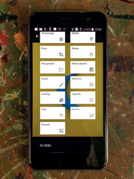
Personally, I favor the Snapseed app, because it allows you to do so many clever things in one place, and it is available for free for both iOS and Android. It’s easy and intuitive to use, with a helpful tutorial for those using the app for the first time. Once you’ve familiarized yourself with navigating the app, here is a list of my essential Snapseed workflow tools:
▶ Begin any edit with the Rotate tool. If your horizon is a bit wonky, this is the tool to sort it out.
▶ Use the Crop tool next. You can move the edges of the image to crop to one of the aspect ratio presets or make a free crop. This step isn’t always needed but is useful to tidy up a composition.
▶ For precision adjustments, use the Brush tool and work in smaller areas. There are several brushes here, including an Exposure and a Saturation tool, but my favorite is the Dodge and Burn tool. The Dodge tool brightens by adding light, so move toward the + sign for this effect, whereas the Burn tool darkens by decreasing the light, so move toward the - sign for this. My advice when using the Dodge and Burn brush is to use it at a strength of +5 rather than +10 to keep the changes small and minimal—subtlety is key!
▶ For larger area adjustments, use the Selective tool. Tap on an area that needs adjusting and a small “B” in a blue circle will appear. Swipe up and down to reveal the adjustments menu. I primarily work with Brightness here. Using a pinch movement on the touch screen, you will see a red blush appear across the area to be affected by the adjustment. Alter the size of the area affected by any change you make by pinching in or out. Swipe left or right to increase or decrease the tool effect. Notice the + (or) - symbol with a number at the top of screen—it changes as adjustments are made. Try to keep that number low, to avoid the image looking overprocessed, especially after the cumulative effect of multiple adjustments is in force.
TUNE IMAGE
Tune Image offers a menu of useful tools; swipe up to reveal them.
▶ Boost the overall Brightness here, but be careful not to blow out your highlights; the aforementioned Selective tool is often the better option.
▶ The Ambience tool works a little magic by giving images with a high dynamic range a bit of a boost, but use it sparingly, ideally between +5 and +30. It adds a small lift to the overall vibrancy and optimizes the shadows and highlights. The result is like the HDR effect, but using the Ambience tool is less destructive and far more pleasing to the eye.
▶ If the Highlights and Shadows need a small amount of attention, then they can be tweaked here. But remember, less is more!
▶ If the picture looks soft, sharpen it with the Detail tools. Swipe to reveal the Sharpening tool, which adds a tiny amount of extra contrast to the edge details to make it appear sharper. Use it sparingly because it can quickly make an image look overcooked.
Working in any of the Tools screens, you can zoom in or out with a pinch movement (pinch two fingertips together on the touchscreen). This will open a blue navigation frame that you can drag around the picture with your finger.
RAW FILES
There is a facility to develop RAW files on Snapseed too. With RAW developing, you can adjust exposure and white balance, among other things. If you do make alterations here, tick to accept the RAW file changes and you will enter the standard editing area.
EDITABLE LAYERS
Snapseed has a clever feature that saves all the edits made in separate layers. This means that you can go back and make adjustments or even delete individual layers, which is particularly useful at the end of the edit when the cumulative effect of the edits is visible.
SNAPSEED TIP
When making lighting adjustments, try not to add light to areas that would not naturally have light in the scene, or viewers will be wondering where the light comes from!
SKY AND LANDSCAPE EXPOSURE BALANCING
If you have followed my previous instructions on exposing for a bright sky, you will have photos with dark areas that need fixing now. Here’s how…
Using the Selective tool, pinch out an area of the dark shadow that needs brightening; ensure that you don’t include the sky in the selected area (denoted as red blush) and then adjust the brightness. This will give the scene the correct balance between the bright sky detail and the shadows as your eye saw it.
EDITING CASE STUDY 1
IN THE ORIGINAL UNALTERED PHOTOGRAPH, THE USE OF A SUPER WIDE-ANGLE LENS ATTACHMENT MEANS THE LENS DISTORTION IS STRONG, CAUSING THE BUILDINGS TO LEAN TOWARD EACH OTHER, AND THE APPEARANCE OF A SLIGHT BULGE IN THE CENTER OF THE IMAGE.


1 In the SKRWT app, I corrected the converging verticals with the Lens Correction tool, setting the “wide” slider to +12.

2 The Chrysler Building in New York still appears to be leaning to the left, so I used the Straighten tool to correct the angle very slightly.

3 With the Vertical Correction tool, I dragged the slider to -6 until the lines made by the columns of the left-side building’s windows are straight. This cropped a large part of the image away but that was okay.

4 The Horizontal Correction tool at -3.5 pulled the roof top of the right-side building into a better line.

5 I saved a copy of the image, and opened it in the Snapseed app. With the Tune Image tool, I swiped down to reveal the menu and increased the Ambience by +14 to boost the colors and saturation very slightly.

6 To add depth I used the Vignette tool, setting the outer brightness to -15 for a tiny overall adjustment
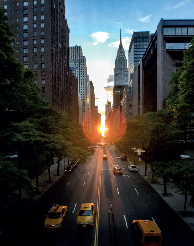
7 Finally, I opened the file in Instagram and applied a small amount of the Luxe filter to the image, which gave it an extra boost.
EDITING CASE STUDY 2
IN THIS ORIGINAL UNALTERED PHOTOGRAPH, THE SKY HAS BEEN EXPOSED TO ENSURE THERE ARE NO BURNT-OUT AREAS AND THE DETAIL IS PRESERVED, BUT THIS MEANS BOTH THE TREE AND THE FERNS ARE UNDEREXPOSED.
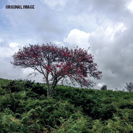
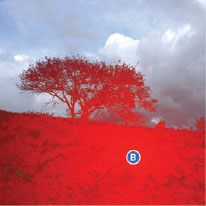
1 Using Snapseed’s Selective tool, I tapped to make a brightness adjustment, and pinched out a selection covering the entire area of land and the tree, shown here as a red blush.

2 Swiping right, I increased the brightness by a factor of +20
3 I selected the Saturation brush from the Brush tools and tapped the down arrow to set its strength to +5. A single stroke across the red berries in the tree gave them a small saturation boost.

4 The photo looked a bit flat overall, so using the Vignette tool with a light touch, I swiped left to reduce the outer brightness to -30.
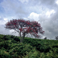
5 I then used the Tonal Contrast tool to overlay contrast across the low, mid-, and high tones. I first swiped up to reset the low and mid-tones back to 0, then adjusted the high tones to +25 to give the clouds some definition.

6 I selected the Tune Image tool, swiped down to reveal the menu, and added a small amount of Ambience to the picture; in this case, just by a factor of +15.

7 Finally, in Instagram, I added the Luxe filter at +35 to give the image an extra boost and added some light and warmth with the Rise filter, dialed back to +45.
PRINTS ON PAPER
THE FINAL PHASE IN YOUR IMAGE-MAKING SHOULD BE THE JOURNEY FROM SCREEN TO HAND. DON’T BE TEMPTED TO LEAVE YOUR BEST PICTURES LANGUISHING ON YOUR PHONE.
Instagram, Facebook, Pinterest, and Flickr, among others, are wonderful platforms for image-sharing with a wide and diverse audience. But social media-sharing alone doesn’t really do the image justice. It is amazing that your photo can be seen on a screen thousands of miles away by millions of people, but most viewers will only enjoy it for a fleeting moment before swiping or scrolling to the next image in their feed.
While it might be more difficult to get an audience of a similar size to see a print, there is no substitute for holding a print and appreciating the hard work invested in crafting the image. As the image has enough pixels to be seen at way beyond the size restrictions of the screen, it is worth exploring the possibilities of enlarging your photos into printed form. I have printed my smartphone photos for exhibition at 10 inches (25 cm) square, to the amazement of all who saw them when they realized that the images had come from a smartphone.
I love hanging my photos on walls, framing them as gifts, exhibiting them in galleries, and putting them in books, cards, and calendars. Owning an inkjet printer isn’t a prerequisite for making prints; there are boundless options for online ordering but they lack any real control over the final color and quality. Personally, I like to print my own pictures. It is easy to do and so rewarding to have control of the image from start to finish. Even a cheap, entry-level inkjet printer, in the right hands, with the right ink and paper, can make a lovely job of your images.
When it comes to paper, there are endless choices, and I have tried them all over the decades, so let me share my preferences with you. I have worked with Fotospeed papers for years; the company makes top-quality paper and knows their business inside out. My passion for their paper has grown even more since they introduced a range of squareformat photographic papers, meaning that I don’t have to cut off a third of a sheet of paper and throw it away when I make square prints now—a more cost-effective option for smartphone shooters like me!
I prefer the feel of a textured paper and opt for one that feels like traditional watercolor paper for printing my photos onto. My favorite paper is Fotospeed’s Platinum Etching paper. At 285gsm it has a proper weight to it, and is 100% acid-free, so when I use it with my Epson pigment inks, I know that the color will last and be true to life. But the main reason I love it, is that it has a velvety textured matte finish that looks lovely in a frame. My glossy paper choice is Fotospeed’s Platinum Baryta 300gsm, which has a lovely smooth surface and is particularly striking with my black-and-white images. I always have several boxes of PF Lustre 275gsm paper from Fotospeed’s photo-quality range on the go, just because it is so reliable and easy to work with. The Fotospeed paper range is compatible with both dye and pigment inks, and is available worldwide.
Getting the color right between screen and print can be a challenge without the right support, so I make use of Fotospeed’s Free Custom ICC profiling service that comes with their papers. This way, I am sure that the paper and printer are properly calibrated to easily achieve accurate, faithful color and black-and-white prints every time.
Don’t leave your images as a collection of pixels: embrace printmaking as part of your craft and realize your images as something physical. Get in the habit of releasing your images from digital storage and allow other people to enjoy and appreciate your hard work and creativity by printing an image that will be a source of pride every time you walk past it on the wall!