Chapter 21
Scientific Reasoning Skills
You don’t need to know science facts for the ACT. For the most part, the Science test is an open-book test, with the passages offering the content you need to answer nearly all the questions. According to ACT, you do need scientific reasoning skills. But all this really means is that you need some common sense. Science may seem intimidating, but it’s based on a lot more common sense than you may think.
YOU KNOW MORE THAN YOU THINK
It’s easy to feel very intimidated by the content and even the figures on the Science test. But all of science is built on common sense. The key to building good scientific reasoning skills is to realize you already have those skills. You use common sense every day to figure things out, to solve problems, to make conclusions. A scientist does the same. When you solve a problem, you think critically, and that’s the basis of scientific reasoning.
How to Solve a Problem
Let’s try an experiment. Say you put on a wool sweater and go out to dinner one night. At the restaurant you order some delectable shrimp for dinner and then a beautiful bowl of strawberries for dessert.
The next morning, you wake up covered in red, itchy hives. What caused them? Do you jump to the conclusion it was the sweater? What about the shrimp? A lot of people have allergies to shellfish. But so, too, do a lot of people have allergies to strawberries. How are you supposed to know which one caused your hives? How do you know any of these options are the only possible culprits?
You don’t. That’s the first rule of scientific reasoning: Make no assumptions. You can’t assume it was the sweater, the shrimp, or the strawberries. But you have to prove it was one and only one of these, if any. So how do you set about finding out which one?
Assumption = Guess
An assumption is nothing more than a guess, and a lazy one at that, if you are willing to believe the riddle has been solved. A guess doesn’t cut it in the scientific world: only proof does.
You design an experiment. You first need to narrow the list of suspects down to the sweater, shrimp, and strawberries. Begin with a baseline. You need to see what happens on a day with none of the possible causes in play to compare to the days with them. Wear a cotton T-shirt and eat cauliflower and cantaloupe. Do you still have hives? Then the three suspects have all been vindicated. But if your hives have cleared up, you’ve confirmed your first hypothesis that it was indeed the sweater, the shrimp, or the strawberries.
Now you have to figure out which one of the three caused your hives. We need a day with one, and one only, of the possibilities, or variables, in play. That’s the second rule of scientific reasoning: Change one variable at a time. On one day wear the sweater, but skip the shrimp and strawberries. On another lose the sweater, and eat the shrimp but not the strawberries. On yet another replace the shrimp with the strawberries. On each day check for hives. The itchy red bumps depend on whatever independent variable is causing them.
Independent and Dependent Variables
The independent variable affects or creates the dependent variable. Does x create or affect y? Some examples of independent variables include time, temperature, and depth. Dependent variables are the events possibly created or affected by an independent variable, and they can be whatever the scientist is studying. Some examples of dependent variables include volume, solubility, and pressure.
That’s all well and good. But what about everything else in your life? Notice we said you couldn’t wear the sweater on the days you ate the shrimp and strawberries. But other than the sweater, you have to wear the exact same clothes on the day you eat shrimp and on the day you eat strawberries. It’s not just what you wear. Everything else in your life has to be exactly the same. If on the day you wore the sweater, you worked out at the gym, but on the day you ate shrimp, you lay on your sofa all day watching television, how much would you know? Not much. Certainly not much of anything with proof, and proof is what it’s all about in science. The third rule of scientific reasoning is that you have to keep all the other variables in the experiment the same as you vary one and only one independent variable. In the hives experiment, this means that in order to conclusively prove the cause, you have to keep everything else the same on each day that you change one and only one independent variable. Do the same things. Wear the same clothes (except the sweater). Eat the same things (except the shrimp and strawberries).
And that’s it. If you follow these three rules, you’ll know what causes your hives.
The Three Rules of Scientific Reasoning
-
Make no assumptions. You need a standard of comparison to measure against your results. How does your dependent variable react without the presence of any of your independent variables?
-
Change one variable at a time. Vary each independent variable to see its effect on your dependent variable.
-
Keep all other variables the same. Your other independent variables and everything else have to be the same as you vary one and only one independent variable.
Trends
In our first example, we looked at a dependent variable, hives, that were present only when an independent variable was present. You’ve undoubtedly faced other situations in which different amounts of a variable seem to have an effect on another variable. The more you study, the better your grades. The more pints of ice cream you eat, the more pounds you gain.
Let’s look at another situation. You sleep only 5 hours a night, staying up late and getting up early to study, but you’re consistently scoring in the high 70s on your daily math quizzes no matter how many hours you study. Suppose you had a hypothesis that if you slept more, your scores would improve. How would you design an experiment to test this? You already have a baseline of 5 hours and consistent scores in the high 70s. So beginning with the first night, you sleep longer, and then see how you score the next day.
The next night, you sleep even longer, and check your quiz score the next day. Can you do anything else differently? No, you have to keep all the other variables in your life the same. Each day you eat the same things and study the same number of hours. You even track quiz scores in the same unit to eliminate any possibility that there is any other reason why your quiz scores improve.
To be organized, you record all your data in a simple table.
|
Table 1 |
|
|
Hours of sleep |
Quiz scores |
|
5 |
78 |
|
6 |
83 |
|
7 |
88 |
|
8 |
93 |
As the number of hours of sleep increases, your quiz score increases. In this experiment, the number of hours of sleep is the independent variable, and the quiz score is the dependent variable. You’ve established that your quiz score is directly proportional to the number of hours you sleep.
Let’s look at another experiment. Suppose your hypothesis this time is that the more cups of coffee you drink, the fewer hours you sleep. How would you design the experiment? Same rules as always. First, you need a baseline. You need to get all the caffeine out of your system and cut your consumption down to 0 cups each day. You establish a consistent routine of the same diet, exercise, studying, sports practice, and so on. Then, without changing any of those variables, you begin drinking coffee again—same size cup each day—increasing the number of cups and measuring the number of hours you sleep the following night.
Once again, you record your findings in a table.
|
Table 2 |
|
|
Cups of coffee |
Hours of sleep |
|
0 |
8 |
|
1 |
7 |
|
2 |
6 |
|
3 |
5 |
As the cups of coffee increase, the hours of sleep decrease. This time, the number of hours of sleep is the dependent variable, and the number of cups of coffee is the independent variable. You’ve established that the amount you sleep is inversely proportional to the amount of coffee you drink.
Many passages on the Science test feature passages whose main point is either a direct or inverse trend of the variables. In Chapter 20, we outlined characteristics of Now passages, such as, small tables and graphs with easy-to-spot consistent trends. When you look at the two tables above, the trend is pretty obvious from just a quick glance. You’ve already cracked the main point, and you will find all the questions that much easier to tackle as a result.
Graphs
Tables and graphs both show the trends of variables. Graphs are more visual, making the trends easier to spot.
If you graphed your data from Table 1, what would it look like?
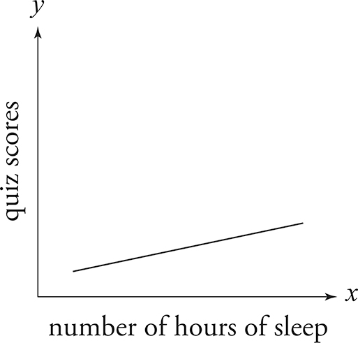
Remember that in math, the horizontal axis is always x: It’s the independent variable. The vertical axis is always y: It’s the dependent variable. Science follows the same rules. This graph shows you that as x increases, y increases. They have a direct relationship.
Slope = 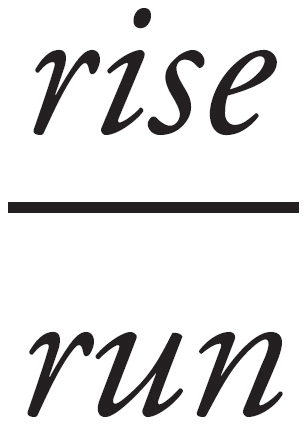

Let’s stick with using math to understand the graphs on the Science test better. Think about slope. It’s the change in y over the change in x. In this graph, the slope is positive. Direct relationships have positive slopes.
Let’s graph Table 2.

This graph shows you that as x increases, y decreases. They have an inverse relationship, and the slope is negative. Inverse relationships have negative slopes.
TRENDS ON THE SCIENCE TEST
The key to cracking the Science test is to look for trends and patterns. Figures with consistent trends point to a Now passage because the figure has provided the main point of the passage—the relationship between the variables.
In the next chapter, we’ll teach you a basic approach to cracking each passage, including passages that don’t feature small tables and graphs with consistent trends. But we hope that this chapter has convinced you to look for passages featuring figures with consistent trends to do Now. You’ll find even the hardest questions are easier to tackle when the figure tells you everything you need to know.
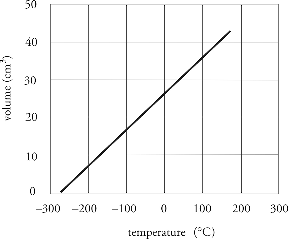
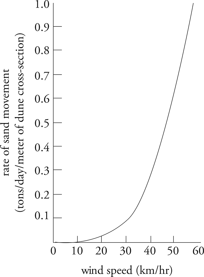
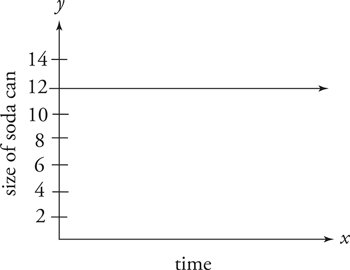
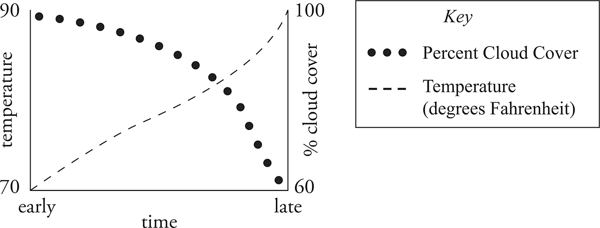
Look at each of the following figures. What are the relationships between the variables?
Dr. Frankenstein’s Experiment