Because of their flexibility and power, spreadsheets have become the general-purpose tool of choice for virtually every investor. In the past, the dividing line between spreadsheets and databases was clearly defined by size limitations. Those lines have become somewhat blurred. Technical analysis experiments involving fewer than one million records are often easier to construct with a spreadsheet than a database. In this regard it is difficult to distinguish between a database table and a worksheet. For example, a set of records that contains the daily open, high, low, close, and volume for all members of the S&P 500 for five years would occupy 630,000 rows—considerably less than Excel’s 1,000,000-row limit. Moreover, our simple data table would only use 5 of the 16,384 available columns. There is virtually no limit to the number of calculations and technical indicators that could be added across the sheet using additional columns. These calculations can then be used to test and refine theories about the behavior of the market or individual stocks, and to tune and fit indicators to that behavior.
This approach is distinctly different from the more familiar back-testing strategies available in most trading platforms. It is also much more scientific because it begins with a theory about market behavior and proceeds through various logical steps that ultimately end with the development of a set of indicators and trading rules. Back-testing indicators without first verifying the underlying market behavior is a hit-and-miss process with a very low probability of success. A more logical order involves developing a theory about market behavior; refining the theory through iterative testing and statistical analysis; selecting appropriate indicators; tuning and back-testing; and, finally, developing a trading strategy.
The more popular approach of fitting indicators to the market is flawed for a variety of reasons. Most significant is the “overfitting” problem that occurs when an indicator is optimally tuned against historical data. The problem is especially severe when the data spans a limited amount of time. Unfortunately, it is almost always the case that indicators, regardless of their sophistication, will work in one time frame and not another. Markets are dynamic in the sense that they are driven by economic forces that change rapidly over time. The past few years, for example, have seen markets that were dominated at different times by dollar weakness, dollar strength, a housing bubble, a housing collapse, a banking crisis, skyrocketing oil prices, collapsing oil prices, and both inflation and deflation. Individual company stocks are more dynamic than the broad market because their businesses respond to both the economy and changes in a specific industry.
Some indicators can be retuned to fit changing market conditions and some cannot. In either case, it is important to have a theoretical model that can serve as a predictor of success. The indicators will stop working when market behavior no longer fits the theoretical model. The overall course of events should, therefore, be extended to include an ongoing process of testing for the original market conditions that were used to select and tune indicators. Top-down approaches that begin with indicators and tuning cannot be extended this way because they lack an underlying theoretical framework.
As we shall see in this chapter, Excel is a perfect platform for developing and testing frameworks that describe the market’s behavior and for fitting technical indicators to that behavior.
Today’s markets are fundamentally different from those of just a few years ago. Most of the change has been driven by the explosive growth of algorithmic trading in very brief time frames—often less than a second. Many of these systems reside on supercomputing platforms that have the additional advantage of being located on an exchange where they benefit from instantaneous access to a variety of data streams spanning several different markets. Just a couple of years before these words were written, large institutions were focused on minimizing data delays with high-speed Internet connections and fiber-optic links. Since then, they have leapfrogged that problem by simply moving their servers to the exchange. The largest customers are even allowed to view market data a few hundredths of a second ahead of retail customers and to decide whether to take a trade before it is shown to the market. The game has evolved into a process of repeatedly generating very small profits in very brief time frames.
These dynamics have made it exceedingly difficult for the investing public to compete in short-term trading. Unfortunately, the technology gap is growing. Powerful institutional trading systems tend to extinguish trends almost immediately—a process that invalidates most technical indicators that can be embedded in a chart. The capability gap between private and institutional investors increases as the trading time frame decreases. This simple fact has far-reaching implications. In the past, short-term trends resulted from the behavior of individual investors. The result has been the evolution of relatively simple indicators based on moving average crosses, momentum, relative strength, and a variety of standard chart patterns with familiar names like pennant, head and shoulders, and teacup with handle. Most of these patterns have little relevance in a time frame that has come to be dominated by high-speed algorithmic trading because they were designed around the behavior of human investors.
Many of these effects tend to cancel over longer time frames, giving way to more dominant long-term trends. An excellent example is the two-year rally in Amazon.com that took the stock from $50 in December 2008 to $175 in December 2010. During this extended time frame, one of the best investment strategies involved using one-day sharp downward corrections as entry points to buy stock. Stated differently, most downward corrections were met with an immediate rally that took the stock to a new high. At the single-minute level, however, this tendency for reversal was mirrored only at the level of extremely large price changes. In 2010, for example, 1-minute downward spikes larger than 0.5% were immediately followed by a reversal 63% of the time. Unfortunately, the data contains only 106 such changes in 98,088 minutes (67 were followed by a reversal). Extremely large single-minute events are too rare, the reversals are too small, and the trading logistics are too difficult to be exploited by public customers.
Excel is an excellent platform for analyzing this type of historical data and formulating theories like the one just mentioned for Amazon. We might, for example, pursue the minute-level strategy by first identifying and flagging each of the large single-minute downward-spike events using simple conditionals and comparisons. The data could then be sorted to create a list containing the events and associated date and time information. The results are very revealing. For example, during the 1-year time frame analyzed at the minute level, only 9 of the 67 reversal events mentioned previously occurred after 2:00 PM. May was the most active month with 20 events, followed by January with 13 and February with 11. There were no such events in March or December. We could continue this analysis by extracting and charting each of the individual events and paying close attention to the preceding chart patterns. In the end, our goal would be to identify a set of conditions that could become the central theme of a trading strategy. The market would eventually extinguish our discovery and the rules would change. Statistical analysis, pattern discovery, and the development of trading strategies is, therefore, an ongoing dynamic process. Our discussion will focus on various strategies that can be deployed in Excel for constructing and testing theories about the behavior of a stock or an index.
Every trading strategy must begin with a theory about the behavior of a stock or an index. For illustration purposes we will begin with the simple theory mentioned previously that sharp downward corrections in Amazon stock are followed by a relatively strong rally. The time frame being studied spans 2 years ending in December 2010.
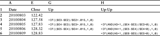
Our strategy uses a worksheet where each row contains date and price information in addition to a series of columns where flags are set to indicate the existence of various conditions. For example, the sheet might be organized with date, open, high, low, close, and volume in columns A–F, and columns G–K reserved for a series of tests. If the closing price change exceeds a preset threshold, then a “1” is placed in column G. A flag is placed in column H of the following row if the next price change also exceeds a threshold and the previous column G is marked. Column G can be thought of as marking “up” and column H as marking “up-up” situations—that is, an “up” day followed by a second “up” day. Likewise, columns I and J can be used to mark “down” and “down-down” events. We then sum each of the columns and divide to obtain the percentage of days where up is followed by another up, or down is followed by another down. A simple form of these tests is listed in Table 3.1.
Table 3.1 Arrangement of conditional and logical expressions to evaluate successive price changes where the first change is larger than 1.5% and the second change repeats the direction of the first. Prices shown are for Amazon.com.
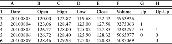
The actual table would have flags set in G3 and H4. These results are visible in Table 3.2, which displays the expanded version of Table 3.1 with flags instead of conditional expressions.
Table 3.2 Expanded version of Table 3.1 with flags set in columns G and H. Prices shown are for Amazon.com.
We can increase the flexibility of this approach by replacing the hard-coded values for the price-change thresholds in columns G (0.015) and H (0) with references to cells in the worksheet that can be modified to quickly recalculate the entire column. This approach eliminates the need to cut and paste rewritten versions of the statements—an especially helpful improvement in worksheets containing tens of thousands of rows of data. Table 3.3 contains a set of modified statements.
Table 3.3 Arrangement of conditional and logical expressions to evaluate successive price changes in which the first change is larger than the value stored in cell I2, and the second change is larger than the value stored in cell I3. As before, column E (not shown) contains closing prices.
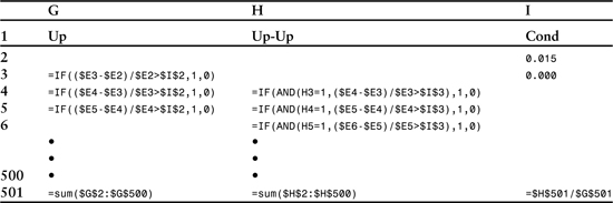
Different conditions can be tested and the entire sheet recalculated simply by changing the values stored in cells I2 and I3. Table 3.3 adds 3 cells at the bottom that contain the sums of columns G and H along with the ratio. Because most tests will involve many hundreds or thousands of rows, it is wise to store these results to the right of the calculations near the top of the sheet. The ($) symbol placed in front of the row and column descriptors makes the formulas portable in the sense that they can be cut and pasted anywhere that is convenient without altering the ranges they refer to. They will ultimately form the basis of a macro-generated table that will display results for a variety of thresholds that the macro will define in cells I2 and I3.
Tables 3.1–3.3 display the basic approach. In actual practice we would add two additional columns containing information about downward price changes. More elaborate comparisons containing additional columns with statistical measurements are almost always required as well. Table 3.4 extends our example by adding the r-squared (RSQ) function. R-squared is obtained by squaring the result of the Pearson product-moment correlation coefficient (r) that we used in the previous chapter. Although closely related, Pearson and r-squared differ in one significant way: The Pearson correlation is a measure of linear dependence, while r-squared reveals the percent of the variation in one variable that is related to variation in the other. For example, a Pearson value of 0.6 would indicate that 36% of the variation in one variable is related to the other (0.6 squared = 0.36).
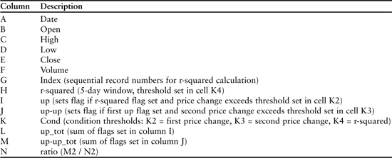
Table 3.4 Column descriptions for a sample experiment. Tables 3.5–3.7 contain detailed formula descriptions.
R-squared is often used when the goal is to extend the best fit line through a dataset to predict additional points. We will use r-squared in this context as a measure of the predictability of a trend. Two variables need to be set: the length of the window for the r-squared calculation and the threshold that will be used as a conditional to set a flag when a trend is detected.
Our ultimate goal in this analysis will be to discover whether a large daily price change occurring at the end of a detectable trend is likely to be followed by another price change in the same direction. Thresholds need to be set for the size of the first price change, the second price change, and an acceptable value for the r-squared test. As mentioned previously, we’ll also need to experiment with the length of the sliding window used to calculate r-squared.
Table 3.4 depicts the structure of a basic experiment built on this theme. It contains a functional outline organized by column. Columns A–F contain daily price information. Column G numbers the records in sequential order. This information is used by the r-squared function, which requires both y and x-axis values. Column E (closing prices) provides the y-axis values, and column G (sequential record numbers) is the x-axis. Simple sequential numbers are appropriate for the x-axis because the records are evenly spaced. Columns H, I, and J contain the core formulas of the experiment. Column H tests r-squared and sets a flag if the calculated value exceeds a preset threshold contained in cell K4 (0.8 in this example). For this experiment the r-squared calculation is based on a window of 5 closing prices. Column I contains the first price-change test. A flag is set in this column when the closing price change exceeds the threshold set in K2 and the adjoining r-squared flag in column H is also set. Column J sets a flag when a price change exceeds the threshold set in K2 and the previous row of column I also has a set flag. In this way columns I and J compare successive price changes. In this particular experiment the threshold for the second price change is 0%. Stated differently, the final flag is set if both price changes are in the up direction and the first exceeds the preset threshold of 1.5%. Because the sequence of tests begins with r-squared, the final flag will not be set unless the previous 5 closing prices fit a relatively straight line that defines a reasonable trend. Column K contains the threshold values for the first price change (K2), the second price change (K3), and the r-squared calculation (K4). Columns L–N represent a single line summary table that stores totals for the two price-change columns and the ratio. When the strategy is finally automated, this location will contain a summary table with successive rows representing different price-change thresholds.
Tables 3.5–3.7 provide detailed descriptions of the worksheet’s layout and formulas. The sheet has been divided into 3 tables to accommodate space limitations of the printed page. Columns E, G, H, and K are included in Table 3.5 which is intended to cover the r-squared calculation. Table 3.6 displays the first and second price-change tests (columns I, J). Associated data columns E (closing prices) and K (preset thresholds) have been omitted for space reasons—the printed page is simply not wide enough. Table 3.7 displays the formulas for the sums (columns L, M, N).
Table 3.5 R-squared calculation (column H) and associated data columns (E, G, and K) described in Table 3.4.
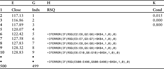
The formula contained in column H is composed of 3 pieces. It includes an r-squared calculation wrapped in a conditional statement that in turn is wrapped in an IFERROR statement. IFERROR is required because the r-squared calculation can generate a divide-by-zero error if all prices in the calculation window are the same. IFERROR will automatically set the flag to 0 in rare instances where this situation occurs.
The innermost statement generates a value for r-squared using a window of 5 closing prices. In this example, the range includes cells E2–E6:
RSQ(E2:E6,G2:G6)
Wrapping the r-squared test in a conditional allows us to set a flag if the value exceeds a threshold. In this case the threshold is stored in cell K4:
IF(RSQ(E2:E6,G2:G6)>$K$4,1,0)
The final enhancement wraps the conditional in an error-handling construct that sets the flag to 0 in situations where RSQ is undefined:
=IFERROR(IF(RSQ(E2:E6,G2:G6)>$K$4,1,0),0)
This method of building up complex statements from the inside out is a critical skill and a distinct advantage of Excel’s technology. The size and complexity that can be obtained far surpasses anything that would be required for this type of experiment. We could, for example, condense all three test columns into a single complex entity—Excel would have no problem with that level of nesting. In Excel 2010, for example, 64 IF functions can be nested as value_if_true and value_if_false arguments in a single statement. This capability allows the construction of very elaborate scenarios using many fewer columns than one might expect.
Table 3.6 displays a snapshot of the two rows used to test for sequential up price changes. Note that the first test (column I) begins in the fifth data row (row 6) to accommodate the r-squared window. The second test (column J) begins one row later because its result depends, in part, on whether a flag is set in the previous row of column I. Stated differently, the result in J7 builds on the result in I6.
Table 3.6 Sequential price-change tests (columns I, J). Associated data columns E and K have been omitted to accommodate the page width.
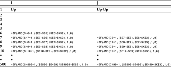
Each of the formulas is composed of a single logical comparison using Excel’s AND function. The formula in column I verifies that a flag was previously set for the r-squared test while also verifying that the current price change exceeds the threshold defined in cell K2. If both these conditions are met, a slag is set in column I. The formula in column J builds on this comparison by verifying that a flag has been set in the previous row of column I and that the current price change exceeds the threshold value of cell K3. Column J completes the 3-step comparison.
The design of the formula in column I is relatively straightforward. The innermost portion is the logical comparison that includes a verification of the r-squared flag and a price change exceeding a preset threshold measured as a percentage:
AND($H6=1,($E6-$E5)/$E5>$K$2)
Unfortunately, the AND function returns a value of TRUE or FALSE. Because our ultimate goal is to sum the number of occurrences, we need to replace TRUE with 1 and FALSE with 0. Wrapping the AND comparison with an IF statement solves this problem:
=IF(AND($H6=1,($E6-$E5)/$E5>$K$2),1,0)
Column J contains a similar formula in the sense that it uses the AND wrapped in IF construct. However, as mentioned above, the AND function refers to both the current price change ($E7-$E6)/$E6 and the flag from the first price change ($I6):
=IF(AND(I6=1,($E7-$E6)/$E6>$K$3),1,0)
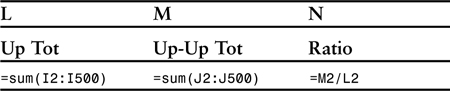
Table 3.7 completes the series with 3 cells that form the basis for a summary table containing many rows. However, in this example we are only testing one set of conditions—RSQ > 0.8 for a window that includes 5 closing prices capped by an upward price change greater than 1.5%. Our summary will count the number of such events and the percentage of occurrences that are immediately followed by a second upward price change.
Table 3.7 Tabulation of final results in columns L, M, and N.
The summary is based on a table with 499 rows of data. Many analyses are far larger. For example, a year of minutes contains more than 98,000 rows, and tick-level data can quickly grow to hundreds of thousands of rows. Excel is perfectly suited to testing such models because it can accommodate 1,048,576 rows and 16,384 columns in a single worksheet.
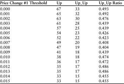
The previous example was designed to illustrate the basic logic and design of a worksheet that can be used to sequentially compare data items and tabulate the results. The real-life experiment described previously for Amazon.com stock would have yielded disappointing results. For the 2 years ending on December 14, 2010, there were 33 events that met the criteria and 15 were followed by a second price change in the same direction. Since the complete dataset included 504 days, 33 events represents 6.5% or just over 1 trading day per month. Half were followed by an up day and half by a down day. Surprisingly, raising the r-squared requirement to 0.8 had no effect. Stated differently, very large price changes that occur during a statistically significant trend cannot be used to predict short-term direction of the stock. Further increasing the price-change threshold or the r-squared isn’t helpful because the number of events falls to a level that is statistically insignificant. A complete set of results for the experiment is presented in Table 3.8.
Table 3.8 Experimental trend-following results for 2 years of daily price changes ending in December 2010 for Amazon.com. In each instance, the first price change exceeds the threshold listed in column 1, and the r-squared of the previous 5 days was larger than 0.8. The column labeled “Up_Up” counts the number of secondary price changes that followed in the same direction. Even the largest price changes were not useful leading indicators.
Discovering a distortion that can be profitably traded is always difficult and time consuming. The previous experiment was step #1 in a long iterative process. Excel is an excellent platform for this kind of work because much of the process can be automated. The most efficient style of automation is a kind of hybrid where a VBA program iteratively modifies key parameters in a worksheet that are used to trigger a recalculation. After each round of calculations, the program fetches the results and uses them to populate a summary table. The process continues until a preset endpoint is reached. Many simultaneous experiments can be run using a variety of different parameters and rules. When all the results are collected, the data can be mined for subtle statistical distortions that can be exploited as trading opportunities. The most common scenario involves a promising discovery that is used to trigger more complex experiments and ultimately the selection of a set of indicators.
Listing 3.1 displays a short program that is designed to work with the kind of worksheet described previously in Tables 3.4–3.8. This program and the worksheet that will be described were used to discover entry points for purchasing Amazon.com stock during 2010.
Listing 3.1 Sample Excel VBA program for processing trend statistics of the form presented in Tables 3.1–3.8.
1: Sub TrendStat()
2: 'columns: A=Date, B=Time, C=Open, _
D=High, E=Low, F=Close, G=Volume
3: 'columns: H=Test#1, I=Test #2A, _
J=Test #2B, K=Test#3A, L=Test#3B
4: On Error GoTo ProgramExit
5: Dim DataRow As Long
6: Dim SummaryRow As Long
7: Dim Param1 As Double
8: Dim Param2 As Double
9: Dim Start_1 As Double
10: Dim End_1 As Double
11: Dim Step_1 As Double
12: 'summary table headings
13: Cells(1, "P") = "Param1"
14: Cells(1, "Q") = "Param2"
15: Cells(1, "R") = Cells(1, "I")
16: Cells(1, "S") = Cells(1, "J")
17: Cells(1, "T") = Cells(1, "J") & " Avg"
18: Cells(1, "U") = Cells(1, "K")
19: Cells(1, "V") = Cells(1, "L")
20: Cells(1, "W") = Cells(1, "L") & " Avg"
21: DataRow = 2
22: SummaryRow = 2
23: 'set loop parameters here
24: Start_1 = 0
25: End_1 = 0.02
26: Step_1 = 0.001
27: For Param1 = Start_1 To End_1 Step Step_1
28: 'set param2 options here
29: 'Param2 = Param1
30: Param2 = 0
31: Cells(2, "N") = Param1
32: Cells(3, "N") = Param2
33: Cells(SummaryRow, "P") = Param1
34: Cells(SummaryRow, "Q") = Param2
35: Cells(SummaryRow, "R") = Cells(1, "Y")
36: Cells(SummaryRow, "S") = Cells(1, "Z")
37: Cells(SummaryRow, "T") = Cells(1, "AA")
38: Cells(SummaryRow, "U") = Cells(1, "AB")
39: Cells(SummaryRow, "V") = Cells(1, "AC")
40: Cells(SummaryRow, "W") = Cells(1, "AD")
41: SummaryRow = SummaryRow + 1
42: Next Param1
43: ProgramExit:
44: End Sub
In this particular version of the program, columns H–L house the test formulas, column M provides the sequentially number index used for the r-squared calculation, and column N contains price-change thresholds (Param1, Param2) as well as the r-squared threshold that will be used for calculations in column H. The summary table is located in columns P–W, and final statistics for each round of calculations are stored in columns Y–AD.
The program differs from the example outlined in Tables 3.1–3.7 in that it has been extended to test a second set of conditionals. Whereas the previous example tested for a single trend-following case encoded in the formulas of columns I and J, the current program assumes that a second set of conditionals will be encoded in columns K and L. Assuming that columns I and J code the up-up example, columns K and L would most likely code the down-down case. Conversely, the formulas of columns I–L could easily be rewritten to screen for reversals—that is, up followed by down (up-down) and down followed by up (down-up). Moreover, the tests may be reversed in this way without altering the program as long as the original column structure remains intact. In either event, both tests prefilter the dataset using the r-squared calculation of column H.
The flow logic of the program is relatively simple. Lines 24, 25, and 26 contain the boundary conditions for the first price-change test in terms of starting point, end point, and step size. The major program loop begins in line 27. Values for the second price-change test are defined in lines 29 and 30. If line 29 is commented out, the second price change will be set at 0 (any size change). If line 30 is commented out, the second price change will be set equal to the first for every test. One, but not both, of the lines must execute.
Each round of calculations begins by incrementing the first price-change test threshold (Param1) and setting the second price-change threshold (Param2) according to the rules specified (lines 29–30). The new settings are stored in column N of the worksheet, triggering a global recalculation. When the worksheet recalculates, it automatically stores new sums for columns I, J, K, and L at the top of the sheet in Y1, Z1, AB1, and AC1. AA1 and AD1 contain the ratios. Lines 35–40 of the program copy these values to the next line of the summary table. Line 41 increments the row pointer for the table, and line 42 restarts the for loop at the top with the next price-change threshold.
Each time the loop restarts, new price-change thresholds are stored in column N, triggering a global recalculation, and the sums representing the number of flags set in columns I, J, K, and L are automatically stored in Y1, Z1, AB1, and AC1, along with the ratios in AA1 and AD1. The program continues fetching these values and adding them to the growing summary table until the endpoint of the loop is reached. Each iteration of the program is, therefore, equivalent to manually changing the threshold values stored in column N and then immediately cutting and pasting the new sums and ratios from Y1 to AD1 to a new line of the summary table.
Several adjustments and iterations of this particular version of the program were used to evaluate daily price-change dynamics for Amazon.com during the two-year period ending in December 2010. While large upward price changes were not predictive events, large downward price changes were. However, rather than being confirmations, large downward spikes that occurred during a significant downtrend most often signaled the beginning of a reversal. The effect vanishes, however, when the downward price change is not part of a distinct trend. The r-squared test was, therefore, critical to the evaluation. Table 3.9 contains results for the “down_up” scenario. As before, the evaluation included a relatively high r-squared threshold of 0.8.
Table 3.9 Downward trend-reversal test results for 2 years of daily price changes ending in December 2010 for Amazon.com. In each instance, the first price change exceeds the threshold listed in column 1, and the r-squared of the previous 5 days was larger than 0.8. The column labeled “Dwn_Up” counts the number of secondary price changes that followed in the opposite direction.
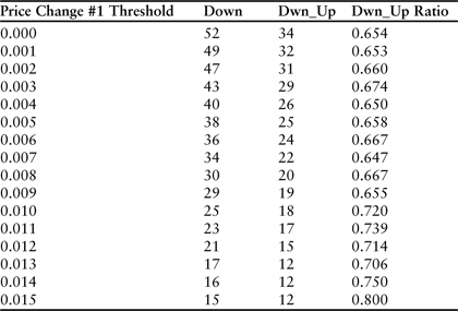
The table reveals that 23 large downward price spikes (>1.1%) meeting the r-squared test occurred during the 24 months evaluated. A large proportion of these (17) were followed by a reversal. The last entry in the table is more impressive but the frequency is relatively small (15 events in 24 months). However, it is important to note that entering the market 15 times in 24 months with an 80% success rate would result in an extraordinary return. These dynamics need to be balanced against investment goals and personal time frames.
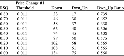
The importance of the r-squared trend significance test is revealed in Table 3.10, which traces results for the 1.1% line of the table across a range of r-squared values from 0.0 (no threshold) to 0.8 (the filter used in Table 3.9).
Table 3.10 Downward trend-reversal test results for 2 years of daily price changes ending in December 2010 for Amazon.com. Each line of the table displays a result of the “down_up” scenario in which the first downward price change was larger than 1.1% and the r-squared filter was set at the level noted in column 1.
Our goal in this experiment was to identify a simple set of rules that can be used to pick entry points for purchasing stock. Using these results, we have determined that it is best to initiate long positions on Amazon when the stock declines more than 1.1% at the end of a significant downward trend where r-squared is greater than 0.8. This approach is fine for persistent long positions that are kept open for long periods of time. However, if our goal is to trade the stock by entering and exiting trades in relatively short time frames, then we need to continue studying price-change statistics to identify exit points. We would be looking for situations where an uptrend is followed by a significant reversal. Once again, the correct approach would be to formulate and test theories until statistically significant results are uncovered. These results must then be developed into a trading plan.
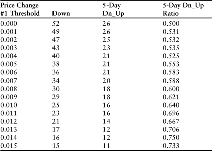
Table 3.11 displays the results with a gap of 5 trading days between the first price change and the second. The effect clearly fades, with the difference being largest for small price changes. For example, in the case of downward spikes larger than .001 (line 2 of tables 3.9 and 3.11), the chance of a reversal was 65.3% in the 1 day time frame but only 53.1% in the 5 day time frame. One interpretation would be that a relatively small downward spike during the course of a downtrend is unlikely to completely disrupt the trend and trigger a long-term reversal in the form of regression to the mean. At the practical trading level it could be said that the down spike is too small to trigger a short covering rally. The fading effect is also apparent in the large price-change categories. Across the range from 0% to 1.5%, the average difference between down_up ratios is substantial (11.7%). These results would indicate that during the 2-year time frame evaluated, significant downtrends tended to end with a single large down spike, and that the reversal that followed tended to fade over the next few days. At the end of 5 days, the chance of the stock trading higher was less than it was the very next day.
Table 3.11 Downward trend-reversal test results for 2 years of daily price changes ending in December 2010 for Amazon.com. In each instance, the first price change exceeds the threshold listed in column 1, and the r-squared of the previous 5 days was larger than 0.8. The column labeled “5-Day Dn_Up” counts the number of secondary price changes that followed in the opposite direction 5 days later.
The most obvious question is whether the trend reversal persists beyond the next day. We can answer this question by once again adjusting the formula and recalculating the worksheet. The entire process takes just a few seconds. Table 3.12 reveals the details for a 2-day gap.
Table 3.12 Downward trend-reversal test results for 2 years of daily price changes ending in December 2010 for Amazon.com. In each instance, the first price change exceeds the threshold listed in column 1, and the r-squared of the previous 5 days was larger than 0.8. The column labeled “2-Day Dn_Up” counts the number of secondary price changes that followed in the opposite direction 2 days later.
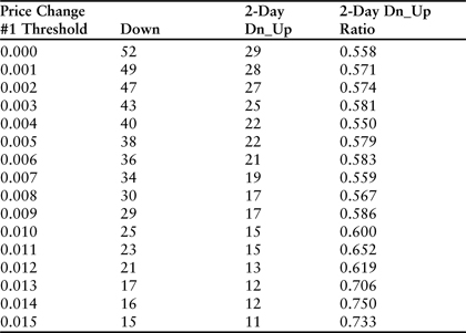
Results were similar in that the reversal was strongest the day immediately after the large downward price change. Across the full range from 0% to 1.5% the difference between the 1- and 2-day results was still significant (11.4%). As in the 5-day case, every size category displayed evidence of a fading trend. These results would argue that the best strategy involves buying the stock immediately after a large downward price spike at the end of a significant trend, and selling the stock the very next day after the reversal that presumably results from a brief short covering rally.
Building an actual trading system requires additional analysis at the individual event level. For example, we have not yet quantified the average size of the price reversals, and none of the daily price-change analysis provides detail that can be used for intraday trade timing. One solution is to rewrite the formula in column L so that it stores the actual price change rather than a simple flag. The threshold for the first price change (N2) can then be manually set to a high level such as 1.1%, and the recalculated worksheet can be sorted by the magnitude of the result in column L (the size of the reversal). The form of the rewritten column L statement would be this:
=IF(AND(K6=1,($F7-$F6)/$F6>$N$3),($F7-$F6)/$F6 ,0)
Following these steps for the downward price spikes larger than 1.1% yielded important results. Of the 17 reversals observed, 13 were larger than 1%, with the average 1-day close-to-close increase being 1.8%. Buying at the market close on the day of the down spike generated a larger return than buying at the open on the following day. Moreover, buying at the next day’s open yielded slight losses in 2 of the 17 reversal cases because the reversal took place immediately. These dynamics tend to confirm the short-lived nature of sharp reversals in a downtrend—further evidence that they are driven by short covering rallies.
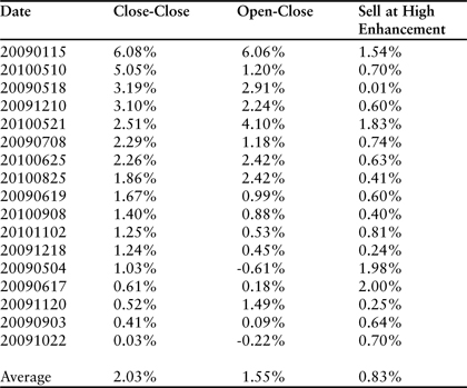
A more detailed minute-by-minute review of each of the 17 reversal days did not reveal any particular pattern that could be used to further optimize the trade. In virtually every case, selling at the high of the day would have yielded a significant enhancement over the close (average enhancement = 0.83%). However, the precise timing of the daily high was difficult to predict. The results are summarized in Table 3.13.
Table 3.13 Summary data for reversal days following downward spikes larger than 1.1%. The column labeled “Close-Close” displays the return that would be achieved by purchasing the stock at the previous day’s close and selling at the close on the reversal day. “Open-Close” refers to buying at the open of the reversal day and selling at the close.
The analysis would not be complete unless we also reviewed the 6 events in which a large downward spike did not result in a reversal. A simplification of the column L statement allows us to capture every event in which a large downward spike occurred on the first day (column K). The following statement stores the second-day price change in column L:
=IF(K6=1,($F7-$F6)/$F6,0)
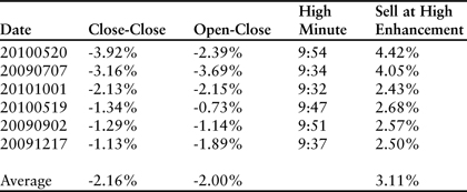
In each case, the downward trend continued with a significant drop in price. Buying at the close of the first day and selling at the close of the second resulted in an average loss of 2.16%. Surprisingly, however, closing the trade at the high of the second day resulted in an overall profit. Minute-by-minute review of each event revealed a startling trend—each of the losing days on which the downtrend continued reached a high point in the first half-hour of trading. Selling within the first half-hour would have resulted in an average profit of 0.95%. Stated differently, each down spike was followed by a sharp reversal, with 6 of the 23 events fading almost immediately on the second day. These 6 events ultimately resulted in a loss if the trade was not closed when the stock began falling. Additional minute-by-minute analysis should be used to identify triggers for stopping out of long positions that are initiated in response to the initial drawdown at the close on the first day. Table 3.14 contains relevant data for the failed days on which the stock closed lower after the initial large down spike.
Table 3.14 Summary data for failed reversal days following downward spikes larger than 1.1%. The “Sell at High Enhancement” is surprisingly large for each event and the high point always occurred before 10:00.
The process of collecting, sorting, and analyzing price-change data is dynamic because the market is in a state of continual flux. Today’s trading environment is much too efficient to allow a simple set of rules to persist for any length of time, and significant distortions are always extinguished very quickly. The example used in this chapter was designed to illustrate one of many processes for gaining a statistical advantage. In this regard, a real-life example was chosen to avoid the more common approach of creating a nearly perfect and highly misleading example. Specific technical indicators and chart patterns have been avoided because the goal in this discussion was to build a statistical framework for identifying relevant trends and events. Approaching the problem from the other side—that is, testing and tuning a set of indicators against historical data—is almost always a flawed approach until statistical relevance is established. Once a statistically relevant scenario is identified, however, this approach should become the dominant theme. For Amazon.com we were able to demonstrate a set of conditions that yield statistically advantaged rules for entering and exiting long positions. These rules can be further tuned by deploying other technical indicators once an event is detected. In all cases simplicity should be the major goal.
It is also important to note that any time frame may be chosen for this type of analysis from individual ticks to minutes, hours, days, or weeks. More sophisticated strategies will also include measures of relative performance against other financial instruments or indexes. Today’s environment is characterized by virtually limitless amounts of data and powerful analytical tools. Excel is perhaps the most versatile of the group.