In the next few pages, you will see how to apply the principles of the The Grammar of Graphics with the ggplot2 package. With this package, you are able to change a lot of details in your graphics and create your own individual style. We will give you examples of some of its main settings.
You can find the
ggplot2 package on CRAN, which makes it very easy to install it:
install.packages("ggplot2")You are then able to simply load it with the following:
library(ggplot2)
Or, you can just check the box in front of the package name in the packages pane of RStudio:
The ggplot2 package provides two functions to create graphic objects:
qplot()

ggplot()
qplot stands just for quick plot, and ggplot is an abbreviation of grammar of graphics plot, which shows its strong connection to the framework mentioned earlier.
qplot aims to be very similar to the basic plot function, and to be very simple to use. But it does not follow the full capacity of the framework and its elements.
For beginners, ggplot and its aspects are not easy to learn, but when you've made yourself familiar with the function, it is a very powerful way to create graphics.
ggplot always focuses on enabling the building of graphics using the three basic components:
- Data
- A set of geoms
- A coordinate system
But ggplot offers a lot of different options for these components.
For our first graph, we will use the preinstalled iris dataset. This data will be loaded automatically when you open R or RStudio. You can look at it using the following line:
head(iris)
We can then use the ggplot() function and add a data argument and an aesthetics element:
ggplot(iris,aes(Sepal.Length,Sepal.Width))
If you execute this line, you will get the following error message:
Error: No layers in plot
This is telling you that you have to add a geom object to the function call, which actually defines the type of the chart:
ggplot(iris, aes(Sepal.Length, Sepal.Width)) + geom_point()
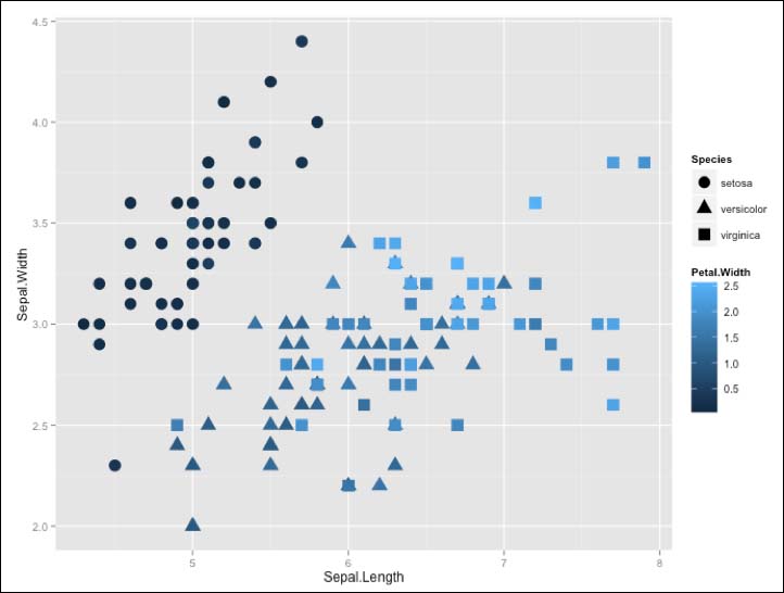
After adding some further options, you can see the power of ggplot2, and how easy it is with one line of code to create a complex data visualization:
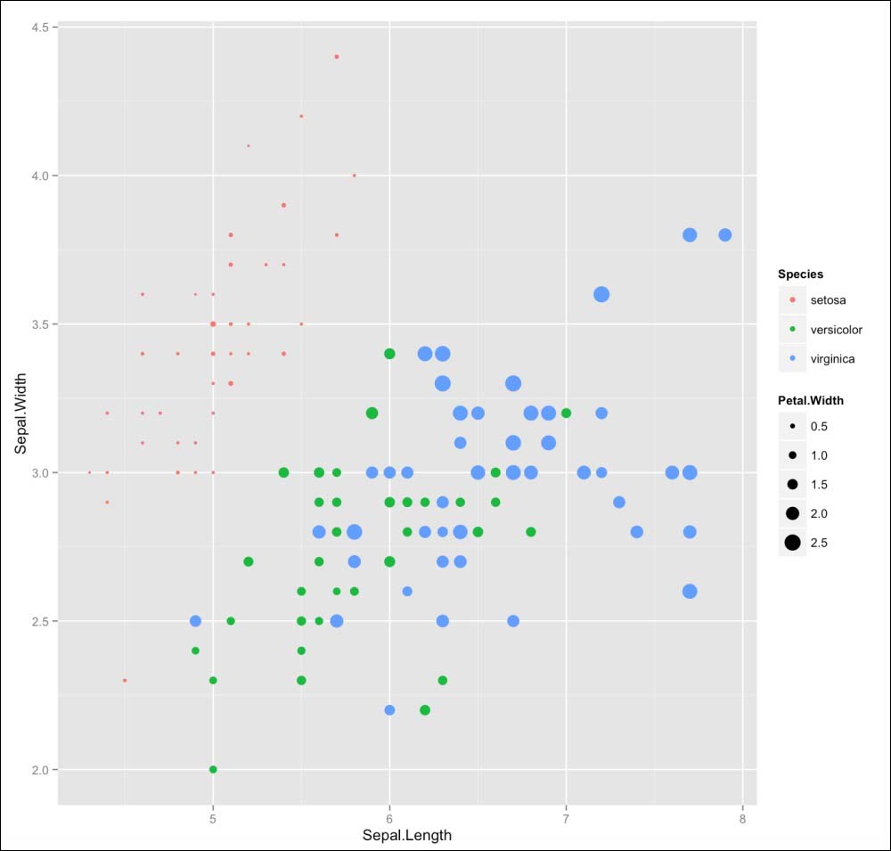
ggplot(iris, aes(x=Sepal.Length, y=Sepal.Width, shape = Species, color = Petal.Width)) + geom_point(size = 5)
We will now take a closer look at the elements that we used to create this graph. But before we can do this, we have to look at the most significant difference from the base plotting system: the plus (+) operator.
The aesthetics function helps you to define what data values should be added to the geom and how variables in the data are mapped to visual properties. You can define the x and y locations, as well as additional parameters such as the color or the size. This depends on the geom function that you use for your visualization. Different visualization forms understand different aesthetics inputs.
Basically, you have to decide on what geoms option to use, based on your dataset and what you want to visualize. Choosing a geom function is deciding how you want to represent data points and variables. The different geom functions return a layer that you can than add to your ggplot object with the + operator. So, to add a layer to our previous example, we could use the
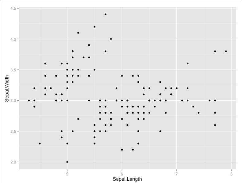
geom_point() option, which is often used if you want to visualize two variables and turn the output into a scatterplot:
ggplot(iris) + geom_point(aes(x = Sepal.Length, y = Sepal.Width)))
This will create the following output in the Viewer pane:
First, we created a ggplot object with the iris dataset. This will not display anything, as it does not include a layer. We add this to our object with the plus operator, and choose a geom_point() model in this case. For this layer object, we define the aesthetics to be Sepal.Length on the x axis, and Sepal.Width on the y axis.
Besides this, the geom_point() function understands seven different aesthetic inputs. They are:
xyalphacolorfillshapesize
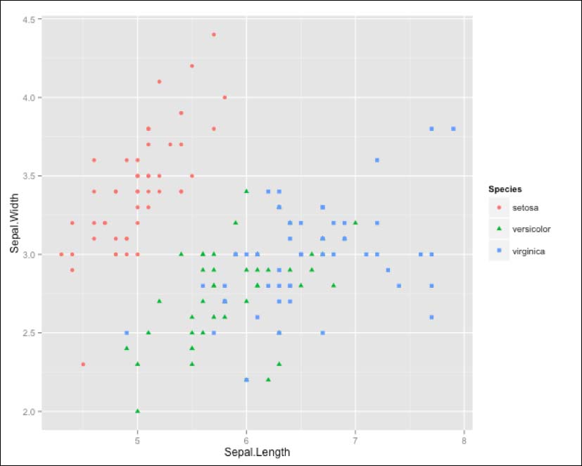
So, we can add another parameter to the aesthetics function of the geom_point() model. In this case, we define the color and shape of the data point to change according to the species it displays:
ggplot(iris ) + geom_point(aes(Sepal.Length, Sepal.Width,color = Species, shape= Species))
Choosing the right geom is one of the most important tasks when you want to visualize your data. You need to have a vision of what you want to visualize, and what it should look like. And you also should know the variables that you want to display in your graphic.
ggplot2 offers a lot of different geoms, and you can choose one according to your needs. Basically, geoms are separated based on how many variables you want to visualize:
|
One Variable |
Two Variables |
|---|---|
|
Continuous Variable
|
Continuous X, Continuous Y variable
|
|
Discrete Variable
|
Discrete X, Continuous Y variable
|
|
Three Variables
|
Continuous Bivariate Distribution
|
|
Graphical Primitives
|
Continuous Function
|
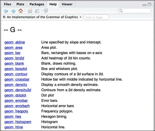
You can get more information about the geom types by searching through the ggplot package description for geom. In RStudio, you can do this by clicking on the ggplot2 package in the Package browser. Then, the Help pane will open and you can search for geom.
ggplot offers a lot of ways to modify your graphics. We will now take a look at three options:
- Color
- Shape
- Size
Often, different colors are needed for different groups in the dataset. As an example we will use the iris dataset again but this time we will use the geom_bar element to create a bar chart.
ggplot(iris, aes(Species, Sepal.Length)) + geom_bar(stat = "identity")
This code snippet will create the following chart:
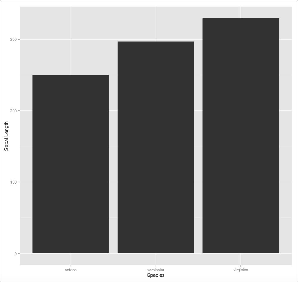
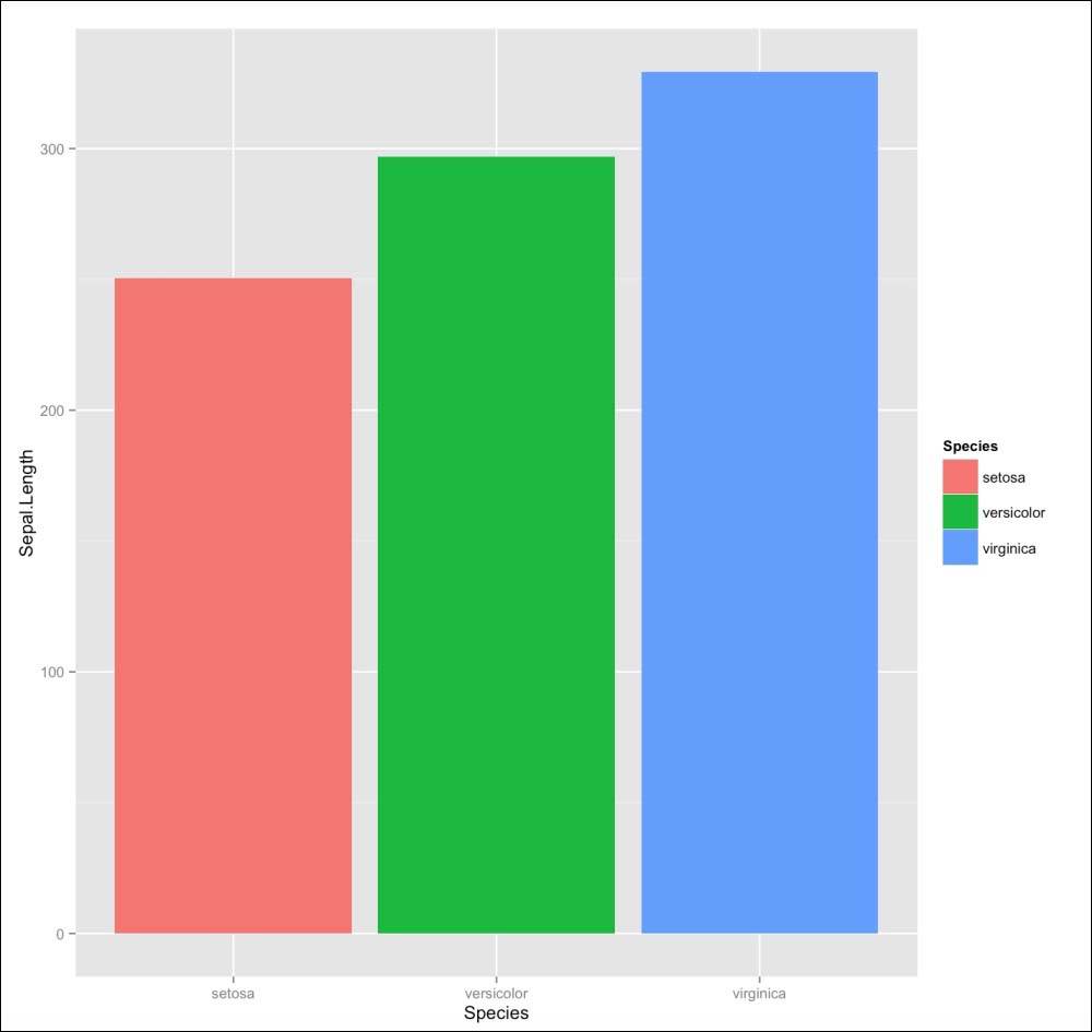
It is hard to differentiate the three categories at first glance. So, we use the fill option of the aesthetics function to make ggplot not just separate the data by Species, but also color the bars according to their species:
ggplot(iris, aes(Species, Sepal.Length, fill = Species)) + geom_bar(stat = "identity")
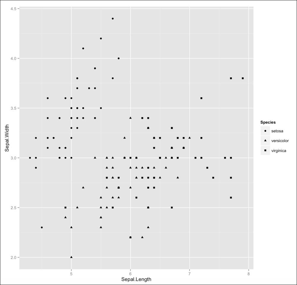
Another way to include a third variable in the visualization is the use of the shape parameter. Similar to the previous example, we can set it to be a specific variable from the dataset. Now, the species are not differentiated by color but by the shape of the data points:
ggplot(iris, aes(Sepal.Length, Sepal.Width, shape = Species)) + geom_point()
You can set the size of the data point shown with the help of the size parameter, and define it to be, for example, another variable to make the points in the scatterplot change their size according to this variable:
ggplot(iris, aes(Sepal.Length, Sepal.Width, color = Species, size = Petal.Width)) + geom_point()
You can also save your ggplot object in a variable. This makes it easier to add new elements and change something later. You can also use this principle to save different versions of a plot. The following lines of code are showing the mentioned methods:
d <- ggplot(iris)

bar_chart <- d + geom_bar(stat = "identity", aes(Species, Sepal.Length, fill = Species))

point_chart <- d + geom_point(aes(Sepal.Length, Sepal.Width,color = Species, shape= Species))
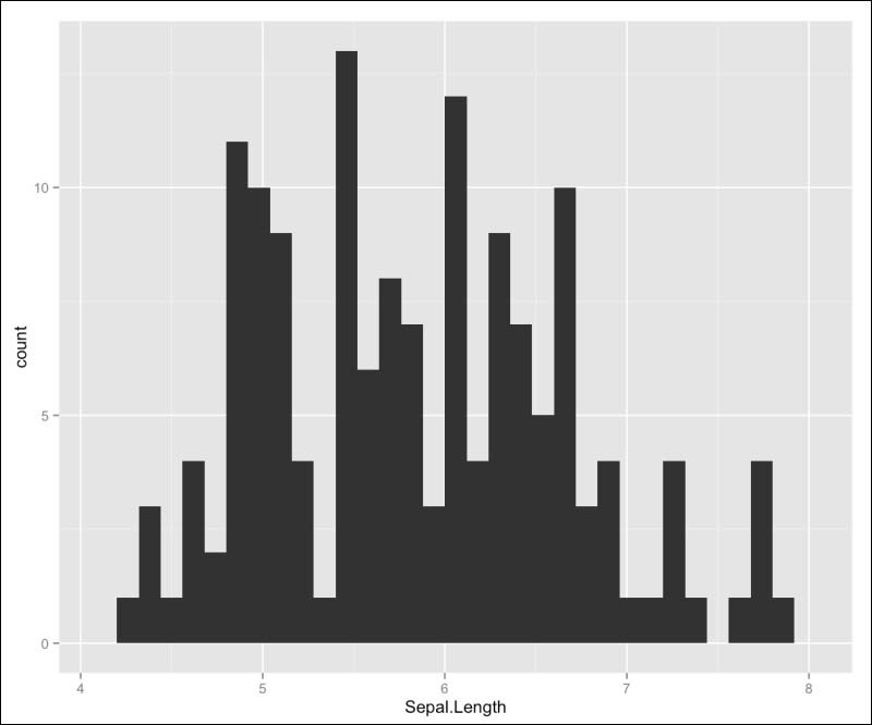
Another way to add a layer is by using the stats element. These layers do not just display your data, but they also transform it. Some of the geoms elements already include stat objects. As do the geom_area() or geom_bar() functions. This one includes the stat argument to be bin, and the other one identity.
You can also include it on your own by adding a stat layer to your ggplot object:
d <- ggplot(iris, aes(Sepal.Length))
d + stat_bin()
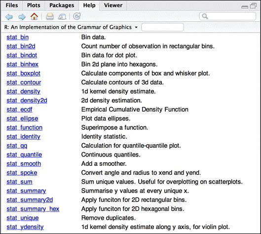
You can get a good overview of the stats options, as you could get for the geom options. This time, you search for stats in the ggplot package description:
Exporting graphics from R can sometimes be very hard when you are working with the base plotting system, but ggplot2 offers you the ggsave() function. This function just needs a filename, including a file extension, to save your plot:
ggsave("Iris_graph.jpg")The ggsave function currently recognizes the following extensions:
eps/pstex(PicTeX)pdfjpegtiffpngbmpsvgwmf(Windows only)
Besides the file format, you can also set a scaling factor for the width, height, as well as the dpi to the user for raster graphics.
When called, ggsave saves the last displayed plot. But you can also specify a plot with the plot argument.