The base, lattice, or ggplot2 plotting systems make it possible to create all conceivable plot types, either quick and simple, or even utterly detailed and sophisticated. All these systems have their own features and peculiarities. But they also have one thing in common: the relevant plots are all purely static.
In particular, the ubiquitous use of the Internet and corresponding browsers make it possible to easily share interactive content. Interactivity, in turn, helps humans to better understand the contents by actively interacting with them. Interactive charts are, of course, a great improvement, since viewers can play with the displayed data, and thus discover possible coherences and differences among other things to get a better understanding of the shown plot.
ggvis is practically the next evolutionary step forward from the successful data visualization package, ggplot2. Hadley Wickham (who is already the author of the ggplot2 package) and Winston Chang authored ggvis. The package description is as follows:
The goal is to combine the best of R (for example, every modeling function you can imagine) and the best of the web (everyone has a web browser). Data manipulation and transformation are done in R, and the graphics are rendered in a web browser using Vega. For RStudio users, ggvis graphics display in a viewer panel, which is possible because RStudio is a web browser. | ||
| --Hadley Wickham, Winston Chang (http://ggvis.rstudio.com) | ||
So, the ggvis package uses the grammar of graphics theory, which is already known from ggplot2, and uses the rendering of the popular JavaScript package, vega. Furthermore, it takes advantage of a few R packages. The reactive programming model of Shiny, the pipe operator (%>%) of the magrittr package, and the data transformation grammar of the
dplyr package are all integrated into ggvis. Thus, the package uses a variety of different technologies to achieve a modern and interactive plotting system.
First of all, the ggvis package must be installed, of course. The mentioned packages, shiny, dplyr, and so on, will get imported through the ggvis installation, if they are not already installed. For our examples, we will use the swiss dataset, which is included in the preinstalled datasets package:
swiss %>% ggvis(~Fertility, ~Education, fill := "blue") %>% layer_points()
This line of code produces the following chart:
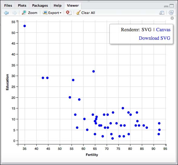
As you can see, we get a scatterplot that looks like a ggplot2 graph. If we break down the previous code snippet, you can see the following structure for creating a ggvis graph:
Graph = Data + Coordinate System + Mark + Properties + ...
Furthermore, there are three types of syntaxes used. They are:
%>%: This is the pipe operator from themagrittrpackage~: This is the tilde operator, which takes a column or a whole data frame:=: This is the setting operator, which sets properties such as color, size, and others
In the right corner of the Viewer pane of RStudio is a small gear icon. A click on this icon opens the controls, where you can render the graph in SVG or Canvas, and also additionally download the plot. This rendering is done by the mentioned vega library.
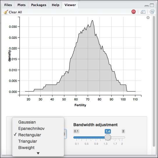
Since our first example is not interactive, in the following one we want to create an interactive ggvis plot:
## example partly taken from the ggvis interactivity vignette
swiss %>% ggvis(x = ~Fertility) %>%
        layer_densities(
                adjust = input_slider(0.1, 2, value = 1, step = .1, label = "Bandwidth adjustment"),
                kernel = input_select(
                        c("Gaussian" = "gaussian",
                          "Epanechnikov" = "epanechnikov",
                          "Rectangular" = "rectangular",
                          "Triangular" = "triangular",
                          "Biweight" = "biweight",
                          "Cosine" = "cosine",
                          "Optcosine" = "optcosine"),
                        label = "Kernel")
        )
This code example provides interactivity by letting the viewer change the bandwidth and the kernel of the density plot. These input boxes are integrated through the Shiny package.
Although ggvis is still under intensive development, it can definitely be stated that this package represents the future of modern plotting systems in R.
rCharts is an R package to create, customize, and publish interactive JavaScript visualizations from R using a familiar lattice style plotting interface. | ||
| --Ramnath Vaidyanathan (http://rcharts.io/) | ||
As indicated in this quote, the rCharts package can virtually be considered as an interactive successor to the lattice plotting system. Since rCharts is not on CRAN, you need to install this package with a package called devtools directly from the GitHub repository of the package creator, Ramnath Vaidyanathan:
library(devtools)
install_github("ramnathv/rCharts")
library(rCharts)
The following lines of code produce an interactive bar chart:
# interactive bar chart with d3js(NVD3)
# this code example was taken from http://ramnathv.github.io/rCharts/
hair_eye_male <- subset(as.data.frame(HairEyeColor), Sex == "Male")
n1 <- nPlot(Freq ~ Hair, group = "Eye", data = hair_eye_male, type = "multiBarChart")
n1$print("chart3")
n1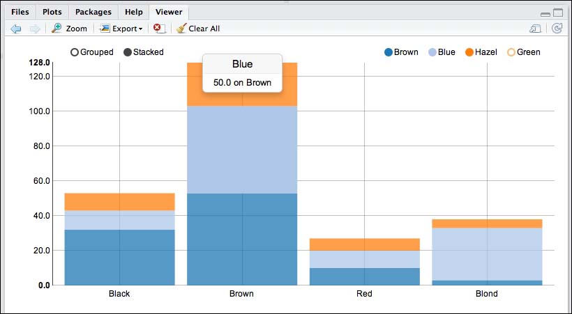
This bar chart is completely interactive. First, you can set the displayed bars as stacked or grouped. In the example, the stacked version is shown. Second, you can virtually switch on and off the eye colors. We switched the color green off; therefore it is not shown in the chart. Furthermore, you can hover over the bars to get the values of the plotted data.
The googleVis package provides an interface between R and the Google Charts API. It allows users to create web pages with interactive charts based on R data frames. Charts are displayed locally via the R HTTP help server. A modern browser with Internet connection is required, and for some charts, a Flash player. The data remains local and is not uploaded to Google. | ||
| --Marcus Gesmann, Diego de Castillo (https://github.com/mages/googleVis) | ||
The googleVis package can be downloaded directly from CRAN. By using the Google Charts API, a variety of different types of charts in a familiar look and feel are available. One limitation, as compared other packages, is certainly the mandatory Internet connection needed to display the chart outputs.
The following code produces an interactive bar and line chart combination:
# interactive line line and bar with googleVis
# this code example was taken from the googleVis package vignette
CityPopularity$Mean=mean(CityPopularity$Popularity)
CC <- gvisComboChart(CityPopularity, xvar='City',
          yvar=c('Mean', 'Popularity'),
          options=list(seriesType='bars',
                       width=450, height=300,
                       title='City Popularity',
                       series='{0: {type:\"line\"}}'))
plot(CC)
The plot function call immediately opens a new browser window and displays the chart there:
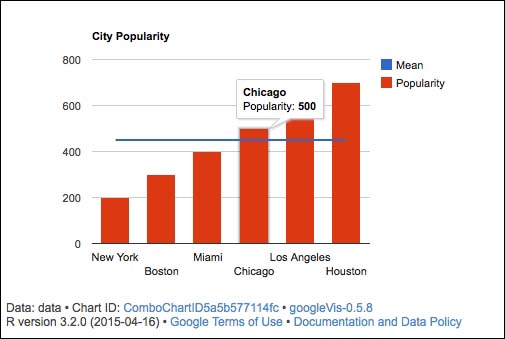
Here, interactivity is given by the fact that you can hover over the data, in this case the bars and the line, to know the exact values.
The htmlwidgets package is a relatively new approach to provide R users with multiple ways to display data and related stories around data, mostly in an interactive manner. In its core, it provides a framework for creating R bindings to JavaScript libraries. That means there are different R packages that are based on the htmlwidgets package. One main advantage of this package, for our purposes, is that the interactive charts can seamlessly be embedded within R Markdown. You install it along with the included packages mostly directly from CRAN. Some packages must be installed from GitHub.
The dygraphs package is an R interface to the dygraphs JavaScript charting library. It provides rich facilities for charting time-series data in R. | ||
| --RStudio Inc. (http://rstudio.github.io/dygraphs/) | ||
Plots created with the dygraph package are opened in the RStudio Viewer pane, and can also be easily integrated into Shiny applications and R Markdown files. Moreover, the syntax takes advantage of the magrittr package and the pipe operator. The following code produces an interactive dygraph with a predicted series:
## example taken from https://rstudio.github.io/dygraphs
hw <- HoltWinters(ldeaths)
p <- predict(hw, n.ahead = 36, prediction.interval = TRUE)
all <- cbind(ldeaths, p)
dygraph(all, "Deaths from Lung Disease (UK)") %>%
  dySeries("ldeaths", label = "Actual") %>%
  dySeries(c("p.lwr", "p.fit", "p.upr"), label = "Predicted")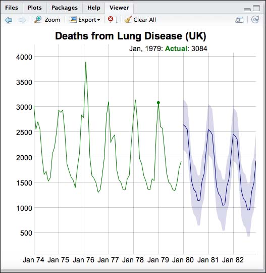
Leaflet is a popular JavaScript library for creating interactive maps. This website describes an R package that makes it easy to integrate and control Leaflet maps from directly within R. | ||
| --RStudio Inc. (http://rstudio.github.io/leaflet) | ||
The leaflet package needs to be downloaded from GitHub in the usual manner:
library(devtools)
install_github("rstudio/leaflet")
library(leaflet)
With the leaflet package, you can easily create maps and customize them by adding different types of layers, such as UI, Raster, Vector, and others.
The following code produces an interactive map, as we know them from our daily use of maps and navigation systems. Even inside the Viewer pane, you can zoom in and out, or stumble around:
leaflet() %>% addTiles() %>%
        addMarkers(174.7690922, -36.8523071, icon = icons(
                iconUrl = 'http://cran.rstudio.com/Rlogo.jpg',
                iconWidth = 40, iconHeight = 40
        )) %>%
        addPopups(174.7690922, -36.8523071, 'R was born here!')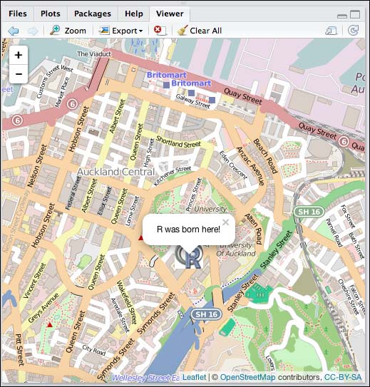
A relatively new package, in this context, is rbokeh. This package is an interface to Bokeh.
Bokeh is a visualization library that provides a flexible and powerful declarative framework for creating web-based plots. Bokeh renders plots using HTML canvas and provides many mechanisms for interactivity. Bokeh has interfaces in Python, Scala, Julia, and now R. | ||
| --Ryan Hafen (http://hafen.github.io/rbokeh) | ||
Download it from a GitHub repository, again, to install this package:
library(devtools)
install_github("bokeh/rbokeh")
library(rbokeh)
rbokeh adapts known principles from the ggplot2 geoms and ggvis layers, but also has traces of the base plotting system. The code and the output of an rbokeh scatterplot with an annotation line look like this:
p <- figure() %>%
  ly_points(cars$speed, cars$dist) %>%
  ly_abline(-17.6, 3.9)
p
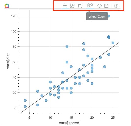
As shown, each rbokeh graph has a setting bar, which in turn provides various tools to interact with the displayed chart. These settings are powerful features for viewers. Since rbokeh is still in its infancy, we can certainly expect a lot more from this plotting system in the future.