After you know how to build a simple Shiny application, as well as how reactivity works, let us take a look at the next step: the various resources to create a custom user interface. Furthermore, there are nearly endless possibilities to shape the look and feel of the layout. As already mentioned, the entire HTML, CSS, and JavaScript logic and functions of the layout options are based on the highly flexible bootstrap framework. And, of course, everything is responsive by default, which makes it possible for the final application layout to adapt to the screen of any device.
Currently, there are four common shinyUI() page layouts:
pageWithSidebar()fluidPage()navbarPage()fixedPage()
These page layouts can be, in turn, structured with different functions for a custom inner arrangement structure of the page layout. In the following sections, we are introducing the most useful inner layout functions. As an example, we will use our first Shiny application again.
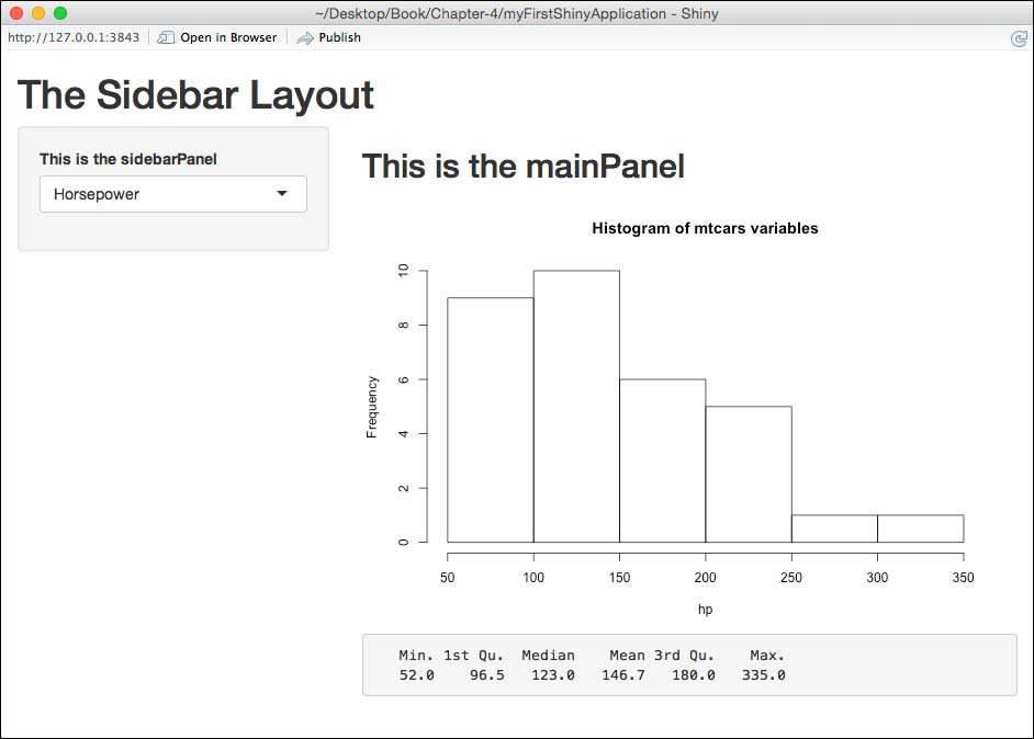
The sidebar layout, where the sidebarPanel() function is used as the input area, and the mainPanel() function as the output, just like in our first Shiny app. The sidebar layout uses the pageWithSidebar() function:
library(shiny)

shinyUI(pageWithSidebar(

        headerPanel("The Sidebar Layout"),

        sidebarPanel(
                selectInput(inputId = "variable",
                            label = "This is the sidebarPanel",
                            choices = c("Horsepower" = "hp",
                                        "Miles per Gallon" = "mpg",
                                        "Number of Carburetors" = "carb"),
                            selected = "hp")
        ),

        mainPanel(
                tags$h2("This is the mainPanel"),
                plotOutput("carsPlot"),
                verbatimTextOutput("carsSummary")
        )
))
When you only change the first three functions, you can create exactly the same look as the application with the fluidPage() layout. This is the sidebar layout with the fluidPage() function:
library(shiny)

shinyUI(fluidPage(

        titlePanel("The Sidebar Layout"),

        sidebarLayout(

                sidebarPanel(
                        selectInput(inputId = "variable",
                                    label = "This is the sidebarPanel",
                                    choices = c("Horsepower" = "hp",
                                                "Miles per Gallon" = "mpg",
                                                "Number of Carburetors" = "carb"),
                                    selected = "hp")
                ),

                mainPanel(
                        tags$h2("This is the mainPanel"),
                        plotOutput("carsPlot"),
                        verbatimTextOutput("carsSummary")
                )
        )
))
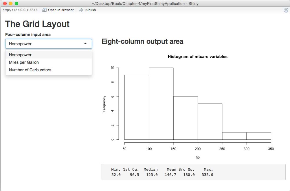
The grid layout is where rows are created with the fluidRow() function. The input and output are made within free customizable columns. Naturally, a maximum of 12 columns from the bootstrap grid system must be respected. This is the grid layout with the fluidPage() function and a 4-8 grid:
library(shiny)

shinyUI(fluidPage(

        titlePanel("The Grid Layout"),

        fluidRow(

                column(4,
                        selectInput(inputId = "variable",
                                    label = "Four-column input area",
                                    choices = c("Horsepower" = "hp",
                                                "Miles per Gallon" = "mpg",
                                                "Number of Carburetors" = "carb"),
                                    selected = "hp")
                ),

                column(8,
                        tags$h3("Eight-column output area"),
                        plotOutput("carsPlot"),
                        verbatimTextOutput("carsSummary")
                )
        )
))
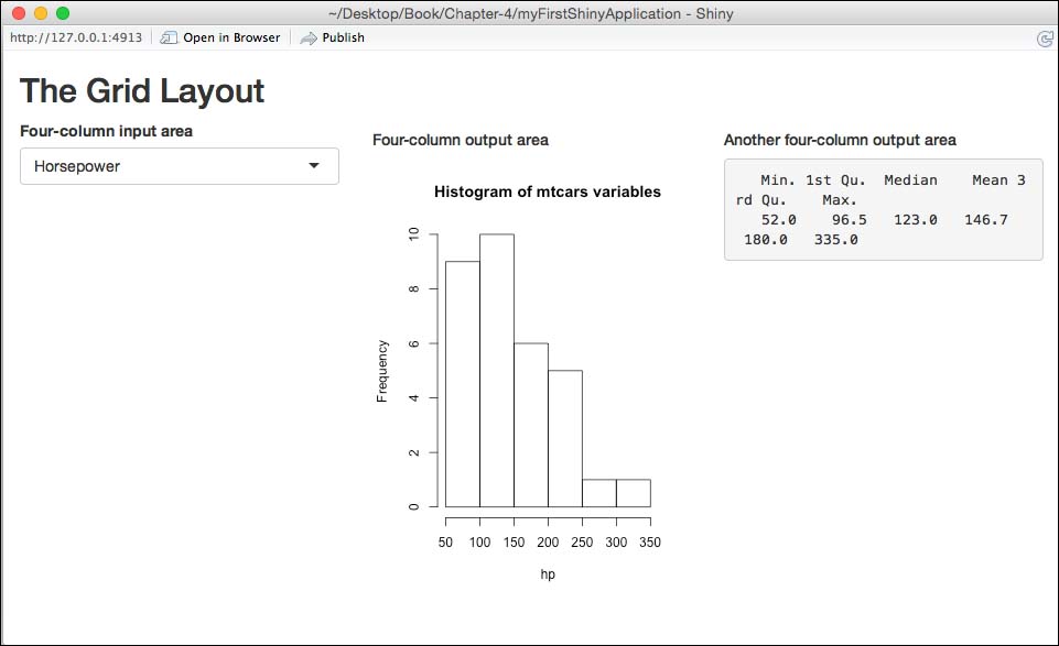
As you can see from inspecting the previous ui.R file, the width of the columns is defined within the fluidRow() function, and the sum of these two columns adds up to 12. Since the allocation of the columns is completely flexible, you can also create something like the grid layout with the fluidPage() function and a 4-4-4 grid:
library(shiny)

shinyUI(fluidPage(

        titlePanel("The Grid Layout"),

        fluidRow(

                column(4,
                       selectInput(inputId = "variable",
                                   label = "Four-column input area",
                                   choices = c("Horsepower" = "hp",
                                               "Miles per Gallon" = "mpg",
                                               "Number of Carburetors" = "carb"),
                                   selected = "hp")
                ),

                column(4,
                       tags$h5("Four-column output area"),
                       plotOutput("carsPlot")
                ),
                column(4,
                       tags$h5("Another four-column output area"),
                       verbatimTextOutput("carsSummary")
                )
        )
))
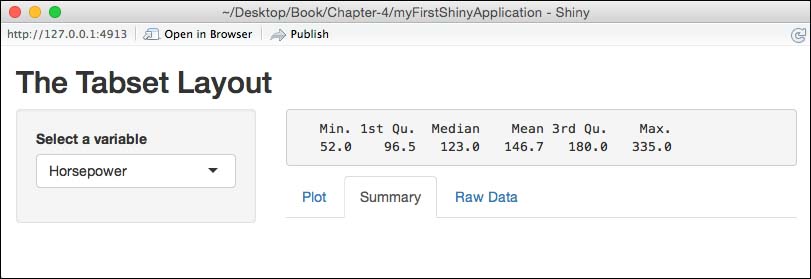
The tabsetPanel() function can be built into the mainPanel() function of the aforementioned sidebar layout page. By applying this function, you can integrate several tabbed outputs into one view. This is the tabset layout with the fluidPage() function and three tab panels:
library(shiny)

shinyUI(fluidPage(

   titlePanel("The Tabset Layout"),

   sidebarLayout(

     sidebarPanel(
        selectInput(inputId = "variable",
                    label = "Select a variable",
                    choices = c("Horsepower" = "hp",
                                "Miles per Gallon" = "mpg",
                                "Number of Carburetors" = "carb"),
                                selected = "hp")
        ),

     mainPanel(
     tabsetPanel(
      tabPanel("Plot", plotOutput("carsPlot")),
      tabPanel("Summary", verbatimTextOutput("carsSummary")),
      tabPanel("Raw Data", dataTableOutput("tableData"))
                 )
              )
      )
))
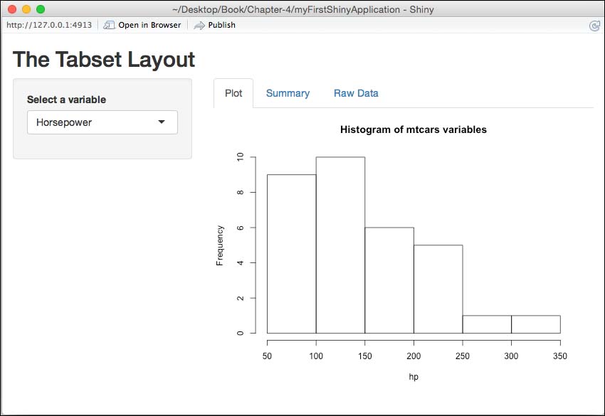
After changing the code to include the tabsetPanel() function, the three tabs with the tabPanel() function display the respective output. With the help of this layout, you are no longer dependent on representing several outputs among themselves. Instead, you can display each output in its own tab, while the sidebar does not change. The position of the tabs is flexible and can be assigned to be above, below, right, and left. For example, in the following code file detail, the position of the tabsetPanel() function was assigned as follows:
...
mainPanel(
        tabsetPanel(position = "below",
             tabPanel("Plot", plotOutput("carsPlot")),
             tabPanel("Summary", verbatimTextOutput("carsSummary")),
             tabPanel("Raw Data", tableOutput("tableData"))
                      )
         )
...
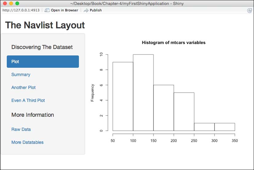
The navlistPanel() function is similar to the tabsetPanel() function, and can be seen as an alternative if you need to integrate a large number of tabs. The navlistPanel() function also uses the tabPanel() function to include outputs:
library(shiny)

shinyUI(fluidPage(

        titlePanel("The Navlist Layout"),

        navlistPanel(
              "Discovering The Dataset",
              tabPanel("Plot", plotOutput("carsPlot")),
              tabPanel("Summary", verbatimTextOutput("carsSummary")),
              tabPanel("Another Plot", plotOutput("barPlot")),
              tabPanel("Even A Third Plot", plotOutput("thirdPlot"),
              "More Information",
              tabPanel("Raw Data", tableOutput("tableData")),
              tabPanel("More Datatables", tableOutput("moreData"))
        )

))
In the previous examples, we have used the page layouts, fluidPage() and pageWithSidebar(), in the first line. But, especially when you want to create an application with a variety of tabs, sidebars, and various input and output areas, it is recommended that you use the navbarPage() layout. This function makes use of the standard top navigation of the bootstrap framework:
library(shiny)

shinyUI(navbarPage("The Navbar Page Layout",

         tabPanel("Data Analysis",

                  sidebarPanel(
                       selectInput(inputId = "variable",
                       label = "Select a variable",
                       choices = c("Horsepower" = "hp",
                                   "Miles per Gallon" = "mpg",
                                   "Number of Carburetors" = "carb"),
                       selected = "hp")
                       ),

                       mainPanel(
                           plotOutput("carsPlot"),
                           verbatimTextOutput("carsSummary")
                       )
                   ),
                   tabPanel("Calculations"

             …

                ),
                   tabPanel("Some Notes"

                   …

                   )

))

After inspecting the most important page layouts in detail, we now look at the different interface input and output elements. By adding these widgets, panels, and other interface elements to an application, we can further customize each page layout.
Already, in our first Shiny application, we got to know a typical Shiny input element: the selection box widget. But, of course, there are a lot more widgets with different types of uses. All widgets can have several arguments; the minimum setup is to assign an inputId, which instructs the input slot to communicate with the server file, and a label to communicate with a widget. Each widget can also have its own specific arguments.

As an example, we are looking at the code of a slider widget. In the previous screenshot are two versions of a slider; we took the slider range for inspection:
sliderInput(inputId = "sliderExample",
            label = "Slider range",
            min = 0,
            max = 100,
            value = c(25, 75))
Besides the mandatory arguments, inputId and label, three more values have been added to the slider widget. The min and max arguments specify the minimum and maximum values that can be selected. In our example, these are 0 and 100. A numeric vector was assigned to the value argument, and this creates a double-ended range slider. This vector must logically be within the set minimum and maximum values.
Currently, there are more than twenty different input widgets, which in turn are all individually configurable by assigning to them their own set of arguments.
As we have seen, the output elements in the ui.R file are connected to the rendering functions in the server file. The mainly used output elements are:
htmlOutputimageOutputplotOutputtableOutputtextOutputverbatimTextOutputdownloadButton
Due to their unambiguous naming, the purpose of these elements should be clear.
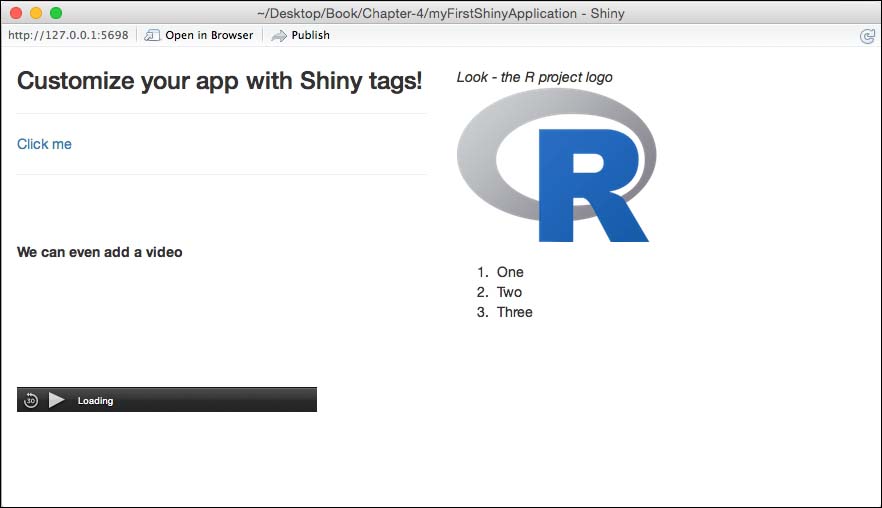
Although you don't need to know HTML to create stunning Shiny applications, you have the option to create highly customized apps with the usage of raw HTML or so-called Shiny tags. To add raw HTML, you can use the HTML() function. We will focus on Shiny tags in the following list. Currently, there are over a 100 different Shiny tag objects, which can be used to add text styling, colors, different headers, visual and audio, lists, and many more things. You can use these tags by writing tags$tagname. Following is a brief list of useful tags:
tags$h1: This is first level header; of course you can also use the known h1-h6tags$hr: This makes a horizontal line, also known as a thematic breaktags$br: This makes a line break, a popular way to add some spacetags$strong= This makes the text boldtags$div: This makes a division of text with a uniform styletags$a: This links to a webpagetags$iframe: This makes an inline frame for embedding possibilities
The following ui.R file and corresponding screenshot show the usage of Shiny tags by an example:
library(shiny)

shinyUI(fluidPage(

        fluidRow(
                column(6,
                       tags$h3("Customize your app with Shiny tags!"),
                       tags$hr(),
                       tags$a(href = "http://www.rstudio.com", "Click me"),
                       tags$hr()

                ),
                column(6,
                       tags$br(),
                       tags$em("Look - the R project logo"),
                       tags$br(),
                       tags$img(src = "http://www.r-project.org/Rlogo.png")
                )
        ),
        fluidRow(
                column(6,
                       tags$strong("We can even add a video"),
                       tags$video(src = "video.mp4", type = "video/mp4", autoplay = NA, controls = NA)
                ),
                column(6,
                       tags$br(),
                       tags$ol(
                               tags$li("One"),
                               tags$li("Two"),
                               tags$li("Three"))
                )
        )
))
We know how to build completely custom user interfaces with all the bells and whistles. But all the introduced types of interface elements are fixed and static. However, if you need to create dynamic interface elements, Shiny offers three ways to achieve it:
- The
conditinalPanel()function: - The
renderUI()function - The use of directly injected JavaScript code
In the following section, we only show how to use the first two ways, because firstly, they are built into the Shiny package, and secondly, the JavaScript method is indicated as experimental.
The condtionalPanel() functions allow you to show or hide interface elements dynamically, and is set in the ui.R file. The dynamic of this function is achieved by JavaScript expressions, but as usual in the Shiny package, all you need to know is R programming.
The following example application shows how this function works for the ui.R file:
library(shiny)

shinyUI(fluidPage(

   titlePanel("Dynamic Interface With Conditional Panels"),

   column(4, wellPanel(
           sliderInput(inputId = "n",
                       label= "Number of points:",
                       min = 10, max = 200, value = 50, step = 10)
           )),

   column(5,
          "The plot below will be not displayed when the slider value",
          "is less than 50.",
          conditionalPanel("input.n >= 50",
                      plotOutput("scatterPlot", height = 300)
                           )
          )
))
The following example application shows how this function works for the Related server.R file:
library(shiny)

shinyServer(function(input, output) {

        output$scatterPlot <- renderPlot({
                x <- rnorm(input$n)
                y <- rnorm(input$n)
                plot(x, y)
        })

})
Note
The code for this example application was taken from the Shiny gallery of RStudio (http://shiny.rstudio.com/gallery/conditionalpanel-demo.html).
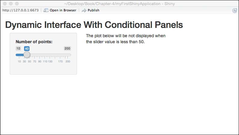
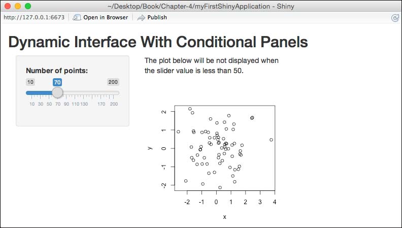
As readable in both code files, the defined function, input.n, is the linchpin for the dynamic behavior of the example app. In the conditionalPanel() function, it is defined that inputId="n" must have a value of 50 or higher, while the input and output of the plot will work as already defined.
The renderUI() function is hooked, contrary to the previous model, to the server file to create a dynamic user interface. We have already introduced different render output functions in this chapter.
The following example code shows the basic functionality using the ui.R file:
# Partial example taken from the Shiny documentation
numericInput("lat", "Latitude"),
numericInput("long", "Longitude"),
uiOutput("cityControls")
The following example code shows the basic functionality of the Related sever.R file:
# Partial example
output$cityControls <- renderUI({
  cities <- getNearestCities(input$lat, input$long)
  checkboxGroupInput("cities", "Choose Cities", cities)
})
As described, the dynamic of this method gets defined in the renderUI() process as an output, which then gets displayed through the uiOutput() function in the ui.R file.