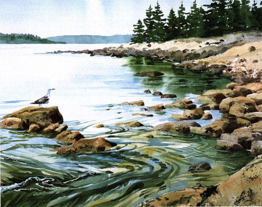
Incoming Tide, Maine 15" × 22"
Incoming Tide, Maine 15" × 22"
It's hard to believe that the surface you choose can have such an effect on the texture you're depicting, but it does. Choose your paper carefully to make your task easier. A good-quality rag paper with a neutral pH will not only ensure your work will last but will make your working as pleasant as possible. There's nothing like trying to fight a nasty, cheap paper that wants to warp up like the Appalachians at the first touch of a wet brush.
To that end, buy the heaviest paper you can afford. Most watercolor paper comes in 90 lb. (too lightweight to use without stretching it first), 140 1b. (a good compromise that will curl some when wet but will usually flatten back out as it dries), or 300 1b., a heavyweight paper that's almost like painting on watercolor board. Of course, that's a nice idea, too, if you can afford it. Most watercolor board—good-quality paper mounted on a cardboard backing—is extremely hardy; it'll take about any kind of punishment, including scrubbing out, scraping or erasing.
Surface characteristics vary from brand to brand; get to know the papers you like and you'll know what to expect from them. Rough paper from one company may seem smooth to you after using another manufacturer's rough for a few years; another brand of hot-press may seem to have a bit of tooth, more like cold-press compared to others. Shop around; buy a pad of various papers or a set of loose samples from one of the larger suppliers. Get your feet wet along with the paper.
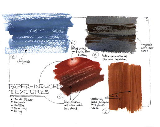
Rough. No matter what brand of rough you choose, it will have certain characteristics, with tiny hills and valleys created by the manufacturing process wherein paper pulp is poured out on a screen to dry. Some papers are almost like a relief map of mountains, others were obviously mechanically created, but it is these tiny bumps that catch and hold pigment.
Oddly enough, it is easier to do a flat wash—an unblemished, featureless expanse—on rough paper than it is on the smoother cold-press or hot-press. The pigment settles more or less evenly in the valleys, almost as if it averages out. But when you drybrush over that smooth wash, the paper surface itself mandates the texture. For that reason, I usually choose cold-press or hot-press; I like to make my own textures, thank you.
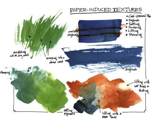
Cold-Press. This paper is weighted down as it dries, smoothing the surface either a little or a lot, depending on the manufacturer and how much pressure is applied. It's very versatile, making a smooth-enough flat wash for most purposes (how often in nature do you find a truly flat, unvarying hue, anyway?) while allowing you to overlay any texture you like with a variety of techniques.
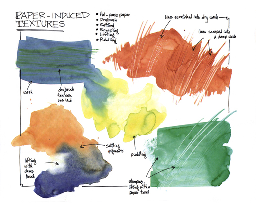
Hot-Press or Plate. You guessed it—this one is made by pressing the paper with a hot metal surface, just like you'd iron your best shirt. It can vary from a rather vellum-like surface to a smoothness you can almost see your face in. Washes are unpredictable on hot-press paper, but very, very exciting. When I find I am tightening up too much, exerting too much control on my paintings, I get out the hot-press for spontaneous effects. Here, you have to create your own textures if you want recognizable ones—otherwise you'll just get puddles that depend for their surface on the paper and the characteristics of the particular pigment you've chosen.
Try samples of each to familiarize yourself with these paper types, and buy as many brands as you can afford to find the one you like best. (But don't marry it. My favorite paper is no longer imported, and I had to learn a whole new approach with much gnashing of teeth.) Pick your paper surface according to the subject you've chosen or to your mood; there's a whole world of difference before you ever set brush to paper.