Figure 3-1: Photo shot with 5-megapixel camera
My experience with teaching people who already have a good working knowledge of Photoshop has been that they are often confused by fundamental digital imaging concepts. How is color represented in channels? What is aliasing? What does bit depth really mean? What is the relationship between canvas size, image size, and resolution? Should I use RGB, CMYK, or Lab color? No matter whether you are an absolute beginner or already have some Photoshop experience, this chapter will answer all of these pressing questions and many more.
After many years of working with digital images, I still marvel at the fact that cameras somehow magically convert light into numbers. This digital alchemy boils down to recording myriad blocks of color, better known as pixels. In the following sections, you will learn the benefits of maximizing megapixels, how to choose the correct pixel aspect ratio for the kind of work you are doing, how to deal with aliasing, and finally, how to navigate through millions of pixels with ease.
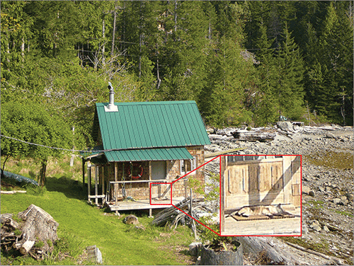
Every year manufacturers seem to produce cameras that can capture more pixels. Modern sensors capture so many pixels in every photo that the pixels number in the millions (megapixels). Figure 3-1 shows a photo captured with a Panasonic Lumix 5-megapixel point-and-shoot camera. Figure 3-2 shows the same scene photographed with a Canon EOS 5D Mark II 21.1-megapixel digital single-lens reflex (DSLR) camera.
Figure 3-1: Photo shot with 5-megapixel camera
Figure 3-2: Photo shot with 21-megapixel camera
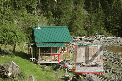
The insets in Figure 3-1 and Figure 3-2 show that more megapixels means you can digitally zoom in much further and still have good quality. The cat on the mat in Figure 3-1 is far more blurry and noisy compared with Figure 3-2.
On the downside, greater numbers of pixels consume more RAM and take up more file storage space. If you are shooting photos for the Web but not for print, you can get away with using fewer megapixels. However, resampling large images down to the desired size will always result in higher-quality photos compared to shooting fewer megapixels to start with. The adage that you get what you pay for rings true for digital cameras.
If you are creating output for the Web or for print, then you will always use square pixels (see Figure 3-3).
Figure 3-3: Square pixels shown at maximum magnification
The Extended version of Photoshop can do video editing and people can easily get confused when dealing with video files having non-square-pixel aspect ratios. It’s really very simple, however. Choose the pixel aspect ratio on the View menu according to the video format you are using.
Figure 3-4 shows pixels that are 1.5 times as wide as they are tall according to the DVCPRO HD 1080 standard. At 100% magnification, an image shown with the wrong pixel aspect ratio would appear either too narrow or too wide. The amount of stretching in standards D1/DV NTSC or D1/DV PAL is very subtle because these standards have aspect ratios closer to square.
Figure 3-4: Pixels with an aspect ratio of 1.5 shown at maximum magnification
Aliasing is a problem that arises out of the practice of representing continuous tones in a grid of pixels. When linear elements don’t align with the grid, a stair-stepping type of distortion occurs. Figure 3-5 shows two lines: the red line exhibits aliasing, and the blue line has been anti-aliased. Anti-aliasing blurs the edge by dithering pixels adjacent to the edge with gradually decreasing values that blend into the surrounding pixels.
Figure 3-5: The blue line is anti-aliased and the red line is aliased. The image on the left is shown at 100% magnification and the image on the right is at 500%.

Most of the time you’ll want to anti-alias the shapes that you draw (see Chapter 5, “Drawing”). However, there are occasions when you might want to intentionally alias lines, especially when they are horizontal, vertical, or at 45 degree angles because these orientations produce crisp lines without any fringe pixels.
When you’re viewing millions of pixels on screen, you’ll need to learn how to navigate to get around any digital photo. The Zoom and Hand tools are all that you need to navigate in 2D. Let’s gain some experience navigating a 21-megapixel photo.
Color is a very powerful visual element, and numerous books have been written on the subject. In the following sections I’ll discuss the fundamentals: how color is represented by primary colors, why primaries are stored in channels, the differences between color modes, and how to pick color in Photoshop.
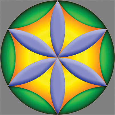
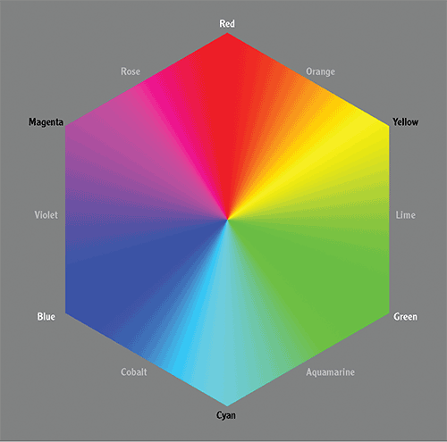
Although the human eye can distinguish between about 10 million different colors, we can agree on names for less than a dozen. Figure 3-6 lists additive primaries in white, subtractive primaries in black, and tertiary colors in gray.
Figure 3-6: Color hexagon
Just as any point can be represented in 3D space as a set of coordinates taken along the X, Y, and Z primary directions, any color can be represented as a combination of three primary colors. However, color is complicated because the nature of light changes depending on whether it shines directly in your eyes or reflects off a surface before entering your eyes.
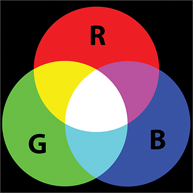
Light emitted from a computer monitor, or light captured by a digital camera or scanner sensor, is additive. Red, green, and blue (RGB) are the primary colors of additive light. Cyan, magenta, and yellow are secondary colors in the RGB system. Figure 3-7 shows that if you add equal intensities of red, green, and blue light together, you get pure white. All the colors of the rainbow are in white light.
Figure 3-7: RGB are additive primaries.
Reflected light, on the other hand, behaves differently. If you start with a white source and reflect it off of a printed surface, the surface will absorb some of the light. The reflected light will have some of its wavelengths subtracted compared with the source. Cyan, magenta, and yellow (CMY) were chosen as the primary colors of subtractive light in order to differentiate them from the RGB system. In the CMY system, red, green, and blue are secondary colors. In theory, if you mix cyan, magenta, and yellow paints, pigments, or inks, you should get pure black (see Figure 3-8).
Figure 3-8: CMY are subtractive primaries.
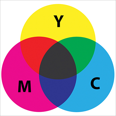
However, no real-world paints, pigments, or inks are perfect. Every painter knows that if you mix multiple paints together, the result is a muddy brown, not black as would match color theory. For this reason black (represented by the letter K) was added to the subtractive primaries so that cyan, magenta, yellow, and black form a four-color system called CMYK.
You might be surprised to learn that camera sensors do not directly record unique colors. For example, there is no orange sensor. Orange is recorded as a combination of red, green, and blue light intensities represented as (255,168,0) in 8-bit color. The human eye has three types of cones mapping roughly to red, green, and blue wavelengths, so there is a strong correlation between how we record additive color and how we see.
In Photoshop, color is stored in channels. Channels are nothing other than grayscale images. In RGB color there are three channels, one for each primary. So an RGB file has three grayscale pictures in one file. Ponder the paradox—there is literally no color in the digital representation of color. Figure 3-9 shows an RGB image created entirely from its three constituent grayscale channels.
Figure 3-9: Red (left), Green (middle), and Blue (right) channels

Each channel in the Photoshop file is sent to corresponding red, green, and blue subpixels for display on your monitor. When this light enters your eyes, three types of cone structures pick up varying intensities of red, green, and blue light and turn this information into a color picture in your mind (see Figure 3-10).
Figure 3-10: Color photo created from RGB channels

In the following steps you will explore the channels in a sample file.
Figure 3-11: Channels panel
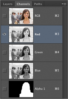
Figure 3-12: Red tinted mask shown when Alpha 1 channel is toggled on

Photoshop’s image modes correspond to different systems for handling color and/or light intensity. The following are Photoshop’s color modes:
In the following steps you will convert an image into several modes and investigate the results in the Channels panel.
Figure 3-13: RGB image of the Taj Mahal

Figure 3-14: Cyan, Magenta, Yellow, and Black channels shown from left to right

Figure 3-15: Lightness, a, and b channels of Lab color shown left to right
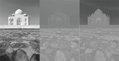
Figure 3-16: Grayscale mode reduces the file to a single channel
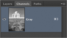
Figure 3-17: Lightness, a, and b channels of Lab color shown left to right
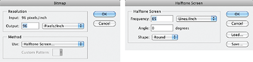
Figure 3-18: Bitmap image shown with halftone screen
Photoshop uses foreground and background colors for a variety of tasks. The default colors are black in the foreground and white in the background. Pressing D restores the default colors and X exchanges the foreground and background colors.
There are many ways of picking colors. In the following steps you will explore some of the methods of selecting foreground and background colors.
Figure 3-19: HUD hue strip color picker
Figure 3-20: HUD hue wheel color picker

Figure 3-21: Using the color picker
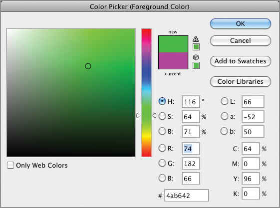
Figure 3-22: Selecting a color from a library

Figure 3-23: Adding a color swatch

Once you understand that digital pictures are made up of 1s and 0s, it makes sense to learn a bit about data, its relationship with detail, and how data can be compressed when stored.
A bit is the most fundamental unit of computer storage, a transistor that is either on or off, which is represented numerically by 1 or 0. A bitmap is the most primitive type of image because each pixel is mapped to 1 bit (black or white).
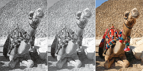
To create black-and-white or color photos, more bits per pixel are clearly required. With 8 bits per pixel, or 2 raised to the eighth power, there are 256 tonal gradations possible. 256 gradations is enough data to represent smooth tonal transitions in black-and-white photos in a single Grayscale channel.
As you learned in the previous section, color photos usually have three channels. RGB images have 8 bits/channel or 24 bits/pixel. Two raised to the 24th power offers more than 16 million possibilities for every pixel, which is enough data to represent color photos. Figure 3-24 shows photos of increasing bit depth.
Figure 3-24: 1-bit (left), 8-bit (middle), and 24-bit (right) images
Professional DSLR cameras have the ability to shoot at higher bit depths up to 16 bits/channel. An RGB image shot at 16 bits/channel would be a 48-bit image, requiring much more storage space and RAM than a similar image having 8 bits/channel.
It is advantageous to shoot at 16 bits/channel if you can afford to support the increased memory and storage requirements because manipulations made to images can be “destructive,” which is something you’ll learn about in the next section. High dynamic range (HDR) images have even higher bit depths at 32 bits/channel (see Chapter 14, “Merging Photos”).
Just because you shoot a 24-bit photo doesn’t mean you have taken advantage of the full tonal range stored in the image. In other words, you might be “paying” for the data even if you are not filling all of it with detail. Histograms provide a way to take a look at how data is distributed across the tonal range.
Figure 3-25 shows a typical histogram. Thin vertical bars are arranged in a statistical representation of where pixels fall across the tonal range, from shadows on the left through mid-tones to highlights (bright areas) on the right. The histogram is color coded to show the contribution from each channel and its complements. The gray graph represents the sum total of all the channels.
Figure 3-25: Using the Histogram panel to see how pixels are distributed
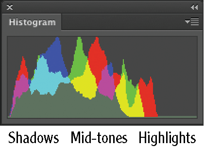
This particular histogram tells us that the brightest highlights aren’t as bright as they should be. The peaks in the shadows show that this image is also dark. After the image is manipulated by increasing brightness and adjusting the highlight input level (which you’ll learn more about in Chapter 11, “Adjusting and Filtering”), the histogram shows a better distribution across the tonal range (see Figure 3-26).
Figure 3-26: Histogram showing redistribution across tonal range and consequent detail loss
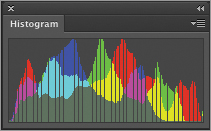
After the image is manipulated, the number of pixels hasn’t changed so the amount of data hasn’t changed either. However, tiny gaps in the histogram show that some of the initial detail has been irretrievably lost. This emphasizes the fact that there is a difference between data and detail.
In Chapter 12, “Developing Photos,” you will learn nondestructive workflows in which you will apply color corrections, make multiple tonal adjustments, reduce noise, and sharpen all at once through the Adobe Camera Raw interface.
Although a set number of pixels consume a given amount of RAM, it is possible to compress the data so the file takes up less storage space. For example, the Cabin.jpg sample file you opened earlier in this chapter is a 21-megapixel image, which consumes 60.2 MB of RAM. However, as a JPG file, the size on the hard drive is only 6.1 MB (showing almost tenfold compression).
Compression works in principle by efficiently representing patterns in the data. For example, if there were a million 1s in a row, it would be more efficient to state that fact rather than literally listing one million 1s in the file. Compression schemes are obviously more technical than this, but you get the general idea.
There are two types of compression: lossless and lossy. Lossless compression represents data concisely and without error but doesn’t compress the data as much as lossy methods do. Tagged image file format (TIFF) files support lossless compression schemes and are good for printing because they don’t sacrifice any detail.
Lossy compression sacrifices some of the detail for the sake of smaller file sizes. The Joint Photographic Experts Group (JPEG) format is widely used on the Web because of the small file sizes made possible with lossy compression. Figure 3-27 compares lossless versus lossy compression in terms of quality. You can plainly see JPEG artifacts in the lower image due to the extreme level of lossy compression used.
Figure 3-27: Lossless compression (top) versus lossy compression (bottom)

Document size and resolution are inversely proportional. That means if you increase document size, the resolution decreases and vice versa. In the following sections, you will learn guidelines on setting resolution for print and for display on the Web. You will also learn how to resample images, change the canvas size, and trim and crop images.
The term resolution refers to pixel density measured in pixels/inch or pixels/cm (centimeter). Contrary to popular belief, resolution is only important for print work. Every computer monitor has a different resolution, so there is no way to ensure that an image with a specific document size will appear at any specific actual size on the Web.
Resolution is very important in printed matter. Each device has different limits on how many dots or lines per inch (or cm) it can print. In general, the minimum resolution for an acceptable-quality print is 200 pixels/inch (80 pixels/cm). Photoshop’s default is to create new print documents having a resolution of 300 pixels/inch (120 pixels/cm) because most output devices support at least this equivalent print density. In the following steps, you will change the resolution of an image without changing its pixel dimensions.
Figure 3-28: Trading document size for resolution
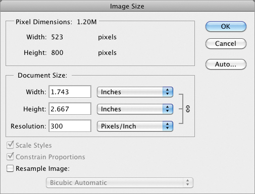
You can’t print this particular image out at a larger size at a reasonable level of quality because it doesn’t have enough pixels. At 523 × 800 pixels, this document would function well as a large sized web graphic but can’t print much larger than a postage stamp.
The Resample Image check box in the Image Size dialog box allows you to change the number of pixels. At first blush you might think your postage stamp printing problems are solved if you can change the number of pixels at will, right? Unfortunately it’s not that simple: Increasing the number of pixels in a photo increases the amount of data without increasing detail. That’s why Photoshop enlargements generally don’t improve print quality.
On the other hand, Photoshop does an excellent job of reducing images. In the following steps you will reduce the pixel dimensions of a large image by resampling it.
Figure 3-29: Resampling an image to fit on smaller paper
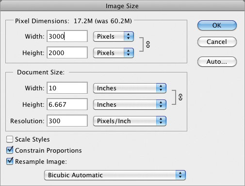
This image can now print in high quality at 106.66 inches with a resolution of 300 pixels/inch. By resampling the image, you reduced the file that would be sent to printer from 60 MB down to 17 MB so it will print that much faster and take up less than a third of the storage space.
Using the analogy of fine art painting, the document window is sometimes referred to as the canvas. A painter would never change their canvas size after they started painting, but such a thing is possible in Photoshop. Changing canvas area is fundamentally different from changing the image size because pixels are never resampled when the canvas is altered—just added or removed. Trimming is like cropping except the trimming algorithm can automatically cut away all the pixels up to the edges of an object. In the following steps you will alter the canvas size and trim it to get a feel for these important tools.
Figure 3-30: Changing the canvas size
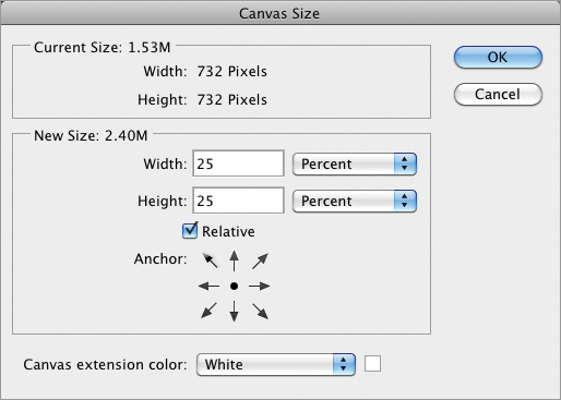
Figure 3-31: Artwork’s canvas size added to in both directions and then clipped in height

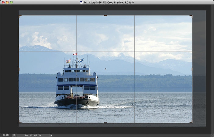
Many photographers tend to crop in the viewfinder or in Live Preview mode on their cameras, but there are times you’ll want to crop photos in Photoshop no matter how you shoot pictures. In the following steps you will crop a photo using the rule of thirds (see Chapter 1, “Design Basics”).
Figure 3-32: Cropping an image using the rule of thirds grid