Art Demo
Team of Heroes, Collage-Style
BY JAMAL IGLE
I’m a big fan of collage-style art that features a team of characters—such as Drew Struzan’s movie posters for Indiana Jones, Star Wars, Harry Potter and many others. I’m going to show you how to design a collage-style team portrait that could be used for a first-issue cover.
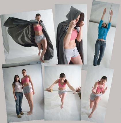
1 Choose a Variety of Photos
Pick at least half a dozen poses to draw from. The members of a comic-book team need to be memorable and distinct from each other, so each photo you choose should show different body language and a different mood. Try to find photos with similar lighting as well, to help unify the images in the collage. As you make your selections, think about what heroic type or personality each photo suggests to you.
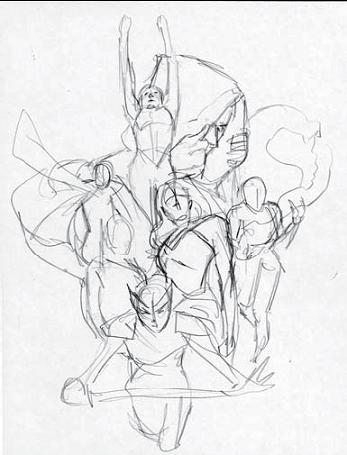
2 Sketch Your Concept Create
Create a rough sketch of the overall idea. The purpose of this sketch is to plan the placement of all the elements of the collage. At the same time, you are beginning to design your characters’ costumes and powers. The idea is to skirt familiar archetypes without using existing characters. The team I’m creating here, “Strike-force Sappho,” includes a star-spangled warrior princess, a samurai droid, a fiery hothead, a high-flying character, a techno-girl, and also a scaly creature whose role is mysterious (is she friend or foe?).
As a rule, don’t trace reference photos. Draw from the photos, not to them, so that your natural style flows through.
I believe in symmetry in art. As human beings we are drawn to symmetry; it should be a priority for any artist.
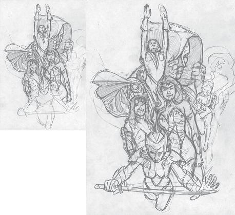
3 Do a More Detailed Sketch
Sketch again on ordinary copier paper. Continue referring to the photos, but tweak the poses a bit; you don’t want to copy them exactly. Your goal should be to capture the lighting and the attitude of the pose. Rough in the details that individualize each character. Create symmetry and balance.
As you place the lights and darks, play with the negative spaces around the characters. The characters in the middle ground and foreground have very few shadows in them. I’ve put the dark, hooded figure in the background so that its dark tones can peek through the spaces between the other characters. This contrast helps the other characters pop out of the image.
When you feel this sketch is done, put down your pencil and just look things over. Is the lighting the way you want it? Is there anything about the design that needs tweaking to make it more balanced or more exciting? Make any needed changes.
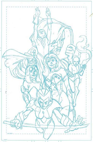
4 Rough In With Nonphoto Blue
Enlarge the sketch from step 3 on a photocopier from 8½" × 11" (22cm × 28cm) to 11" × 17" (28cm × 43cm), a 140 percent enlargement. Tape the photocopy face down on the back of a sheet of 11" × 17" (28cm × 43cm) blueline board or any two-ply bristol board. Turn the board face up, lay it on a light table, and transfer the sketch onto the board with a nonphoto blue pencil. This kind of pencil won’t reproduce when scanned or photocopied, so it is an ideal base for your final drawing. You can make minor tweaks to the drawing as you go.
When you’re done transferring your sketch, use a gum eraser to remove all nonessential lines. Nonphoto blue pencils, being wax-based, don’t take graphite pencil very well, so you want the finished blueline drawing to be very light and unobtrusive.

5 Do the Pencils
Draw on top of the blueline drawing with an HB pencil. As you’re pencilling, you may find yourself redrawing a bit. This stage can be a long process because as you’re penciling, you’re sometimes redrawing, making the final determination about how the art will look.
Tighten the pencil drawing until it contains all the information you’ll need for inking.
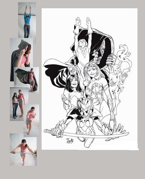
6 Ink
Ink the drawing. For brush inking, I like a no. 3 Scharff kolinsky red sable brush with Japanese sumi ink (which I find to be the best ink for a matte black finish). For corrections, I use Faber-Castell PITT pens and Daler-Rowney Pro White ink.