
Art Demo
Evolution of a Cover
BY JG JONES WITH COVER DESIGNER TERRI WOESNER
We all know we’re not supposed to judge a book by its cover, but that’s what people do when they browse bookstore shelves. For this project, IMPACT Books needed cover art with attention-grabbing action, color and energy. We knew superstar cover artist JG Jones had the artistic stopping power to help this book leap off the shelves.
In this lesson, JG Jones gives you a behind-the-scenes look at his sketches, studies and notes, while Buddy Scalera and IMPACT designer Terri Woesner share their recollections and observations about the cover development process.
1 TERRI
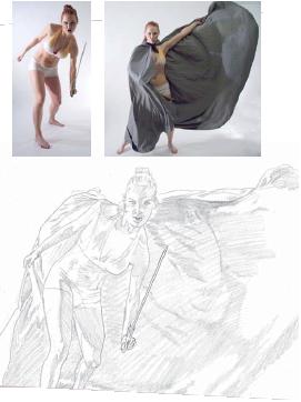
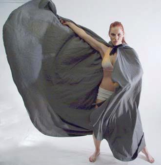
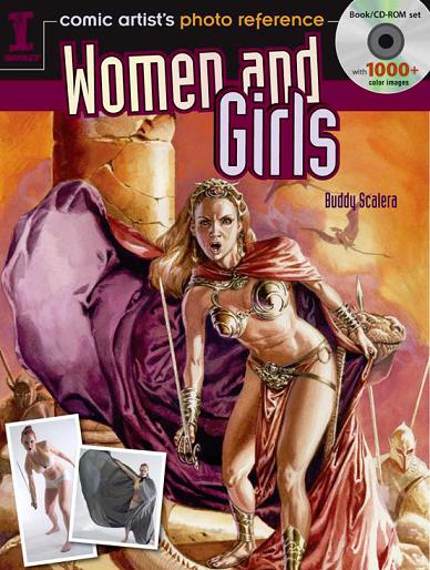
I asked JG to choose two of Buddy’s photos to use as the basis for a piece of dynamic cover art that would engage the reader at first glance. JG picked these photos of Pamela. In the sword photo, she really grabs the viewer with her direct gaze and aggressive pose. JG thought the cape from the other photo could be incorporated to create contrast and visual interest in the background.
I agreed that the concept was cover-worthy. I asked JG for art with a science-fiction/fantasy theme.
3 BUDDY
JG flops the image back and forth using his computer. In this early sketch, he uses both photos backwards, testing whether the image “reads” more naturally that way.
2 BUDDY
If you want the subject of a photo to look strong and dominant, you shoot from a low angle. That’s what I was doing here.
4 TERRI
This rough thumbnail sketch let me see how JG was planning to pull the two photos together, so that I could give him my input before he started to invest a lot of time in creating final art.
5 TERRI
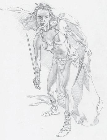
JG said this concept was inspired by the warrior women on various covers from the science-fiction classic John Carter, Warlord of Mars. Here, you can see him starting to add costume elements that are in that spirit.
For this sketch, JG flopped the photos back to their original orientations. In a minute, you’ll see why.
6 BUDDY
As JG takes Pamela’s core pose and starts to add props and costume, he doesn’t just paste them on like paper-doll clothes; he wraps them around the figure. The scabbard of the sword hangs behind the leg; the bracelets curve around the wrists; the straps and chains drape around the hips; the loincloth partly disappears behind the leading leg. All of these details contribute depth and realism, enhancing our sense of this character as a 3-D woman.
7 BUDDY
Pamela was in motion when both of the reference photos were shot. JG does a great job of adding visual cues that capture this sense of motion: the flowing cape, the flying hair.
8 BUDDY
A figure in motion is inherently off balance. If you draw the lines of Pamela’s frame on the photo, you get subtle clues as to how she was moving when I snapped the picture. In this pose, Pamela was pretending to duel with an unseen opponent. Even though her body and shoulders are tilted, she keeps her eye level almost perfectly horizontal, which is typical of people with good physical control.

9 BUDDY
When I photographed Pamela, I was using more than one light. The most intense light was coming from her left. Additional studio lights made it easier to see details that would otherwise have been lost in the shadows.
The sketch above clearly shows the direction of the light source, even though JG had no specific knowledge of how I had set up the photo studio.
10 TERRI
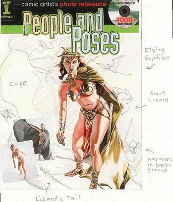
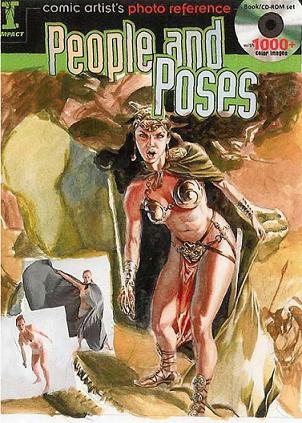
JG scanned the cover of the first book in Buddy’s series, People and Poses, and used it as a template for a mock-up. I didn’t ask him to do this; he just did it, and I was thrilled because it made it much easier for everyone at IMPACT to visualize the final product. Also at this stage, JG started painting with watercolors to show me the color notes he had in mind.
The first cover in the series featured reference photos in the lower left corner. For consistency, I wanted to keep the photos at the lower left for this cover as well. So JG flopped the pose again, back to the original orientation, to make room for the photos.
11 TERRI
You can see JG’s handwritten notes in the margins here. The creatures and other background touches were all his idea. I was excited to see JG’s vision for the entire piece starting to materialize.
12 TERRI
I really liked the red tones JG used for the loincloth, and I asked him to repeat those colors in the background of the image.
TERRI 13
The red-orange palette worked well with Pamela’s warm skin tones. The hint of purple amid the orange in the loincloth was an exciting contrast.
14 BUDDY
As JG roughs in the background creatures and other elements, the cover is gaining depth and context. With just a few carefully chosen details, he is creating a complete and believable environment for the character.
15 TERRI
Buddy’s studio floor was of course flat, yet just by curving those long shadows in the foreground, JG was able to make the character look as if she is standing on uneven ground or even stepping over something!

16 TERRI
The colors in the studies were pretty muted, so I asked JG if he could brighten them up a little for the final. I was impressed by how much punch he was able to add with watercolors.
To make the character work with the red-and-orange theme, JG changed the color of the character’s hair from brunette to blonde so that it wouldn’t get lost in the background.
17 TERRI
Books in a series need to have a unified design, yet they also need to be easily distinguished from one ups another. The green title treatment in JG’s mock-second came from the first book in the series. For the book (this one), I knew I would be changing the color behind the title. I allowed JG’s artwork to guide choice. The purple that started out as just a hint my of feminine color in the loincloth became a powerful yet color for the title treatment.