“I wish protection from the wind and privacy from the road and a house as enduring as the rocks, but as transparent and charming as the waves and as delicate as a sea shore.”
During the 50 years Frank Lloyd Wright was designing buildings in California, he spent much more time in Southern California than Northern California. In fact, Wright moved his office to Los Angeles in 1923, and lived in that city for the next two years before moving back to the Midwest (see Chapter 2). However, he designed a total of seven houses and three public buildings in Northern California between 1936 and 1959. Wright also had an office in San Francisco from the late 1940s through the late 1950s, during the time he was designing the V. C. Morris Gift Shop and later the Marin County Civic Center. During those years he often spent a few weeks at a time staying at hotels in San Francisco, and occasionally with clients who were also friends. Though he once disparagingly described San Francisco as “a city made of shanties,” there is plenty of evidence from letters and interviews that he actually liked the City by the Bay, as well as the rest of Northern California.[1] He also occasionally complimented the work of some local architects, such as Gardner Dailey and William Wurster, although he never praised the region’s most respected architect, Bernard Maybeck, for whom he seemed to feel a keen sense of rivalry.[2]
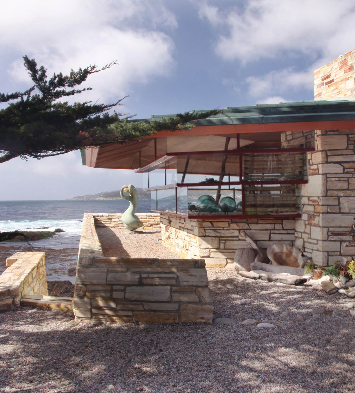
Walker House, Carmel, California (1948–54), detail of south side.
Two of the clients with whom Wright became good friends were Professor Paul Hanna and his wife, Jean. This couple became his first Northern California clients when they commissioned a four-bedroom, proto-Usonian-style house from him on the campus of Stanford University in 1936. The Hanna House, nicknamed “Honeycomb House” due to Wright’s use of a repeated hexagonal pattern in his design of the floor plan, stands today in a quiet, tree-shaded corner of the Stanford campus known as “faculty ghetto.” Except for some remodeling done by Wright for the Hannas in the 1950s, this 2,500-square-foot house has retained almost all of the original details and design features it had when it was completed in 1938.
Jean and Paul Hanna decided they wanted Frank Lloyd Wright to design a home for their family after reading some of Wright’s lectures on architecture and visiting him at Taliesin East. They approached him about the project in 1936, stipulating that they wanted separate bedrooms for their three children, and that their total budget was only $15,000.[3] Wright had just completed his first Usonian house in Wisconsin, and he welcomed the opportunity to use this new design philosophy on a residence in California. The house he created for the Hanna family is actually a melding of some Prairie elements with primarily Usonian design features. Its Prairie elements consist of the mostly low-angled rooflines, wide overhanging eaves around all the exterior walls, and an overall horizontal massing. The Usonian features are the repeated hexagonal pattern in the floor plan, the modular units of wood paneling along the outside, and the prow-like gables set into the living room and dining room roofs.
Wright sited the Hanna House to take fullest possible advantage of the heavily wooded, parklike setting. The house sits atop a small knoll, which commands views of the rolling hillsides studded with valley oak and coast live oak trees that surround it. When the house was being built, there were almost no other buildings visible in this part of the 8,180-acre Stanford campus.[4] In keeping with his organic design philosophy, he incorporated a 60-year-old Monterey cypress on the lot into his plans by putting an opening for it in the roof that adjoins the two carports at the northern end of the house. Wright also left a 200-year-old valley oak at the south end, letting its broad overhanging branches shade the children’s playroom (it was later converted to a dining room).[5] The wide overhanging eaves provide shade from the California sun for all the other rooms in the house (in Wright’s plans, he called the eaves “trellises”). The front entrance to the house is at the north end. The small doorway has a low clearance, which opens into a compact, narrow entry hall. When one walks into the living room on the right, the ceiling is much higher and the effect of the open, spacious floor plan creates a very dramatic contrast, a classic example of Wright’s technique of compression and release that he employed in so many of his residences.
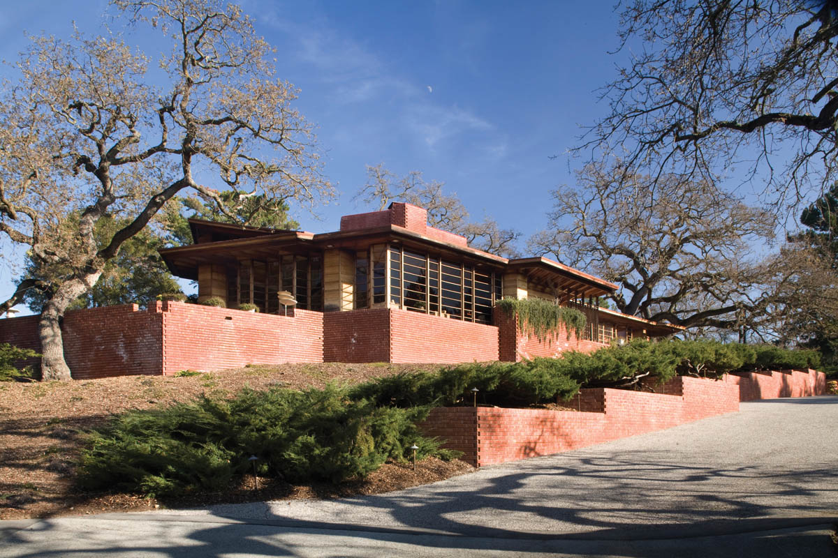
Hanna House (Honeycomb House), Stanford, California (1936), northwest corner

Hanna House, west façade.
The honeycomb, or hexagonal, pattern of the floor plan is evident upon entering the large, bright living room, which flows into the dining room at the southern end of the house. The rooms are arranged along a series of adjoining diagonal lines, with the living room wrapping around the centrally located fireplace, with its red brick, floor-to-ceiling facing. Four shallow concrete steps lead up to the dining room. Both rooms have concrete slab floors in Cherokee red with hexagonal patterns scored into them. The western walls of these rooms consist of floor-to-ceiling horizontal panes of glass, framed by California redwood, as are the built-in seats around the fireplace and the rear wall of the dining room, as well as the built-in bookcases in the living room. The combination of the redwood-framed windows and built-ins, the red concrete floors, and the massive red brick fireplace create a warm, inviting ambience, one that Wright continued throughout the rest of the house. Perhaps the most striking feature of the Hanna House is the sense of being surrounded by the natural beauty of the wooded hillsides, which are easily seen through the walls of horizontal windowpanes. This feature is a classic example of the indoor-outdoor effect Wright used on all his best residences, from his earliest Prairie-style homes in the early 1900s to his late Usonian houses in the 1950s.
The kitchen of the Hanna House, as in most of his later Usonian homes, is tucked into a space behind the living room fireplace wall, and it opens onto the current dining room (in the original floor plan, a small alcove between the living room and the playroom served as the dining room). For the first 20 years the Hannas lived here, it had four bedrooms along the eastern, or back, side of the house: one bedroom for each of their three children and a master bedroom. There were two full baths, and a “sanctum,” or study, for Paul. Wright also designed a servants’ quarters and attached guesthouse beyond the carports, but these were not built until the 1950s.[6]
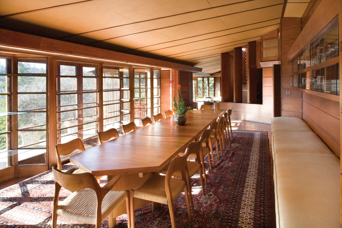
Hanna House, dining room looking north.
Construction on the house began in early January 1937, and letters between the Hannas and Mr. Wright show that the Hannas were closely involved in the refinements and final changes to Wright’s original plans. Paul Hanna had carpentry skills, and he and Wright developed a friendly relationship, one based on mutual respect and common interests. The Hannas and Wright shared an interest in music and literature, and they remained friends for the rest of their lives. That is not to say there was never any tension between Wright and his clients, as there often was in many of his other important commissions. One example of this is a letter from Wright to Paul and Jean, which was in response to some concerns they had over his rigid adherence to the modular floor plan and the tight dimensions this would impose on features like the bathrooms and doorways. Wright’s response, which was included in the Hanna’s personal account of the project, titled Frank Lloyd Wright’s Hanna House: The Client’s Report, was dated January 27, 1937, and displays some of the sarcastic wit for which he was famous:
I am afraid the full import of the plans for your domicile hasn’t yet penetrated your scholarly brain, and that reality has yet to dawn there. For instance: I’ve tried to impress upon you the fact that stock and shop proportions in planning modern houses were as clumsy and wasteful as they were ugly. Conservation of space based upon the proportions of the human figure has taken place actually, so far as I know, only in building ships and Pullman cars, the Imperial Hotel, and my own houses, although “modern architecture” had done something.
This house of yours is the latest essay in that direction wherein good aesthetics call for adequate but economic treatment of this important matter where living in houses is concerned. . . . Now indubitably, when the proportions of doors and furnishings are measured by the simple requirements of human use, there is greater satisfaction in the freedom to use the whole space. The house seems larger—the rooms seem and are larger while, certainly, physical comfort is no less. Briefly, this is the thesis. You have heard it from me before. And I am sure when you concentrate on it without too much ring around the rosie and holding of outside hands you will recognize its common sense. Or shall we say science? It is the kind of science that is the true basis for art.
After you have in hand the drawings we have been making to extra illustrate the plans (which will be very soon now) and our builder has digested them, if you feel it is necessary, I will send a superintendent to stay with you while you need him. I don’t want to promise anything about my own advent. Whatever gods may be take umbrage where there is too much presumption. I hope this lets in light and restores confidence. If it does not, why then let those same gods have mercy.[7]
Paul and Jean made it quite clear in the comments in their account that they did not find offense with Wright’s comments, but saw them as good-natured ribbing. Wright reassured them on more than one occasion that he was their “protection,” and he would make certain they would get the home they wanted. Construction on the Hanna House was completed in the fall of 1937, and Paul and Jean and their three children moved into their new home in late November, just in time for Thanksgiving. After four months of finishing work on interior details, the Hannas invited Wright to come visit them. He showed up on April 4, 1938, along with 20 of his apprentices, to stay for the weekend. He had not seen the house since before it had been completed. When he entered the living room, he stood there for a moment looking around admiringly, and finally said, “Why, it’s more beautiful than I had imagined; we have created a symphony here.”[8] The final cost of the original house, including preparing the hillside lot for construction, came to $39,000.[9]
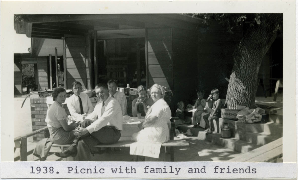
Paul and Jean Hanna (couple on left), family picnic at their house, c. 1938. Courtesy of Hanna House Collection, sc0280. Department of Special Collections & University Archives, Stanford University Libraries, Stanford, California.

Jean Hanna in living room of her house, c. 1938. Courtesy of Hanna House Collection, sc0280. Department of Special Collections & University Archives, Stanford University Libraries, Stanford, California.

Hanna House, dining room looking south
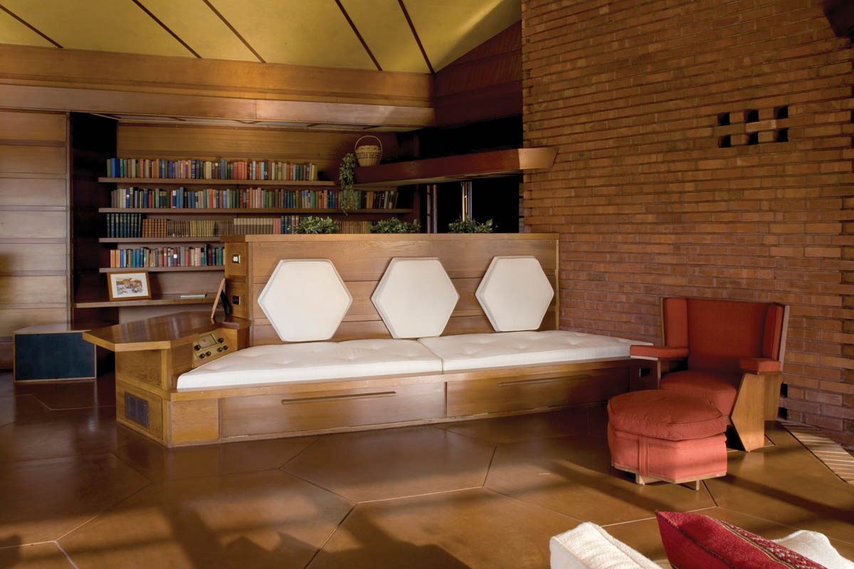
Hanna House, living room
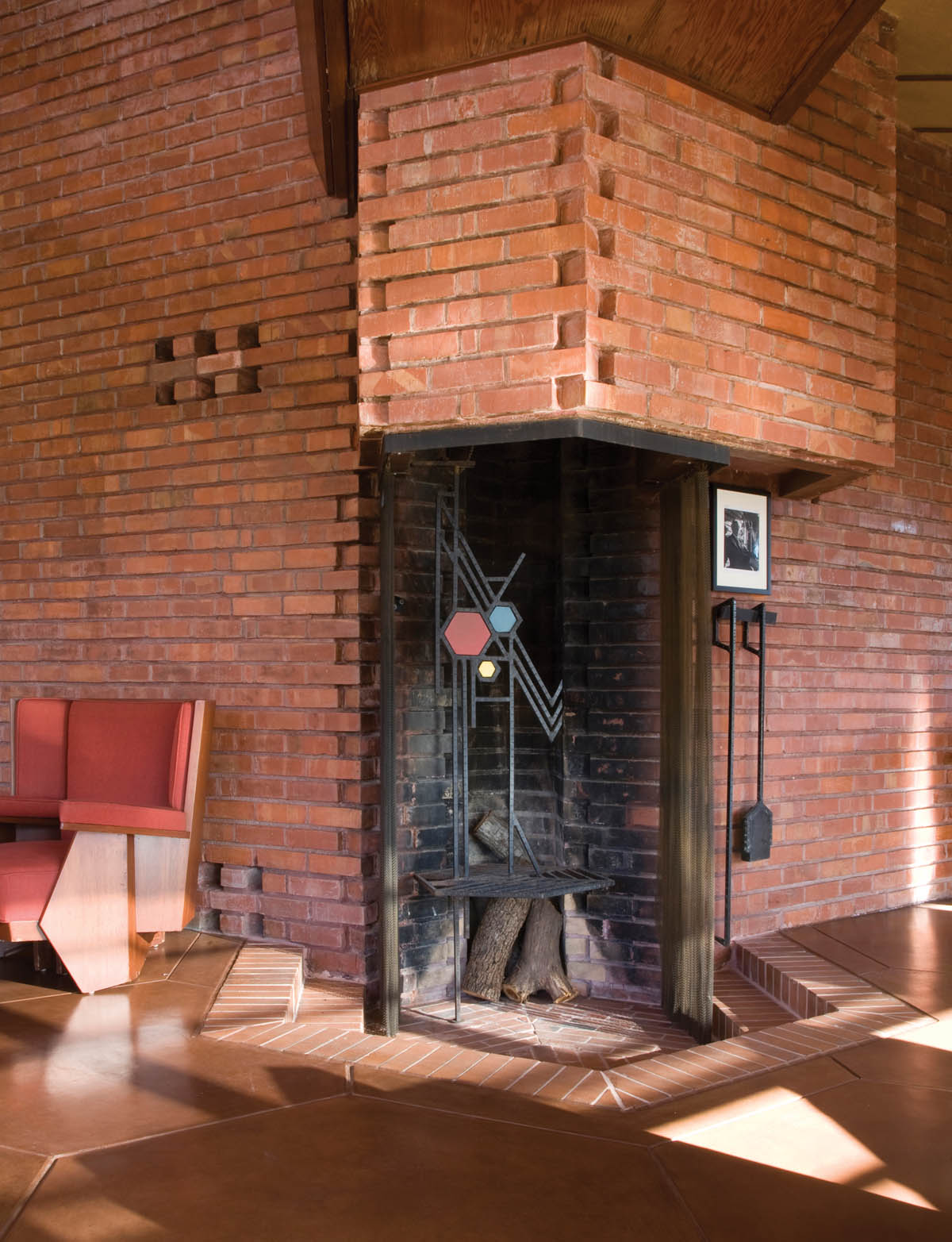
Hanna House, detail of fireplace.
After living in the house for several years, the Hannas decided they needed to add on to the original home to accommodate the increased number of guests they were hosting, as well as create a woodworking shop. They hired Wright to draw new plans for these additions, and after several unforeseen delays, construction on the new wing began in late April 1950. The new wing was off the carports, at the northern end of their property. The work was finished on time, three months later. Again, in 1957, after their three children had moved out of the house, Paul and Jean decided to hire Wright to remodel the east side of the main house, since they didn’t need four bedrooms anymore. He drew up plans to convert two of the children’s bedrooms at the south end of the house into a large master bedroom and bath. He also converted the middle bedroom into a TV room, as well as remodeling the two other rooms at the north end into a large library and study. This is the current floor plan of the house. Aaron Green was appointed by Wright to supervise all of the final remodeling, working from preliminary plans drawn by Wright.
Other changes were made to the lot during the nearly 40 years that the Hannas occupied the home. A circular driveway from Frenchmans Road was created in the late 1940s by Wright’s studio. A freestanding teahouse was constructed in the 1960s, designed by Wes Peters from Taliesin Associated Architects. Peters also supervised construction of the cascading water feature in the backyard, which Wright designed for the Hannas in the 1930s but they decided not to build until 1961.[10] In the front yard the Hannas placed a massive carved stone lantern they brought from the Wright-designed Imperial Hotel in Tokyo, which was salvaged when that building was torn down in 1967.
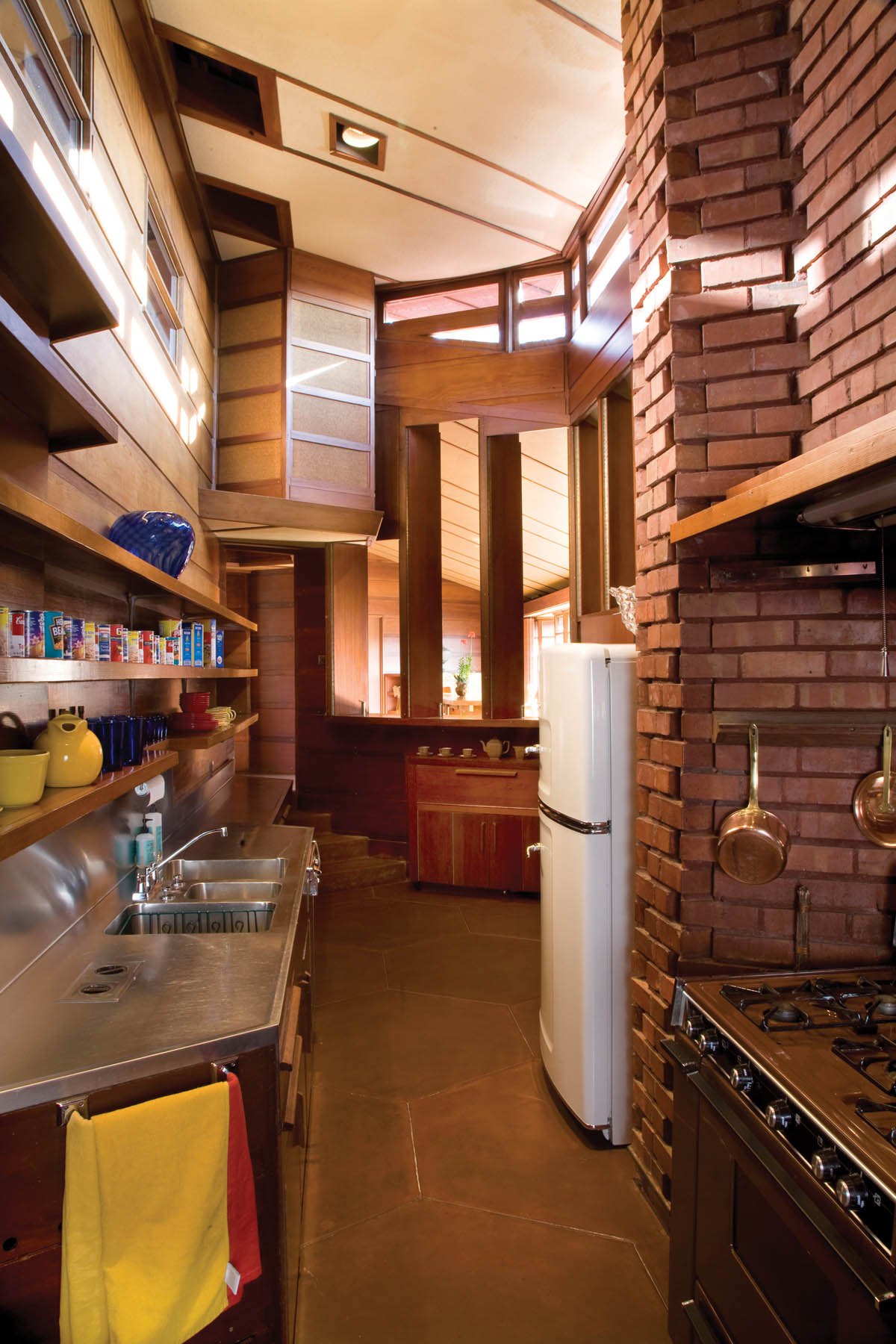
Hanna House, kitchen
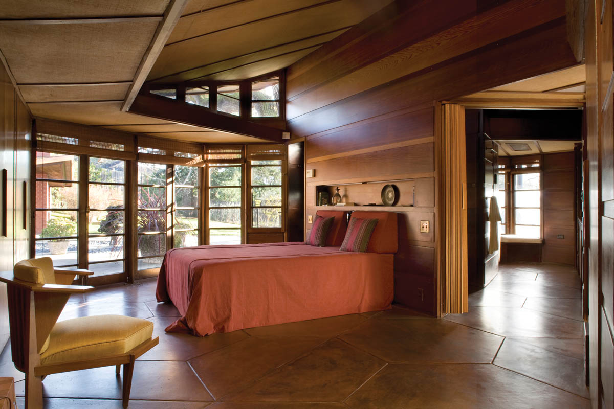
Hanna House, master bedroom.
During the 1960s, Paul and Jean began planning for the future of their home. They wanted it to be preserved and serve a useful purpose after they were gone. In 1975 they moved out of the house, after Stanford University decided it would maintain the house as a residence for the university provost. In December 1976, after lobbying of various corporate donors by the Hannas for funds to preserve the house, Frank Lloyd Wright’s reputation in Japan proved fruitful in the form of an endowment by the Nissan Motor Company to maintain and preserve the Hanna House and its grounds. Between 1979 and 1989 four provosts lived there.[11] In 1989 the Loma Prieta earthquake did serious damage to the house, making it unsafe to inhabit for a while. Condoleezza Rice, who became the university provost in 1993, agreed to authorize the $1.8 million in repairs the home needed.[12] After the restoration was completed in 1999, the house was opened to the public for tours by appointment. Hanna House was placed on the National Register of Historic Places in 1978.

Hanna House, library.
After the Hanna House, Wright designed two other houses on the peninsula south of San Francisco. The first one was for Sidney Bazett in 1938, at 101 Reservoir Road in Hillsborough. The rear of this house embraces a private elevated meadow, and it stands exactly as it appeared after Wright designed an addition in 1954. Hillsborough is a wealthy, secluded community of substantial homes on large lots. The Bazett House is an exception to this, with a total of only 2,046 square feet, including the addition. Wright employed the same hexagonal version of the Usonian-style floor plan here that he had used on the Hanna House.
The Bazett House is a V-shaped, single-story residence, with walls made of red brick on the lower portions and laminated redwood on the upper sections. The living room wing has an unusual, undulating façade on the wall facing the meadow. Wright used the same horizontal, wood-latticed, floor-to-ceiling windows on this wall that he used on the Hanna House. The roof is low-angled, with a gently sloping overhanging gable at the end of the living room wing. Flat overhanging eaves continue around the rest of the exterior. A massive brick chimney rises above the intersection of the two wings, and the roof above the bedroom wing is flat. There is a brick terrace around the perimeter of the main house. Wright placed a carport between the main house and the guest wing he designed beside it. A covered walkway leads to the entrance to this detached guest wing, which has its own small terrace behind the carport.

Bazett House, Hillsborough, California (1938), entry exterior.

Bazett House, east façade
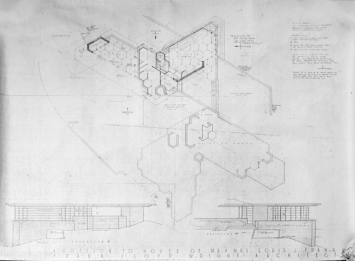
Bazett House, blueprint of elevation A and B with floor plan. Copyright © The Frank Lloyd Wright Foundation, Scottsdale, Arizona
The living room of the Bazett House, like many other Usonian homes, has a high ceiling that rises to a peak in the center. The solid redwood front door is almost hidden, tucked beneath the overhang on the north side. After the low entryway, one enters into the grand space of the living room, a classic example of Wright’s dramatic compression-and-release technique. The ceiling here is wood paneled, as are the main walls. Indirect lighting brightens the space above the west wall, where Wright placed a long alcove lined with low built-in seating and bookshelves. A geometric pattern in sawn wood graces the clerestory along the top of this alcove. At the far end of the living room, a magnificent set of undulating floor-to-ceiling windows open out onto the terrace and flood the room with natural light. Wright placed a brick-faced fireplace at the opposite end of the room. The living room flows into an open dining area, and a small, enclosed kitchen with a skylight sits at the apex of the two wings. The bedrooms are in the south wing, which has lower wood- paneled ceilings that are flat. This creates the impression of a series of small cabinlike rooms, but the rich wood paneling along the walls gives these bedrooms warmth, and the floor-to-ceiling windows provide ample light.
Construction of the Bazett House was completed in 1940. In 1945, Betty and Lou Frank bought the house, and they soon decided they needed more space for their children. In the mid-1950s, they asked Wright to expand the guest wing, so he added a playroom to the guest bedroom for their boys to use. This space was later converted into a studio and adjacent bedroom after the boys moved out. In a testament to the pleasant ambience of the Bazett House, the famed California midcentury architect Joseph Eichler rented it for a while just before the Franks bought it. Eichler loved the house so much that he tried to prevent the sale to the Franks from going through. Years later, when he had established his own very successful practice, he attributed his inspiration for his light-filled home designs to the experience of living in the Bazett House.

Bazett House, living room.
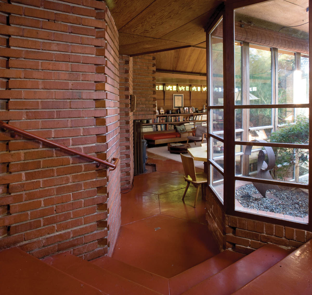
Bazett House, view from entryway to living room

Bazett House, north end
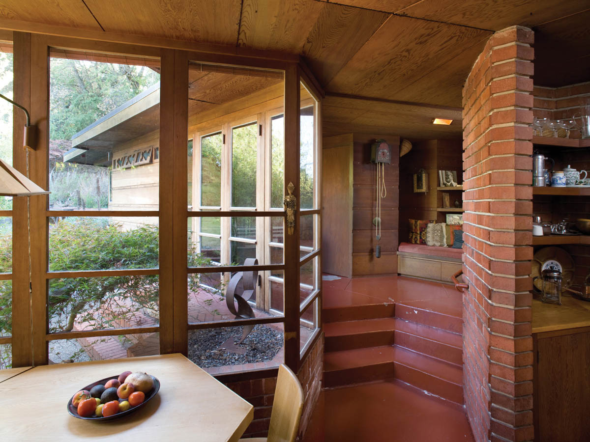
Bazett House, view from living room towards kitchen.
Ten miles south of the Bazett House stands the Arthur C. Mathews House, at 83 Wisteria Way in the leafy, tony suburb of Atherton, designed by Wright in 1950 and constructed the same year. The Mathews House is an individualized example of a late Usonian house, one that is based on paired, four-by-four-foot equilateral triangles, which create a diamond pattern for the floor plan. The two wings extend from the central work area and dining space. The living room wing is at a 120-degree angle to the workspace, while the bedroom wing is at a 60-degree angle. There are three bedrooms and two bathrooms in this modest-sized home.
The exterior walls are mostly composed of floor-to-ceiling windows with wide sections of red brick in between—similar to the walls in the Bazett House, but with an even greater portion given over to glass. These “walls of windows” create a seamless flow from indoor to outdoor spaces. The two wings embrace a semiprivate terrace and large lawn. The roof is a low-angled hipped roof made of wood shingles with wide overhanging eaves. The interior is finished in board-and-batten redwood paneling. This is one of the few Wright-designed homes where the owner-builder decided to not install any of Wright’s built-in furniture.

Mathews House, Atherton, California (1950), detail of entryway
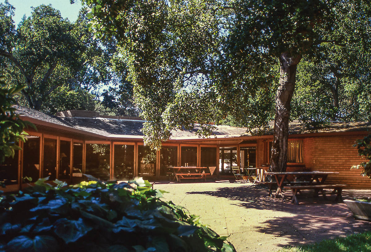
Mathews House, west façade. Photographs © 1988 Scot Zimmerman.
Frank Lloyd Wright often extolled the virtues of having his clients build their own homes from a set of his plans. One of the most important aspects of his Usonian concept was that the structures were both simple enough and affordable enough for the average, educated homebuilder to be their own contractor, when they had the required skills (although in practice these homes did not always prove to be simple or inexpensive to construct, as we have seen from earlier examples). Perhaps the ultimate example of an entirely owner-built home done from Wright’s plans is the Robert Berger House in the quiet, upscale Marin County community of San Anselmo.
In 1950, Robert and Gloria Berger purchased a one-acre, tree-studded lot at the top of a hill, at 259 Redwood Road in San Anselmo. Their lot had a panoramic view of the verdant, rolling hills and valleys surrounding it. While deciding on how to proceed with building a home for themselves and their three children, they saw an article on Wright’s V. C. Morris Gift Shop in San Francisco in Architectural Forum . The shop had just been finished, and the article mentioned that Wright was currently working out of his San Francisco office. So Robert wrote a letter to Mr. Wright, asking him to design a two-bedroom house for his family. In a 1959 article in Life magazine, the author explained: “Over his wife’s objections that he was crazy and that surely Mr. Wright would scorn a do-it-yourself project, he wrote to the famous architect. Wright replied by asking for his lot size and a description of his property. In a few months he sent the plans along.”[13] The plans were ready by the fall of 1950, but construction was delayed by Robert’s military service in the Korean War. When Robert returned from the war in 1952, he got a job teaching math at Novato High School, and then at the College of Marin. He decided the time was right to begin construction on his home.

Berger House, San Anselmo, California (1950–58), Robert Berger building masonry core, c. 1955. Courtesy of Berger Family Collection.
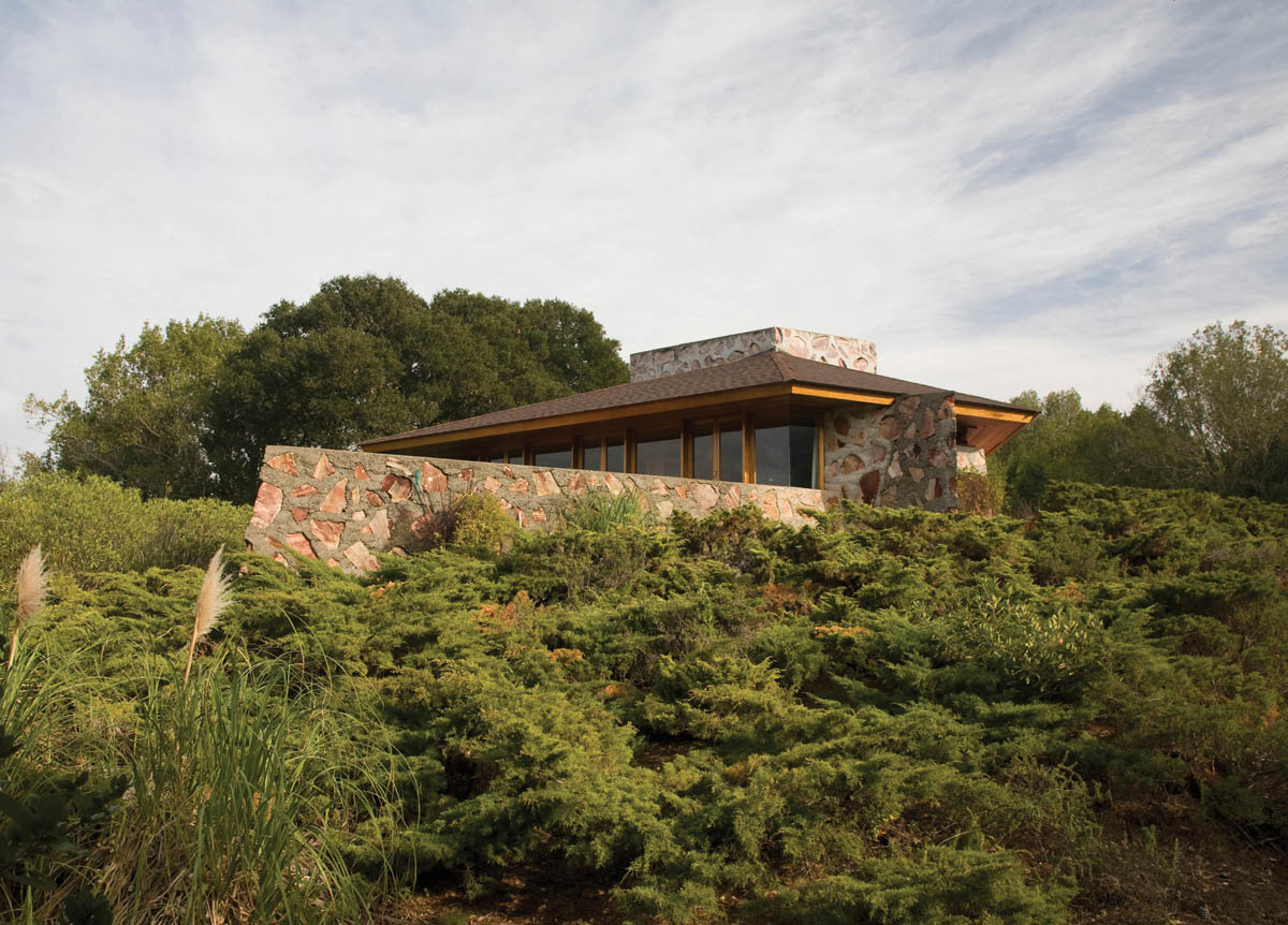
Berger House, south façade.

Berger House, floor plan. Copyright © The Frank Lloyd Wright Foundation, Scottsdale, Arizona.

Berger House, blueprint of north, south, east, and west elevations. Copyright © The Frank Lloyd Wright Foundation, Scottsdale, Arizona.
Over the next six years, Robert Berger worked on the house mostly by himself, although Aaron Green acted as consulting architect on the project. His wife, Gloria, and occasionally their children, helped him with a number of tasks, including the plumbing, digging the foundation, and pouring concrete. The biggest task they worked on, and one of the first things to be completed, was building the 20-foot-tall fireplace shaft, which was the masonry core of the house. This required pouring 50 tons of rock and cement into a wooden mold, and it took several months to complete.[14] Robert created the distinct inlaid stone patterns on all the exterior walls out of local pink Sonoma stone (Wright called this material “desert masonry”). He gathered, chiseled, and fitted each of the several hundred stones into the walls by hand. His work had progressed enough by 1956 for the family to move into the first section of the house. The remaining section of the home, and all of the interior finishing work, was finally completed in 1958.[15]
The Berger House retains almost all of its original features, and is considered a gem of the Usonian style. It is a single-story, two-bedroom, two-bath home, with 1,760 square feet of living space and a built-in carport under the overhanging roof to the left of the front door. The low-angled hipped roof, the horizontal massing of the house, and the native stone walls make it appear to be a natural outgrowth of the forested hillside it sits atop. Wright designed the house on an equilateral parallelogram pattern, creating a hexagonal living room that juts off the north side of the home. The living room ceiling is higher than the other rooms, a typical feature of Usonian houses. There is a serene view of the lushly wooded Marin hills in three directions from the floor-to-ceiling windows in the living room. A sliding glass door leads from the living room out onto the concrete deck, which is shaped like a ship’s prow and points almost due north.
The other interior features of the Berger House display classic Usonian elements. The kitchen is in an alcove behind the living room, and there is a raised-hearth fireplace set into the rear wall of the living room, made of concrete inlaid with pink Sonoma stone. There are built-in shelves and cabinets in the kitchen, and one section of these shelves and cabinets runs out into the living room. A built-in table of mahogany extends off these shelves, creating a small dining area at the west end of the living room. Behind these shelves is a playroom for the Berger children, which could double as a study after they went to bed. This open-ended space has a built-in desk and bookshelves along the walls. There are also built-in window seats of redwood along two of the living room walls. The floors throughout the house are made of concrete slabs, scored in a hexagonal pattern and stained Cherokee red. Wright designed many built-in cabinets lining the walls throughout the rest of the home, to insure plenty of indoor storage space.
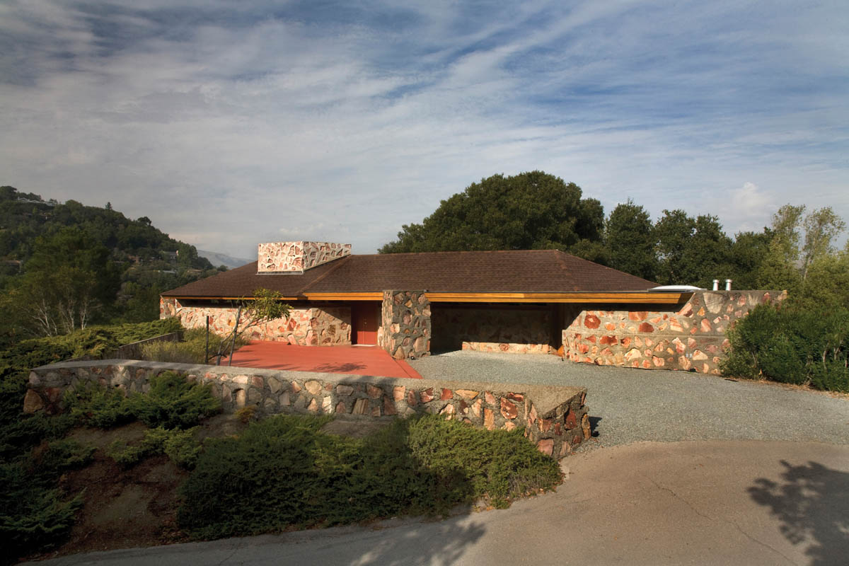
Berger House, south façade
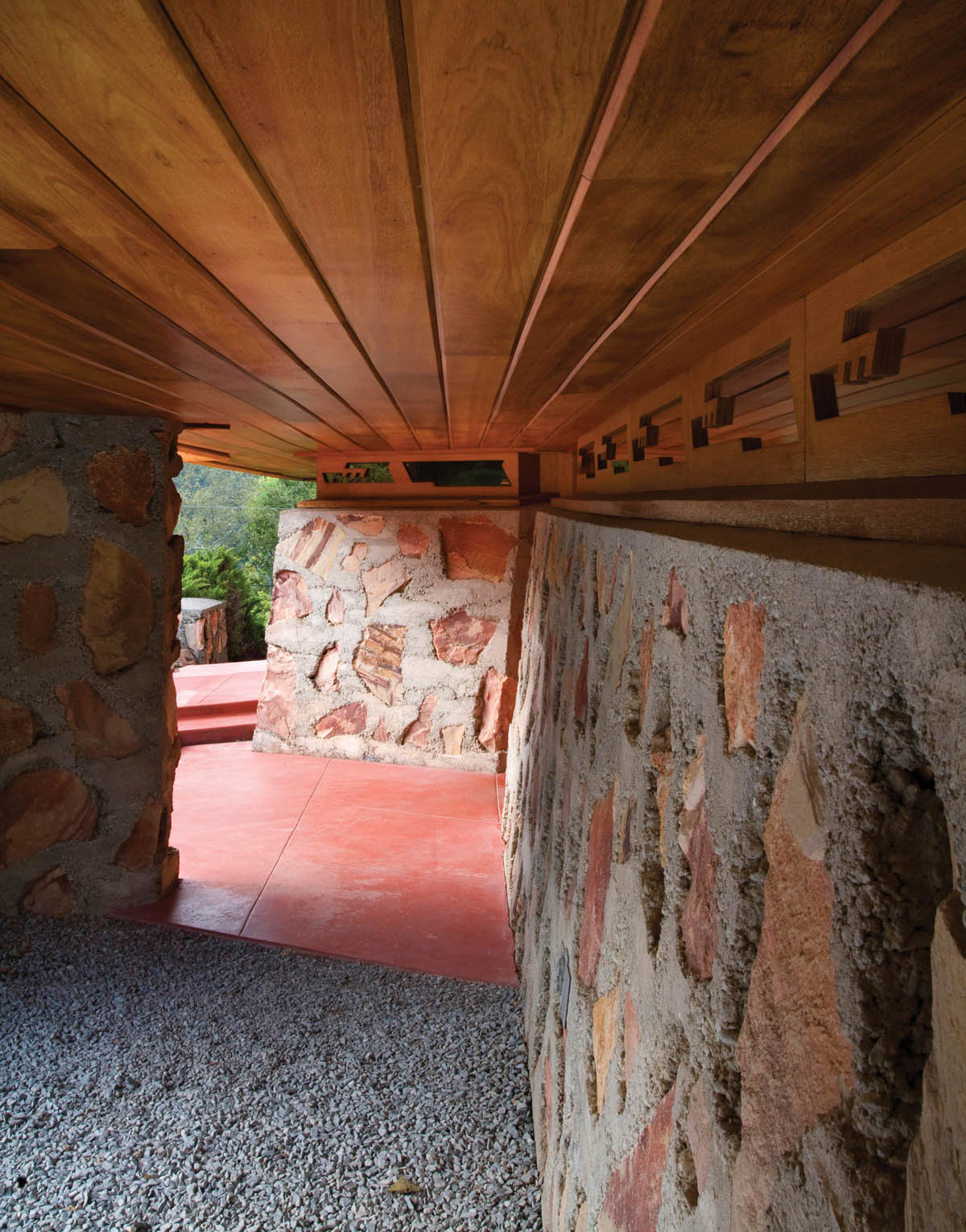
Berger House, desert masonry with overhanging eaves
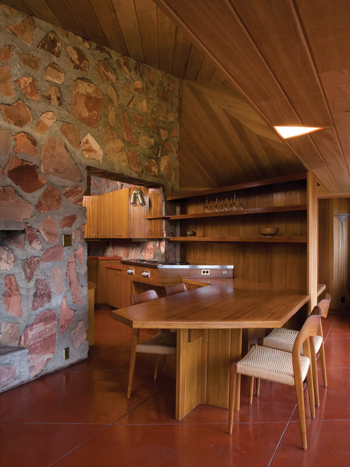
Berger House, dining room with Frank Lloyd Wright–designed built-in table.
The original master bedroom and bath were directly behind the rear wall of the kitchen. This bedroom has been converted into a study, but it retains all its Wright-designed built-in bookshelves, cabinets, and nightstands. A gallery-style hallway leads from the east end of the living room to the rest of the living quarters. The hallway has more built-in storage cabinets along its walls. The second and third bedrooms are off the eastern end of this hallway, with a bathroom tucked in between them. There is a built-in desk along one wall of the larger bedroom, so the children could do their homework there. A spacious workshop occupies the southeastern corner of the house, accessible from the larger bedroom. The northern exterior wall of this wing rises about eight feet from the ground to the floor level and tapers inward, creating a battered wall effect, often used in Tibetan monasteries.
The front door to the Berger House is hidden underneath the wide overhanging eaves on the south side of the house. These eaves are embellished by a repeating cutout pattern along a frieze that lines the entire south side, much like the eaves on the Buehler House. There is a parking area for four cars in front of the carport, and a pink-stained concrete patio to the left of the front door. A low retaining wall made out of the same stone-embedded concrete as the house lines this patio on the south and west sides.
The Berger House remains structurally sound to this day, nearly 60 years after it was built. There is no sign of settling of the foundation or cracking on the floors, and there was no noticeable damage from the 1989 Loma Prieta earthquake. Thus, the solid condition of this “do-it-yourself” Frank Lloyd Wright–designed home is a rebuke to those critics who claim that Wright’s houses were not well engineered.

Berger House, living room
In the 1959 Hollywood film A Summer Place, a middle-aged couple invites their two grown children to stay with them in their new beachfront home, supposedly on the Atlantic Coast. The house that was actually used for this scene was the Mrs. Clinton Walker House in Carmel, California, just south of Monterey Bay. As the wife opens the door to their house, she proudly says, “Frank Lloyd Wright designed our house.” But when they go inside, the interior bears no resemblance to Wright’s design. A set was used instead, making the house appear to be two stories, and much more spacious than it really is.
The actual Walker House is one of Frank Lloyd Wright’s most popular designs with the general public. Besides being used as a setting in the above-mentioned film, the exterior of the home has been photographed by hundreds of thousands of tourists over the nearly six decades since its completion. It was also one of Wright’s favorite residential commissions, one that he referred to as a little masterpiece appropriate to the unique site. The reason both Wright and his client were so pleased with this design is obvious to anyone who has stood on the beach at Carmel and looked up at the Walker House perched comfortably atop its prominent outcropping, overlooking the deep blue waters and massive rocks of Carmel Bay. The Walker House is a perfect blending of nature and building; of sea, sky, sand, and stone—and of local materials with the magnificent natural setting. In short, it is a masterful example of Wright’s philosophy of organic design, flawlessly executed. The process of designing and building this house, however, was anything but seamless, as a number of testy exchanges between Mrs. Walker and Wright during the construction of her residence make abundantly clear.

Walker House, Carmel, California (1948–54), south view.
The genesis of the Walker House dates back to 1945, when Clinton Walker’s widow, Della Brooks Walker, purchased a one-acre lot on a prominent outcropping along Carmel Bay. She wrote a letter to Frank Lloyd Wright on June 13, 1945, describing her site and asking if he would design a beachfront house for her:
I own a rocky point of land in Carmel, California extending into the Pacific Ocean. The surface is flat, and it is located at the end of a white sand beach. I am a woman living alone—You are the only man who can do this—will you help me?[16] I wish protection from the wind and privacy from the road and a house as enduring as the rocks, but as transparent and charming as the waves and as delicate as a sea shore.
Before she decided to write this letter, Mrs. Walker said to her friends and family that the reason she chose Wright as her architect was because of his design for Fallingwater. “If he could do that for a stream,” her great-grandson quotes her as saying, “just imagine what he could do with an ocean?”[17] Obviously, Mrs. Walker was a woman who knew exactly what she wanted, and who knew how to express herself clearly and eloquently to get it.
When Wright received Mrs. Walker’s letter, he responded promptly, saying he’d be happy to design her house. There were delays in the starting of the project, however, due to Wright’s work on other buildings. Construction finally began in April 1948, but a shortage of building materials during the Korean War interrupted the project once more. The house was finally completed in November 1952, and Mrs. Walker lived there alone for the next 45 years, until her death in 1997.
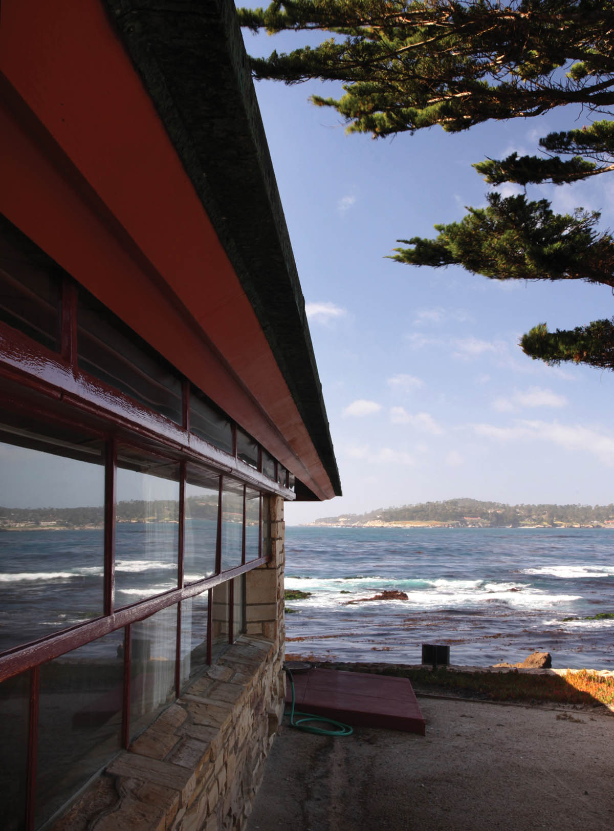
Walker House, view toward the bay
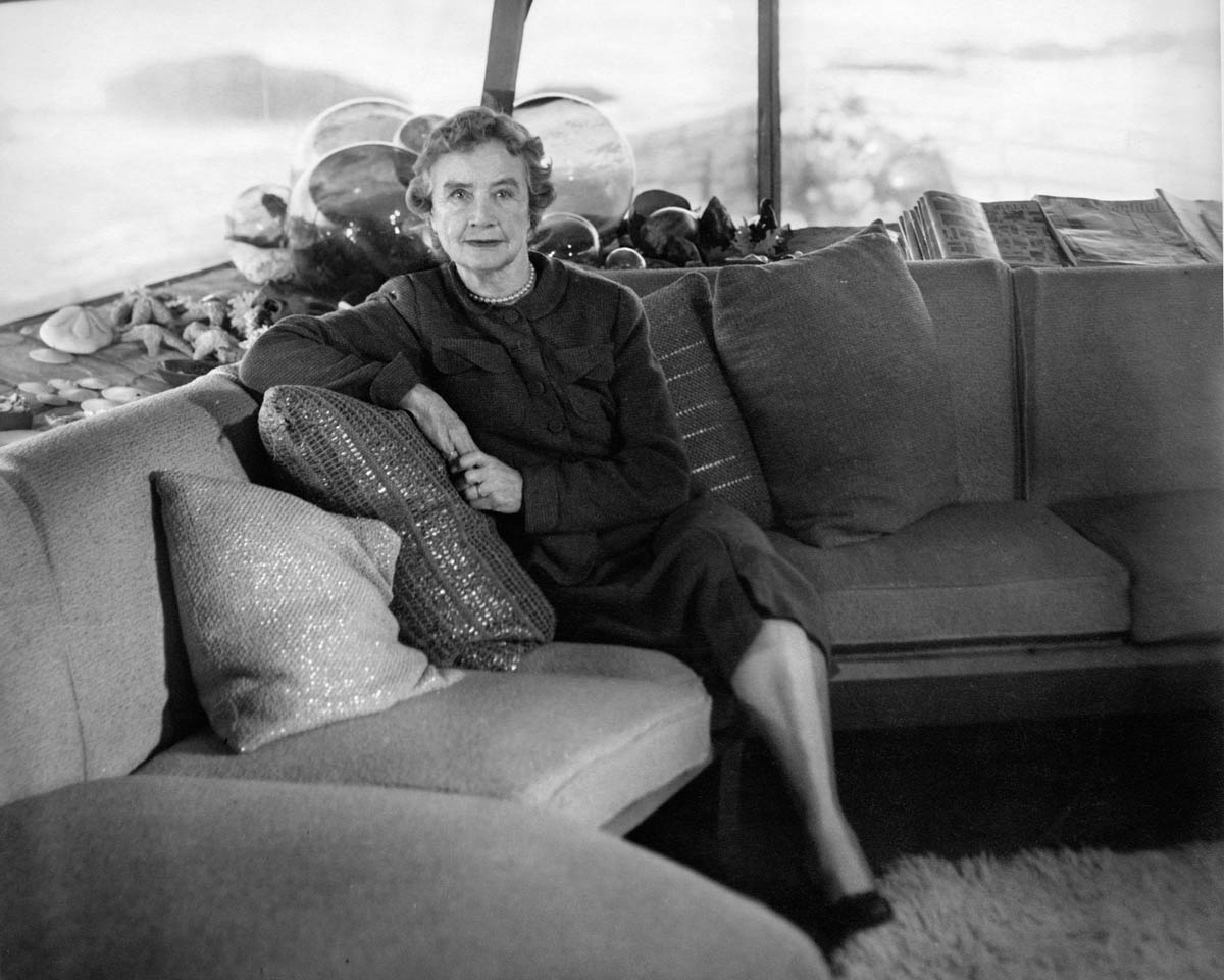
Della Walker in living room of her house, c. 1950. Courtesy of Walker Family Collection.

Walker House, view of windows along south side.
The Walker House is a single-story, five-room residence with three bedrooms, a combination living room/dining room, a small kitchen, and a total of 1,200 square feet of living space. The back bedroom was enlarged in the early 1960s from drawings done by Wright and executed by Sandy Walker, Della Walker’s grandson.[18] This is not a typical Usonian house, but rather a unique example of Wright’s organic design principles, a gem he created to fit perfectly into its natural setting through the integration of the structure and materials with its site. The fact that this was one of Wright’s favorite residences out of all his West Coast work is clearly indicated by the fact that in his correspondence with Mrs. Walker during and after the construction, he affectionately referred to it as the “Cabin on the Rocks,” and called it “a little masterpiece.”[19]
The living room/dining room faces due west, and is the most impressive room in the house, with its sweeping vista of Carmel Bay, the white sand beaches that line it, and the blue waters of the Pacific Ocean beyond. The tiers of metal-framed windows that encircle this room are slanted outward, to reduce the glare from the sunlight on the water in the late afternoon. The wide, overhanging eaves of the low-hipped roof also serve to reduce glare. The roof was originally clad in blue green porcelain to reflect the colors of the ocean. However, as with so many other Wright homes, this roof began leaking soon after construction was completed, so it was replaced with a copper roof about 1960.
The living room is designed on an interlocking triangular pattern, which was used for the entire floor plan. The west front of the house forms a prow-like projection, as does the terrace running in front of the living room, which is made out of concrete faced with Carmel stone. The prominent prow shapes of these features, pointing out to sea, create an impression of a ship about to be launched into the ocean. Wright placed a row of window seats all along the west end of the living room, to make it easier for the residents to enjoy the view. He also designed a small dining table made from triangular sections, and a set of chairs (which have since been replaced by another set designed by Wright). The open-hearth fireplace that forms the rear wall of the living room is faced in Carmel stone. When it was first installed, the stones were incorrectly set in a horizontal pattern. So Aaron Green, the supervising architect, told the contractors to take them out and reinstall them with an upward slant as Wright had intended. The living room ceiling tilts upward from the edges toward the center, and is made of combed plywood. The walls throughout the house are made of cedar panels with beveled battens, and the floors are made of concrete slabs, scored in a four-by-four-foot diamond pattern and stained Cherokee red.

Walker House, view of living room windows
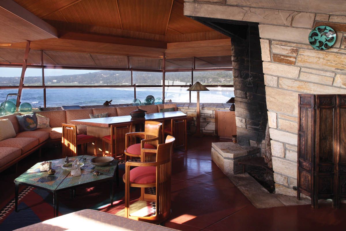
Walker House, view of living room with fireplace.
A gallery-style hallway runs along the south side of the house, which is sheltered from the glare of the afternoon sun by custom-designed blinds with thin slats that tilt at just the right angle to allow views of the beach and still provide shade. The small front door is at the west end of the hallway. Two bedrooms and two full baths open onto the hallway. The enlarged master suite in the rear wing has a large adjoining bath and a big fireplace lined in Carmel stone along the north wall. This bedroom opens onto a spacious trapezoidal deck along the north side of the house, which has unobstructed views of the beach and the ocean below.
Before construction on the Walker House was completed, a request from Della Walker about the kitchen caused a battle royal with Mr. Wright. She wanted a door put into the north wall of the kitchen so she could put the trash can out easily. In a testy letter dated February 27, 1951, Wright stated his strenuous objection:
Again we are up in the air—Looks very much as though the Cabin on the Rocks was on the rocks in more than one sense. You were once of my mind about the cabin. You gave me reason to think so, and I was happy to build it as I put my best mind and heart into producing a little masterpiece appropriate to the unique site. An ordinary little “door and window” house on that site would look as foolish as a hen resting where you ought to see a seagull. I am unwilling to spoil my charming seabird and substitute the hen. You don’t need me for that. Anyone can do it.[20]

Walker House, kitchen

Walker House, detail of bathroom
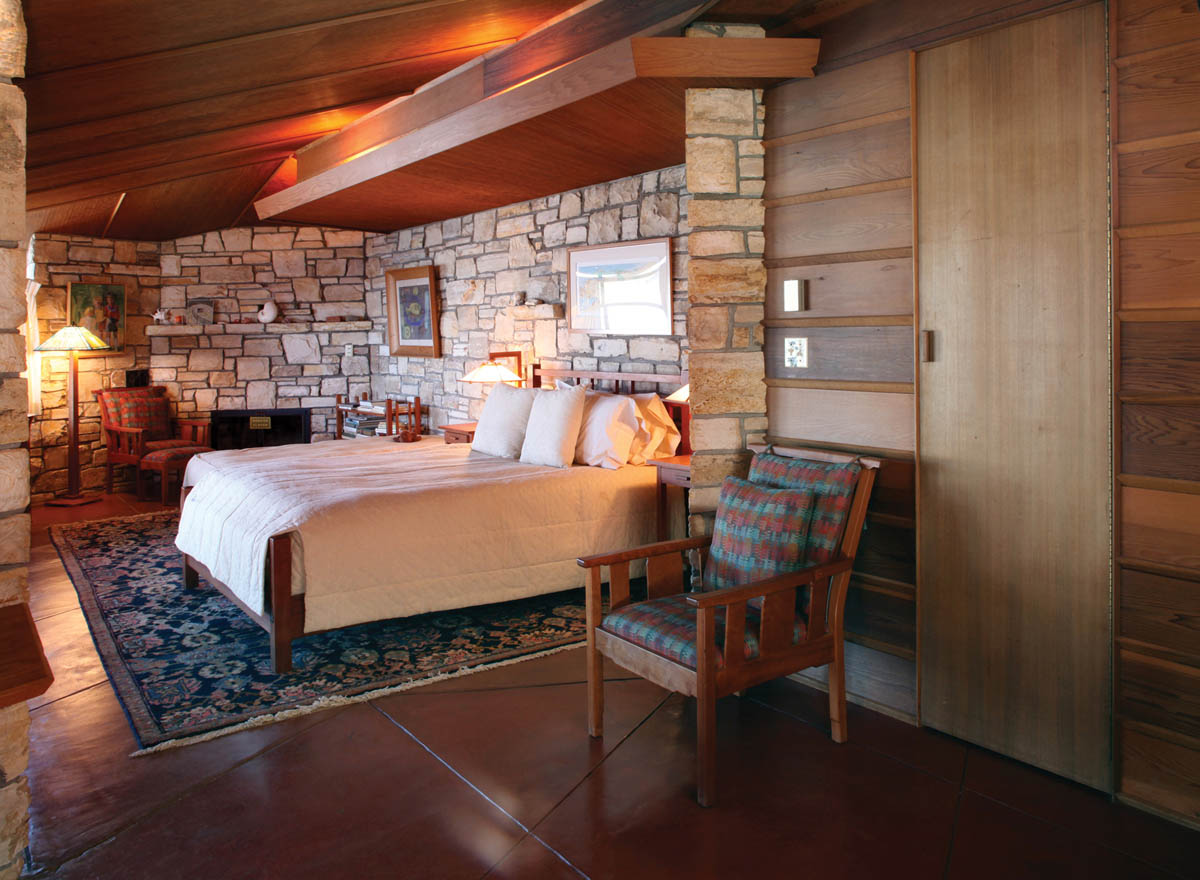
Walker House, master bedroom.
Wright and Mrs. Walker arrived at a compromise—to sink the trash can into a hole bored into the concrete deck so it couldn’t be seen by passersby, thus removing one of Wright’s concerns. He still opposed putting a door in the kitchen wall, but since she was paying the contractors, in the end she got her door. There were more testy exchanges between Mrs. Walker and Mr. Wright when construction was nearly complete. Della hired the renowned landscape architect Thomas Church to design the landscape scheme for the exterior of her house. When some of Wright’s staff informed him of this, Wright again fired off an indignant letter of protest, dated March 21, 1952:
Distressing news from several quarters. One of my former apprentices says to Aaron Green “Someone has ruined Mr. Wright’s house with landscaping. Walter Olds, distressed, said “Mrs. Walker hired a professional landscaper to undo all Mr. Wright has done for her.” If you did employ one, it is the first time it has happened to me in a long lifetime of building. The first destructive insult. I don’t believe it.
Throughout the nation, these destructive vermin plant a skirt of shrubbery around a house and stick up a couple of trees at the entrance. A “William Worse than Wurster” might be benefitted by this stock performance. Not so the Cabin on the Rocks. Is it all true?—I hope what I hear is not true and loves labor lost. I love the Cabin and had it in my heart as well as my head.[21]
But Mrs. Walker stuck to her guns, and once again her desires prevailed over the heated objections of Mr. Wright. Thomas Church’s landscaping design was carried out largely as he had planned it, with no discernable detriment to the aesthetic effect of Wright’s creation. Anyone who has strolled along the white sand beaches of Carmel and looked up to see the Walker House, set so perfectly into its rocky outcropping, would be happy to agree with Wright that the Cabin on the Rocks is indeed a little masterpiece that fits beautifully into its unique site.

Walker House, south façade.
On the outskirts of Modesto in the heart of the Central Valley, on a 10-acre lot studded with old almond trees, sits one of the most unusual Frank Lloyd Wright houses on the West Coast. The Robert G. Walton House, at 417 Hogue Road, is one of Wright’s largest residences of the 1950s. This 3,200-square-foot, single-story house is a modified version of Wright’s Usonian-style homes. Many of its features are not Usonian at all, but the result of the original owners, Robert and Mary Walton, insisting on full input into the design of their home, and convincing Mr. Wright to accept their ideas—no small feat, as we have seen. At this writing, Robert and Mary Walton still own and occupy this house, and it retains nearly all of its original features.
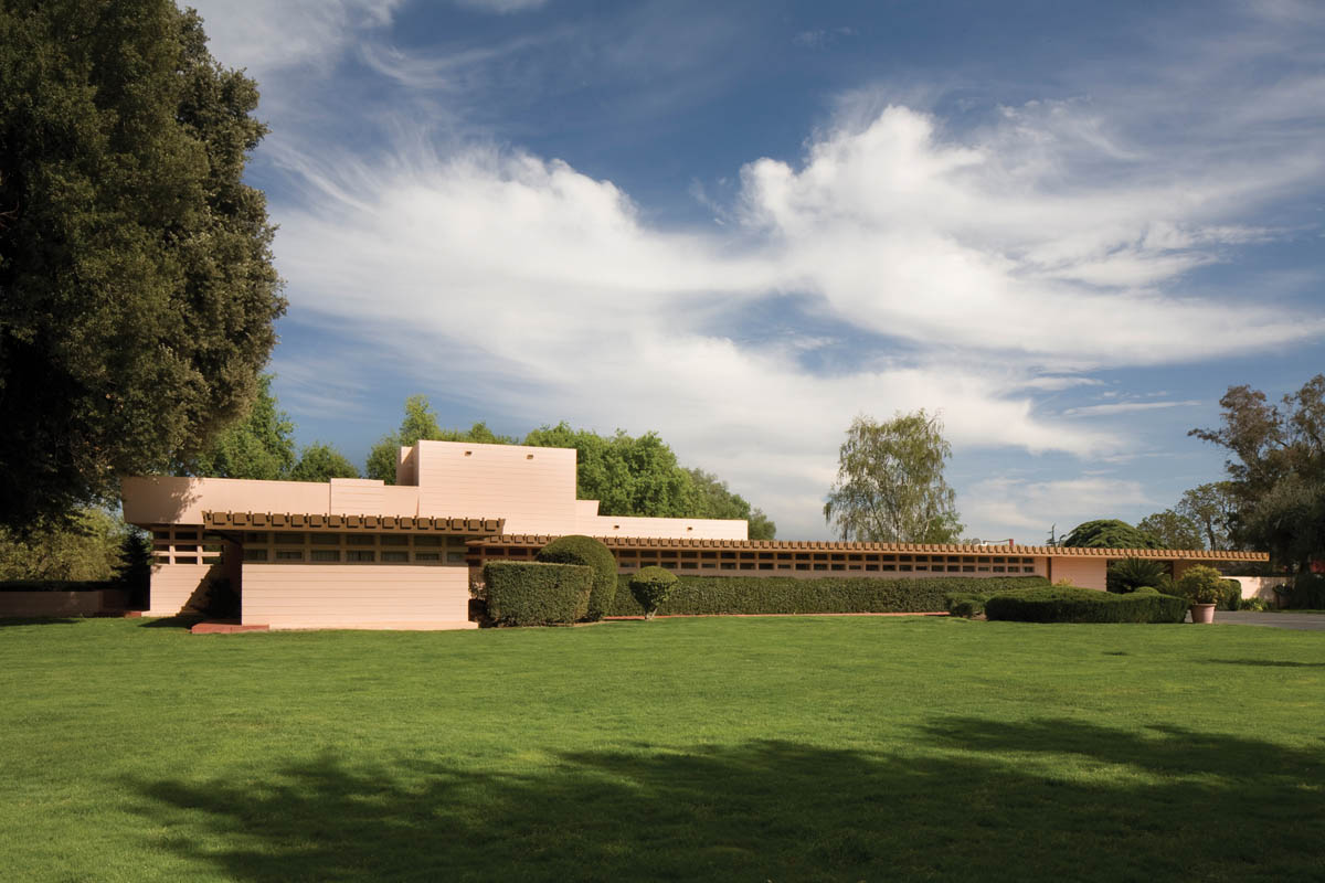
Walton House, Modesto, California (1957–61), view of west façade.
Mary Walton first met Frank Lloyd Wright at Taliesin East in the late 1940s, when she was in her teens. She went there because her brother, Douglas Lee, was working at Taliesin as an intern. She and her mother had dinner there, and heard Wright speak about architecture. Growing up in Michigan, Mary had seen several Frank Lloyd Wright houses, and decided she wanted him to design one for her when she got married. In 1955, a few years after she married British-born dermatologist Robert Walton, they bought a level lot in a rural tract that had been an almond orchard, about a half mile south of the Stanislaus River. The lot still has many old almond trees along its western edge, as well as several 400-year-old valley oaks shading its eastern and northern sides. The site retains the feeling of being completely out in the country.
Soon after they purchased their lot, Mary wrote a letter to Wright, asking him to design a home for them. He agreed, and they went to visit him at Taliesin West in 1957. During a detailed conversation with them about the design of their house, Mary suggested building it out of adobe bricks, to fit in with the local Spanish Colonial–style architecture. Ignoring her, Wright turned to her husband and announced, “Dr. Walton, I build scientific houses out of concrete block and steel reinforcement, so I know that they are safe.” Dr. Walton replied, “Yes, Mr. Wright,” and agreed to build their home of those materials.[22] Wright’s bid for the project was $60,000, and surprisingly the final cost actually came to very nearly that amount.

Walton House, view down walkway to front door
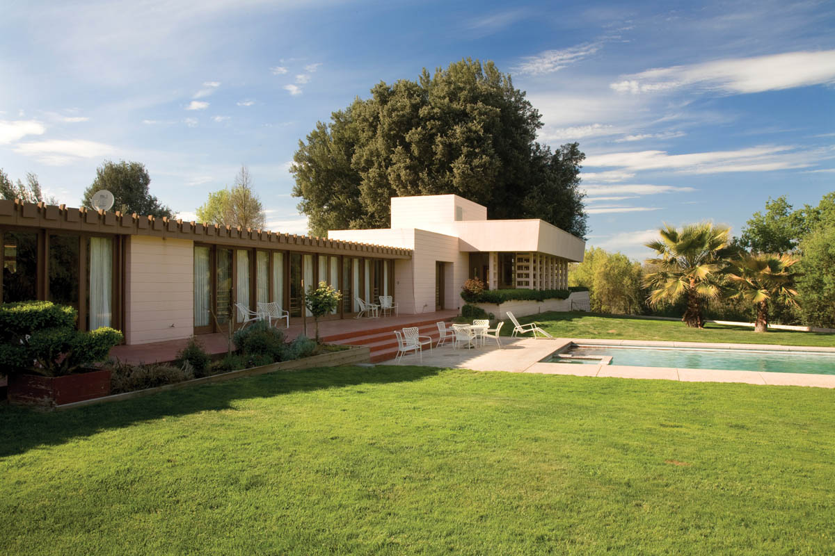
Walton House, view of east side with pool

Walton House, blueprint of general plan. Copyright © The Frank Lloyd Wright Foundation, Scottsdale, Arizona.
Once construction began in early 1958, however, the Waltons would request, and obtain, a number of modifications of Wright’s original plans. The house took nearly one year to complete, and they moved in just before Christmas 1958. Wes Peters was their supervising architect, and although Wright never visited the site, the Waltons had regular communication with him during construction. Wright’s design was a six-bedroom house along a north–south axis, with a living room, a dining room, a kitchen, a playroom, two studies, three and a half baths, and a two-car carport at the south end.
The floor plan of the Walton House forms a long “L” shape, with a short tail at the northern end. The exterior walls are made of concrete blocks, painted a light pink salmon color. The roof is flat, except for a squared ventilation tower that rises over the kitchen (which Mary Walton calls “our Norman tower”). Most of the wall area along the eastern façade is taken up with floor-to-ceiling banded picture windows, and the western façade has a clerestory of windows above the built-in shelving along the inside. A concrete slab terrace runs around the west, south, and north sides of the house, stained Cherokee red. A long patio runs off the north end of the house, accessible from the living room through tall glass doors. There is a swimming pool set into the east terrace. Wright’s original plan called for a rectangular pool, but Mary’s brother redesigned it as a nonrectangular parallelogram and installed it three years later.
The front entrance to the house is on the south side of the west wing. The interior was designed in a modified Usonian style, based on a 32-inch-square grid pattern for the floor plan. To the left as you enter is a large study and a master bedroom suite with one of the most spacious bathrooms in any of Wright’s California Usonian residences. To the right is the light-filled living room, with floor-to-ceiling banded windows and doors on the north and east sides. These doors and windows are framed in Philippine mahogany, as are the built-in cabinets below the wall of windows along the eastern side, and the built-in bookshelves along the western wall. There is an open-hearth fireplace on the south wall. Several original Wright-designed straight-backed chairs are still used by the Waltons in this living room, as are the Wright-designed chairs in the adjacent formal dining room.

Walton House, view of south terrace looking through living room.

Walton House, living room.

Mary Walton, 2010. Courtesy of Walton Family Collection.
A formal dining room is a rarity in a Usonian house, but the Waltons insisted on having one. This room can be closed off by using the Pella folding doors that Mary asked Wright to install. The ceilings in both the living and dining rooms are 12 feet high, another unusual feature in a Wright-designed residence that the Waltons were able to get Mr. Wright to agree to. Robert also asked to have a built-in wet bar in the living room, but Wright recommended a portable one. Robert insisted, and Wright finally acquiesced. To the right of the dining room is the galley-style kitchen, with much more cabinet space and workspace than most Usonian houses, a concession to Mary, as was the tall ventilation tower with a skylight set into the ceiling. A playroom was placed adjacent to the kitchen, which is now used as a small library.
Along the western side of the house is an 80-foot-long gallery-style hallway, which connects the five bedrooms in this wing of the house. A full bath sits between the fourth and fifth bedrooms. The shelves along the west wall of this hallway provide lots of storage space, and are enclosed by latched doors that open outward. The Waltons also insisted that the heating and air conditioning for their home be air blown, instead of a radiant heating system from pipes set into the slab floor as was used in most Usonian houses. When Wright suggested that they didn’t really need an air-blown air-conditioning system and could simply rely on crosscurrents from opening all the doors and windows to cool the house, Mary simply replied, “I’m sorry Mr. Wright, but when it’s 108 degrees outside in the summer and there’s no breeze, that just won’t work.”[23] So once again, Wright reluctantly agreed.

Walton House, gallery.
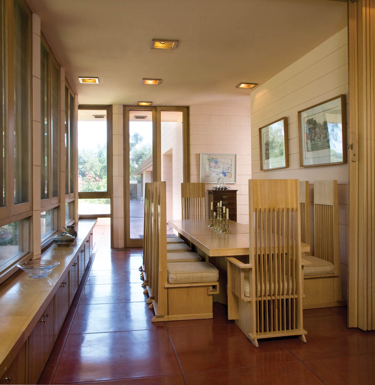
Walton House, view of dining room.
Much has been written about the few homes that were designed by Frank Lloyd Wright before his death in 1959, but not built until after he died. Taliesin kept all of Wright’s unbuilt plans, and a number of them were authorized to be used by the original clients later on, or new clients who wanted a Wright-designed home after the master’s death. I have often jokingly referred to these houses as examples of Wright’s “postmortem period.” One such residence, which is perhaps the most accurate example of a postmortem Wright design being executed exactly as he planned it, is the Hilary and Joe Feldman House in Berkeley, California.
The Feldman House stands in the Berkeley Hills above the UC Berkeley campus, at 13 Mosswood Road. It was originally designed in 1939 for Mr. and Mrs. Lewis N. Bell for a lot in the Hollywood Hills in Southern California. However, the Bells decided they couldn’t afford the cost of construction, so the plans remained at Taliesin. Thirty-five years later, Berkeley tax attorney Joe Feldman was doing some work for Wright’s widow, Olgivanna Wright, and she could not afford to pay his fee right away. So in lieu of payment, he arranged for permission to use the existing plans for the Bells’ house to construct a residence on a pie-shaped lot he had bought in the Berkeley Hills. The plan had to be flip-flopped to fit conveniently into the new lot, and Olgivanna walked around the site before giving her approval for the project. Wright’s original designs for the furniture and drapes were included as part of the agreement, which Joe was happy to accept as a precondition for Olgivanna’s approval.[24]
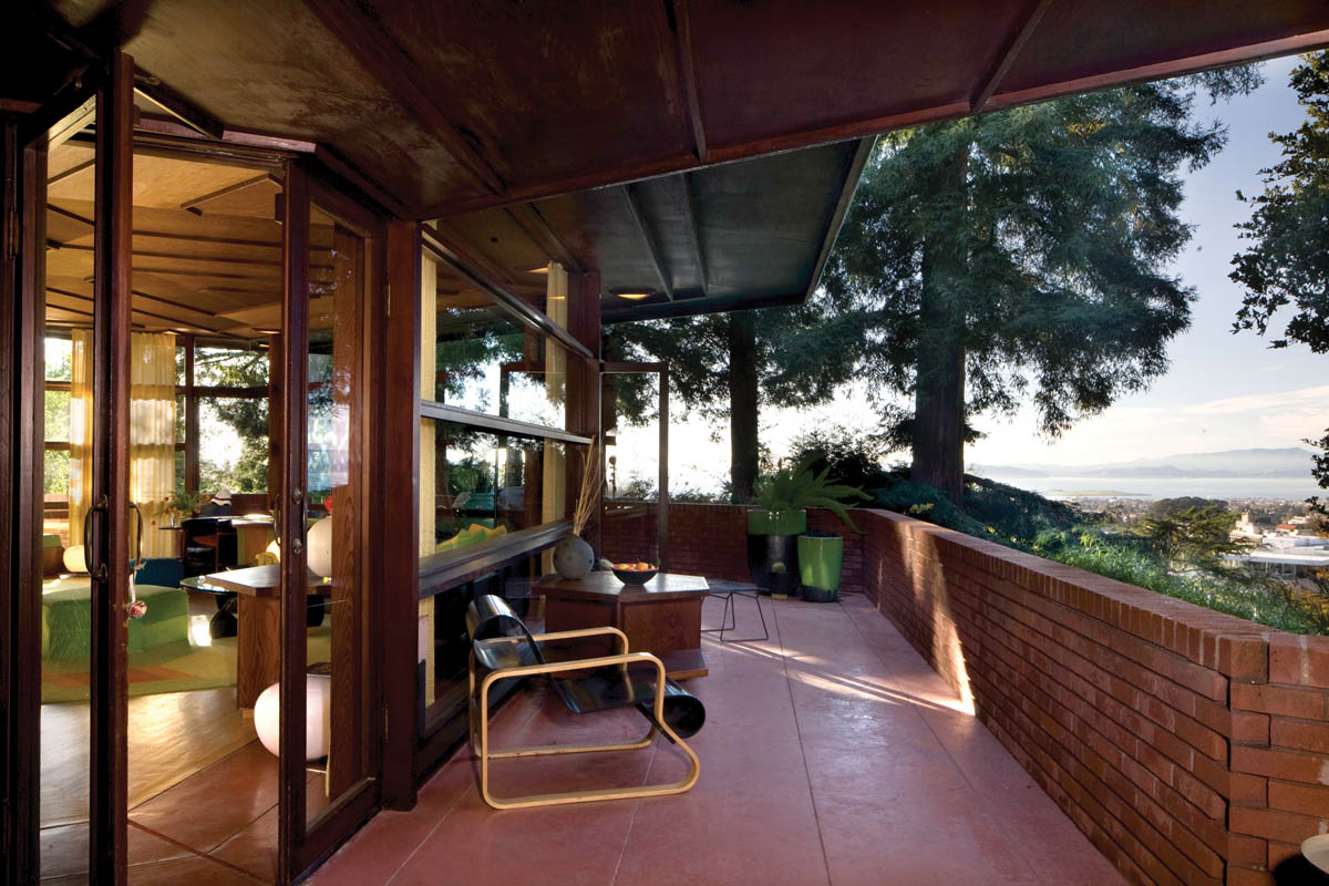
Feldman House, Berkeley, California (1937–74), view along north terrace.
Construction began on the Feldman House in 1974, and was completed in 1976. But by the time the house was completed, Feldman’s wife, Hilary, had been offered a teaching position at Oxford University, and moved to England to accept this position. So Joe Feldman lived in the house by himself for only a few months while the house was on the market. He eventually moved to Oxford to be with his wife, and the house was finally sold in 1980 to Marc Grant and Jeanne Allen, who have lived in it ever since. They couldn’t afford to buy the original furniture, so the Feldmans gave it to the Victoria and Albert Museum in London. After living in the house for nearly 30 years, Marc and Jeanne contacted a curator they knew at the Victoria and Albert and asked if they could have the furniture, since it had never been put on display. The museum said yes, and after inspecting the furniture in London, they were asked to pay only the shipping cost of having it sent to Berkeley, where it has been placed in the house since 2010, just as Wright had planned it.
The Feldman House is a 1,100-square-foot, single-story Usonian house with a total of five rooms: one bedroom, one bath, a study, a combination living room/dining room, and a kitchen. There is a very wide terrace around the entire perimeter of the house, with superb views of the city of Berkeley, and San Francisco Bay and the Golden Gate beyond. These views can also be seen from much of the interior due to Wright’s placement of floor-to-ceiling plate glass windows all around the north, south, and west sides. This feature, together with its prominent hilltop location, gives the Feldman House one of the lightest interiors of all of Wright’s West Coast residences.

Feldman House, living room with Frank Lloyd Wright–designed furniture.
The spacious living room is accessed from the small front door on the north side of the house, after passing through a two-car carport and a red metal gate in a fence that Wright designed to surround the west and north perimeters of the tree-shaded lot. Upon entering the living room, the immediate impression is one of a light-filled, open, flowing space with walls of glass framed with redwood along three sides. The floors in the center of the room are made of oak, while those around the outer edges are made from concrete slabs stained Cherokee red. An open-hearth fireplace is set into the rear wall of the living room, with a built-in redwood sofa adjacent to it, and there are built-in redwood window seats along the north side. The ceiling here is higher than in many Usonian houses, and is made of redwood plywood with geometric decorative trim, and has a raised section above the middle with a clerestory of cutout geometric patterns. The kitchen is hexagonal, and retains the original built-in shelves and butcher-block countertops.
The walls of the Feldman House are red brick facing over concrete block, giving the home an overall warm quality. The same materials were used for the retaining walls along the north, west, and south sides. The terrace that runs along these three sides has two-and-a-half-foot-high brick borders, lined with built-in redwood seating in several places, making this area perfect for outdoor dining and entertaining. The roof is flat, with wide overhanging eaves. Wright’s original plans did not include a basement, but when Joe Feldman built the house he had a full basement dug out of the steep downslope lot. Other than this change, the Feldman House is a faithful incarnation of a Frank Lloyd Wright–designed home set into the Berkeley Hills—one that appears perfectly suited to its current location.

Feldman House, view through terrace doors to living room

Feldman House, kitchen.
In the tiny, rural community of Los Banos east of Interstate 5 in California’s Central Valley sits one of Frank Lloyd Wright’s most unusual houses, one with several innovative features that were years ahead of their time. The Randall Fawcett House, at 2120 Center Avenue, is a late Usonian House. It was designed in 1955, but the construction was carried out by Taliesin Associated Architects, and not completed until 1961.[25] Thus it could be considered another example of Wright’s postmortem-period homes, like the Feldman House in Berkeley.
The Fawcett House is in the shape of a wide “U,” which embraces an enclosed lush lawn and garden area. At the northeast corner of the house is a trapezoidal pool, bordered by a series of concrete steps and terraces. The overall effect of this setting is to create the impression of a desert oasis, where one can refresh body and soul after walking through the unrelenting heat of the Central Valley in summer. The walls of the house are made of concrete blocks, tapered inward. Another unusual feature is the low-angled roof, which is cantilevered out several feet over the walls. The edges of the roof are encased in metal sheathing with geometric patterns, and the overhangs are perforated with jagged, metal-framed holes that cast interesting patterns when the sun shines through onto the concrete terraces below. The private side of the house, facing the garden and pool, has walls made of floor-to-ceiling windows and doors. These walls are not load bearing, as Wright used steel I-beams within the cantilevered roof for support.

Fawcett House, Los Banos, California (1955–61), north façade with three-car carport

Fawcett House, south façade, c. 1980s. Photograph © 1988 Scot Zimmerman.
At the top of the wall leading to the front entrance of the Fawcett House, Wright placed a shallow urn-shaped flower box, similar to the one he used on the entry gate of the Walker House in Carmel. The front door is on the northwest façade, set well back beneath a wide overhang that provides shade from the hot sun. This opens into a spacious rectangular living room, which occupies most of the central wing. The dominant feature of this room is the wide walk-in fireplace set into the south wall. There is an inglenook flanking the fireplace, made from concrete footings. The wall along this side of the room slants outward, and the ceiling tilts slightly upward to the middle, then levels off. Wright placed triangular recesses along the midline of this ceiling, with hanging light fixtures in them. Along the upper walls of the living room, as well as the entry hall, Wright designed a clerestory with cutout geometric patterns, as he did in so many other Usonian houses. These clerestories are made out of cedar trim over Plexiglas. The floors throughout this house are made of the same concrete slabs found in other Usonians, but they are stained dark brown rather than the usual Cherokee red.
In the southwest wing of the Fawcett House, Wright placed four bedrooms and three baths, as well as the master bedroom suite at the end. The southeast wing contains the kitchen and a large playroom, with a built-in dining table attached at the north end. This long room opens out onto the pool. A three-car attached carport runs off the northeast corner of the house, with a tool shed at the far end. As with all his other Usonian houses, Wright designed built-in bookshelves and window seats for the living room, and built-in furniture in most of the other rooms.
Wright’s original choice for the site of the Fawcett House was in an adjacent walnut grove. But the clients decided this setting would be too humid, so the site of their house was moved a short distance. With all of its sharp-edged rooflines, wide overhangs, tapering walls, and geometric patterns in jagged metal, the Fawcett House resembles a smaller-scale residential version of the work of such au courant architects as Frank Gehry, whose “starkitecture” designs have come to dominate public architecture in cities around the globe since 2000. Here, once again, Frank Lloyd Wright was several decades ahead of his time.

Fawcett House, detail of south façade

Fawcett House, living room. Photographs © 1988 Scot Zimmerman.