“Tell the people of the little church that I will help them out. . . . If I like the ‘feel’ of a job, I take it.”
The Solomon R. Guggenheim Museum in New York City is one of Frank Lloyd Wright’s most famous buildings. Indeed, it is one of the most recognized buildings in the world. It has been used as a setting or backdrop for dozens of TV shows and countless movies since it was completed in 1959. Yet a full decade earlier, Wright completed a small commercial building in San Francisco in which he pioneered the signature spiral interior ramp that is the most famous feature of the Guggenheim Museum. The V. C. Morris Gift Shop, at 140 Maiden Lane (just off Union Square), is an architectural gem that is reminiscent of its larger, younger cousin on the East Coast. Although Wright had completed his preliminary set of drawings for the Guggenheim in 1943, the V. C. Morris Gift Shop was the first building in which he actually used his innovative spiral ramp design.

V. C. Morris Gift Shop, San Francisco (c. 1948–49), spiral ramp.
Frank Lloyd Wright’s first contact with Mr. and Mrs. Morris was in 1944, when they visited him at Taliesin West to ask him to design a residence for them. He produced a set of plans for a unique house that was in the form of a vertical three-story stacked cylinder, perched on a steep hillside 110 feet above the beach in the Sea Cliff section of San Francisco.[1] This radical design, different from anything else Wright had envisioned, was never built. However, the Morrises were intrigued enough with Wright’s unorthodox thinking to ask him to design a gift shop, by remodeling an old warehouse they had bought along a narrow side street in the heart of San Francisco’s retail district. The street was level, thus avoiding the construction problems that their residential site created. Yet Wright’s design for the gift shop was, in several ways, just as unconventional as his earlier proposal for their home.
The plans for the V. C. Morris Shop were completed in 1948, five years after Wright’s preliminary drawings for the Guggenheim were drawn up. Thus there is no doubt that the Morris Shop served as a working prototype for the Guggenheim Museum; a trial run done on a much smaller scale. For the shop project, Wright incorporated both innovative features and design motifs he had used earlier in other buildings—often on the same part of the building. The best example of this is the unusual façade and entryway on Maiden Lane. Instead of having the front of the building sheathed in plate glass to display the wares for sale within and seduce passersby, he had the entire façade faced in narrow red brick. Around the entrance he placed a Romanesque-like set of concentric arches that emphasize the small, barrel-vaulted entry vestibule. Wright did this to create a sense of mystery and draw visitors to the front door to discover for themselves what lay within, thereby avoiding the “vulgar display of goods for sale” that was seen in traditional storefronts.[2] His use of a Romanesque archway around the main entrance was a motif he had used five decades earlier on the Francisco Terrace Apartments in Chicago (1895), and on some of his first Prairie houses in the Midwest, such as the Frank W. Thomas House in Oak Park, Illinois (1901), and the Francis and Mary Little House in Peoria, Illinois (1902).
Another innovative feature of the façade was Wright’s placement of a row of lighted square acrylic plastic bricks in a horizontal band that runs from the far right side of the building all the way along the waist-high platform that extends to the middle of the entryway. At night, these bricks gave off a soft yellow light from bulbs set into the wall behind them, and served as a subtle signpost to direct visitors to the front doorway. Wright’s use of acrylic plastic for the exterior lights, as well as on the ceiling inside, was quite innovative, since this was a new material at that time.

V. C. Morris Gift Shop, exterior

V. C. Morris Gift Shop, south elevation. Copyright © The Frank Lloyd Wright Foundation, Scottsdale, Arizona.

V. C. Morris Gift Shop, detail of entry tunnel.
After walking beneath the brick archway, visitors are ushered into the glass-and-metal-framed tunnel Wright designed to provide a transition from the noisy street into the quiet elegance of the gift shop’s interior, with its array of fine and collectable merchandise that the Morrises were selling. Wright described this feature by telling Mr. and Mrs. Morris, “We are not going to dump your beautiful merchandise on the street but create an arch-tunnel of glass, into which a passerby may look and be enticed.”[3]
Upon entering the Morris Shop, most visitors’ attention is drawn upward along the dynamic angle of the curved ramp as it spirals towards the ceiling 40 feet above the floor. This ramp is made of white-painted reinforced concrete and lined with polished brass handrails, creating an elegant effect. Wright designed a drop-down ceiling to cover the entire width of the showrooms below. This false ceiling consists of a repeating pattern of acrylic plastic panels that are molded into bubble shapes and set into square metal frames. These “bubble panels” admit sunlight for skylights above them, and their soft white surfaces seem to glow with an inner light. The overall effect of these unique features is to create the ambience of a bright, open, graceful space; one that invites visitors to linger and spend some time exploring all of the various treasures on display there.
Wright also designed all of the built-in display cases, cabinets, and tables that are arranged along the ground floor. These furnishings are all made with a walnut veneer. One of the largest cases, near the left rear corner of the shop as you enter, has a gilt ceiling above the glass-fronted display shelves. Wright also put built-in cabinets and countertops lining the curved walls behind the ramp. This provides an intriguing setting for some of the smaller sculptures for sale. These objects can be viewed through several porthole windows Wright placed along the ramp. The use of these porthole windows is reminiscent of Art Deco commercial buildings of the 1930s, and was a feature Wright liked to use in many of his post-Deco-era public buildings, such as the Marin County Civic Center. The floors throughout the ground floor are made of beige-colored, polished concrete slabs.

V. C. Morris Gift Shop, view of ramp and acrylic plastic ceiling.
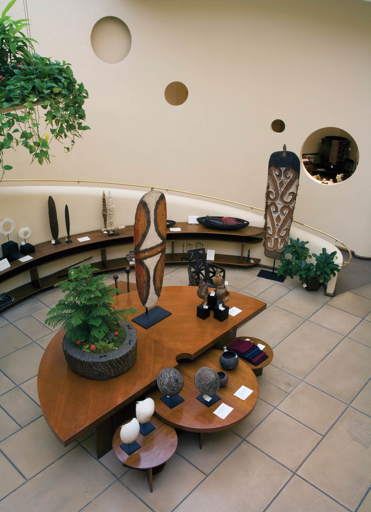
V. C. Morris Gift Shop, view of ground level with Frank Lloyd Wright–designed furniture.
The floor plan for the Morris Shop includes space for two corner offices. In the left front corner is a small room used for displaying antique Japanese prints, while the other small room in the right rear corner is used for the owner’s office. Wright also designed a kitchen and two bathrooms on the ground floor. The total area of the shop is about 7,500 square feet, including a large basement for storing any overflow of merchandise that can’t be kept in the display cases on the upper two levels. Construction of the shop took more than a year, and the supervising architects were Aaron Green and Walter Olds.[4] The Morrises opened the gift shop for business in 1949. They sold fine china and linens, as well as silver, gold, and crystal objects. They owned the shop until 1960, and there have been several owners since then. Over the past five decades, the shop has been used as a fine jewelry shop, a lady’s dress shop, and a modern art gallery, among other things.[5]
In 1997, Raymond Handley bought the shop. He realized it needed a major restoration, so he hired Aaron Green out of retirement to supervise the renovation of the interior. This project took 11 months, and the new shop opened for business in December 1997. The City of San Francisco also required a total retrofit of the building for earthquake safety. So in 2002, Raymond’s wife, Marsha, oversaw the completion of a seismic retrofit of the entire structure, which included stabilizing the brick façade on Maiden Lane. After this work was completed, the row of square, recessed lights along the façade became inaccessible from the inside, so the bulbs inside them could no longer be changed. Other than this detail, the building has retained nearly all of its original Wright-designed features. The shop is now known as the Xanadu Gallery, and specializes in antique Asian works of art, as well as featuring Oceanic, pre-Columbian, and African sculptures, and other objects.
Marsha Handley sees a historic continuity in the type of shop she runs in this unique building and the original shop Wright designed in 1948. “Having worked in this very special space and displaying our art here for many years, it seems to me that our collection of Asian antiquities blends in quite well with Wright’s design. Since Mr. Wright was a collector of antique Asian art himself, especially old Japanese prints, his design meshes beautifully with the objects we have on display now.”[6] The V. C. Morris Gift Shop became an official San Francisco Landmark in 1975.
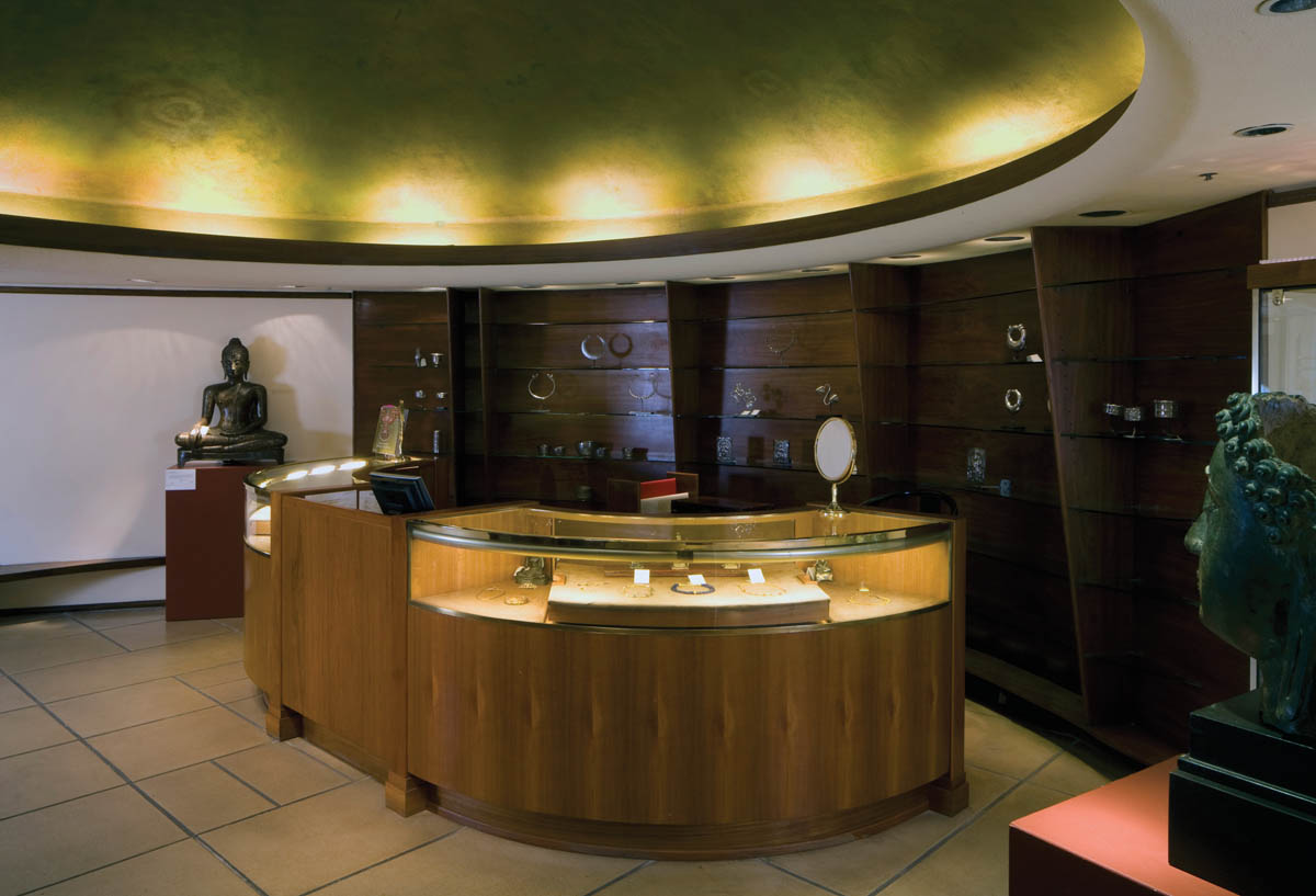
V. C. Morris Gift Shop, ground-floor display cases with gold ceiling.
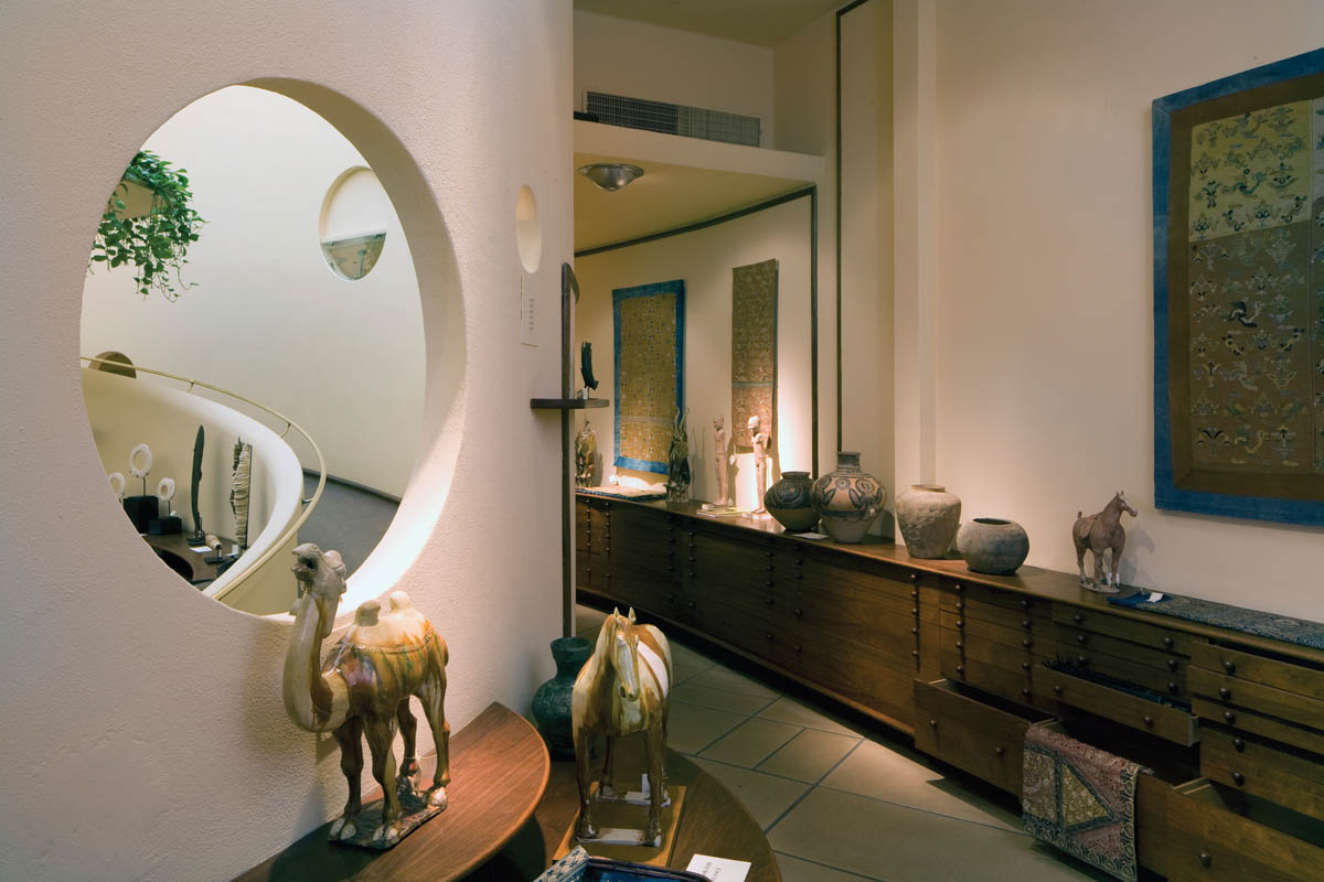
V. C. Morris Gift Shop, view of ground-floor display cabinets
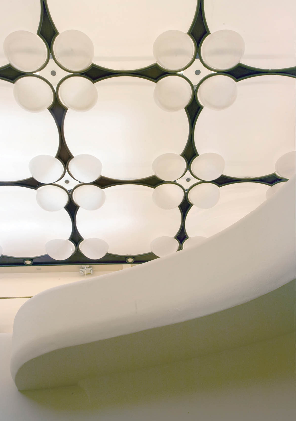
V. C. Morris Gift Shop, detail of ceiling.
Although religious structures did not constitute a major portion of Frank Lloyd Wright’s total output, he did design eight such buildings during his career. The variety of Wright’s religious buildings covers quite a wide range, including an Arts and Crafts Unitarian chapel in Spring Green, Wisconsin, in 1886, his first completed commission; Unity Temple in Oak Park, Illinois, a synthesis of Prairie and Arts and Crafts styles, designed in 1905 and completed in 1908; two modernistic chapels on the campus of Florida Southern College, built between 1938 and 1954; the futuristic Beth Sholom Synagogue in Elkins Park, Pennsylvania, designed in 1954; and the round, Space Age–looking Annunciation Greek Orthodox Church in Wauwatosa, Wisconsin, designed in 1956.
The last religious building Frank Lloyd Wright designed, and one of the most unorthodox of all his commissions, was the Pilgrim Congregational Church in Redding, California. Designed in 1958 and not completed until 1961, it remains one of Wright’s least-known buildings, and is the only Wright-designed religious structure ever built on the West Coast. Pilgrim Congregational Church sits above the banks of Jenny Creek, at 2850 Foothill Boulevard, about three miles west of Interstate 5. Redding is an old mining and lumber town of over 90,000 residents two hours south of the Oregon border.[7] Besides its Wright-designed church, the town boasts the famous Sundial Bridge, designed by the internationally acclaimed Spanish architect Santiago Calatrava.

Pilgrim Congregational Church, Redding, California (1958–61), east façade
Wright’s commission for Pilgrim Congregational Church had its origins in 1957, when Reverend Ray Welles joined a building committee seeking to find an architect for his growing congregation’s future church. In 1956, a 4.6-acre site was chosen along the creek to build the church. In 1958, Reverend Welles announced that Frank Lloyd Wright had agreed to design their new building. A member of the building committee had placed a call to Taliesin West, requesting Wright design their church after they had rejected eight other architects. The request was relayed to Wright in New York City, where he was working on the Guggenheim Museum. Wright told the Taliesin staff to give this reply: “Tell the people of the little church that I will help them out. . . . If I like the ‘feel’ of a job, I take it.”[8]
While the committee had been interviewing other architects, students from Shasta College had surveyed the lot and produced detailed site drawings. When these drawings were sent to Wright to study, he remarked that he’d never seen a better job of terrain drawings. Working from these drawings, Wright produced a plan for an A-frame-type complex with four intersecting wings, anchored by a tall stone tower topped with a metal spire. The roofs of these wings would be hung from a series of redwood bents, resembling a whale’s skeleton. The style of this building was dubbed “pole and boulder Gothic” in a notation by Wright himself on his preliminary drawings.[9]
In March 1958, the building committee had sent Wright a document called “What Our Building Must Express.” It included this vision: “We believe that creative architecture will make people aware of the resources of our Christian faith. Men thirst for God and are particularly desperate in our time. For many people, God is transcendent and distant. Our building ought then to reflect the intimacy and eminence of God as well as his majesty.” Though Wright did not come in person to see the site, the committee members met with Wright in his office in San Francisco, after the drawings for the Marin County Civic Center were published in the local press. As the members sat in a tight circle around Wright discussing their project with him, he reached over and tapped Reverend Welles’s knee and said to him, “Well, Domini a familiar Scottish term for a reverend], how long do you suppose we’ll keep building churches?” A lively discussion ensued about the place of religion in modern American society and Wright’s own strong religious faith, from which he’d never wavered throughout his life.[10]

Pilgrim Congregational Church, view of west façade

Pilgrim Congregational Church, detail of rubblestone wall.
During the committee’s visit, Wright explained that his concept for their church represented a tent form, which symbolized the ancient dwellings of Israel. He told them the church would appear to grow out of the ground, since it would nestle comfortably into its hillside setting, and the fitted stone walls and wooden poles supporting the roof would blend in well with the stony, wooded landscape. The pulpit area in the sanctuary would resemble a cave, and worshipers would walk down a set of steps into the sanctuary to suggest a return to God’s creation. Then Wright summed up by telling them, “your faith has emotion in it, and so does your building.”[11]
The original plans called for a fellowship hall and adjoining offices to be built on a north–south axis, with an adjacent education wing running diagonally southeast off the central section. At the north end was to be a large sanctuary that would run diagonally northwest off the central section and a small chapel running diagonally northeast off the sanctuary. The floor plan was based on a series of intersecting equilateral triangles, a system Wright often used in his later public buildings. The final set of drawings was dated April 1959, the month Wright died.
Construction began in the summer of 1960, after some difficulty in finding a local contractor who could carry out Wright’s unusual plans. The work was done under the supervision of John Rattenbury, Tony Puttnam, and Aaron Green of Taliesin Associated Architects. In the end, only the fellowship hall, education wing, and offices were built. Construction of these sections was completed in late December 1961, just in time for the congregation to celebrate Christmas mass in the fellowship hall. The church has used this space as their sanctuary ever since. Both the education wing and the office section have been remodeled in recent years, and a basement was added to provide more classroom space. The bents, or poles, were changed from redwood to concrete, due to cost considerations. Wright had chosen redwood because he mistakenly assumed Redding was surrounded by redwood forests.[12]

Pilgrim Congregational Church, view of sanctuary

Pilgrim Congregational Church, view of stage and pulpit.
The main entrance to the Pilgrim Congregational Church is on the eastern side, down a set of polished concrete steps. These steps, as well as the concrete floor and steps throughout the sanctuary, are stained Wright’s favorite Cherokee red color. The first feature one notices in the sanctuary is a steeply pitched ceiling, which rises to a point in the middle and is lined with massive beams. These beams were originally made of Douglas fir, but were replaced with cedar planks after a fire in 1992 required some restoration of the ceiling. The wood window frames were also replaced with metal framing at that time. The most interesting part of the sanctuary is the front, where a short set of steps rises up to a stage and the pulpit. Wright designed a large wooden cross for the stage, anchored to the wall behind the pulpit.
The walls of the sanctuary are made out of a variety of local rocks set into concrete. These rocks vary greatly in color, size, and shape, and they create a rich set of textures and visual patterns. Wright used this same technique for the walls surrounding the sunken garden terrace, adjacent to the education wing. All of these fieldstones were gathered by members of the congregation and brought to the site during construction. At the south end of the sanctuary there is a massive two-story stone tower, made out of the same materials. A door set in the rear left corner of the stage leads into a small kitchen on the ground floor. The second floor was originally used as the pastor’s office, but is now used as a storage area.
The head of the Pilgrim Congregational Church at the time of this writing, Reverend Ann Corrin, described those qualities she liked best about the building: “Anyone who has a creative spark, when they walk into the church it feeds that in them. I’ve noticed that this building has a creative spirit, one that inspires artists and musicians. We frequently have musical events here, and all of the musicians say they love playing here, and that the acoustics are really perfect.”[13]
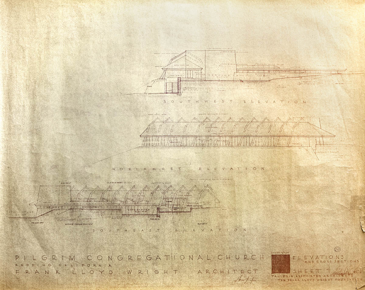
Pilgrim Congregational Church, blueprint of southwest, northeast, and southeast elevations. Copyright © The Frank Lloyd Wright Foundation, Scottsdale, Arizona.
During his 66 years of independent practice, Frank Lloyd Wright designed dozens of commercial buildings. Besides retail shops, he also designed corporate headquarters, banks, a gas station, a restaurant, law offices, and even a real estate office, despite his stated disdain for that profession (see Chapter 7). Wright also designed four medical clinics late in his career, including the Meyers Medical Clinic in Dayton, Ohio (1956); the Fasbender Medical Clinic in Hastings, Minnesota (1957); and the Lockridge Medical Clinic in Whitefish, Montana (1958). But the first medical clinic he designed was the Kundert Medical Clinic in 1954 in San Luis Obispo, California. This is also the most intimate of his medical clinics in scale, and many historians feel it’s the most charming in ambience.
San Luis Obispo is a quaint old California town of about 45,000 people on the central coast. It lies just 30 miles south of famed Hearst Castle, built by William Randolph Hearst and designed by America’s first independent woman architect, Julia Morgan. Most of the nearly one million tourists who visit Hearst Castle each year never venture into the historic town of San Luis Obispo and have no idea it has an intact architectural gem by Frank Lloyd Wright.
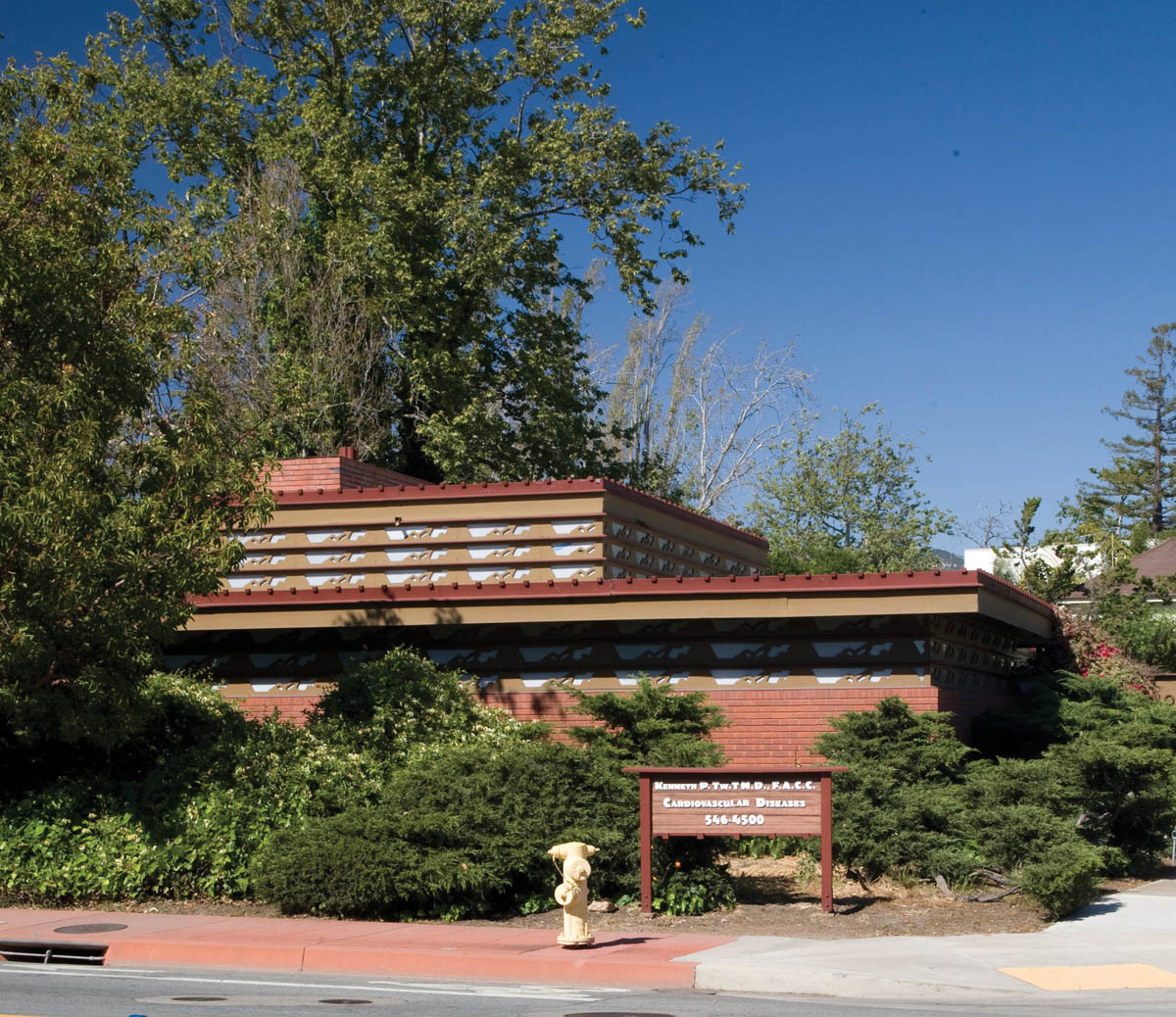
Kundert Medical Clinic, San Luis Obispo, California (1954–56), southwest façade.
The Kundert Medical Clinic (now called the Tway Clinic) sits at 1106 Pacific Street, at the northeast corner of Pacific and Santa Rosa streets near the historic central business district. Dr. Karl Kundert was an ophthalmologist with a thriving practice when he first wrote to Frank Lloyd Wright in 1950 about designing a new clinic for him. He was familiar with Wright’s buildings from having seen many of them while growing up in Wisconsin.[14] He sent Wright flowchart studies of his patient load, as well as photos and a map of his lot. The site he chose, a narrow, uneven, irregular corner lot that sits just above San Luis Creek, with a steep ravine along its northern edge, presented more than a minor challenge. Wright’s solution was to orient the building primarily on an east–west axis, with the front entrance on Santa Rosa Street. The low, horizontal massing, the flat roofline along the two street sides, and the undisturbed woodsy ravine along the north side, give the 2,500-square-foot building the appearance of nestling comfortably into its lush creekside setting. Wright used warm red brick for the façade of the clinic, and placed a triple clerestory with a repeating geometric pattern along the upper walls of the waiting room and to the right of the front entrance.
Wright’s original plan called for concrete block construction, but local building codes required him to switch to brick, which is more in keeping with the façades of other commercial buildings in the area. Wright completed a set of plans in 1954, but Dr. Kundert requested that the two outside walls be moved two feet out to provide more room for his staff to treat their patients. The final plans were drawn up in 1955, and the construction took five months. The building was completed in 1956, under the supervision of Aaron Green. Wright was busy working on dozens of other projects around the country during that time, but he did visit the site two times: once briefly just before construction began, and once when it was nearly finished.[15]
Before construction could begin on the building itself, a massive, wedge-shaped slab of concrete had to be poured to create a retaining wall for the hillside and stabilize the foundation. This was accomplished without altering the course of San Luis Creek. The floor plan of the clinic is basically a large “L” shape, with the short side running along Pacific Street and the long side running up Santa Rosa Street. Both of these wings have a windowless room at the end, originally designed for eye exams and treatments. Wright used a grid pattern with two-foot squares for this structure, and the overall style is Usonian, adapted for commercial use. There is a concrete patio with a three-foot-tall wall around it, which provides a pleasant view of the creek for staff during breaks. Wright placed a parking pad, with space for eight cars, at the rear of the lot. He had the roof covered in tar and gravel. Surprisingly, this was one of Wright’s few flat roofs that didn’t leak profusely shortly after it was finished. However, there was some leakage near the chimney due to loose bricks in that section of the roof, which allowed rain to seep in through the mortar. Dr. Kundert soon had this problem fixed, and the roof stopped leaking.[16]
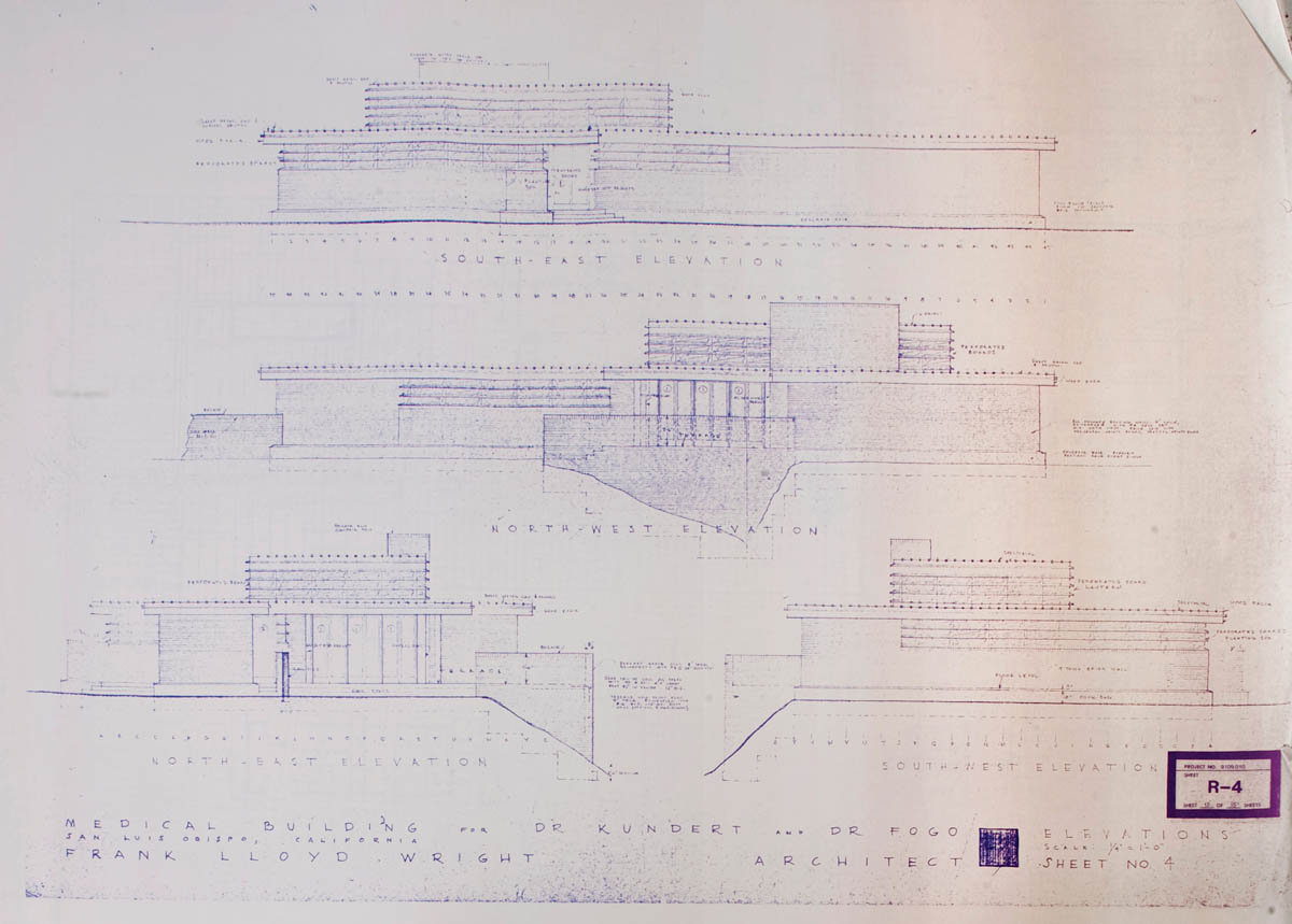
Kundert Medical Clinic, blueprint of southeast, southwest, northeast, and northwest elevations. Copyright © The Frank Lloyd Wright Foundation, Scottsdale, Arizona

Kundert Medical Clinic, view of northwest façade.

Kundert Medical Clinic, view of entryway and reception area.
The main entrance to the clinic is down a wide cement slab path leading from the sidewalk. The cement is scored in square panels and painted classic Cherokee red, which is the same material Wright used for the floors throughout the clinic. This pathway, and the red brick walls flanking the wide glass-paneled front door, give visitors a feeling of being invited into a welcoming space. Upon entering, the first thing one notices is the spacious central waiting room, with its soaring, 14-foot-high ceiling paneled in mahogany. The ceiling is hipped at the corners, and lined with horizontal wood panels that emphasize its height. Just below these panels Wright placed a triple clerestory made of milk glass, with its intriguing cutout wooden decorative patterns. The north and east walls of this room are made from solid walls of banded glass doors, set into six-and-a-half-foot-tall wooden frames. These doors have piano hinges that allow them to be opened outwards onto the patio, to bring the outdoors indoors on mild days. There is a massive, brick-faced, open-hearth fireplace with a ceiling-high flue in the southwest corner of the room, and built-in wooden seating along the south side. The receptionist’s desk is in the southeast corner, and sits behind a row of wood shelving below eye level, which gives some privacy to the receptionist while still allowing full eye contact with the patients. These shelves are decorated with the same cutout geometric pattern that lines the clerestory. These features create a warm, peaceful ambience for the patients, one that makes the experience of sitting in a waiting room of a doctor’s office much more pleasant than it usually is.
The rest of the interior is divided into 11 individual exam rooms, a few small offices, and three bathrooms, as well as a break room for the staff. Most of the exam rooms are arranged along the long wing facing Santa Rosa Street. In a remodel of the building done in 1992, the walls of some of the exam rooms were moved out further into the hallways to make more space for the doctors who used them.
Dr. Kundert operated his ophthalmology clinic here until he retired in 1986, and after that the building sat empty for six years. Then Dr. Kenneth Tway opened a cardiovascular clinic in the facility, after he remodeled some of the exam rooms. This clinic still occupies the site as of this writing. The building has maintained its structural integrity quite well over the past six decades or so since it was finished. During the heavy rains in the winter of 1967–68, San Luis Creek rose to 50 feet, well above its flood stage. The building might have been severely damaged, but because of the massive concrete retaining wall and the heavy, reinforced concrete slab Wright placed under the foundation for seismic stability, the clinic weathered the flood without any structural damage.[17]

Kundert Medical Clinic, view of waiting room.
The heart of the Beverly Hills shopping district on Rodeo Drive, with its kitschy, often garish imitations of Greek and Roman temples attached to trendy storefronts, is hardly the place one would expect to find a futuristic Frank Lloyd Wright–designed courtyard of small, inconspicuous shops. But right in the center of this world-famous retail district, at 332 North Rodeo Drive, Wright designed the Anderton Court Shops in 1952. Thousands of tourists walk past these shops every day without realizing their architectural significance. Indeed, this structure bears little resemblance to any of Wright’s other commercial buildings, let alone any of the buildings around it.
Between 1907 and 1952, Frank Lloyd Wright designed a total of seven stores in Illinois and California, including two art galleries. The Anderton Court Shops, built for local businesswoman Nina Anderton, is the only Wright-designed shopping center, large or small, that was ever built on the West Coast. It is also the last building Wright completed in the Los Angeles area. These shops, wedged into a narrow lot on Rodeo Drive, were placed on the National Register of Historic Places in 2004.[18]
At first glance from across the street, the Anderton Court Shops have an almost Wizard of Oz /Emerald City appearance, or perhaps that of a scaled-down Mormon temple. The dominant feature is a tall, pointed concrete spire that rises about 15 feet above the middle of the structure. This spire has serrated edges that tilt upward, much like Buddhist temple finials. This motif was used on some earlier Art Deco–era buildings in California, and the shape of this spire is vaguely reminiscent of the much larger one Wright designed for the Marin County Civic Center several years later.

Anderton Court Shops, Beverly Hills, California (1952), Art Deco concrete spire
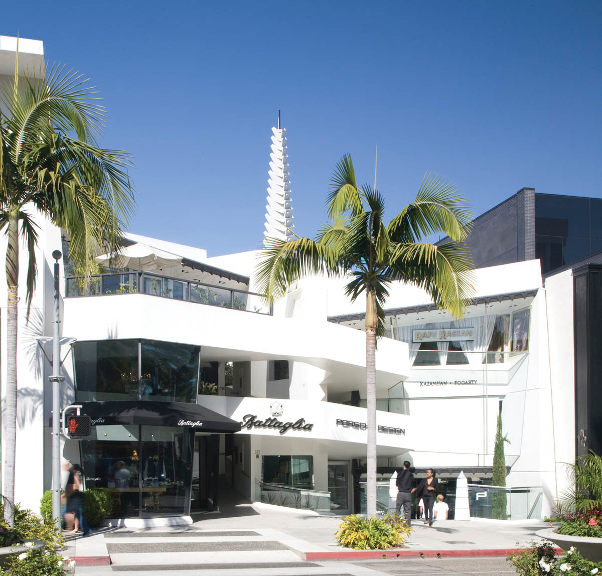
Anderton Court Shops, view from Rodeo Drive.
The overall shape of the building forms a shallow “V,” which opens toward the sidewalk. Wright designed four small shops on the first two levels, around a central, angled ramp. This ramp tilts upward at a gentle angle, and allows access to each of the shops. On the third level, Wright designed a penthouse apartment. In recent years, the retail space here has been divided into six smaller shops. The façade of the building is marked by long concrete balconies on the second and third levels, which line the edges of the ramp and run all the way across the front of the third story along the north side. The floors of the ramp have a scored, diamond-shaped pattern, similar to Wright’s Usonian houses. Wright originally planned for the shop windows to be set back from the edges of the ramp, but since then, eight-foot-tall display windows have been installed out to the sidewalk at the north end of the first and second stories. Other changes that have been made to Wright’s original design include attaching business signs to the balconies, and painting the stucco exterior white with black trim, instead of the original buff color offset by oxidized copper on the trim and the spire.[19]
Nevertheless, the Anderton Court Shops retain their Late Modern, Space Age character. Perhaps the best way to appreciate Wright’s aesthetic concept for this building is to walk up the ramp to the third level and look down the narrow, open courtyard that runs to the back wall. Wright had two large porthole window motifs embossed into the wall at eye level on the right side. A squat, square tower rises above the wall at the back of the courtyard, a part of the original penthouse. When the afternoon sun forms strong diagonal shadows across this courtyard, it creates a Cubist-like effect, resembling an early abstract composition by Picasso or Georgia O’Keeffe.

Anderton Court Shops, side view of shop fronts

Anderton Court Shops, upper level of courtyard from central staircase.