| 3 | The Fight against Disease |
| Life Expectancy, Disease, and Lifestyle | |
| with Ridhi Kashyap and Elisabeth Garratt |
Introduction
Disease was the second of Beveridge’s five giants. Considerable progress had already been made earlier in the century before he published his report. Successful interventions such as mass vaccination programmes, better sanitation systems, water supplies, and food safety standards had all worked together to substantially reduce infant mortality and the burden from infectious, water-, and food-borne illnesses. Progress at tackling infectious diseases and in extending years of life had been one of the great success stories of the first half of the twentieth century. And the discovery of antibiotics just before the war gave promise of tackling further diseases such as pneumonia and tuberculosis which were still major killers when I was young. I can remember from my childhood an uncle who had lost a lung to TB and had spent months in isolation hospital. Isolation hospitals are thankfully now a thing of the past. By 1960, the impact of infectious diseases had been dramatically reduced to the levels that are similar to those found today.
To be sure, Beveridge had singled out health care as the one area where provision in Britain fell behind that of other developed countries, but the establishment of the National Health Service, with its universal provision of free health care at the point of delivery, gave great promise of further progress and of reducing health inequalities between richer and poorer sections of society.
These medical and health-care improvements, and the continued progress in reducing infant mortality, mean that in the twenty-first century the vast majority of Britons can expect to live well into old age. Other diseases such as cancer and dementia now pose major challenges, and there are concerns that, among the elderly, advances in life expectancy may have come at the expense of quality of life, with increasing numbers of elderly people suffering from dementia (and other disabilities) in their later years.
The focus has thus shifted away from infectious diseases, which would have been uppermost in Beveridge’s mind, to the so-called diseases of affluence, such as heart disease. There are concerns that, as a society gets richer, unhealthy lifestyles and problems of obesity and excessive drinking may be storing up trouble and may undermine future progress in advancing life expectancy. The incidence of a number of diseases for which lifestyle factors such as obesity and alcohol are risk factors appear to be on the rise. Increasing social inequality has also been linked to a wide variety of health problems.
So my main questions in this chapter are whether progress has been stalling and whether growing economic inequality has generated greater health inequalities too, holding back the health and life expectancy of poorer sections of the population. I also ask how Britain’s progress compares with that of our peer countries. In particular, how successful has the NHS been in closing the gap with other countries?
I will begin the chapter by looking at trends in life expectancy both in Britain and in our seven peer countries. Life expectancy, leaving aside for the moment the issue of the elderly’s quality of life, is perhaps the most basic measure of social progress. What is the value of ever greater material prosperity if it were to come at the expense of premature death and a shortened lifespan? Indeed, one could argue that a long and healthy life is an even better measure of social progress than are any of the economic measures. There is also excellent long-term data on mortality, at least for our large Western countries. These data are of a distinctly higher quality and reliability than the economic data which I examined in Chapter 2 or the educational data which I will examine in Chapter 4. Registration of deaths became compulsory in England and Wales early in the nineteenth century and ever since 1841 Britain has had accurate and comprehensive data on mortality.1 Moreover, there are no technical issues akin to the difficulty of estimating purchasing power parity when trying to compare countries’ material standards of living. Mortality means the same everywhere and at all times. We can actually trust the demographic data.
As I will show, Britain has made considerable progress in increasing length of life in the years since the war, and continues to do so. However, several other peer countries (apart from the USA) made even more progress. Britain slipped towards the back of the bunch. I will therefore explore some of the reasons for this relatively poor performance, focussing on lifestyle choices such as smoking, exercise, eating, and drinking. I will finally turn to the issues of social inequality and the performance of the NHS.
How Do British Trends in Life Expectancy Compare with Those in Peer Countries?
Let me start, as in Chapter 2, by setting Britain’s progress in perspective by comparing improvements over time in the eight peer countries. I will focus on life expectancy at birth, which is the most usual and readily available measure (although not without its problems). Basically, life expectancy at birth tells us how long someone born in a particular year might expect to live. The measure is based, however, on a rather important assumption, namely that currently prevailing mortality rates at different ages will continue unchanged in the future. I will look at some alternative measures later to check the robustness of the conclusions.
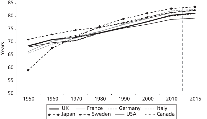
Just as in the case of material progress, as measured by GDP per head, there was major progress between 1950 and 2015 in extending length of life. In all eight countries life expectancy increased by well over ten years (Figure 3.1). But in other respects there are major differences between progress in material prosperity and in life expectancy. First, in the case of life expectancy, we don’t see the fluctuations every decade or so as a result of the periodic boom and bust which characterized economic growth. Life expectancy shows on the whole a steadier pattern of improvement, at least over these sixty-five years. If we had gone back earlier in the twentieth century, we would have found some big fluctuations during the two world wars and the flu epidemic after the First World War. British citizens like myself have been fortunate to have lived through relatively settled times without any major catastrophes. Russia, for example, experienced a catastrophic increase in mortality after the collapse of the Soviet Union and the economic shock therapy which followed, life expectancy falling by over five years between 1989 and 1994.
Figure 3.1. Life expectancy at birth increased by over ten years in all eight peer countries between 1950 and 2015
Note: estimates for Germany before 1990 refer to West Germany
Source: Human Mortality Database (1951–2013); World Health Organization (2015)
More remarkably, however, Figure 3.1 shows that in 2015 the rank order of the eight countries with respect to life expectancy was completely different from their rank order with respect to material prosperity. Italy and Japan brought up the rear in the case of material prosperity, but in the case of life expectancy these two countries are in the lead, while it is the USA which brings up the rear. Like the other countries, the USA has seen life expectancy increase by over ten years, but the US rate of progress has been much slower than in the other seven countries and in 2015 it was lagging behind by nearly two years. US life expectancy in 2015 was 79—a figure which Japan had reached twenty-five years earlier. Higher national levels of GDP per head do not seem to translate straightforwardly into longer life for the country’s citizens.
Britain, too, has tended to slip behind. In 1950 Sweden, the UK, Canada, and the USA were in the lead, but France and Japan had caught up with Britain by 1970, and Italy had caught up as well by 1980. Since then Italy, France, and Japan have moved further ahead—in 2015 Italians had more than one year’s greater life expectancy than Britons while the Japanese had more than two years’ greater life expectancy. Thus Japan and Italy moved from the back of the pack to the front, while Britain, and even more so the USA, slipped to the back.2 In 1950, the rank order of countries in terms of life expectancy was quite similar to their rank order for GDP per head—USA towards the front and Japan bringing up the rear. In contrast their improvements over the last sixty years seem unrelated to their improvements in GDP.
The differences are now quite small, smaller than they were in 1950. But it should dent British (and US) complacency. Leaving aside the catching up of Italy and Japan, which may reflect special features of their social conditions in the first half of the twentieth century and their wartime experiences, maybe Britain has something to learn from France. Britain is not doing as well as it could. Perhaps British governments have focussed too much on economic growth and not enough on health and social progress.
The poor performance of the USA in improving longevity has naturally worried Americans. In 2008 the American National Research Council set up a panel of social scientists to investigate.3 They focussed on a shortlist of potential culprits for US underperformance—unhealthy lifestyles (such as cigarette smoking, obesity, and lack of exercise), lack of social integration, socio-economic inequalities, and an inefficient health-care system. They concluded that the very high levels of smoking in the USA in the 1950s were a major part of the story. They suspected that increasing levels of obesity and lack of exercise might also be part of the story but they were not sure how conclusive the evidence was. However, while there was plenty of evidence that social support and social integration promote longer life expectancy, they found no evidence that Americans had fallen behind other countries in these respects.
The panel was less sure about the role of socio-economic inequalities in explaining the poor US performance in prolonging its citizens’ lifespans. To be sure, there is a socio-economic gradient in health and mortality (which is reflected in similar gradients in smoking and obesity). It is also likely, but less certain, that socio-economic inequalities have increased at a faster rate in the USA than in most European countries. The US panel concluded: ‘These trends are consistent with the view that rising socioeconomic disparities contributed to the deteriorating longevity position of the United States, but data on trends in inequality are too scattered to permit a firm conclusion about their role.’4 The panel also had some interesting things to say about the US health-care system.
It is quite likely that some of the same factors which the US panel identified—smoking, obesity, lack of exercise, and growing socio-economic inequalities—played a role in explaining British underperformance, too. I will explore these later in the chapter. First, however, I want to take a closer look at the trends in Britain so that we can check the findings of Figure 3.1 against alternative measures.
British Trends in Infant Mortality, Modal Age of Death, and Healthy Longevity
The standard demographic measure of life expectancy requires some strong assumptions. Basically, it tells us how long people of a particular age could expect to live if they were to experience the same mortality risks in the future as are currently prevailing for people of that age. In other words, the calculation assumes that the future will resemble the recent past. This is not a bad assumption, but we do know that, even in Britain, mortality rates have been declining at all ages due to medical advances. So it’s a fair bet that the further we peer into the future, the less accurate this assumption will be. For example, at my current age of 74 my projected remaining life expectancy, based on prevailing death rates of people of my age and older in 2017, is another twelve years of life. (This of course is an average around which there will be a lot of variation depending on things like one’s social class, drinking habits, lifestyle choices, and luck.) But if mortality rates decline in the future as they have done in the past, the estimate of another twelve years of life for a 74 year old could prove to be an underestimate.
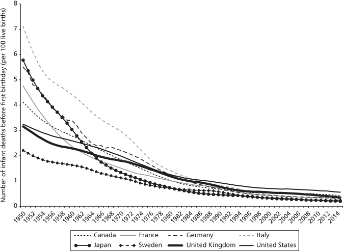
In order to avoid making these assumptions about the future, demographers also look at hard facts about past and current mortality rates. Some of the most persuasive hard facts are those on infant mortality. Reductions in infant and child mortality account for a substantial proportion (one fifth) of the British improvement in life expectancy in the post-war period. Figure 3.2 shows a major decline in infant mortality (that is, deaths before the first birthday) in all eight peer countries. In the case of the UK, just over 3 out of every 100 babies did not survive until their first birthday in 1950. By 2015, this figure had fallen to just over 3 per 1000.
Figure 3.2. Infant mortality showed a major decline in all peer countries, although the UK’s relative position slipped
Note: break in data for Germany in 1967
Source: Max Roser, ‘Child mortality’, Our World in Data, https://ourworldindata.org/
So there was real progress in tackling infant mortality, although the rate of improvement gradually slowed. This is hardly surprising, since infant mortality rates had become so low in these large developed democracies. The main explanations for the long-term decline in infant mortality include the control of infectious diseases, higher birth weights, and improved health care. These reflected technical advances, improving nutrition, and improved access to health care with the newly created NHS after the war. But in 2015 the infant mortality rate was even lower in Germany (3.1 per 1000), Italy (2.9 per 1000), Japan (2.0 per 1000), and Sweden (2.4 per 1000) than in the UK, confirming the story told by Figure 3.1. International differences in infant mortality therefore mirror closely those in life expectancy—the UK was a relatively good performer in 1950, but it had slipped back by 2015.
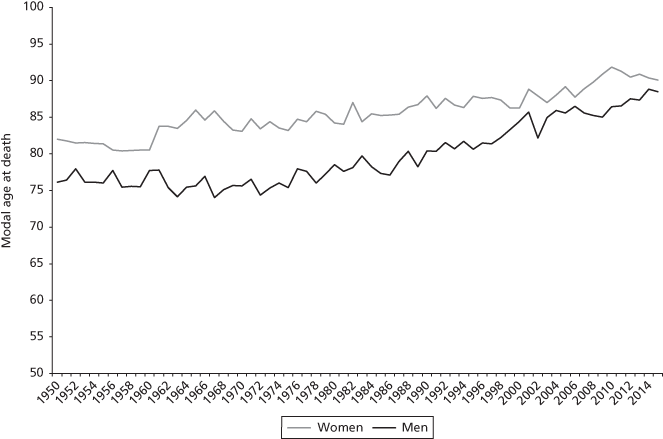
As well as the decline in infant mortality, substantial reductions in mortality also took place at older ages. One third of the progress made after 1950 in extending length of life was made by progress at ages over 65. In Figure 3.3 I show the most common age at death (technically called the modal age at death), for deaths occurring after the age of 10.
Figure 3.3. Modal age at death in the UK rose by eight years for women and twelve years for men between 1950 and 2015
Source: Office for National Statistics6
Figure 3.3 shows a substantial improvement since 1950 with the most common age at death rising from around 82 years of age for women and 76 for men in 1950 to 90 for women and 88 for men in 2015—a major increase overall but also a substantial narrowing of the gender gap.5 The trends are not as smooth as the Figure 3.1 trends in life expectancy at birth. This is because the modal age at death in any particular year will reflect mortality among older people; this could be higher or lower if there is a particularly harsh or mild winter or a more or less effective flu vaccine. In contrast, the estimates for life expectancy combine mortality rates for people of the full range of ages. In the case of modal age at death, therefore, one should focus on the longer-term trends rather than the short-term variations.
These trends in infant mortality and the modal age at death suggest that mortality has been postponed for most of the population to older ages. However, a key question is whether the longer lifespans are also healthy lifespans—does reduced mortality from disease imply that Britons are living those extra years gained healthily? One measure which adds a quality dimension to the standard measure of life expectancy is disability-free life expectancy.7 To measure this, demographers use people’s answers about their health and disability in nationally representative surveys in order to adjust the estimates of life expectancy. For example, someone who contracted polio as a child in the 1950s may report spending the rest of their life with a disability—a paralysed arm, perhaps. Someone who suffered a stroke in their seventies may report spending their remaining years confined to a wheelchair. In such cases their disability-free lifespan will be a lot shorter than their overall lifespan.
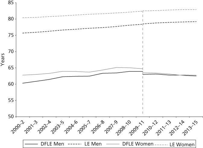
The surveys which enable us to calculate disability-free life expectancy are only available for the most recent period so I cannot show long-term trends. Figure 3.4 shows estimates both of life expectancy and of disability-free life expectancy for men and women in Great Britain over the period from 2000/2 to 2013/15. (In order to obtain more reliable estimates the results from adjacent years are pooled.) Unfortunately, even for this short period, the data are not as robust as one would like. One needs to interpret the results with caution.
Figure 3.4. Disability-free life expectancy in Britain increased during the twenty-first century, although more so for men than for women
Note: the vertical break indicates the change in the data source; DFLE: disability-free life expectancy; LE: life expectancy
Source: General Lifestyle Survey (2000–2/2009–11); Annual Population Survey (2009–11/2013–15)
As we might expect, Figure 3.4 shows that disability-free lifespans are much shorter than overall life expectancy—in 2000/2 there were about fifteen years less for men and seventeen less for women.8 The trends for the decade between 2000/2 to 2009/11 suggest that disability-free life expectancy increased over this period. Among men it increased by 3.6 years while among women the increase was a somewhat smaller 1.9 years.
The Office for National Statistics then moved to using a different source of data, which I indicate by a vertical line in Figure 3.4.9 The new source suggests a slightly lower level of disability-free life expectancy than the older source had done, but more importantly, the new source suggests that the trends after 2009/11 were less positive. Crucially, estimates from 2009–11 onward indicate that disability-free life expectancy remained stable for men but fell for women. In 2009–11 a newborn baby girl in the UK would expect to live 63.5 years on average without disability. For 2013–15, this figure had fallen to 62.4 years. Since overall life expectancy continued to increase over this period, it follows that, in the most recent few years, both women and men were spending an increasing proportion of their lives with a disability.
Why might this have happened? One possibility is that improvements in tackling conditions such as heart disease and strokes allowed higher survival rates than were possible in previous years. One’s chances of surviving a stroke, for example, were higher in 2015 than they were a decade earlier, but the increased survival rate also means that more people will survive to live with a disability. Survival from a stroke, for example, might leave survivors needing to use a wheelchair for their remaining lifespan. Less death from the disease does not necessarily imply less disability in the population.
Death Rates from Some Common Causes of Death
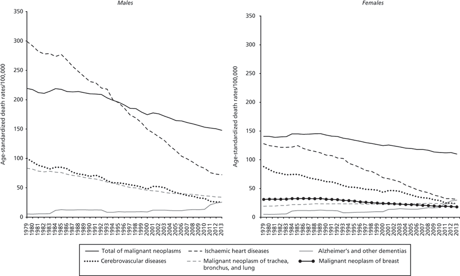
Beveridge termed his giant Disease, not mortality or life expectancy, so I feel that I should at least look at the diseases which have been the major causes of death in post-war Britain. I distinguish just some broad categories of disease—ischaemic heart disease (often termed coronary artery disease), of which the most familiar form is a heart attack; cerebrovascular disease, of which the most common form is a stroke; cancers (technically malignant neoplasm), among which I distinguish breast cancer and smoking-related cancers such as lung cancer; and finally, dementias, of which there are a number including the familiar Alzheimer’s disease.
In Figure 3.5 I show trends over time since 1979 (which is the earliest that our source, the Global Burden of Disease Study, allows us to start) in age-standardized death rates. As one can see, there was a steep decline in deaths from heart disease, especially among men.10 Women in general experienced lower levels of mortality from heart disease compared with men, but declines in mortality from these diseases also occurred among women, outpacing the reductions in other major causes of death.
Figure 3.5. There were large decreases in deaths from heart disease between 1979 and 2013 in the UK, especially among men
Source: Global Burden of Disease Study, http://thelancet.com/gbd
In contrast, although reductions in cancer mortality also took place for both men and women, the rates of improvement were slower than for heart disease.11 As a result, the contribution of cancers to mortality increased after the 1950s. The trends, moreover, varied for different types of cancer. Since the 1950s, lung cancer remained the most common cancer-related cause of death for men, and towards the end of the twentieth century came to rival breast cancer as the most common cancer-related cause of death among women.
Until recently mortality resulting from breast cancer was the most common cause of death from cancer among women. Mortality from breast cancer increased until 1988 after which it started to decline. In 2013, breast cancer accounted for 16 per cent of cancer mortality among women, down from 22 per cent in the mid-1980s. The availability of better treatment combined with the introduction of better screening were important developments in helping improve survival outcomes for breast cancer. Nevertheless, breast cancer mortality as well as mortality from cancers more generally was higher in the UK than in comparable European countries. A survival deficit for cancer in the UK compared to peer countries has been noted by several experts, and I will look at this further in the final section of the chapter.12
In contrast to the declining mortality from cardiovascular diseases and cancers, mortality from Alzheimer’s and other dementia-related illnesses rose among both men and women. In part, this was due to declining mortality at younger ages, leaving more people surviving into old age. However, the contribution to overall death rates from dementias remains very low, although of course it has a major impact on quality of life (and on the cost of care) for the elderly.
Healthy Lifestyles? Smoking, Drinking, Obesity, and Exercise
So far I have been able to tell a fairly positive story—the evidence shows that life expectancy, infant mortality, modal age of death, and disability-free life expectancy have all improved, although more slowly in recent years. However, Britain—like the USA—made slower progress than several other rich countries and tended to fall behind. What is going on—and what might Britain need to do to catch up?
Since the British experience is quite similar to the US experience, it makes sense to look at the same list of suspects that the US panel did—smoking, obesity, lack of exercise, social inequalities, and health care. From the US list I have dropped social integration—partly because the US study found that this was not a major factor and partly because we shall be looking at social integration in its own right in Chapter 8. I have also added alcohol to the list, as it is another important aspect of a healthy lifestyle. Liver disease, of which alcohol consumption is a primary cause, has become the third most common cause of what demographers call premature deaths (ischaemic heart disease and self-harm being the most common causes of premature death).13
Smoking, obesity, lack of exercise, and excessive drinking can all be thought of as linked, more or less closely, to lifestyle choices. They are thus very different from previous causes of mortality such as those related to malnutrition and infectious diseases—these were all things that happened to one rather than things that one chose for oneself. The diseases which result from these lifestyle choices have sometimes been termed diseases of affluence—it is much easier to become overweight or to drink too much in a wealthy society where food and drink are cheap and in plentiful supply. While I am sure a full explanation would need to be much more complex, one can see why increasing prosperity might be related to new health challenges that a poorer country might not have to face in the same way.
Smoking
Smoking is now known to be a major cause of lung cancer and also of other so-called degenerative diseases such as heart disease. British epidemiologist Richard Doll was the first to produce evidence that smoking might be a cause of lung cancer. In 1950, with Austin Bradford Hill, Doll undertook a study of lung cancer patients in twenty London hospitals. He suspected that lung cancer was due to the new material tarmac used for surfacing roads, or perhaps to fumes from the increasing number of motor cars. However, he rapidly discovered that tobacco smoking was the only factor that the patients had in common. Doll himself stopped smoking as a result of his findings, published in the British Medical Journal in 1950, which concluded ‘The risk of developing the disease increases in proportion to the amount smoked. It may be 50 times as great among those who smoke 25 or more cigarettes a day as among non-smokers.’14
The initial reception of Richard Doll’s ideas were quite mixed, with vigorous criticism from the eminent statistician R. A. Fisher who objected that correlation does not prove causation. (Fisher was quite right about proof, but a correlation is consistent with a causal hypothesis and failure to prove causation is no excuse for ignoring the possibility of causation.) The tobacco industry came forward with a range of criticisms of the research, and the government dragged its feet. Four years later, however, a larger study which followed up 40,000 doctors over a twenty-year period strengthened Richard Doll and Bradford Hill’s original thesis, and the government subsequently issued advice that smoking and lung cancer rates were related.15
The health risks of smoking are now indisputable. Approximately half of lifelong smokers are expected to die as a consequence of smoking, losing on average twenty years of life.16 In the early 1950s the USA had particularly high rates of smoking and it is likely that this had major consequences for limiting Americans’ lifespans over ensuing decades, explaining in part why life expectancy in the USA dropped behind that of other rich countries. Historical evidence from cigarette and tobacco sales confirms that Britain too had one of the highest rates of consumption of manufactured cigarettes in 1950 (an average of six cigarettes a day for every adult), second only to the USA (nine cigarettes a day), and much higher than in any of the other countries apart from Canada. France (two and a half) and Italy (just under two) had levels of cigarette smoking less than half the British rate.17 The good news is that smoking in Britain declined steadily after the 1970s—quite possibly because of public health campaigns and growing awareness in Britain of the risks associated with smoking. The decline brought the proportion of daily smokers in Britain down to levels lower than those in France, Germany, and Italy (although it became lower still in Canada, Sweden, and the USA).
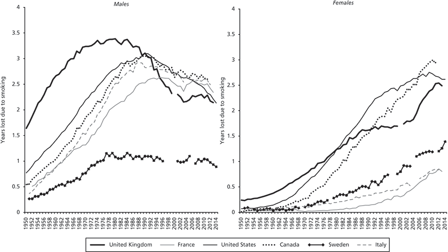
Smoking basically takes a long time to show up in mortality statistics. High levels of smoking in the 1940s showed up in mortality from lung cancer and heart disease around twenty to thirty years later. We can see this in Figure 3.6, which highlights the number of years in life expectancy lost due to smoking in the UK and in five of the countries in the post-war period.19 Men in the UK were among the earliest to experience the harmful effects of smoking on their life expectancy as they were among the first to have taken up smoking in the early decades of the twentieth century, particularly during the First World War. In the case of men, smoking-related mortality peaked by 1980 and started declining thereafter. After the 1990s the peer countries experienced a greater smoking-related mortality burden among men than the UK did.
Figure 3.6. Smoking-related mortality peaked around 1980 among British men but peaked nearly thirty years later among British women
Source: Human Mortality Database; World Health Organization18
Women took up smoking later than men in Britain, with smoking becoming popular among women during the Second World War. Even when women did take up smoking, they generally smoked less than men and also used brands of cigarettes with less tar that were on average less harmful.20 This shows up in the mortality statistics where the female peak is a lot lower than the male peak. Moreover, the peak of smoking-related mortality among women occurred around thirty years later than the peak among men. This is an important part of the explanation for the narrowing gap between male and female life expectancy in Britain.
Obesity
Obesity is perhaps the paradigm example of a condition which becomes more prevalent as a society gets richer and as food becomes cheap and plentiful. Technically, obesity is defined as occurring when a person’s body mass index (often referred to simply as BMI) exceeds 30. This is equivalent to someone with my height of 5 feet 9 inches (a pretty average height) weighing 14.5 stone (203 pounds)—which happens to be four stone more than my actual weight and a lot more than the average for people of my height.
The links between obesity and mortality are not quite as clear-cut as they are in the case of smoking, but obesity is linked to a range of conditions such as diabetes, high blood pressure, heart disease, gallstones, and some cancers (colorectal cancer, breast cancer, endometrial cancer, and cancers of the kidney, pancreas, liver, and gallbladder) which all tend to increase the risk of premature death.21 Like smoking, the effects of obesity are dose-dependent—the more obese one is, the higher the risk of premature death. One estimate suggests that a body mass index of 30 will likely lead to a 20-year-old white American man living one year less than if he had had a BMI like mine of 21. If his BMI increased to 32, he would be expected to lose two years of life; if his BMI increased to 36 he would lose nearly four years of life, and if it increased to 44 he would lose nearly eight years of life.22 Obesity almost certainly has implications for the risk of disability, too.23 It may well be that the principal impact of obesity is on disability-free life expectancy rather than on life expectancy itself.24
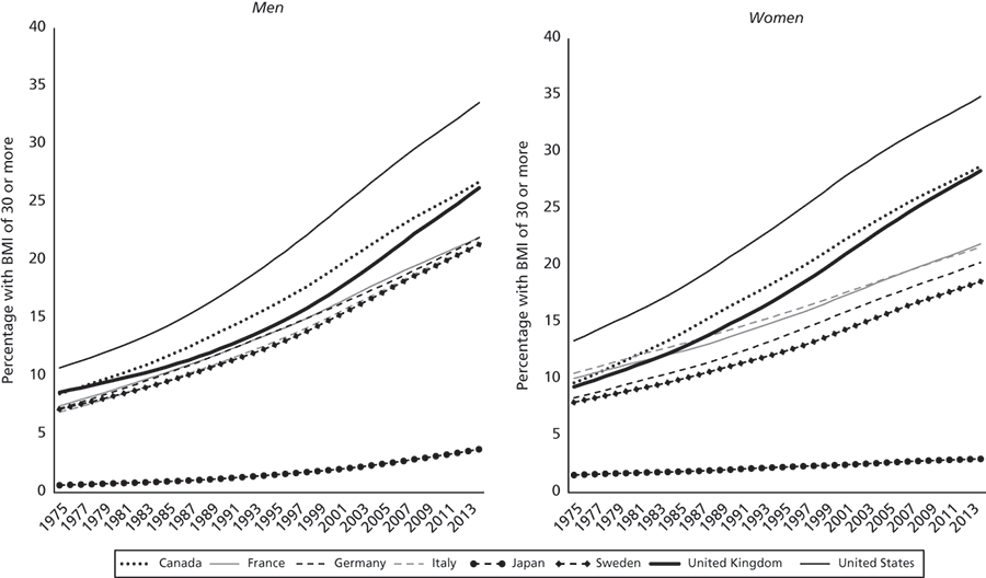
At any rate, Britain has seen a major increase in obesity. Just under 10 per cent of adults had a BMI of 30 or above in 1975, but in 2014 the proportion had risen to around 25 per cent. As we can see from Figure 3.7 the upward trend seems to have slowed down a little in recent years. All the same, a quarter of adults losing at least one year of life each amounts to an awful lot of lost years.
Figure 3.7. The UK, like the USA and Canada, saw large increases in adult obesity between 1975 and 2014
Source: Non-communicable Disease Risk Factor Collaboration26
Britain, like the USA (and Canada) saw larger increases in the numbers overweight or obese than did Japan and other large European countries.25 As a result USA is well ahead in terms of obesity, followed by Canada and the UK. France, Germany, and Italy all saw big increases in obesity too, but they remain some way behind Britain. The only country not to have seen a major epidemic of obesity is Japan, where obesity rates remain very low—far lower indeed than British levels of obesity forty years ago.
However, I doubt whether the high level of obesity in Britain can explain why Britain currently remains behind our European neighbours in life expectancy. The differences are relatively small, and are also fairly recent, and the impact of obesity on mortality is likely to be somewhat delayed, as in the case of smoking. The more worrying question is whether Britain’s current obesity epidemic will have long-term consequences for disability and mortality. Obesity is perhaps the major new challenge for the future—and the worry is that it will lead Britain to fall further behind European countries, cancelling out the progress which Britain made on smoking.
Lifestyles: Exercise and Diet
Taking exercise and eating a healthy diet are continually being emphasized by health professionals as important preventive measures for avoiding heart disease and degenerative diseases. Exercise is proving increasingly important for a wide range of illnesses, particularly cardiovascular diseases. It also appears to have wider consequences and is probably protective against neurodegenerative diseases such as dementia, as well as for psychological conditions such as depression.27 So while lack of exercise is closely linked with being overweight, lack of exercise may well have wider implications for health than does obesity on its own.
We do not have decent long-term trend data about levels of physical exercise in Britain, although there is some recent evidence that increasing numbers of people may be taking recommended levels of exercise.28 My guess is that people are indeed taking more leisure exercise than they used to. When I was a student, I was a keen middle-distance runner and used to compete regularly in local cross-country races and half-marathons. At that time the only competitors were other club runners, so a field of a few hundred would be a large one. But the most recent half-marathon which I ran (last year) had over 6000 runners, most of them fun runners like me running rather slowly, not the serious competitors of my youth.
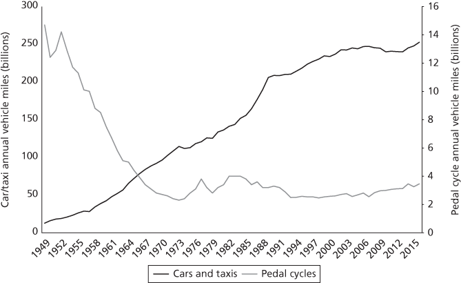
The increase in leisure exercise, however, may have been cancelled out by declining levels of exercise going to and from work. In my youth in the 1950s, my father used to cycle to work every day and most of his fellow workers did, too. Today, cars have taken over from bicycles, and despite some government efforts to promote cycling, there seems to be little change in practice (Figure 3.8).29 There is a growing body of evidence that cycling has major health benefits and is associated with lower rates of cardiovascular disease, type 2 diabetes, cancer, and mortality. Rigorous randomized experiments have confirmed that these findings are likely to be causal, not coincidental.30
Figure 3.8. Vehicle miles by bicycle fell greatly in Great Britain whereas vehicle miles by car or taxi increased
Source: Department for Transport Statistics33
We do not have good measures of international differences in levels of physical exercise; not many surveys have included relevant measures. When they have done so, they have measured exercise in different ways in different countries, making it almost impossible to establish how our eight peer countries compare. The best available evidence suggests that England (and the USA) are about the same as, or even above, the average for leisure exercise.31 However, rates of cycling in the UK are very low compared with European countries: according to a recent survey by the European Commission, only 4 per cent of adults in the UK cycle daily. This is one of the lowest proportions in the whole of Europe. In contrast four in ten people in the Netherlands, and three in ten respondents in Denmark and Finland cycle daily.32
So it is not clear that increases in leisure exercise have compensated for the decline in work-related exercise such as cycling to work. As a regular commuting cyclist, I am not surprised—it’s terribly dangerous for cyclists on British roads whereas sensible cycle lanes are much more widespread in the Netherlands and Germany. My guess is that, in the absence of serious government investment, Britain is likely to remain well behind Europe, at least as regards cycling.
Alcohol
Drinking alcohol is associated with a range of negative health outcomes including heart disease, several cancers, diabetes, diseases of the liver and pancreas, and intentional and unintentional injuries.34 Unsurprisingly, the risk of liver cirrhosis—a major cause of alcohol-related mortality—increases with higher levels of alcohol consumption.35 As I mentioned earlier, cirrhosis is an increasingly common cause of death in Britain, so increasing consumption of alcohol represents another potential challenge to lengthening lifespans.
We do not have good survey data on drinking patterns. When answering questions in surveys about their drinking habits people almost certainly underestimate the amount they drink. (This is probably due to what survey methodologists term ‘social desirability bias’.) However, the British Beer and Pub association has produced intriguing long-term data on sales of alcohol, going back to the beginning of the twentieth century. This is not perfect but the overall pattern is probably broadly accurate. There was a big decline during the first third of the twentieth century, a stable phase mid-century, a big increase in the last decades of the century (almost returning to the levels of the early 1900s), before starting to drop once more. The decline in the first half of the century may have been a result of government using the licensing laws to make access more restricted. The Defence of the Realm Act, passed in 1914 immediately after the declaration of the First World War, restricted licensing hours in order to limit alcohol consumption, the government believing that high levels of drinking could interfere with the war effort. Taxes on alcohol were also sharply increased.
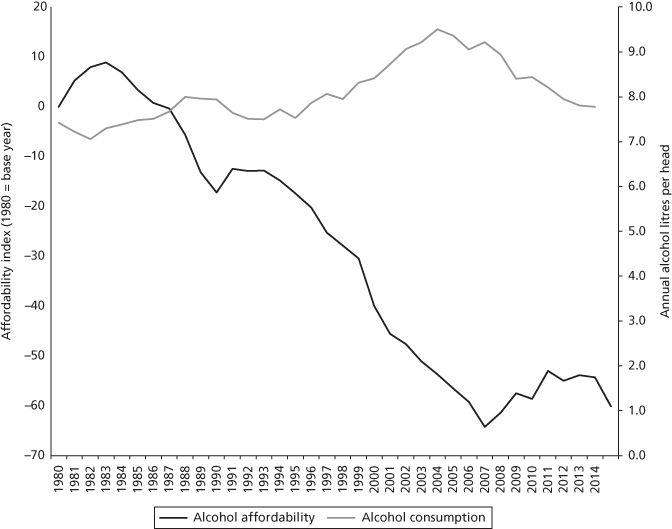
In the more recent period it seems that changing price levels can partly explain the increasing consumption of alcohol, and the subsequent reduction after 2007. Figure 3.9 shows a measure of alcohol affordability in England (developed by the Office for National Statistics)36 alongside sales of alcohol, measured by litres of pure alcohol and adjusted for population size. Incidentally, 1 litre of 100 per cent alcohol is equivalent to 54 pints of beer, 12.5 bottles of wine, or 125 single servings of spirits.
Figure 3.9. Alcohol consumption in the UK broadly reflects affordability
Source: alcohol consumption: British Beer and Pub Association, Statistical Handbook 2015, table B8. Affordability: Statistics on Alcohol, England 2015, https://www.gov.uk/government/statistics/statistics-on-alcohol-england-2016. Copyright © 2016, reused with the permission of NHS Digital. All rights reserved
Figure 3.9 strongly suggests that changing price levels can explain some of the recent changes in consumption. Alcohol became increasingly affordable between 1983 and 2007 and alcohol sales increased over the same period. The trend in affordability then went into reverse after 2007 while consumption declined. Over the 1980–2015 period as a whole, then, levels of alcohol sales seem to mirror the affordability of alcohol, although I find it puzzling that sales started to decline in 2005 shortly before, rather than after, alcohol started to become less affordable. So price is probably not the only thing that matters.
However, although overall levels of consumption appear to be declining, it is not clear whether this has yet had any measurable impact on life expectancy in England. Alcohol-related hospital admissions and treatment for alcohol dependency continued to rise in England after 2007.37 Alcohol-related death rates rose steadily throughout the 1990s, reaching a peak around 2008. Since then the number of deaths attributable to alcohol have been fairly stable in England, although they declined quite dramatically in Scotland, which had previously had mortality rates from alcohol that were more than double those of England.38
The contrast in the trends for consumption of alcohol and mortality may of course be because, as with smoking, excessive drinking has delayed effects on health and mortality. The decline in alcohol consumption in England started only recently, and current rates of hospital admissions and deaths probably reflect earlier patterns of alcohol consumption.
However, I should point out that Britain is not all that unusual in its level of drinking. Compared with the rest of Europe, data from the Organisation for Economic Co-operation and Development (OECD) suggest that UK levels of consumption have been catching up with European levels but are still below those of France and Germany.39 It is unlikely, then, that alcohol consumption and consequent alcohol-related deaths can explain why Britain’s record on life expectancy has been worse than those of European countries like France and Germany. Rising consumption of alcohol in the last two decades of the twentieth century will not have helped Britain’s record, but Britain is not such an outlier in terms of alcohol as it was with respect to smoking or obesity.
Socio-Economic Inequality
There is a great deal of evidence that there are major socio-economic differences in many of the diseases which I have discussed so far in this chapter. In contemporary Britain it tends to be people in more disadvantaged economic positions (people who are workless or in low-skilled or insecure employment) and those with lower levels of education who are more likely to smoke or be overweight, and who are less likely to have healthy diets or take regular exercise. (Interestingly, alcohol consumption is an exception.) There are also clear differences between highly educated and less well-educated groups in infant mortality and in life expectancy.40
Medical researchers such as Michael Marmot sometimes term social and economic disadvantage ‘the causes of the causes’.41 In other words, excessive smoking, overeating, and failure to take sufficient exercise or an adequate diet should not be seen solely as matters of individual choice, for which the individuals could be blamed. Instead they may reflect or be a consequence of the disadvantaged social positions in which people have ended up. We are still some way from fully understanding quite why disadvantaged social positions have these effects, but it is likely to involve more than purely material poverty. While issues of cost may partly explain poor diets—junk food being notoriously cheaper—time pressures, stress, and lack of empowerment may be relevant, too. As I will show in Chapter 4, there is quite a strong link between empowerment and education, and this could well be relevant to health inequalities as well.
Notwithstanding the varied and complex causes of health inequalities, the worry is that the growth of economic inequality will have exacerbated these health inequalities and, in turn, may have slowed down Britain’s progress in improving health and life expectancy. The key issue here is that an unequal society may have lower life expectancy than a similar but more equal society at the same level of development. Furthermore, a society which becomes more unequal over time may show less progress in reducing mortality than one where the level of inequality has remained unchanged. Why might this be the case? One possible answer comes from the economic principle of diminishing marginal returns: improving the situation of poor people (for example, by improving their access to high-quality health care) can bring them bigger health gains than the same investment in improving the lot of people who already have excellent access to health care. An additional line of argument suggests that there may be psychological damage as a result of being lower in the status and power hierarchy, although this is more controversial.42 These arguments could be relevant to the British case because, as Chapter 2 showed, Britain experienced a much bigger increase in inequality in the 1980s than did peer countries.
There are some reasonably good data on changing patterns of social class inequalities in infant mortality and in life expectancy. Interestingly, the trends are rather different for the two outcomes, which suggests that they may have rather different explanations. Let me start with infant mortality.
In Figure 3.10 I show the results of a study conducted by Roderick Floud and his colleagues. They investigated social class differences in infant mortality, using a classification originally developed in 1911 by T. H. C. Stevenson, a medical statistician in the General Register Office. Stevenson set out to investigate social differences in infant mortality. He felt that culture was more important than income or wealth for understanding mortality differences and so he developed a classification of occupations, arranging them in order of their ‘standing within the community’, with professionals at the top and unskilled manual workers at the bottom.
Figure 3.10. Social class inequalities in infant mortality in England and Wales shrank until the 1990s but subsequently showed little change
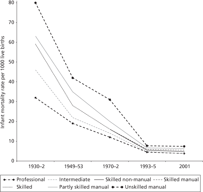
Note: after 1970–2, the ‘skilled’ group splits into two different groups: ‘skilled manual’ and ‘skilled non-manual’
Source: Max Roser, ‘Child mortality’, Our World in Data, https://ourworldindata.org/43
In line with Figure 3.3, which showed the overall trend in infant mortality, Figure 3.10 shows that infant mortality declined sharply before the war, continued to decline although at a slower rate after the war, and declined more slowly still in the final decade of the twentieth century as infant mortality became more and more rare. Moreover, as the overall rate declined, so too did the gaps between the social classes. In the early 1930s, infant mortality was 80 per 1000 live births in the unskilled manual class compared with only 32 per 1000 among professionals, a gap of 48 per 1000. By the mid-1990s these rates had fallen to 7.2 and 4.5 per 1000, respectively, a much smaller gap of less than 3 per 1000.
This pattern of declining gaps between the social classes is not surprising when infant mortality falls so low. As the overall rate reaches what one could term the floor (the minimum possible level), there becomes less scope for advantaged classes to make additional improvements, and hence more scope for disadvantaged classes to catch up. So it is all the more surprising that, in the final decade of the twentieth century, the gap actually widened slightly, with the professionals making more progress in improving their infant mortality than the unskilled workers.
The classification developed by Stevenson was finally abandoned in 2001 by the Office for National Statistics. A new classification was introduced (the National Statistics Socio-Economic Classification), which is not strictly comparable with Stevenson’s so I have not attempted to add it to Figure 3.10. However, the Office for National Statistics has published some statistics for the twenty-first century using the new system. These show that there has been little change in the size of the gaps between the social classes, despite continuing decline in the overall infant mortality rate. In short, social class inequalities in infant mortality have become very small, but no longer appear to be narrowing.
Turning to the other end of life, the Office for National Statistics has also published estimates of social class inequalities in life expectancy among people aged 65 (that is, how much longer someone who had reached the age of 65 could expect to live given prevailing mortality rates). These statistics use the new socio-economic classification, so are not precisely comparable with the infant mortality statistics. Moreover, the ONS statistics only go back as far as the 1980s.
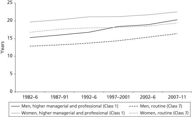
Figure 3.11 shows that, although life expectancy at age 65 in England and Wales increased for all social classes between 1982/6 and 2007/11, the gaps between the most and least advantaged social classes tended if anything to widen. Thus, in the early 1980s, 65-year-old men with higher professional and managerial occupations could have expected to live an extra 15.3 years. By the late 2000s this had increased by five years to an extra 20.3 years. Men in routine occupations also saw an increase over this period, but it was smaller and the gap between the two classes widened from 2.4 years to 3.9 years. The picture is not quite so clear for women, however. Higher-professional women made less progress than did their male peers and the gap between higher-professional and routine women stayed more or less unchanged.
Figure 3.11. Social class differences in life expectancy among men at age sixty-five widened gradually in England and Wales between 1982–6 and 2007–11
Source: Office for National Statistics Longitudinal Study44
A natural question to ask is whether the increasing class inequality in male life expectancy is in any way connected to the increasing income inequality which I reported in Chapter 2. To answer this, we would need to look at trends before the 1980s. If class inequalities in life expectancy paralleled changes in income inequality, declining up until the early 1980s and thereafter widening, it would be reasonable to think that the two might be connected. Is this what we find in practice?
Unfortunately, I cannot give a definite answer. For the period before the 1980s we do not have comparable data to that used by the Office for National Statistics in Figure 3.11. However, data sources using alternative methods suggest that the trend towards increasing class inequalities is a long-standing one. Ray Fitzpatrick and Tarani Chandola, for example, have shown that social class inequalities in mortality rates actually increased between the 1970s and the 1980s, and the Marmot review using methods more similar to those used by the Office for National Statistics also reached the same conclusion.45
While we cannot be 100 per cent sure, the most plausible interpretation is that increasing inequality in male life expectancy is not directly linked with the post-1980 increase in income inequality. Theoretically, too, this makes sense. A recurring theme throughout this chapter has been that trends in health and life expectancy are not straightforward reflections of trends in material prosperity. I suspect that T. H. C. Stevenson was right when he suggested in 1911 that mortality had more to do with culture than with income and wealth. My interpretation is that recent changes in health and longevity have had more to do with lifestyle than with material constraints. The higher professional and managerial classes have tended to be leaders in cutting back on smoking, for example. They may well also be the leaders in adopting other aspects of healthy lifestyles. This could explain why class inequalities have widened.46 Economic inequality is important, but it is not the only form of inequality that exists in modern Britain.
Health Care
No discussion of disease and life expectancy should be without at least a brief consideration of our health-care system. The National Health Service was established in 1948 and was intended to provide a universal health service that was free at the point of use, replacing inconsistent paid-for care and employment-based insurance schemes that excluded many women and children. With some exceptions—notably for dental and optical services and prescription charges in England—seventy years later the NHS continues to operate according to this founding principle. However, there is mounting concern that the NHS, and especially its funding, is in crisis. How well does the NHS perform compared with health-care systems in similar countries? Can Britain’s lagging performance in life expectancy be blamed in any way on the lack of funding or other failings of the NHS?
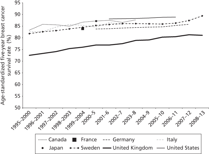
This is another huge and complex topic in its own right so I am just going to look at one important health-care outcome where there is good evidence which enables us to compare the performance of the British health-care system with that of other countries—namely cancer survival rates. There is considerable evidence that cancer survival rates are considerably lower in the UK than in the seven peer countries. The OECD provide data on five-year survival rates for breast cancer, cervical cancer, and colorectal cancer. In Figure 3.12 I show the data for breast cancer, since this is such a major cause of death.
Figure 3.12. Breast cancer survival rates improved in the UK between 1995–2000 and 2008–13, although lagging behind those of peer countries
Note: data for females aged fifteen and older
Source: OECD Health Statistics 2016
The data are rather patchy, but two conclusions stand out. First, breast cancer survival rates improved steadily in Britain from 72.5 per cent in 1995/2000 to 81.1 per cent just over a decade later. Second, survival rates have also improved in the other countries for which we have the data, and the UK’s survival rate of 81.1 per cent is still lower than the figures for any of the other seven countries for any of the years for which data are available. This is not an impressive performance. The OECD also provides evidence on survival rates from some other cancers, and Britain lags behind on these, too. To be sure, cancer survival rates are only one among many possible health outcomes that one could in theory investigate, so I should not attempt to generalize. Moreover, there are technical reasons why the results for Britain might not be strictly comparable with those for other countries.47 One has to be cautious when comparing administrative data from different countries because of their different institutional arrangements and recording systems. It is possible, but unproven, that cancer survival rates in Britain are not quite as bad as Figure 3.12 suggests. Nevertheless, I think one should take very seriously the possibility that Britain is not doing nearly as well as peer countries.
The lower survival rates in Britain have been attributed to factors such as varied access to treatments across the UK, shortage of manpower, and delayed diagnosis.48 Concerns about this gap resulted in the development of the NHS cancer plan in 2000.49 The plan recommended reduction in diagnostic delay as a key priority, since much of excess cancer-related mortality in the UK happens early on after diagnosis. There appear to have been some improvements in one-year survival after the introduction of the NHS cancer plan,50 and Figure 3.12 suggests that perhaps the gap with the peer countries has been narrowing. But Britain is still clearly well behind.
How far Britain’s poor performance can be attributed to lack of resources for the NHS is unclear. It is true that the UK spends less on health care both per person and as a proportion of GDP than all the peer countries apart from Italy.51 In 2015, for example, the UK spent 9.8 per cent of GDP on health care. Italy spent only 9.1 per cent whereas most of the other countries spent between 10 and 11 per cent, while the USA spent a whopping 16.9 per cent of GDP on health care (much of this being privately rather than publicly funded).52
However, the expenditure figures suggest that money cannot be the whole story. Despite its lower expenditure, Italy’s survival rates are better than British ones. And while the USA does have relatively good survival rates, they are not markedly better than those of countries like Japan and Canada, whose spending is much closer to British levels. I am sure that more money for the NHS is essential, but I suspect that it will not be sufficient on its own to close the gap in cancer survival rates.
Conclusions
Progress in extending healthy lives may well be an even more important criterion of social progress than is increasing material prosperity. What is the value of ever greater material prosperity if it were to come at the expense of premature death and a shortened lifespan? The basic data on mortality are also more reliable and trustworthy than the economic data. I think government should give at least as much attention to health and longevity as they do to material progress.
There can be no doubt that Britain made huge strides in health and life expectancy during the second half of the twentieth century. This progress resulted from reductions in infant mortality and control of infectious diseases, while since the 1970s reductions in mortality from heart disease and cancers played an important role, too. Progress continued into the twenty-first century, although it begins to look as though disability-free life expectancy may be flatlining, or even going into reverse among women.
There is also clear evidence that many other advanced democracies made greater progress than Britain did. The USA made the least progress of all and slipped right to the back of our group of eight peer countries. But Britain has been overtaken by France, Italy, and Japan and is now towards the back of the bunch. So in these respects Britain’s performance in promoting long and healthy lives has not been as strong as its economic performance.
While technical advances (for example, control of infectious diseases, treatment of cardiovascular disease and cancer) have been of major importance in extending length of life, lifestyles clearly play an important role—perhaps an increasing role as society gets richer. This is most evident in the case of smoking. Immediately after the war, Britain along with the USA had one of the highest rates of (male) smoking of all eight peer countries. Smoking subsequently declined, especially as the evidence linking smoking with lung cancer became more convincing and public health campaigns reinforced the message of the scientists. However, the major effects of the post-war smoking epidemic only showed up in the mortality statistics several decades later—smoking-related mortality peaked around 1980 among men in Britain, and has since been declining. British women took up smoking rather later than men, so the peak in smoking-related mortality for women has only just been reached. This can then explain (at least in part) why the male/female gap in life expectancy has been closing and also why Britain made slower progress than other countries where smoking had not been so prevalent after the war. Now that British men and women’s rates of smoking have fallen and are no longer higher than those of other European countries, we might expect to see Britain making relatively better progress than it did before.
Unfortunately, other lifestyle choices may be working in the opposite direction. Important among these is obesity and lack of exercise. British rates of obesity have climbed—not as much as in the USA and Canada but rather more than in European peer countries and much more than in Japan. It is not entirely clear as yet what the implications will be for life expectancy but obesity is a new and threatening giant, and a major challenge for the future.
Two other major challenges are health inequalities and low cancer survival rates in Britain. Over the decades since the Second World War, absolute social class inequalities in infant mortality reduced strikingly. Infant mortality fell for all social classes, and did so particularly for the more disadvantaged classes up until 2000. Since then, however, the available evidence suggests that class inequalities in infant mortality have not reduced any further. Similarly, among older people, disadvantaged social classes do not appear to be catching up with respect to life expectancy, despite the general increase in length of life. If anything, the gaps have been widening among men—possibly because it has been the professional and managerial classes who have been earlier adopters of healthy lifestyles than more disadvantaged classes.
Finally, while Britain has a national health service that compares favourably with other countries, particularly the USA, with respect to equity, access, and efficiency, there are some aspects of health care where Britain trails behind peer countries. As we saw, breast cancer survival rates are particularly poor in Britain. This is indeed the first clear example where Britain is at the bottom of the class of the eight large democracies. Moreover, I think it is unlikely that this is simply a matter of lack of expenditure, since other countries such as Italy and Canada which spend similar amounts on health care have substantially better survival rates. The problem in Britain seems to be due to late diagnosis of cancer. This may well reflect the organization of health care—perhaps the length of time it takes to see a GP and then to be referred on and be seen in hospital.
The story is a complex one, but perhaps one of the crucial take-home messages is that progress in health and longevity does not straightforwardly parallel progress in material prosperity. Among our eight peer countries, rates of progress in improving material prosperity have no obvious link with progress in improving health and longevity. True, some rich countries saw smoking epidemics after the war, and some are seeing obesity epidemics in the twenty-first century. But other rich countries such as Japan have avoided these epidemics. The amount spent on health care seems to be largely unrelated to cancer survival rates. Increasing income inequality in Britain does not seem to translate straightforwardly into increasing social class inequalities in either infant mortality or mortality among older adults. I suspect that T. H. C. Stevenson’s desire in 1911 to go beyond income and wealth in order to understand health inequalities remains as relevant today as it was one hundred years ago.