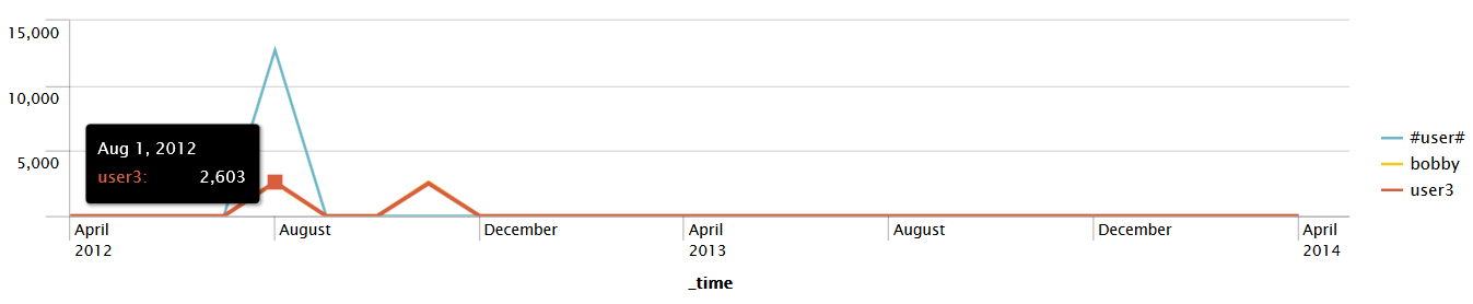
Timechart has many arguments and formatting options. We'll touch upon a few examples of formatting, but they are too numerous to cover in detail. We will use other chart types in later chapters. Let's throw a few options in (to a simple search) and see what they do:
sourcetype="*" GET | timechart bins=100 limit=3 useother=false
 usenull=false count as "Error count" by user
Let's step through each of these arguments:
- sourcetype="*" GET is our search query.
- bins defines how many bins to slice time into. The number of bins will probably not be exactly 100, as the time will be sliced into logical units. In our example, this comes to 10 minutes per bin. To be more exact, you can use span (for example, span=1h) for hourly slices, but note that if your span value creates too many time slices, the chart will be truncated.
- limit changes the number of series returned. The series with the largest values are returned, much like in top. In this case, the most common values of a user will be returned.
- useother instructs timechart whether to group all series beyond the limit into another bucket. The default value is true.
- usenull instructs timechart whether to bucket, into the group NULL, events that do not have a value for the fields in the by clause. The default value is true.
This combination of arguments produces a graph similar to this:
As mentioned earlier in this chapter, Splunk offers us a variety of Formatting options for our visualizations. Clicking on the drop-down selector on the Visualization tab in the following graph gives us quite a few options to work with:
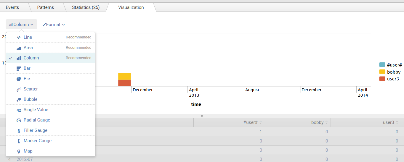
The preceding graph shows a common chart style, the stacked column. This graph is useful for showing how many events of a certain kind occurred, but with colors to give us an idea of the distribution. Some great examples of all of the available chart styles are available at http://www.splunk.com/, and we will touch upon more styles in later chapters.