One limitation of graphing in Splunk is that only a certain number of events can be drawn, as there are only so many pixels available to draw. When counting or adding values over varying periods of time, it can be difficult to know what timescale is being represented. For example, consider the following query:
earliest=-1h sourcetype=impl_splunk_gen
| timechart count
Splunk will produce this graph for the preceding query:

Each of these bars represents 1 minute. Let's change the time frame to 24 hours:
earliest=-24h sourcetype=impl_splunk_gen
| timechart count
We are presented with this graph:
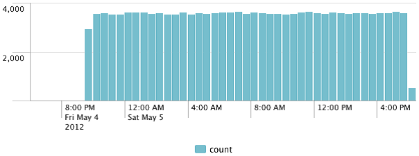
There is no indication as to what period of time is represented by each bar unless you roll over the chart. In this case, each bar represents 30 minutes. This makes the significance of the y axis difficult to judge. In both cases, we can add span=1m to timechart, and we would know that each bar represents one minute. This would be fine for a chart representing 1 hour, but a query for 24 hours would produce too many points and we would see a truncated chart.
Another approach would be to calculate the average events per minute, and then calculate that value over whatever time frame we are looking at. The Splunk timechart command provides a convenient function to accomplish this, but we have to do a little extra work:
earliest=-24h sourcetype=impl_splunk_gen
| eval eventcount=1
| timechart span=1h per_minute(eventcount)
The per_minute command calculates the sum of eventcount per minute, then finds the average value for the slice of time that each bar represents. In this case, we are seeing the average number of events per hour:
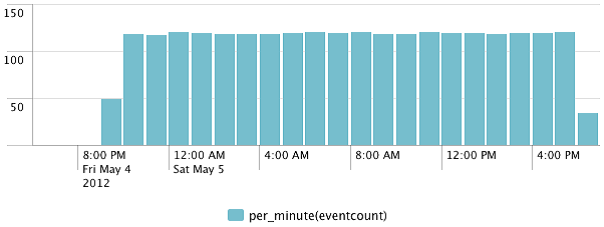
This scale looks in line with our 1 hour query, as we are now looking at the event count per minute.
Like in the Calculating average requests per minute section, we can also ignore minutes that had no data. We accomplish this as shown in the following code:
earliest=-24h sourcetype=impl_splunk_gen
| bucket span=1m _time
| stats count by _time
| timechart span=1h avg(count)
This approach does not penalize incomplete hours, for instance, the current hour.
The graph looks like this:

This gives us a better understanding of events for the current hour, but it is arguably not entirely truthful about the first hour in the graph.