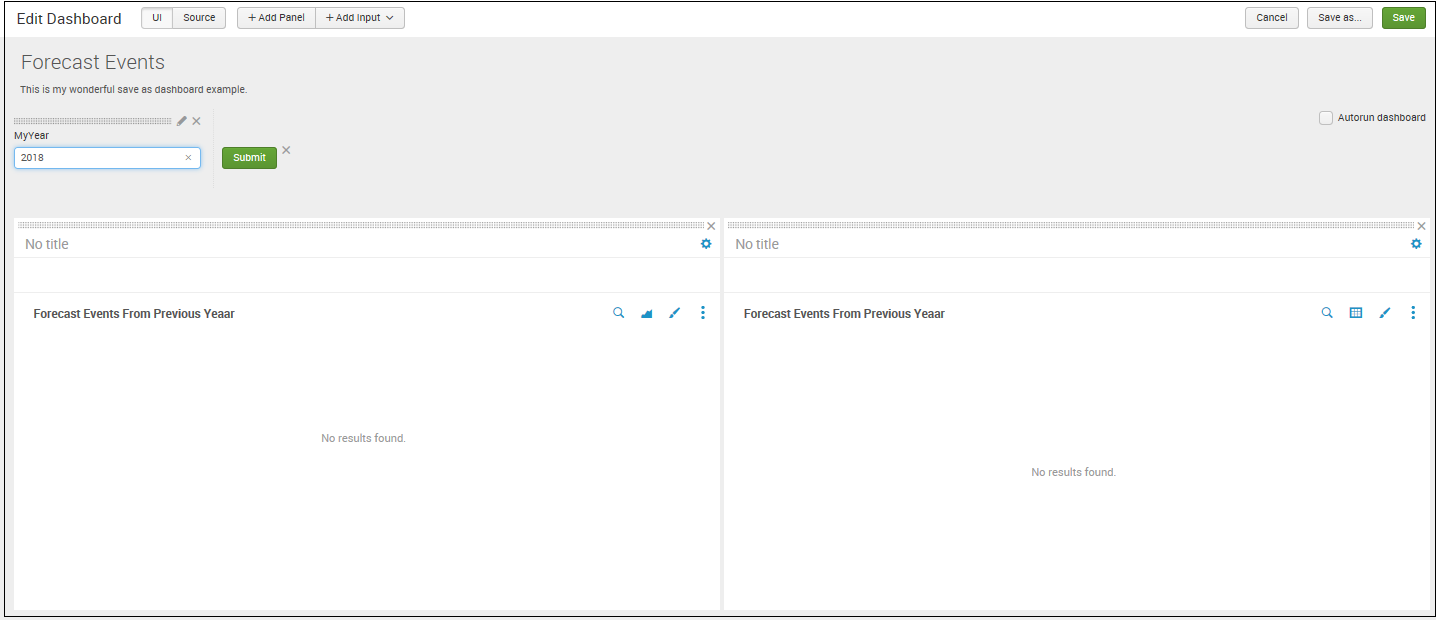
A single form can also be used to drive multiple panels at once. Earlier, we had our dashboard with two panels, one of which we converted into a report. Let's revisit the dashboard in that state for a moment. If we want to (and this would probably make the most sense), we can again edit the XML source for the dashboard and this time convert all the searches, as we did in the previous example, to use our form field:
<form>
 <label>Forecast Events</label>
 <description>This is my wonderful save as dashboard example.</description>
 <fieldset>
  <input type="text" token="myyear">
   <label>MyYear</label>
  </input>
 </fieldset>
 <row>
  <panel>
   <table>
    <title>Forecast Events From Previous Yeaar</title>
    <search>
     <query>sourcetype="*" Forecast date_year=$myyear$ | timechart count as "Forecast Events" by date_month</query>
     <earliest>-1y@y</earliest>
     <latest>@y</latest>
    </search>
   </table>
  </panel>
 </row>
 <row>
  <panel>
   <chart>
    <title>Forecast Events From Previous Yeaar</title>
    <search>
     <query>sourcetype="*" Forecast date_year=$myyear$ | timechart count as "Forecast Events" by date_month</query>
     <earliest>-1y@y</earliest>
     <latest>@y</latest>
    </search>
    <option name="wrap">true</option>
    <option name="rowNumbers">true</option>
    <option name="dataOverlayMode">none</option>
    <option name="count">10</option>
    <option name="charting.axisLabelsX.majorLabelStyle.overflowMode">ellipsisNone</option>
    <option name="charting.axisLabelsX.majorLabelStyle.rotation">0</option>
    <option name="charting.axisTitleX.visibility">visible</option>
    <option name="charting.axisTitleY.visibility">visible</option>
    <option name="charting.axisTitleY2.visibility">visible</option>
    <option name="charting.axisX.scale">linear</option>
    <option name="charting.axisY.scale">linear</option>
    <option name="charting.axisY2.enabled">false</option>
    <option name="charting.axisY2.scale">inherit</option>
    <option name="charting.chart">area</option>
    <option name="charting.chart.bubbleMaximumSize">50</option>
    <option name="charting.chart.bubbleMinimumSize">10</option>
    <option name="charting.chart.bubbleSizeBy">area</option>
    <option name="charting.chart.nullValueMode">gaps</option>
    <option name="charting.chart.sliceCollapsingThreshold">0.01</option>
    <option name="charting.chart.stackMode">default</option>
    <option name="charting.chart.style">shiny</option>
    <option name="charting.drilldown">all</option>
    <option name="charting.layout.splitSeries">0</option>
    <option name="charting.legend.labelStyle.overflowMode">ellipsisMiddle</option>
    <option name="charting.legend.placement">right</option>
   </chart>
  </panel>
 </row>
</form>
After clicking on Save, we should be back at the dashboard; it is now a form with our field, which drives both the dashboard panels.
There are several other form elements available, with many options to customize their behavior. To find the official documentation, search on http://www.splunk.com/ for build and edit forms with simple XML. There are also many useful examples in the documentation and in the UI examples app (see the UI examples app section earlier in this chapter).