STAY NEUTRAL
Always exciting, never bland, never boring
I passionately believe that a palette of neutrals – whether taupe-, sand- or cream-based – can provide a serene and harmonious backdrop against which to layer the colour and activity of your life. I like the way they make me feel, as much as the way they look, which is why I have made them my signature colourway for the past 40 years. I believe they are the perfect antidote to our frequently oversubscribed schedules and perpetually shrinking amounts of downtime. But whichever family of neutrals I choose to work with on a project, textural contrast is always absolutely key, in order to add richness, depth and character. It is true that, if used badly, neutrals can be flat and unexciting. But when layered with differing tones and textures, they can be warm or cool, calm or dark, and they are always elegant, refined, sophisticated and sexy.

The soothing shades of off-white and grey set the tone in this Zen-like living room, where the textures of the materials and the placement of the objects are working in harmony. Balance is created by the shapes and configuration of the three black-and-white photographs of roses, the two linen-covered chairs and the grid of six glass bowls of rose heads and pussy willow stems on the marble tabletop.

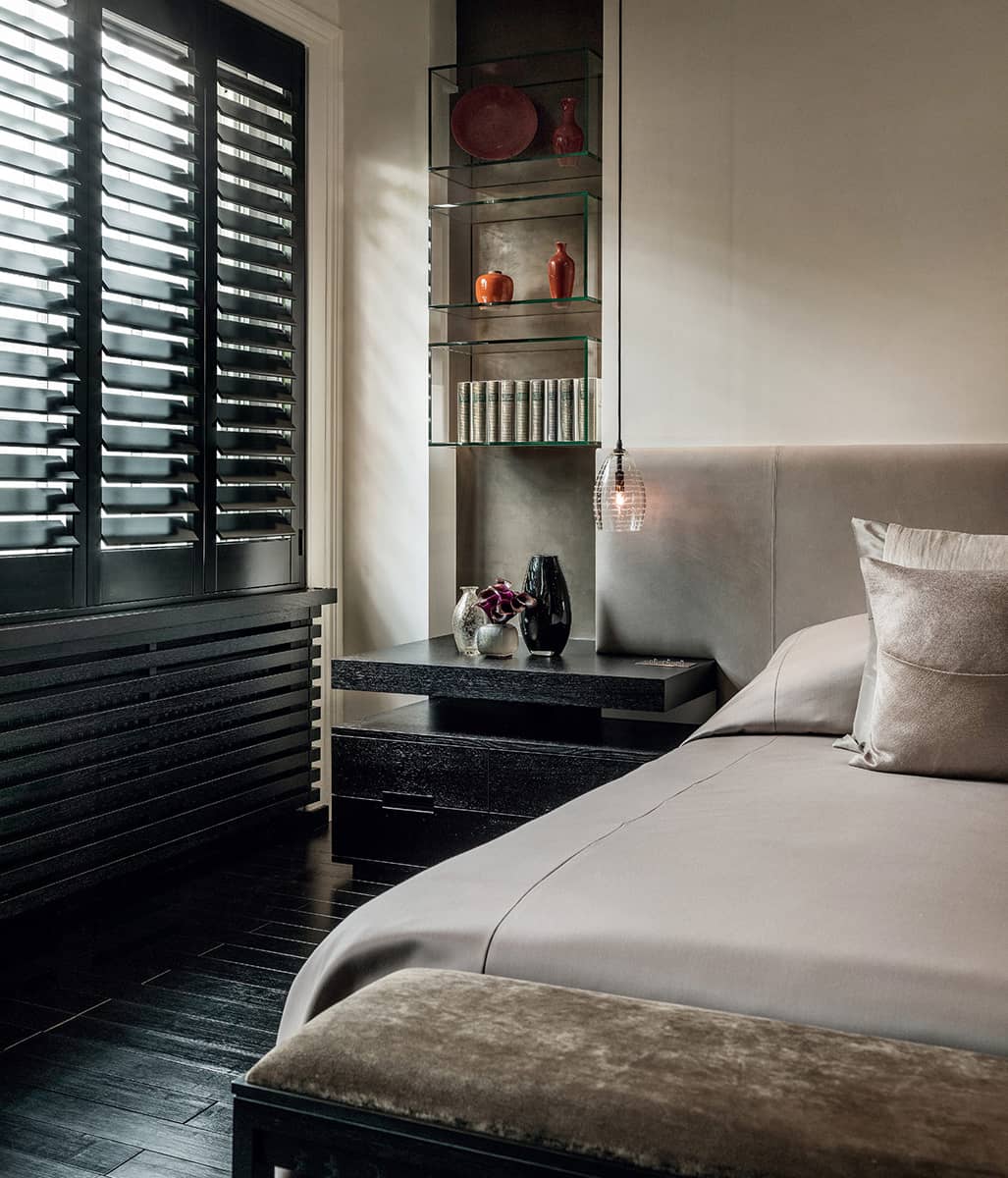
This master bedroom has a mouthwatering combination of taupe materials at play. Slatted timber panels add texture to the wall and emphasize the grid, while the backlit slatted runners create a backdrop for the wall-mounted bedside floating shelves. The runners wrap over the ceiling, defining the grid overhead. The bed base and headboard are upholstered in rich taupe leather, which offsets the silver-leaf wallpaper and linen bedcover. The white glass and metal mesh pendant and the leaf-lined glass bowls of roses add further colour accents and textural layers.
HEROES
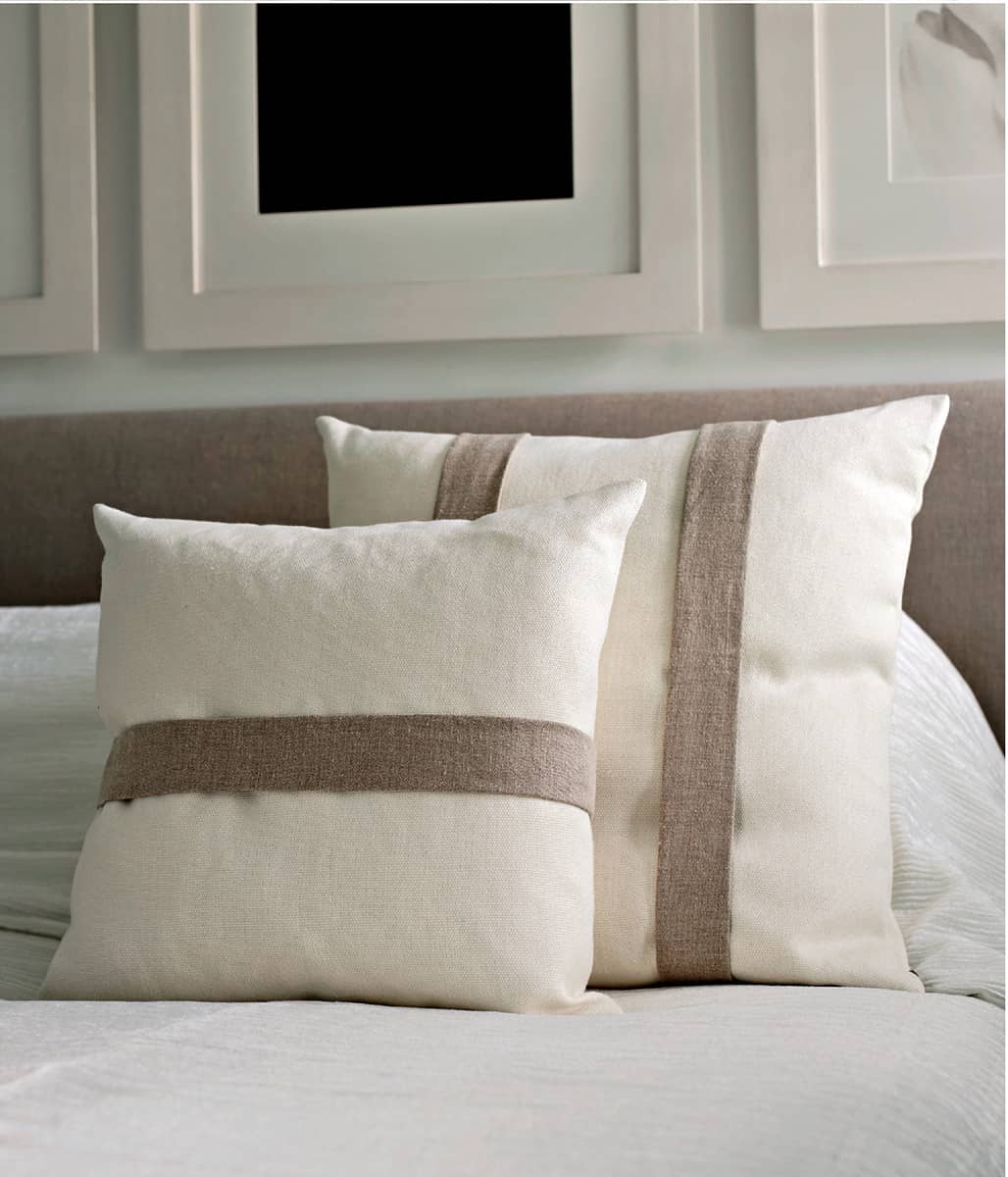
Interesting textural combinations are what make neutral schemes sing, as the various qualities of the different surfaces, weaves and grains absorb or reflect light in different ways and create subtle variations of tone and pattern. One of my favourite ways to juxtapose textures is to use cushions with contrasting bands, which can be placed on everything from leather benches or linen sofas to beds. Bands may be single or layered, wide or narrow, horizontal or vertical, and great fabric choices are velvet, silk and linen.
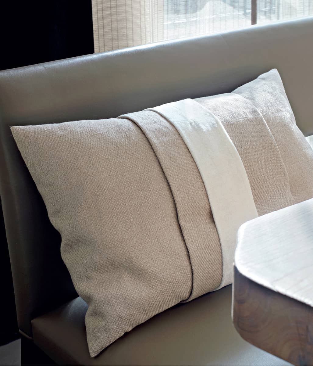
A taupe linen bench is complemented by a paler taupe cushion in linen with a matching band, topped with a narrow band of white silk velvet.

An organic pattern cut into a stone sink for the water to run through creates interest in a neutral bathroom.

Delicate patterning and subtle texture are provided by the grain of the whitened floorboards and the white lacy curtain.

A similar curtain filters the winter light in a Swiss chalet bedroom.

A taupe linen cushion with a wide band of cream velvet adds the finishing touch to a Baltus frame chair upholstered in pale linen.

A cream ostrich-leather headboard is offset by crisp bed linen.
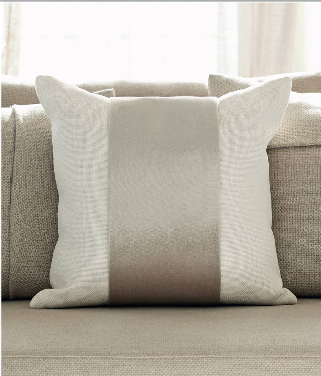
An off-white linen cushion with a wide taupe velvet band adds tactile luxe to a taupe linen sofa.
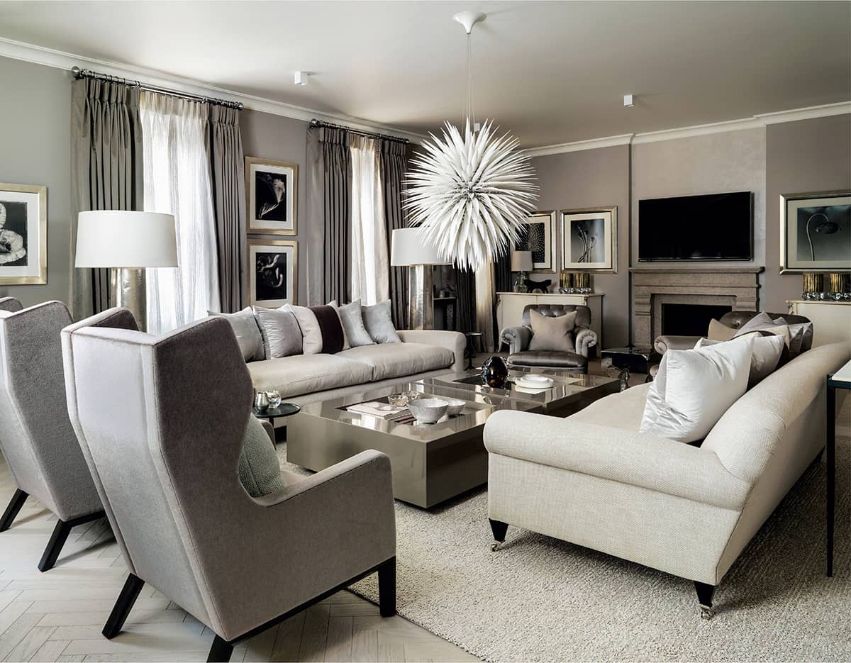
Carefully composed layers of textures in taupe, cream and silvery grey work in harmony to make up this comfortable and elegant living room. The seating is upholstered in a sensuous mix of silk, linen and mohair, with cushions in silk velvet and linen. The shiny surfaces of the Robert Kuo metal floor lamps and the taupe-lacquered coffee tables from kellyhoppen.com play against the matt walls and floor, while the bone-china pendant light by Jeremy Cole adds a fabulous spiky focal point.

Another view of the same room shows how the subtle patterning of the herringbone oak floor, white mesh sheer curtains and custom-made table by Robert Kuo, which appears to be made from a stack of concentric discs, plays against the taupe silk drapes, matt walls and mohair-upholstered Holly Hunt Darder Wingback chairs.
COOL
I have always loved the chic elegance of a monochrome interior, which takes on the stylish quality of a black-and-white photograph in which every element is perfectly framed and balanced. Encompassing the entire range of black and white tones, and everything in between, it is a palette that goes with everything, in which neither one extreme dominates the other. The result is an easy yin-yang equilibrium as the different tones contrast with, and set each other off, to great effect. Introducing layers of texture is essential to enhance the subtle interplay of light and dark that creates a sense of drama and enlivens the space.

Creating a sense of flow from one room to another results in a coherent atmosphere where nothing jars or is out of place. This dining room and adjoining hallway have been decorated in a monochrome palette featuring many of the same materials and elements to ensure a seamless connection, with the dark wenge dining table echoed by the tall wenge side tables and black-and-white artworks displayed on white walls.

A fabulous combination of woods, linens and marbles in neutral tones of taupe, off-white and charcoal is accented with clear glass and grass stems. The walls and floor of this living space are both clad in taupe timber, and the chic side table, alongside the linen sofa, was custom-made by Kelly Hoppen Interiors in a mix of black marble and taupe wood with inlay detail. It perfectly sets off the wonderful Globe table lamp by Lee Broom, which is made from a half-sphere of Carrara marble, topped with a lead crystal dome.
WARM
Shades of cream and sand have yellow undertones and tend to be described as ‘warm’, whereas neutrals such as white, grey and taupe are harder to classify in this way. Taupe encompasses many shades from mushroom to grey-purple, which all work harmoniously with white, black and silver, but don’t sit comfortably with sands or warm-toned woods. The choice of textures evokes warmth or coolness in an interior and these can be changed seasonally, along with accent colours. Velvet, fur and cashmere are ideal for the winter months, while linens, cottons and sheers have a lighter feel.

Layering cushions on beds is a design signature of mine and here, one in dark taupe velvet supports a smaller one of ivory linen with a silver silk-velvet band.

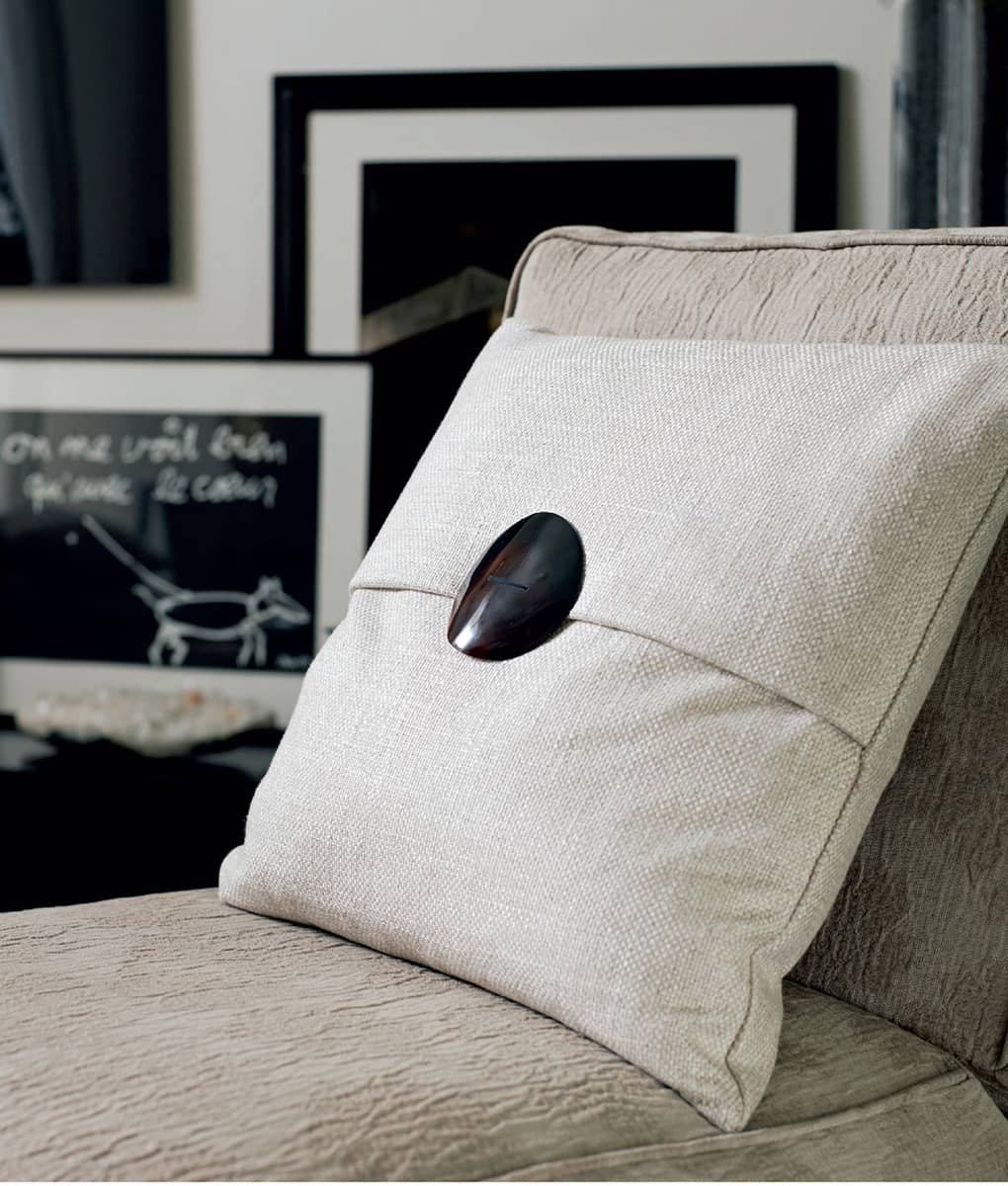
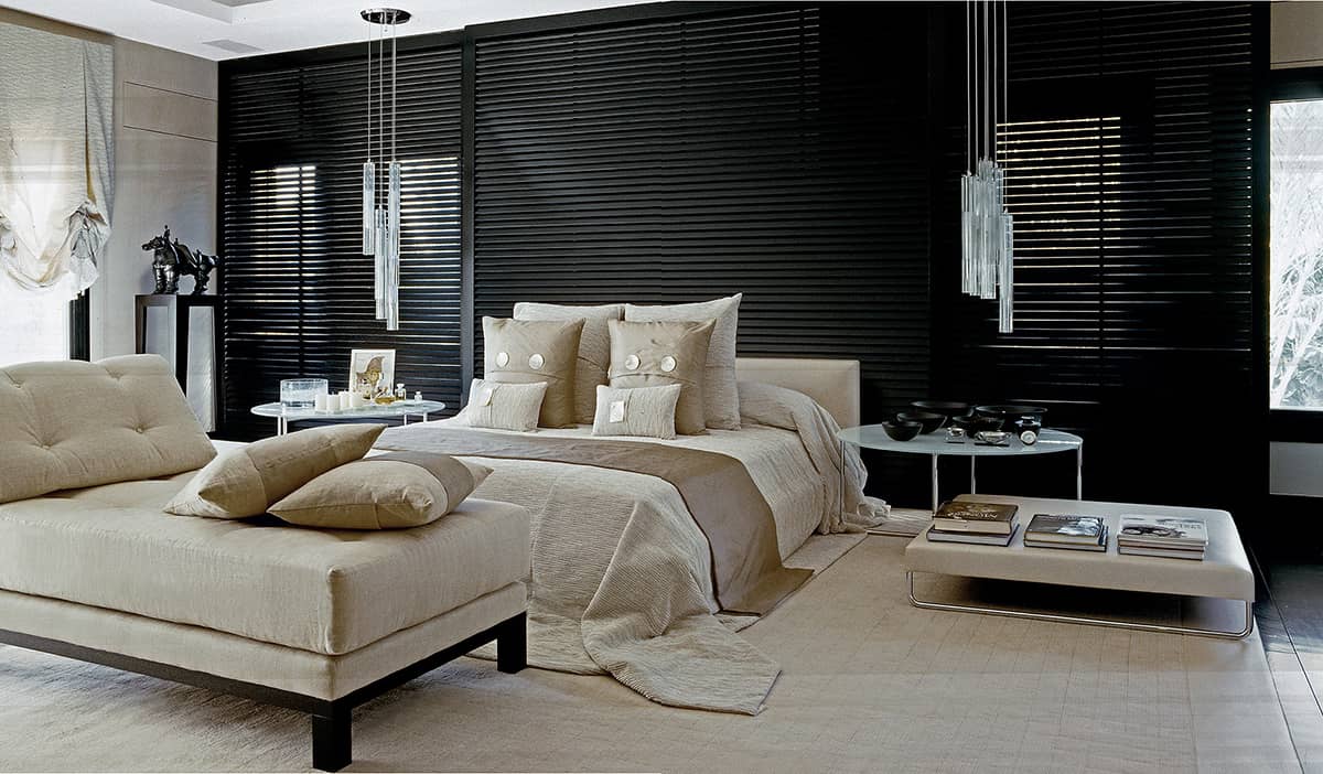
A geometric statement is made by the grid-like padded headboard, the horizontal stripes of the horned buttons on the oblong linen cushions, and the spot design of the knotted quilt.

Cushions in toning knits and linen with a faux-leather band bring warmth and comfort to this bed, set against a rustic wall.
In this chic bedroom, black bamboo flooring, black shutters and black custom-made joinery and furniture harmonize with pale grey walls, silvery furnishings and glass accents.
CALM
Neutrals provide the perfect quiet backdrop for any room, offering a blank canvas in spaces where you want to bring in bold colour accents, furnishings, artworks or star pieces; but, where there is also a carefully curated textural mix, they contribute enough interest in their own right. Calming and harmonious, bedrooms decorated predominantly in neutral tones can be luxurious, sensuous and eminently relaxing.

The stars of this bedroom are the headboard of sueded buffalo, also used as a border on the silk carpet, and the oversized Spina crystal chandeliers hung as bedside lamps.
Horizontal and vertical narrow bands of taupe silk on white linen cushions make a simple but dynamic detail.

A crystal wall light highlights the surface of the specialist plaster finish within the niche, emphasizing the grid.

I love using pairs of pendants as bedside lamps, and these scripted glass examples by Alison Berger for Holly Hunt add another layer of texture.

This luxurious bedroom is dressed with a rich mix of linen, velvet, satin, cotton and silk, with glossy lacquer side tables, crystal pendants and a specialist plaster runner behind the bed.
Taupe and grey linen and glazed raffia fabrics give understated shifts of tone and texture.

A pair of satin-and-chenille cushions stacked on a velvet ottoman create a more blatantly contrasting textural story.
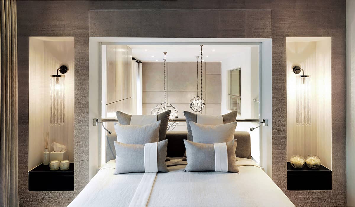
Everything about this perfectly balanced bedroom reflects the grid, from the contrasting bands on the cushions that flow into the runner on the bedcover, to the lines of the textural plaster niches, to the geometric pattern of the wall finishes in the main space, seen through the internal window (see also here and here).
DARK
Rich tones of bitter chocolate, charcoal and black make sharp, chic interiors. It is the quantity in which these dark, dense colours are used that affects the mood of the room, taking it from defined and smart in small touches to moody and cocooning when used in greater expanses. Dark colours will naturally make a room feel smaller, but this can work well in bedrooms, which need to feel cosy and nurturing, as well as in dining rooms and cloakrooms. The materials used will also have a dramatic effect, as matt textures absorb the light, whereas shiny ones reflect it.
Two views of this smart bedroom illustrate how to balance light and dark.

The pale bedcover and walls are contrasted with the black wood shutters, joinery and bedside tables.
The headboard, with its dark wood panels on either side, is echoed by the chocolate cushions with their wide white bands.
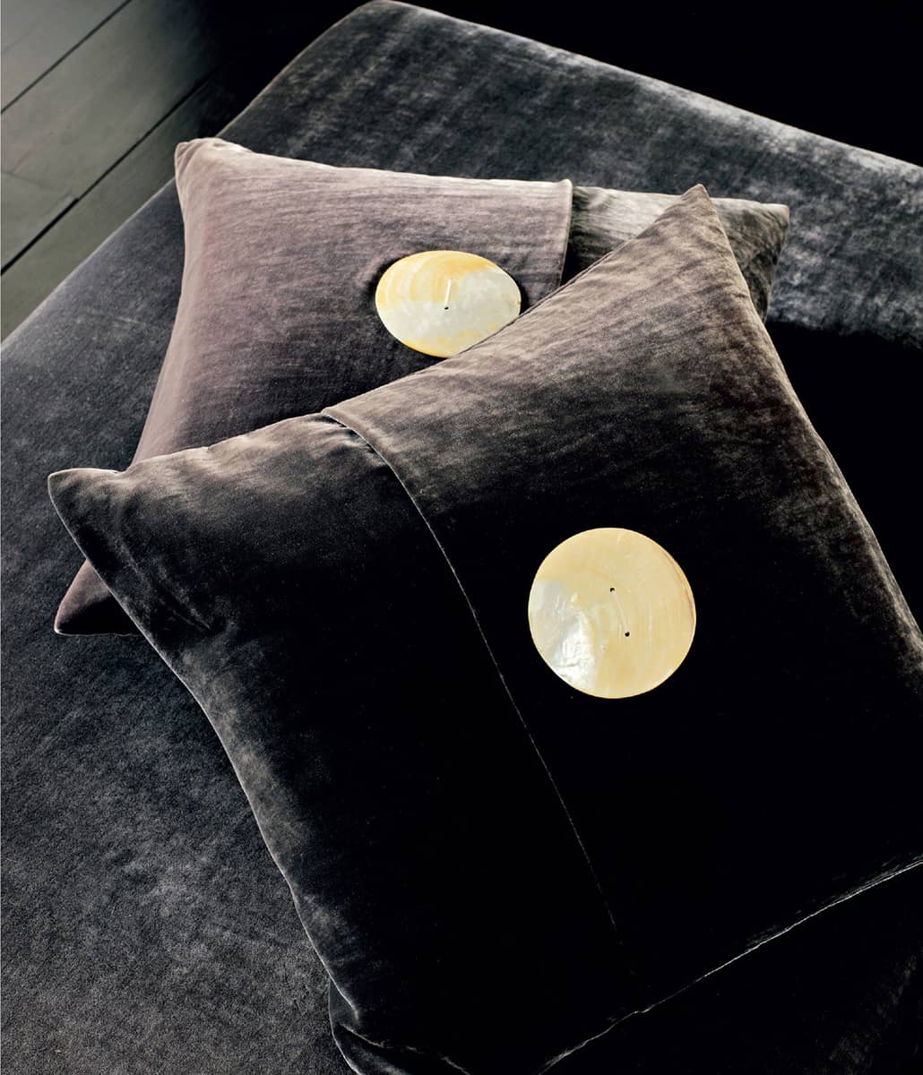
Dramatic contrasts of colour and texture (above and below) arrest the eye, such as a shiny black horn button on a cream linen cushion and mother-of-pearl buttons on sumptuous chocolate velvet.
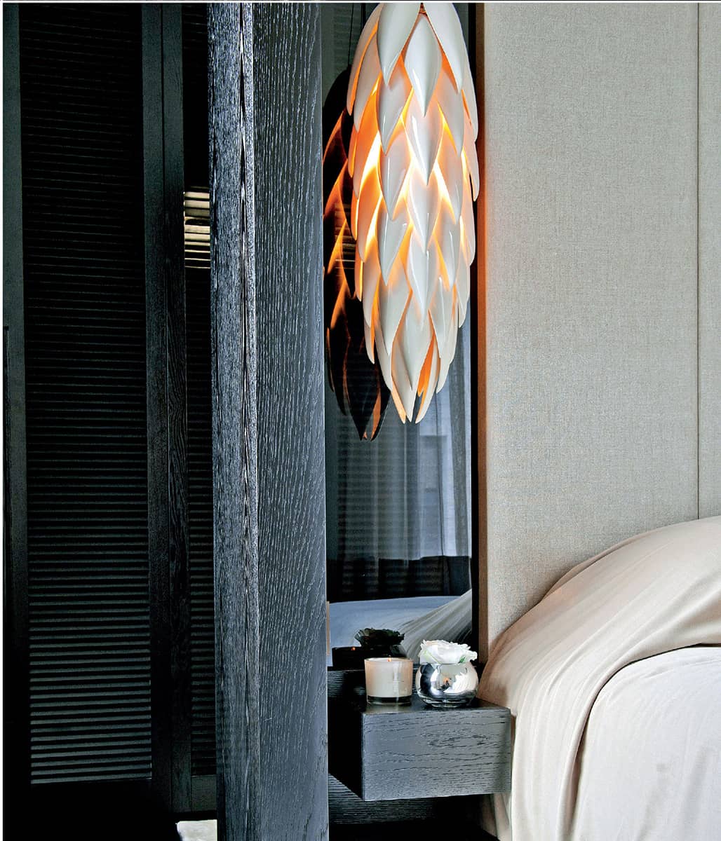
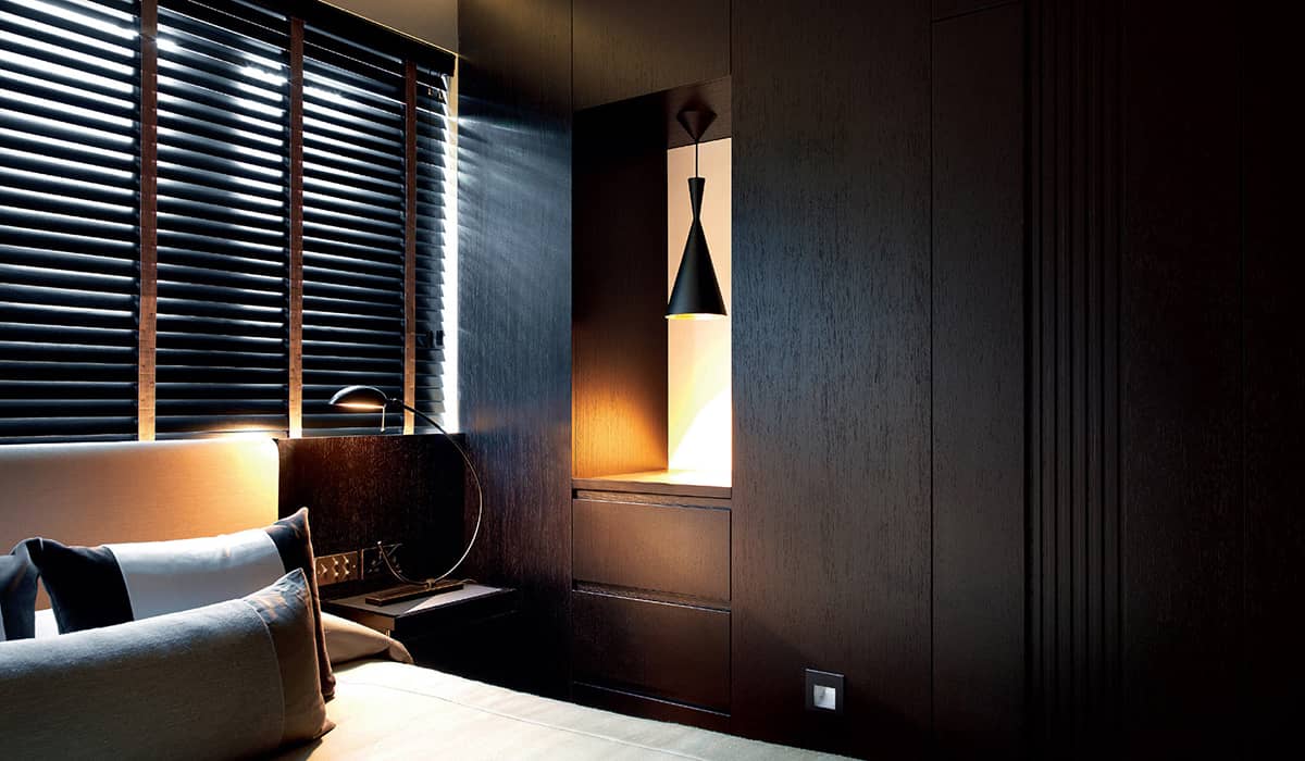
In this bedroom, dark wood joinery is contrasted with the pale velvet bedcover and linen headboard, along with the feature ceramic Aloe Shoot pendant light by Jeremy Cole.
Interesting detail can be introduced to rooms by contrasting colours, textures, finishes and shapes.
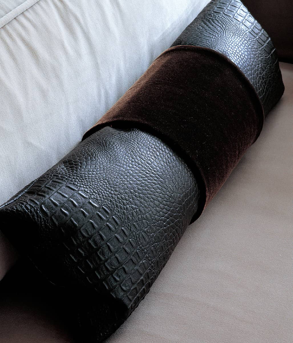
A slim bolster of faux-crocodile banded with bitter-chocolate velvet accentuates the lines of a white and taupe velvet sofa.

An organic-shaped dark wood and woven-cane vintage chaise and a bitter-chocolate velvet cushion with an oversized pearl button make a striking focal point.

A combination of dark brown velvet cushions and a faux-crocodile bolster on white linen upholstery underlines the characteristics of each material.

A white silk-and-linen carpet with a black faux-crocodile border makes a luxurious layer on a grey stone floor.

The wonderful combinations of textures in this bedroom – the black wood panelling and bedside table, glass pendant lamp from Lasvit, Square Panel textured wallpaper from my range for Graham & Brown, leather headboard, textured cushions and bedcover, taupe marble runner, which is inset with black marble on the floor, and chrome skirting board – all play against each other and emphasize the grid.

Three large polished wooden containers from Africa make a simple foil for the grey concrete floor.

Taffeta cushions with a cream linen band and mother-of-pearl buttons contrast with the matt velvet and Novasuede upholstery, while their straight lines are offset by the Kelly Hoppen Ring Screen.

The stunning Fortuny pleated silk used to cover this chair cascades onto the dark-stained parquet floor like a shimmering chocolate-coloured evening gown. Together with the striking black-and-white photograph of actress Glenn Close by Herb Ritts (1994), it is the focal point of a hallway.
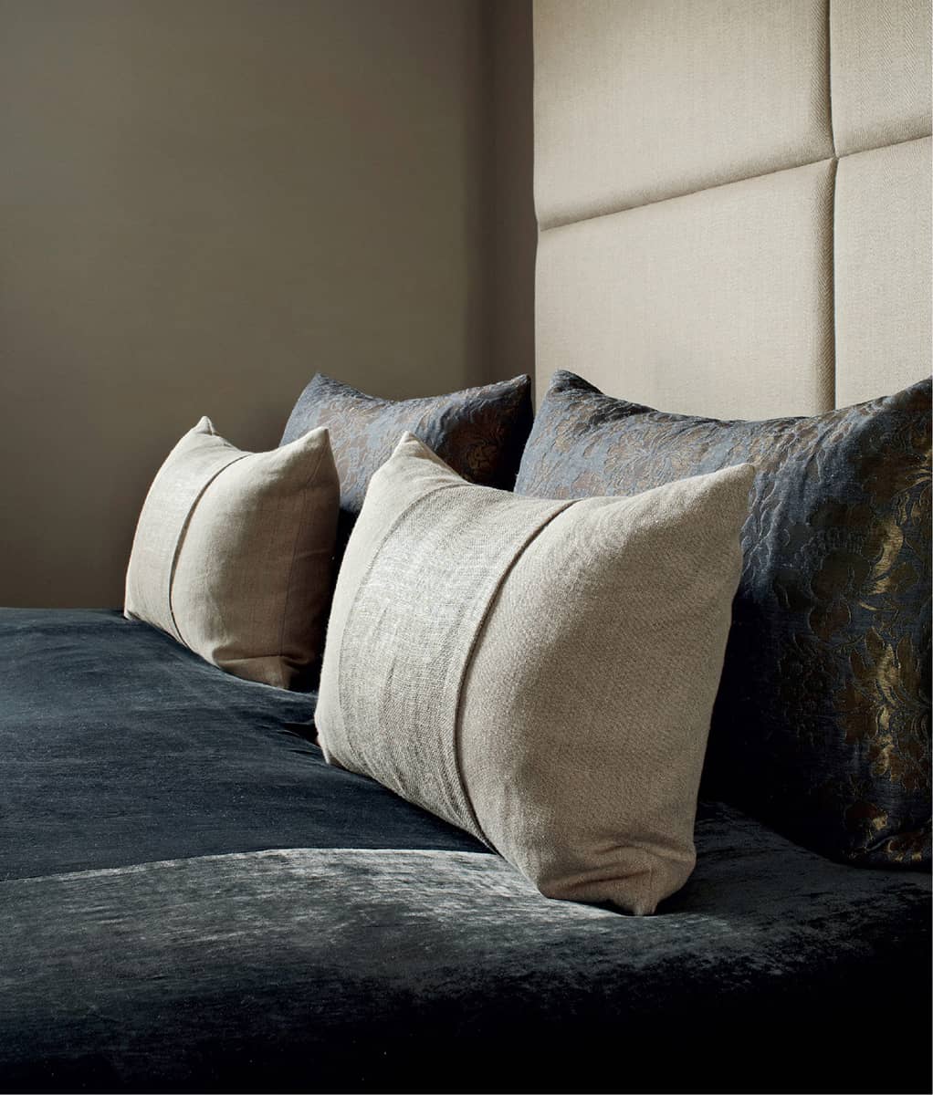
A rich combination of linens, silk velvet and damask fabrics in shades of light and dark taupe has been used for the headboard, bedcover and cushions, creating a sensuous effect.

A chair by Kelly Hoppen, upholstered in pale linen and embellished by a floor-length chainmail fringe, makes an interesting and unusual juxtaposition with dark wood flooring and a wood stool by Bleu Nature.

The rich tones and sheen of the Makassar ebony Aspre lounge chair by Christian Liaigre, upholstered in white leather, add subtle colour and detail to this room, in which it is the statement piece.
By day, this comfortable Zen-like bedroom is bright and airy, with a soothing combination of cream and taupe fabrics and carpet bathed in the soft light filtering through the wall of dark wood shutters behind the bed. At night, with the shutters closed and the festoon blinds lowered, the mood changes entirely and the lighting comes into its own, highlighting the qualities of the different textures at play.