Figure 673: Focus Sampler, Showing Requested Focus
As developers, we are very used to creating apps that are designed to be navigated by touch, with users tapping on widgets and related windows to supply input.
However, not all Android devices have touchscreens, and not all Android users use touchscreens.
Internationalization (i18n) and localization (L10n) give you opportunities to expand your user base to audiences beyond your initial set, based on language. Similarly, you can expand your user base by offering support for non-touchscreen input and output. Long-term, the largest user base of these features may be those with televisions augmented by Android, whether via Android TV, OUYA consoles, or whatever. Short-term, the largest user base of these features may be those for whom touchscreens are rarely a great option, such as the blind. Supporting those with unusual requirements for input and output is called accessibility (a11y), and represents a powerful way for you to help your app distinguish itself from competitors.
In this chapter, we will first examine how to better handle focus management, and then segue into examining what else, beyond supporting keyboard-based input, can be done in the area of accessibility.
Understanding this chapter requires that you have read the core chapters and are familiar with the concept of widgets having focus for user input.
To test focus management, you will need an environment that supports “arrow key” navigation. Here, “arrow key” also includes things like D-pads or trackballs – basically, anything that navigates by key events instead of by touch events.
Examples include:
DPad support hardware property set to yes
Hence, even if the emulator will be insufficient for your needs, you should be able to set up a hardware test environment relatively inexpensively. Most modern Android devices support Bluetooth keyboards, and such keyboards frequently can be obtained at low relative cost.
For accessibility beyond merely focus control, you will certainly want to enable TalkBack, via the Accessibility area of the Settings app. This will cause Android to verbally announce what is on the screen, by means of its text-to-speech engine.
On Android 4.0 and higher devices, enabling Talkback will also optionally
enable “Explore by Touch”. This allows users to tap on items (e.g., icons in a
GridView) to have them read aloud via TalkBack, with a double-tap to actually
perform what ordinarily would require a single-tap without “Explore by Touch”.
Android tries its best to have intelligent focus management “out of the box”, without developer involvement. Many times, what it offers is sufficient for your needs. Other times, though, the decisions Android makes are inappropriate:
EditText
widget, that is not desirableHence, if you feel that you need to take more control over how focus management is handled, you have many means of doing so, covered in this section.
In order for a widget to get the focus, it has to be focusable.
You might think that the above sentence was just a chance for the author to be witty. It was… a bit. But there are actually two types of “focusable” when it comes to Android apps:
There are three major patterns for the default state of a widget:
EditText)Button)TextView)So, when a Button is not focusable in touch mode, that means that while
the button will take the focus when the user navigates to it (e.g., via keys),
the button will not take the focus when the user simply taps on it.
You can control the focus semantics of a given widget in four ways:
android:focusable and android:focusableInTouchMode in
a layoutsetFocusable() and setFocusableInTouchMode() in JavaWe will see examples of these shortly.
By default, the focus will be granted to the first focusable widget in the activity, starting from the upper left. Often times, this is a fine solution.
If you want to have some other widget get the focus (assuming that the widget is focusable, per the section above), you have two choices:
requestFocus() on the widget in question<requestFocus />, to stipulate that this widget should be the one
to get the focusNote that this is a child element, not an attribute, as you might ordinarily expect.
For example, let’s look at the
Focus/Sampler
sample project, which we will use to illustrate various focus-related topics.
Our main activity, creatively named MainActivity, loads a layout named
request_focus.xml, and demonstrates the <requestFocus /> element:
<LinearLayout xmlns:android="http://schemas.android.com/apk/res/android"
  android:layout_width="match_parent"
  android:layout_height="match_parent">

  <Button
    android:id="@+id/button1"
    android:layout_width="wrap_content"
    android:layout_height="wrap_content"
    android:text="@string/a_button"/>

  <EditText
    android:id="@+id/editText1"
    android:layout_width="0dp"
    android:layout_height="wrap_content"
    android:layout_weight="1"
    android:contentDescription="@string/first_field"
    android:hint="@string/str_1st_field"
    android:inputType="text"/>

  <EditText
    android:id="@+id/editText2"
    android:layout_width="0dp"
    android:layout_height="wrap_content"
    android:layout_weight="1"
    android:contentDescription="@string/second_field"
    android:hint="@string/str_2nd_field"
    android:inputType="text">

    <requestFocus/>
  </EditText>

</LinearLayout>
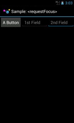
Here, we have three widgets in a horizontal LinearLayout: a Button, and
two EditText widgets. The second EditText widget has the <requestFocus />
child element, and so it gets the focus when we display our launcher activity:
Figure 673: Focus Sampler, Showing Requested Focus
If we had skipped the <requestFocus /> element, the focus would have wound
up on the first EditText… assuming that we are working in touch mode.
If the activity had been launched via the pointing device or keyboard, then
the Button would have the focus, because the Button is focusable in
non-touch mode by default.
Calling requestFocus() from Java code gets a bit trickier. There are a few
flavors of the requestFocus() method on View, of which two will be the
most popular:
requestFocus()
requestFocus(), with the argument being the direction
in which the focus should theoretically be coming fromYou might look at the description of the second flavor and decide that the
zero-argument requestFocus() looks a lot easier. And, sometimes it will
work. However, sometimes it will not, as is the case with our second
activity, RequestFocusActivity.
In this activity, our layout (focusable_button) is a bit different:
<LinearLayout xmlns:android="http://schemas.android.com/apk/res/android"
  android:layout_width="match_parent"
  android:layout_height="match_parent">

  <EditText
    android:id="@+id/editText1"
    android:layout_width="0dp"
    android:layout_height="wrap_content"
    android:layout_weight="1"
    android:contentDescription="@string/first_field"
    android:hint="@string/str_1st_field"
    android:inputType="text"/>

  <EditText
    android:id="@+id/editText2"
    android:layout_width="0dp"
    android:layout_height="wrap_content"
    android:layout_weight="1"
    android:contentDescription="@string/second_field"
    android:hint="@string/str_2nd_field"
    android:inputType="text">
  </EditText>

  <Button
    android:id="@+id/button1"
    android:layout_width="wrap_content"
    android:layout_height="wrap_content"
    android:focusableInTouchMode="true"
    android:text="@string/a_button"/>

</LinearLayout>
Here, we put the Button last instead of first. We have no <requestFocus />
element anywhere, which would put the default focus on the first EditText
widget. And, our Button has android:focusableInTouchMode="true", so it
will be focusable regardless of whether we are in touch mode or not.
In onCreate() of our activity, we use the one-parameter version of
requestFocus() to give the Button the focus:
  @Override
  public void onCreate(Bundle savedInstanceState) {
    super.onCreate(savedInstanceState);
    setContentView(R.layout.focusable_button);
    initActionBar();

    button=findViewById(R.id.button1);
    button.requestFocus(View.FOCUS_RIGHT);
    button.setOnClickListener(this);
  }
If there were only the one EditText before the Button, the zero-argument
requestFocus() works. However, with a widget between the default focus
and our Button, the zero-argument requestFocus() does not work, but using
requestFocus(View.FOCUS_RIGHT) does. This tells Android that we want the focus,
and it should be as if the user is moving to the right from where the focus
currently lies.
All of our activities inherit from a BaseActivity that manages our action
bar, with an overflow menu to get to the samples and the app icon to
get to the original activity.
So, if you run the app and choose “Request Focus” from the overflow menu, you will see:
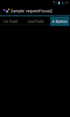
Figure 674: Focus Sampler, Showing Manually-Requested Focus
We also wire up the Button to the activity for click events, and in
onClick(), we call clearFocus() to abandon the focus:
  @Override
  public void onClick(View v) {
    button.clearFocus();
  }
What clearFocus() will do is return to the original default focus for this
activity, in our case the first EditText:
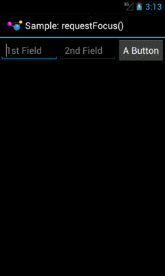
Figure 675: Focus Sampler, After Clearing the Focus
Beyond manually placing the focus on a widget (or manually clearing that focus), you can also override the focus order that Android determines automatically. While Android’s decisions usually are OK, they may not be optimal.
A widget can use android:nextFocus... attributes in the layout file to indicate
the widget that should get control on a focus change in the direction indicated
by the ... part. So, android:nextFocusDown, applied to Widget A, indicates
which widget should receive the focus if, when the focus is on Widget A, the
user “moves down” (e.g., presses a DOWN key, presses the down direction on a
D-pad). The same logic holds true for the other three directions
(android:nextFocusLeft, android:nextFocusRight, and android:nextFocusUp).
For example, the res/layout/table.xml resource in the FocusSampler
project is based on the
TableLayout sample from early in this book, with a bit more focus control:
<?xml version="1.0" encoding="utf-8"?>
<TableLayout xmlns:android="http://schemas.android.com/apk/res/android"
  android:layout_width="match_parent"
  android:layout_height="match_parent"
  android:stretchColumns="1">

  <TableRow>

    <TextView android:text="@string/url"/>

    <EditText
      android:id="@+id/entry"
      android:layout_span="3"
      android:inputType="text"
      android:nextFocusRight="@+id/ok"/>
  </TableRow>

  <TableRow>

    <Button
      android:id="@+id/cancel"
      android:layout_column="2"
      android:text="@string/cancel"/>

    <Button
      android:id="@+id/ok"
      android:text="@string/ok"/>
  </TableRow>

</TableLayout>
In the original TableLayout sample, by default,
pressing either RIGHT or DOWN while the EditText has the focus
will move the focus to the “Cancel” button. This certainly works. However, it
does mean that there is no single-key means of moving from the EditText to
the “OK” button, and it would be nice to offer that, so those using the
pointing device or keyboard can quickly move to either button.
This is a matter of overriding the default focus-change behavior of the
EditText widget. In our case, we use android:nextFocusRight="@+id/ok"
to indicate that the “OK” button should get the focus if the user presses
RIGHT from the EditText. This gives RIGHT and DOWN different behavior, to
reach both buttons.
Let’s suppose that you have a UI design with a fixed bar of widgets at the
top (e.g., action bar), a ListView dominating the activity, and a panel
of widgets at the bottom (e.g., a Toolbar). This is a common UI pattern
on iOS, though it is relatively uncommon on Android nowadays. You used
to see it with the so-called “split action bar”, which is now officially
deprecated as a pattern:
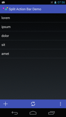
Figure 676: Split Action Bar
However, this UI pattern does not work well for those using pointing devices or keyboards for navigation. In order to get to the bottom panel of widgets, they will have to scroll through the entire list first, because scrolling trumps focus changes. So while this is easy to navigate via a touchscreen, it is a major problem to navigate for those not using a touchscreen.
Similarly, if the user has scrolled down the list, and now wishes to get to the action bar at the top, the user would have to scroll all the way to the top of the list first.
Workarounds include:
Toolbar (e.g., left moves you to the action
bar, right moves you to the Toolbar)Toolbar entirely, moving those items instead to the action
bar, or perhaps an action mode (a.k.a., contextual action bar)
if the items are only relevant if the user checks one or more items in the
listPeople suffering from impaired vision, including the blind, have had to rely heavily on proper keyboard navigation for their use of Android apps, at least prior to Android 4.0 and “Explore by Touch”. These users need focus to be sensible, so that they can find their way through your app, with TalkBack supplying prompts for what has the focus. Having widgets that are unreachable in practice will eliminate features from your app for this audience, simply because they cannot get to them.
“Explore by Touch” provides accessibility assistance without reliance upon proper focus. However:
Button), may cause some challenges when the UI itself requires additional
taps (e.g., a double-tap on a widget to perform an action — is this now a
triple-tap in “Explore by Touch” mode?)So, even though “Explore by Touch” will help people use apps that cannot be navigated purely through key events, the better you can support keyboards, the better off your users will be.
While getting focus management correct goes a long way towards making your application easier to use, it is not the only thing to consider for making your application truly accessible by all possible users. This section covers a number of other things that you should consider as part of your accessibility initiatives.
For TalkBack to work, it needs to have something useful to read aloud to the user. By default, for most widgets, all it can say is the type of widget that has the focus (e.g., “a checkbox”). That does not help the TalkBack-reliant user very much.
Please consider adding android:contentDescription attributes to most of your
widgets, pointing to a string resource that briefly describes the widget
(e.g., “the Enabled checkbox”). This will be used in place of the basic type of
widget by TalkBack.
Classes that inherit from TextView will use the text caption of the widget
by default, so your Button widgets may not need android:contentDescription
if their captions will make sense to TalkBack users.
However, with an EditText, since the text will be what the user types in,
the text is not indicative of the widget itself. Android will first use your
android:hint value, if available, falling back to android:contentDescription
if android:hint is not supplied.
Also, bear in mind that if the widget changes purpose, you need to change
your android:contentDescription to match. For example, suppose you have a
media player app with an ImageButton that you toggle between “play” and “pause”
modes by changing its image. When you change the image, you also need to change
the android:contentDescription as well, lest sighted users think the button
will now “pause” while blind users think that the button will now “play”.
The engine behind TalkBack is an accessibility service. Android ships with some, like TalkBack, and third parties can create other such services.
Stock Android widgets generate relevant accessibility events to feed data into
these accessibility services. That is how android:contentDescription gets used,
for example — on a focus change, stock Android widgets will announce the widget
that just received the focus.
If you are creating custom widgets, you may need to raise your own accessibility
events. This is particularly true for custom widgets that draw to the Canvas
and process raw touch events (rather than custom widgets that merely aggregate
existing widgets).
The Android developer documentation provides instructions for when and how to supply these sorts of events.
Sometimes, your app will change something about its visual state in ways that do
not get picked up very well by any traditional accessibility events.
For example, you might use GestureDetector to handle some defined library of
gestures and change state in your app. Those state changes may have visual impacts,
but GestureDetector will not know what those are and therefore cannot supply
any sort of accessibility event about them.
To help with this, API Level 16 added announceForAccessibility() as a method
on View. Just pass it a string and that will be sent out as an “announcement”
style of AccessibilityEvent. Your code leveraging GestureDetector, for example,
could use this to explain the results of having applied the gesture.
For users with limited vision, being able to change the font size is a big
benefit. Android 4.0 finally allows this, via the Settings app, so users
can choose between small, normal, large, and huge font sizes. Any place
where text is rendered and is measured in sp will adapt.
The key, of course, is the sp part.
sp is perhaps the most confusing of the available dimension units in Android.
px is obvious, and dp (or dip) is understandable once you recognize
the impacts of screen density. Similarly, in, mm, and pt are fairly simple,
at least once you remember that pt is 1/72nd of an inch.
If the user has the font scale set to “normal”, sp equates to dp, so a
dimension of 30sp and 30dp will be the same size. However, values in
dp do not change based on font scale; values in sp will increase or
decrease in physical size based upon the user’s changes to the font scale.
We can see how this works in the
Accessibility/FontScale
sample project.
In our layout (res/layout/activity_main.xml), we have six pieces of text:
two each (regular and bold) measured at 30px, 30dp, and 30sp:
<LinearLayout xmlns:android="http://schemas.android.com/apk/res/android"
  xmlns:tools="http://schemas.android.com/tools"
  android:id="@+id/LinearLayout1"
  android:layout_width="match_parent"
  android:layout_height="match_parent"
  android:orientation="vertical">

  <TextView
    android:layout_width="match_parent"
    android:layout_height="wrap_content"
    android:layout_marginTop="10dp"
    android:text="@string/normal_30px"
    android:textSize="30px"
    tools:context=".MainActivity"/>

  <TextView
    android:layout_width="match_parent"
    android:layout_height="wrap_content"
    android:text="@string/bold_30px"
    android:textSize="30px"
    android:textStyle="bold"
    tools:context=".MainActivity"/>

  <TextView
    android:layout_width="match_parent"
    android:layout_height="wrap_content"
    android:layout_marginTop="10dp"
    android:text="@string/normal_30dp"
    android:textSize="30dp"
    tools:context=".MainActivity"/>

  <TextView
    android:layout_width="match_parent"
    android:layout_height="wrap_content"
    android:text="@string/bold_30dp"
    android:textSize="30dp"
    android:textStyle="bold"
    tools:context=".MainActivity"/>

  <TextView
    android:layout_width="match_parent"
    android:layout_height="wrap_content"
    android:layout_marginTop="10dp"
    android:text="@string/normal_30sp"
    android:textSize="30sp"
    tools:context=".MainActivity"/>

  <TextView
    android:layout_width="match_parent"
    android:layout_height="wrap_content"
    android:text="@string/bold_30sp"
    android:textSize="30sp"
    android:textStyle="bold"
    tools:context=".MainActivity"/>

</LinearLayout>
You will be able to see the differences between 30px and 30dp on any
Android OS release, simply by running the app on devices with different
densities. To see the changes between 30dp and 30sp, you will need to
run the app on an Android 4.0+ device or emulator and change the font scale
from the Settings app (typically in the Display section).
Here is what the text looks like with a normal font scale:
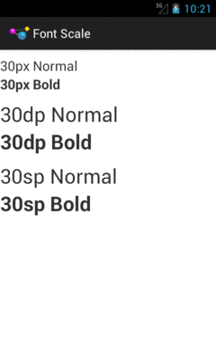
Figure 677: Fonts at Normal Scale
As you can see, 30dp and 30sp are equivalent.
If we raise the font scale to “large”, the 30sp text grows to match:
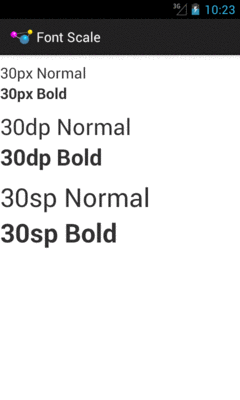
Figure 678: Fonts at Large Scale
Moving to “huge” scale increases the 30sp text size further:
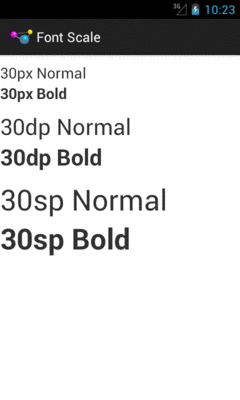
Figure 679: Fonts at Huge Scale
In the other direction, some users may elect to drop their font size to
“small”, with a corresponding impact on the 30sp text:
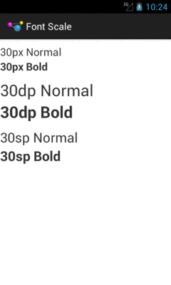
Figure 680: Fonts at Small Scale
As a developer, your initial reaction may be to run away from sp, because
you do not control it. However, just as Web developers should deal with
changing font scale in Web browsers, Android developers should deal with
changing font scale in Android apps. Remember: the user is changing the
font scale because the user feels that the revised scale is easier for them
to use. Blocking such changes in your app, by avoiding sp, will not be met
with love and adoration from your user base.
Also, bear in mind that changes to the font scale represent a configuration change. If your app is in memory at the time the user goes into Settings and changes the scale, if the user returns to your app, each activity that comes to the foreground will undergo the configuration change, just as if the user had rotated the screen or put the device into a car dock or something.
Users with ordinary sight already have trouble with tiny widgets, as they are difficult to tap upon.
Users trying to use the Explore by Touch facility added in Android 4.1 have it worse, as they cannot even see (or see well) the tiny target you are expecting them to tap upon. They need to be able to reliably find your widget based on its relative position on the screen, and their ability to do so will be tied, in part, on widget size.
The Android design guidelines recommend 7-10mm per side minimum sizes for tappable widgets. In particular, they recommend 48dp per side, which results in a size of about 9mm per side.
You also need to consider how closely packed your widgets are. The closer the tap targets lie, the more likely it is that all users — whether using Explore by Touch or not — will accidentally tap on the wrong thing. Google recommends 8dp or more of margin between widgets. Also note that the key is margins, as while increasing padding might visually separate the widgets, the padding is included as part of the widget from the standpoint of touch events. While padding may help users with ordinary sight, margins provide similar help while also being of better benefit to those using Explore by Touch.
If you employ gestures, be careful when employing the same gesture in different spots for different roles, particularly within the same activity.
For example, you might use a horizontal swipe to the right to switch pages
in a ViewPager in some places and remove items from a ListView in others.
While there may be visual cues to help explain this to users with ordinary sight,
it may be far less obvious what is going on for TalkBack users. This is even
more true if you are somehow combining these things (e.g., the ListView in
question is in a page of the ViewPager).
Also, be a bit careful as you “go outside the box” for tap events. You might decide that a double-tap, or a two-finger tap, has special meaning on some widgets. Make sure that this still works when users use Explore by Touch, considering that the first tap will be “consumed” by Explore by Touch to announce the widget being tapped upon.
All else being equal, users seeking accessibility assistance will tend to use keyboards when available. For users with limited (or no) sight, tactile keyboards are simply easier to use than touchscreens. For users with limited motor control, external devices that interface as keyboards may allow them to use devices that otherwise they could not.
Of course, plenty of users will use keyboards outside of accessibility as well. For example, devices like the ASUS Transformer series form perfectly good “netbook”-style devices when paired with their keyboards.
Hence, consider adding hotkey support, to assist in the navigation of your app.
Some hotkeys may be automatically handled (e.g., Ctrl-C for copy in an EditText).
However, in other cases you may wish to add those yourself (e.g., Ctrl-C for
“copy” with respect to a checklist and its selected rows, in addition to a “copy”
action mode item).
API Level 11 adds KeyEvent support for methods like isCtrlPressed() to detect
meta keys used in combination with regular keys.
Of course, another way to make your app more accessible is to provide alternative modes of input and output, beyond the visual.
Audio is popular in this regard:
However, bear in mind that deaf users will be unable to hear your audio. You are better served using both auditory and visual output, not just one or the other.
In some cases, haptics can be helpful for input feedback, by using the Vibrator
system service to power the vibration motor. While most users will be able
to feel vibrations, the limitation here is whether the device is capable of
vibrating:
So, audio and vibration can help augment visual input and output, though they should not be considered complete replacements except in rare occurrences.
Approximately 8% of men (and 0.5% of women) in the world are colorblind, meaning that they cannot distinguish certain close colors:
…It’s not that colorblind people (in most cases) are incapable or perceiving “green,” instead they merely distinguish fewer shades of green than you do. So where you see three similar shades of green, a colorblind user might only see one shade of green.
(from “Tips for Designing for Colorblind Users”)
Hence, relying solely on colors to distinguish different items, particularly when required for user input, is not a wise move.
Make sure that there is something more to distinguish two pieces of your UI than purely a shift in color, such as:
Accessibility is often tied to impaired users: ones with limited (or no) sight, ones with limited (or no) hearing, ones with limited motor control, etc.
In reality, accessibility is for situations where users may have limitations. For example, a user who might not normally think of himself as “impaired” has limited sight, hearing, and motor control when those facilities are already in use, such as while driving.
Hence, offering features that help with accessibility can benefit all your users, not just ones you think of as “impaired”. For example: