Figure 169: Android Studio, Selected Widget in Graphical Layout Editor
If you are using an IDE, and you have been experimenting with the graphical layout editor and drag-and-drop GUI building, this chapter will cover some other general features of this editor that you may find useful.
Even if you are not using an IDE, you may want to at least skim this chapter, as you will find a few tricks that will be relevant for you as well.
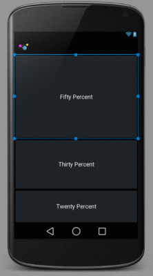
Clicking on a widget makes it the selected widget, meaning that the toolbar buttons will affect that widget (or, sometimes, its container, depending upon the button). Selected widgets have a thin blue border with blue square “grab handles” for adjusting its size and position.
Figure 169: Android Studio, Selected Widget in Graphical Layout Editor
Clicking on a container also selects it. However, there may or
may not be a blue border — in particular, containers that fill the
screen (match_parent for width and height) do not seem to get the
border.
Sometimes, though, you want to select a container that you cannot reach, because its contents are completely filled with widgets. In these cases, click on the widget or container in the Component Tree pane to select it.
Sometimes, you have a widget or a collection of widgets
that you want to reuse across multiple layout XML resources. Android
supports the notion of an “include” that allows this. Simply create
a dedicated layout XML resource that contains the widget(s) to reuse,
then add them to your main layouts via an <include> element:
<include layout="@layout/thing_we_are_reusing" />
You can even assign the <include> element a width or height if
needed, as if it were just a widget or container.
The IDE makes it easy for you to take widgets from an existing
layout XML resource and extract them into a separate layout XML resource,
replacing them with an <include> element.
In Android Studio, select the widget(s) that you want to reuse, then choose Refactor > Extract Layout from the context menu. This will display a dialog where you can fill in the file name of your resulting resource:
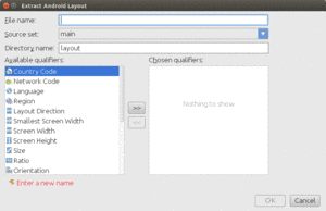
Figure 170: Android Studio Extract Layout Dialog
If you are extracting multiple widgets that are not wrapped in their own
container, the IDE will automatically wrap them in a <merge> element:
<?xml version="1.0" encoding="utf-8"?>
<merge xmlns:android="http://schemas.android.com/apk/res/android">
  <!-- widgets go here -->
</merge>
This is necessary purely from an XML standpoint — you cannot have multiple
root elements in an XML file. When the <merge> is added to another layout
via <include>, the <merge> element itself evaporates, leaving behind its
children.
Occasionally, you might configure a widget, only to decide later on that
you really want it to be a different type of widget. For example, perhaps you
start with a CheckBox and later want to switch it to be a ToggleButton.
To do this in Android Studio, right-click over the widget (in the preview pane or the Component Tree pane) and choose Morphing from the context menu. This brings up a fly-out menu of possible alternative classes; choosing one will automatically convert your widget into the selected type.
At the top of the graphical layout editor, you will find a series of drop-downs that allow you to tailor what the preview looks like:

Figure 171: Android Studio Preview Controls
Your IDE will choose some likely defaults based upon your project settings, but you are welcome to change them as you see fit. Notable changes include:
These only affect the preview, so they show you (approximately) what your layout will look like under those conditions, but they do not modify anything about your layout XML itself.