
Figure 1061: Android 2.3.3
DatePicker, as the name might suggest, allows the user to pick a date.
You supply a starting date, which the user then manipulates, triggering
event listeners whenever the date is changed.
If you do nothing, the DatePicker will start with today’s date.
However, if you want to set up an OnDateSetListener to find out when
the date changes, you will need to call init() to do so, in which
you also need to set the date.
DatePicker works well with Calendar and GregorianCalendar, in
terms of setting and getting the year/month/day-of-month from the
DatePicker and converting it into something you can use in your code.
API Level 11 introduced an optional CalendarView adjunct to the
DatePicker, determined via setCalendarViewShown() or
android:calendarViewShown. This works well on -normal screens in
landscape and on -large/-xlarge screens. On -normal screens
in portrait, the year portion of the picker may be chopped off
to save room. Using the CalendarView option on -small screens
is probably not a good idea.
However, on Android 5.0+, the CalendarView is always shown and
cannot be removed, as the “picker” itself does not allow the user to
pick a date. The user uses the CalendarView to pick a date, or taps
on the year in the “picker” to choose a year. This means that DatePicker
is not a particularly good widget to use, especially on smaller
screens.
The sample project can be found in
WidgetCatalog/DatePicker.
Layout:
<LinearLayout xmlns:android="http://schemas.android.com/apk/res/android"
  android:layout_width="match_parent"
  android:layout_height="match_parent"
  android:orientation="vertical"
  android:gravity="center_horizontal">

  <DatePicker
    android:id="@+id/picker"
    android:layout_width="match_parent"
    android:layout_height="0dip"
    android:layout_weight="1"
    android:calendarViewShown="true"/>

  <CheckBox
    android:id="@+id/showCalendar"
    android:layout_width="wrap_content"
    android:layout_height="wrap_content"
    android:checked="true"
    android:text="@string/calendar"/>

</LinearLayout>
Activity:
package com.commonsware.android.wc.datepick;

import android.app.Activity;
import android.os.Build;
import android.os.Bundle;
import android.view.View;
import android.widget.CheckBox;
import android.widget.CompoundButton;
import android.widget.CompoundButton.OnCheckedChangeListener;
import android.widget.DatePicker;
import android.widget.DatePicker.OnDateChangedListener;
import android.widget.Toast;
import java.util.Calendar;
import java.util.GregorianCalendar;

public class DatePickerDemoActivity extends Activity implements
    OnCheckedChangeListener, OnDateChangedListener {
  DatePicker picker=null;

  @Override
  public void onCreate(Bundle savedInstanceState) {
    super.onCreate(savedInstanceState);
    setContentView(R.layout.main);

    CheckBox cb=(CheckBox)findViewById(R.id.showCalendar);

    if (Build.VERSION.SDK_INT>=Build.VERSION_CODES.HONEYCOMB) {
      cb.setOnCheckedChangeListener(this);
    }
    else {
      cb.setVisibility(View.GONE);
    }

    GregorianCalendar now=new GregorianCalendar();

    picker=(DatePicker)findViewById(R.id.picker);
    picker.init(now.get(Calendar.YEAR), now.get(Calendar.MONTH),
                now.get(Calendar.DAY_OF_MONTH), this);
  }

  @Override
  public void onCheckedChanged(CompoundButton buttonView,
                               boolean isChecked) {
    if (Build.VERSION.SDK_INT>=Build.VERSION_CODES.HONEYCOMB) {
      picker.setCalendarViewShown(isChecked);
    }
  }

  @Override
  public void onDateChanged(DatePicker view, int year, int monthOfYear,
                            int dayOfMonth) {
    Calendar then=new GregorianCalendar(year, monthOfYear, dayOfMonth);

    Toast.makeText(this, then.getTime().toString(), Toast.LENGTH_LONG)
         .show();
  }
}
The CheckBox is tied to the visibility of the CalendarView. Since
this is only available on API Level 11 and higher, we simply remove the
CheckBox on earlier versions of Android, so we do not have to worry
about whether or not the CheckBox gets unchecked by the user.
This is what a DatePicker looks like in a few different Android
versions and configurations, based upon the sample app shown above.
Figure 1061: Android 2.3.3
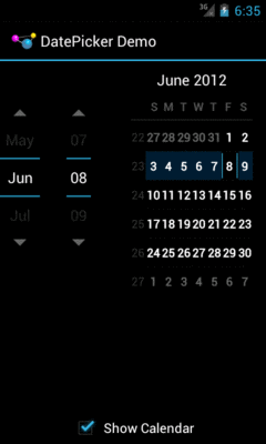
Figure 1062: Android 4.0.3, with CalendarView, Portrait
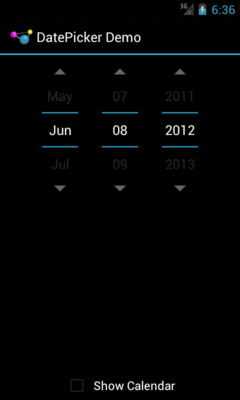
Figure 1063: Android 4.0.3, without CalendarView, Portrait
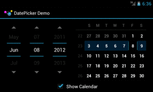
Figure 1064: Android 4.0.3, with CalendarView, Landscape
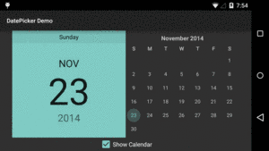
Figure 1065: Android 5.0, with CalendarView, Landscape
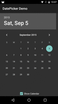
Figure 1066: Android 6.0, with CalendarView, Portrait
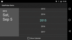
Figure 1067: Android 6.0, Showing Year Picker, Landscape
—