Directions: Try the questions that follow. Show your work so that you can compare your solutions to the ones found in the Check Your Work section immediately after this question set. The “Category” heading in the explanation for each question gives the title of the lesson that covers how to solve it. If you answered the question(s) for a given lesson correctly, and if your scratchwork looks like ours, you may be able to move quickly through that lesson. If you answered incorrectly or used a different approach, you may want to take your time on that lesson.
Source: CDC
The scatterplot shows the prevalence of obesity plotted against the prevalence of diabetes in various areas of the United States. Which of the following best estimates the average rate of change in the prevalence of diabetes as compared to the prevalence of obesity?
0.3
0.9
1.1
3
Questions 2 and 3 refer to the following stimulus.
Wind chill, a measurement that reflects the temperature that one feels when outside based on the actual temperature and the wind speed, was first introduced in 1939, and the formula was revised in 2001. If the outside temperature is 0°F, what is the approximate wind chill at 40 miles per hour based on the 2001 formula?
−20°F
−30°F
−40°F
−50°F
What wind speed would produce the same wind chill using the 1939 formula as the wind chill produced using the 2001 formula when the outside temperature is 0°F and the wind speed is 40 miles per hour?
10 miles per hour
15 miles per hour
20 miles per hour
40 miles per hour
Page 205
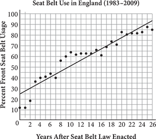
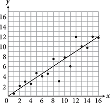
The scatterplot above shows data collected each year after the British Parliament enacted a mandatory seat belt law and the line of best fit to the data. Which of the following equations best represents the trend of the data shown in the figure?
y = 0.4x + 25
y = 1.8x + 15
y = 2.1x + 35
y = 2.6x + 25
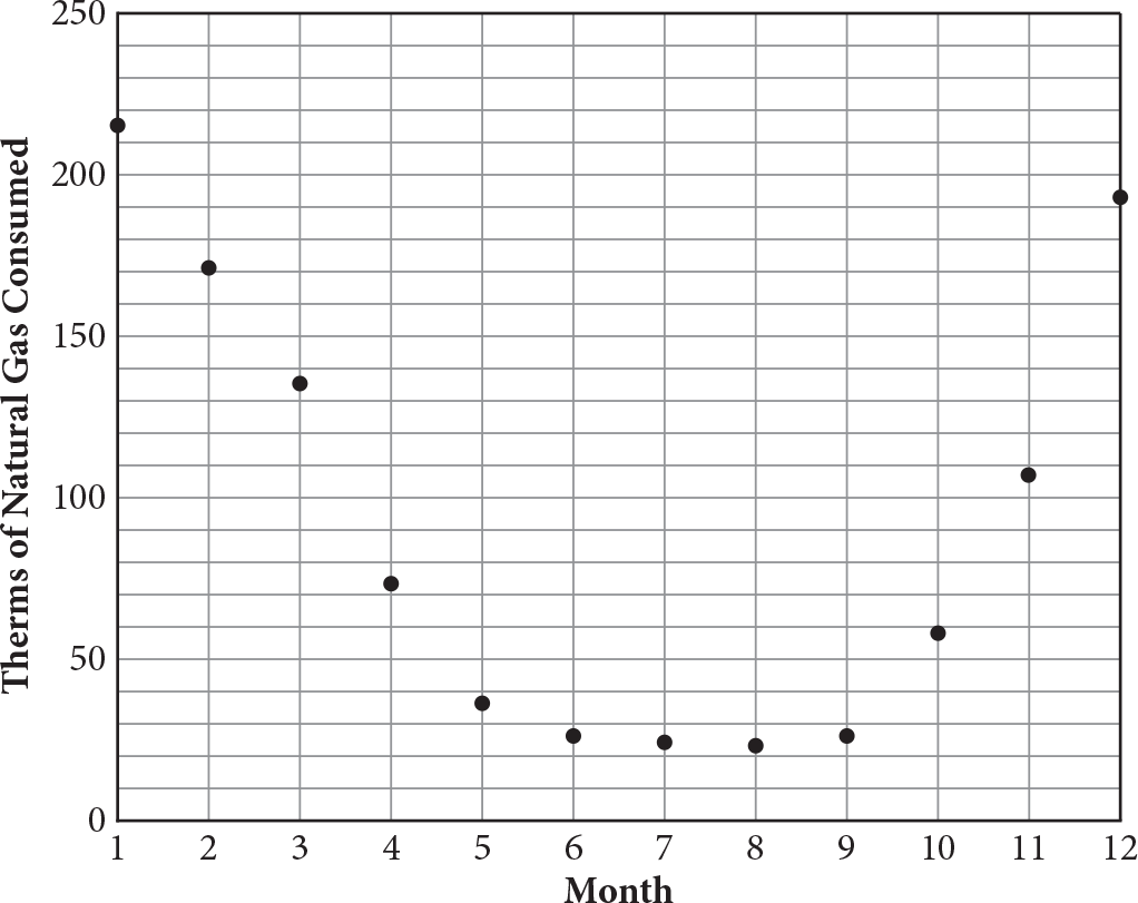
The scatterplot above shows the average therms of natural gas used by residential customers over a 12-month period. Of the following equations, which best models the data in the scatterplot?
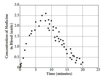
Scientists measured the concentration of an experimental medication in blood samples over time. If a quadratic function is used to model the data, which of the following best explains the meaning of the vertex?
The average maximum medicine concentration in the blood sample is 7.5 units.
The average maximum medicine concentration is more than 20 units.
The average maximum medicine concentration in the blood samples occurs around 2.5 minutes.
The average maximum medicine concentration in the blood sample occurs between 5 and 10 minutes.
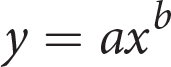
For which of the following values of a
and b does the equation model the data in the scatterplot above?
a < 0, b < 0
a < 0, b > 0
a > 0, b < 0
a > 0, b > 0
Page 206
Check Your Work
A
Difficulty: Easy
Category: Line of Best Fit
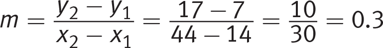
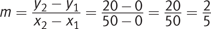
Getting to the Answer: The scatterplot shows obesity prevalence plotted against diabetes prevalence, and because the line goes up as it moves to the right, there is a positive linear correlation between the two. The phrase “rate of change” is the same as the slope of the line of best fit, so pick two points to plug into the slope formula. Estimating, the endpoints appear to be (14, 7) and (44, 17). (If your estimate is different, that’s okay—whenever the SAT requires you to make an estimate, the answer choices will be spread far enough apart that you’ll get the right answer as long as you’re looking in the right place and thinking the right way.) Calculate the slope, m:
This matches (A).
B
Difficulty: Medium
Category: Line of Best Fit
Getting to the Answer: The 2001 formula plot has a slight curve that straightens as wind speed increases. Extend the line to reflect this trend; once complete, draw a straight line from 40 mph on the x-axis to the extended 2001 formula plot (a straight edge such as an extra pencil will help). Then draw a horizontal line from the intersection of the 2001 formula line and the vertical line to the y‑axis; you’ll see that the corresponding wind chill is –30°F. (B) is correct.
B
Difficulty: Medium
Category: Line of Best Fit
Getting to the Answer: Since the conditions mentioned are the same as those in the previous question, start with the wind chill calculated using the 2001 formula for that question, –30°F.
Draw a horizontal line from –30°F on the y-axis until it intersects a data point on the 1939 formula plot. Draw a vertical line from that point down to the x-axis; you’ll find that in 1939, a wind speed of approximately 15 mph would yield a wind chill of –30°F. Therefore, the correct answer is (B).
D
Difficulty: Medium
Category: Line of Best Fit
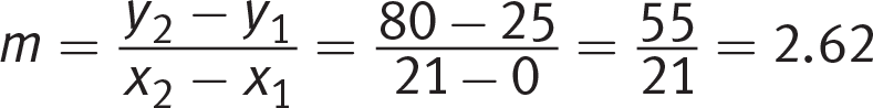
Getting to the Answer: A line that “represents the trend of the data” is another way of referring to the line of best fit, which is linear in this diagram. Use the y-intercept and slope of the line of best fit to eliminate the choices.
Start by finding the y-intercept. For this graph, it’s about 25, so eliminate (B) and (C). To choose between (A) and (D), find the approximate slope using two points that lie on (or very close to) the line of best fit. Use the y-intercept (0, 25) as one of the points to save time (it’s easy to subtract 0) and estimate the second, such as (21, 80). Then, use the slope formula to find the slope:
The result is very close to the slope in (D), making it the correct answer.
C
Difficulty: Medium
Category: Scatterplot Modeling
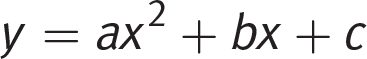
Getting to the Answer: The data in the scatterplot can be modeled by a parabola opening upward. (A) is an exponential growth equation, and (B) is an exponential decay equation. Neither will graph as a parabola, so eliminate both. Recall that a parabola is the graph of a quadratic. For a quadratic equation in the form , a determines whether the parabola opens upward or downward and c is the y-intercept. When a > 0, the parabola opens upward, so (C) is correct. (D) is a quadratic equation, but a < 0, so this equation would graph as a parabola that opens downward.Page 207
D
Difficulty: Medium
Category: Scatterplot Modeling
Getting to the Answer: The vertex of a parabola opening downward, like this one, is at the maximum. For this scatterplot, the medicine concentration is measured on the y-axis, and the maximum value (the vertex) is about 2.6 units, so the average maximum medicine concentration cannot be above 2.6 units. Eliminate (A) and (B). The x-value of the vertex occurs between 5 and 10 minutes; therefore, (D) is correct.
B
Difficulty: Hard
Category: Scatterplot Modeling
Getting to the Answer: The shape of the data is concave down with an increasingly negative slope as x
increases. The y-values of the data are negative, which indicates a < 0. Eliminate (C) and (D). As x increases, the magnitude of the y-values increases. This indicates b > 0. Note that If b < 0, the y-values would approach 0 as x increases. Thus, (B) is correct. Page 208
Line of Best Fit
To answer a question like this:
Which of the following equations corresponds to the line of best fit for the data set shown above?
y = 0.4x – 1
y = 0.4x + 1
y = 2.5x + 1
y = 2.5x – 1
You need to know this:
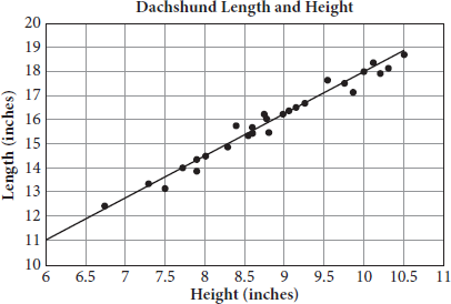
A scatterplot is a visual representation of a set of data points. The data points are plotted on the x- and y-axes such that each axis represents a different characteristic of the data set. For example, in the scatterplot below, each data point represents a dachshund. The x-axis represents the dog’s length and the y-axis represents its height.
Page 209The line of best fit, or trend line, is drawn through the data points to describe the relationship between the two variables as an equation. This line does not necessarily go through any single data point, but it does accurately reflect the trend shown by the data with about half the points above the line and half below.
The equation of the line of best fit is the equation that describes the line of best fit algebraically. On test day, you’ll most likely encounter this equation as linear, quadratic, or exponential, though it can also be other types of equations. The next lesson will cover these various forms.
Some SAT questions will require you to extrapolate from the line of best fit. (Question 1 in the Try on Your Own set is an example of this type of question.) For example, you might be asked to predict the length of a dachshund that is 10.9 inches in height. Trace your way up to the line of best fit from the given x-value and trace over to find the corresponding y-value, in this case about 19.75 inches.
You need to do this:
To determine the equation of the line of best fit for a linear equation, like the one in the dachshund scatterplot, start by finding the slope, also called the average rate of change. Watch out for the units when you do this. In the dachshund example, using the points (6, 11) and (10, 18), the slope is . Next, find the y-intercept. Using the point (10, 18) and plugging those values into slope-intercept form yields 18 = 1.75(10) + b. Thus, b = 0.5 in the dachshund example. So the equation in slope-intercept form is length = (1.75 × height) + 0.5.
You can also extrapolate using the equation for the line of best fit. For a dachshund that is 11 inches tall, the calculation would be: length = 1.75(11) + 0.5 = 19.75.
Explanation:
Knowing where the y-intercept of the line of best fit falls will help you eliminate answer choices. Because the line of best fit intersects the y-axis below the x-axis, you know that the y-intercept is negative, so eliminate (B) and (C) (the y-intercept is +1 for each of those lines). Now, look at the slope. The line rises along the y-axis much faster than it runs along the x-axis, so the slope must be greater than 1, making (D) correct.Page 210
Try on Your Own
Directions: Take as much time as you need on these questions. Work carefully and methodically. There will be an opportunity for timed practice at the end of the chapter.
Questions 1 and 2 refer to the following information.
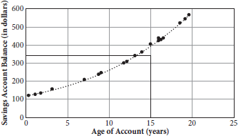
Most chickens reach maturity and begin laying eggs at around 20 weeks of age. From this point forward, however, as the chicken ages, its egg production decreases. A farmer was given a flock of 100 chickens (all of which were the same age) and asked to measure daily egg output for the entire flock at random intervals starting at maturity until the chickens were 70 weeks old. The data are recorded in the scatterplot below and the line of best fit has been drawn.
Based on the line of best fit, what is the predicted number of eggs that will be produced by the flock when it is 33 weeks past maturity?
33
50
58
64
How many times did the farmer’s data differ by more than 5 eggs from the number of eggs predicted by the line of best fit?
Page 211
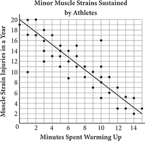
The scatterplot above shows the number of minor muscle strain injuries sustained in a year by athletes, plotted against their self-reported amount of time spent stretching and doing other warm-up activities before engaging in rigorous physical activity. Which of the following best estimates the average rate of change in the number of injuries compared with the number of minutes spent warming up?
−1.2
−0.8
2
20
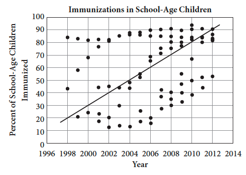
The graph above shows the percent of school-age children in the United States who received immunizations for various illnesses between 1996 and 2012. What was the average rate of increase in the percent of children immunized per year over the given time period?
5 percent per year
10 percent per year
25 percent per year
70 percent per year
Page 212
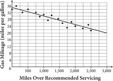
A car manufacturer compiled data that indicated gas mileage decreased as the number of miles driven between recommended servicing increased. The manufacturer used the equation
to model the data. Based on the information, how many miles per gallon could be expected if this particular car is driven 3,400 miles over the recommended miles between servicing?
Page 213
Scatterplot Modeling
To solve a question like this:
Given that a, b, and c are constants and that a > 0,which of the following is the equation for the line of best fit for the above scatterplot?
y= ax + b
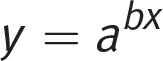
y = abx
y = −ax2 + bx + c
y = ax2 + bx + c
You need to know this:
There are several patterns that are common forms for the line of best fit. Scatterplots are typically constructed
so that the variable on the x-axis is the independent variable (input) and the variable on the y-axis is the dependent variable (output). The equation for the line of best fit quantifies the relationship between the variables represented by the two axes. The patterns that you are most likely to encounter on the SAT are shown in the table below.
Best Fit Description
Relationship Between Variables
Upward-sloping straight line
Linear and positive
Downward-sloping straight line
Linear and negative
Upward-opening parabola
Quadratic with a positive coefficient in front of the squared term
Downward-opening parabola
Quadratic with a negative coefficient in front of the squared term
Upward-sloping curve with an increasing slope
Exponential and positive (e.g., compound interest)
Downward-sloping curve with a flattening slope
Exponential and negative (e.g., radioactive decay)
Page 214Here are visual representations of linear, quadratic, and exponential models:
You need to do this:
Examine the line of best fit (draw it in, if necessary) and determine its curvature.
If the line of best fit is straight, the scatterplot represents a linear relationship and the correct answer choice will not contain any exponents. It will likely be in slope-intercept form, y = mx + b.
If the line of best fit is a parabola, the correct answer will be in the form of a quadratic equation, . If the parabola opens downward, a will be negative; if upward, a will be positive. (Chapter 12 presents more detailed information about parabolas, but this will suffice for now.)
If the line of best fit starts with a gradual rate of change that steepens over time, the correct answer will represent an exponential relationship in the form .
Explanation:
The line of best fit for this scatterplot is curved, so it is not a straight line as would be created by the linear equation y = ax + b. Eliminate (A).
The exponential equation would result in a curve that opens upward in one direction. The line of best fit of the scatterplot opens upward in two directions, so (B) is incorrect.
Quadratic equations create parabolas when graphed, but the negative coefficient of the x2 term means that (C) would be a downward-opening parabola rather than the upward-opening parabola of the scatterplot. Thus, (D) is correct since that equation would be graphed as an upward-opening parabola.Page 215
Try on Your Own
Directions: Take as much time as you need on these questions. Work carefully and methodically. There will be an opportunity for timed practice at the end of the chapter.
Which of the following is best modeled using a linear regression equation, y = ax + b, where a < 0 ?
Adriana used the data from a scatterplot she found on the U.S. Census Bureau’s website to determine a regression model showing the relationship between the population in the area where she lived and the number of years, x, after she was born. The result was an exponential growth equation of the form y = x0(1 + r)x. Which of the following does x0 most likely represent in the equation?
The population in the year that she was born
The rate of change of the population over time
The maximum population reached during her lifetime
The number of years after her birth when the population reached its maximum
Suppose a scatterplot shows a weak negative linear correlation. Which of the following statements is true?
The slope of the line of best fit will be a number less than −1.
The slope of the line of best fit will be a number between −1 and 0.
The data points will follow, but not closely, the line of best fit, which has a negative slope.
The data points will be closely gathered around the line of best fit, which has a negative slope.
Page 216
A drain at the bottom of a cylindrical water tank is opened and the height of the water is measured at regular time intervals. The tank is refilled and the process is then repeated. The scatterplot above shows the measured height on the y-axis and time on the x-axis for the two trials. Which of the following conclusions can be drawn from the observations in the scatterplot?
Water flows out of the drain at a constant rate.
The flow rate from the tank decreases as the height of the water in the tank decreases.
The drain is inefficiently designed.
The is no relationship between the height of the water in the tank and time.
Page 217
How Much Have You Learned?
Directions: For testlike practice, give yourself 15 minutes to complete this question set. Be sure to study the explanations, even for questions you got right. They can be found at the end of this chapter.
The Human Resources department of a company tracks employee sick day usage to see if there are patterns. One of the HR representatives decides to check employee sick day usage against outside temperature. He compiles the information for the employees’ sick day usage and temperature in the scatterplot above. Which of the following conclusions can he draw based on this data?
There is no relationship between the number of sick days used by employees in general and outside temperature.
There is no relationship between the number of sick days used by this company’s employees and outside temperature.
No conclusions can be drawn about the number of sick days used by this company’s employees and outside temperature.
There is a relationship, but not a causal link, between the number of sick days used by this company’s employees and outside temperature.
Scientists plotted data for two animal populations on a scatterplot: population A, which they graphed along the x-axis, and population B, which they graphed along the y-axis. The data showed a strong negative correlation. Which of the following statements is justified?
The rise in population A caused the decline in population B.
The decline in population B caused the rise in population A.
Because the correlation is negative, there cannot be causation between the two populations.
The rise in population A is correlated to the decline in population B, but causation is unknown.
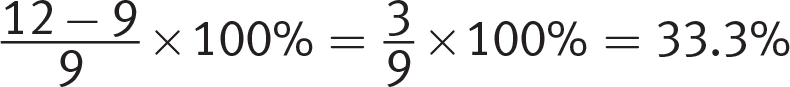
By what percent does the y-coordinate of the data point (12, 12) deviate from the y-value predicted by the line of best fit for an x-value of 12 ? (Ignore the percent sign and grid your response to the nearest percent.)
Page 219
The scatterplot below compares the average gasoline prices in Boston, per gallon, to the average gasoline prices across the United States, per gallon, during a one-year period from 2017 to 2018.
Of the following equations, which best models the data in the scatterplot?
y = −1.7848x + 0.5842
y = 1.7848x + 1.5842
y = 0.7848x + 0.5842
y = −0.7848x + 0.5842
A physics professor presented the scatterplot above to her first-year students. What is the significance of the slope of the line of best fit?
The slope represents the rate at which time spent on an exam increases based on a student’s exam performance.
The slope represents the average grade on the exam.
The slope represents the rate at which a student’s exam grade increases based on time spent on the exam.
The slope has no significance.
Which of the following is the most accurate statement about the scatterplot above?
The data in the scatterplot has a weak positive correlation.
The data in the scatterplot has a strong positive correlation.
The data in the scatterplot has a negative correlation.
There is no correlation in the data set.
Page 220
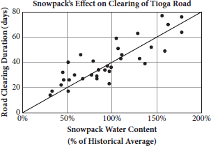
Questions 17 and 18 refer to the following information.
Tioga Road is a mountain pass that crosses the Sierra Nevada through northern Yosemite National Park. The road is closed from about November through late May. This time period can change depending on the quantity and nature of the season’s snowfall, as well as unforeseen obstacles such as fallen trees or rocks. The scatterplot above compares the snowpack water content on April 1 (for years 1981–2014) as a percent of the historical average to the time it takes the National Park Service to fully clear the road and open it to traffic.
For every 5 percent increase in snowpack water content, how many more days does it take the National Park Service to clear Tioga Road?
Assuming no unforeseen obstacles or machinery issues, if the road’s snowpack water content on April 1 is 248 percent of the historical average, based on the prior experience shown on the graph, how many days will it take to fully clear Tioga Road?
Page 221Which of the following scatterplots shows a relationship that is appropriately modeled with the equation y = −ax2 + bx − c, where a and c are negative and b is positive?
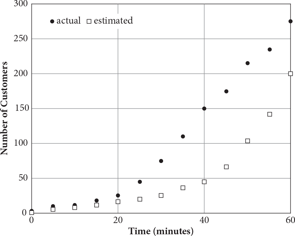
The scatterplot above shows the actual and estimated number of customers visiting a new shopping plaza within the first hour of opening. Which of the following statements correctly compares the rates of increase for the actual and estimated numbers of customers?
The rate of increase for the actual number of customers is greater than that of the estimated number in every 20‑minute interval.
The rate of increase for the actual number of customers is less than that of the estimated number in every 20-minute interval.
The rate of increase for the actual number of customers is greater than that of the estimated number in the interval from 20 to 40 minutes and less in the interval 40 to 60 minutes.
The rate of increase for the actual number of customers is less than that of the estimated number in the interval from 20 to 40 minutes and greater in the interval 40 to 60 minutes.
Page 222
Reflect
Directions: Take a few minutes to recall what you’ve learned and what you’ve been practicing in this chapter. Consider the following questions, jot down your best answer for each one, and then compare your reflections to the expert responses on the following page. Use your level of confidence to determine what to do next.Page 223
What is the significance of a scatterplot’s line of best fit?
Given a scatterplot and a line of best fit, how can you tell whether the line of best fit is an accurate one?
What are the three most common patterns for modeling scatterplots that you’ll see on test day?
Expert Responses
What is the significance of a scatterplot’s line of best fit?
The line of best fit describes the relationship between the two variables of the scatterplot. For example, if the line of best fit is linear and has a positive slope, then the two variables have a linear and positive relationship: as one variable increases, the other one also increases and at a constant rate.
Given a scatterplot and a line of best fit, how can you tell whether the line of best fit is an accurate one?
A line of best fit should be drawn such that approximately half the points are above it and half are below it.
What are the three most common patterns for modeling scatterplots that you’ll see on test day?
Most test day scatterplots can be modeled by a linear (y = mx + b), quadratic (y = ax2 + bx + c), or exponential (y = abx + c) relationship.
Next Steps
If you answered most questions correctly in the “How Much Have You Learned?” section, and if your responses to the Reflect questions were similar to those of the SAT expert, then consider scatterplots an area of strength and move on to the next chapter. Come back to this topic periodically to prevent yourself from getting rusty.
If you don’t yet feel confident, review those parts of this chapter that you have not yet mastered, then try the questions you missed again. In particular, make sure that you feel comfortable extrapolating data from a line of best fit. As always, be sure to review the explanations closely.Page 224
Answers and Explanations
C
Difficulty: Easy
Getting to the Answer: In this case, you merely need to match the y-value on the line of best fit with the x-value of 33, since the x-axis of the graph represents the number of weeks after maturity. Take care to use the line of best fit rather than an individual point on the graph; (B) is a trap answer. At x = 33, the y-value of the line of best fit seems to be just shy of 60. Thus, (C) is correct.
2
Difficulty: Easy
Getting to the Answer: Examine the graph, including the axis labels and numbering. Each vertical grid line represents 5 eggs, so look to see how many data points are more than a complete grid space away from the line of best fit. Only 2 data points meet this requirement—the first data point at about 3 weeks and the one between 30 and 35 weeks, making 2 the correct answer.
A
Difficulty: Medium
Getting to the Answer: Examine the graph, paying careful attention to units and labels. The average rate of change is the same as the slope of the line of best fit. The data is decreasing (going down from left to right), so eliminate (C) and (D). To choose between (A) and (B), find the slope of the line of best fit using the slope formula,, and any two points that lie on (or very close to) the line. Using the two points (5, 14) and (10, 8), the average rate of change is about , which matches (A).
A
Difficulty: Easy
Getting to the Answer: The question asks for a rate of change, which means you’ll need the slope of the line of best fit. Pick a pair of points to use in the slope formula, such as (1998, 20) and (2012, 90):
Choice (A) is correct.
18
Difficulty: Medium
Getting to the Answer: Because the y-value of the graph when x = 3,400 is not shown, this question requires a mathematical solution; extending the line of best fit will not provide an accurate enough answer. The equation of the model is given as . Miles over recommended servicing are graphed along the x-axis, so substitute 3,400 for x to find the answer:
Grid in 18.
C
Difficulty: Easy
Getting to the Answer: A regression equation is the equation of the line (or curve) that best fits the data. A linear regression is used to model data that follows the path of a straight line. In the equation given, a represents the slope of the linear regression (the line of best fit), so you are looking for data that is linear and is decreasing, or falling from left to right, which happens when a is negative, or as the question states, when a < 0. You can eliminate (A), which is a quadratic curve, and (D), an exponential curve. You can also eliminate (B) because it is increasing (rising from left to right) instead of decreasing (falling from left to right). (C) is correct.
A
Difficulty: Easy
Getting to the Answer: When an exponential equation is written in the form y = x0(1 + r)x, the value of x0 gives the y-intercept of the equation’s graph. To answer this question, you need to think about what the y-intercept would represent in the context described.
Whenever time is involved in a relationship that is modeled by an equation or a graph, it is almost always the independent variable and therefore graphed on the x-axis. Therefore, for this question, population would be graphed on the y-axis, so x0 most likely represents the population when the time elapsed was zero, or in other words, in the year that Adriana was born, making (A) correct.
Page 225
C
Difficulty: Medium
Getting to the Answer: “Correlation” simply means relationship. The word “weak” refers to the strength of the relationship (how close the data lies to the line of best fit), which has no effect on slope. Be careful not to confuse slope and strength. The fact that a data set shows a weak correlation does not give you any information about the magnitude of the slope. This means you can eliminate (A) and (B). Also, keep in mind that the terms “weak” and “negative” are not related, but rather are two independent descriptors of the correlation. So the fact that the rate of change is negative has nothing to do with the strength of the correlation. In a weak correlation, the data points will loosely follow the line of best fit, which makes (C) the correct answer.
B
Difficulty: Easy
Getting to the Answer: A line of best fit for the scatterplot would show that the measured height of the water decreases over time, but the slope becomes less steep over time, too. The slope, change in height divided by change in time, represents the flow rate of water out of the tank. Since the flow changes as the height of the water changes, (A) is incorrect. Because the slope of the line of best fit becomes less steep as the height of the water decreases, it follows that the flow rate decreases as the height of the water decreases. (B) is correct. (D) is incorrect because the height of the water decreases (though at an ever slower rate) as time progresses, so there is a relationship between the height of the water and time. (C) is incorrect because the data presented doesn’t imply anything about the efficiency of the drain design.
D
Difficulty: Medium
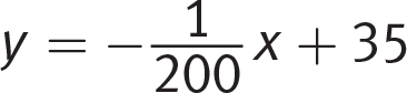
Strategic Advice: Lines of best fit only approximate trends based on a given data set.
Getting to the Answer: In the line of best fit equation that the students calculated, the initial principal is $120, but that does not necessarily mean that all of the account holders had that much in the account initially. Eliminate (B).
To test (A) and (D), sketch in the line of best fit:
Notice that the line of best fit, which is based on an initial principal of $120, is definitely above $350 at the 15 year mark, so (D) is correct. Since the line of best fit is exponential, not linear, there will not be a consistent difference between the 10% annual rate and 8% annual rate, which makes (C) incorrect.
B
Difficulty: Medium
Category: Scatterplot Modeling
Getting to the Answer: There are two things to keep in mind for a question like this: correlation does not prove causation, and as a general rule, conclusions can be drawn only about the population studied, not about all populations. The population in the study is only the employees at the company, not all employees in general, so eliminate (A). The data points are scattered and do not form any discernible pattern. This means there is no correlation, which is another way of saying the two variables aren’t related, so you can eliminate (D). You can also eliminate (C) because the HR representative is able to draw a conclusion—that there is no relationship. Therefore, (B) is correct.Page 226
D
Difficulty: Medium
Category: Scatterplot Modeling
Getting to the Answer: The fact that the two variables are strongly correlated, whether it be negatively or positively, shows only that there is a relationship between the variables. It does not indicate whether the change in one variable caused the change in the other. For example, population A might thrive in wet climates, while population B does not, and in the years studied, rainfall may have increased, which caused the changes in the populations. Eliminate (A) and (B). Conversely, the negative correlation does not discount the possibility of causation; rather, the data does not allow you to draw a conclusion about causation, so eliminate (C). This means (D) is the correct answer.
33
Difficulty: Medium
Category: Line of Best Fit
Getting to the Answer: The point (12, 12) is three full grid lines away from the line of best fit, which goes through (12, 9). To find the percent difference between the expected and actual y-values, use the percent change formula. Note that the phrasing of the question indicates that the original value to use is 9, the y-value on the line of best fit: . Grid in 33.
C
Difficulty: Medium
Category: Scatterplot Modeling
Strategic Advice: For scatterplot questions, it is important to determine whether using logic or plugging in values is more efficient.
Getting to the Answer: Notice that the answer choices involve very precise coefficients, which is a good indicator that logic is the best way to get to the correct answer. The slope of the line of best fit is positive, so eliminate (A) and (D), which have negative slopes. It is also important to note that the lower-left corner of the graph is not the origin, which means that the y-intercept needs to be extrapolated. With only two choices left, you can test only one of them. If the equation you test works, then it is correct. If the equation you test does not work, the other is correct. To test (B), choose one of the values from the scatterplot that is close to the line of best fit, for example (2.7, 2.7). Plugging 2.7 in for x should mean that y = 2.7, but with the equation in choice (B) you get:
This does not match the coordinate point, so (C) is correct.
C
Difficulty: Medium
Category: Line of Best Fit
Getting to the Answer: The slope of a line is always a rate of change of some sort, so you can eliminate (B) and (D). The graph indicates that time spent on the exam is the independent variable, so exam performance depends on it. The choice that correctly describes this relationship is (C).
C
Difficulty: Medium
Category: Scatterplot Modeling
Strategic Advice: Correlation refers to how closely the values on the scatterplot match the line of best fit.
Getting to the Answer: Since correlation is related to the best-fit line, it is important to sketch one on the graph. Here’s a rough approximation:
A strong correlation means that the data points are closely gathered around the line of best fit; a weak correlation means that the data points are farther from the line of best fit. The line of best fit has a definite negative slope, so eliminate (A) and (B). When there is no correlation, the data set is distributed evenly over the entire graph, but that is not the case here, so (D) can be eliminated as well. (C) is correct.Page 227
2
Difficulty: Medium
Category: Line of Best Fit
Getting to the Answer: You’re asked for a rate; this means finding the slope of the line of best fit. Start by picking a pair of points, preferably where the line of best fit passes through a grid line intersection to minimize error. The points (0, 0) and
(50, 20) are good choices to make the calculation easy. Determine the slope:
Don’t grid in , though. Remember what you’re being asked: you need the road clearing duration increase for a 5% increase in snowpack water content, not a 1% increase. Therefore, multiply
by 5, which yields 2. Grid in 2.
99.2
Difficulty: Medium
Category: Line of Best Fit
Getting to the Answer: The slope you found in the previous question will save you some time here. The line of best fit on the scatterplot intersects the y-axis at (0, 0). Therefore, the equation of the line of best fit is . Plug 248 in for x and simplify:
The road clearing time at 248% snowpack water content will take 99.2 days.
D
Difficulty: Medium
Category: Line of Best Fit
Strategic Advice: Think about how the graphs of different equations look and eliminate the choices that don’t match.
Getting to the Answer: Sketch in the lines of best fit for the answer choices. (A) and (D) are parabolas that open up, (B) is a parabola that opens down, and (C) is an exponential curve. The equation that needs to be modeled is y = −ax2 +bx − c, which is quadratic and graphs as a parabola. Eliminate (C). Pay careful attention to the details “a and c are negative and b is positive.” The coefficient in front of the x2 term determines whether the parabola opens up or down. The negative sign in front of the a multiplies by the negative value for a to create a positive coefficient in front of the x2 term, which means that the parabola opens up. Eliminate (B). Finally, the c coefficient in the equation determines the y-intercept for the graph. Again, the negative sign in front of c multiplies by the negative value for c to create a positive y-intercept. Eliminate (A) because the best-fit parabola has a negative y-intercept. (D) is correct.
C
Difficulty: Hard
Category: Scatterplot Modeling
Getting to the Answer: For every 20-minute interval, draw a line of best fit through the data for the actual number of customers and similarly for the estimated number of customers. Then compare the slopes of the lines of best fit for actual and estimated for each 20-minute interval to compare the rates of increase.
In the interval from 0 to 20 minutes, the slope of the line of best fit for the actual number of customers is slightly greater (steeper) than that of the estimated model. In the interval from 20 to 40 minutes, the slope of the line of best fit for the actual data is greater than that of the estimated data. In the interval from 40 to 60 minutes, the slope of the line of best fit for the actual data is less than that of the estimated data. Thus, (C) is correct.


 model the data in the scatterplot above?
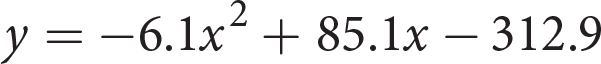
 , a determines whether the parabola opens upward or downward and c is the y-intercept. When a > 0, the parabola opens upward, so (C) is correct. (D) is a quadratic equation, but a < 0, so this equation would graph as a parabola that opens downward.Page 207
 . Next, find the y-intercept. Using the point (10, 18) and plugging those values into slope-intercept form yields 18 = 1.75(10) + b. Thus, b = 0.5 in the dachshund example. So the equation in slope-intercept form is length = (1.75 × height) + 0.5.

 to model the data. Based on the information, how many miles per gallon could be expected if this particular car is driven 3,400 miles over the recommended miles between servicing?
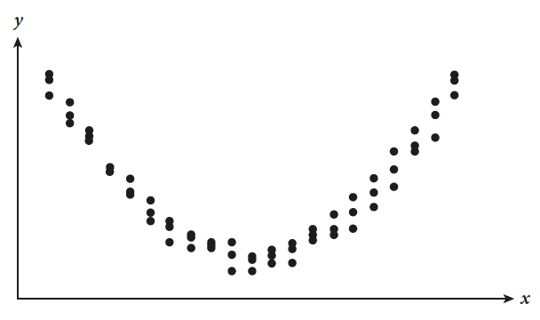

 . If the parabola opens downward, a will be negative; if upward, a will be positive. (Chapter 12 presents more detailed information about parabolas, but this will suffice for now.)
 .
. would result in a curve that opens upward in one direction. The line of best fit of the scatterplot opens upward in two directions, so (B) is incorrect.


 (Data source: www.nps.gov/yose/planyourvisit/tiogaopen.htm)


 , and any two points that lie on (or very close to) the line. Using the two points (5, 14) and (10, 8), the average rate of change is about
  , which matches (A).
 . Miles over recommended servicing are graphed along the x-axis, so substitute 3,400 for x to find the answer:
 . Grid in 33.
 , though. Remember what you’re being asked: you need the road clearing duration increase for a 5% increase in snowpack water content, not a 1% increase. Therefore, multiply
  by 5, which yields 2. Grid in 2.
 . Plug 248 in for x and simplify: