3.1. Introduction
Statistics provides various techniques and tools to support quality management and production processes analysis (e.g., for monitoring efficiency levels and improvements obtained). These techniques allow to highlight the most important aspects of the data available and to reach quantitative conclusions from (large) sets of data.
Descriptive statistics refers to the techniques, used in statistics, to describe data. Inferential statistics refers instead to the methods used to get information about a population from a sample (i.e., sub-set) of it and to quantify the reliability of such information. Information drawn from a sample can in fact refer to the whole population of interest with a certain degree of uncertainty. It is therefore worth to use language and methods of probability, that is, the branch of mathematics that allows to deal with uncertainty.
In this chapter, the main ideas related to the statistical tools helpful in quality management will be briefly presented. For an extended discussion, it may be useful to refer to the numerous statistics textbooks (e.g., Box, Hunter, & Hunter, 1978; Johnson, Miller, & Freund, 2000, Montgomery, 2017; Navidi, 2008; Ross, 2014).
Statistical analysis requires appropriate software tools. Most of the basic techniques can be applied using a simple spreadsheet. However, it is often easier to use statistical software, in which both basic techniques and more sophisticated procedures are available. Among the many existing statistical software, an interesting option is R (see www.r-project.org), that is, an open source software, extremely powerful and versatile, which is increasingly growing in popularity. Detailed information about this tool can be found in many textbooks (such as Hothorn & Everitt, 2004), as well as in the website of the software https://cran.r-project.org/manuals.html). As far as commercial software is concerned, the most widespread tools are SPSS and STATA (see Field, 2009, and Acock, 2018, respectively, for a detailed presentation of these tools).
3.2. Descriptive Statistics
Basic techniques for data description include summary statistics and graphical representations. The analysis is usually limited to the application of simple methods, but there are also sophisticated descriptive techniques that can be applied to datasets with a complex structure.
The description of the data available should be the first step of any analysis and requires significant attention.
3.2.1. Summary Statistics
Available data are measured starting from the observation of some statistical units, such as the products of a production plant or a production line. These units often represent a sample, which is a subset of randomly extracted units (i.e., without favoring any unit compared to the others) from a much larger set called population or universe. The sample size is usually indicated with n, which represents the number of statistical units available for data collection. Some variables are detected from the statistical units, and they are usually denoted with uppercase letter, such as X, Y, Z. Variables can be numerical or qualitative. We refer to values (or modalities, for qualitative variables) detected in the sample of a certain variable Y with y1, …, yn.
Statistics is defined as a function of the sampled data. We also call statistics all the quantities used for the description of the data.
The position indexes identify a representative value for the whole sample, according to an appropriate criterion. The most used measure is the average

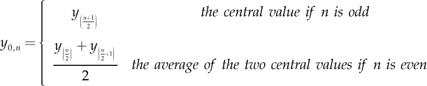
Another position index is the median, which requires the reorganization of the sample, placing the observations in ascending order
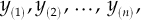
where y(1) denotes the smallest observation of the sample, y(2) the second one, and so on, until the highest observation of the sample y(n). The sample median is defined as follows:
Unlike the average, the median is not influenced by abnormal observations (also called outliers), which are often present in samples, and constitutes therefore a robust statistic.
The median divides the sample into two equal subsets. More information about the sample can be identified considering additional position indices. Quartiles divide sample into four equal parts, while pth percentile (or quantile) (with 0 < p < 100) indicates the value below which a given percentage of observations in a group of observations may be found. For example, the 10th percentile (quantile) is the value (or score) below which 10% of the observations may be found.
The dispersion indexes are another important category of statistics, which describe the degree of heterogeneity existing between sampled observations. The most used index is the sample variance
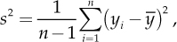
or its square root, the standard deviation  , which is expressed in the same measurement unit of the variable itself (Y). Both s2 and s are null in total absence of variability in sampled data
  . Otherwise, they both assume higher values when observations are more different from the sample average.
Other dispersion indexes are the interquartile range (IQR), equal to the difference between the 75th and the 25th percentiles (IQR = y0.75 – y0.25) and the range of variation (or range), equal to the difference between the highest and the lowest values in the sample (range = y(n) – y(1))
The statistics presented above are defined for numeric variables. For qualitative variables, other statistics can be used. The most important one is the frequency distribution. If Y is a qualitative variable (or factor) with K possible categories (modalities), the frequency distribution is given by the values ni, i = 1, ..., K containing the number of sample observations showing the i-th category. The values ni are the absolute frequencies, while the relative frequencies are given by fi = ni/n. When categories can be sorted (i.e., a sorting criterion is available), the absolute and relative cumulative frequencies can be defined, respectively, as  and
and  .
.
Frequency distributions can also be defined for numerical variables, after splitting data into K classes.
3.2.2. Graphical Representations
The graphical representation of data is a very important phase of the statistical analysis, because valuable information can usually be drawn from it. In other words, visualizing data is essential to get an idea of the studied phenomenon. With the evolution of calculation tools, the visualization of data guided by statistical principles has become a discipline (see e.g., Cleveland, 1993; Wilkinson, 1999).
In this chapter, we will briefly present some useful charts for the quality control. These charts can be developed using open-source as well as commercial software (e.g., R, SPSS, STATA, and Microsoft Excel). In R, there are many libraries of tools for graphical representation, also suitable for large data sets.
As far as qualitative data are concerned, the frequency distribution is usually graphically represented. In general, the most common representation of frequency distributions is the pie chart. In quality management, the Pareto diagram, is however considered more effective. This diagram represents the relative frequency of each category (sorting the categories in descending order of frequency) and the cumulative relative frequencies.
A simple example is the representation of the frequencies of the failures occurring in a certain amount of time to a production plant, classified into four categories (A, B, C, and D). The Pareto diagram (available in R in the QCC Library) is shown in Fig. 3.1 (na = 22, nb = 45, nc = 17, and nd = 51).
The most commonly used chart to represent numerical data is the histogram. For its realization, observed data are divided into K classes, identified by K ranges whose amplitude is not necessarily constant. The relative frequencies of each class are calculated and represented in the graph with rectangles whose height (y-axis) is equal to the frequency density, defined as the ratio between the relative frequency and the amplitude of the range, or to the relative frequency.
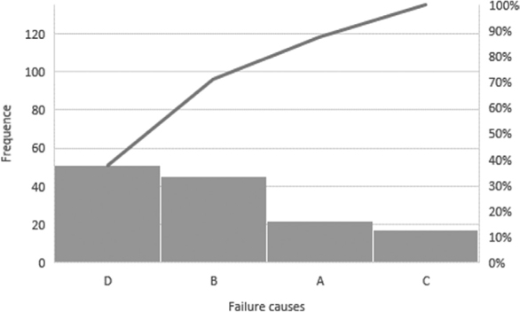
Fig. 3.1: Pareto Diagram.
An example is provided in Fig. 3.2, where a histogram is used to represent data referring to the age of a sample of 30 employees of a company (divided into four classes: 16–29 years, 30–42 years, 43–55 years, and 55–68 years).
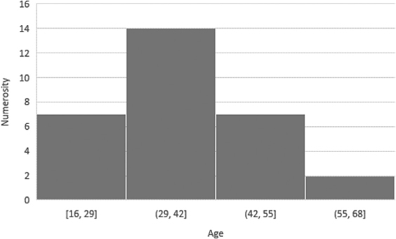
Fig. 3.2: Histogram.
The boxplot (or box and whiskers chart) is an alternative way to synthetically represent data about a numeric variable. The boxplot displays a rectangle (box) that extends between the first and the third quartile (the median is also highlighted by a line within the box and the average by a cross, i.e., “x”). Two segments, called whiskers, extend beyond the ends of the box, to a distance chosen according to a certain criterion. In most software (e.g., R), the lower whisker extends to the first quartile minus 1.5 IQR (y0.25 − 1.5 IQR) or to the lowest observation (if higher than y0.25 − 1.5 IQR), while the upper whisker extends to the third quartile plus 1.5 IQR (y0.75 + 1.5 IQR) or to the highest observation (if lower than y0.75 + 1.5 IQR) (Tukey, 1977). The points (if any) over or under the whiskers (outliers) are also represented in the boxplot.
The boxplot is a very effective chart, especially for comparative purposes, that is, when there is a need to compare data from distinct groups of units. Fig. 3.3 shows the boxplots of the breakages during the weaving obtained in the production of wool yarns with three distinct levels of stress for the frames (low, medium, and high).1 For each stress level, 18 observations are available, displayed in the three boxplots: it is easy to notice that the median level of the breakages and the dispersion of the data decrease as the stress level increases.
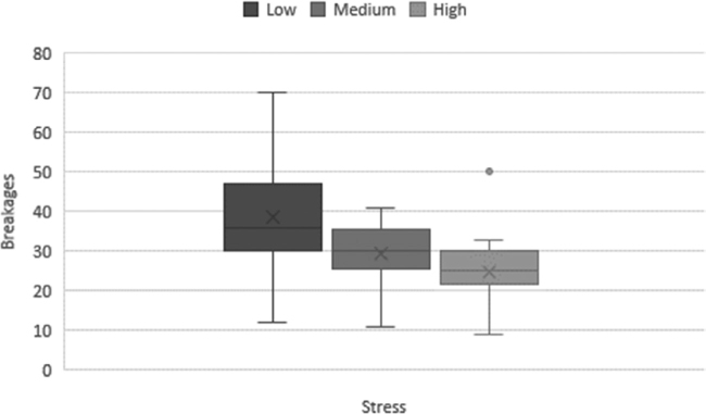
Fig. 3.3: Boxplot.
A final graphical representation is the dispersion diagram (scatter plot), which represents on a cartesian plane the relationship between two numeric variables of the same statistical unit. Fig. 3.4 shows the scatter plot of the speed and the braking distance measured on a sample of cars circulating in 1920s.2 The chart shows that the braking distance increases as the speed increases, according to a roughly linear relationship.
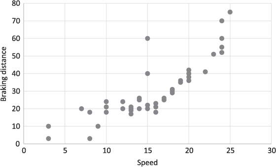
Fig. 3.4: Scatterplot.
The scatter plot is usually associated with the calculation of the correlation coefficient that quantifies the intensity of the linear relationship between the two variables. If X and Y are the variables, the index is defined as
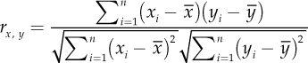
The correlation coefficient ranges between −1 and +1 (−1 ≤ rx, y ≤ 1). A correlation coefficient equal to 0 means that there is no linear relationship between the two variables. A correlation coefficient equal to +1 or −1 indicates instead a strong positive or negative linear correlation, that is, a perfect alignment of points along a line with negative or positive gradient (depending on the sign). In the example reported in Fig. 3.4, the correlation coefficient is equal to 0.81, underlining a strong positive linear connection between the speed of the car and the braking distance.
Finally, in case of more than two numeric variables, it is possible to consider all the possible couples of variables and develop a series of dispersion diagrams and of correlation indexes, usually collected in a correlation matrix.
3.3. A Fundamental Mathematical Tool: Probability
Probability is the branch of mathematics that provides tools for dealing with uncertainty. We present in this section only a few main concepts, to introduce the notation used in this chapter. A more detailed presentation about the topic can be found in the statistics textbooks mentioned in the introduction.
P(A) indicates the probability of an event of interest (A). A key concept is the one of random variable, which summarizes in numerical terms the result of a random experiment, that is, any process with uncertain outcomes. We use uppercase letters for random variables and lowercase letters for their observed values. Y denotes therefore, for example, a random variable and y its observed value. Each random variable Y has its probability distribution. If Y is a discrete variable, the distribution is defined by the probability function P(y), that is, P (Y = y), while if Y is a continuous variable, it is described by the probability density f(y). These functions are used to calculate probabilities of events related to Y, such as probability of P(Y≤ y) (with y ∈ R).
Two important quantities are the expected value (or average) and the variance of Y, defined for a continuous variable as follows:
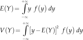
For discrete variables, P(y) is used instead of f(y) and the integral is replaced by the sum extended to all values that Y can assume.
The expected value (mean) is a central trend measure, while the variance summarizes the variability of the distribution.
The probability distributions are fundamental for statistical modeling. Subsequently, we will present the most important ones used in quality management.
3.3.1. Some Probability Distributions
The three most important discrete probability distributions are the Bernoulli, Binomial, and Poisson distributions.
A random Bernoulli variable is suitable to describe the result of an experiment with only two possible results, conventionally called “success” (1) and “failure” (0). If p is the probability of success, when a random variable Y has a Bernoulli distribution, it is indicated as Y ~ B (1, p). This notation reminds that Bernoulli random variable is a particular type of binomial random variable, which describes the number of successes obtained in n independent experiments, all with the same probability of success p.
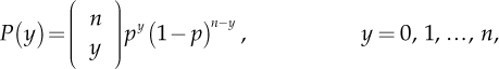
A random variable Y with Binomial distribution, synthetically Y ~ B (n, p), has the following probability function:
where 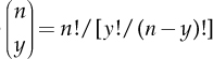 indicates the binomial coefficient.
Expected value and variance are E(Y) = n p and V(Y) = n p (1−p), respectively.
A classic example of a variable with a binomial distribution in quality management is the number of defective elements (e.g., products) in a random sample of n elements. Here, p represents the portion of defective elements related to the production process studied and it is a quantity of great interest.
The binomial distribution assumes that the extracted objects are reinserted in the sample before the subsequent extraction (extraction with reinsertion). However, this distribution can also be used for extractions without reinsertion. In this case, the binomial distribution is an approximate model, but it is possible to verify that a small error is committed.
Poisson distribution is suitable for a variable Y that is defined as the result of a time or space count operation. It is indicated with Y ~ P (λ) and the probability function is
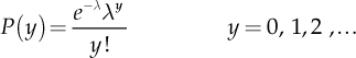
where λ represents the expected value of the random variable as well as its variance, that is, E(Y) = V(Y) = λ. A typical application of the random Poisson variable in quality management is a model for the distribution of the characteristics that do not conform to the specifications in a unit of product.
The most important continuous distribution is the Normal or Gaussian distribution, with the following probability density function:
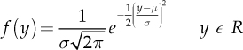
depending on the two parameters μ ∈ R and σ > 0. The notation is Y ~ N (μ, σ2), where E(Y) = μ and V(Y) = σ2.
The graph of f(y) is the normal curve, shown in Fig. 3.5.
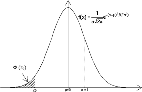
Fig. 3.5: Normal Density Function with the Calculation of Φ(Z0). Source: Tomi and Pierpao (2017).
The probability density of the normal distribution is defined for y ∈ R, but this does not imply that the distribution is not suitable for physical quantities which can only be positive. In fact, if Y ~ N (μ, σ2), P(µ − 3σ ≤ Y ≤ µ −3σ) ≈ 0.997; this means having all or almost all the values assumed by the variable in an amplitude range of ±3σ around the average.
The probability calculation for the normal distribution requires standardization techniques, which take advantage from the fact that Z = (Y−µ)/σ ~ N(0, 1) (also called standard normal distribution). Therefore,
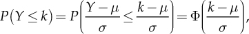
where Φ(•) is the cumulative distribution function of Z, that is, Φ(z) = P(Z ≤ z), as shown in Fig. 3.5. The values of Φ(•) are calculated using statistical software or tables (the so-called standard normal distribution tables). The breakdown function is linked with the percentile calculation of α level. Zα indicates the value for which Φ(zα) = α, with 0 < α < 1. It is also easy to verify that the level percentile α of Y is given by yα = μ + σzA.
An important property of normal distribution is that linear combinations of random variables are also normally distributed. In particular, if y1,...,yn are independent random variables with normal distribution N(μ, σ2), the random variable sample average  is equal to
If Yi, i = 1, ..., n are instead independent and identically distributed (i.i.d.) with any distribution, the distribution of  , becomes increasingly closer to a normal distribution with E(Yi) = µ and V(Yi) = σ2 as the number n of variables becomes larger (central limit theorem).
The normal distribution is linked to a series of distributions that are usually not used as a mathematical model for random phenomena but play a key role in statistical inference. Among these, we quote the chi-square distribution and the Student’s t distribution which depend on a positive integer parameter v called degrees of freedom. The Student’s t distribution looks like the standard normal distribution when v is high (e.g., for v = 30 the two density functions look the same).
A further important distribution is the F of Fisher, which is defined for positive values and depends on two positive integer parameters, degrees of freedom in numerator (dfn) and degrees of freedom in denominator (dfd).
Finally, a key role in quality management is occupied by the lifetime distributions, suitable for shaping the lifetime of mechanical or electronic devices. The main lifetime distributions are the exponential distribution, the gamma distribution, and the Weibull distribution.
3.5. Basic Techniques for Statistical Inference
This section will describe through a simplified example how statistical methods can be used in quality management.
A machine is used to fill vessels with a liquid. In each vessel, the machine must pour exactly 25 cl (centiliter) of liquid, with a tolerance of ±0.5 cl. To verify the correct operation of the machine, five vessels are randomly extracted, and their content is measured. Their content is 25.39 cl, 25.33 cl, 25.19 cl, 25.43 cl, and 25.17 cl, respectively.
To analyze these data, we consider the contents of the vessels as determined by random experiments, and the quantity of liquid that the machine pours in the vessel as a continuous random variable with density function f(•). In other words, we try to understand using the collected sample whether the density function f(•) gives an excessive probability to the malfunction of the machine (i.e., a container whose content is not within the range 25 ± 0.5 cl).
Indicating with Y1, Y2, ..., Y5 random variables that describe the contents of each filled vessel and knowing that:
(1) there is no dependency between the Yi i =1, …, 5;
(2) Yi has the same probability distribution; and
(3) this distribution is well approximated by a normal distribution with average µ and variance = 0.01, where µ is an unknown parameter.
In other words, we are in presence of i.i.d. values from the same random variable Y.
This statistical model represents a concise and operative description aimed at a specific objective of a much more complex reality. Since the model is not the reality represented, it is certainly wrong (i.e., not able to fully represent the complexity of the reality), but it is still useful for the specific objective, Box, 1976).
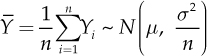
Considering this model, we can say that the density function is almost completely specified, since only the parameter µ is unknown. The first goal is therefore to obtain an estimation of this parameter µ. The arithmetic average of the observed data is a good estimation. In the example, the arithmetic average of the observed data is ȳ 25.302 cl.
Based on the estimated density function, it is possible to quantify the proportion of poorly filled vessels. The two events of interest are the following:
(1) the fact that a vessel has been filled too much, that is, Y > 25.5 cl, referred to as event A and
(2) the fact that a vessel has been filled not enough, that is, Y < 24.5 cl, referred to as event B.
The probabilities that these events occur, P(A) and P(B), depend on the unknown parameter µ. Using standard normal distribution (see Section 3.3.1), we can calculate:
where gA(µ) and gB(µ) show that the two probabilities can be seen as functions of the (unknown) parameter µ. Replacing µ with the estimate ȳ, the obtained estimates are  .
.
In other words, according to the observed data and the model, it is estimated that the probability that machine fills the vessel too much is 2.4%, while the probability that it fills the vessel not enough is null.
It is worth remembering that the conclusions obtained in the example are based on the appropriateness of the normal distribution for the phenomenon of interest. It is always advisable to make an assessment on the goodness of the assumed model, relying not only on the theoretical knowledge of the phenomenon but also on appropriate techniques of empirical control, such as the probability plots.
3.5.1. Confidence Intervals
Since  is only an estimation (i.e., an approximation) of the parameter µ, it is useful to measure its quality and quantify the error committed using such an estimation instead of the true/real value of the parameter.
With the hypothesized model (normal distribution), the distribution of the sample average is  with
with 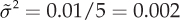 . Note that
  and Y have the same expected value, while the sample variance is the variance of the original observations divided by the number n of units in the sample. This means that the sample average is less variable than the original observations. The distribution of the estimation error
 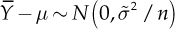 , and the square root of its variance (i.e.,
  ) is called standard error of
  , that is,
 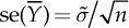 . If
. If  is also unknown, it is necessary to carry out an estimate and modify the procedures.
It is then possible to use the distribution of the estimation error to quantify the degree of accuracy of the obtained estimates. For example, it is easy to calculate the probability that the estimation error is less than a certain fixed amount in absolute value. The probability that the error is less than 0.05 can be evaluated by calculating  . This means that the probability that the interval
 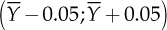 includes the real average µ is 0.736. In general, a random interval that contains the true value of an unknown parameter with a probability of 1 − α is labelled confidence interval of level 1 − α for that parameter. Most of the times confidence intervals with a fixed level are obtained, which is usually 0.90, 0.95, or 0.99 (corresponding to α equal to 0.10, 0.05, and 0.01).
With the percentile notation for the standard normal distribution introduced earlier, the confidence interval of level 1 − α for µ, is given by 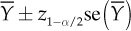 , that is
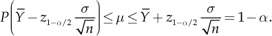
For the example of the machine which fills vessels presented in Section 3.5, choosing α = 0.05 leads to z0.975 = 1.96 and to a confidence interval (25.21; 25.39), which provides a more realistic response to the problem of estimating the average amount of liquid. This gives a measure of the error in predicting the unknown parameter µ. However, we are also interested to a precise estimation of the quantities already indicated with P(A) and with P(B). For these quantities, relations had been obtained, gA(μ) and gB(μ) that bind them to the unknown parameter µ. Since gA(μ) is a growing function of µ, since Φ (y) is increasing with y, it can be verified that the confidence interval of level 1 − α for gA(μ) is equal to
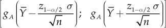
A similar result is obtained for gB(μ) also.
With α = 0.05, the confidence interval obtained for the probability of observing overfilled vessels is (0.002; 0.135), which means that the results obtained from the sample of the five vessels are compatible with defects greater than 10%. It seems therefore advisable to recalibrate the machine.
3.5.2. Hypothesis Verification
The example described in the previous sections can also be analyzed using a different approach. To make the example slightly more realistic, let us suppose that the variance of the process (s2) is not constant and equal to 0.01 (as hypothesized in Section 3.5). It is therefore appropriate to estimate also this quantity on a new sample with n = 20 elements. After data collection, the average and corrected sample variance are calculated:  and s2 = 0.021.
The nominal value for the liquid content in the containers is 25 cl. An average value μ different from µ0 = 25 cl indicates problems in the production process. Following this approach, we should evaluate two alternative hypotheses:
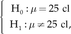
where H0 corresponds to the regular machine activity, while H1 reports some problems.
These kinds of problems where there is a choice between two options are called hypothesis verification, and the two assumptions are null hypothesis, usually referred to as H0, and alternative hypothesis, indicated using H1. The tool used to decide whether accepting or refusing the null hypothesis is called statistical test.
In this case it is reasonable to base the decision about the difference between the average  and the nominal value µ0 on its standardized version
  where
where
is the random variable corrected sample variance used to estimate the variance (or the estimator of σ2).
The function used to test the hypothesis is called test statistics. It is a random variable that is selected in such a way that its distribution, when H0 is true (i.e., under H0), is the furthest distribution from the one with H1 true (i.e., under H1). In the example, under H0, T takes values around zero. It can in fact be verified that T has the Student’s t distribution with n − 1 = 19 degrees of freedom. Under H1, the distribution of T is more complicated, but it can be verified that it takes values relatively far values from 0, and their distance increases as µ differs from µ0.
Deciding whether accepting or rejecting H0 requires to compare the observed values with the distribution under H0. In particular, a percentile of the distribution should be selected (in our case a percentile of the Student’s t distribution with v = n − 1) and the null hypothesis should be rejected if the observed test statistic is higher or lower than the value of the selected distribution, so if |T| > t1−α/2; 19. The value α that defines the percentile to be used is called significance level of the test, and it can be verified that it is equal to the probability of refusing the null hypothesis when it is true. Setting, for example, α = 0.05, the percentile t1−α/2; 19 is equal to 2.09, and the observed value of the statistic test is t = 2.716, which is higher than 2.09, and therefore suggests refusing H0 and highlight the need to recalibrate the machine.
The observed value would lead to reject the null hypothesis for all significance levels equal or higher than 0.0137 (α ≥ 0.137): this value is often labeled as observed significance level or p-value. This means that H0 must be refused if α = 0.05, but not if α = 0.01.
Calculating the p-value requires to get the probability under H0 of getting a test statistic as extreme or more extreme than the calculated test statistic. The p-value is very used in the hypothesis verification because it allows to verify the conformity (or not) of the data with the hypothesis of interest.
There are two possible ways to make mistakes in hypothesis verification problems. It may happen that the null hypothesis H0 is rejected when it is true. This is called type I error. Alternatively, it may happen to accept H0 when it is false. This is called type II error. In quality management, chances of making errors of I and II types are called producer risk and consumer risk (or buyer’s risk).
3.5.3. Regression
Many quality management problems are required to determine the relationship between two or more variables. The aim is often to measure the influence of some variables X1, X2, ..., Xk, called explanatory or independent variables, on a variable of interest Y, called dependent variable. In other words, we are looking for a relationship like this:

where ε expresses the part of the response variation that is not explained by the dependent variables.
The simplest relationship is the linear one, which, can be written as

where β0, β1, ..., βk are constant.
A model like this is called linear regression model. To get an indication about the relationship between Y and explanatory variables, the values of the parameters β0, β1, ..., βk and of the error ε should be estimated. There are several methods to obtain these parameters’ estimations, but certainly the most common is the method of least squares which consists in minimizing the sum of squares of the differences between the hypothesized values and the observations of Y (residuals).
A rich literature has studied the relationship between explanatory and dependent variables, providing tools to measure the significance of each explanatory variable, methods to check quality of the adopted model, or even suggestions to overcome the assumptions of linearity, normality of errors and independence of observations. For more details, the interested reader might refer to the literature already mentioned (e.g., Acock, 2018; Field, 2009; Hothorn & Everitt, 2004).
3.6. Advanced Techniques
The methods presented in the previous sections are just some simple examples of the many statistical methodologies used in quality management. In this section, we will present some more advanced statistical models used in this field.
3.6.1. Quality Control Charts
Quality control charts are graphic tools used in statistics to represent parameters of a process collected over time and to control/monitor them (Fig. 3.6).
In Shewhart charts, the most used control charts, the measurements made during the analyzed production process are reported. The central line represents the best (“right”) value, i.e., it is preferable having measurements distributed around it. The chart also sets two control limits: a lower one (LCL – Lower control limit) and a higher one (UCL – Upper control limit). They are equal to the best value ±3 times the standard deviation (σ). It is important to note that, if data follow a normal distribution with average μ, a range of μ ± 3σ covers 99.73% of measurements.
In a production process, there are two types of variability:
(1) natural variability (or accidental), which indicates the effect of many small and random intrinsic fluctuations in the process and
(2) systematic variability, which indicates distortions in the process due to problems such as irregular machines, faulty raw materials, operator failures, etc.
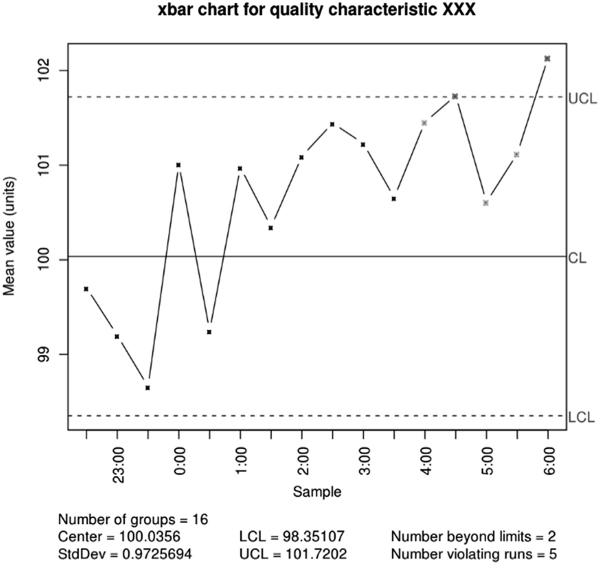
Fig. 3.6: Example of Quality Control Chart. Source: Penfield (2010).
The objective is to identify the presence in the process of systematic variability because the presence of natural variability is impossible to eliminate, and it does not influence the production particularly. Having only natural variability within a production process means that the process is “under control,” and it is rather predictable. Instead, in presence of systematic variability, the process is “out of control” (not predictable) and one or more points are probably out of the area bounded by the control limits. This signal makes easy to discover the error and remove it quickly from the process.
The effectiveness of quality management tools can also be measured according to the speed at which they are able to detect sudden state changes (from “under control” to “ out of control”), to permit quick intervention, determining the causes and correcting them.
A process is “out of control” if:
one or more points are outside the control limits;
two out of three consecutive points are outside the surveillance limits placed at μ ± 2σ, but they remain within the limits μ ± 3σ;
four consecutive points out of five are outside μ ± σ;
eight consecutive points are on the same side of the central line;
six consecutive points are in ascending (or descending) order;
15 points are in the area included between μ + σ and μ − σ (both above and below the center line);
14 consecutive points alternate with zig-zag;
eight consecutive points alternate within the central line, but none in the area included between μ + σ and μ − σ;
non-random data behavior is manifested; or
one or more points are positioned near the limits of surveillance and control.
3.6.2. Historical Series and Stochastic Control
An historical serie, or time serie, is a succession of chronologically sorted observations, which expresses the dynamics of a certain process over time. They are subject of many statistical studies (e.g., probability calculation, econometrics, and mathematical analysis) because they might help to interpret a phenomenon, to identify trend components, cyclicality, seasonality, and accident, as well as to predict future trends.
A stochastic process, or random process, is an ordered set of real functions of a certain parameter (usually time) with some statistical properties. From a practical point of view, a stochastic process is a form of representation of a magnitude that varies over time in a random way (e.g., an electrical signal, the number of cars passing through a bridge, etc.) and with certain characteristics.
Examples of time series can be found in many fields of business/economics and industrial production (including quality management).
It is possible to identify different categories of time series, referable to different categories of stochastic processes:
discrete phenomenon and discrete parameter processes (number of rainy days in a month);
discrete phenomenon and continuous parameter processes (radioactive particles recorded by a geiger counter);
continuous phenomenon and discrete parameter processes (meteorology); and
continuous phenomenon and continuous parameter processes (electroencephalogram).
Historical series analysis may have different objectives:
concisely describe the time trend of a phenomenon (the chart of a series easily highlights both regularities and abnormal values);
explaining the phenomenon, identifying its generator mechanism and any relations with other phenomena;
filtering the series, that is, decomposing series in its non-observable components; and
predicting future trends.
References
Acock, A. C. (2018). A gentle introduction to Stata (6th ed.). College Station, TX: Stata Press.
Box, G. E. P. (1976). Science and statistics. Journal of the American Statistical Association, 71, 791–799.
Box, G. E. P., Hunter, J. S., & Hunter, W. G. (1978). Statistics for experintenters (2nd ed.). Hoboken, NJ: John Wiley & Sons.
Cleveland, W. S. (1993). Visualizing data. Summit, NJ: Hobart Press.
Field, A. (2009). Discovering statistics using SPSS. Thousand Oaks, CA: Sage Publications.
Hothorn, T., & Everitt, B. S. (2014). A handbook of statistical analyses using R. London, UK: Chapman and Hall/CRC.
Johnson, R. A., Miller, I., & Freund, J. E. (2000). Probability and statistics for engineers. London: Pearson Education.
Montgomery, D. C. (2017). Design and analysis of experiments. Hoboken, NJ: John Wiley & Sons.
Navidi, W. C. (2008). Statistics for engineers and scientists. New York, NY: McGraw-Hill Higher Education.
Penfield, D. (2010). Example en:np-chart for a process that experienced a 1.5σ drift starting at midnight. Wikimedia. Retrieved from https://commons.wikimedia.org/wiki/File:Np_control_chart.svg
Ross, S. M. (2014). Introduction to probability and statistics for engineers and scientists. London, UK: Academic Press.
Tomi & Pierpao. (2017). Grafico v.c.Gaussiana. Wikimedia. Retrieved from https://commons.wikimedia.org/wiki/Image:Grafico_v.c.Gaussiana.png?uselang=it
Tukey, J. (1977). Exploratory data analysis. Reading, MA: Addison-Wesley.
Wilkinson, L. (1999). The grammar of graphics. New York, NY: Springer-Verlag.