Chapter 6
Meeting Standards and Standings
IN THIS CHAPTER
 Standardizing scores
Making comparisons
Working with ranks in files
Rolling in the percentiles
In my left hand, I hold 100 Philippine pesos. In my right, I hold 1,000 Colombian pesos. Which is worth more? Both are called pesos, right? So shouldn’t the 1,000 be greater than the 100? Not necessarily. Peso is just a coincidence of names. Each one comes out of a different country, and each country has its own economy.
To compare the two amounts of money, you have to convert each currency into a standard unit. The most intuitive standard for U.S. citizens is our own currency. How much is each amount worth in dollars and cents? As I write this, 100 Philippine pesos are worth over $2. One thousand Colombian pesos are worth 34 cents.
So when you compare numbers, context is important. To make valid comparisons across contexts, you often have to convert numbers into standard units. In this chapter, I show you how to use statistics to do just that. Standard units show you where a score stands in relation to other scores within a group. I also show you other ways to determine a score’s standing within a group.
Catching Some Z’s
A number in isolation doesn’t provide much information. To fully understand what a number means, you have to take into account the process that produced it. To compare one number to another, they have to be on the same scale.
When you’re converting currency, it’s easy to figure out a standard. When you convert temperatures from Fahrenheit to Celsius, or lengths from feet to meters, a formula guides you.
When it’s not so clear-cut, you can use the mean and standard deviation to standardize scores that come from different processes. The idea is to take a set of scores and use its mean as a zero point, and its standard deviation as a unit of measure. Then you make comparisons: You calculate the deviation of each score from the mean, and then you compare that deviation to the standard deviation. You’re asking, “How big is a particular deviation relative to (something like) an average of all the deviations?”
To make a comparison, you divide the score’s deviation by the standard deviation. This transforms the score into another kind of score. The transformed score is called a standard score, or a z-score.
The formula for this is
if you're dealing with a sample, and
if you're dealing with a population. In either case, x represents the score you're transforming into a z-score.
Characteristics of z-scores
A z-score can be positive, negative, or zero. A negative z-score represents a score that's less than the mean, and a positive z-score represents a score that's greater than the mean. When the score is equal to the mean, its z-score is zero.
When you calculate the z-score for every score in the set, the mean of the z-scores is 0, and the standard deviation of the z-scores is 1.
After you do this for several sets of scores, you can legitimately compare a score from one set to a score from another. If the two sets have different means and different standard deviations, comparing without standardizing is like comparing apples with kumquats.
In the examples that follow, I show how to use z-scores to make comparisons.
Bonds versus the Bambino
Here's an important question that often comes up in the context of serious metaphysical discussions: Who is the greatest home run hitter of all time: Barry Bonds or Babe Ruth? Although this is a difficult question to answer, one way to get your hands around it is to look at each player's best season and compare the two. Bonds hit 73 home runs in 2001, and Ruth hit 60 in 1927. On the surface, Bonds appears to be the more productive hitter.
The year 1927 was very different from 2001, however. Baseball (and everything else) went through huge, long-overdue changes in the intervening years, and player statistics reflect those changes. A home run was harder to hit in the 1920s than in the 2000s. Still, 73 versus 60? Hmmm… .
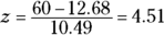
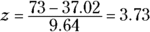
Standard scores can help decide whose best season was better. To standardize, I took the top 50 home run hitters of 1927 and the top 50 from 2001. I calculated the mean and standard deviation of each group and then turned Ruth’s 60 and Bonds’s 73 into z-scores.
The average from 1927 is 12.68 homers with a standard deviation of 10.49. The average from 2001 is 37.02 homers with a standard deviation of 9.64. Although the means differ greatly, the standard deviations are pretty close.
And the z-scores? Ruth’s is
Bonds’s is
The clear winner in the z-score best-season home run derby is Babe Ruth. Period.
Just to show you how times have changed, Lou Gehrig hit 47 home runs in 1927 (finishing second to Ruth) for a z-score of 3.27. In 2001, 47 home runs amounted to a z-score of 1.04.
Exam scores
Getting away from sports debates, one practical application of z-scores is the assignment of grades to exam scores. Based on percentage scoring, instructors traditionally evaluate a score of 90 points or higher (out of 100) as an A, 80–89 points as a B, 70–79 points as a C, 60–69 points as a D, and less than 60 points as an F. Then they average scores from several exams together to assign a course grade.
Is that fair? Just as a peso from the Philippines is worth more than a peso from Colombia, and a home run was harder to hit in 1927 than in 2001, is a “point” on one exam worth the same as a “point” on another? Like “pesos,” isn't “points” just a coincidence?
Absolutely. A point on a difficult exam is, by definition, harder to come by than a point on an easy exam. Because points might not mean the same thing from one exam to another, the fairest thing to do is convert scores from each exam into z-scores before averaging them. That way, you're averaging numbers on a level playing field.
I do that in the courses I teach. I often find that a lower numerical score on one exam results in a higher z-score than a higher numerical score from another exam. For example, on an exam where the mean is 65 and the standard deviation is 12, a score of 71 results in a z-score of .5. On another exam, with a mean of 69 and a standard deviation of 14, a score of 75 is equivalent to a z-score of .429. (Yes, it's like Ruth’s 60 home runs versus Bonds’s 73.) Moral of the story: Numbers in isolation tell you very little. You have to understand the process that produces them.
Standard Scores in R
The R function for calculating standard scores is called scale(). Supply a vector of scores, and scale() returns a vector of z-scores along with, helpfully, the mean and the standard deviation.
To show scale() in action, I isolate a subset of the Cars93 data frame. (It’s in the MASS package. On the Packages tab, check the box next to MASS if it’s unchecked.)
Specifically, I create a vector of the horsepowers of 8-cylinder cars from the USA:
> Horsepower.USA.Eight <- with(Cars93, Horsepower[Origin ==
         "USA" & Cylinders == 8])
> Horsepower.USA.Eight
[1] 200 295 170 300 190 210
And now for the z-scores:
> scale(Horsepower.USA.Eight)
[,1]
[1,] -0.4925263
[2,] 1.2089283
[3,] -1.0298278
[4,] 1.2984785
[5,] -0.6716268
[6,] -0.3134259
attr(,"scaled:center")
[1] 227.5
attr(,"scaled:scale")
[1] 55.83458
That last value is s, not σ. If you have to base your z-scores on σ, divide each element in the vector by the square root of (N-1)/N:
> N <- length(Horsepower.USA.Eight)
> scale(Horsepower.USA.Eight)/sqrt((N-1)/N)
[,1]
[1,] -0.5395356
[2,] 1.3243146
[3,] -1.1281198
[4,] 1.4224120
[5,] -0.7357303
[6,] -0.3433408
attr(,"scaled:center")
[1] 227.5
attr(,"scaled:scale")
[1] 55.83458
Notice that scale() still returns s.
Where Do You Stand?
Standard scores show you how a score stands in relation to other scores in the same group. To do this, they use the standard deviation as a unit of measure.
If you don't want to use the standard deviation, you can show a score's relative standing in a simpler way. You can determine the score's rank within the group: In ascending order, the lowest score has a rank of 1, the second lowest has a rank of 2, and so on. In descending order, the highest score is ranked 1, the second highest 2, and so on.
Ranking in R
Unsurprisingly, the rank() function ranks the scores in a vector. The default order is ascending:
> Horsepower.USA.Eight
[1] 200 295 170 300 190 210
> rank(Horsepower.USA.Eight)
[1] 3 5 1 6 2 4
For descending order, put a minus sign (–) in front of the vector name:
> rank(-Horsepower.USA.Eight)
[1] 4 2 6 1 5 3
Tied scores
R handles tied scores by including the optional ties.method argument in rank(). To show you how this works, I create a new vector that replaces the sixth value (210) in Horsepower.USA.Eight with 200:
> tied.Horsepower <- replace(Horsepower.USA.Eight,6,200)
> tied.Horsepower
[1] 200 295 170 300 190 200
One way of dealing with tied scores is to give each tied score the average of the ranks they would have attained. So the two scores of 200 would have been ranked 3 and 4, and their average 3.5 is what this method assigns to both of them:
> rank(tied.Horsepower, ties.method = "average")
[1] 3.5 5.0 1.0 6.0 2.0 3.5
Another method assigns the minimum of the ranks:
> rank(tied.Horsepower, ties.method = "min")
[1] 3 5 1 6 2 3
And still another assigns the maximum of the ranks:
> rank(tied.Horsepower, ties.method = "max")
[1] 4 5 1 6 2 4
A couple of other methods are available. Type ?rank into the console window for the details (which appear on the Help tab).
Nth smallest, Nth largest
You can turn the ranking process inside out by supplying a rank (like second-lowest) and asking which score has that rank. This procedure begins with the sort() function, which arranges the scores in increasing order:
> sort(Horsepower.USA.Eight)
[1] 170 190 200 210 295 300
For the second-lowest score, supply the index value 2:
> sort(Horsepower.USA.Eight)[2]
[1] 190
How about from the other end? Start by assigning the length of the vector to N:
> N <- length(Horsepower.USA.Eight)
Then, to find the second-highest score, it’s
> sort(Horsepower.USA.Eight)[N-1]
[1] 295
Percentiles
Closely related to rank is the percentile, which represents a score's standing in the group as the percent of scores below it. If you've taken standardized tests like the SAT, you've encountered percentiles. An SAT score in the 80th percentile is higher than 80 percent of the other SAT scores.
Sounds simple, doesn’t it? Not so fast. “Percentile” can have a couple of definitions, and hence, a couple (or more) ways to calculate it. Some define percentile as “greater than” (as in the preceding paragraph), some define percentile as “greater than or equal to.” “Greater than” equates to “exclusive.” “Greater than or equal to” equates to “inclusive.”
The function quantile() calculates percentiles. If left to its own devices, it calculates the 0th, 25th, 50th, 75th, and 100th percentiles. It calculates the percentiles in a manner that’s consistent with “inclusive” and (if necessary) interpolates values for the percentiles.
I begin by sorting the Horsepower.USA.Eight vector so that you can see the scores in order and compare with the percentiles:
> sort(Horsepower.USA.Eight)
[1] 170 190 200 210 295 300
And now the percentiles:
> quantile(Horsepower.USA.Eight)
0% 25% 50% 75% 100%
170.00 192.50 205.00 273.75 300.00
Notice that the 25th, 50th, and 75th percentiles are values that aren’t in the vector.
To calculate percentiles consistent with “exclusive,” add the type argument and set it equal to 6:
> quantile(Horsepower.USA.Eight, type = 6)
0% 25% 50% 75% 100%
170.00 185.00 205.00 296.25 300.00
The default type (the first type I showed you) is 7, by the way. Seven other types (ways of calculating percentiles) are available. To take a look at them, type ?quantile into the Console window (and then read the documentation on the Help tab.)
Moving forward, I use the default type for percentiles.
The 25th, 50th, 75th, and 100th percentiles are often used to summarize a group of scores. Because they divide a group of scores into fourths, they’re called quartiles.
You’re not stuck with quartiles, however. You can get quantile() to return any percentile. Suppose you want to find the 54th, 68th, and 91st percentiles. Include a vector of those numbers (expressed as proportions) and you’re in business:
> quantile(Horsepower.USA.Eight, c(.54, .68, .91))
54% 68% 91%
207.00 244.00 297.75
Percent ranks
The quantile() function gives you the scores that correspond to given percentiles. You can also work in the reverse direction — find the percent ranks that correspond to given scores in a data set. For example, in Horsepower.USA.Eight, 170 is lowest in the list of six, so its rank is 1 and its percent rank is 1/6, or 16.67 percent.
Base R doesn’t provide a function for this, but it’s easy enough to create one:
percent.ranks <-
         function(x){round((rank(x)/length(x))*100, digits = 2)}
The round() function with digits = 2 rounds the results to two decimal places.
Applying this function:
> percent.ranks(Horsepower.USA.Eight)
[1] 50.00 83.33 16.67 100.00 33.33 66.67
Summarizing
In addition to the functions for calculating percentiles and ranks, R provides a couple of functions that quickly summarize data and do a lot of the work I discuss in this chapter.
One is called fivenum(). This function, unsurprisingly, yields five numbers. They’re the five numbers that box plot creator John Tukey used to summarize a data set. Then he used those numbers in his box plots. (See Chapter 3.)
> fivenum(Horsepower.USA.Eight)
[1] 170 190 205 295 300
From left to right, that’s the minimum, lower hinge, median, upper hinge, and maximum. Remember the quantile() function and the nine available ways (types) to calculate quantiles? This function’s results are what type = 2 yields in quantile().
Another function, summary(), is more widely used:
> summary(Horsepower.USA.Eight)
Min. 1st Qu. Median Mean 3rd Qu. Max.
170.0 192.5 205.0 227.5 273.8 300.0
It provides the mean along with the quantiles (as the default type in quantile() calculates them).
The summary() function is versatile. You can use it to summarize a wide variety of objects, and the results can look very different from object to object. I use it quite a bit in upcoming chapters.